

Picky AI app icon
LifestyleScreenshot teardown15 min read

Picky AI App Store screenshots

When your product asks users to stop guessing and start posting, your screenshots can’t afford to hesitate. Picky AI’s App Store set abandons the Lifestyle category’s obsession with serene minimalism and instead builds a maximalist, Y2K-forward collage system that tries to turn the product tour into a mood board. The result is seven frames that oscillate between scrapbook chaos and targeted UI proof, tied together by a strict palette of powder sky, hot pink, mint teal, and dark charcoal condensed type. These screenshots do not sit quietly on the page; they stack, overlap, glow, and interrupt. For a designer preparing to launch a social-meets-AI utility, the set is a case study in committing to a single visual dialect—even when that dialect risks drowning its own message.

Set published by Picky AI · 7 frames analysed

0.0Freev1.1.1Updated 5mo ago
Picky AI App Store screenshot 1
01At a glance

The set in one screen

Framing
Mixed collage and device-in-frame
Captions
Heavy condensed sans, all-caps, dark gray on sky
Backdrop
Cloud/sky gradient continuity with Gen Z chrome accents
Type
Condensed geometric sans for headlines; retro pixel for AI callouts; casual script for in-photo annotations
UI / copy split
approximately 60% interface/UI-chrome to 40% floating collage objects
Frame 1 job
Frame 1 establishes decision paralysis using a traffic-light STOP, competing camera-roll thumbnails, and a literal hand hovering between choices.

Sampled palette

(Hot Pink)#FF5CCC
(Mint Teal)#99F6E4
(Charcoal)#1F2937
(Sky Blue)#A3D8F4
(Lavender Aura)#C4B5FD
02The challenge

What this screenshot set had to solve

App Store shoppers in the Lifestyle category are trained to expect either spa-clean utility screens or hyper-polished influencer fantasy. Picky AI sits in the awkward middle: it is part AI photo rater, part social polling tool. That duality creates an immediate taxonomy problem. How do you signal “artificial intelligence” and “friends vote” in the same breath without splitting the frame into two different apps? Add to this the Gen Z target demographic, which has evolved past the flat-vector era into chrome 3D, meme layering, and ironic disembodied hands. The design challenge, then, was not simply to show features, but to construct a visual noise floor high enough to feel native to TikTok and BeReal while still delivering readable feature hierarchy inside a 9:16 App Store crop that often gets thumbnailed at a width of 300 px. Every chrome heart, every cloud render, and every scan-line texture had to earn its place without cannibalizing the headline.

03The approach

How the set argues its case

Picky AI’s team opted for tonal consistency over safe legibility. Rather than isolate UI on flat backgrounds, they embedded every screen into a living composition where 3D charms, chat bubbles, and cloud assets share z-space with the interface. The background never changes radically—a powder-to-white sky gradient (#A3D8F4 to #FFFFFF) persists across all seven frames, acting as a substrate that lets pink and teal accents pop without reintroducing new base colors. Headlines are handled by one family: a heavy, tightly tracked, all-caps condensed sans in near-black (#1F2937). That discipline is crucial, because without it the surrounding collage—hands, skulls, traffic lights, glass hearts—would fragment into visual static. The designers also made a subtle structural choice: odd frames (1, 2, 4, 7) treat the canvas as the app experience, while even device-heavy frames (3, 5, 6) embed literal phones. That alternation prevents the fatigue of a standard UI carousel while still delivering functional proof.

POSITIONED AS A GEN-Z UTILITY THAT BEHAVES LIKE A SOCIAL PLATFORM RATHER THAN A CLEAN TOOL. THE SET COMPETES NOT WITH MINIMALIST PHOTO EDITORS BUT WITH THE VISUAL DENSITY OF TIKTOK OVERLAYS AND INSTAGRAM STICKERS. THE STRATEGY IS TO MATCH THE AESTHETIC VELOCITY OF THE FEED IT WANTS TO OPTIMIZE.

04Frame by frame

Every screenshot, and the job it does

Picky AI App Store screenshot 1 — The Traffic-Light Hook
01

The Traffic-Light Hook

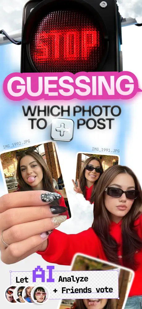
On-frame caption: “STOP GUESSING WHICH PHOTO TO POST

Frame 1 opens with a traffic-light housing in matte black (#1A1A1A) filling the top fifth, its LED matrix spelling STOP in arterial red (#FF0101). That single object does the emotional heavy lifting: it reframes photo selection as an emergency, not a vanity task. Below, a massive hot-pink pill shape (#FF5CCC) with a soft diffuse glow houses the word GUESSING in a rounded, almost liquid white sans-serif— the letterforms are thick enough to read at法学院 thumbnail size. Underneath, WHICH PHOTO TO POST locks in with a dark charcoal (#27272A) geometric sans, interrupted by a metallic 3D plus-sign button that catches a specular highlight. Two camera-roll candidates angle up from the bottom quarter, tagged with monospace filenames IMG_1991.JPG and IMG_1992.JPG. A disembodied hand with rhinestone nail art slices horizontally across the foreground, physically bridging the two photos and turning the composition into a shallow stage. At the very bottom, a dashed-border sticker box with checkerboard corners holds the line Let AI Analyze + Friends vote; the AI is set in a purple (#7C3AED) pixel font that cites early-2000s screen culture, while four tiny circular avatars peek from the left edge. The hierarchy is sky → light → headline → photos → hand → sticker, giving the eye a staircase to climb even while the overall mood is maximalist.
Picky AI App Store screenshot 2 — Notification Collage
02

Notification Collage

On-frame caption: “GET FLOODED WITH REAL VOTES

Frame 2 pivots from paralysis to social velocity, but it pays a legibility price. A notification bell with a red badge sits between the Picky AI and Ask Friends pills, establishing the app’s bimodal navigation for the first time. Chat bubbles layer at contradictory angles: a dark graphite pill reads First vote from Japan!, a white pill carries an American flag icon and the text NYC and LA disagree - they picked different favorites!, and a larger black bubble announces Paris just rated your pics! beside a French flag. Smaller fragments—50 views milestone, Someone from Jersey is viewing your li—, and k the lead—shear off at the edges, implying motion that continues beyond the crop. Translucent lavender and glossy pink heart charms float in the upper right like refrigerator magnets. The central photo, the same bubble-gum image from Frame 1, is now held by a different hand (silver rings, black polish) and threaded through a shiny plastic ring. At the bottom, GET FLOODED WITH REAL VOTES lands in the same heavy condensed sans, dark charcoal against pale sky, giving the eye one stable plane amid the noise. Structurally, the frame sells momentum, but every textual element outside the headline battles for survival against the collage.

Picky AI App Store screenshot 3 — The Device Reveal
03

The Device Reveal

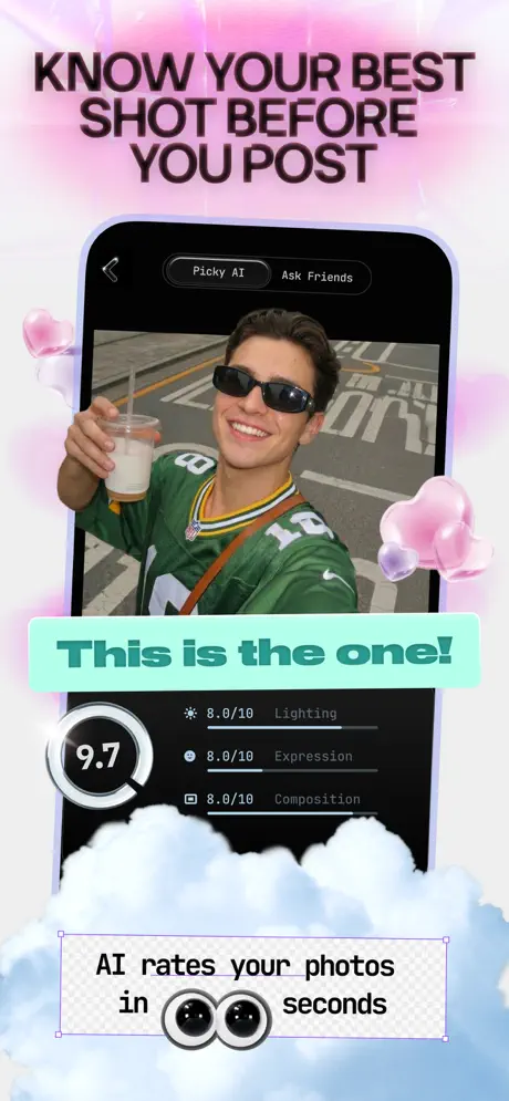
On-frame caption: “KNOW YOUR BEST SHOT BEFORE YOU POST

For the first time we see a literal device: an iPhone wrapped in a thick lavender aura (#C4B5FD) that separates screen from sky. The headline KNOW YOUR BEST SHOT BEFORE YOU POST sits above it in the same charcoal condensed sans, centered and stacked. Inside the phone, the app shows a dark-mode interface with a back chevron and a segmented control toggling Picky AI against Ask Friends. The viewport displays a photo of a user in a green jersey holding an iced coffee. A mint-teal banner (#99F6E4 background, deep teal text) slices across the lower third of the photo declaring This is the one! in italicized retro sans. Below the image, a circular dial reads 9.7 in white on black with a partial ring indicator. To its right, three metric rows sit in small gray type (#6B7280) on the black background: 8.0/10 Lighting, 8.0/10 Expression, and 8.0/10 Composition, each paired with a hairline icon. At the very bottom of the frame, outside the device, a dashed sticker states AI rates your photos in [eyeball][eyeball] seconds, substituting cartoon eyes for numerals. Pink translucent glass hearts float at the edges, maintaining continuity with Frame 1. This is the most information-dense frame in the set, and it succeeds because the device border creates a quiet zone that the previous frames deliberately avoided.

Picky AI App Store screenshot 4 — Conversational Editing
04

Conversational Editing

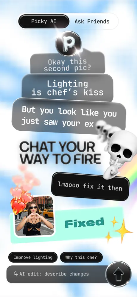
On-frame caption: “CHAT YOUR WAY TO FIRE

Frame 4 returns to free collage. The top again shows the bimodal pills, now with a chrome P logo emitting a lens flare. A vertical stack of three rounded chat bubbles in graduated gray (#6B7280 to #9CA3AF) delivers a micro-narrative: Okay this second pic?, Lighting is chef's kiss, and But you look like you just saw your ex. The bubbles overlap slightly, compressing vertical space and reinforcing the text-message metaphor. A large white skull—finger pressed to mouth in a shushing gesture, trailed by smaller skulls—interrupts the right margin, adding an ironic Gen Z punctuation mark. Centered in the chaos, CHAT YOUR WAY TO FIRE sits in the house condensed sans, black against sky. Below, a simulated chat shows a black pill reading Lmaooo fix it then, answered by a mint-teal bubble stating Fixed with yellow sparkle vectors beside it. A thumbnail photo of a woman in a black sequin top making heart hands against a yellow-cab street is pinned with flaming-heart stickers. Bottom action pills read Improve lighting and Why this one?, followed by an input field AI edit: describe changes and a circular send button. A faint rainbow arcs in from the bottom right. The frame’s structural tension is between the casual chat fantasy and the actual UI affordances; the skull and flames risk overpowering the functional proof, but they do cement the app’s ironic, post-ironic voice.

Picky AI App Store screenshot 5 — Link Distribution
05

Link Distribution

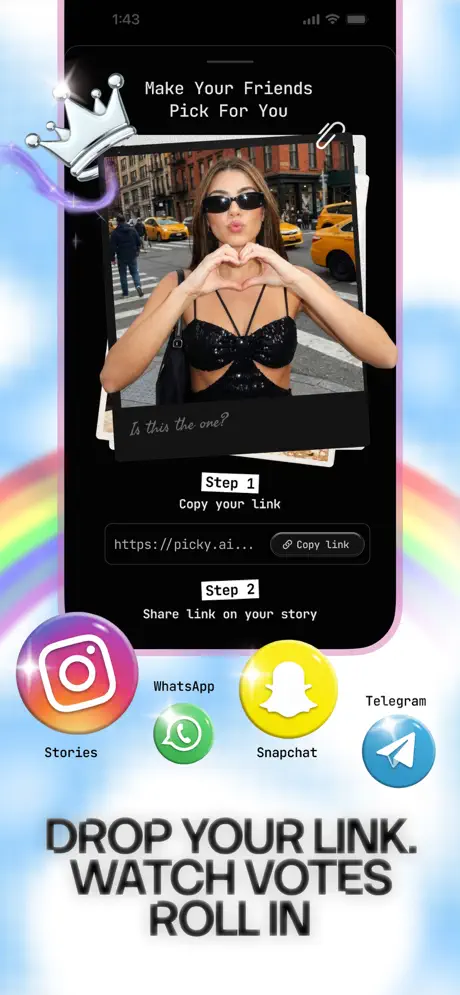
On-frame caption: “DROP YOUR LINK. WATCH VOTES ROLL IN

The device returns, now outlining a sharing workflow. The status bar shows 1:43. The screen header reads Make Your Friends Pick For You above a photo of a woman in a black sequin top against a New York street; handwritten text Is this the one? is scrawled across the photo’s lower third in white casual script, mimicking a Sharpie note on a printout. Step indicators use small white rectangular tags: Step 1 / Copy your Link above a black URL field containing https://picky.ai... and a Copy link button with a chain icon. Step 2 / Share Link on your story sits below. Four share icons—Instagram, WhatsApp, Snapchat, and Telegram—rest at the bottom of the screen, though the labeling beneath them is slightly disjointed: Stories appears under Instagram rather than the app name. A chrome crown with a purple neon glow and a paperclip float outside the device bounds, treating the hardware as a scrapbook page rather than a sacred container. The bottom headline DROP YOUR LINK. WATCH VOTES ROLL IN uses the same heavy condensed sans as Frame 4, creating rhythm through repetition. The rainbow arc from Frame 4 returns at the bottom, and the overall background remains the continuous powder sky.

Picky AI App Store screenshot 6 — Archive & Geography
06

Archive & Geography

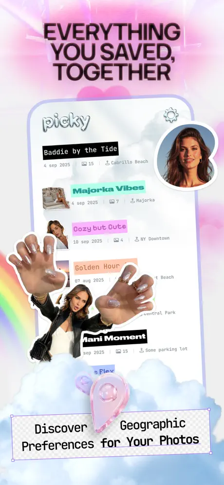
On-frame caption: “EVERYTHING YOU SAVED, TOGETHER

Frame 6 opens with the headline EVERYTHING YOU SAVED, TOGETHER in dark condensed sans, then reveals a device showing a gallery feed inside a lavender outline. The app header contains the wordmark picky in a soft, rounded sans at the top left; a settings gear sits top right, beside a circular profile avatar of a woman with warm brown tones. The feed lists collections behind color-coded tags: black for Baddie by the Tide (4 sep 2025, 15 photos, Cabrillo Beach), mint for Majorca Vibes (4 sep 2025, 7 photos, Majorca), pink for Cozy but Cute (10 sep 2025, 4 photos, NY Downtown), peach for Golden Hour (07 aug 2025, 14 photos, truncated Beach), black again for Mani Moment (sep 2025, 15 photos, Some parking lot), and a partially visible purple row reading s Flex. A large cutout of a woman reaching both hands toward the camera—manicured nails visible—physically covers the lower rows, turning the device into a collage substrate rather than a clear window. A translucent pink location heart-pin hovers near the bottom. At the frame’s base, a dashed sticker reads Discover Geographic Preferences for Your Photos. A rainbow arcs in from the left edge, ensuring the Y2K palette stays active. Structurally, this frame is the busiest device showcase; the hands sacrifice some list legibility for personality, betting that users will recognize the archive concept from the thumbnail alone.

Picky AI App Store screenshot 7 — Pre-Post Correction
07

Pre-Post Correction

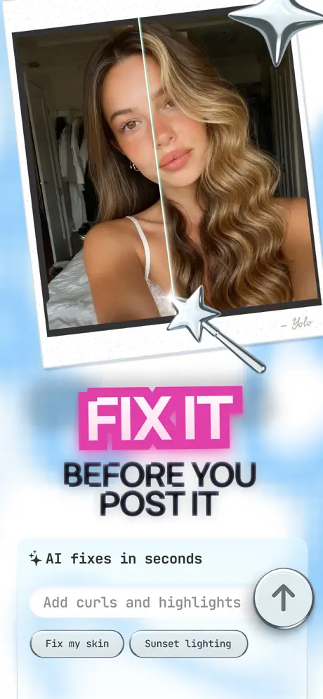
On-frame caption: “FIX IT BEFORE YOU POST IT

The final frame narrows the promise to a single transformation. A Polaroid-style white frame dominates the upper half, slightly tilted. Inside, a photo is bisected vertically: the left side shows straighter, more muted hair; the right side shows curled, highlighted hair. A silver star wand sits at the dividing line, literalizing the edit action, while a chrome star punctuates the top right corner outside the frame. Handwritten text - Yolo appears in the Polaroid’s bottom right corner. Below the photo, FIX IT sits in massive white block letters on a hot pink rectangle (#EC4899) with a chromatic aberration offset—red and cyan shadows giving a digital glitch effect. BEFORE YOU POST IT follows in the standard dark condensed sans. The lower third shows a chat-style input UI: AI fixes in seconds in plain black sans, a filled pill reading Add curls and highlights, and two option pills below it labeled Fix my skin and Sunset lighting. The send button is a light gray circle (#D1D5DB) with a black up-arrow. The background shifts to a grainy powder blue (#BFDBFE), the calmest and coolest base in the set, allowing the hot pink to scream. Structurally, this frame functions as the closer: it returns to the single-image format of Frame 1, but now the hand is replaced by a wand, and indecision is replaced by an explicit before/after promise.

05The craft

Captions, colour and the mechanics of the sell

Caption pattern

Headlines are always centered, always stacked, always heavy condensed sans. Sub-captions use a lighter weight or a dashed-border sticker box. UI text inside devices uses the app’s native dark mode, which is black (#000000) with gray (#6B7280) secondary labels.

Visual system

BACKGROUND: Powder sky with soft clouds, occasional rainbow arc. TYPOGRAPHY: One condensed sans family for headlines; pixel font for AI mentions; casual marker script for photo annotations. ACCENTS: 3D chrome hearts, glassy notification bells, plastic rings, rhinestone nails, skull emoji. COLOR CODING: Pink (#FF5CCC) for social/vote actions; Mint (#99F6E4) for AI-generated fixes and scores; Lavender (#C4B5FD) for device auras. FRAMING: No two devices are treated identically—some have thick colored glows, others are bordered by Polaroid edges, others are pierced by floating objects.

The thumbnail test

At thumbnail scale, only three elements survive: the pink pill in Frame 1, the mint banner in Frame 3, and the hot-pink FIX IT block in Frame 7. Everything else melts into texture. That is both a strength—the frames are unmistakably branded—and a weakness, because Frame 2 and Frame 6 become illegible mud below 400 px width.

Conversion mechanics

The headline cadence is almost military in its consistency: every frame uses the same condensed sans, same centered stacking, same dark gray color. That repetition trains the shopper to read the caption first and decrypt the collage second. Where the set wobbles is in the functional priority of its two modes: Ask Friends and Picky AI swap active-state color and position across frames (Frame 2 features Ask Friends as the black pill; Frame 3 and 4 favor Picky AI). A shopper swiping quickly could mistake the app for a pure AI tool and miss the social voting layer, or vice versa.

06Where it slips

What we would change

Density Without Breath

Frame 2 is a victim of its own energy. The notification bubbles overlap, the France/USA/Japan flags compete with the central image, and the fragment text at the edges becomes pure noise at thumbnail scale. At 300 px width, only GET FLOODED WITH REAL VOTES survives; the rest is gray mush. The fix is surgical: remove two notification pills, increase bubble contrast to pure black on white or white on black, and isolate the central photo so the hand does not obscure the face. Let one social proof point land instead of five whispering.

Inconsistent Mode Signaling

The bimodal value proposition—AI versus Friends—is the app’s core differentiator, yet the toggle’s visual language shifts per frame. In Frame 2, Ask Friends is the active black pill; in Frame 3’s device UI, Picky AI is selected; in Frame 4, Picky AI is active again but accompanied by a chrome P logo that never appears elsewhere. This risks training the eye to ignore the toggle. The fix is to lock a color convention across all frames: mint for AI, hot pink for Friends, applied uniformly to the pills regardless of which frame they appear in.

Occlusion in the Archive

Frame 6 sacrifices too much UI legibility for decoration. The reaching-hands cutout covers the lower feed rows, and the location metadata Some parking lot reads as glitched rather than casual. The profile avatar also sits uncomfortably close to the settings gear. The fix is to scale the cutout down by roughly thirty percent and anchor it to the left margin, or conversely to fade its lower half to transparent so the list remains scannable.

Marginal Contrast on Metrics

Frame 3’s metric labels—Lighting, Expression, Composition—sit in mid-gray (#6B7280) on a black background. In Apple Search Ads or compressed App Store renders, that gray will crush to illegibility against OLED black. The fix is to lighten label text to at least #D1D5DB and increase the icon stroke from hairline to 1.5 pt so the AI scoring feature remains readable when the frame is shrunk.

Cognitive Echo in the Closing Frame

Frame 7’s BEFORE YOU POST IT repeats the temporal premise of Frame 3’s KNOW YOUR BEST SHOT BEFORE YOU POST. Both frames argue about timing rather than capability, which slightly flattens the arc. The fix is to shift Frame 7’s copy toward the transformation itself—highlighting the AI editing mechanic—rather than reiterating the pre-post window. The before/after split already does that work visually; the headline could afford to name the edit explicitly.

07The recipe

How to apply this to your own app

  1. 01

    Choose one base environment and repeat it. Picky AI’s powder sky is not exciting on its own, but its repetition across seven frames turns it into a recognizable brand substrate. If you are building a screenshot set, lock your background first and vary only the foreground objects.

  2. 02

    Alternate device frames with canvas collage. Pure UI tours feel like documentation; pure collage feels like advertising. A 3:4 or 4:3 rhythm of device-to-collage keeps the shopper anchored while still delivering emotional texture.

  3. 03

    Treat your headline type as infrastructure, not styling. Picky AI uses the same condensed sans in the same weight, color, and center alignment across all seven frames. That consistency is what allows the surrounding chaos to exist without breaking the hierarchy.

  4. 04

    Color-code your value propositions. If your app has two modes, assign each a hex and protect it. Picky AI’s pink/mint split is readable, but it wobbles in execution. Lock those colors to specific features and never let them swap places.

08Takeaways

Five things worth stealing

  • MAXIMALISM REQUIRES INFRASTRUCTURE. THE SKY BACKGROUND, THE CONDENSED SANS, AND THE LIMITED ACCENT PALETTE ARE THE SCAFFOLDING THAT LETS THE CHAOS SURVIVE.
  • DEVICE FRAMES CAN BE SCRAPBOOK OBJECTS. LET THEM GET CROPPED, OVERLAID, AND PIERCED BY FLOATING ELEMENTS—BUT ONLY AFTER YOU HAVE SHOWN AT LEAST ONE CLEAN SCREEN.
  • SOCIAL PROOF NEEDS WHITE SPACE TO REGISTER. FRAME 2’S NOTIFICATION STORM IS ENERGETIC, BUT AT SMALL SIZES IT BECOMES TEXTURE INSTEAD OF EVIDENCE.
  • PRE-POST IS A CATEGORY, NOT A HEADLINE. IF YOUR CLOSING FRAME REITERATES THE SAME TEMPORAL PROMISE AS AN EARLIER FRAME, YOU ARE WASTING A SLOT THAT COULD NAME A NEW FEATURE.
  • THE HAND / NAIL / CHROME ASSET KIT IS A GEN Z DESIGN LANGUAGE THAT READS AS AUTHENTIC TO THE DEMOGRAPHIC, BUT IT AGES FAST. BUDGET FOR A SEASONAL ASSET REFRESH.
09The verdict

What the set actually achieves

The resulting set embraces a ‘frictionless collage’ language: seven frames that share a continuous sky/background motif, a single headline typeface, and alternating hot-pink/mint-teal accents that loosely map to Social (pink) and AI (mint). Device frames are treated as physical objects rather than precious windows—they get cropped, pierced by rainbow arcs, and layered under disembodied hands. The copy arc is deliberate: Frame 1 poses the problem, Frame 2 injects social proof, Frame 3 introduces the AI rating, Frame 4 demonstrates chat-based editing, Frame 5 shows distribution, Frame 6 introduces archiving, and Frame 7 closes with pre-post correction. It is a coherent AIDA loop rendered in maximalist Gen Z vernacular.

Designers building social-meets-AI utilities for audiences under 25 who need a benchmark for high-density, collage-forward App Store storytelling. The set is especially useful if you are debating between a sterile UI carousel and a full-mood maximalist approach—Picky AI proves you can do both, provided you enforce typographic discipline.

10Questions

Frequently asked

Does the maximalist style hurt conversion with older demographics?

Likely yes. The disembodied hands, pixel fonts, and ironic skulls are demographic hyperspecifics. If your audience skews thirty-plus, this visual noise floor will scan as juvenile rather than native.

How many UI screens are actually shown?

Three frames contain full device frames (Frames 3, 5, 6). Frames 4 and 7 show cropped UI snippets. Frames 1 and 2 are pure collage. That distribution gives enough functional proof without turning the set into a manual.

Should I copy the alternating device/collage rhythm?

It is a strong pattern, but only if your headlines are loud enough to survive the collage frames. Without the charcoal condensed sans anchoring every frame, the alternation would feel like two different apps.

What is the weakest frame?

Frame 2. It has the lowest signal-to-noise ratio and the most at-risk text legibility. The social proof is valuable, but the execution needs a stricter editorial pass.

11Keep reading

Build your own screenshot set

The full set

7 shots
Picky AI App Store screenshot 1Picky AI App Store screenshot 2Picky AI App Store screenshot 3Picky AI App Store screenshot 4Picky AI App Store screenshot 5Picky AI App Store screenshot 6Picky AI App Store screenshot 7

About the app

Stop staring at your camera roll wondering which photo to post. You took the pics. You did the poses. Now you're stuck scrolling through dozens of nearly identical shots, Picky AI, via the App Store listing.

Screenshots and store metadata belong to Picky AI. They are shown here for design commentary and criticism. The analysis on this page is original work by floow.design. View the original listing.

More Lifestyle teardowns

Browse all →