Deen Tracker app icon
LifestyleScreenshot teardown13 min read

Deen Tracker App Store screenshots

Deen Tracker's App Store screenshot set tries to be a complete lifestyle directory prayer times, widgets, streaks, qibla, fasting, and period tracking inside eight frames. The result is a catalogue of distinct background colours that often feel like separate apps sharing a single store page, which raises the central question for any utility with broad scope: do you let each module own its own palette, or do you force visual uniformity and risk drowning niche features in a single brand wash?

Set published by Bair Island LLC · 10 frames analysed

5.0 · 1 ratingsFreev2.0.5Updated 6mo ago
Deen Tracker App Store screenshot 1
01At a glance

The set in one screen

Framing
iPhone 15 Pro with Dynamic Island, single or double depending on feature complexity
Captions
Large bold rounded white sans-serif headline with a smaller white subhead, always top-aligned
Backdrop
Full-bleed solid colour per frame; forest green (#1B4D3E), iOS blue (#0A84FF), hot pink (#FF375F), warm taupe (#8E7E74), mustard (#D4A037)
Type
Heavy white display type for headlines, clean San Francisco-like UI type inside devices, right-aligned times in prayer lists
UI / copy split
Roughly 60% device chrome, 25% floating cards or notifications, 15% caption
Frame 1 job
Does not show the product experience first. Frame 1 opens with a defensive commercial claim rather than the core user value.

Sampled palette

#1B4D3E#1B4D3E
#0A84FF#0A84FF
#FF375F#FF375F
#8E7E74#8E7E74
#D4A037#D4A037
02The challenge

What this screenshot set had to solve

The product surface is unusually wide for a single Lifestyle app: prayer-time tables, lock-screen widgets, Apple Watch integrations, streak tracking, Qibla compass, missed-fast scheduling, and menstrual-cycle logging with Islamic ritual context. The set's job is to prove all of these live in one native container without leaking the confusion of a bundled wrapper. At thumbnail scale on the Search tab, a shopper sees only the first frame and a sliver of the second, so the sequence must establish immediate category recognition (Islamic practice aid) while also signalling modern utility (widgets, habit science, privacy-first health tracking). The deeper tension is audience segmentation: a user downloading Deen Tracker for prayer times may be startled by period-tracking screenshots, while a user seeking a period companion may not recognise the green prayer-UI frames as part of the same product. The designer therefore had to solve for modular clarity, the ability to quickly parse which feature is being shown, without fragmenting the brand into a rainbow of unrelated modules.

The designer solved for modular clarity by giving every feature its own background colour, but the cure became the disease: the set reads as a bundle, not a universe.
03The approach

How the set argues its case

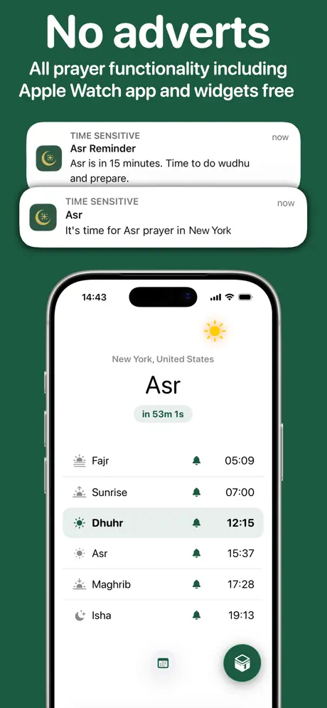
The designer opted for feature-per-frame spotlighting with full-bleed background colours acting as chapter markers. Frame 1 opens with economic trust using the headline 'No adverts' and the subheadline 'All prayer functionality including Apple Watch app and widgets free'. Frames 2 and 3 stay within the green family and introduce habit tracking and widgets. Frame 4 violently pivots to hot pink to signal the period tracker. Frame 5 drops to warm taupe for travel settings. Frame 6 returns to green for Qibla. Frame 7 introduces mustard exclusively for fasting. Frame 8 closes on red again for period companion notifications. Typography is uniformly heavy: white, rounded, sans-serif headlines set flush top with generous line height. Devices are always the iPhone 15 Pro with Dynamic Island, preserving hardware context. Notification bubbles and widget cards float above the devices to simulate iOS system-level integration. This approach treats each screenshot as an independent poster, but sacrifices horizontal continuity.

Positioned as the freemium-but-actually-free Islamic utility that respects privacy and spans worship, health, and travel. The set leans into that breadth, showing six distinct feature modules across eight frames. However, the lack of a persistent logo, icon, or colour thread between the red, blue, and mustard frames means the brand identity is carried entirely by the caption copy and the occasional green return.

04Frame by frame

Every screenshot, and the job it does

Deen Tracker App Store screenshot 1 — Prayer Times & Ad-Free Promise
01

Prayer Times & Ad-Free Promise

On-frame caption: “No adverts / All prayer functionality including Apple Watch app and widgets free

Dark forest-green background against a single iPhone 15 Pro showing the prayer-times dashboard for New York. The app UI lists Fajr at 05:09, Sunrise at 07:00, Dhuhr at 12:15 (highlighted with a pale grey row), Asr at 15:37, Maghrib at 17:28, and Isha at 19:13. A small green pill above the list reads 'in 53m 1s' beneath the large 'Asr' header. Two notification bubbles float above the device: the upper reads 'Asr Reminder / Asr is in 15 minutes. Time to do wudhu and prepare', and the lower reads 'Asr / It's time for Asr prayer in New York'. Both bubbles carry a dark green icon with a crescent and star. The headline leads with a negative commercial claim rather than a positive user outcome.
Deen Tracker App Store screenshot 2 — Habit Streaks & Daily Worship
02

Habit Streaks & Daily Worship

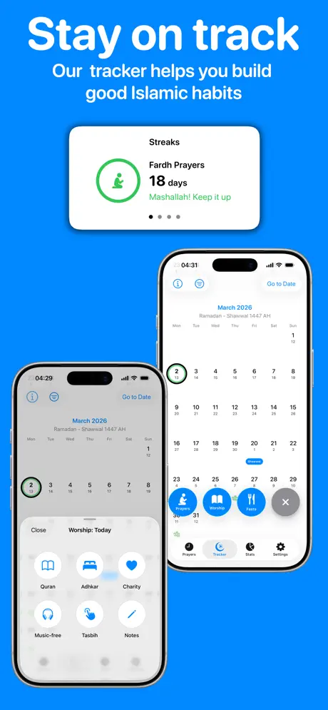
On-frame caption: “Stay on track / Our tracker helps you build good Islamic habits

Vivid blue background close to #0A84FF. A floating card at top reads 'Streaks / Fardh Prayers / 18 days / Mashallah! Keep it up' with a green ringed icon of a figure in prayer. Below, two staggered iPhones overlap. The left device shows a calendar for March 2026 with the 2nd ringed in green, overlaid by a bottom sheet titled 'Worship: Today' containing six circular icons: Quran, Adhkar, Charity, Music-free, Tasbih, Notes. The right device shows the same calendar at 04:31 with an expanded floating action menu: Worship, Charity, and a grey close button with an X. The overlap obscures the lower portion of the left phone's bottom sheet, making the label 'Notes' partially hidden.

Deen Tracker App Store screenshot 3 — Lock Screen & Home Screen Widgets
03

Lock Screen & Home Screen Widgets

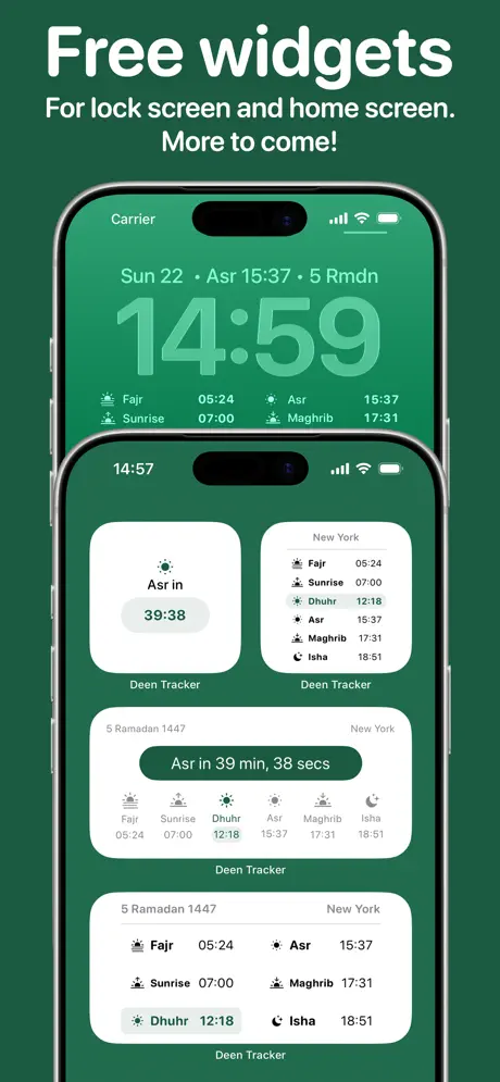
On-frame caption: “Free widgets / For lock screen and home screen. More to come!

Returned to forest green (#1B4D3E). Two devices stacked vertically. The top phone displays a Lock Screen widget with large San Francisco time '14:59' above a horizontal strip of prayer abbreviations and times: Fajr 05:24, Sunrise 07:00, Asr 15:37, Maghrib 17:31. The bottom phone shows a Home Screen grid of four widgets: a small square 'Asr in 39:38', a small list for New York, a medium rectangle with all six prayers laid out horizontally, and another medium split widget showing Fajr/Sunrise on the left and Maghrib/Isha on the right. The text 'Deen Tracker' appears in grey beneath each widget, the only in-frame brand impression beyond the caption.

Deen Tracker App Store screenshot 4 — Period Tracker Calendar
04

Period Tracker Calendar

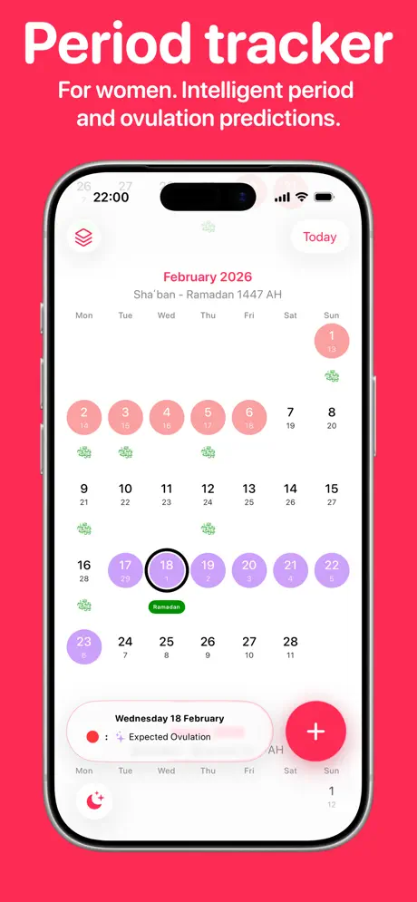
On-frame caption: “Period tracker / For women. Intelligent period and ovulation predictions.

Hot pink background near #FF375F. Single iPhone showing a menstrual calendar for February 2026 with the Islamic date 'Sha'ban - Ramadan 1447 AH'. Days 1-6 are filled hot pink for menstruation. Days 17-23 are filled purple for ovulation, with day 18 ringed in black and tagged in a bottom sheet as 'Wednesday 18 February — Expected Ovulation'. Small green leaf icons appear under random dates. A red plus button floats bottom right. The top left toolbar shows a stacked-layers icon; top right shows a pink 'Today' text button. This frame severs the green thread established in Frames 1 and 3.

Deen Tracker App Store screenshot 5 — Travel Detection & Calculation Settings
05

Travel Detection & Calculation Settings

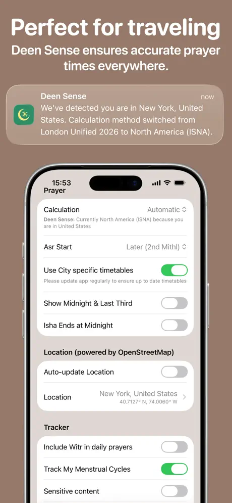
On-frame caption: “Perfect for traveling / Deen Sense ensures accurate prayer times everywhere.

Warm taupe background near #8E7E74. A notification bubble floats above the device reading 'Deen Sense / We've detected you are in New York, United States. Calculation method switched from London Unified 2026 to North America (ISNA).' The iPhone displays a grouped-settings table: Calculation set to Automatic, Asr Start set to Later (2nd Mithl), and toggles for city-specific timetables (green/on), Show Midnight & Last Third (grey/off), Isha Ends at Midnight (grey/off). A Location section powered by OpenStreetMap lists New York at 40.7127° N, 74.0060° W. Tracker toggles include 'Track My Menstrual Cycles' (green/on). This is the set's only pure-settings frame.

Deen Tracker App Store screenshot 6 — Qibla Compass
06

Qibla Compass

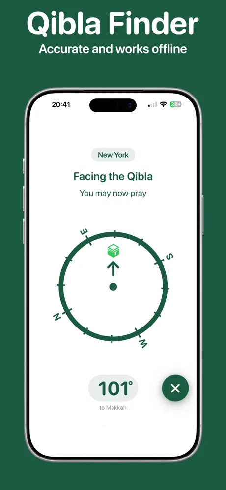
On-frame caption: “Qibla Finder / Accurate and works offline

Forest green again. Single iPhone with a minimalist compass UI. A grey pill at top centre reads 'New York'. Below, 'Facing the Qibla' in dark green text, then 'You may now pray' in lighter grey. A flat compass ring with N, E, S, W tick marks occupies the centre; an upward arrow points to a small Kaaba icon at the top of the ring. Bottom left presents '101° to Makkah' inside a grey pill. Bottom right offers a dark green circular close button with a white X. The generous whitespace makes the single gesture readable even at small scale, and the return to green after the red and taupe interludes feels like a reunion with the app's visual home.

Deen Tracker App Store screenshot 7 — Missed Fasts & Scheduling
07

Missed Fasts & Scheduling

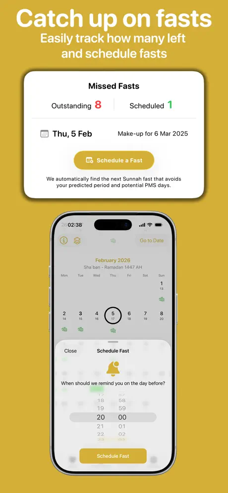
On-frame caption: “Catch up on fasts / Easily track how many left and schedule fasts

Mustard background near #D4A037. A floating card above the phone reads 'Missed Fasts / Outstanding 8 / Scheduled 1' with a gold vertical divider. A row with a calendar icon states 'Thu, 5 Feb' paired with 'Make-up for 6 Mar 2025'. A gold pill button reads 'Schedule a Fast'. Small subtext beneath says 'We automatically find the next Sunnah fast that avoids your predicted period and potential PMS days.' The phone shows the March/Shaban calendar with the 5th ringed in black, overlaid by a bottom sheet 'Schedule Fast' with a bell icon and a time picker set to 20:00. This is the only frame in the mustard hue, making it an outlier.

Deen Tracker App Store screenshot 8 — Period Companion Notifications
08

Period Companion Notifications

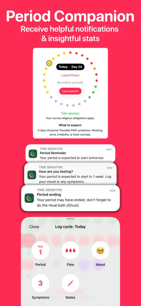
On-frame caption: “Period Companion / Receive helpful notifications & insightful stats

Hot pink matching Frame 4. A circular cycle-card at top reads 'Today - Day 24 / Luteal Phase / Be kind to yourself' with a 'Log symptoms' pink button. Below, text notes 'Tuhur (purity)' and 'What to expect: 4 days till period. Possible PMS symptoms: Bloating, acne, irritability, or food cravings.' Three notification bubbles stack beneath: 'Period Reminder / Your period is expected to start tomorrow'; 'How are you feeling? / Your period is expected to start in 1 week. Log your mood or any symptoms.'; 'Period ending / Your period may have ended; don't forget to do the ritual bath (Ghusl).' The phone at bottom shows a 'Log cycle: Today' sheet with five white circular buttons: Period, Flow, Mood, Symptoms, Notes. The set closes on menstrual health, creating narrative whiplash after opening with prayer times.

05The craft

Captions, colour and the mechanics of the sell

Caption pattern

Every frame follows a strict two-line hierarchy: a two-to-four word bold headline in sentence case, followed by a longer functional subheadline. Frame 1: 'No adverts' / 'All prayer functionality including Apple Watch app and widgets free'. Frame 2: 'Stay on track' / 'Our tracker helps you build good Islamic habits'. Frame 3: 'Free widgets' / 'For lock screen and home screen. More to come!'. Frame 4: 'Period tracker' / 'For women. Intelligent period and ovulation predictions.'. Frame 5: 'Perfect for traveling' / 'Deen Sense ensures accurate prayer times everywhere.'. Frame 6: 'Qibla Finder' / 'Accurate and works offline'. Frame 7: 'Catch up on fasts' / 'Easily track how many left and schedule fasts'. Frame 8: 'Period Companion' / 'Receive helpful notifications & insightful stats'. This pattern is mechanically disciplined but also mechanically repetitive; there is no variation in scale or weight to create rhythm across the swipe.

Visual system

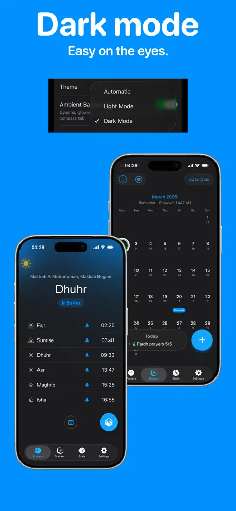
The system relies on full-bleed colour blocking to differentiate modules. Inside the devices, the UI language is iOS native: grouped tables, circular buttons with SF Symbol-style icons, pill-shaped tags, and tab bars with chunky touch targets. The floating cards above the phones use soft drop shadows and rounded 22pt corners, mimicking Apple's notification and widget language. Colours inside the UI are restrained: green toggles for 'on', grey for 'off', pink for menstruation, purple for ovulation. The only place the app's name appears visually inside a frame is beneath the widgets in Frame 3, where 'Deen Tracker' is printed in small grey text under each widget preview.

The thumbnail test

At 25% scale, only Frame 1's white headline 'No adverts' and the red 'Period tracker' survive with any contrast. The forest green and taupe frames darken into muddy rectangles, and the mustard fast-tracking frame loses edge definition against the gold background. Inside the devices, widget prayer times and settings toggles become grey smudges. Only the compass needle in Frame 6 and the large circular cycle dots in Frame 4 remain legible.

Conversion mechanics

The set is front-loaded with a monetisation assurance ('No adverts') rather than an emotional product hook. Conversion-oriented sets typically lead with the user outcome (accurate prayer times, calm Qibla direction) and relegate the free/ads pitch to a third or fourth frame. Frame 6, the Qibla compass, is the most visually calm and focused screen; it would likely outperform the settings table of Frame 5 as a second or third thumb-stopper. The period-tracking frames (4 and 8) are legitimate differentiators in a crowded Islamic-app market, but their placement as separate bookends rather than a contiguous pair reduces the chance that a period-tracking shopper recognises the depth of the health module.

06Where it slips

What we would change

Chromatic dissonance fragments brand identity

The background palette oscillates between forest green, iOS blue, hot pink, taupe, and mustard. A shopper swiping horizontally sees what appears to be four unrelated apps. The fix is to anchor every frame in the forest green and differentiate modules through small floating accent pills or icon tints, not full-bleed swaps.

Frame 5 is a settings graveyard

A dense table of toggles and calculation-method labels is unreadable at thumbnail scale. The literal selling point, automatic location switching, is buried inside grey rows. The fix is to replace this with a contextual arrival scene: a traveller at an airport with a simple banner over a clean prayer-times screen, keeping the caption but clearing the chrome.

Overlapping devices in Frame 2 obscure content

The left iPhone is cropped by the right handset, hiding the lower portions of the Worship sheet. The 'Notes' label and the bottom of the circular icons are partially lost. The fix is to separate the devices vertically or to fade the rear phone to 40% opacity so the front screen remains the legible hero.

Widget text in Frame 3 will not survive compression

Four Home Screen widgets contain prayer times in 11pt system type. At App Store thumbnail widths, these blur into indistinct grey lines. The fix is to show fewer widgets at exaggerated scale, or to isolate a single medium widget and enlarge its typography for screenshot purposes.

Sequence logic inverts persuasion hierarchy

Opening with 'No adverts' answers a pricing objection before the shopper knows what the app does. The fix is to move monetisation reassurance to Frame 3 or 4, and lead with the prayer dashboard or the Qibla compass so the first thumb impression is functional, not financial.

07The recipe

How to apply this to your own app

  1. 1. Choose one dominant background hue

    If your app spans multiple modules, resist the temptation to give each module its own full-bleed colour. Pick a single base and vary only accent tints so the swipe path reads as one continuous product.

  2. 2. Lead with the core gesture, not the business model

    State what the app does before stating what it does not do. A user must desire the product before they care about the absence of advertisements.

  3. 3. Banish settings tables from the hero sequence

    Replace administrative screens with contextual moments. If the feature is automatic location switching, show the airport arrival, not the toggle list.

  4. 4. Separate overlapping devices

    When using multiple iPhones, ensure no primary content is occluded. If stagger is unavoidable, drop the rear device opacity below 50% so the front screen dominates visual parsing.

  5. 5. Enlarge widget type for screenshot legibility

    Real widget text is small; screenshot widget text must be large enough to remain crisp at 30% scale. Simplify to one widget per frame and boost the point size.

  6. 6. Sequence related features adjacently

    If your app has distinct verticals, such as prayer and period tracking, group them in contiguous frames so the user recognises depth rather than randomness.

08Takeaways

Five things worth stealing

  • Use a single dominant background colour across your entire screenshot set so swiping feels like exploring one product rather than stumbling through a bundle.
  • Move monetisation or ad-disclaimers out of Frame 1 and instead open with the primary user outcome your app delivers.
  • Never let overlapping device mock-ups obscure primary UI, because any cropped button or label becomes unreadable at thumbnail scale.
  • Replace settings screens and toggle tables with contextual product moments, since dense chrome signals administrative burden rather than user delight.
  • Test every frame at 30% scale to ensure body text inside widgets, notifications, and bottom sheets remains legible and does not blur into grey noise.
  • If your app serves distinct user segments, place related features next to each other rather than scattering them; contiguous pairing breeds perceived depth, random placement breeds confusion.
09The verdict

What the set actually achieves

The set communicates breadth honestly. A shopper will leave the listing understanding that Deen Tracker handles prayer notifications, streaks, widgets, period predictions, travel calculation methods, Qibla direction, and fast make-ups. However, the visual cost of that breadth is high: the brand reads as five different apps stitched together. Cohesion is not saved by consistent device framing alone; the backgrounds shout louder than the UI. The sequence also front-loads monetisation anxiety (no adverts) before product desire, and buries the visually calmest, most focused frame the Qibla compass in sixth position where fewer than half of scrollers will see it.

Teams building multi-module utilities, especially in Lifestyle and Health & Fitness, where prayer, fasting, habit tracking, and health monitoring must coexist under one icon. The case study is a warning about palette fragmentation and a playbook for keeping breadth legible.

10Questions

Frequently asked

Would a single green background have hurt the period-tracker frames?

Not if the UI inside the device already uses pink and purple to signal the feature. The background does not need to scream the module; the content inside the phone can do that work.

Why does Frame 5 fail where Frame 6 succeeds?

Frame 5 shows a settings table, which is documentation. Frame 6 shows a focused compass with one action and one result, which is persuasion. Screenshot sets are sales tools, not manuals.

Is the two-device layout in Frame 2 ever advisable?

Only when the rear device is decorative or shows a before-state at low opacity. Here, both devices carry important UI, and the overlap sacrifices legibility for depth.

Should Frame 8 have been removed entirely?

No. Period tracking is a genuine differentiator. But it should sit adjacent to Frame 4, and the set should close with a frame that unifies the experience, such as a dashboard or a privacy promise, rather than ending on a niche vertical.

11Keep reading

Build your own screenshot set

The full set

10 shots
Deen Tracker App Store screenshot 1Deen Tracker App Store screenshot 2Deen Tracker App Store screenshot 3Deen Tracker App Store screenshot 4Deen Tracker App Store screenshot 5Deen Tracker App Store screenshot 6Deen Tracker App Store screenshot 7Deen Tracker App Store screenshot 8Deen Tracker App Store screenshot 9Deen Tracker App Store screenshot 10

About the app

Deen Tracker is an Islamic app designed to help you track your daily religious practices and provide valuable insights into your spiritual journey. With a strong focus on user Bair Island LLC, via the App Store listing.

Screenshots and store metadata belong to Bair Island LLC. They are shown here for design commentary and criticism. The analysis on this page is original work by floow.design. View the original listing.

More Lifestyle teardowns

Browse all →