BitePal app icon
Health & FitnessScreenshot teardown13 min read

BitePal App Store screenshots

A food-tracking app in the Health & Fitness category faces an immediate shelf-space problem. Shoppers scrolling the App Store have already seen dozens of calorie counters, water loggers, and fasting timers. The design team here had to telegraph at least seven distinct feature vectors—AI scanning, macro logging, weight trends, water tracking, meal planning, intermittent fasting, daily challenges, and a virtual pet—inside eight static frames. The risk was textbook: either flatten everything into generic dashboard grids that look identical to every competitor, or lean so hard into character illustration that the UI credibility disappears and buyers assume the product is a game. The challenge, then, was to let a cartoon raccoon carry the personality while keeping the interface chrome legible at thumbnail size on a 6.1-inch display.

Set published by Reface Lithuania UAB · 9 frames analysed

4.7 · 39K ratingsFreev2.13.0Updated 4mo ago
BitePal App Store screenshot 1
01At a glance

The set in one screen

Framing
Captions
Backdrop
Every frame shares the same canvas: a cool gradient background that shifts between #C9E6F8 at the top and a slightly warmer sky tone toward the bottom.
Type
UI / copy split
Frame 1 job

Sampled palette

#C9E6F8#C9E6F8
#2D6A42#2D6A42
#111827#111827
#F59E0B#F59E0B
#3B82F6#3B82F6
#22C55E#22C55E
02The challenge

What this screenshot set had to solve

The design team had to communicate breadth without sacrificing identity. Health & Fitness screenshots often default to white-card dashboards on white backgrounds, so the first challenge was simply avoiding invisibility in a crowded search results page. The second challenge was sequencing: the app does meal scanning, calorie counting, photo-based progress tracking, water logging, meal planning, intermittent fasting, challenges, and virtual-pet dress-up. Eight screenshots is generous, but it is also enough for the set to feel like a disjointed checklist if the wrapping system is weak. Finally, the team needed to signal that the raccoon is not just a sticker pack but a persistent companion inside the actual interface.

03The approach

How the set argues its case

The organizing principle is environmental consistency. By locking every frame to the same pale blue sky gradient and the same headline typeface, the team turns eight separate features into chapters of one story. The raccoon provides the thread. Instead of trapping the mascot inside a static logo zone, the designers let it break the fourth wall— physically overlapping list rows, resting on tab bars, and wearing snorkel gear inside the water tracker. This makes the character feel native to the interface rather than pasted on top. The absence of realistic device bezels is equally strategic: it removes temporal hardware references and lets the UI cards scale to fill the canvas.

The set targets casual health trackers rather than clinical athletes. The palette is pastel and friendly, the type is bold but not aggressive, and the presence of a dress-up minigame in frame 8 signals that adherence matters more than precision. By placing AI scanning on frame 2 and gamification on frame 7, the sequence acknowledges the shopper’s desire for effortless logging before it reveals the retention mechanic.

04Frame by frame

Every screenshot, and the job it does

BitePal App Store screenshot 1 — Food tracker pet
01

Food tracker pet

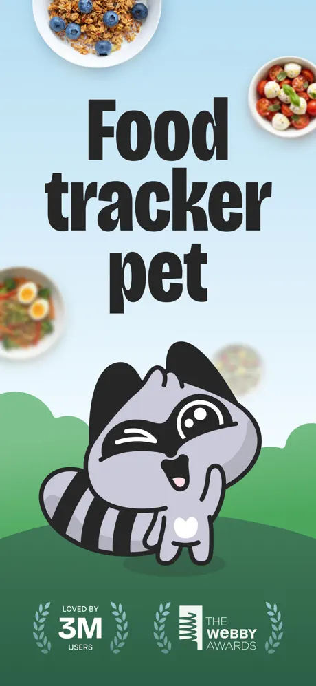
On-frame caption: “Food tracker pet

This is a pure brand poster with no UI chrome. The background gradients from a pale sky blue at the top to a mid-tone green hill at roughly the 60% mark. The headline is set in three lines of black condensed type, each word its own line, centered, with the point size large enough that the ascenders nearly touch the food photography at the top margin. Four food bowls act as corner anchors: granola and blueberries at top-left; a caprese-style salad with mozzarella and basil at top-right; a noodle bowl with halved eggs at mid-left; and a blurred bowl at mid-right. The raccoon sits in the lower half, grey fill around #A8A8B8, masked eyes in black, one eye winking, left paw raised in a wave, white heart on its belly. Beneath the character, the canvas darkens to #2D6A42, where two laurel-wreathed lockups live in white: “LOVED BY 3M USERS” on the left and “THE WEBBY AWARDS” on the right. The overall crop is full-bleed vertical, giving the impression of a storybook cover rather than an app screenshot.
BitePal App Store screenshot 2 — Scan your meal
02

Scan your meal

On-frame caption: “Powered by AI ✨ / Scan your meal

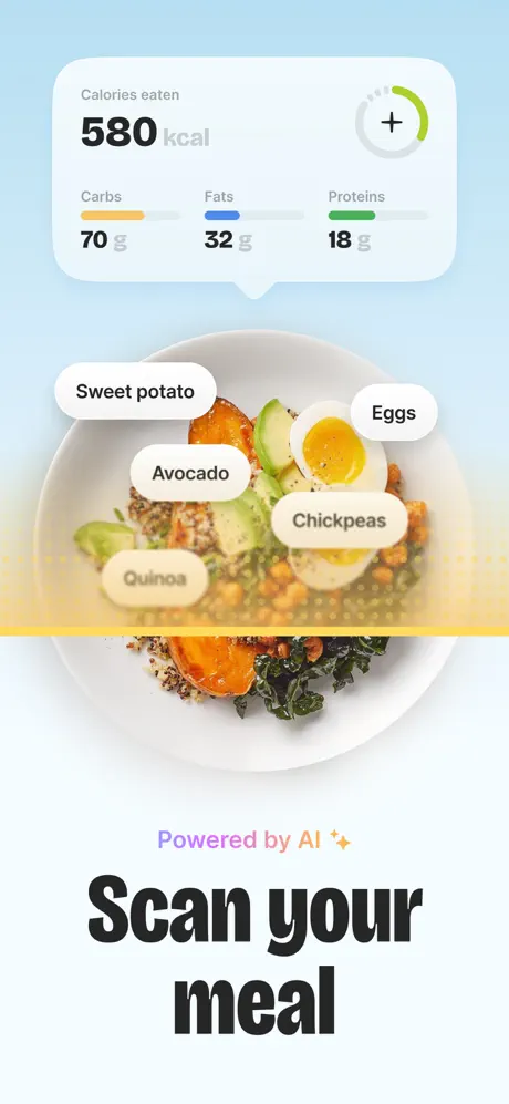
The headline moves to the bottom here, reading “Powered by AI ✨” in a gradient purple-to-amber script weight, followed by “Scan your meal” in the same heavy sans-serif used throughout. The upper two-thirds of the frame is dominated by a white rounded card—corner radius roughly 24 pt—containing a faux analytics readout. Inside the card, “Calories eaten” appears in a small grey #888888, then “580 kcal” in black at roughly 48 pt. A circular add button with a grey plus and a green progress arc sits at the right edge of the card. Below the calorie total, three macro rows read “Carbs 70 g” with an orange #F59E0B track, “Fats 32 g” with a blue #3B82F6 track, and “Proteins 18 g” with a green #22C55E track. Beneath this card is an overhead photograph of a grain bowl. Five white pill-shaped labels overlay the food photo: “Sweet potato”, “Avocado”, “Eggs”, “Chickpeas”, and “Quinoa”. A yellow horizontal scan band with a dotted fade pattern cuts across the bowl at roughly the 55% mark, implying computer vision. The food photo bleeds to the left and right edges; there is no phone frame.

BitePal App Store screenshot 3 — Track progress
03

Track progress

On-frame caption: “Track progress

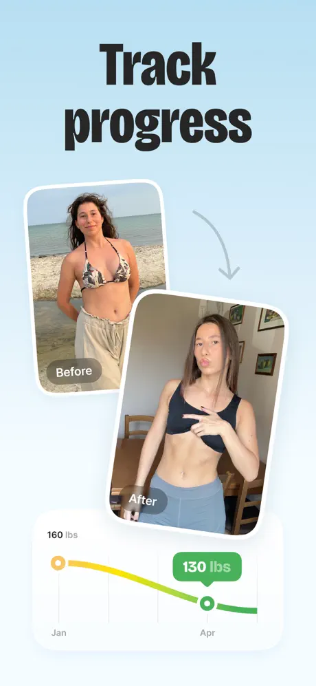
Again no device bezel. The headline “Track progress” sits at top center. Two user photos appear as tilted rectangles with white 4 pt borders and a 16 pt inner corner radius. The top-left photo is tagged with a translucent pill reading “Before”; the bottom-right photo is tagged “After”. A thin grey curved arrow connects the two. Below, a weight-trend card with a white fill and soft shadow spans most of the width. Its Y-axis is labeled “160 lbs” in grey, its X-axis shows “Jan” and “Apr”. A gradient stroke—starting orange at January and shifting to green by April—curves downward to a terminus dot above a green lozenge badge reading “130 lbs”.

BitePal App Store screenshot 4 — Water tracker
04

Water tracker

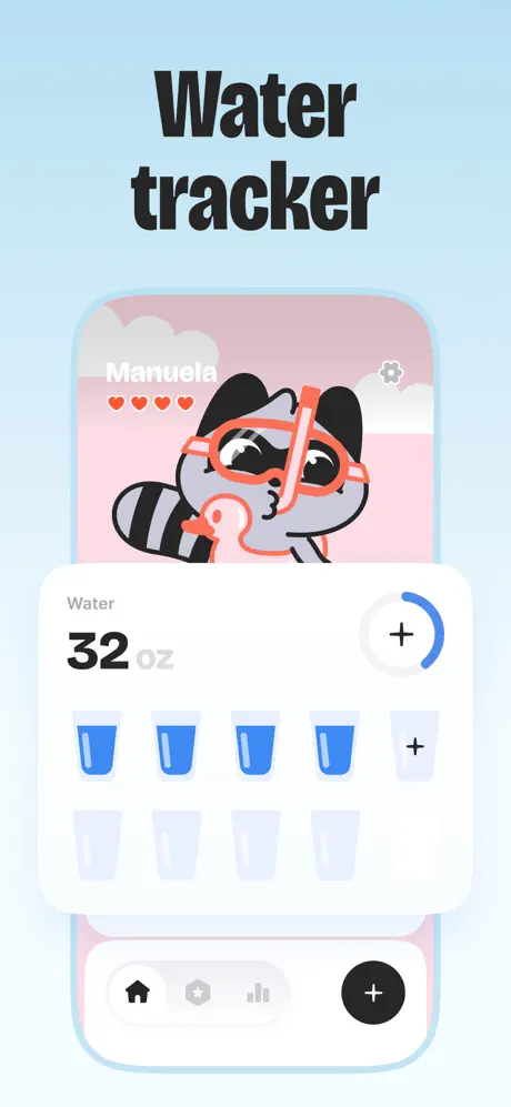
On-frame caption: “Water tracker

The headline “Water tracker” sits above the first appearance of the abstract phone frame. Inside, the upper portion shows a pink sky #F9C0C0 with cloud shapes. White text reads “Manuela” beside four small red hearts and a grey gear icon. The raccoon appears in snorkel gear, mask and snorkel in coral #FF7F50, holding a duck floatie. A white bottom sheet—24 pt top radius—slides up over the scene. It carries a “Water” label in grey, “32 oz” in black heavy type with “oz” in lighter grey, and a circular add button with a blue #3B82F6 progress arc. Below are two rows of water glass icons: row one shows four filled-blue glasses and one empty glass with a plus sign; row two shows four empty glasses. At the very bottom, a tab bar contains a filled home icon, a star, a chart icon, and a black circle containing a white plus. The overall stroke of the phone silhouette is light blue, roughly #B3E0F7.

BitePal App Store screenshot 5 — Meal plans
05

Meal plans

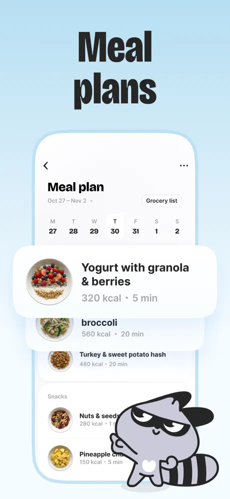
On-frame caption: “Meal plans

The phone frame returns. The screen header carries a back chevron, the title “Meal plan”, the date range “Oct 27 – Nov 2”, and a “Grocery list” outline button. A calendar strip below lists M T W T F S S with dates 27 through 2; Thursday the 30th is selected with a black circle. The list beneath uses circular food thumbnails—approximately 48 px—left-aligned with titles in black. The first item, “Yogurt with granola & berries”, sits inside an elevated white card with its metadata “320 kcal · 5 min” in grey. Below it, list rows read “broccoli” (with a lowercase b), “Turkey & sweet potato hash”, a “Snacks” section header, “Nuts & seed…”, and “Pineapple c…”. At the bottom-right corner of the frame, the raccoon leans against the list with arms crossed, expression skeptical, partially obscuring the last snack item.

BitePal App Store screenshot 6 — Intermittent fasting
06

Intermittent fasting

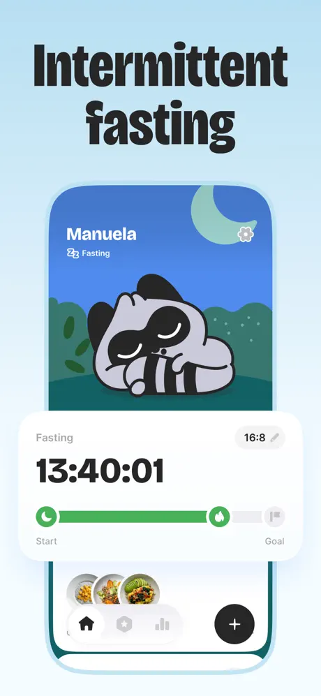
On-frame caption: “Intermittent fasting

Inside the phone frame, the background is a night scene: deep blue #3B6ECF sky, a pale green crescent moon, and dark green hills. White text reads “Manuela” with a “Fasting” subtitle accompanied by a Zzz icon. The raccoon is curled asleep. A white card overlays the lower half. It is labeled “Fasting” at the left and “16:8” at the right with a small edit pencil. Centered in the card is a timer reading “13:40:01” in black bold monospace-like numerals. A segmented progress bar runs beneath: a green #22C55E filled segment stretches from a crescent icon to a flame icon; the remainder is grey #E5E7EB leading to a flag icon. Microcopy “Start” and “Goal” anchors the ends. At the bottom of the phone screen, a partial tab bar and a carousel of meal thumbnails are visible.

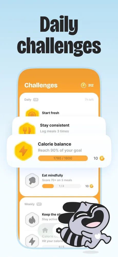
BitePal App Store screenshot 7 — Daily challenges
07

Daily challenges

On-frame caption: “Daily challenges

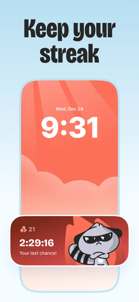
The phone frame displays an orange #F59E0B header with “Challenges” in white 28 pt and a coin icon plus “312” at the right. The list is divided by time gates: “Daily 1/5” with “7h left”, then “Weekly 1/7”. List items live in white cards with 16 pt radius and subtle shadow. Active challenges carry yellow-hexagon icons #FBBF24: “Start fresh” (sunrise), “Stay consistent” (fork and knife), and “Calorie balance” (lightning). The “Calorie balance” row includes an amber progress bar filled almost to “1780 / 1800” and a reward pill reading “10” beside a coin. Below, greyed-out hexagons lock future tasks: “Eat mindfully” with a grey brain icon, progress “1/3”; and weekly items “Keep the st…” with a fire icon. The raccoon appears bottom-right, mouth open in a laugh, body rotated roughly 30 degrees, overlapping the tab bar.

BitePal App Store screenshot 8 — Style your pet
08

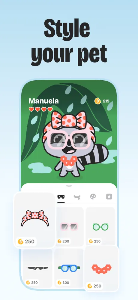
Style your pet

On-frame caption: “Style your pet

The final frame shows the phone frame against a green jungle background #2D6A3E with oversized leaf illustrations. The header reads “Manuela”, four red hearts, and a coin count of “215”. The raccoon is centered, wearing three accessories: a pink polka-dot bow, pink translucent sunglasses, and a pink scalloped collar. A white bottom sheet—24 pt top radius—contains a category tab bar: glasses selected with a black underline, plus mustache, palette, and star tabs. A 2×3 grid of rounded grey #F3F4F6 cells displays items: pink bow at 250 coins, pink wayfarer-style glasses at 200, green round glasses at 250, black mask at 250, blue goggles at 300, and red flower lei at 250.

05The craft

Captions, colour and the mechanics of the sell

Caption pattern

Every frame uses a single two-word headline in the same heavy condensed sans-serif, centered near the top: “Food tracker pet”, “Scan your meal”, “Track progress”, “Water tracker”, “Meal plans”, “Intermittent fasting”, “Daily challenges”, “Style your pet”. There is no subcaption. This creates a staccato rhythm when swiped quickly.

Visual system

The background is an unbroken vertical gradient. Cards use 20–24 pt corner radii and float with soft shadow rather than hard borders. The mascot introduces accent colors through accessories—coral snorkels, pink bows—while the core UI palette stays in orange, blue, and green. Photos of real food appear in circular 48 px thumbnails inside lists and full-bleed overhead shots inside the scanner frame.

The thumbnail test

At thumbnail scale, the light blue wrapper makes the set instantly recognizable against competitors who default to dark mode or white. The black condensed headlines remain readable because they are short—usually one or two words—and centered with ample negative space. The raccoon’s silhouette is distinctive enough that a returning shopper can spot it in a grid.

Conversion mechanics

Frame 1 delays gratification: there is no UI at all, only social proof and mascot. That is a gamble. It works only because frame 2 immediately answers “what does this app actually do?” with the scanner card. Frame 3 introduces the emotional payoff—human progress—before the utility frames (water, meal plans, fasting) take over. By frame 7 the shopper sees gamified retention, and frame 8 reveals the vanity loop of dressing the pet. The arc mirrors the expected user lifecycle: scan → track → plan → fast → compete → customize.

06Where it slips

What we would change

Device grammar breaks at frame 4

Frames 1–3 are free-floating posters. Frame 4 suddenly introduces an abstract phone silhouette with a 40 pt corner radius and a light blue stroke. A shopper swiping sequentially experiences a jarring shift from canvas-only layouts to contained interface. The fix is either to commit to device-less floating cards for the entire set—letting the raccoon and UI elements breathe without chrome—or to introduce the abstract phone silhouette as early as frame 2 so the grammar is consistent from the start.

Frame 3 carries regulatory risk

Apple’s App Store Review Guideline 3.8 discourages before-and-after weight-loss imagery. The frame shows two photos tagged “Before” and “After” with a weight graph. The fix is not to remove the human story but to replace the photos with illustrated avatar progression or retain only the weight chart, which already communicates the same data without risking rejection.

Inconsistent text casing in frame 5

The list item “broccoli” is sentence-cased while every other recipe title—“Yogurt with granola & berries”, “Turkey & sweet potato hash”—uses title case. At thumbnail scale it reads as a polish failure. The fix is trivial: normalize every list title to Title Case.

Label alignment in frame 2

The five white pill labels over the food photograph—‘Sweet potato’, ‘Avocado’, ‘Eggs’, ‘Chickpeas’, and ‘Quinoa’—appear to have inconsistent vertical padding and shadow values. ‘Quinoa’ in particular sits lower and softer than ‘Sweet potato’, suggesting misaligned export assets. The fix is to lock each label to identical 16 pt horizontal padding and a uniform 30% black shadow at y-offset 2 pt.

Accessibility on yellow challenge icons

In frame 7, the yellow lightning-bolt hexagon on a white card uses a fill of #FBBF24 against a white background; the bolt itself is only slightly darker yellow. At small scale the icon shape dissolves. The fix is to darken the bolt stroke to #92400E or add a 1 pt outline to preserve glyph recognition under WCAG contrast guidelines.

07The recipe

How to apply this to your own app

  1. Use a mascot as a physical actor, not a logo

    Notice how the raccoon leans on the meal-plan card in frame 5 and laughs over the challenges list in frame 7. This creates depth and emotional continuity. If you are designing with an illustration system, let the character cast a shadow on the UI and overlap buttons rather than confining it to a hero slot.

  2. Pick one off-canvas color and never deviate

    The light blue gradient wrapper turns eight disparate features into one cohesive story. If your screenshots currently use white, dark mode, and photo backdrops interchangeably, commit to a single environmental tint that matches your onboarding screen.

  3. Lead with brand, but resolve with UI by frame 2

    Frame 1 here is pure mascot and social proof. That is acceptable only because frame 2 immediately shows a recognizable interface mechanic—the calorie card and photo scanner. If you attempt a poster-style opening, ensure the very next frame answers ‘what do I tap?’ within one swipe.

  4. Avoid realistic device bezels unless you are targeting a specific phone generation

    The rounded abstract frame used here ages better than a photographic iPhone 14 bezel and frees up horizontal space for larger type. Just introduce it early and keep it consistent.

08Takeaways

Five things worth stealing

  • A single recurring character can carry visual continuity across features as diverse as fasting timers and dress-up shops.
  • Short, centered, two-word headlines create a staccato swipe rhythm but risk reading as keyword stuffing if they do not include a verb or benefit.
  • Introducing a phone frame mid-sequence disrupts the visual grammar; decide on chrome before frame 1 and keep it.
  • Social proof placed at the bottom of frame 1 anchors trust before the shopper sees any actual interface.
  • Color discipline—orange for energy/calories, blue for water/fats, green for protein/progress—lets a shopper map features to meaning without reading subcaptions.
09The verdict

What the set actually achieves

The team opted for a poster-style sequence with no photographic iPhone bezel. When UI appears it floats inside a soft, rounded-rectangle phone silhouette with roughly a 40 pt corner radius and a faint #A3D5F7 stroke. A single oversized headline in a heavy condensed sans-serif—black, tight leading, centered—acts as a chapter title on every frame. The raccoon is treated not as decoration but as a physical actor: it leans on cards, sleeps inside headers, and laughs over tab bars. Color coding is disciplined. Orange maps to calories and challenges, blue maps to fats and water, green maps to protein and fasting progress. Social proof is front-loaded in frame 1, while actual interface is delayed until frame 2, letting the set read as brand-first, UI-second.

This set is built for a casual health and fitness audience that needs emotional adherence, not clinical precision. The presence of a virtual pet, gamified challenges, and dress-up mechanics signals the app targets shoppers who have abandoned stricter trackers and need a lower-friction entry point to logging.

10Questions

Frequently asked

Why is there no phone bezel in frames 1–3?

The team treats the first three frames as brand posters rather than interface demos. This lets the mascot and food photography fill the full canvas without being cropped by device chrome. The trade-off is a structural break when the abstract phone frame finally appears in frame 4.

How does the headline typography stay legible at thumbnail size?

The type is a heavy condensed sans-serif set in black against a pale blue gradient. By keeping each headline to one or two words and centering it with generous negative space, the glyphs remain distinct even when the screenshot is compressed to a width of roughly 360 px.

Is the before/after imagery safe for App Store approval?

It presents risk. Apple’s guideline 3.8 restricts before-and-after weight-loss imagery. The safer path is to replace the photos with illustrated progress or rely solely on the weight chart already present in the lower portion of the frame.

What makes the raccoon feel integrated rather than pasted on top?

Shadow, overlap, and context. In frame 5 the raccoon leans against the list with its arms crossed, casting a soft shadow on the white card. In frame 7 it laughs with its mouth overlapping the bottom tab bar. These physical intrusions make the character feel anchored in the same z-space as the interface.

Why place social proof on frame 1 instead of later?

Social proof in the first frame acts as a trust filter. A shopper who does not recognize the app name can still see 3M users and a Webby Award before deciding to swipe further. Delaying that proof to frame 5 or 6 would mean most viewers never see it.

What is the purpose of the yellow scan band in frame 2?

The horizontal yellow dotted band bisecting the food photo at roughly 55% from the top serves as a visual metaphor for the AI scanning process. It connects the photo of real food to the calorie card above, answering the shopper’s question of how the two are related without requiring a subcaption.

11Keep reading

Build your own screenshot set

The full set

9 shots
BitePal App Store screenshot 1BitePal App Store screenshot 2BitePal App Store screenshot 3BitePal App Store screenshot 4BitePal App Store screenshot 5BitePal App Store screenshot 6BitePal App Store screenshot 7BitePal App Store screenshot 8BitePal App Store screenshot 9

About the app

Meet BitePal — a gamified food tracking app with an AI scanner. Snap your meals, track effortlessly, and let a cute raccoon turn your weight goals into fun, easy habits you'll Reface Lithuania UAB, via the App Store listing.

Screenshots and store metadata belong to Reface Lithuania UAB. They are shown here for design commentary and criticism. The analysis on this page is original work by floow.design. View the original listing.

More Health & Fitness teardowns

Browse all →