Bump app icon
SocialScreenshot teardown13 min read

Bump App Store screenshots

Bump’s App Store screenshot sequence is a masterclass in controlled chaos. Over eight frames, the team behind the social map app bets everything on a maximalist, sticker-bombed visual system that treats the iPhone not as a window to be framed, but as a scrapbook to be collaged. The result is a set that feels unmistakably Gen Z—loud, blue-drenched, and deliberately unpolished—but that same energy creates a knife-edge tension between brand tone and interface legibility. For designers tasked with selling a social utility without looking like a utility, Bump’s sequence offers a vivid, imperfect playbook.

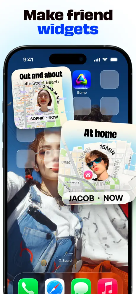
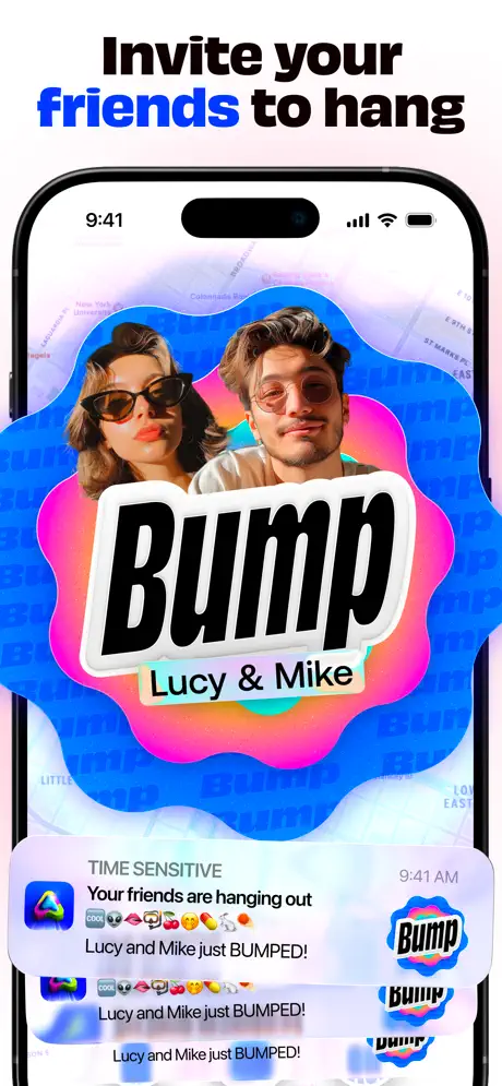
Set published by amo · 10 frames analysed

4.8 · 5.1K ratingsFreev2.78.0Updated 4mo ago
Bump App Store screenshot 1
01At a glance

The set in one screen

Framing
Poster (Frame 1), iPhone 15 Pro with Dynamic Island (Frames 2–8)
Captions
Heavy condensed sans-serif, ~80–100pt, one keyword per frame in #0057FF
Backdrop
Mapbox-style map tiles for NYC, Miami, and Ann Arbor, plus one non-map chat frame
Type
Extruded 3D drop-shadow on floating map labels; flat bold for captions
UI / copy split
UI: 45%, Collage overlays: 55%
Frame 1 job
Vibe / Social proof only (zero product UI)

Sampled palette

electric blue#0057FF
cyan#00C6FF
white#FFFFFF
sticker red#FF2D2D
status green#00C853
heatmap violet#4D2EFF
02The challenge

What this screenshot set had to solve

The central design challenge for Bump is the location-sharing paradox: the app is a precise, battery-friendly utility built on map tiles, coordinates, and real-time push notifications, but its audience treats it as a social toy. The screenshot set has to teach eight distinct functional stories—friend tracking, ETA, music presence, city exploration, campus networks, saved places, and group messaging—without ever looking like a navigation app. At the same time, because the product competes in the Social category against glossy entertainment apps, the frames cannot feel clinical. The team needed a system that would let UI chrome, map typography, chat bubbles, 3D stickers, and user-generated cutouts coexist in a 9:19 canvas without collapsing into mud. The hardest part was determining how much of the actual interface to sacrifice in order to signal personality.

Decorate aggressively, but always leave one layer of the composition untouched so the shopper knows what they are actually buying.
03The approach

How the set argues its case

The approach is a maximalist collage system with a single disciplined anchor: electric blue. Every caption highlights exactly one operative word in #0057FF, creating a strobe-like rhythm as the user swipes. Typography is pushed to an extra-bold, tightly tracked condensed sans, occasionally extruded with faux-3D drop shadows so the text floats above Apple Maps-style tiles. Rather than confining the UI to safe zones, the designers let stickers, flags, coffee cups, and chat bubbles bleed off the device edges. The crescendo is deliberate: Frame 1 is pure poster (no device chrome), Frames 2–7 alternate between map contexts while piling on feature-specific overlays, and Frame 8 abandons the map entirely to prove the app is also a messenger. The underlying bet is that the target user will read visual density as social proof—if the screenshot looks this alive, the app must be populated.

Against a sea of flat, white-background social screenshots, Bump positions itself as the chaotic friend. The set assumes the shopper is already bored with clean, and uses sticker bombing as a category interrupt. By keeping the iPhone 15 Pro frame consistent from Frame 2 onward, however, the team still grounds the chaos inside a recognizable hardware context, preventing the sequence from drifting into pure illustration.

04Frame by frame

Every screenshot, and the job it does

Bump App Store screenshot 1 — The Billboard
01

The Billboard

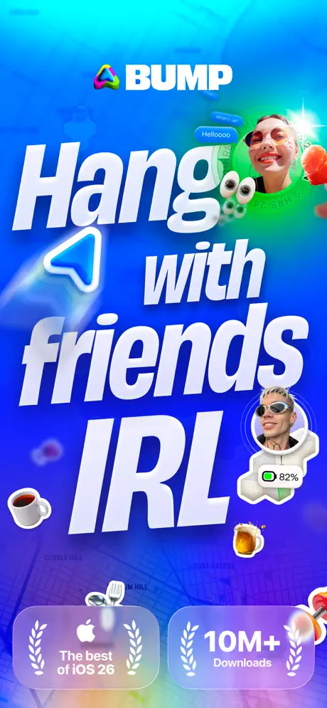
On-frame caption: “BUMP / Hang / with / friends / IRL

There is no device frame. The canvas is a saturated gradient that moves from cyan (#00C6FF) at the top through electric blue (#0057FF) to deep violet (#3D00FF) at the bottom, with a faint road-grid texture ghosted beneath. Center-top sits the wordmark: a faceted, multicolour triangle icon followed by 'BUMP' in white. The main lockup dominates the Y-axis: 'Hang' in massive italic extruded type, 'with' reduced and centered, 'friends' at similar scale, and 'IRL' anchored at the bottom in even larger condensed italic. Orbiting the typography are floating cutout portraits of users wearing sunglass filters, a blue speech bubble reading 'Hellooooo,' googly eyes, a coffee cup, a beer mug, and a location-arrow sticker. Near the bottom, two frosted-glass badges—one reading 'The best of iOS 26' with an Apple logo flanked by laurels, the other '10M+ Downloads'—provide social proof. This frame is pure mood. It reveals zero interface, zero navigation patterns, and zero hint of the map utility to come. The value proposition is entirely emotional: this is where your friends hang out.
Bump App Store screenshot 2 — Live Map Density
02

Live Map Density

On-frame caption: “See where your friends are

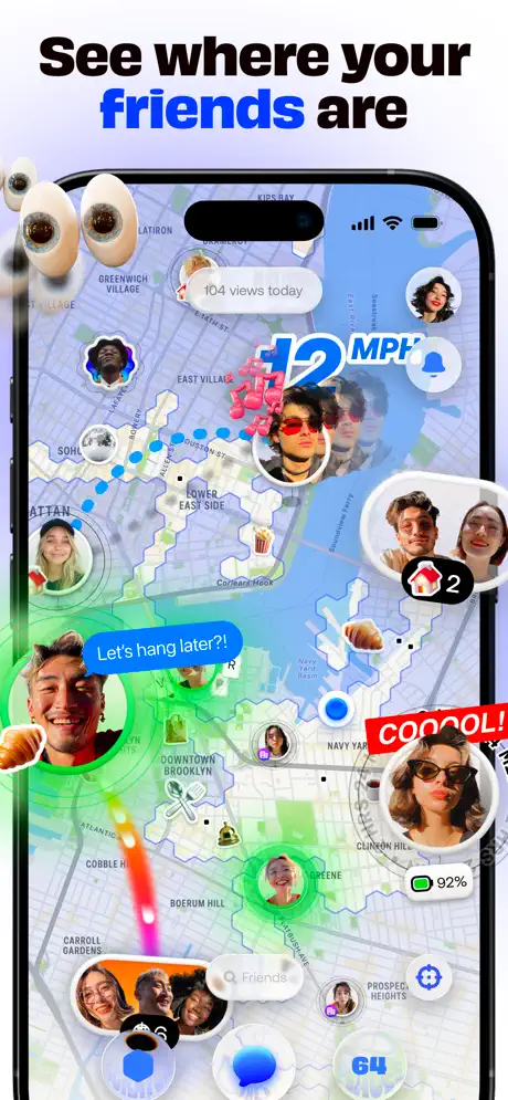
The iPhone 15 Pro frame arrives, set against a clean white background that will persist through Frame 8. The caption reads 'See where your friends are,' with 'friends' set in #0057FF. Inside the screen, a map of lower Manhattan and Brooklyn shows circular avatar clusters scattered across neighborhoods like Greenwich Village and the Lower East Side. Blue dotted lines trace movement paths. A floating '12 MPH' badge in extruded sky-blue type hovers near the center, while a blue chat bubble declares, 'Let's hang later?!' A red torn-paper sticker shouts 'COOOOL!' at the lower right. An eyeball sticker bleeds off the top-left edge of the device, and a battery indicator reading '92%' clings to one avatar. The bottom of the screen hints at a search bar and tab chrome, but stickers obscure the exact boundaries. This frame carries the heaviest educational load: it must establish that Bump is a real-time map populated by friends, and it does so by sacrificing legibility for energy.

Bump App Store screenshot 3 — ETA as 3D Type
03

ETA as 3D Type

On-frame caption: “Check their live ETA

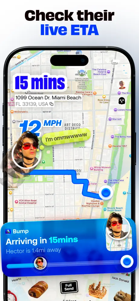
The caption reads 'Check their live ETA,' with 'live ETA' in #0057FF. The map context switches to Miami Beach, identifiable by street labels like Ocean Dr and Collins Ave. Dominating the upper left is an extruded '15 mins' in deep blue with a thick drop shadow. Below it, an address pill reads '1099 Ocean Dr. Miami Beach FL 33139, USA' with a copy icon. A green-to-yellow chat bubble says, 'I'm ommmmwwwww,' while the recurring '12 MPH' badge hovers nearby. A thick blue route line snakes down the map with a pulsing white dot. At the bottom, a system-style notification sheet appears: 'Bump / Arriving in 15mins / Hector is 1.4mi away,' complete with a circular user thumbnail and a horizontal progress bar. Beneath that, a small black pill reads 'Full Send.' The frame isolates a single utility—ETA tracking—but refuses to present it quietly. By repeating the same user avatar with red sunglasses in multiple positions, the designers keep the collage logic intact even while teaching a logistics feature.

Bump App Store screenshot 4 — Music + Presence Overlap
04

Music + Presence Overlap

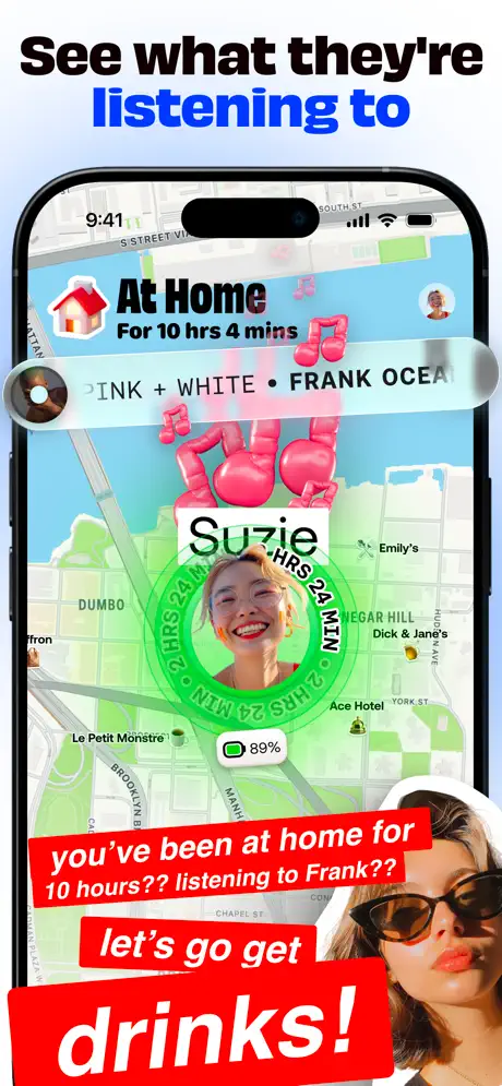
On-frame caption: “See what they're listening to

Caption: 'See what they're listening to,' with 'listening to' in #0057FF. The map moves to DUMBO, Brooklyn. At top, a status card shows a house icon and the text 'At Home / For 10 hrs 4 mins.' Below that, a frosted music marquee reads 'PINK + WHITE • FRANK OCEAN.' The name 'Suzie' is blown up large in black. A bright green circular ring encircles an avatar, stamped repeatedly with '24 HRS 24 MIN.' Battery life reads '89%.' Two aggressive red sticker-bubbles occupy the bottom third: 'you've been at home for 10 hours?? listening to Frank??' and 'let's go get drinks!' Pink 3D music notes float between layers. The density here is the highest in the sequence. The red stickers obscure the map's street names and risk making the actual UI unreadable, yet they communicate the conversational friction the app encourages around music and location status. It is a deliberate trade-off, but one that pushes the 9:19 canvas to its limit.

Bump App Store screenshot 5 — Gamified Exploration
05

Gamified Exploration

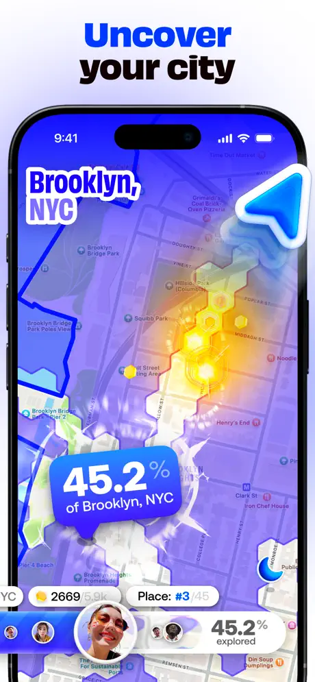
On-frame caption: “Uncover your city

Caption: 'Uncover your city,' with 'Uncover' set in #0057FF. The map turns monochromatic purple-blue, showing Brooklyn in #4D2EFF to #7B4DFF tones. Instead of avatars, a heat map of white hexagonal cells glows yellow-orange along a central corridor. A large white label reads 'Brooklyn, NYC.' A blue speech bubble states '45.2% of Brooklyn, NYC.' At bottom, stats appear in individual pills: a coin icon with '2669,' 'Place: #3/45,' and a progress label '45.2% explored.' A giant blue arrow cursor points toward the heat zone. This is the most legible frame in the set because the reduced color palette and absence of photographic cutouts let the data visualization breathe. It introduces game mechanics—exploration percentage, leaderboards—without needing explanatory text beyond the caption. For designers, this frame proves that a single moment of restraint inside a noisy sequence can carry disproportionate clarity.

Bump App Store screenshot 6 — Campus Collage
06

Campus Collage

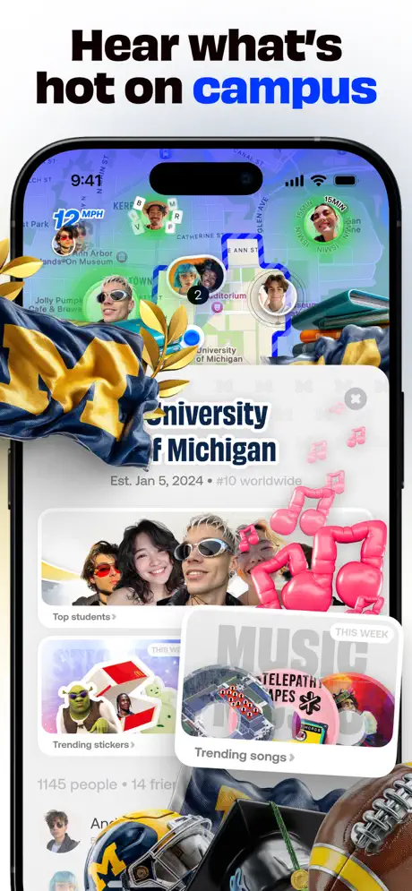
On-frame caption: “Hear what's hot on campus

Caption: 'Hear what's hot on campus,' with 'campus' in #0057FF. The map centers on Ann Arbor and the University of Michigan. Blue and maize gold (#00274C and #FFCB05) wash over the frame. A bottom sheet rises over the map: 'University of Michigan / Est. Jan 5, 2024 • #10 worldwide.' Inside the sheet are rows labeled 'Top students,' 'Trending stickers' (featuring a Shrek cutout), and 'Trending songs' with album art labeled 'TELEPATHIC TAPES.' Physical 3D objects—a Michigan flag, football helmets, pom-poms, a football—collage over the top and bottom edges. Text at the bottom reads '1145 people • 14 friends.' The '12 MPH' badge persists in the upper left. While thematically strong, this frame suffers from occlusion: the flag and helmets cover critical sheet corners, making it hard to tell where the interface ends and the marketing collage begins. The campus feature is visible, but its interaction model is buried.

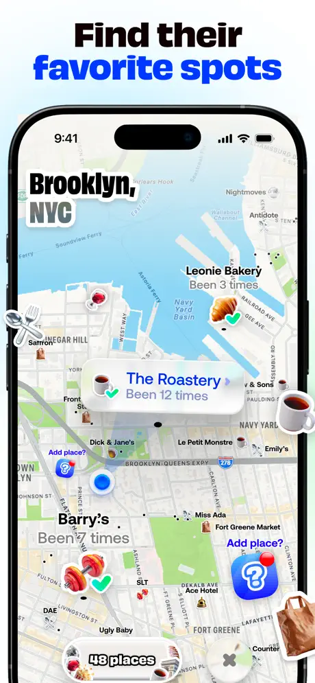
Bump App Store screenshot 7 — POI Legibility
07

POI Legibility

On-frame caption: “Find their favorite spots

Caption: 'Find their favorite spots,' with 'favorite spots' in #0057FF. Back to Brooklyn. The map is annotated with place cards: 'Leonie Bakery / Been 3 times' with a croissant icon and green check; 'The Roastery / Been 12 times' with a coffee cup; 'Barry's / Been 7 times' with boxing gloves. Blue 'Add place?' pills with question-mark icons float nearby. At bottom, a counter reads '48 places.' Coffee cups and a grocery tote bag appear as floating stickers, but they are pushed to the periphery. Unlike the campus frame, the 3D objects here do not occlude the interface. The place cards sit cleanly in the center of the screen, readable and tappable. This frame best balances decoration and information architecture, suggesting that the collage system works when the foreground stickers are treated as margins rather than as centerpieces.

Bump App Store screenshot 8 — Chat Apocalypse
08

Chat Apocalypse

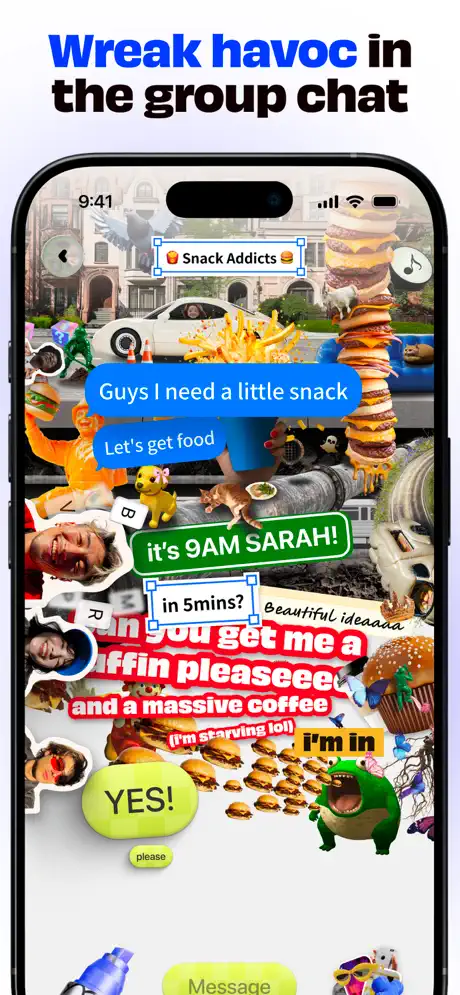
On-frame caption: “Wreak havoc in the group chat

Caption: 'Wreak havoc in the group chat,' with 'group chat' in #0057FF. The map disappears entirely. The background is a photographic street scene overlaid with a sticker apocalypse. A group header reads '🍔 Snack Addicts 🍔.' Message bubbles layer in iOS blue and green, plus custom red and yellow shapes: 'Guys I need a little snack,' 'Let's get food,' 'it's 9AM SARAH!,' 'in 5mins?,' 'can you get me a muffin pleaseeee and a massive coffee (i'm starving lol),' 'I'm in,' and a large green 'YES!' The word 'Message' appears in a bottom input bar. The intentional chaos is so extreme that actual chat UI patterns—timestamps, read receipts, sent status, or even consistent bubble alignment—are impossible to locate. It communicates tone, but sacrifices any ability to evaluate the chat experience. For a shopper worried about usability, this frame offers reassurance only to those already convinced by Frames 2–7.

05The craft

Captions, colour and the mechanics of the sell

Caption pattern

Each caption follows an identical two-tone grammar: base words in #000000, one highlighted word in #0057FF. 'See where your friends are' spotlights 'friends'; 'Check their live ETA' spotlights 'live ETA'; 'Uncover your city' spotlights 'Uncover.' The inconsistency—sometimes the verb, sometimes the noun phrase—is a subtle friction that weakens the set’s editorial voice. A fixed rule (always highlight the action, or always the object) would tighten the rhythm.

Visual system

Bump establishes a hierarchy of three layers: (1) the device frame and map UI as base, (2) extruded type labels and status cards as middle ground, and (3) photographic cutouts and 3D stickers as foreground. The base layer stays consistently an Apple Maps-style tileset; the middle layer shifts color per feature (green for success states, blue for navigation, red for chat stickers); the foreground layer is intentionally uncropped, letting elements spill past the device bezel to create depth.

The thumbnail test

Frame 1 wins the thumbnail battle. The full-bleed cyan-to-violet gradient and massive white italic type are readable even at 200px wide. No competing social app in the carousel uses a device-free opener, so the poster treatment generates curiosity, though it risks looking like a banner ad rather than a product screenshot.

Conversion mechanics

The set converts on personality, not on UI clarity. Frame 1 stops the scroll with a burst of blue and social proof; Frame 5 closes the deal with a legible stat ('45.2% explored'). However, shoppers in evaluation mode—those who swipe specifically to see how the chat or ETA interface behaves—will find Frames 4, 6, and 8 actively hostile to inspection. The set could improve conversion by adding one 'breath' frame: a calmer profile, friends list, or empty state that proves the app is manageable when the user wants quiet.

06Where it slips

What we would change

Frame 1's Missing Device Chrome

By opening with a poster instead of a device, Bump sacrifices immediate product comprehension. Shoppers may not register that this is an app screenshot until Frame 2. A specific fix: either introduce a faint device outline ghosted into Frame 1, or accept the poster as a calculated risk but tighten the transition so Frame 2 arrives within the first 500ms of attention.

Sticker Overlap in Frames 4 and 8

In Frame 4, the red stickers at the bottom ('you've been at home for 10 hours??') obscure street names and the bottom edge of the status card. In Frame 8, the density is so high that individual messages cannot be parsed as native UI. The fix is a 120pt 'safe zone' rule: keep all decorative assets outside the central 70% of the screen where core interface lives. This preserves vibe without destroying legibility.

Frame 6 Occlusion

The University of Michigan flag and football helmet overlap the top corners of the bottom sheet, hiding the dismiss affordance and crowding the sheet title. A 30% reduction in the size of those 3D assets, or moving them to the bottom edge below the sheet, would let the campus UI surface read as interactive rather than decorative.

Caption Emphasis Inconsistency

The blue highlight alternates unpredictably between verb ('Uncover'), noun phrase ('favorite spots'), and adjective phrase ('live ETA'). Establishing a strict editorial rule—highlight only the action, or only the object—would make the caption rhythm feel designed rather than improvised.

Lack of a Calm Frame

Every frame after the opener is running at maximum RPM. There is no screenshot showing a manageable friends list, a quiet profile, or an empty state. Adding one mid-sequence frame with negative space and standard iOS density would reassure risk-averse downloaders that the app is not permanently overwhelming.

07The recipe

How to apply this to your own app

  1. Pick a single color anchor

    Bump uses #0057FF as aCaption highlight and UI accent in every frame. Choose one swatch that can survive across light and dark map contexts, then apply it religiously to headlines, buttons, and status badges.

  2. Separate 'poster' from 'product' frames

    If you open with a vibe-only billboard (Frame 1), treat Frame 2 as a hard reset into product education. The shopper needs to see the device frame and the core interaction within the first two swipes, or the sequence fails its primary job.

  3. Use extruded type sparingly

    Bump deploys 3D drop-shadow type for floating map labels ('15 mins,' '12 MPH') to separate marketing text from native map typography. The effect works because it is reserved for ephemeral, user-generated data rather than static captions. Copy this logic: extrude the variable, flatten the brand.

  4. Define safe zones for collage

    Sticker bombing only works if the shopper can still identify tap targets. Before adding decorative assets, lock the base UI into a central safe zone and let foreground elements bleed only from the margins.

08Takeaways

Five things worth stealing

  • A consistent device frame (iPhone 15 Pro) can anchor an otherwise chaotic visual system.
  • One fully legible, data-rich frame (Frame 5) can redeem an entire sequence of noisy frames.
  • Extruded 3D type is an effective way to separate marketing overlays from native map typography.
  • Overloading every frame with stickers trains the shopper to ignore detail; reserve the densest compositions for features that require the least explanation.
  • Caption highlight rules should be grammatical, not arbitrary, to maintain editorial authority across the set.
09The verdict

What the set actually achieves

A high-energy, polarizing set that prioritizes tone over tutorial. Shoppers who respond to sticker-bomb aesthetics will instantly understand Bump’s social proposition; shoppers who need to see clean interactions before downloading will be forced to hunt for them inside the noise.

This sequence is best suited for social apps targeting 16–24 year old audiences who value tone over tutorial. Founders building location-based or campus-centric products can study Bump’s method for layering chat, ETA, and music status onto map tiles without defaulting to Google Maps UI conventions. Designers in crowded categories can also borrow the 'poster + device' two-step opener as a pattern for interrupting the App Store scroll. However, teams selling productivity, finance, or health tools should avoid this density; the same rules that make Bump feel alive would make a banking app feel broken.

10Questions

Frequently asked

Why does Frame 1 omit the device frame?

It functions as a billboard or thumbnail hook. By filling the entire 9:19 canvas with gradient, type, and social proof, Bump maximizes scroll-stopping contrast against white-background competitors. The trade-off is that no UI is visible until Frame 2.

How does the set maintain unity across eight different features?

Three constants: the electric blue (#0057FF) accent, the heavy condensed sans-serif caption style, and the iPhone 15 Pro device frame from Frame 2 onward. Even as the map context shifts from NYC to Miami to Ann Arbor, these three elements create a visual metronome.

What is the weakest frame, and why?

Frame 8 is the weakest for product education. While it communicates chaotic group energy, it intentionally obscures chat UI patterns to the point that timestamps, bubble alignment, and input states are unreadable. It sells tone at the expense of trust.

Which frame should I copy first?

Frame 5. It proves that a data-dense feature (city exploration, heatmaps, leaderboards) can be communicated clearly inside the collage system because the designers pulled back on photographic stickers and let the visualization dominate.

11Keep reading

Build your own screenshot set

Guides

The full set

10 shots
Bump App Store screenshot 1Bump App Store screenshot 2Bump App Store screenshot 3Bump App Store screenshot 4Bump App Store screenshot 5Bump App Store screenshot 6Bump App Store screenshot 7Bump App Store screenshot 8Bump App Store screenshot 9Bump App Store screenshot 10

About the app

From the Zenly team, the original location sharing app loved by 100s of millions of people around the world! On Bump, create a personal map of your favorite people and places amo, via the App Store listing.

Screenshots and store metadata belong to amo. They are shown here for design commentary and criticism. The analysis on this page is original work by floow.design. View the original listing.

More Social teardowns

Browse all →