Timeleft app icon
SocialScreenshot teardown17 min read

Timeleft App Store screenshots

Timeleft’s App Store screenshot set treats the eight-frame carousel as a single storyboard, alternating full-bleed lifestyle photography with warm, cream-backed UI devices to walk a prospective user from discovery through post-event messaging. It is an editorially minded sequence that relies on a tight pairing of high-contrast serif headlines and an off-white interface shell to stand out in the Social category, where neon gradients and infinite swipe-decks are the norm.

Set published by Timeleft SAS · 9 frames analysed

4.7 · 6.9K ratingsFreev5.7.1Updated 4mo ago
Timeleft App Store screenshot 1
01At a glance

The set in one screen

Framing
Centered device bezels with soft, diffuse drop shadows; full-bleed lifestyle photography frames with bottom-heavy text placement
Captions
Large, two-to-three line headlines combining upright display serifs with script or italic serif emphasis; set above the device in the UI frames and directly over photography in lifestyle frames
Backdrop
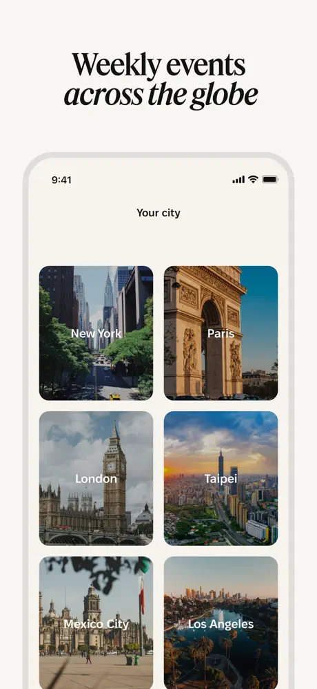
Warm cream (#F5F2ED) behind all UI frames; deep photographic shadows and full-bleed dinner/bar photography in frames 1, 4, and 8
Type
High-contrast serif family for headlines, with select words rendered in either a flowing script ("new," "compatible," "venue") or italic serif ("people offline," "every week," "to connect with")
UI / copy split
70% UI, 30% lifestyle photography
Frame 1 job
Frame 1 anchors the entire sequence on trust and offline aspiration, layering five media logotypes, dual app-store laurels, a five-star rating, and a large headline over a dinner photograph before any UI is shown.

Sampled palette

#F5F2ED#F5F2ED
#0B0B0B#0B0B0B
#FF6B1A#FF6B1A
#FFFFFF#FFFFFF
#8E8E93#8E8E93
02The challenge

What this screenshot set had to solve

The brief for a social-discovery app always presents the same tension: you are selling an offline experience—dinner, drinks, conversation—but the purchase decision happens inside a digital storefront. The shopper cannot taste the food or hear the laughter; they can only see pixels. That means the screenshots must simultaneously prove the app is safe enough to join, simple enough not to overwhelm, and structured enough that the user understands exactly what will happen after they tap ‘Get.’ For Timeleft, the added difficulty is category positioning. The Social tab is crowded with dating interfaces that default to portrait cards, neon accents, and swipe gestures. Timeleft needed to signal ‘friendship and community’ rather than ‘match and date,’ which demands warmer photography, softer UI geometry, and a deliberate absence of romantic visual shorthand. Finally, the product itself is chronological—quiz, booking, venue reveal, icebreaker, follow-up—so the screenshots had to function as a step-by-step tutorial without feeling like a tutorial. The designer had to turn a linear onboarding funnel into a visually varied carousel that would hold a swiper’s attention across eight frames.

Meet new people offline
03The approach

How the set argues its case

The strategy is narrative sequencing. Rather than leading with an isolated feature, the designer mapped the screenshots to the user’s chronological experience: take a quiz → book an event → receive a venue → preview the group → play an icebreaker game → select connections → continue chatting afterward. That order turns a skeptical browser into a provisional participant; by frame 8, the shopper has already mentally walked through their first dinner. Visually, the set enforces unity through a single off-white backdrop (#F5F2ED) that appears behind every device frame. This cream field acts as a branded canvas—whenever the user sees it, they are inside Timeleft. Lifestyle photography is used sparingly but strategically at frames 1, 4, and 8 to reset visual energy and re-inject human warmth before the next UI explanation. Typography is deployed with deliberate inconsistency: headline emphasis alternates between a cursive script and an italic serif, which prevents the large repeated text blocks from feeling like a template, though this approach introduces its own system-risk. Device framing is kept soft—there are no hard reflective bezels, only light gray outlines and diffuse shadows—so the UI feels approachable rather than hardware-focused.

The set positions Timeleft as the anti-dating-app by refusing category clichés. There are no neon chat bubbles, no floating heart icons, no dark-mode profile stacks. Instead, the photography shows mixed-gender groups laughing over food, the UI uses emoji-driven personality prompts rather than photos, and the color palette leans on warm neutrals and editorial black rather than algorithmic purples or reds. Even the device frames feel gentler: rounded rectangles, generous whitespace, and 16pt+ body copy suggest an experience designed for slightly older, professionally-minded users who value curation over volume.

04Frame by frame

Every screenshot, and the job it does

Timeleft App Store screenshot 1 — The Social-Proof Anchor
01

The Social-Proof Anchor

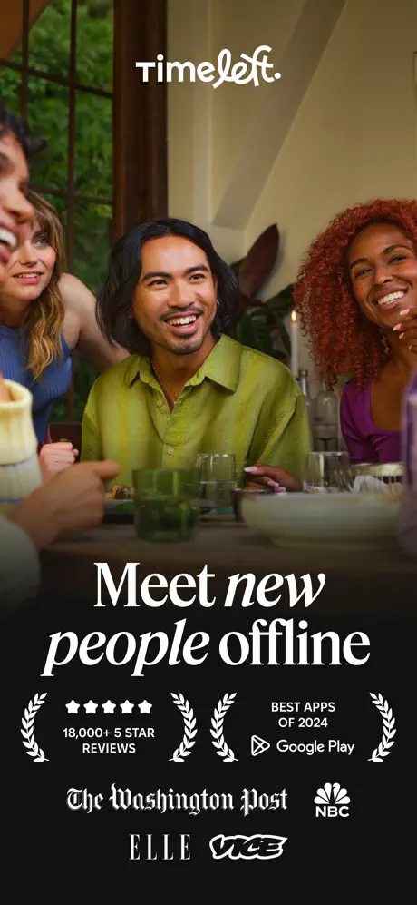
On-frame caption: “Meet new people offline

The first frame opens with a full-bleed photograph of a diverse group seated around a dinner table, shot from a slightly low angle so that the subjects feel inviting and present. The Timeleft wordmark sits centered in the upper third, rendered in a clean white sans-serif with a distinctive cut on the lowercase ‘t.’ Below the image, a dense black gradient—fading from transparent to roughly #0B0B0B—supports the headline. The headline itself is set in three typographic registers: ‘Meet’ in an upright, high-contrast serif; ‘new’ in a flowing white script; and ‘people offline’ in a lighter italic serif. This mixing establishes the editorial tone immediately. Beneath the headline, the bottom 20 percent of the frame is packed with credibility signals: a five-star App Store rating reading ‘18,000+ 5 STAR REVIEWS,’ laurel wreaths, a ‘BEST APPS OF 2024’ Google Play badge, and logotypes for The Washington Post, NBC, ELLE, and VICE. The density here is intentional—social apps live or die on trust, and frame 1 chooses to lead with third-party validation before showing a single interface element. The trade-off is that the trust bar competes for attention with the headline; the eye does not know whether to read the serif promise or scan the media row first.
Timeleft App Store screenshot 2 — The Matching Promise
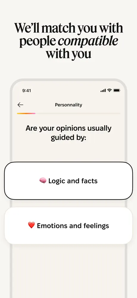
02

The Matching Promise

On-frame caption: “We’ll match you with people compatible with you

Frame 2 drops the photography entirely, shifting to the warm cream backdrop that will define every subsequent UI frame. The headline, set in near-black against the cream, reads ‘We’ll match you with people *compatible* with you,’ with the word ‘compatible’ rendered in the same white script seen in frame 1. Below the text, a device mockup floats with a soft gray shadow and a hairline border. Inside the device, the app is running a personality quiz titled ‘Personality.’ A thin progress bar at the top carries an orange-to-pink gradient—approximately #FF9F43 to #FF6B9D—spanning roughly one-quarter of its width. The quiz prompt, ‘Are your opinions usually guided by:,’ is centered in a clean sans-serif. Two massive touch targets dominate the lower half of the screen: ‘🧠 Logic and facts’ and ‘❤️ Emotions and feelings,’ each inside a white rounded rectangle with a 1pt black border and corner radii around 24pt. The second button is cropped at the bottom edge of the device, implying a scrollable or lengthy screen. The status bar shows the standard Apple 9:41 time and full signal indicators. Notably, there is no visible tab bar or navigation chrome here; the UI reads as an immersive, modal step-by-step flow, which helps reduce cognitive load for the viewer.

Timeleft App Store screenshot 3 — The Event Feed
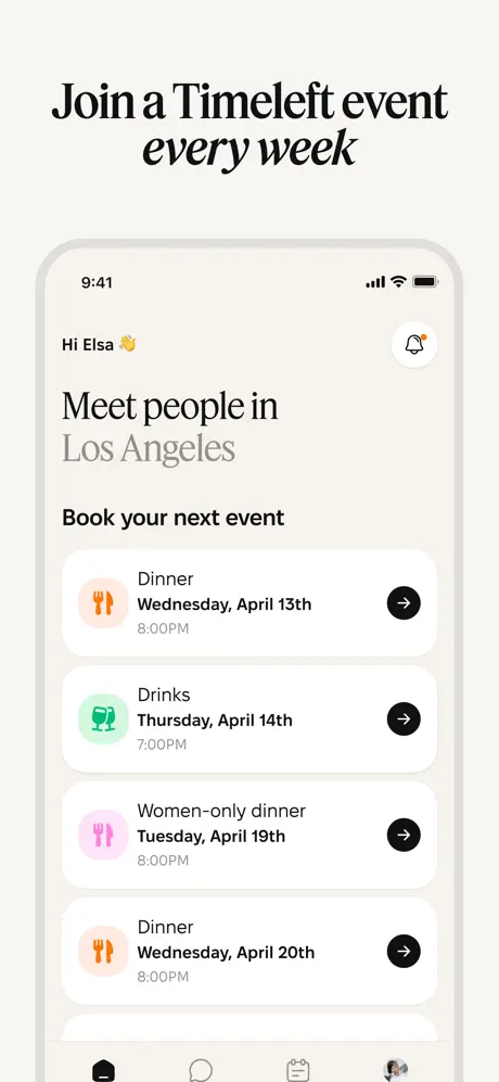
03

The Event Feed

On-frame caption: “Join a Timeleft event every week

Frame 3 maintains the cream background and introduces the app’s home screen. The headline places ‘every week’ in italic serif, continuing the pattern of mixed emphasis. Inside the device, the interface presents a personalized greeting—‘Hi Elsa 👋’—followed by a location header, ‘Meet people in Los Angeles,’ where ‘Los Angeles’ is set in a lighter gray (#8E8E93) to subordinate it beneath the action-oriented ‘Book your next event.’ Four event cards stack vertically, each with a rounded white container, a left-aligned category icon inside a tinted circle, and a right-aligned black circular action button containing a white arrow. The color coding is specific: dinner events get an orange fork-and-knife icon, drinks get a mint-green clinking-glasses icon (#34C759), and the women-only dinner gets a pink variant of the fork-and-knife. Each card lists a day, date, and time in a strict sans-serif hierarchy. At the very bottom of the device, a tab bar is visible but aggressively cropped—the top halves of four icons peek above the frame edge, while the labels are entirely lost. This reads as an awkward compromise: the designer wanted to show the tab bar to prove persistent navigation exists, but the crop makes it look like an export error rather than an intentional bleed.

Timeleft App Store screenshot 4 — The Venue Reveal
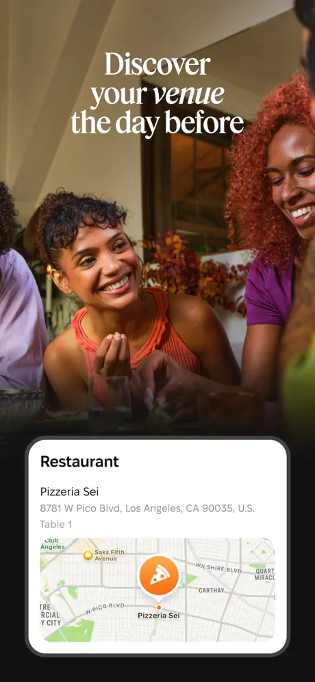
04

The Venue Reveal

On-frame caption: “Discover your venue the day before

The fourth frame returns to photography, this time a tighter crop of smiling diners leaning across a table. The headline ‘Discover your *venue* the day before’ floats in the upper third, with ‘venue’ rendered in the editorial script. A dark gradient vignette behind the text ensures contrast against the warm skin tones and interior lighting. Anchored at the bottom is a device mockup showing a venue card. The card is headed by the word ‘Restaurant’ in bold, followed by ‘Pizzeria Sei,’ a full street address (‘8781 W Pico Blvd, Los Angeles, CA 90035, U.S.’), and ‘Table 1’ in smaller gray text. Below the copy sits an embedded map—clearly Apple Maps styling—with an orange pizza-slice pin dropped at the restaurant location. Streets such as Wilshire Blvd and W Pico Blvd are legible. The device itself has a pronounced border and rounded corners that echo the card’s geometry inside it. By placing the map inside the device and the device inside the photograph, the frame creates a visual sandwich: real world on top, digital confirmation on bottom. The hierarchy is clear, but the frame risks feeling like two disconnected layers because the device does not integrate with the photograph as seamlessly as in frame 1.

Timeleft App Store screenshot 5 — The Group Preview
05

The Group Preview

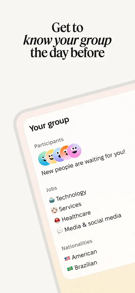
On-frame caption: “Get to know your group the day before

Frame 5 breaks the orthogonal grid. The device is rotated roughly 12 to 15 degrees clockwise and set against the familiar cream background, though a subtle peach vignette bleeds in from the bottom right corner. The headline reads ‘Get to *know your group* the day before,’ with ‘know your group’ in italic. Inside the tilted screen, a section titled ‘Your group’ displays five gradient smiley-face circles in cyan, yellow, orange, pink, and purple, followed by the phrase ‘New people are waiting for you!’ Below that, a ‘Jobs’ list pairs emoji with industry tags: ‘🤖 Technology,’ ‘🎲 Services,’ ‘🎒 Healthcare,’ and ‘💬 Media & social media.’ A ‘Nationalities’ section lists ‘🇺🇸 American’ and ‘🇧🇷 Brazilian.’ The rotation is presumably meant to inject dynamism into an otherwise static carousel, but the effect is questionable: the horizontal text within the tilted device fights against the vertical orientation of the screenshot itself, forcing the shopper to mentally rotate the content. Because the status bar and safe-area margins are cropped by the angle, the device also loses some of its structural context. The information architecture—anonymous emoji avatars, job categories, national flags—successfully communicates diversity and privacy at once, which is a clever solution for a social app that must preview strangers without exposing their identities.

Timeleft App Store screenshot 6 — The Icebreaker
06

The Icebreaker

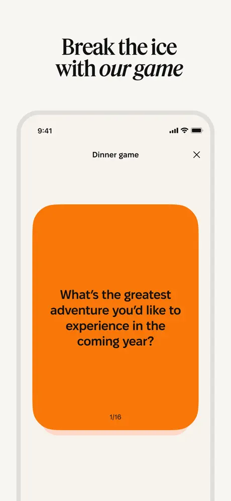
On-frame caption: “Break the ice with our game

Frame 6 is the most chromatically aggressive of the set. Against the cream backdrop, the headline ‘Break the ice with *our game*’ sets up a device running a modal titled ‘Dinner game.’ The modal’s chrome is minimal: a centered nav title and an ‘X’ close button in the upper right. The entire content area is consumed by a single large orange card—this is the app’s accent color at full saturation, approximately #FF6B1A or #FF7700—with an extreme corner radius of roughly 40–48pt. The card feels tactile, almost like a physical playing card. Centered on the orange, in bold black sans-serif, is the prompt: ‘What’s the greatest adventure you’d like to experience in the coming year?’ Pagination at the bottom center reads ‘1/16,’ telling the viewer that the game is extensive. The color contrast is stark: black on orange is less common in the Social category than white on purple or blue, so it arrests the swipe. However, the orange used here is noticeably more saturated than the softer orange of the dinner icons in frame 3 or the progress-bar gradient in frame 2. The discrepancy suggests either a separate design system for the game module or an oversight in color governance; either way, the palette loosens here.

Timeleft App Store screenshot 7 — The Connection Decision
07

The Connection Decision

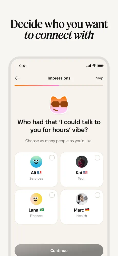
On-frame caption: “Decide who you want to connect with

Frame 7 brings the user to the post-event matching phase. The headline reads ‘Decide who you want *to connect with*,’ with the final words in italic serif. Inside the device, a screen titled ‘Impressions’ presents a progress bar in the same orange-to-pink gradient seen in frame 2, now roughly two-thirds complete. A large mascot icon—an abstract cat-like face wearing sunglasses on a pink circle—sits above the prompt: ‘Who had that ‘I could talk to you for hours’ vibe?’ Sub-copy reads ‘Choose as many people as you’d like!’ A two-by-two grid of profile tiles fills the center. Each tile contains a circular avatar (either a colored smiley face or a photograph), a first name, a flag emoji indicating nationality, and a job tag such as ‘Services,’ ‘Tech,’ ‘Finance,’ or ‘Health.’ Empty checkboxes perch in the upper right of each tile. At the bottom, a full-width pill button labeled ‘Continue’ sits in a medium gray (#8E8E93), suggesting a disabled or default state awaiting input. The layout is clean and scannable, but the grid spacing feels slightly loose; the gutters between tiles could be tightened to reinforce the relationship between avatar and checkbox. The presence of the word ‘Skip’ in the upper right is a subtle but important trust signal, implying that the user is never trapped in a flow.

Timeleft App Store screenshot 8 — The Follow-Through
08

The Follow-Through

On-frame caption: “Keep the conversation going after the event

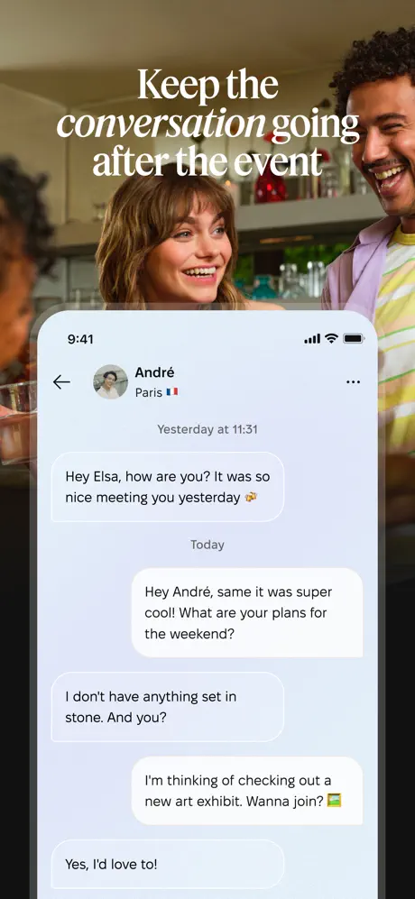
The final frame closes the narrative loop. A full-bleed photograph shows two people laughing at what appears to be a bar or kitchen counter, shot in warm, intimate lighting. The headline ‘Keep the *conversation going* after the event’ places emphasis on ‘conversation going’ in italic script. A device mockup is overlaid in the lower half, displaying an in-app chat with a contact named ‘André’ from Paris, flagged with a French flag emoji. The conversation is dated and realistic: ‘Yesterday at 11:31’ opens with André saying, ‘Hey Elsa, how are you? It was so nice meeting you yesterday 🍻.’ A ‘Today’ separator follows, then a user reply, ‘Hey André, same it was super cool! What are your plans for the weekend?’ The back-and-forth continues with plans for an art exhibit and an affirmative ‘Yes, I’d love to!’ Blue-gray incoming bubbles (#E9E9EB with a slight cool shift) and white outgoing bubbles maintain standard iOS chat conventions, which lowers the learning curve to zero. The device is framed by a darkened photographic vignette that ensures the white bubbles do not bleed into any bright background areas. By ending on messaging rather than another lifestyle shot, the designer emphasizes that Timeleft is not merely an event broker; it is a platform for sustained connection. It is a structurally sound closer, though the tone of the chat—cheerful but generic—could have included a specific reference to the dinner or icebreaker game to tie the loop even tighter.

05The craft

Captions, colour and the mechanics of the sell

Caption pattern

Every frame follows a strict two-line headline formula: an upright serif phrase on line one, and a continuation on line two where one or two words are rendered in either script italic or italic serif. For example, frame 2 reads ‘We’ll match you with people *compatible* with you,’ with ‘compatible’ in script. Frame 3 reads ‘Join a Timeleft event *every week*,’ with ‘every week’ in italic serif. This pattern creates a recognizable cadence across the set, though the rules governing when to use script versus italic serif are not visually obvious from frame to frame.

Visual system

The visual system rests on three load-bearing elements. First, the cream background (#F5F2ED) unifies all product frames into a single environment. Second, near-black typography (#0B0B0B) at large sizes (likely 34–40pt) ensures headline legibility against both the cream and the photographic backgrounds. Third, a single saturated orange (#FF6B1A) acts as the only high-energy accent, appearing in the personality-quiz progress bar, the dinner iconography, the map pin, and the icebreaker game card. The restraint of this palette is notable: no secondary greens, no blues beyond the standard iOS system elements, and no gradients except for the thin horizontal progress indicators.

The thumbnail test

Frame 1 is a strong thumbnail candidate because it buries its trust signals directly beneath a human headline. The dense bottom bar of media logos and store badges reads even at small scale, while the smiling group shot communicates category instantly. However, the lack of any visible UI in the thumbnail means the viewer must swipe once to see the product, which is a gamble in a category where users often expect to see the interface before trusting the brand.

Conversion mechanics

The set converts through narration. A skeptic who swipes left eight times is walked through an entire first-week experience before downloading. The chronological framing reduces the perceived risk of the unknown by making the unknown explicit: the shopper knows there is a quiz, knows they will book a Wednesday dinner, knows they will get a map, knows they will play a card game, and knows they can chat afterward. That transparency is a conversion tool. The repeated social proof in frame 1 plus the friendly, emoji-driven UI throughout frames 2–7 also lowers the barrier for users who might otherwise assume the app requires heavy profile curation or aggressive networking.

06Where it slips

What we would change

The Trust Bar in Frame 1 Creates Visual Gridlock

Frame 1 attempts to communicate too many credibility signals in a single horizontal band. The five media logotypes, two app store laurels, a star rating, and decorative wreaths stack into a dense black bar that fights the headline for hierarchy. The fix is to tier the proof: lead with the star count and one row of press, or animate between press rows if video is available. As a static image, the current density forces the eye to skip rather than scan.

Typographic Emphasis Lacks a Discernible Rule

The headline system alternates between script italic and italic serif without a clear pattern visible to the shopper. In frame 1, ‘new’ is script while ‘people offline’ is italic serif. In frame 2, ‘compatible’ is script. In frame 3, ‘every week’ is italic serif. In frame 7, ‘to connect with’ is italic serif, but in frame 6 ‘our game’ is also italic serif, while frame 8’s ‘conversation going’ appears to be script. The inconsistency weakens the brand system. The fix is to reserve script for the app’s core value proposition—offline connection—and use italic serif strictly for subordinate actions or frequency statements, or vice versa, but codify the rule and apply it without exception.

Frame 3’s Tab Bar Crop Reads as an Error

In the event-list frame, the iOS tab bar is cropped so tightly at the bottom edge of the device that only the top half of the icons are visible. This does not look like an intentional bleed; it looks like a mockup exported without safe-area padding. The fix is either to pull the crop upward to reveal the full tab bar and labels, or to remove it entirely and let the cards float, which would focus attention on the booking action rather than the navigation system.

The Orange Accent Is Inconsistent Across Frames

Frame 6’s icebreaker card deploys a saturated orange—approximately #FF6B1A—that is significantly more aggressive than the softer tints used for the dinner icons in frame 3 or the progress-bar gradient in frame 2. Because the set otherwise exercises extreme color restraint, this jump feels like a module that was designed in isolation. The fix is to pull the game card back to the same orange value used in the event icons, or to darken the iconography systemwide to match the vibrancy of frame 6 and create a single, owning color.

Frame 5’s Device Rotation Sacrifices Legibility

Rotating the device mockup in frame 5 adds visual noise without adding meaning. The horizontal text lines inside the tilted screen clash with the vertical scroll direction of the App Store carousel, and the emoji avatars lose their circular clarity when viewed at an angle. The fix is to keep the device orthogonal. If dynamism is needed, use a subtle off-center placement or a layered card stack, but do not distort the primary reading surface.

07The recipe

How to apply this to your own app

  1. Map your screenshots to the user journey, not your feature list

    Timeleft’s strongest structural choice is chronological ordering. Instead of leading with ‘Personality Quiz’ as a feature bullet, the set presents the quiz as the first step the user will take. When designing your own sequence, list the emotional and functional milestones a user hits in their first 48 hours, then assign one screenshot to each milestone.

  2. Use a single neutral backdrop to unify all UI frames

    The warm cream field in frames 2, 3, 5, 6, and 7 acts as a brand color in its own right. Choose one off-white or light tint that is not pure #FFFFFF and use it behind every device mockup. This creates instant visual continuity when a shopper swipes quickly.

  3. Separate trust signals from your value proposition

    Frame 1 proves that awards and press logos can coexist, but the density creates competition. If you have multiple credibility layers, consider placing press validation on frame 1 and star ratings on frame 2, or consolidate them into a single row. White space around proof points is itself a trust signal.

  4. Match typographic rules to meaning, not aesthetics alone

    If you use more than one display style in your headline system, write the rule down before you export. Shoppers do not read style guides, but they sense inconsistency. Define exactly which words get script, which get italic, and why, then apply that rule across every frame.

08Takeaways

Five things worth stealing

  • Leading with lifestyle photography and social proof before showing UI is an effective trust-first strategy for offline social apps, but it risks hiding the product if the first frame is too crowded.
  • A single off-white backdrop (#F5F2ED) can function as a brand identifier across UI frames more effectively than a saturated primary color, particularly when paired with near-black editorial type.
  • Chronological storytelling—quiz, booking, venue, group, game, match, chat—turns a feature list into a user journey, reducing perceived friction before install.
  • Device mockups should remain orthogonally aligned unless the content itself justifies rotation; arbitrary tilting reduces legibility and destabilizes the composition.
  • Color governance matters: accent colors must be sampled and locked to a single hex value systemwide, or the interface will read as disconnected modules rather than a unified product.
09The verdict

What the set actually achieves

The published set resolves this tension by alternating between two distinct modes: full-bleed lifestyle photography that sells the emotional payoff, and floating device mockups on a shared cream background that teach the mechanic. Eight frames trace a complete user journey from matching algorithm to post-event chat, anchored by a typographic system that reads more like an editorial spread than a software feature list.

This screenshot set is best suited for social, community, or marketplace apps that need to sell an offline outcome through an online storefront. It will resonate with designers building products that have a clear before-during-after user lifecycle and who want to avoid the swipe-card visual language common to dating apps.

10Questions

Frequently asked

What typeface does the set use for headlines?

The set uses a high-contrast serif family—similar in character to Playfair Display or a sharp Didone—for the upright and italic weights. The script emphasis appears to be a separate cursive or brush-style serif, though the exact font cannot be confirmed from the raster images alone. The UI copy inside the devices is rendered in Apple’s San Francisco (SF Pro).

Why is there no visible UI in the first screenshot?

Frame 1 is a trust-and-aspiration anchor. By showing a photograph of a real dinner and a dense row of media logos, the designer prioritizes emotional proof and third-party validation over interface education. This is a common strategy for new social apps that lack immediate brand recognition.

How does the set handle user privacy in the group preview?

Frame 5 anonymizes participants using colorful gradient emoji avatars rather than photos, and it reveals only first names, job industries, and national flags. This lets the shopper see that matching is based on social attributes rather than profile swiping, while preserving the privacy of actual users.

What is the hex value of the orange accent color?

The most saturated instance appears on the icebreaker card in frame 6, sampled at approximately #FF6B1A to #FF7700. Softer variants appear in the progress bars and dinner icons, suggesting the product uses a tint range rather than a single locked value.

Does the set work in thumbnail view?

Frame 1 functions as a strong thumbnail because the human faces and white headline read immediately, though the crowded bottom trust bar compresses poorly. The alternating photo-UI rhythm also helps: browsers scrolling the Social category will notice the cream UI frames as a visual pattern between competing apps that use darker backgrounds.

11Keep reading

Build your own screenshot set

The full set

9 shots
Timeleft App Store screenshot 1Timeleft App Store screenshot 2Timeleft App Store screenshot 3Timeleft App Store screenshot 4Timeleft App Store screenshot 5Timeleft App Store screenshot 6Timeleft App Store screenshot 7Timeleft App Store screenshot 8Timeleft App Store screenshot 9

About the app

The friendship app 3M+ users love. Timeleft matches you for dinners, drinks, coffee, and runs with like-minded people. No swiping. No planning. Just show up. ▶ HOW IT WORKS ◀ 1. Timeleft SAS, via the App Store listing.

Screenshots and store metadata belong to Timeleft SAS. They are shown here for design commentary and criticism. The analysis on this page is original work by floow.design. View the original listing.

More Social teardowns

Browse all →