The provocation
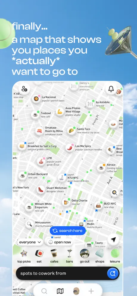
On-frame caption: “finally... a map that shows you places you *actually* want to go to”
The opening frame anchors the upper-left quadrant with a heavy white sans-serif headline, the word 'actually' wrapped in asterisks for tonal emphasis. Beneath it, a tall device frame — roughly 85 percent the canvas width — contains a densely populated map view. Circular venue pins dominate: 'La Nacional' tagged 'popular spanish tapas,' 'Teabout' tagged 'new cafe,' 'Omakase Room by Mitsu' tagged 'omakase sushi,' 'Breakfast by Salt's Cure' tagged 'oatmeal griddle cakes,' and 'LPR' tagged 'popular avant-garde venue.' Each pin pairs a thumbnail photo with a subtitle, establishing image-first wayfinding. At the screen's bottom, a black search pill reads 'spots to cowork from,' flanked by a bright blue circular button at approximately #0A84FF. Just above, a white pill toggle reads 'open now,' and a segmented control labeled 'everyone' sits left of that. A category tab bar presents icons for top picks, eat, cafes, bars, go out, shops, and leisure. A lime-green tennis ball and a metallic martini glass intrude from the top-left and right edges. The density argues the map is already alive with desirable locations.