The poster
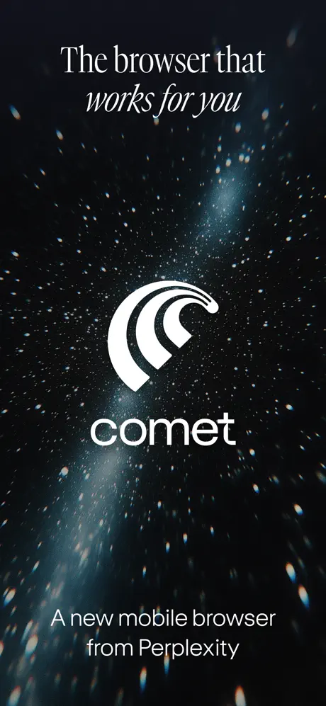
On-frame caption: “The browser that / works for you”
A new mobile browser from Perplexity — Tone-setting poster with no device, full-bleed starfield, centered logomark, and bottom-anchored provenance line.Frame one is a pure declaration of atmosphere. There is no handset, no affordance, no URL bar—only the starfield bleeding edge-to-edge in near-black #06070A, salted with white and cyan particles and a vertical column of pale light behind the mark. The Comet logo, a white abstract tail or arc, sits dead-center above the wordmark “comet” in a geometric, lowercase sans. The headline above reads “The browser that” in an upright, sharp serif, with “works for you” in an italic script beneath it. Near the bottom, the provenance line “A new mobile browser from Perplexity” grounds the frame in white sans-serif. The spacing between logo and wordmark is tight, almost lockup-like, and the vertical rhythm is generous. As a piece of static design, it is confident and quiet. As an App Store screenshot, it is a gamble: it burns the first and most valuable impression on brand alone, asking the shopper to trust that the next swipe will reveal something functional. The background particles are densest directly behind the logo, creating a subtle spotlight effect without a gradient. For a designer building a set, this frame states that the first impression will be emotional, not utilitarian.