PURE app icon
SocialScreenshot teardown14 min read

PURE App Store screenshots

This App Store screenshot deck walks a tightrope between dating-app convention and underground zine maximalism. Here is a frame-by-frame audit of how PURE uses colour, crop, and caption hierarchy to sell a subcultural identity before it sells a feature set.

Set published by Online Classifieds AG · 9 frames analysed

4.3 · 79K ratingsFreev3.24.1Updated 4mo ago
PURE App Store screenshot 1
01At a glance

The set in one screen

Framing
9:16 portrait, no hardware bezels, floating device rectangles at inconsistent scale and rotation
Captions
All-caps, hand-drawn sans in cream (#F3E5B5), stacked line breaks for rhythmic tension
Backdrop
Alternating concentric magenta waves (#FF00E5) against burnt orange (#E04025); wobbly purple (#9333EA) and orange checkerboards; solid black voids
Type
White circular icons (diamond, heart) against black chrome; in-app text is white or lavender on near-black; headlines are analog marker never mixed with UI body copy
UI / copy split
Roughly 50/50 in early frames, shifting toward 60% device and 40% pattern in later functional frames, with Frame 2 being 100% illustration and zero UI.
Frame 1 job
Establish tone, prove photo-first mechanics, and introduce the 'Anything but Boring' positioning line inside the UI itself.

Sampled palette

#FF00E5#FF00E5
#E04025#E04025
#9333EA#9333EA
#F3E5B5#F3E5B5
#0A0A0A#0A0A0A
02The challenge

What this screenshot set had to solve

The central tension in this set is cohesion under chaos. With eight frames and at least three distinct background systems—wavy lines, purple-orange checkerboards, and solid black negative space—the deck risks fragmenting into a mood board rather than a persuasive sequence. The product itself communicates through personal ads, intent filters, chat, and gifts, but none of these mechanics share a visual lineage with the psychedelic exterior. That gap creates a design challenge: how do you wrap a functional dating interface inside an aesthetic that looks like a silkscreened gig poster without obscuring the very features you need to sell? Additionally, the absence of hardware bezels means there is no automatic visual cue that the central rectangle is a phone screen; the viewer must infer it from the aspect ratio and UI patterns. In a category where trust and clarity drive conversion, betting everything on subcultural legibility is a high-wire act. The team has to teach intention-setting, profile construction, conversation, and posting flow while never breaking the storybook illustration language. Each frame must therefore pull double duty as both billboard and instruction manual.

The louder the wallpaper, the more rigorous the grid must be.
03The approach

How the set argues its case

The team solves this by enforcing a rigid three-zone hierarchy inside nearly every frame. The top third is reserved for a hand-drawn, all-caps headline in an irregular cream sans that acts as the chapter title. The middle third carries either a device mockup or a card cluster, always rendered against the darkest local value so the interface pops. The bottom third is either a black silhouette, an illustrated limb, or a press credential block—something that grounds the composition and prevents the eye from drifting off-screen. This sandwich structure repeats with enough discipline that the viewer can locate the product UI within a half-second, even when the backgrounds swap patterns. Typography is another anchor: the headline style never changes, and the in-app UI stays locked in dark mode with light grey chrome. Colour is used strategically to mark territory. Frames explaining abstract values—honesty, anti-ghosting, gift-giving—sit on checkerboard grounds, while frames showing literal profiles or creation flows return to the wave or solid black. The result is a rhythm: pattern for emotion, solid for function. By modulating background complexity rather than interface complexity, the designers allow the product to remain readable while the world around it screams.

Upstart alternatives to Tinder/Bumble frequently use gradient human photography and polite pastels. PURE goes in the exact opposite direction: no faces on the wallpaper, no romance, no softness. The aesthetic is closer to a risograph flyer for an after-hours warehouse party than to a mainstream dating app. That friction is the point. It filters the audience by taste before they ever reach the download button.

04Frame by frame

Every screenshot, and the job it does

PURE App Store screenshot 1 — The Promise and the Product
01

The Promise and the Product

On-frame caption: “MEET & DATE / OPEN-MINDED / PEOPLE

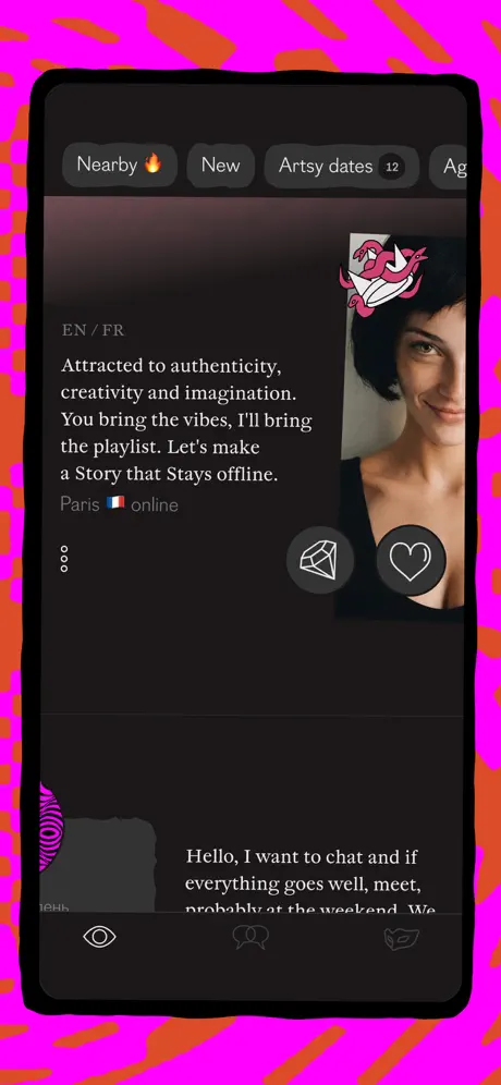
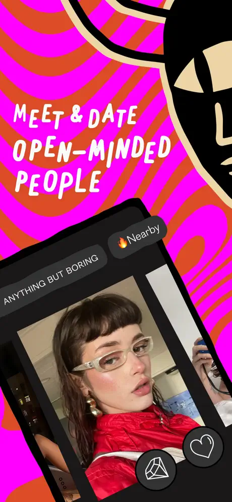
Frame 1 opens with the caption 'MEET & DATE OPEN-MINDED PEOPLE' stacked in three centered lines of cream marker-style type against a field of concentric magenta waves. The background colour sits near #FF00E5, sliced through with burnt orange arcs approximating #E04025. A massive black illustrated hand with thick cream outlines—roughly #F3E5B5—cuts in from the right edge, fingers cropped by the frame boundary, giving the composition an unfinished, collaged feel. The device floats at roughly a 15-degree counter-clockwise tilt across the lower two-thirds. Its chrome is pure black, displaying a photo-card interface. In the upper-left of the card, a charcoal pill—maybe #2A2A2A—reads 'ANYTHING BUT BORING' in white uppercase sans. Upper-right, a matching pill carries a fire emoji and the word 'Nearby'. The bottom of the device shows two circular action buttons: a faceted diamond outline and a heart outline, both set in light grey against the black footer bar. Because the photograph on the card fills the width of the UI without heavy borders, the slide immediately signals a photo-first product. The headline text is sized to nearly span the full 9:16 width, leaving only narrow side margins, which forces the reader to engage with the pattern before they can process the interface.
PURE App Store screenshot 2 — Credibility as Collage
02

Credibility as Collage

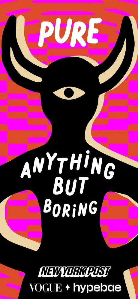
On-frame caption: “PURE / ANYTHING BUT BORING

Frame 2 is the only slide without a device, functioning as a pure brand beat. A black horned silhouette with a single central eye fills the vertical center, its antlers and torso lined in the same cream #F3E5B5 used in the headline type. Behind it, the background shifts to a distorted horizontal stripe pattern in the same orange and magenta family, but here the bands glitch and interrupt like analog scan lines. At the top, 'PURE' sits in tight, bouncy letters. Across the creature's chest, 'ANYTHING BUT BORING' stacks three lines deep in the same hand-cut style. Near the bottom edge—a zone usually reserved for UI chrome—the deck places press validation: 'NEW YORK POST' rendered in heavy white italic serif locked inside a black rectangular block, followed by 'VOGUE + hypebae' in a lighter sans directly beneath it. The absence of a phone screen means there is no functional product read in this frame; it is entirely identity and credibility. While this gives the pattern room to breathe, it also breaks the device cadence that frames 1, 3, and 4 establish, forcing the shopper to reset their visual parsing rules for a single beat before jumping back into UI.

PURE App Store screenshot 3 — Intent as Tarot
03

Intent as Tarot

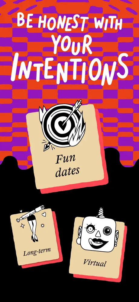
On-frame caption: “BE HONEST WITH YOUR / INTENTIONS

The headline reads 'BE HONEST WITH YOUR INTENTIONS', with 'YOUR' centered between the longer lines. The background is an electric purple and burnt orange checkerboard—purple approximating #9333EA—that warps at the edges as if viewed through water. Three tan intention cards float in a ragged cluster, each card roughly #F3E5B5 with a hot pink drop shadow—close to #FF4D6D—offset to the lower right. The top card shows a target illustration pierced by an arrow through a heart, labelled 'Fun dates' in a small, elegant serif italic. Below and to the left, a card with a mannequin-leg illustration reads 'Long-term'; to the right, a robot head illustration reads 'Virtual'. The bottom third of the frame is solid black, so the cards appear to rise out of a void rather than sit on a surface. This frame explains the app's intent-selection mechanic without showing the actual settings screen, translating a functional toggle into a tarot-like visual metaphor. It is evocative, but the small serif type on the cards may drop below readable size when the frame is scaled to App Store thumbnail dimensions.

PURE App Store screenshot 4 — Tone Over Tech
04

Tone Over Tech

On-frame caption: “NO SPACE / FOR / GHOSTING

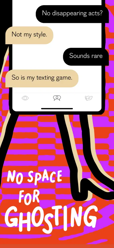
Here the deck returns to the checkerboard ground, pairing it with the caption 'NO SPACE FOR GHOSTING' in three lines of cream type. A device mockup, smaller than in frame 1, shows a chat transcript with alternating bubble colours: black bubbles carrying white text that reads 'No disappearing acts?' and 'Sounds rare', and tan bubbles carrying black text that reads 'Not my style.' and 'So is my texting game.' The tan matches the card stock in frame 3, maintaining material continuity. The conversation is cropped just above the input field, revealing a white tab bar with three faint grey icons—an eye, a theatrical mask, and a winged leaf—indicating persistent navigation. Below the phone, two black illustrated legs with cream inner contours dangle as if the device itself were a body. The frame sells a behavioural promise rather than a technical feature, relying on dialogue copy to imply accountability. Because the phone is smaller and the background is still high-contrast checkerboard, the UI chrome competes with the pattern; a subtle dark gradient scrim behind the device would have separated the layers more cleanly.

PURE App Store screenshot 5 — The Gift Economy
05

The Gift Economy

On-frame caption: “CATCH THEIR ATTENTION WITH A GIFT

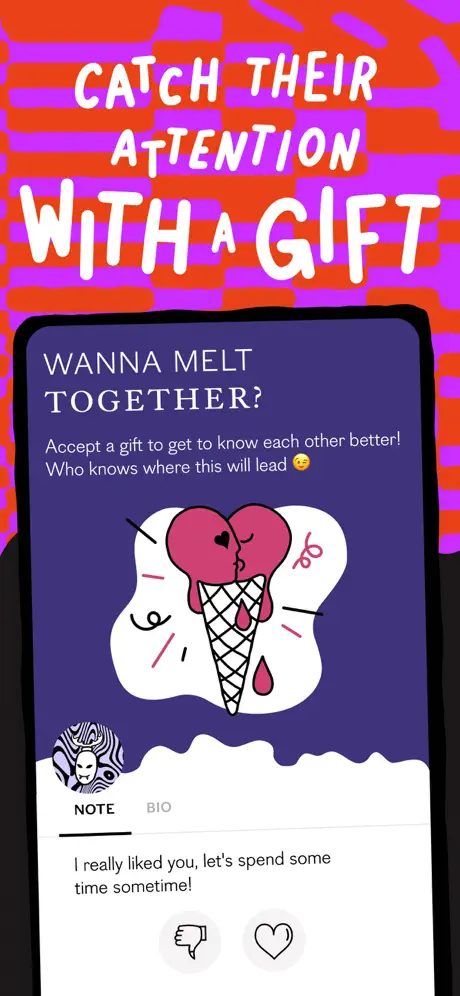
The headline 'CATCH THEIR ATTENTION WITH A GIFT' dominates the upper third, with 'WITH A GIFT' scaled significantly larger than the first line. The device returns to a tilted angle against the same purple-orange checkerboard. Its screen is rendered in a deep violet close to #4C1D95, a new colour introduction that signals a modal or special state. On-screen, the headline 'WANNA MELT TOGETHER?' appears in pale lavender—roughly #E9D5FF—with wide tracking. Beneath it, body copy in the same tint reads: 'Accept a gift to get to know each other better! Who knows where this will lead 😉'. A central illustration shows two magenta heart-scoops melting into a black-crosshatched cone against a white blob. Below the graphic, a card interface shows 'NOTE / BIO' tabs with a thick underline on NOTE. A message states: 'I really liked you, let's spend some time sometime!' followed by circular thumbs-down and heart buttons in light grey. The density is high: headline, illustration, subtext, tab switcher, quote, and actions all stack inside a single screen capture. At thumbnail scale, the lavender text on violet may lack the contrast needed for instant legibility.

PURE App Store screenshot 6 — Status Fantasy
06

Status Fantasy

On-frame caption: “DATE LIKE A / QUEEN

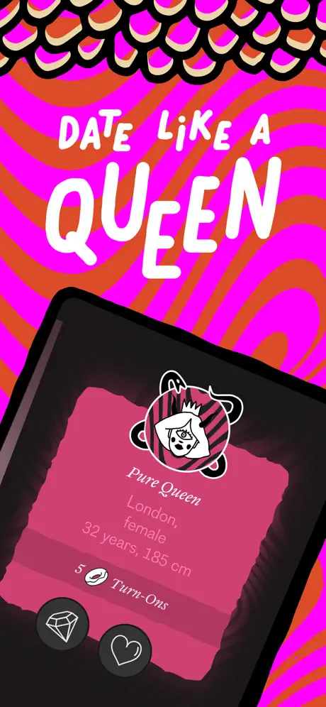
The caption 'DATE LIKE A QUEEN' uses a dramatic scale contrast: 'DATE LIKE A' is small, while 'QUEEN' is oversized and fills nearly the entire width. The background reverts to the wavy magenta-orange motif from frame 1, establishing a link between profile browsing and the opening promise. A large device mockup shows an elevated profile card rendered in hot magenta—near #DB2777—on a black ground. A circular avatar illustration contains a masked face with a crown and bear ears, set against pink diagonal stripes. The name 'Pure Queen' appears in italic, followed by metadata in lighter pink: 'London, female / 32 years, 185 cm'. A line reading '5 🍑 Turn-Ons' uses the peach emoji as a bullet. The two familiar action buttons—diamond and heart—reappear at the bottom of the card, confirming a persistent interaction pattern across the deck. The card's right edge is torn, continuing the collage language. While the fantasy is clear, the light pink metadata on the saturated magenta ground pushes contrast dangerously close to the failure line for quick scanning, which could alienate users auditing the profile depth at a glance.

PURE App Store screenshot 7 — The Hierarchy Collapse
07

The Hierarchy Collapse

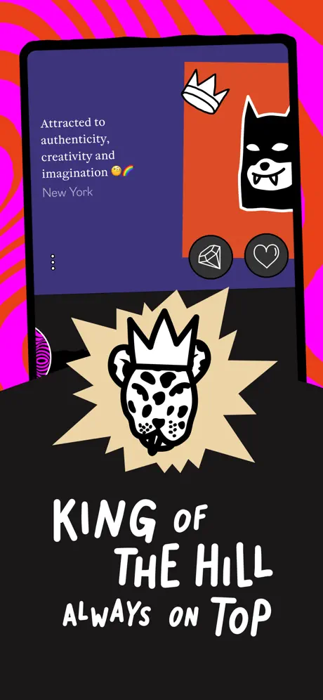
On-frame caption: “KING OF THE HILL / ALWAYS ON TOP

This frame is bifurcated. The top half is a device showing a profile page with a deep indigo background near #312E81. Left-aligned white text reads: 'Attracted to authenticity, creativity and imagination 🧐🌈' followed by 'New York'. To the right, the diamond and heart icons sit against the indigo, while a small white crown sticker and a bat-like mascot head intrude from the top-right corner, overlapping the bezel. Below the device, the entire lower half is solid black. Against that void, a cream starburst contains an aggressive leopard head wearing a crown. The bottom caption reads 'KING OF THE HILL' in large irregular type, with 'ALWAYS ON TOP' centered beneath in a smaller size. The transition from the pixel-precision of the UI to the analog texture of the illustration is intentional, but abrupt. Unlike previous frames, there is no continuous background pattern wrapping both zones; the hard horizontal cut where the device ends and the black begins creates a visual seam. The frame communicates status hierarchy, yet the profile text on the device is so brief—only two lines—that it functions more as decoration than as proof of content depth.

PURE App Store screenshot 8 — The Atomic Action
08

The Atomic Action

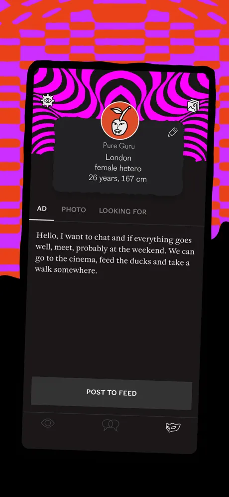
On-frame caption: “Pure Guru / POST TO FEED

The final frame closes the loop by revealing the atomic unit of the product: the personal ad composer. The background returns to the purple-orange checkerboard, creating a bookend with the intent and chat frames. The upright device shows a header area flooded with the same magenta wave pattern seen in frame 1, confirming that this pattern denotes profile or personal territory. Inside an orange circle avatar, a white face with a leaf sprout sits above the name 'Pure Guru'. Metadata follows in white: 'London / female hetero / 26 years, 167 cm'. A segmented tab bar reads 'AD' (active, underlined in white), 'PHOTO', and 'LOOKING FOR' (inactive in muted grey). The body area displays a full paragraph in white sans: 'Hello, I want to chat and if everything goes well, meet, probably at the weekend. We can go to the cinema, feed the ducks and take a walk somewhere.' At the bottom, a grey button—close to #2A2A2A—reads 'POST TO FEED', nearly camouflaged against the dark tab bar. The bottom navigation icons mirror frame 4 exactly. By ending on creation rather than consumption, the deck argues that self-expression is the product's climax.

05The craft

Captions, colour and the mechanics of the sell

Caption pattern

Each frame uses the same marker-style uppercase face, roughly 60–80pt equivalent at full resolution. Lines are broken for impact, not for grammar. For example, 'OPEN-MINDED' is hyphenated and isolated on its own line in Frame 1, and 'ALWAYS ON TOP' is separated from 'KING OF THE HILL' in Frame 7. This creates a staccato reading rhythm that slows the shopper down.

Visual system

Three motif families repeat across the set: cyclopean/antlered silhouettes, target/robot/tarot iconography, and leopard/bat mascot stickers. These are not decorative flourishes; they replace the traditional 'smiling couple' stock imagery entirely. The black-and-cream drawing style unifies them even as the backgrounds shift from waves to checkerboards to flat black.

The thumbnail test

At 220px wide, the checkerboard backgrounds collapse into vibrating noise and the cream headline letterforms thin out. The magenta wave motif survives compression slightly better because its arcs create fewer high-frequency edges than the checkerboard squares. For designers, this is a critical reminder: pattern density should be stress-tested at 15% of actual size before the set ships.

Conversion mechanics

The deck never shows a signup screen, a permission prompt, or a paywall. It trusts that vibe alone will drive the install. That is a valid top-of-funnel bet for a lifestyle product, but it leaves price, safety, and onboarding entirely unexplored. For designers, this is a reminder that screenshot real estate is finite; choosing emotional story beats over objection-handling is a strategic call that only works when brand affinity is the primary conversion lever.

06Where it slips

What we would change

Chromatic vibration is eating the headlines.

The orange-on-purple checkerboard in frames 3, 4, 5, and 8 uses values close to #9333EA and #E04025 that, at small thumbnail scale, vibrate against each other and veil the cream headline type. A specific fix: apply a 40% black gradient scrim behind every headline area, or desaturate the background patterns by roughly 15% to push the copy to the foreground without killing the palette.

Device scale is structurally unstable.

Frame 1 presents a steeply tilted phone; frame 4 shrinks it; frame 6 inflates it to a tablet-like crop; frame 7 crops the device awkwardly at the waist; and frame 2 removes it entirely. For a shopper auditing the UI, this inconsistency means the viewport never becomes familiar. The fix is to lock the device frame to a uniform width and rotation—say, 87% of canvas width at a consistent 12-degree tilt—across all slides that contain UI. Reserve the full-bleed, device-free moments for a dedicated cover or closing brand card only.

Lavender on deep violet is too quiet.

Frame 5 introduces lavender text on deep violet (#E9D5FF on #4C1D95) inside the gift screen. While elegant, the contrast ratio is too low for the App Store's compressed JPEG pipeline. Bumping the text to pure white or adding a subtle text-shadow would recover readability without breaking the colour story.

Press logos sit in the thumb occlusion zone.

In frame 2, the press logos sit dangerously low, within the thumb occlusion zone of a right-handed scroll. Raising the 'NEW YORK POST' and 'VOGUE + hypebae' block by at least 60pt and enclosing it in a solid black baseline strip would protect it from the hardware home indicator on iOS screenshot view and improve scanability.

The primary CTA in the final frame disappears.

The grey 'POST TO FEED' button in frame 8 fails to read as a primary action because it lacks elevation, stroke, or colour shift. Adding a 1px #FFFFFF22 border, increasing the background to #3F3F46, and adding 12pt of vertical padding would make the CTA scannable without departing from the dark aesthetic.

07The recipe

How to apply this to your own app

  1. Separate emotional beats from functional beats with a background rule.

    If you use a loud pattern, reserve it for value-prop frames and switch to flat solids or gradients when showing actual UI. PURE does this half the time; doing it consistently would improve scannability.

  2. Anchor with one unchanging typeface across all headlines.

    The marker sans never changes in PURE's deck. That continuity is what allows the backgrounds to vary so wildly. If your own screenshot set uses multiple type styles, keep the headline face locked to a single weight and case.

  3. End on action, not aspiration.

    PURE's strongest structural choice is closing on the ad composer. It proves the app is a tool, not just a mood. Whatever your product's core loop is—posting, editing, matching—put it in the final frame so the shopper leaves with a verb in mind.

  4. Thumbnails erode pattern; plan for 220px.

    Before you ship, export every frame to 220px wide and check whether your text and UI survive. If the background turns to mud, add a scrim or reduce saturation. Noise that looks charming at full scale becomes interference at icon size.

08Takeaways

Five things worth stealing

  • Background maximalism works only if the foreground UI is locked to a predictable anchor shape and colour.
  • Recurring micro-icons (diamond, heart) can replace lengthy feature lists because they train the eye through repetition.
  • A single device-free frame is a useful palette cleanser, but it should be followed immediately by a strong UI read to re-establish context.
  • Headline line breaks are a rhythm tool; breaking for emphasis rather than syntax forces slower reading and higher recall.
  • Personal ads as the core mechanic allow the screenshots to show real text instead of lorem ipsum, which increases trust even when the art direction is surreal.
09The verdict

What the set actually achieves

A maximalist, illustration-first carousel that converts category fatigue into curiosity, though it occasionally sacrifices UI legibility for background decoration at thumbnail scale. The set closes on a strong product note—the ad composer—recovering clarity after multiple abstract emotional beats.

Design teams building in saturated lifestyle or social categories who need to signal niche identity without abandoning App Store legibility conventions entirely. Also useful for illustrators and brand designers who want to see how hand-drawn assets can integrate with live UI captures.

10Questions

Frequently asked

Why are there no device bezels?

Removing hardware chrome makes the UI feel like a floating layer inside a collage rather than a screenshot trapped in a phone. It also lets the illustration elements overlap the screen edges, which would be impossible with a realistic bezel.

Does the checkerboard pattern hurt conversion?

At full scale it is memorable; at thumbnail scale it vibrates. The deck likely wins on stop-power but may lose on clarity for users who need immediate feature recognition. The trade-off is intentional brand filtering.

What is the purpose of the horned creature in Frame 2?

It replaces the traditional 'happy couple' lifestyle shot with a mythological mascot, reinforcing the app's positioning as a space for 'open-minded' people. It is pure identity signaling with zero functional explanation.

Why end on the composer instead of a match or chat success?

Because PURE's core differentiator is the personal ad. Ending on creation tells the user that agency and self-expression are the product's climax, not passive consumption.

11Keep reading

Build your own screenshot set

The full set

9 shots
PURE App Store screenshot 1PURE App Store screenshot 2PURE App Store screenshot 3PURE App Store screenshot 4PURE App Store screenshot 5PURE App Store screenshot 6PURE App Store screenshot 7PURE App Store screenshot 8PURE App Store screenshot 9

About the app

PURE is a dating app for curious people to show up in their most playful version of themselves. It’s a space to be honest with your intentions and clear in your Online Classifieds AG, via the App Store listing.

Screenshots and store metadata belong to Online Classifieds AG. They are shown here for design commentary and criticism. The analysis on this page is original work by floow.design. View the original listing.

More Social teardowns

Browse all →