Open app icon
SocialScreenshot teardown11 min read

Open App Store screenshots

Open App Store Screenshot Set: Selling Atmosphere Before Interface in Eight Frames

Set published by Open Inc. · 10 frames analysed

4.9 · 16K ratingsFreev26.17Updated 4mo ago
Open App Store screenshot 1
01At a glance

The set in one screen

Framing
Floating iPhone chassis with rounded corners; no status bar; no home indicator; thin bezel outline.
Captions
Large, centered, regular-weight white sans-serif headlines locked high on a #000000 canvas.
Backdrop
Pure black frames alternate with full-bleed motion-blur photography and in-app warm gradients.
Type
White neutral grotesque; extreme tracking on the brand mark; sentence case for quotes; all-caps for UI labels and category tags.
UI / copy split
Five frames show device UI; three frames contain no device at all.
Frame 1 job
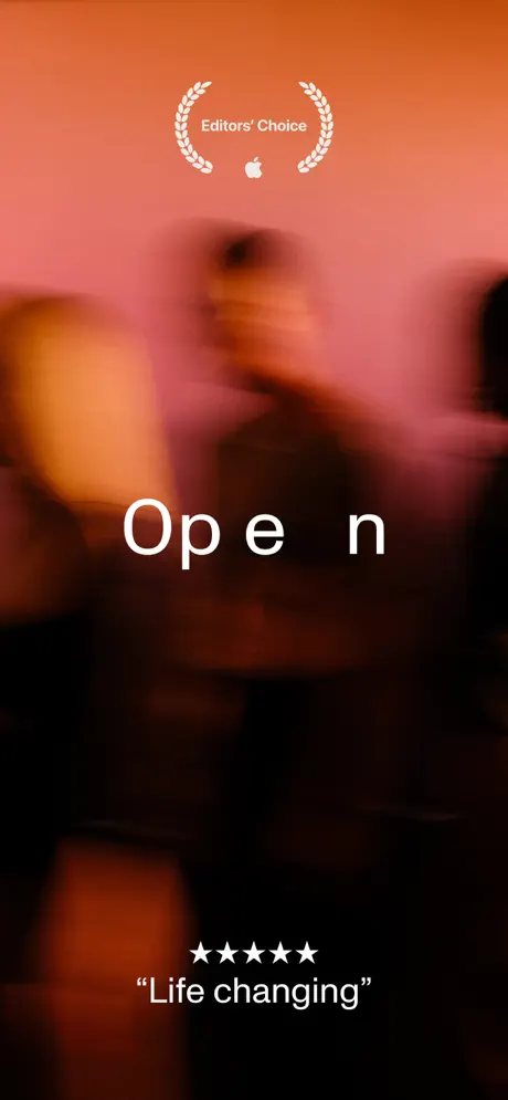
The opening frame functions as a theatrical poster rather than a product screenshot. Its job is to establish tonal mood and cultural weight before any interface is revealed, using an Editors’ Choice badge and a testimonial to front-load credibility while the brand name itself becomes a graphic object rather than a simple label.

Sampled palette

#000000#000000
#E86B4E#E86B4E
#A64B1A#A64B1A
#1B2735#1B2735
#1A3A2E#1A3A2E
#1A0505#1A0505
02The challenge

What this screenshot set had to solve

The App Store wellness aisle trains shoppers to skim predictable palettes—soft sage, lavender gradients, and lotus iconography—which means any new entrant has milliseconds to signal difference. Open’s visible problem is one of tonal sequencing: the set must move from an abstract, device-free emotional promise to tangible interface proof, then to social authority, without the whiplash of swapping from a blurry orange photograph to a dense publisher logo wall. The designers have to hold a single visual thread across warm gradient interiors, absolute black canvases, and disparate photography styles so that the eight frames read as chapters of one object rather than a random asset dump. Because three of the eight frames contain no device at all, the set risks being read as a gallery or magazine rather than a mobile product, so every frame has to earn its place in the swipe path while maintaining a dark, editorial tone that avoids generic serenity clichés.

Break often — not like porcelain, but like waves.
03The approach

How the set argues its case

The team uses a rhythm of expose-and-withhold. A strict #000000 canvas is used for every non-photographic frame, creating a continuous dark room that lets in-app terracotta, olive, and midnight-blue gradients glow. Headlines are locked to a high, centered position in a large regular-weight sans so the eye lands on the value proposition before the device. Within device frames, the UI is shown without iOS status bars or home indicators, which makes the interface feel gallery-clean. Photography follows a tight editorial rule: low light, side-lit or silhouetted figures, motion blur, and no frontal portraits. The pacing follows an emotional arc—poster, daily utility, personalization, breadth, social proof, biometric evidence, customization, artist coda—alternating between giving the shopper a feeling and giving them a feature. The final frame borrows music-release typography to signal that the content catalog is artist-driven rather than purely instructional.

The set positions the app as a studio-grade, culturally fluent wellness platform rather than a utilitarian meditation timer. This is achieved by prioritizing editorial photography and publisher logos over feature callouts, letting the aesthetic argue for premium positioning before the UI ever describes the mechanics.

04Frame by frame

Every screenshot, and the job it does

Open App Store screenshot 1 — Brand stamp and mood poster
01

Brand stamp and mood poster

On-frame caption: “None

The first frame is a pure brand poster with no device. A full-bleed motion-blur photograph fills the vertical canvas with a gradient shifting from warm coral-pink at the top to deep burnt umber and near-black at the bottom. At top center sits a white Editors’ Choice laurel badge enclosing the Apple logo. Dead center, the word “O p e n” is set in a large white sans-serif with extreme letter-spacing—each character floats in its own column. Near the bottom, five solid white stars sit above the verbatim quote “Life changing”. The frame behaves like a theatrical poster, establishing atmospheric temperature before any interface is revealed.
Open App Store screenshot 2 — Daily ritual proof
02

Daily ritual proof

On-frame caption: “Your daily reset

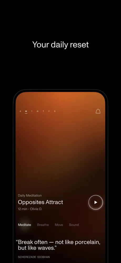
Against a pure black background, the headline “Your daily reset” is centered in the upper third. A floating iPhone chassis with rounded corners occupies the middle band, displaying a warm terracotta-to-black gradient UI. Inside the device, a hairline weekday strip reads “S M T W T F S” with “M” underlined, accompanied by a notification bell. Lower left text reads “Daily Meditation”, “Opposites Attract”, and “12 min · Olivia O.”; a thin-ringed circular play button sits to the right. A bottom tab bar shows “Meditate”, “Breathe”, “Move”, “Sound”. Below the phone, outside the chassis, the quote “Break often — not like porcelain, but like waves.” appears in white, with “SCHEREZADE SIOBHAN” set beneath in smaller uppercase. The layout gives roughly sixty percent of the vertical space to the device and uses the remaining forty as a typographic footer.

Open App Store screenshot 3 — Personalization promise
03

Personalization promise

On-frame caption: “Made for your mind

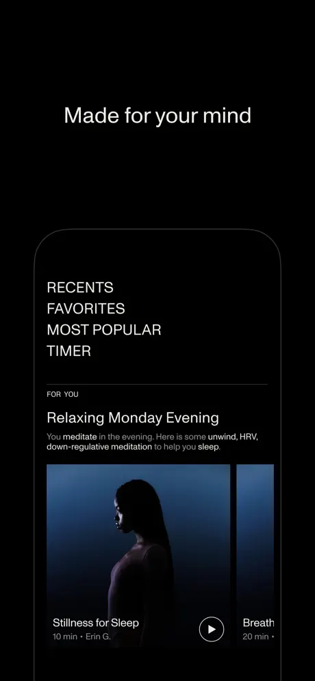
The headline “Made for your mind” sits centered above the device. The phone screen shows a near-black UI with a vertically stacked navigation menu: “RECENTS”, “FAVORITES”, “MOST POPULAR”, “TIMER” in all-caps white, followed by a hairline rule and the label “FOR YOU”. A recommendation card titled “Relaxing Monday Evening” includes body copy that reads, in part, “You meditate in the evening. Here is some unwind, HRV, down-regulative meditation to help you sleep.” The card image shows a figure in profile bathed in deep cyan-teal shadow against a midnight-blue (#1B2735) field. Below, a media row shows “Stillness for Sleep”, “10 min · Erin G.”, a play glyph, and the edge of a second card labeled “Breath”. The frame argues personalization through image temperature and descriptive metadata rather than through empty claims.

Open App Store screenshot 4 — Content breadth collage
04

Content breadth collage

On-frame caption: “Designed for your life

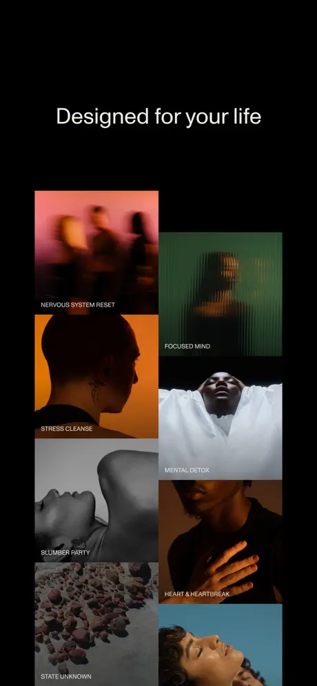
No device is present. The headline “Designed for your life” floats above an asymmetrical masonry grid of seven photographic tiles against black. Top-left repeats the motion-blur crowd image from frame one, labeled “NERVOUS SYSTEM RESET”. Top-right shows a figure behind vertical glass distortion in deep green (#1A3A2E), labeled “FOCUSED MIND”. Middle-left is a warm orange profile tagged “STRESS CLEANSE”; middle-right is a high-key white-shirt figure tagged “MENTAL DETOX”. Lower rows hold a black-and-white double exposure for “SLUMBER PARTY”, a warm brown hand-on-chest image for “HEART & HEARTBREAK”, and a rocky landscape for “STATE UNKNOWN”. Labels are white, small, and pinned to the lower-left of each tile. The composition sacrifices functional clarity for mood, acting as a content promise rather than a navigational demonstration.

Open App Store screenshot 5 — Social proof logo wall
05

Social proof logo wall

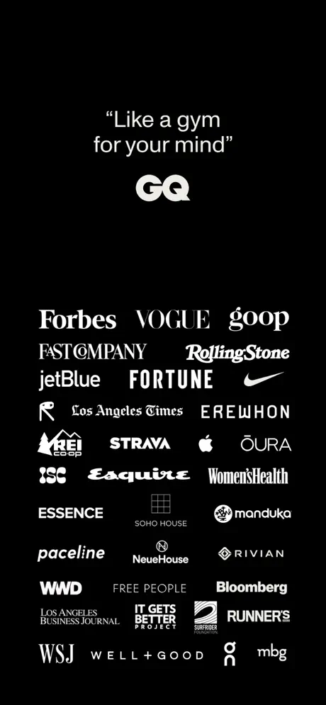
On-frame caption: ““Like a gym for your mind” GQ

A pure trust frame against black. Near the top, the pull-quote “Like a gym for your mind” appears in white, followed by the bold “GQ” logotype. The remainder is a dense white logo wall: Forbes, VOGUE, goop, FAST@MPANY, Rolling Stone, jetBlue, FORTUNE, Nike, Los Angeles Times, EREWHON, REI Co-op, STRAVA, Apple, ŌURA, Esquire, Women’s Health, ESSENCE, SOHO HOUSE, manduka, paceline, NeueHouse, RIVIAN, WWD, FREE PEOPLE, Bloomberg, Los Angeles Business Journal, IT GETS BETTER PROJECT, Surfrider Foundation, RUNNER’S, WSJ, WELL + GOOD, and mbg. No UI or photography interrupts the grid. It is a typographic resume meant to telegraph cultural legitimacy through sheer density.

Open App Store screenshot 6 — Biometric evidence
06

Biometric evidence

On-frame caption: “Improve your recovery

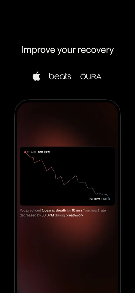
The headline “Improve your recovery” is centered above the device. Just beneath the headline and above the phone, three integration logos—Apple, beats, ŌURA—float in white. The device displays a dark maroon (#1A0505) radial gradient containing a black card. Inside the card, a jagged line graph descends from “START 100 BPM” marked by an orange dot to “70 BPM END” marked by a blue dot. Caption text below the card states: “You practiced Oceanic Breath for 10 min. Your heart rate decreased by 30 BPM during breathwork.” Key terms appear in brighter white against muted gray. The frame attempts to make biometric evidence feel atmospheric rather than analytical by embedding the graph inside the same warm-dark palette used elsewhere.

Open App Store screenshot 7 — Customization and breathwork
07

Customization and breathwork

On-frame caption: “Build your own practice

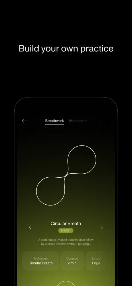
Headlined “Build your own practice”, the device shows a segmented control with “Breathwork” selected and underlined beside “Meditation”, plus a back arrow. Center stage is a large, thin-stroke white infinity-loop glyph on an olive-green radial gradient fading from #5A6B1A at the bottom to near-black at top. The label “Circular Breath” sits beneath, flanked by chevrons, with a pill-shaped tag reading “ENERGY” in muted lime (#8B9A3A). Three bottom cards read “Technique / Circular Breath”, “Duration / 2 min”, and “Sound / Edge”. The palette shifts the app’s temperature from warm terracotta to cool green, signaling a different modality without breaking the dark-room aesthetic.

Open App Store screenshot 8 — Artist collaboration proof
08

Artist collaboration proof

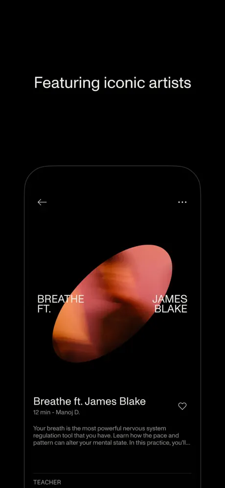
On-frame caption: “Featuring iconic artists

“Featuring iconic artists” closes the sequence. The device presents a detail view with a back arrow and an ellipsis. Dominating the screen is a horizontally stretched oval mask filled with a blurred pink-orange abstract motion image. Overlaid left and right are the words “BREATHE FT.” and “JAMES BLAKE” in white stacked caps. Below the oval, the title “Breathe ft. James Blake” repeats with a heart outline icon and the metadata “12 min · Manoj D.”. Body copy begins: “Your breath is the most powerful nervous system regulation tool that you have. Learn how the pace and pattern can alter your mental state. In this practice, you'll...” The layout borrows record-sleeve typography to frame the content as a collaboration rather than a lesson.

05The craft

Captions, colour and the mechanics of the sell

Caption pattern

Every device-bearing frame opens with a centered, sentence-case white headline that describes a benefit: 'Your daily reset', 'Made for your mind', 'Improve your recovery', 'Build your own practice', 'Featuring iconic artists'. Non-device frames carry headlines like 'Designed for your life' or pull-quotes attributed to publications, creating a rhythmic alternation between functional promise and emotional statement.

Visual system

The visual system is built on absolute black negative space, warm tactile gradients inside the UI, and photographic human presence outside of it. The iPhone chassis acts as a literal frame for the interface, but the team strips away Apple chrome—no Dynamic Island, no status bar, no tab indicators—so the gradients feel boundless. Typography is relentlessly white and sans-serif, avoiding any serif or script that might tip into spa-day cliché. The photography is consistently underexposed and grain-tolerant, favoring burnt orange, deep teal, and olive tones that harmonize with the in-app palettes rather than matching competitor pastels.

The thumbnail test

At thumbnail scale, the first frame’s motion blur risks reading as unfocused noise, and the extreme tracking on the brand name may dissolve into disconnected white shapes. The consistent black canvases create strong silhouette contrast, but frame five’s dense logo wall collapses into a uniform gray texture. Frames two, three, six, and seven benefit from the bright UI inside the dark phone chassis, which reads as a glowing object even when compressed.

Conversion mechanics

The set prioritizes cultural persuasion over functional clarity. Shoppers who need to see a timer, a calendar, or a notification widget will not find those cues until frame six, and even then the UI is dressed in gradients rather than conventional affordances. This is a conversion strategy aimed at brand-aware users rather than problem-solution searchers.

06Where it slips

What we would change

Frame 1 sacrifices scanability for atmosphere

The extreme letter-spacing on “O p e n” collapses into visual static at thumbnail scale; shoppers may not parse it as the app name, and the lack of any device or UI forces them to trust the brand before knowing the product. A tighter tracking or a ghosted device outline would preserve the poster effect while anchoring the product category.

Frame 4 labels lack text protection

The masonry grid is aesthetically rich, but the bottom labels struggle against their backgrounds; “HEART & HEARTBREAK” sits on a warm brown image with insufficient contrast, and “STATE UNKNOWN” overlays a busy rock field. A uniform 10–15 % black scrim behind every label would guarantee legibility without flattening the photography.

Frame 5 stalls the narrative

The logo wall is exhaustive yet rhythmically dead—it halts the arc of use to deliver a resume, and at small sizes the logos merge into a single gray mass because there is no negative-space hierarchy. Replacing this with a single publisher quote overlaid on relevant UI, or clustering logos into three tiers by scale, would maintain trust without breaking the interface rhythm.

Frame 6 buries the data visualization

The BPM graph is physically small inside the device bezel, and the 30 BPM claim uses type that competes with the graph rather than amplifying it. The data would punch harder if the card were cropped larger or the frame zoomed into the graph itself, letting the line occupy at least sixty percent of the device screen.

Monotonous canvas flattens the later frames

Because five consecutive frames use an identical pure black canvas, the set begins to feel one-note after the third swipe. A subtle shift in canvas tint—perhaps a deep charcoal or warm gray behind one of the social-proof or device frames—would rekindle visual attention without abandoning the premium restraint.

07The recipe

How to apply this to your own app

  1. Test your first frame at 120 px wide

    If your brand mark uses extreme tracking, verify that it still resolves as a readable word at thumbnail scale; otherwise tighten the spacing or anchor the name to a device bezel.

  2. Add scrims to all overlay labels on photography

    When category labels sit on variable imagery, apply a consistent dark gradient or 10–15 % black scrim so white type survives across every tile regardless of image brightness.

  3. Replace logo walls with curated social proof

    More than a dozen monochrome logos against black merge into unreadable noise; instead, feature one strong publisher pull-quote overlaid on relevant app UI.

  4. Zoom biometric proof to fill the device

    Health and fitness shoppers scan for numbers first, so let graphs or metrics occupy the majority of the screen inside the chassis rather than floating in a small card.

  5. Lock headline position across all frames

    Keep the value-proposition text at the same Y-coordinate and type size so the eye finds the promise instantly while the imagery changes around it.

  6. Strip system chrome but keep the chassis

    Present the iPhone frame for UI shots but remove the status bar and home indicator so the interface reads as edge-to-edge content rather than a generic device demo.

08Takeaways

Five things worth stealing

  • If you set your brand name with extreme tracking on the first frame, verify at 120 px wide that the letters still resolve as a word; otherwise tighten the spacing or anchor the name to a device bezel.
  • Apply a consistent dark scrim behind all typographic labels that sit on top of variable photography grids so white type survives across every tile.
  • Convert dense logo walls into a single publisher pull-quote overlaid on relevant app UI, because more than a dozen monochrome logos against black merge into unreadable noise in thumbnail view.
  • Let biometric data fill at least sixty percent of the device screen by cropping tightly into the graph, since health shoppers scan for numbers before they read supporting captions.
  • Lock your headline to the same Y-coordinate and type size across every frame so the value proposition remains the anchor while the imagery changes.
  • Keep the iPhone chassis present for all UI frames but strip the status bar and home indicator so the interface reads as edge-to-edge content rather than a device demo.
09The verdict

What the set actually achieves

The sequence delivers a cohesive dark-room narrative that feels more like a museum placard than a feature list. A shopper leaves with an impression of warm gradients, silhouetted bodies, and cultural legitimacy rather than a inventory of buttons and timers.

This approach is optimized for lifestyle and wellness apps that need to signal cultural credibility before functional utility. It works best when the target shopper is discovery-browsing by brand affinity rather than searching for a specific feature like a timer or tracker.

10Questions

Frequently asked

Why is there no device in the first frame?

The team treats the first frame as a theatrical poster rather than a product screenshot, using a full-bleed motion-blur photograph to establish emotional temperature and cultural weight before showing interface.

How does the set avoid looking like a generic meditation app?

It avoids sage greens and lotus iconography, instead using absolute black canvases, warm terracotta and olive gradients, low-light editorial photography, and typography borrowed from music-release packaging.

What is the risk of the logo wall frame?

At thumbnail scale the thirty-plus white logos against black merge into a uniform gray texture, and the frame halts the narrative momentum by removing both UI and photography for a pure trust signal.

Which frame carries the hardest functional proof?

Frame six carries the hardest functional proof by displaying a heart-rate graph showing a 30 BPM decrease during a breathwork session, supported by Apple, Beats, and ŌURA integration logos.

11Keep reading

Build your own screenshot set

The full set

10 shots
Open App Store screenshot 1Open App Store screenshot 2Open App Store screenshot 3Open App Store screenshot 4Open App Store screenshot 5Open App Store screenshot 6Open App Store screenshot 7Open App Store screenshot 8Open App Store screenshot 9Open App Store screenshot 10

About the app

“We believe that mindfulness is more than a form of stress relief — it can be a tool for personal growth, deeper understanding, vibrancy. More than a way to disconnect — it can be Open Inc., via the App Store listing.

Screenshots and store metadata belong to Open Inc.. They are shown here for design commentary and criticism. The analysis on this page is original work by floow.design. View the original listing.

More Social teardowns

Browse all →