
GO Club app icon
SocialScreenshot teardown11 min read

GO Club App Store screenshots

Why GO Club’s eight-frame sequence matters for conversion-focused app design.

Set published by ARKADE CLUB PRIVATE LIMITED · 9 frames analysed

4.4 · 234 ratingsFreev1.3.1Updated 6mo ago
GO Club App Store screenshot 1
01At a glance

The set in one screen

Framing
Mixed: 3D hand-held perspective, flat frontal devices, and abstract widget grids.
Captions
Lowercase, bold, rounded sans-serif; friendly and punchy.
Backdrop
Frames 2–8 share a pale peach/glassmorphic world; Frame 1 stands alone in a deep blue void.
Type
Geometric sans-serif; massive display headlines top-aligned against small functional captions.
UI / copy split
UI dominates roughly 60% of each canvas; marketing copy occupies the top 25–30%.
Frame 1 job
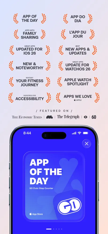
Credibility and authority via awards, press logos, and a cinematic hero device.

Sampled palette

#2E4CFF#2E4CFF
#3B4CFF#3B4CFF
#FF5A1F#FF5A1F
#34C759#34C759
#007AFF#007AFF
#FF9500#FF9500
02The challenge

What this screenshot set had to solve

The design problem is differentiation inside a category where shopper attention decays within the first two frames. Although GO Club is listed under Social, its screenshots sell a utility toolset—steps, hydration, Apple Watch complications, widgets, and on-device privacy—meaning the images must explain the product before the user ever reads the description. Frame one is therefore loaded with trust signals: an App Store Awards 2025 finalist badge, gold laurels, and a press row that includes The Economic Times, The Telegraph, and 60. The risk is front-loading too much marketing varnish before the shopper grasps the core mechanic. Beyond that, the app spans four distinct surfaces—iPhone, Apple Watch, Lock Screen widgets, and Home Screen widgets—so the sequence has to function as an ecosystem map without devolving into a feature checklist. The designer must balance cinematic appeal with truthful UI legibility, all while keeping a recognizable brand temperature across contexts that range from wrist-sized complications to full-bleed hydration animations.

The set chooses aggression over restraint, betting that density and color saturation will stop the thumb.
03The approach

How the set argues its case

The creative solution is a deliberate split between atmosphere and interface. Atmospheric frames use environmental storytelling—hands, steep perspective, glassmorphic blobs, and soft peach gradients—to imply human habit and real-world usage. Informational frames strip away the theater to expose UI density, widget portfolios, and data visualizations. A strict typographic system anchors the chaos: every headline is set in a bold, rounded sans-serif at an oversized display scale, locked to the top third and left-aligned for scannability. The color strategy is equally disciplined; the electric blue acts as a constant across every screen, while accent colors—safety orange for calls-to-action, iOS green for privacy, and highlighter yellow for streaks—serve as semantic cues. Device framing is intentionally varied: steep perspective on frames one, two, and seven; dead-flat frontal on frames three and five; and no device at all on frames six and eight. This variation is meant to prevent the parallax monotony that kills conversion on long screenshot sets.

Friendly precision. The headlines are oversized and conversational, but the data underneath is exact—8,290 steps, 6.13 km, 690 kcal—suggesting a tool that is casual in voice but serious in measurement. The app comes across like a specialized habit dashboard rather than a passive social network.

04Frame by frame

Every screenshot, and the job it does

GO Club App Store screenshot 1 — productPositioning
01

productPositioning

On-frame caption: “steps & hydration made simple.

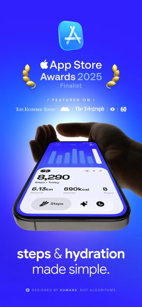
Frame one is a pure credibility play set inside a saturated cobalt-to-indigo gradient that reads roughly #2E4CFF at center and deepens toward #1A33FF at the edges. Centered at top is the App Store Awards 2025 finalist lockup—white text flanked by rendered gold laurels—followed by a press row in small white caps: The Economic Times, The Telegraph, 60. Below, two hands cradle an iPhone in steep perspective, its screen showing a white summary card against a blue bar chart. The UI card lists 8,290 Steps, 6.13 km Distance, 690 kcal Calories, and 8 Floors in a crisp, dark numeric hierarchy. The bottom third carries the campaign line 'steps & hydration made simple.' in lowercase white, with a small-caps footer 'DESIGNED BY HUMANS. NOT ALGORITHMS.' The crop is generous, but the deep blue world never reappears in the remaining seven frames, making this feel like an isolated billboard rather than the start of a cohesive environment.
GO Club App Store screenshot 2 — habitLoop
02

habitLoop

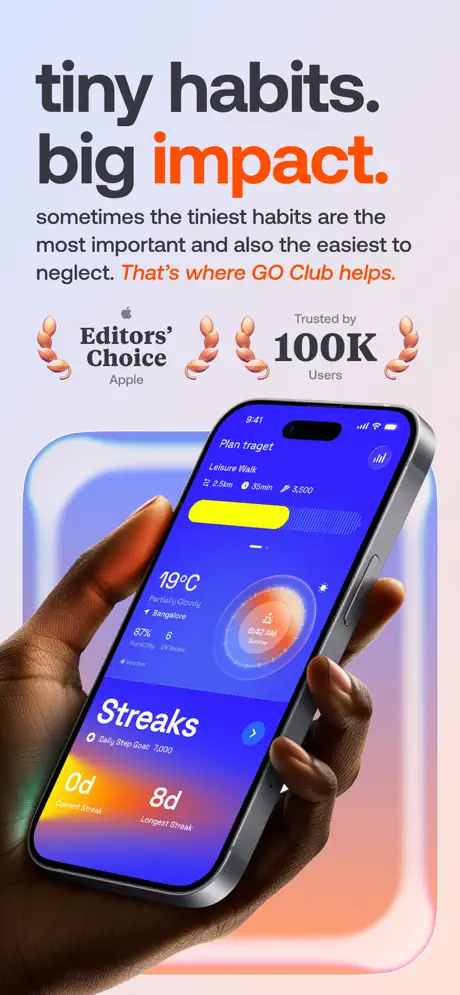
On-frame caption: “tiny habits. big impact.

The palette pivots abruptly to a warm, desaturated peach—roughly #FFF0EB—with soft, glassmorphic rounded-square artifacts bleeding in pastel blue and orange behind the device. The headline 'tiny habits. big impact.' is set in enormous bold sans-serif, with the word 'impact.' picked out in a hot safety orange close to #FF5A1F. The sub-head reads verbatim: 'sometimes the tiniest habits are the most important and also the easiest to neglect. That’s where GO Club helps.' with the brand clause in the same orange. Two social-proof badges—'Editors’ Choice' and 'Trusted by 100K Users'—are bookended by 3D coral laurels. An iPhone held in the same dark-skinned hand as frame one displays a busy dashboard: a yellow progress pill labeled 'Plan traget' (a visible typo for target), weather data for Bangalore, a circular sunrise dial, and a Streaks module with a yellow '0d Current Streak' card and a purple '8d Longest Streak' card. The density is aspirational but slightly chaotic; the typo undermines the authority built in frame one.

GO Club App Store screenshot 3 — productCore
03

productCore

On-frame caption: “step counter

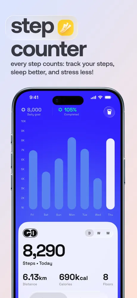
This is the clearest artifact in the set. The background is a near-white gradient, and the device is rendered frontally with no hand interference, maximizing screen real estate. The headline lockup reads 'step [yellow shoe icon] counter' in dark charcoal, with the icon housed in a rounded yellow square. The sub-copy says: 'every step counts: track your steps, sleep better, and stress less!' The UI itself is a pure data dashboard on an electric blue field. A seven-day bar chart dominates the upper half, with days Fri through Thu along the x-axis and volumes from 1K to 10K on the y-axis; the Thu bar is rendered in white while the rest sit in a lighter blue tint. Header metrics show '8,000 Daily goal' and '105% Completed.' Below, a white rounded card carries the G1 logo, a D / W / M segmented control, and the familiar summary: 8,290 Steps, 6.13 km, 690 kcal, 8 Floors. The spacing is even, the contrast is high, and the message is parsed in under two seconds.

GO Club App Store screenshot 4 — platformExpansion
04

platformExpansion

On-frame caption: “now on your wrist

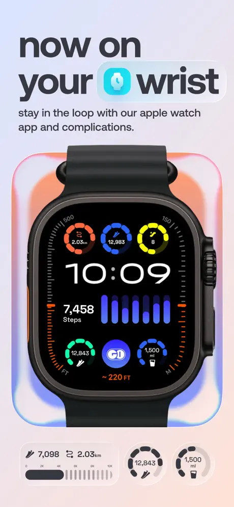
The headline 'now on your [watch icon] wrist' introduces the Apple Watch extension. The watch icon is a light, cyan-leaning blue pill. The body copy reads: 'stay in the loop with our apple watch app and complications.' Centered is an Apple Watch Ultra with a black band and orange action button, set against the same peach glassmorphism as frame two. The watch face is packed: three top rings in orange (2.03 km), blue (12,983), and yellow (8 floors); center time reads 10:09; a middle module shows 7,458 Steps beside a blue micro-chart; bottom rings display 12,843 FT in green, a G1 app shortcut in blue, and 1,500 ml hydration in blue. Below the watch, two flat widget previews echo the step count and intake modules. The frame communicates breadth, but the sheer density of rings and numbers makes it difficult to decode which metric is primary; the shopper sees color, not comprehension.

GO Club App Store screenshot 5 — secondaryFeature
05

secondaryFeature

On-frame caption: “water reminder

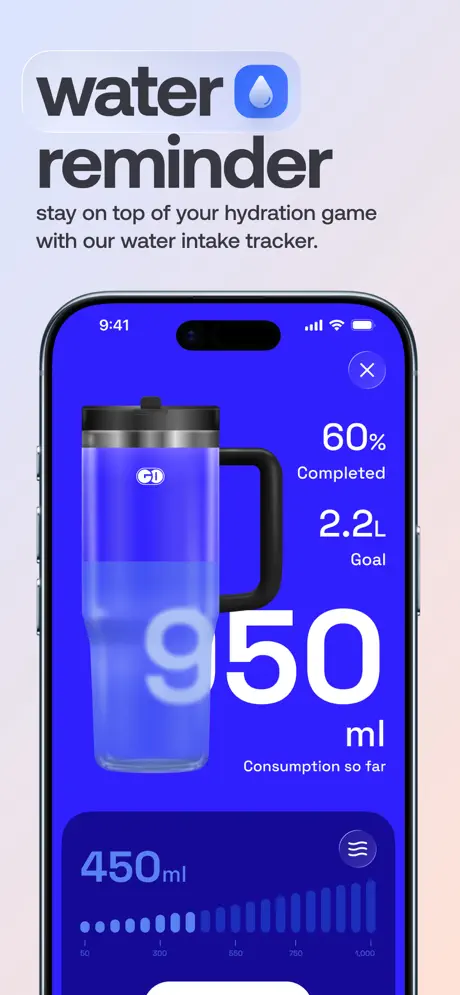
Headline: 'water [blue droplet icon] reminder' with a #007AFF droplet inside a rounded square. Sub-copy: 'stay on top of your hydration game with our water intake tracker.' The iPhone sits frontally against a pale gradient. The interface is the most theatrical in the set: a large 3D-rendered translucent tumbler occupies the left half, filled with liquid that reads as a lighter blue-violet. Overlaid in massive white sans-serif is '950 ml Consumption so far,' with the numerals partially ghosted behind the glass. To the right, smaller text stacks read '60% Completed' and '2.2L Goal.' At bottom, a dark indigo card houses a histogram of daily intake with a dotted x-axis from 50 to 1,000 and a current reading of '450ml.' An 'X' close button sits in the top-right corner of the screen, confirming this is a modal sheet. The layering is visually rich, yet the overlaid type risks legibility when scaled to thumbnail size.

GO Club App Store screenshot 6 — trustSignal
06

trustSignal

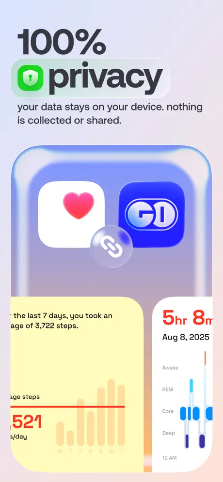
On-frame caption: “100% privacy

This frame attempts to communicate privacy through abstraction. The headline '100% [green shield] privacy' uses an iOS-style green shield (#34C759) with a white keyhole. The lockup below says: 'your data stays on your device. nothing is collected or shared.' There is no device frame; instead, the composition floats three UI cards inside a glassmorphic rounded rectangle. Top row: the Apple Health icon (red heart on white) and the GO Club icon (white 'G1' on blue) joined by a glass chain-link bubble. Bottom left: a beige card truncated at the top, reading '…the last 7 days, you took an average of 3,722 steps,' above an orange bar chart and a red baseline at 3,521. Bottom right: a white sleep-analysis card clipped at its top edge, showing '5hr 8m' and a hypnogram with Awake, REM, Core, and Deep stages. The cropping is unforgivable—the sleep card is visibly cut off, and the chain-link metaphor feels decorative rather than informative.

GO Club App Store screenshot 7 — ecosystemProof
07

ecosystemProof

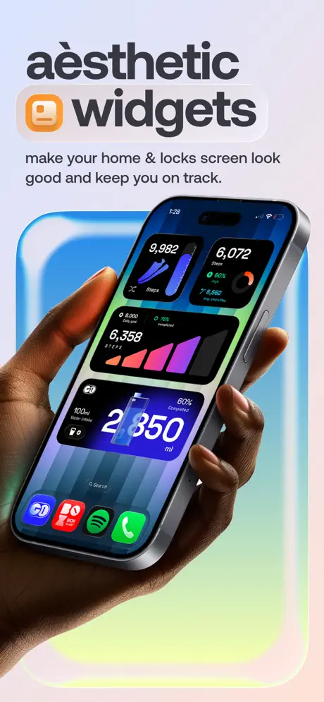
On-frame caption: “aèsthetic widgets

Headline: 'aèsthetic [orange widget icon] widgets,' using an orange (#FF9500) rounded square with a white widget glyph. Sub-copy: 'make your home & locks screen look good and keep you on track.' An iPhone in the recurring hand model displays the actual iOS Home Screen at 1:28. Four GO Club widgets are arranged: a top-left small widget showing 9,982 steps beside a blue shoe graphic; a top-right small widget with 6,072 steps and an orange ring; a middle large black widget tracking 6,358 steps against a pink-to-purple gradient bar chart; and a bottom large blue widget showing 2,850 ml water intake with a glass graphic. The Dock exposes Spotify, TikTok, and the G1 app, grounding the product in a real media context. Behind the phone, a large glassmorphic gradient blob shifts from cyan to lime to peach. It is the most persuasive lifestyle frame because it proves utility without requiring imagination.

GO Club App Store screenshot 8 — socialProof
08

socialProof

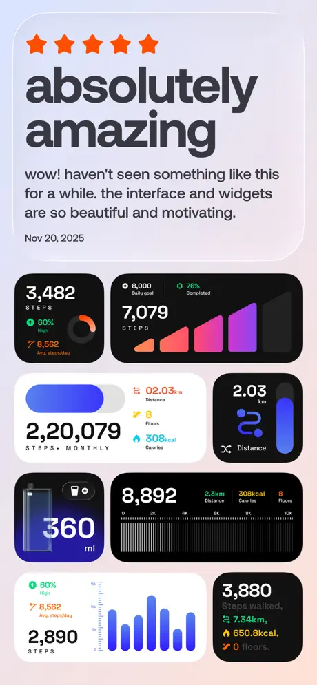
On-frame caption: “absolutely amazing

The final frame is a social-proof and widget-catalog hybrid. Five solid orange stars sit above the headline 'absolutely amazing.' The review quote reads verbatim: 'wow! haven’t seen something like this for a while. the interface and widgets are so beautiful and motivating.' Dated Nov 20, 2025. Below, eight widget variations are tiled in a loose masonry grid without any device frame. Top-left black: 3,482 steps with a green status and orange ring. Top-right black: 7,079 steps with a pink-purple bar chart. Second row: a white card showing 2,220,079 monthly steps with a blue toggle, and a black distance widget (2.03 km). Third row: a dark-blue hydration widget at 360 ml, and a black stats card with 8,892 steps alongside distance, calories, and floors. Bottom row: a white step widget and a black one with multiline colored metrics. It is visually noisy and functionally redundant after frame seven’s contextual home-screen proof.

05The craft

Captions, colour and the mechanics of the sell

Caption pattern

The caption rhythm follows a strict verb-noun pattern: 'step counter,' 'water reminder,' '100% privacy.' This makes each frame immediately scannable. The downside is that Frame 8 abandons the pattern for a testimonial headline ('absolutely amazing'), which breaks the feature-forward cadence.

Visual system

Three layers: (1) a persistent electric blue (#3B4CFF) inside every app screen; (2) shifting environmental backgrounds—deep indigo in Frame 1, pale peach with glassmorphism in Frames 2–8; (3) a recurring 3D hand model that reappears in Frames 1, 2, and 7 to stitch the set together with human warmth.

The thumbnail test

The electric blue UI surfaces read as a single color blob even at low resolution, which helps brand recognition. However, the shift from Frame 1’s dark blue environment to Frame 2’s pale peach means the first two thumbnails look like different apps side-by-side, potentially hurting brand consistency in search results.

Conversion mechanics

The sequence front-loads authority (awards, press, user count) before exposing actual interface. This works for cold traffic but may alienate shoppers who prefer to see the UI first. Frame 3 is the true conversion hinge: if a user swipes past the social proof, the clean bar chart and white summary card close the loop on value. The watch and widget frames serve as ecosystem reassurance rather than primary selling points.

06Where it slips

What we would change

environmentalSplit

The set fractures into two distinct visual systems: frame one’s deep blue void and the soft peach ecosystem that follows. A shopper swiping sequentially might wonder if the first frame belongs to the same product. The fix is simple: migrate frame one’s background to the same pale gradient family, or keep the deep blue as a recurring accent rather than a one-off hero.

typoInUI

Frame two contains a glaring typo—'Plan traget'—which is visible in the yellow pill on the device screen. In a credibility-first frame that also displays an Editors’ Choice badge, misspelled UI copy is fatal; it needs a corrected build export.

frameSixCrop

Frame six is structurally broken: the sleep card is cropped at the top, the Health-app chain-link metaphor is ambiguous, and the absence of a device frame makes it feel like a rushed asset. The fix is to recompose within a device bezel or, better, show the privacy settings screen inside a realistic iPhone frame with readable copy.

watchDensity

Frame four’s Apple Watch face is overpopulated; the 12,983 figure in the blue ring competes with the 7,458 Steps reading below it. Strip the watch face down to one primary metric and two complications to prove elegance, not overload.

widgetRedundancy

Frame eight repeats widget content already contextualized in frame seven. Replace it with a unique surface—perhaps a sharing card or the onboarding flow—to extend the narrative rather than echo it.

07The recipe

How to apply this to your own app

  1. Adopt at least one signature background color that survives the entire sequence.

    GO Club’s blue UI is recognizable because it never disappears. If your app has a signature tint, thread it through every frame so the gallery reads as a single branded strip, not a random collection.

  2. Never let an award frame outshine the actual interface.

    Authority badges are important, but if the background language of frame one never returns, the frame becomes a standalone poster. Tie the award visuals to the same gradient or glassmorphism used later so the sequence feels continuous.

  3. Vary the device state to fight scroll fatigue.

    Alternate between hand-held perspective and flat-frontal renders. Hands add warmth and scale; flat fronts add readability. GO Club uses both, which keeps the thumb engaged across eight frames.

  4. Proofread every pixel in your UI screenshots as if it were billboard copy.

    A typo inside a screenshot is more damaging than a typo on the web because it takes an app update to fix. Export your marketing screenshots from the same build you submit to review, and spell-check every button label.

08Takeaways

Five things worth stealing

  • Strong color ownership (#3B4CFF) can carry brand recognition across an entire set even when backgrounds change.
  • Frame 3 proves that a frontal device with a clear data visualization outperforms cinematic styling for feature comprehension.
  • Realistic hands and 3D perspective are effective emotional hooks, but they must be paired with at least one cold, legible UI frame to close the sale.
  • The sequence shows too many widget variations in the final two frames; one contextual home-screen shot is more persuasive than a catalog grid.
  • Privacy is best communicated with literal UI screenshots, not abstract metaphors like chain-link bubbles.
09The verdict

What the set actually achieves

Grab attention through visual boldness and a highly saturated blue identity, then hand off to legible data visualizations. The sequence converts authority into curiosity with cinematic, hand-held devices, and answers buyer questions progressively.

This set is a study for designers building habit-tracking or health-dashboard apps who need to balance emotional appeal with dense data visualization. It is particularly useful if you are trying to sell an ecosystem—iPhone, Apple Watch, and widgets—within a single gallery.

10Questions

Frequently asked

Why does Frame 1 look so different from the rest?

It uses a deep blue gradient and cinematic hand-held perspective that is abandoned in Frames 2–8. This creates a visual split that hurts brand continuity.

Is the typo in 'Plan traget' real?

Yes. It appears in the yellow pill inside the device screen on Frame 2. It is an unforced error that undermines the social proof displayed in the same frame.

What makes Frame 3 the strongest?

It removes hands and environmental effects, presenting a flat, frontal device with a high-contrast bar chart and a scannable white summary card. The information hierarchy is immediate.

How does the set handle color?

It commits to an electric blue (#3B4CFF) inside every app screen, while environmental accents shift between peach, orange, and green. This makes the UI feel like a single product even when the backgrounds vary.

11Keep reading

Build your own screenshot set

The full set

9 shots
GO Club App Store screenshot 1GO Club App Store screenshot 2GO Club App Store screenshot 3GO Club App Store screenshot 4GO Club App Store screenshot 5GO Club App Store screenshot 6GO Club App Store screenshot 7GO Club App Store screenshot 8GO Club App Store screenshot 9

About the app

Sometimes the tiniest habits are the most important and also the easiest to neglect. That’s where GO Club helps. Why You’ll Love GO Club: → Effortless Step Counter No charts or ARKADE CLUB PRIVATE LIMITED, via the App Store listing.

Screenshots and store metadata belong to ARKADE CLUB PRIVATE LIMITED. They are shown here for design commentary and criticism. The analysis on this page is original work by floow.design. View the original listing.

More Social teardowns

Browse all →