Claude app icon
ProductivityScreenshot teardown12 min read

Claude App Store screenshots

Claude App Store Screenshots: A Study in Brand-First Conversion

Set published by Anthropic PBC · 9 frames analysed

4.7 · 117K ratingsFreev1.260416.0Updated 4mo ago
Claude App Store screenshot 1
01At a glance

The set in one screen

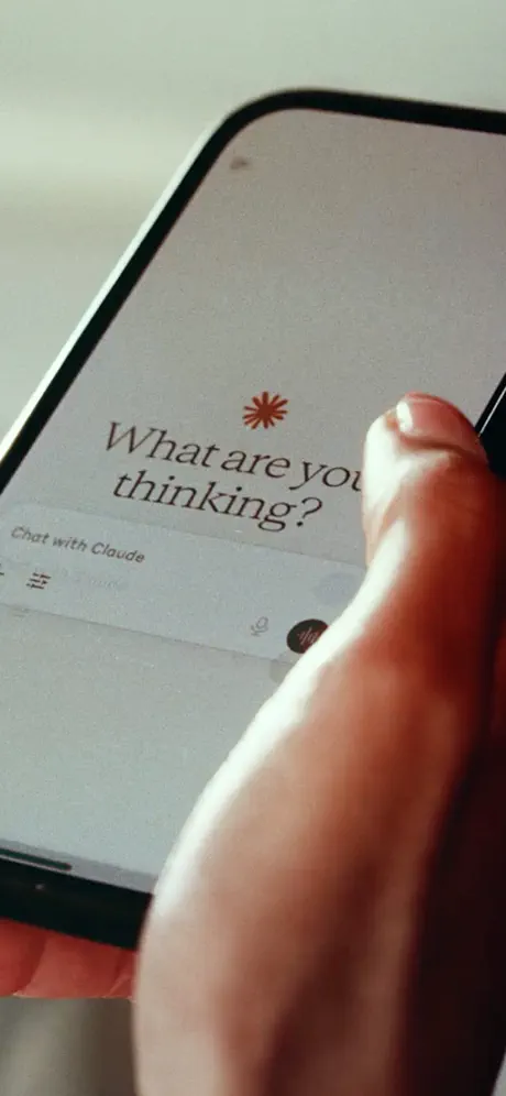
Framing
Editorial portrait opener followed by floating-device product frames
Captions
Transitional serif, sentence case, top-aligned
Backdrop
Matte terracotta (#D97A5F) across five consecutive frames; single near-black (#141414) frame at the end
Type
editorial serif for headlines; ui sans for chat text
UI / copy split
roughly 70 percent ui chrome and Chat bubbles to 30 percent headline and negative space
Frame 1 job
Establish brand mood before showing product

Sampled palette

#D97A5F#D97A5F
#FAF9F6#FAF9F6
#141414#141414
02The challenge

What this screenshot set had to solve

The Productivity category on the App Store is saturated with AI assistants that all promise to write, code, and summarize. For Claude, the conversion challenge is not explaining what a chatbot does; it is proving that Claude thinks differently from ChatGPT, Gemini, or Copilot. The screenshot set therefore has to work as both an emotional filter—signaling intellectual depth within a fraction of a second—and as a functional demo that justifies a download. The added difficulty is aspect ratio: vertical phone screenshots must communicate clearly as tiny thumbnails in search results, as full-bleed gallery frames, and as compressed carousel tiles. Any sequence that opens with brand storytelling rather than product UI risks losing scrollers before they ever see a feature.

The set makes a sophisticated wager: it assumes the viewer will sit through two full frames of mood-setting photography before seeing a single pixel of product UI.
03The approach

How the set argues its case

The designers chose an editorial, brand-first rhythm. Frame 1 and Frame 2 are purely atmospheric, using 35 mm-style portraiture and minimal typography to frame Claude as a thinking partner rather than a tool. Only at Frame 3 does the product appear, and when it does, it is wrapped in a consistent visual kit: a matte terracotta background, an off-white device chassis, and a repeating bottom input bar that acts as a metronome across the sequence. By giving each conversation a named protagonist—Nino, Austin, Maria, Chelsea, Paula—the screenshots become micro-scripts rather than feature lists. The palette is intentionally restrained so that color itself becomes a brand signature: five frames of warm coral, one frame of near-black at the tail to signal the developer use case. Typography reinforces the intellectual positioning; headlines are set in a refined transitional serif with generous letter spacing, while the in-app UI relies on clean, neutral sans-serif text.

Claude is positioned as the AI for people who want depth—writers, travelers, analysts, and coders—rather than quick answers. The screenshot set never shows a generic prompt; every example is a multi-step workflow with external artifacts (spreadsheets, PDFs, tickets, health data, code).

04Frame by frame

Every screenshot, and the job it does

Claude App Store screenshot 1 — The Gatefold Portrait
01

The Gatefold Portrait

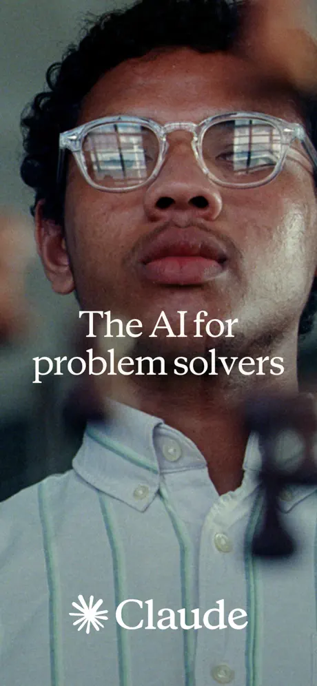
On-frame caption: “The AI for problem solvers

Frame 1 is a full-bleed portrait photograph with no device chrome, no app UI, and no feature callout. The image is cropped tightly at the upper forehead and mid-chest, showing a person in a pale blue-and-white striped oxford shirt with clear acetate eyeglasses. The lenses catch a reflection of what reads as horizontal window blinds, hinting at an indoor workspace. Soft, natural daylight gives warm, realistic skin texture. Centered in the lower third, white serif type reads 'The AI for problem solvers' across two lines. At the bottom edge sits the Claude wordmark: a six-pointed sparkle or asterisk icon followed by the word 'Claude' in a matching white sans-serif. The overall density is low; negative space is provided by the defocused background bokeh in muted greys and creams. This frame functions as a magazine cover: it establishes tone—thoughtful, human, unhurried—before explaining utility.
Claude App Store screenshot 2 — The Palate Cleanser
02

The Palate Cleanser

On-frame caption: “Keep thinking.

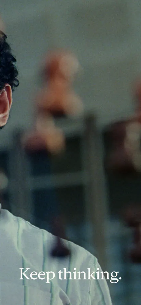
Frame 2 continues the photographic narrative but shifts the subject to the left margin. Only a sliver of an ear, a dark curl of hair, and the shoulder of the same striped shirt remain in frame. The rest is out-of-focus architecture and ambient office light in warm, hazy greys. Anchored at the bottom in the same white serif face, the two-word caption reads: 'Keep thinking.' There is no product, no UI, and no secondary text. As a standalone frame it is austere to the point of emptiness; as a transition it extends the cinematic language established in Frame 1. The blur quality suggests a shallow depth of field shot on a fast lens. Structurally, this frame breaks the App Store convention of front-loading utility, betting that brand intrigue will carry the swipe.

Claude App Store screenshot 3 — The Integration Promise
03

The Integration Promise

On-frame caption: “Connect the tools you already use

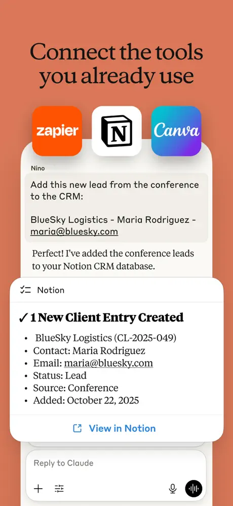
At Frame 3, the background switches abruptly to a flat matte terracotta in the #D97A5F range. A dark serif headline at the top reads 'Connect the tools you already use'. Below it floats the first product UI: a cream-colored phone chassis showing a chat with 'Nino'. Above the chat bubbles, three rounded app icons sit in a horizontal row: Zapier in orange, Notion in black and white, and Canva in blue-purple gradient. The conversation shows Nino pasting conference lead details, including an underlined email address, 'maria@bluesky.com'. Claude's response appears inside the chat in a white rounded rectangle, but the key artifact is the pinned card below: a Notion-branded module with a zig-zag icon, a bold checkmark, and '1 New Client Entry Created', followed by structured fields including 'BlueSky Logistics (CL-2025-049)', 'Status: Lead', and 'Added: October 22, 2025'. A blue hyperlink reads 'View in Notion'. The bottom of the device repeats the same input bar seen throughout the sequence, with the placeholder text 'Reply to Claude'.

Claude App Store screenshot 4 — Artifact Generation
04

Artifact Generation

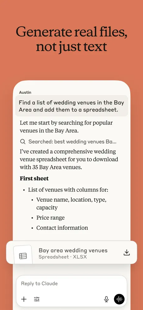
On-frame caption: “Generate real files, not just text

Frame 4 keeps the coral field and identical device framing. The headline is 'Generate real files, not just text'. Inside the chat, 'Austin' requests a spreadsheet of Bay Area wedding venues. Claude's reply includes a search step marked by a magnifying-glass icon and the text 'Searched: best wedding venues Ba...'. The response body explains that a spreadsheet with thirty-five venues has been created, then lists columns under a bold 'First sheet' header: venue name, location, type, capacity, price range, and contact information. At the bottom edge of the phone, a file card overlaps the input bar. It displays a small spreadsheet icon, the filename 'Bay area wedding venues', the format label 'Spreadsheet • XLSX', and a download arrow on the right. The card casts a soft shadow that lifts it above the chat plane, making it the focal point of the frame.

Claude App Store screenshot 5 — Document Context
05

Document Context

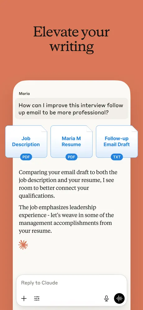
On-frame caption: “Elevate your writing

The fifth frame is set against the same terracotta backdrop, headline 'Elevate your writing' in the dark serif. The chat protagonist is 'Maria', who asks about improving an interview follow-up email. Above Claude's reply, three document chips appear as floating attachments: 'Job Description' and 'Maria M Resume' both tagged with blue 'PDF' pills, and 'Follow-up Email Draft' tagged with a blue 'TXT' pill. The chips use a light blue gradient fill with dark blue text, creating a frosted interface element that sits between user and assistant messages. Claude's response compares the draft against the resume and job description, suggesting the user 'weave in some of the management accomplishments'. A small coral-orange asterisk icon sits below the text block, aligned left. The input bar at the bottom is unchanged, preserving the visual rhythm established two frames earlier.

Claude App Store screenshot 6 — Visual Translation
06

Visual Translation

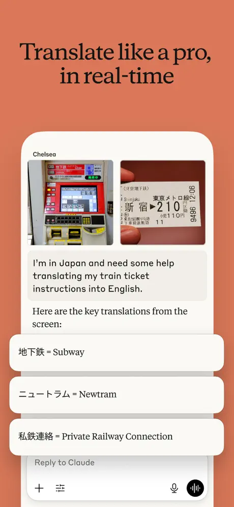
On-frame caption: “Translate like a pro, in real-time

Frame 6 carries the headline 'Translate like a pro, in real-time'. The chat is with 'Chelsea', who has uploaded two photographs: a red Japanese ticket machine interface on the left and a close-up of a physical train ticket on the right, showing characters including '新宿' and '210'. Chelsea asks for translation help. Claude's response introduces three white rounded rectangles stacked with slight vertical overlap, each containing a Japanese term, an equals sign, and its English equivalent: '地下鉄 = Subway', 'ニュートラム = Newtram', and '私鉄連絡 = Private Railway Connection'. These cards use a subtle drop shadow and sit on top of the chat background, functioning as discrete flashcards rather than plain text. The repeated input bar with microphone and waveform icons appears at the bottom, grounding the composition.

Claude App Store screenshot 7 — Data Visualization
07

Data Visualization

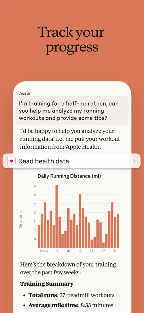
On-frame caption: “Track your progress

In Frame 7, the headline reads 'Track your progress'. The conversation is again with 'Austin', who requests running analysis. Claude offers to pull Apple Health data, presenting a pill-shaped button labeled 'Read health data' with a pink heart-in-square icon on the left and a right-facing chevron on the right. Below this permission affordance sits a bar chart titled 'Daily Running Distance (mi)'. The vertical axis is labeled 'Distance (mi)' and runs from 0 to 6; the horizontal axis shows dates from Dec 7 through Dec 31. Bars are rendered in a coral-orange hue that harmonizes with the outer background. Beneath the chart, bold introductory text leads into a 'Training Summary' with two bulleted lines: 'Total runs: 27 treadmill workouts' and 'Average mile time: 8:33 minutes'. The chart is dense, with twenty-five or more narrow bars compressed into the phone width, which sacrifices legibility at thumbnail scale.

Claude App Store screenshot 8 — The Dark Mode Punctuation
08

The Dark Mode Punctuation

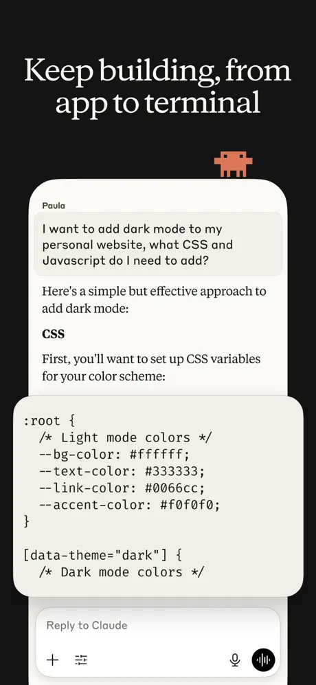
On-frame caption: “Keep building, from app to terminal

Frame 8 breaks the coral sequence with a near-black background around #141414. The headline 'Keep building, from app to terminal' reverses to an off-white serif. A small pixel-art character—blocky, coral-red, resembling a crab or creature—floats just above the right edge of the phone chassis, introducing a playful rupture in an otherwise formal system. Inside the device, 'Paula' asks about adding dark mode to a website. Claude responds with a code block formatted inside a light grey-beige card. The visible CSS shows a :root declaration with custom properties: '--bg-color: #ffffff;', '--text-color: #333333;', '--link-color: #0066cc;', and '--accent-color: #f0f0f0;', followed by a '[data-theme= dark ]' selector with a comment reading 'Dark mode colors'. The syntax uses muted color coding and a monospace face. The white phone frame reads as a spotlight against the dark canvas, making this the highest-contrast frame in the set.

05The craft

Captions, colour and the mechanics of the sell

Caption pattern

Each headline is a command or promise in sentence case, set in a dark serif against the coral field. The pattern is: verb + object + qualifier. Examples: 'Connect the tools you already use', 'Generate real files, not just text', 'Translate like a pro, in real-time'.

Visual system

The system is built around a single floating iPhone frame with a cream-colored body (#FAF9F6) and no visible notch or Dynamic Island, suggesting a focus on content rather than hardware. Inside the frame, the chat interface is always anchored by the same bottom bar: a plus icon, a list icon, a microphone icon, and a black circular waveform send button. This repetition creates rhythm but also flattens hierarchy.

The thumbnail test

At thumbnail scale, the coral blocks read as a single continuous color field, which helps the listing look unified in search results, but the first two photographic frames lose all typographic detail and may scan as lifestyle stock. The dark eighth frame is the only one that creates a strong value contrast in the grid view.

Conversion mechanics

The sequence follows a narrative arc: identity → integration → creation → refinement → perception → analysis → engineering. By naming each user, the set invites the shopper to project themselves into a specific role, which is more persuasive than generic 'Ask anything' messaging.

06Where it slips

What we would change

The Two-Frame Gamble

Opening with two full frames of non-product photography is an editorial luxury that the App Store may not reward. In search results, shoppers see Frame 1 at thumbnail size; if it reads as a lifestyle portrait rather than a utility demo, many will scroll past before reaching Frame 3. A specific fix: merge the brand promise into Frame 1 by overlaying a subtle, translucent device reflection or a UI snippet at the bottom edge, or simply cut Frame 2 and move the product reveal forward.

Coral Fatigue

Five consecutive frames on the same terracotta field create a monolithic block of color. While this enforces brand recognition, it flattens hierarchy and makes each frame fight the last for attention. The single dark frame at the end provides relief, but it arrives too late. A specific fix: alternate the background earlier—perhaps using the dark field for Frame 7 (data/health) to create a mid-sequence reset, or vary the coral tint slightly between frames to suggest progression.

Rigid Template Constraints

Every product frame centers the phone at the same scale, places the headline in the same top zone, and repeats the identical bottom input bar. This consistency is calming, but it also prevents any single feature from dominating. Frame 4's file download card and Frame 6's translation cards are important artifacts, yet they are trapped inside the same compositional box. A specific fix: let one artifact break the device frame—bleed the spreadsheet card or the code block beyond the phone bezel onto the background to create visual punctuation.

Thumbnail Legibility

Frame 7's bar chart contains dense data that becomes pixel mush at small sizes. The axis labels, date markers, and individual bars merge into an undifferentiated orange texture. A specific fix: reduce the date range to seven bars, increase bar width, and enlarge the key metric so it reads as a headline even at 20 percent scale.

07The recipe

How to apply this to your own app

  1. 1. Delay or confront

    Decide whether your brand is strong enough to justify a non-product opener. If not, lead with your most difficult-to-explain feature in Frame 1.

  2. 2. Lock a color signature

    Use a single background color across multiple frames to make your listing read as a unified panel in search, but introduce at least one tonal shift to reset the shopper's eye.

  3. 3. Name your users

    Assigning first names to example conversations turns abstract features into character-driven stories. This costs nothing and improves recall.

  4. 4. Repeat one chrome element

    Keep one UI element identical across every frame—like Claude's bottom input bar—to train the viewer on where to look, then break that pattern once for emphasis.

  5. 5. Design for the thumbnail, not the gallery

    Zoom out to 20 percent scale and check whether your key artifact or chart is still legible. If it becomes noise, simplify the data or enlarge the focal object.

08Takeaways

Five things worth stealing

  • Claude's screenshot set proves that App Store storytelling can borrow from editorial print design, but that borrowing comes at the cost of immediate comprehension.
  • The terracotta palette is the real branding hero here; it turns six disparate features into a single visual unit.
  • Breaking the template once—with the dark frame and pixel character—is the most memorable decision in the entire sequence.
  • For designers building their own sets, the lesson is to commit to a system, then strategically violate it.
  • The sequence shows that showing a workflow is more persuasive than showing a conversation, but only if the artifact is legible at every scale.
09The verdict

What the set actually achieves

Anthropic solves the positioning problem by treating the first two frames as a magazine gatefold: cinematic photography, no interface, and a promise rather than a spec list. The subsequent six frames lock into a strict visual system—coral field, floating cream handset, dark serif headline, named persona, and artifact—that turns each swipe into a discrete use-case story. The result is a cohesive, heavily branded sequence that prioritizes identity over immediate comprehension.

Product designers and brand strategists who are building screenshot sequences for complex, multi-modal AI tools and need to balance emotional storytelling with hard feature proof.teams at generative-ai-or-highest-stakes. Early-stage apps should not copy the two-frame brand opener unless their organic recognition is already high.

10Questions

Frequently asked

Why are there two frames with no product UI?

Anthropic is treating the App Store gallery like a magazine gatefold, prioritizing brand mood over instant utility. This signals confidence and positions Claude as a thinking partner rather than a commodity tool.

What font is used for the headlines?

The headlines appear to be set in a transitional serif—possibly a custom cut or something like Tiempos Text or GT Super—with generous spacing and a sharp, intellectual character. It is not the system serif.

Why is the background coral across so many frames?

The flat terracotta field unifies the sequence visually, making the listing read as a cohesive brand panel in search results. It also differentiates Claude from the default white or dark-mode UI screenshots common in the category.

Does the small pixel character in Frame 8 appear anywhere else?

No. The pixel-art creature appears only in Frame 8, acting as a single moment of playful punctuation that breaks the otherwise serious, editorial tone.

What could be improved in the chart frame?

Frame 7 crams too many bars into the phone width. At thumbnail scale the data becomes unreadable orange noise. Reducing the date range and increasing bar width would preserve impact at all sizes.

11Keep reading

Build your own screenshot set

The full set

9 shots
Claude App Store screenshot 1Claude App Store screenshot 2Claude App Store screenshot 3Claude App Store screenshot 4Claude App Store screenshot 5Claude App Store screenshot 6Claude App Store screenshot 7Claude App Store screenshot 8Claude App Store screenshot 9

About the app

Meet Claude, your AI problem solver and thinking partner. Claude works with you to write, research, code, and tackle complex problems with depth and precision. It enhances your Anthropic PBC, via the App Store listing.

Screenshots and store metadata belong to Anthropic PBC. They are shown here for design commentary and criticism. The analysis on this page is original work by floow.design. View the original listing.

More Productivity teardowns

Browse all →