Stuff app icon
ProductivityScreenshot teardown16 min read

Stuff App Store screenshots

Instead of treating screenshots as isolated feature slides, the set for Stuff builds a single visual sentence: the same iPhone chassis, the same blue highlight, and the same fictional world of birthday parties and Gotham crime fighting carry the shopper from frame one to frame eight. The discipline is admirable, and the flaws are instructive.

Set published by 2196, LLC · 10 frames analysed

4.5 · 61 ratingsFreev2.2.13Updated 4mo ago
Stuff App Store screenshot 1
01At a glance

The set in one screen

Framing
iPhone 15 Pro with Dynamic Island, graphite bezel, 9:41 status bar, consistent across all eight frames.
Captions
Bold, large sans-serif headline with one keyword rendered in white italic against a saturated blue highlight (~#007AFF). On blue backgrounds the highlight bleeds into the canvas and the keyword survives as white italic alone.
Backdrop
Alternating white and full-bleed blue diagonal waves; the blue accent peeks from the left or right margin on white frames and floods the canvas on blue frames.
Type
The typographic signature is the star of the set. The designer extracts a single keyword from every headline—"stuff," "Organize," "dependencies," "teammates," "Adventure Log," "Today," "anywhere," "Deadlines"—and renders it in white italic against a bright blue highlight (~#007AFF). On frames 2, 5, and 7, where the background is a full-bleed blue gradient, the highlight shape is invisible, so the keyword survives purely through italic contrast. The result is a motif that is legible at swipe-speed and instantly recognizable as belonging to the same product. The main headline sits in a heavy sans-serif, roughly equivalent to SF Pro Display Black at 48–56pt, with about 24–32pt of clearance above the device forehead. The consistency of that top-margin lockup means the shopper’s eye always knows where to land.
UI / copy split
The copy-to-UI ratio is aggressively balanced. Each frame dedicates roughly the top 25% of the canvas to the headline and the remaining 75% to the device. The UI inside the phone is never cropped to a single component; instead, the designer shows full screens so that navigation patterns—back chevrons, modal sheets, list groupings—remain readable. That choice sacrifices extreme close-ups but earns trust: the shopper sees real interface density rather than abstracted illustrations.
Frame 1 job
Frame 1 has to do more heavy lifting than any other. It introduces the app name, the hero color, the information architecture, and the playful dummy-data universe that will persist for eight frames.

Sampled palette

(primary blue)#007AFF
(dependency orange)#FF9F0A
(tag green)#34C759
(priority yellow)#FFD60A
(urgency red)#FF3B30
(cell gray)#F2F2F7
02The challenge

What this screenshot set had to solve

The app shown in these screenshots is not a simple list-maker. Inside the eight frames the viewer is asked to understand nested lists, dependencies, teammate collaboration, a daily focus view, a historical log, and deadline-based grouping. The design challenge, therefore, is not merely to show features but to show relationships: how does a dependency differ from a deadline? How does a teammate fit into a list? How does the home screen relate to the Today view? If the frames are too abstract, the shopper dismisses the app as generic; if they are too dense, the shopper drowns in UI chrome. The designer needs a container that is rigid enough to feel branded and loose enough to accommodate eight distinct functional contexts without breaking the swipe rhythm of the App Store carousel.

The dummy data does more work than the captions: a single narrative universe—Esther’s birthday, Batman’s supply runs, antidotes from Fox—turns abstract productivity features into a story the viewer can follow.
03The approach

How the set argues its case

The strategy relies on what could be called narrative tethering. Rather than random placeholders, the screenshots reuse the same tasks and lists across frames. Frame 1 shows an Esther Birthday Party list and a Batman space. Frame 2 opens that birthday list. Frame 3 references the antidote task inside a dependency chain. Frame 6 shows those same birthday and Batman tasks inside the Today view. Frame 7 surfaces them again in a modal. Frame 8 sorts them by deadline. The shopper does not need to read a feature list; they recognize the continuity and infer that the app connects work across contexts. It is a sophisticated storytelling device disguised as UI documentation.

Positioning is aimed at the productivity-curious user who has outgrown Apple Reminders but is intimidated by enterprise tools. The copy is imperative and short—never more than five words per headline—and the UI emphasizes color-coded tags, emoji icons, and friendly counts rather than Gantt charts or velocity metrics. The design language says: structured, but not corporate.

04Frame by frame

Every screenshot, and the job it does

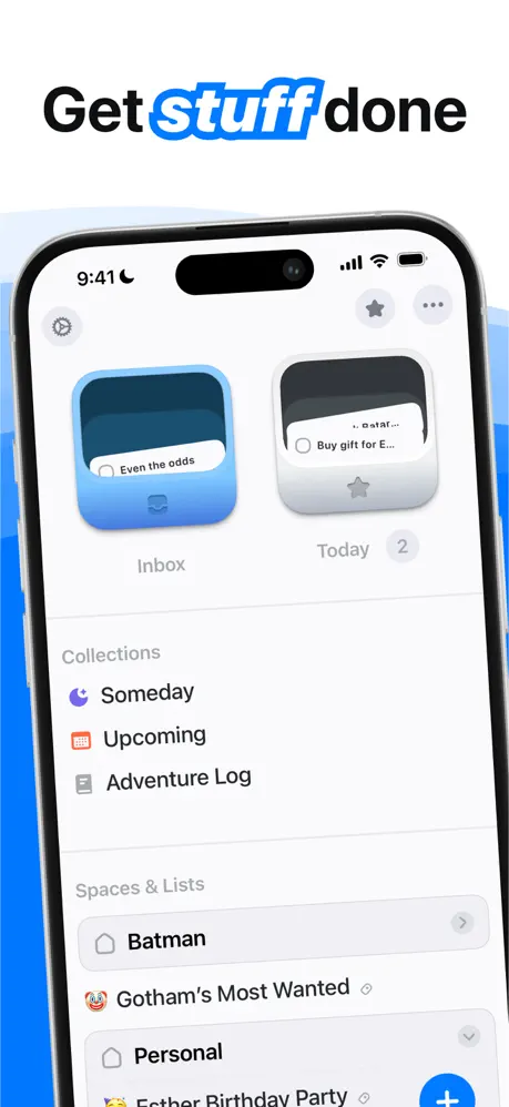
Stuff App Store screenshot 1 — 'Get stuff done'
01

'Get stuff done'

On-frame caption: “Get stuff done

The first frame places the product name inside the headline by rendering 'stuff' in white italic against a bright blue highlight (~#007AFF). The background is white with abstract blue waves bleeding in from the left edge and lower right corner. Centered on the canvas is an iPhone 15 Pro showing the app's root view. At the top of the screen are two hero cards: 'Inbox' sits on a blue gradient (~#5AC8FA to ~#007AFF) and 'Today' sits on a light gray surface (~#F2F2F7) with a small '2' badge. Below, a 'Collections' section in secondary gray text (~#8E8E93) lists Someday, Upcoming, and Adventure Log. Further down, a 'Spaces & Lists' section surfaces Batman, Gotham's Most Wanted (preceded by a clown emoji), Personal, and Father Birthday Party. The tab bar is cropped away, forcing all hierarchy into the upper two-thirds of the screen. The dummy data is already planting narrative seeds: the Esther party and the Batman project will recur for seven more frames. Scale and placement feel intentional—the phone occupies roughly 80% of the canvas width, large enough to make the list text legible without dominating the headline above. The blue wave behind the left bezel creates shallow depth, suggesting the phone is floating slightly forward of the background plane.
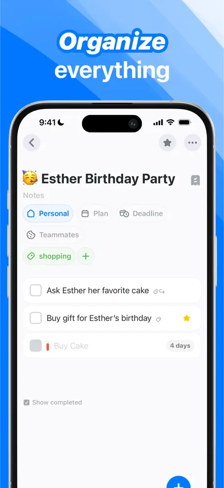
Stuff App Store screenshot 2 — 'Organize everything'
02

'Organize everything'

On-frame caption: “Organize everything

The caption stacks 'Organize' in the blue-highlighted italic style above 'everything' in plain white, both set against a full-bleed diagonal blue gradient (~#007AFF to ~#5AC8FA). The shift from white canvas to blue background signals that the user has swiped into a deeper beat. Inside the phone, the screen shows the 'Esther Birthday Party' list. A party-face emoji 🥳 anchors the header. Below, metadata runs horizontally: a blue 'Personal' chip (~#007AFF with white text), a gray 'Plan' chip, and a gray 'Deadline' chip. A 'Teammates' row sits beneath. A green 'shopping' tag (~#34C759) with a plus button introduces the first non-blue color in the UI. The task list demonstrates three states at once: an active item ('Ask Esther her favorite cake'), a starred priority item ('Buy gift for Esther's birthday' with a yellow star ~#FFD60A), and a dimmed future item ('Buy Cake' with a red vertical bar ~#FF3B30 and a '4 days' label in gray). The bottom-right corner shows a blue circular plus button. Compositionally, this frame is denser than the first, proving that the UI can carry taxonomy without looking like a spreadsheet.

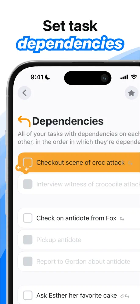
Stuff App Store screenshot 3 — 'Set task dependencies'
03

'Set task dependencies'

On-frame caption: “Set task dependencies

The headline returns to the white-canvas treatment, with 'dependencies' highlighted in blue italic and a blue wave lapping in from the left edge. The phone is framed slightly tighter here, with the right bezel closer to the canvas edge than in Frame 1. The screen reveals a view titled 'Dependencies' with a subtitle that reads, 'All of your tasks with dependencies on each other, in the order in which they're depende...' The most salient element is an orange row (~#FF9F0A) containing 'Checkout scene of croc attack' with a dependency-chain icon. Beneath it, a grayed row begins 'Interview witness of crocodile attac...' followed by fully legible rows: 'Check on antidote from Fox,' 'Pickup antidote,' 'Report to Gordon about antidote,' and 'Ask Esther her favorite cake.' The back chevron and star icon in the navigation bar are light gray (~#8E8E93). The orange row sits at roughly the vertical center of the device, making it the natural fixation point. The warm color is a jolt against the cool blue system, which is exactly what a novel feature needs. That said, the frame only shows the result of dependencies, not the act of setting them; no button, gesture, or link line is visible to explain how the relationship is created.

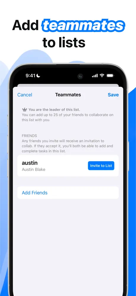
Stuff App Store screenshot 4 — 'Add teammates to lists'
04

'Add teammates to lists'

On-frame caption: “Add teammates to lists

The headline splits across three lines—'Add teammates to lists'—with 'teammates' receiving the blue italic highlight. The background is white with the blue wave now entering from the right margin, a mirror of Frame 1's left-side wave that balances the set horizontally. The phone presents a native modal sheet titled 'Teammates' with a blue 'Cancel' button at the upper left and a blue 'Save' button at the upper right, both in ~#007AFF. Below the title, a crown icon introduces the copy: 'You are the leader of this list. You can add up to 25 of your friends to collaborate on this list with you.' A 'FRIENDS' section explains that invited friends will receive an invitation to collab. A single row lists 'austin' and 'Austin Blake' with a blue pill button reading 'Invite to List.' At the bottom, 'Add Friends' appears as blue text. This frame is the most utilitarian of the eight. The standard iOS table view leaves large gray fields (~#F2F2F7) between elements, and because there is only one friend visible, the screen feels underpopulated. The blue wave on the right compensates somewhat, but compared to the tag-rich Frame 2, the visual energy drops measurably here.

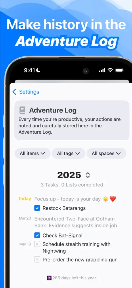
Stuff App Store screenshot 5 — 'Make history in the Adventure Log'
05

'Make history in the Adventure Log'

On-frame caption: “Make history in the Adventure Log

The frame switches back to a full-bleed blue gradient background with cloud-like shapes at the top. The headline is white, and the words 'Adventure Log' are rendered in italic. Unlike the white-background frames, there is no separate blue rectangle behind the italic text; the highlight color merges with the background, so the words rely entirely on slanted weight for emphasis. Inside the phone, a navigation row shows '< Settings' in blue. A gray card contains a list icon and explanatory text: 'Every time you're productive, your actions are noted and carefully stored here in the Adventure Log.' Three filter pills sit below: 'All items,' 'All tags,' 'All spaces,' each in a light gray (~#E5E5EA) rounded rectangle with a downward chevron. A bold year header '2025' is centered, with the subtitle '3 Tasks, 0 Lists completed' in secondary gray. The timeline begins with a yellow 'Today' label, followed by the motivational line 'Focus up - today is your day ☀️❤️' and a checked blue box next to 'Restock Batarangs.' Older entries for March 20 and March 19 follow, mixing checked and unchecked states. At the bottom, a small badge reads '🎆 285 days left this year!' The framing is informative, but the '0 Lists completed' statistic inadvertently suggests an empty or underused product. Dummy data in a screenshot should project momentum, not starting-from-zero energy.

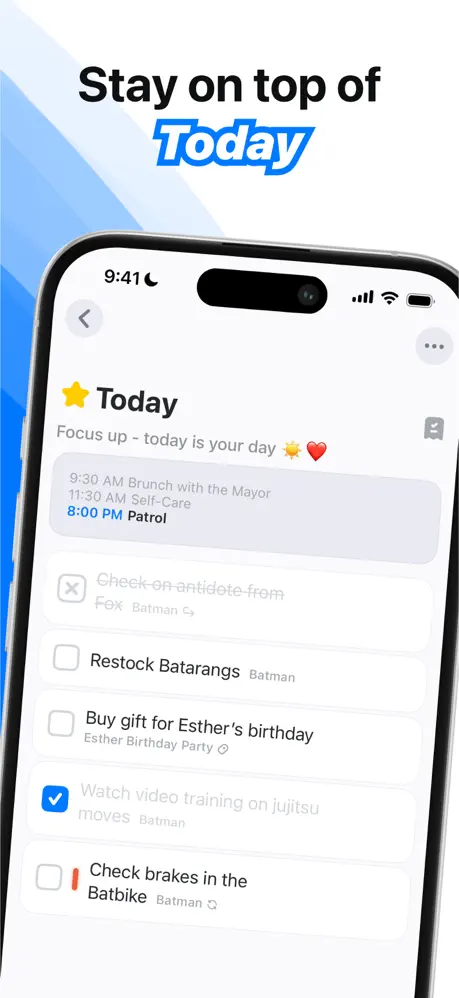
Stuff App Store screenshot 6 — 'Stay on top of Today'
06

'Stay on top of Today'

On-frame caption: “Stay on top of Today

Returning to the white canvas with a left-side blue wave, the headline places 'Today' in the familiar blue-highlighted italic. The phone displays the Today view. A yellow star icon precedes the 'Today' header, and the subhead repeats the motivational phrase 'Focus up - today is your day ☀️❤️.' At the top of the list is a time-blocked band in light gray (~#F2F2F7) listing '9:30 AM Brunch with the Mayor,' '11:30 AM Self-Care,' and '8:00 PM Patrol,' with the evening item in blue text. Below the band, standard task cells appear. One item, 'Check on antidote from Fox Batman,' is struck through and heavily dimmed, indicating completion. Active items include 'Restock Batarangs Batman,' 'Buy gift for Esther's birthday Esther Birthday Party,' and 'Check brakes in the Batbike Batman.' A blue checked circle marks 'Watch video training on jujitsu moves Batman.' The mix of crossed-out, checked, and open states is realistic, but the strikethrough text introduces visual noise that fights for attention against open tasks. Red priority bars (~#FF3B30) appear on the left side of some cells, providing another layer of semantic color. The frame proves the app can blend calendar events and actionable tasks in a single feed, though the crossed-out items could be suppressed in a marketing context to keep the feed looking forward rather than backward.

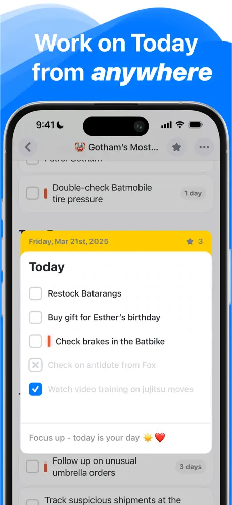
Stuff App Store screenshot 7 — 'Work on Today from anywhere'
07

'Work on Today from anywhere'

On-frame caption: “Work on Today from anywhere

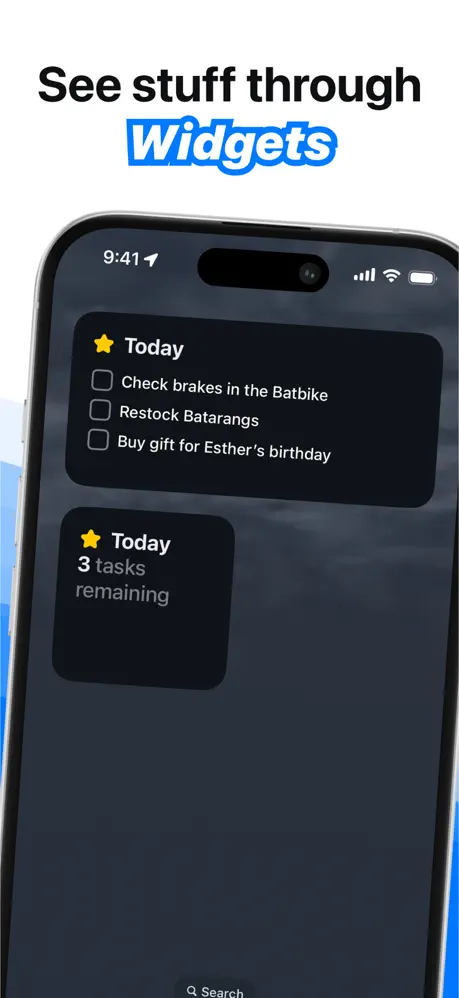
The frame erupts into full blue again. The headline is white, with 'anywhere' in italic receiving the highlight treatment. The phone shows an interesting layered composition: a dimmed list in the background and a bright modal card in the foreground. The background list header shows a clown emoji and 'Gotham's Most...' with a star and ellipsis. The foreground modal is crowned by a yellow banner (~#FFD60A) reading 'Friday, Mar 21st, 2025' with a star and the number '3.' Inside the modal, the title 'Today' is followed by the recurring task set: 'Restock Batarangs,' 'Buy gift for Esther's birthday,' 'Check brakes in the Batbike,' a crossed-out 'Check on antidote from Fox,' and a blue-checked 'Watch video training on jujitsu moves.' A footer inside the modal repeats 'Focus up - today is your day ☀️❤️.' Behind the sheet, partially visible tasks include 'Double-check Batmobile tire pressure' and 'Follow up on unusual umbrella orders.' The modal demonstrates an overlay pattern, but the caption 'Work on Today from anywhere' promises mobility and cross-context access that the image does not substantiate. There is no secondary device, no Apple Watch face, no Lock Screen widget, and no location indicator. The visual shows an in-app modal, not 'anywhere.' The yellow banner is the single most saturated element in the entire eight-frame set, so the eye is drawn to the date, yet the conceptual disconnect between copy and photography undercuts the message.

Stuff App Store screenshot 8 — 'Organize stuff by Deadlines'
08

'Organize stuff by Deadlines'

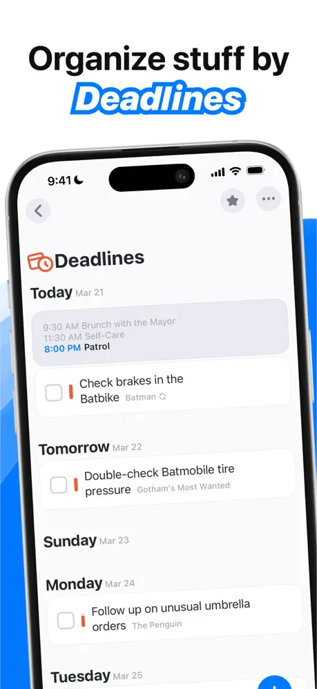
On-frame caption: “Organize stuff by Deadlines

The final frame returns to the white canvas with the blue wave now bleeding in from the right, bookending Frame 4's composition. The headline highlights 'Deadlines' in blue italic. Inside the phone, an orange calendar icon (~#FF9F0A) with a small clock glyph sits beside the word 'Deadlines.' The content is grouped chronologically: 'Today Mar 21' carries the time-blocked schedule from Frame 6 (9:30 AM Brunch, 11:30 AM Self-Care, 8:00 PM Patrol) plus a task cell for 'Check brakes in the Batbike' tagged with 'Batman' and a red priority bar. 'Tomorrow Mar 22' holds 'Double-check Batmobile tire pressure' tied to 'Gotham's Most Wanted.' 'Sunday Mar 23' is empty but present, followed by 'Monday Mar 24' with 'Follow up on unusual umbrella orders' tied to 'The Penguin,' and 'Tuesday Mar 25' peeking in at the bottom. The date headers use bold black (~#1C1C1E) for the day name and lighter gray (~#8E8E93) for the calendar date, creating clear typographic hierarchy without extra rules or lines. The list feels like a calendar without being a calendar grid, which neatly differentiates the app from traditional planner UIs. As the closing shot, it reinforces the message that tasks can be navigated through time, not just through projects.

Stuff App Store screenshot 9 — Critique
09

Critique

On-frame caption: “What works, what cracks, and what a designer should steal or avoid.

The greatest strength of this set is its typographic hook. By extracting one keyword per frame and rendering it in white italic against a blue highlight (~#007AFF), the designer created a signature that survives the App Store's tiny thumbnail view. The consistency of the iPhone 15 Pro framing—same bezel, same scale, same 9:41 status bar—grounds the sequence in physical reality. The narrative tethering of dummy data is genuinely clever; following Esther's birthday cake and Batman's batarangs across eight frames turns functional screenshots into a comic strip that requires zero reading comprehension. The A/B rhythm of white and blue backgrounds prevents monotony better than a single static template would. That said, there are specific fractures. Frame 7's caption 'Work on Today from anywhere' overpromises. The image shows an in-app modal sheet, not a cross-device or out-of-app experience. A shopper swiping at speed will expect to see an Apple Watch, a Lock Screen widget, or at least a multitasking view. The fix is simple: change the caption to match the visual evidence, or swap the asset for one that includes a second device or widget context. Frame 3 suffers from a show-don't-tell gap. The headline says 'Set task dependencies,' yet the UI displays a read-only list. There is no visible affordance for creating a link—no 'Add dependency' button, no drag handle, no graph line being drawn. The fix is to stage the action: capture the moment a user is linking two tasks, or highlight a contextual menu with the dependency command. Frame 4 is visually underweight. A single friend row floating in a sea of gray table cells feels like dead air after the dense tagging of Frame 2. Cropping tighter or populating the list with multiple pending invites would restore compositional balance. Frame 5's '0 Lists completed' is a self-inflicted wound; dummy data should flatter the product, not suggest inactivity. Bump the stat to double-digit tasks and a few completed lists to project habit and momentum. Finally, the blue wave shape is identical on nearly every frame. By Frame 8, the motif is predictable. Varying the wave angle, opacity, or scale—even slightly—would sustain visual interest across the full scroll. Verdict: this is a disciplined, coherent set with a strong identity and a smart narrative strategy. Tighten the caption-to-image fidelity in Frames 3 and 7, populate the sparse teammate screen, and retire the static wave, and the set would move from competent to reference-grade.

05The craft

Captions, colour and the mechanics of the sell

Caption pattern

The headline pattern is strictly imperative verb + keyword: 'Get stuff done,' 'Organize everything,' 'Set task dependencies,' 'Add teammates to lists,' 'Make history in the Adventure Log,' 'Stay on top of Today,' 'Work on Today from anywhere,' 'Organize stuff by Deadlines.' The highlighted keyword is always the noun—except in 'Organize,' where the verb itself is highlighted. That single exception breaks an otherwise perfect rule; it is a minor crack in the system, but it is noticeable when swiping quickly.

Visual system

The visual system is built on a triad: black or white type, one blue accent, and one warm accent (orange or yellow) used only for states. The restraint is effective. Orange appears exclusively for dependencies and deadlines, so the viewer learns to associate warmth with urgency or linkage. Green appears only for tags. Red appears only for task priority bars. The color logic is semantic, which reduces cognitive load even as the information density increases.

The thumbnail test

At thumbnail size, the blue highlight keyword jumps out against both white and blue backgrounds. The iPhone bezel provides a dark horizontal band that anchors the composition. However, frames 4 and 8, which sit on white with a right-side wave, can appear visually quieter than the full-bleed blue frames, potentially causing scroll-stutter at the carousel level.

Conversion mechanics

This set does not try to convert through decoration; it converts through repetition. By the time the shopper reaches Frame 8, they have seen the same blue highlight, the same phone, and the same Esther-and-Batman universe four times. That repetition is the funnel. For designers building their own sets, the lesson is to pick one typographic stunt, one hardware frame, and one fictional data story, then run them like a drum beat across every slide. Just make sure the story you tell with your captions is the same story visible inside your screenshots.

06Where it slips

What we would change

Caption-Visual Mismatch in Frame 7

The headline 'Work on Today from anywhere' promises cross-device flexibility, but the screenshot only shows an in-app modal over a dimmed list. The shopper sees no Watch, no widget, no external context. Fix: Replace the asset with a Lock Screen widget or Apple Watch companion, or rewrite the caption to 'Focus on Today's priority' to match the modal treatment.

Passive Feature Demonstration in Frame 3

'Set task dependencies' implies an action, yet the frame only shows a finished dependency list. There is no visible affordance for creating the relationship. Fix: Stage the creation flow—show two tasks being linked, or a context menu with an 'Add Dependency' row in focus.

Visual Underpopulation in Frame 4

The Teammates screen is a sparse native table with one friend and large empty gray fields. Compared to Frame 2's rich taxonomy, it feels unfinished. Fix: Either populate the list with multiple pending teammates or crop the device tighter so the 'Invite to List' button dominates the canvas.

Unflattering Dummy Data in Frame 5

The Adventure Log displays '3 Tasks, 0 Lists completed.' A zero-completed stat inadvertently suggests the app is unused. Fix: Inflate the dummy data to '14 Tasks, 3 Lists completed' to convey momentum without changing the layout.

Static Background Motif

The blue wave shape repeats identically across Frames 1, 2, 3, 4, 6, 7, and 8. By the final frames the motif is fatiguing. Fix: Introduce subtle rotation or scale variation in the wave geometry, or alternate between soft clouds and sharp diagonal bands.

07The recipe

How to apply this to your own app

  1. Pick one typographic stunt and repeat it. If you extract a keyword, extract one in every frame without exception.

    Stuff's blue italic highlight is its mnemonic device. Choose one accent color and one font treatment, then implement it as a hard rule across every screenshot. Consistency builds brand recognition faster than variety.

  2. Choose one data story and thread it through all frames.

    Using Esther, Batman, and the same recurring tasks lets the viewer spend cognitive energy understanding features rather than parsing new names in every slide. Invent a single project with three tasks and reuse them.

  3. Alternate background intensity between slides.

    The A/B pulse of white/blue/white/blue gives the carousel rhythm. If your brand color is green, stage half your frames on white with green accents and half on full green with white type.

  4. Never let your caption promise something the UI does not visibly deliver.

    Frame 7 teaches the most expensive lesson. Shoppers trust screenshots more than copy; if the text says 'anywhere' and the image says 'modal,' the shopper detects vaporware. Stage the literal action your caption describes.

08Takeaways

Five things worth stealing

  • A single typographic hook (blue italic highlight) can unify eight different features into one recognizable brand moment.
  • Recurring dummy data turns feature screenshots into a continuous narrative, reducing the cognitive load required to understand interconnected tools.
  • Alternating background intensity (white vs. full-bleed blue) creates swipe rhythm without changing layout templates.
  • The most common failure mode is caption overreach: promising cross-device, creation, or social features that the staged UI does not explicitly show.
  • Screenshots should project success; zero-completed counters and underpopulated lists inadvertently argue against adoption.
09The verdict

What the set actually achieves

The designer solves the cohesion problem by standardizing three variables: hardware, headline grammar, and background cadence. Every frame uses the same iPhone 15 Pro at the same scale. Every headline uses the same two-line stack with one blue-highlighted keyword. And the backgrounds alternate between blue-bleed and white-canvas in a steady pulse. That predictability lets the user absorb new features without re-orienting to a new layout language. The result is a set that reads as one continuous scroll rather than eight disjointed advertisements.

Product designers building screenshot sets for feature-rich productivity or utility apps who need to communicate depth without visual chaos, and who want to see how a strict modular system can survive across eight distinct contexts.

10Questions

Frequently asked

Why does the designer crop the tab bar out of Frame 1?

Removing the tab bar pushes the information hierarchy upward, letting the Collections and Spaces sections occupy the visual center. It also prevents the first frame from looking like a generic iOS template.

What is the blue color used in the highlight and UI accents?

Approximately #007AFF, matching Apple's system blue, which makes the interface feel native while still being ownable through the italic-highlight treatment.

Why is Frame 7 the weakest frame?

Because the caption promises cross-device flexibility ('from anywhere') but the image only shows an in-app modal. The disconnect breaks the trust established by the otherwise literal framing of the other seven slides.

How does the set avoid looking like eight different apps?

Through iron discipline: identical device framing, identical headline grammar, identical dummy-data characters, and a strict two-color backdrop system that alternates rather than randomizes.

What should I copy for my own productivity app?

Copy the narrative tethering: create one fictional project (like Esther's birthday) and reuse its tasks across every screenshot so the viewer follows a story. Copy the typographic highlight as a signature. Avoid copying the static wave background or the underpopulated teammate screen.

11Keep reading

Build your own screenshot set

Guides

The full set

10 shots
Stuff App Store screenshot 1Stuff App Store screenshot 2Stuff App Store screenshot 3Stuff App Store screenshot 4Stuff App Store screenshot 5Stuff App Store screenshot 6Stuff App Store screenshot 7Stuff App Store screenshot 8Stuff App Store screenshot 9Stuff App Store screenshot 10

About the app

Stuff is built to help you organize your life and achieve your goals. Your Stuff can be as simple as a list of to-dos, or as complex as a system of interconnected lists, organized 2196, LLC, via the App Store listing.

Screenshots and store metadata belong to 2196, LLC. They are shown here for design commentary and criticism. The analysis on this page is original work by floow.design. View the original listing.

More Productivity teardowns

Browse all →