Pocket app icon
ProductivityScreenshot teardown8 min read

Pocket App Store screenshots

This eight-frame set for an AI productivity assistant attempts to merge physical hardware presence with conventional iOS interface storytelling, and the tension between those two languages is where both its best ideas and its structural risks live.

Set published by Open Vision Engineering, Inc · 10 frames analysed

4.8 · 958 ratingsFreev0.6.5Updated 4mo ago
Pocket App Store screenshot 1
01At a glance

The set in one screen

Framing
iPhone 15 Pro with Dynamic Island centered on a warm gray field; opening frame breaks convention by showing the device back and camera island.
Captions
Heavy, tightly tracked sans serif—likely SF Pro Display Black—positioned in the upper third on most frames.
Backdrop
Uniform warm gray near #F2F2F0 across all eight frames.
Type
High-contrast white cards inside the device; consistent SF Pro system typography for list items and transcripts.
UI / copy split
Medium density—headlines outside the device are dominant, while UI copy inside uses realistic sample data rather than lorem ipsum.
Frame 1 job
Establish hardware credibility and ambient-capture promise, but at the cost of showing recognizable software UI.

Sampled palette

#F2F2F0#F2F2F0
#0B0B0B#0B0B0B
#007AFF#007AFF
#FF3B30#FF3B30
#60A5FA#60A5FA
#FBBF24#FBBF24
02The challenge

What this screenshot set had to solve

Selling ambient capture and structured productivity inside a single App Store sequence means resolving a fundamental narrative tension. The viewer must understand both the physical act of recording and the software output that makes that recording useful, all within a swipe-heavy browsing context where each frame gets less than four seconds of attention. The set opens with a hand holding what appears to be a titanium-finish smartphone, rotated to display its triple-camera island and a thin sliver of glowing blue screen—yet the remaining seven frames are entirely software interface. That pivot places a heavy explanatory burden on the transition: the shopper must intuit that audio captured in the opening shot automatically becomes the notes, tasks, and mind maps shown later. The designer works within a deliberately constrained macro palette: a warm gray field near #F2F2F0, near-black typography for all headlines, and almost no chromatic accents outside the opening gradient and the occasional blue link. Staying neutral keeps the phone readable, but it also removes the safety net of color-coded wayfinding, forcing every frame to rely on layout, scale, and caption hierarchy to hold interest across the full arc.

The set reads as two disconnected episodes: a physical hardware reveal followed by a conventional productivity app. Tying them together with a single recurring object is the most urgent structural repair.
03The approach

How the set argues its case

The strategy relies on consistency of scale, placement, and tonal restraint. Every front-facing iPhone 15 Pro frame is centered with matching bezel cropping, preserving the Dynamic Island and status bar so the UI reads as live software rather than a sanitized mock. Headlines sit in the upper third using a heavy, tightly tracked sans serif—likely SF Pro Display at or near Black weight—establishing a steady vertical rhythm a thumb can follow without hesitation. Color is rationed aggressively: the first frame spends the only gradient, shifting from violet to rose on the words ‘AI Personal Assistant,’ while the rest of the set draws from a shared pool of near-black text, white cards, and a single blue accent near #007AFF for interactive elements like template links. The sequence itself follows a chronological logic rather than a feature grid: spoken input is transformed into notes, notes into tasks, tasks into a conversational query layer, and raw audio into transcripts, templates, and finally a visual mind map. This progression gives the set a narrative beginning, middle, and end, turning eight isolated screenshots into a single argument for the workflow.

The set positions the app as an end-to-end thought-capture system rather than a single-purpose tool, targeting shoppers who recognize productivity pain points across meetings, tasks, and planning but do not yet see them as a unified workflow.

04Frame by frame

Every screenshot, and the job it does

Pocket App Store screenshot 1 — The opening shot—‘AI Personal Assistant’
01

The opening shot—‘AI Personal Assistant’

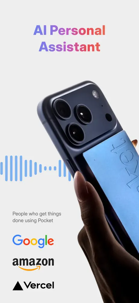
On-frame caption: “A hand with dark skin tone holds a deep-space titanium phone rotated roughly thirty degrees away from the viewer, revealing the triple-camera island and a thin sliver of glowing blue screen with the word ‘Pocket’ debossed in large type. Above, the headline ‘AI Personal Assistant’ is set in a gradient that moves from violet to rose, the only full-spectrum color moment in the entire set. Below the device, the caption ‘People who get things done using Pocket’ is rendered in small, muted dark-gray text, followed by three stacked logotypes—Google, Amazon, Vercel—flush left. A light-blue audio waveform near #60A5FA stretches horizontally across the left midground. By presenting the back of the phone rather than its interface, the frame privileges physical presence over software clarity. The trade-off is intentional but risky: a shopper may not immediately recognize what the app actually does.

The gradient text and corporate logos sit in separate visual registers; nothing ties the violet-rose headline to the blue waveform or the black brand marks beneath it.
Pocket App Store screenshot 2 — From Conversation To Clear Notes
02

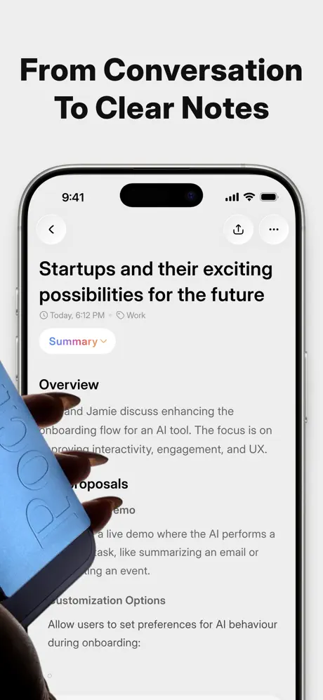
From Conversation To Clear Notes

On-frame caption: “Here the view snaps to a conventional front-face iPhone 15 Pro frame. The headline reads ‘From Conversation To Clear Notes.’ Inside the device, a note titled ‘Startups and their exciting possibilities for the future’ sits beneath a navigation bar showing 9:41, signal indicators, and the Dynamic Island. Metadata below the title reads ‘Today, 6:12 PM’ paired with a ‘Work’ tag. An orange-captioned ‘Summary’ dropdown pill sits below that, followed by section headers ‘Overview,’ ‘Proposals,’ and ‘Customization Options.’ A hand holding the same blue branded card from the first frame intrudes from the left edge, partially masking the note body and creating a diagonal bridge between hardware and software. The crop keeps the top architecture visible but truncates the note content mid-sentence, trading completeness for immediacy.

The back-arrow, share, and overflow icons are housed in light-gray circular buttons—a pattern that repeats across every subsequent frame, establishing a recognizable chrome language.

Pocket App Store screenshot 3 — Every Next Step, Captured
03

Every Next Step, Captured

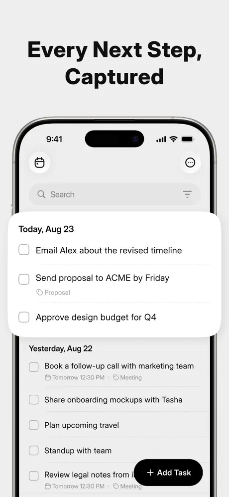
On-frame caption: “The headline ‘Every Next Step, Captured’ heads a task-list view. A floating white card labeled ‘Today, Aug 23’ contains three items: ‘Email Alex about the revised timeline,’ ‘Send proposal to ACME by Friday’ with a gray ‘Proposal’ sub-label, and ‘Approve design budget for Q4.’ Behind it, the underlying screen lists ‘Yesterday, Aug 22’ with its own unchecked items including ‘Book a follow-up call with marketing team’ and a floating black pill button reading ‘+ Add Task’ anchoring the bottom right. By staging the card as an elevated layer over the list, the designer visualizes the extraction of to-dos from prior notes. The hand and blue card are absent here, giving the interface room to breathe and shifting the narrative from capture to organization.

The search field at the top of the phone screen uses a subtle gray fill, keeping the hierarchy beneath the white task card and black action button clear and scannable.

Pocket App Store screenshot 4 — Ask Pocket Anything
04

Ask Pocket Anything

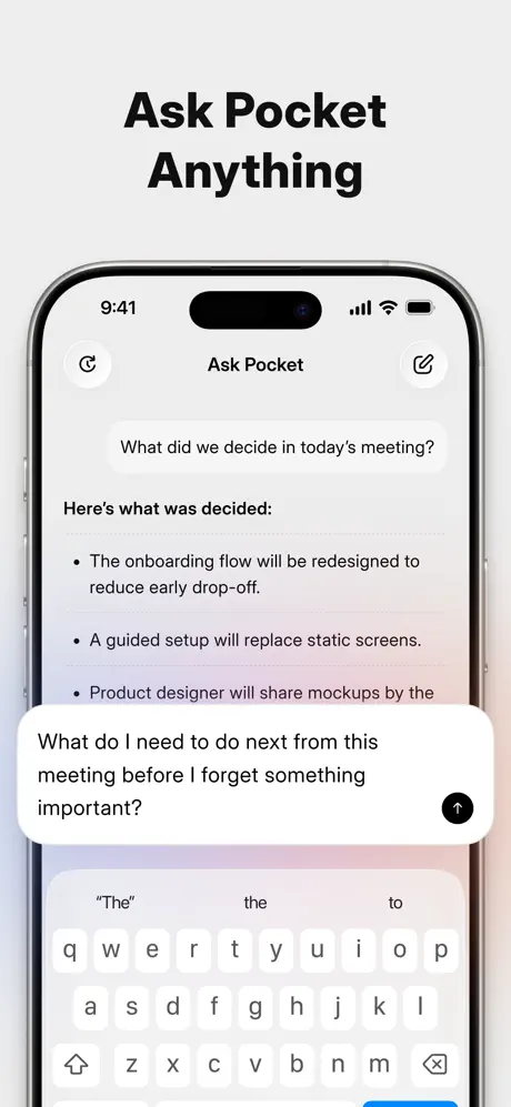
On-frame caption: “‘Ask Pocket Anything’ introduces a conversational interface. The navigation bar centers ‘Ask Pocket’ between a history icon and a compose icon. A user bubble asks, ‘What did we decide in today’s meeting?’ The response is structured with a bold lead-in ‘Here’s what was decided:’ followed by three bullets about onboarding flow redesign, guided setup replacement, and mockup delivery deadlines. At the bottom, a second query appears in a white rounded input sheet: ‘What do I need to do next from this meeting before I forget something important?’ beside a black circular send button. The standard iOS keyboard occupies the lower third, rendered in untouched system gray with no custom tint or glyph. Including the keyboard adds realism but cedes a large portion of the frame to unbranded Apple UI.

The chat background is nearly flat, with only a whisper of warmth, keeping the black text and white bubbles in sharp relief but offering no brand texture of their own.

Pocket App Store screenshot 5 — Real-Time Transcription
05

Real-Time Transcription

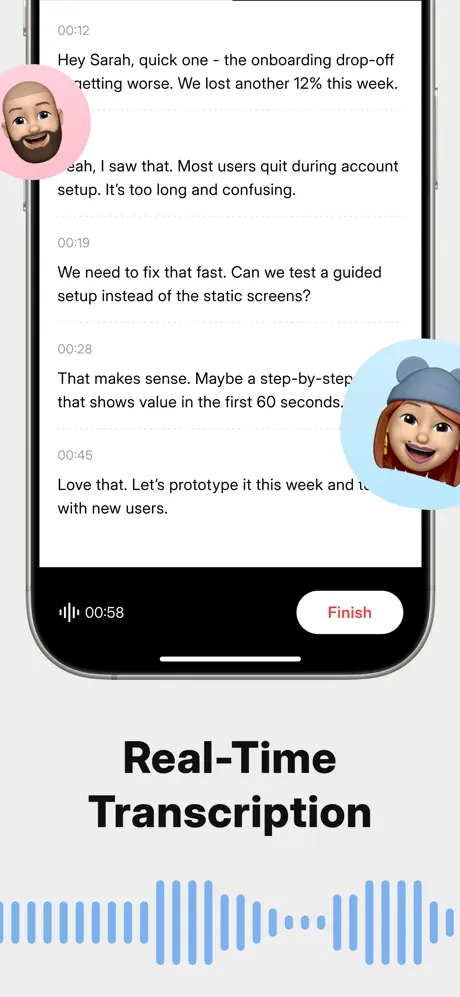
On-frame caption: “This frame reverses the vertical rhythm: the headline ‘Real-Time Transcription’ sits below the device rather than above. The screen shows a dense transcript with timestamps at 00:12, 00:19, 00:28, and 00:45, recording a dialogue about onboarding drop-off and account-setup confusion. Two circular Memoji avatars break the left and right margins—one bald with a beard inside a pink circle, one wearing a beanie inside a light-blue circle. At the bottom of the device, a waveform scrubber sits beside a white pill button labeled ‘Finish’ in red near #FF3B30. A decorative blue waveform echoes the first frame across the bottom background. The crop is noticeably tighter than earlier frames, minimizing lateral margin. The headline displacement breaks the swipe-scan pattern established previously; a shopper thumbing quickly may miss the caption entirely.

The transcript uses a monospaced or tabular timestamp column on the left, creating a clean editorial grid that separates speaker time from spoken content without divider rules.

Pocket App Store screenshot 6 — 120+ Languages
06

120+ Languages

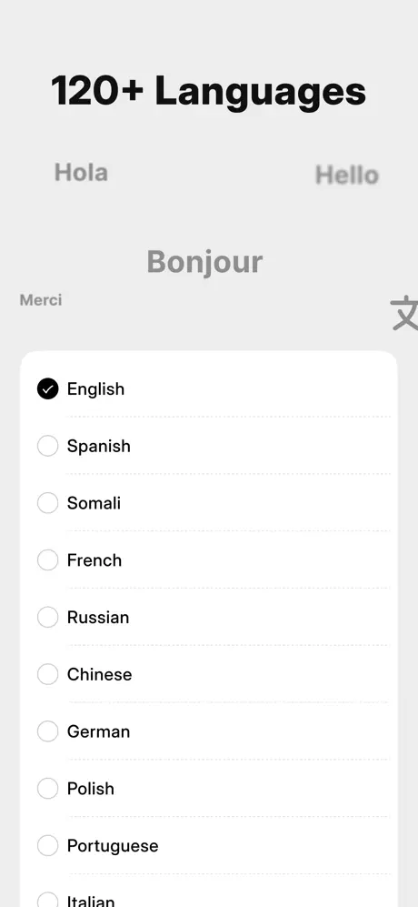
On-frame caption: “‘120+ Languages’ shifts to an atmospheric composition. The device sits lower on the canvas while out-of-focus ghost words—‘Hola,’ ‘Hello,’ ‘Bonjour,’ ‘Merci,’ and a clipped Chinese character—float in mid-gray behind the headline. Inside the phone, a white rounded list presents language options: English carries a filled black checkmark, while Spanish, Somali, French, Russian, Chinese, German, Polish, Portuguese, and Italian follow with hollow radio buttons. The list relies on whitespace rather than divider rules. Pushing the device down lets the background typography signal global scale without cluttering the interface with flags. The problem is that seven frames of nearly identical vertical framing have already happened; this subtle shift may arrive too late to refresh attention.

The unchecked circles are thin and light, which looks elegant at a glance but may render too faint when the image is scaled down on smaller phones in the store.

Pocket App Store screenshot 7 — Templates For Every Workflow
07

Templates For Every Workflow

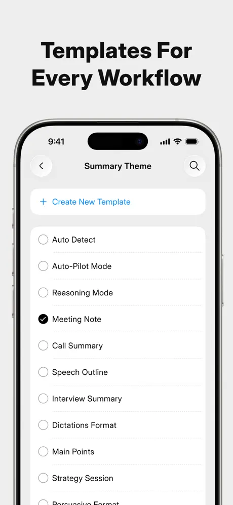
On-frame caption: “Headlined ‘Templates For Every Workflow,’ the screen shows ‘Summary Theme’ in the navigation bar with back and search affordances. A primary row reads ‘+ Create New Template’ in #007AFF blue, followed by a scrollable list inside a white card: Auto Detect, Auto-Pilot Mode, Reasoning Mode, Meeting Note—selected with a black checkmark—Call Summary, Speech Outline, Interview Summary, Dictations Format, Main Points, Strategy Session, and a partially visible ‘Persuasive Format.’ The density communicates flexibility, but every item uses identical text weight and the same hollow-circle affordance, flattening the hierarchy. The selected state is indicated only by a filled circle; there is no row tint or accent color to accelerate recognition for a scrolling viewer.

The plus icon preceding ‘Create New Template’ is rendered in the same blue as the text, providing the only chromatic anchor in an otherwise monochrome screen of options.

Pocket App Store screenshot 8 — Mind Map, Visualized Instantly
08

Mind Map, Visualized Instantly

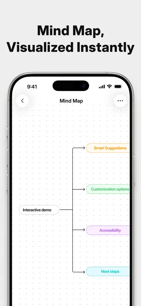
On-frame caption: “The final frame, ‘Mind Map, Visualized Instantly,’ shows a canvas-style mind map on a dotted white grid. A root node labeled ‘Interactive demo’ sits in a light-gray pill, branching right through orthogonal connector lines to four child nodes: ‘Smart Suggestions’ in yellow-orange, ‘Customization options’ in mint green, ‘Accessibility’ in soft purple, and ‘Next steps’ in cyan. These node colors are the most saturated hues in the entire set, and they appear nowhere else. The engineering-diagram aesthetic—sharp right angles and a dot grid—contrasts with the rounded card treatments throughout the previous frames. Ending here provides visual crescendo, but the stylistic dissonance risks making the mind map feel like a separate application rather than a native output of the same note-taking flow.

The back icon and overflow icon remain in light-gray circles, a rare constant that reminds the viewer this is the same app, even as the interior language has shifted.

05The craft

Captions, colour and the mechanics of the sell

Caption pattern

Each frame uses a single imperative or declarative headline in the same heavy sans serif: ‘From Conversation To Clear Notes,’ ‘Every Next Step, Captured,’ and so on. The grammar is consistent, but frame five breaks the pattern by placing the headline below the device.

Visual system

Outside the device, the system is grayscale plus one reserved blue; inside the device, it is white cards, hollow-circle radio buttons, and native iOS navigation icons. The only exceptions are the orange-tinted ‘Summary’ pill in frame two and the four pastel mind-map nodes in frame eight.

The thumbnail test

The first frame fails the thumbnail test because it shows the back of a phone rather than an identifiable interface; in a busy category, the hardware shot may scan as an accessory ad rather than a productivity app, requiring the shopper to swipe before understanding the value proposition.

Conversion mechanics

The sequence is front-loaded with credibility signals—corporate logos in frame one, realistic meeting transcripts in frame five—but withholds a recognizable UI until the second swipe. In a category where shoppers often decide in the first frame, the hardware reveal may function as a speed bump rather than a hook.

06Where it slips

What we would change

Chromatically disconnected hero

The set’s most disciplined asset is its macro restraint. By locking the background to a warm gray near #F2F2F0 and headlines to near-black, the designer forces attention onto the white interface cards and the phone bezel. That discipline collapses in the opening frame, where a violet-to-rose gradient on ‘AI Personal Assistant’ operates at a completely different temperature than the blues and grays used throughout the rest of the sequence. Because no other screenshot revisits that gradient or even that hue family, the headline feels like a temporary sticker rather than a branded anchor.

Framing anxiety

Framing anxiety is evident across the middle and late frames. Frame five drops the headline below the device, frame six lowers the device on the canvas, and frame eight abandons the rounded card language for an engineering diagram aesthetic. These micro-discontinuities read as the designer hunting for variety rather than reinforcing a trustworthy grid. A locked headline baseline and consistent device scale would let the UI content provide the variation instead of the layout breaking its own rhythm.

Ceding territory to stock iOS chrome

Inside the device, the reliance on stock iOS components is thorough to the point of anonymity. Frame four’s keyboard is presented in default iOS light gray with no custom tint or glyph, donating roughly a third of the screenshot to unbranded system territory. Reclaiming that space with a subtle background tint on the keyboard or a branded send glyph would preserve cognitive familiarity while asserting visual identity.

Late-stage color whiplash

Frame seven’s template list suffers from uniform weighting; without a tinted selected row or colored checkmark, every option competes equally for attention. Meanwhile, frame eight introduces four new accent colors—yellow-orange, mint green, soft purple, and cyan—that were never seeded in earlier interfaces. If those pastels had appeared in the ‘Summary’ pill of frame two or the ‘Proposal’ tag of frame three, the mind map would feel like the payoff to a cohesive system rather than a sudden stylistic departure.

Abandoned physical motif

Finally, the physical hand and blue card with debossed lettering create an effective through-line in frames one and two, yet they vanish entirely afterward. Reintroducing that prop, even as a partial sliver in frame five, would sustain the hardware-to-software narrative across the full swipe journey. As it stands, the set reads as two disconnected episodes: a physical hardware reveal followed by a conventional productivity app. Tying them together with a single recurring object is the most urgent structural repair.

07The recipe

How to apply this to your own app

  1. Select headline anchor points

    Place every headline in your sequence at the exact same x and y coordinates so that swiping feels like turning pages in a bound book rather than browsing a randomized gallery.

  2. Brand the system zones

    If your screenshot includes the iOS keyboard, status bar, or home indicator, tint or overlay those elements slightly to match your primary accent; otherwise you are giving Apple free real estate inside your own marketing.

  3. Seed your finale colors early

    Introduce accent colors that you plan to use in the final frame at least once in frame two or three—in tags, pills, or icons—so that the last screenshot resolves as a natural evolution rather than a surprise.

  4. Secure your visual bridge

    If you open with a physical prop, hand, or environmental object, weave at least a fragment of that object into one later frame to prevent your sequence from splitting into two unrelated stories.

  5. Unify selection states

    In list or radio-button screenshots, use a colored fill behind the active row or a tinted checkmark instead of relying solely on a black icon, because hollow-circle selection patterns flatten hierarchy at small scales.

08Takeaways

Five things worth stealing

  • Lock every headline to the same baseline across all eight frames so the viewer's eye does not recalibrate its scan path on every swipe.
  • Replace the stock iOS keyboard in screenshot mockups with a subtly tinted version that matches the app's primary accent to avoid donating a third of the canvas to unbranded system UI.
  • Seed the mind-map accent colors earlier in the sequence by tinting tags or pills in preceding frames so the finale does not feel visually disconnected.
  • Extend the physical hand-and-card motif from the first two frames into at least one later frame to maintain the hardware narrative throughout the entire set.
  • Replace the opening gradient headline with a solid color drawn from the app's actual interface palette to prevent a chromatic mismatch against the rest of the neutral set.
09The verdict

What the set actually achieves

The sequence successfully communicates a chronological workflow—capture, note-taking, task extraction, chat querying, transcription, localization, templating, and visualization—but sacrifices some UI legibility and layout consistency in pursuit of narrative variety.

Mid-to-heavy productivity users who run meetings, manage tasks, and need post-hoc summarization in a single tool rather than a fragmented stack of apps, likely skewing toward tech-forward professionals who recognize the Google, Amazon, and Vercel logos as social proof.

10Questions

Frequently asked

Why does the first frame show the back of the phone?

The designer is signaling that the product has a physical, always-on capture dimension, but the choice sacrifices immediate UI comprehension for hardware credibility.

Does the sequence rely on custom UI or native iOS components?

It relies heavily on native iOS components—system keyboards, default back chevrons, and standard radio buttons—which keeps the app feeling credible but also strips away distinctive brand identity.

What is the biggest structural weakness?

The physical hand and blue card disappear after frame two, causing the sequence to fracture into a hardware story and a separate software story that are never visually reconnected.

How does the set handle color?

Macro color is extremely restrained—warm gray and near-black—while micro color is introduced late: a violet-to-rose gradient only in frame one, blues for links, and a sudden pastel quartet in the final mind-map frame.

What makes the fifth frame different from the others?

The headline is placed below the device rather than above it, breaking the vertical scan rhythm established in every other frame and risking skipped comprehension during fast swipes.

11Keep reading

Build your own screenshot set

The full set

10 shots
Pocket App Store screenshot 1Pocket App Store screenshot 2Pocket App Store screenshot 3Pocket App Store screenshot 4Pocket App Store screenshot 5Pocket App Store screenshot 6Pocket App Store screenshot 7Pocket App Store screenshot 8Pocket App Store screenshot 9Pocket App Store screenshot 10

About the app

Pocket is your always-on AI personal assistant -- a wearable device that captures every idea, meeting, and moment without ever reaching for your phone. CAPTURE WITHOUT Open Vision Engineering, Inc, via the App Store listing.

Screenshots and store metadata belong to Open Vision Engineering, Inc. They are shown here for design commentary and criticism. The analysis on this page is original work by floow.design. View the original listing.

More Productivity teardowns

Browse all →