Evernote app icon
ProductivityScreenshot teardown11 min read

Evernote App Store screenshots

Evernote uses collage chaos and split storytelling to sell productivity

Set published by Evernote Corporation · 9 frames analysed

4.4 · 74K ratingsFreev11.13.2Updated 4mo ago
Evernote App Store screenshot 1
01At a glance

The set in one screen

Framing
iPhone 15 Pro frames, collage, floating UI cards, hybrid
Captions
Bold black centered headline, 40–48 pt, occasional gradient accent words
Backdrop
Off-white warm gray with organic blob shapes; near-black for scan/transcribe frames
Type
Geometric sans system type inside UI; handwritten marker labels for collage arrows
UI / copy split
Balanced: headline dominates top third, device or collage fills center
Frame 1 job
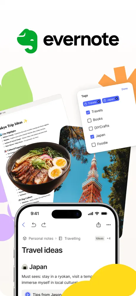
Brand stamp + immediate density. The Evernote logo and wordmark occupy the top half while an iPhone and floating note cards establish content richness without a value proposition caption.

Sampled palette

#FAFAF9#FAFAF9
#00A82D#00A82D
#8B5CF6#8B5CF6
#FEF08A#FEF08A
#0A0A0A#0A0A0A
02The challenge

What this screenshot set had to solve

Evernote’s screenshot set faces the classic productivity-app paradox: the product is a blank canvas that only becomes valuable once filled with a user’s own data. The challenge is to communicate breadth—notes, tasks, calendar, scan, clipper, sync—without the gallery feeling like a disjointed feature list. At the same time, the brand must fight the perception of being just another note-taking commodity. That means every frame has to do double duty: show a credible UI density that power users expect, yet remain legible at thumbnail size where white cards and gray chrome can wash out into sameness. The set must also establish an emotional tone; note-taking is personal, so the visuals need warmth and spatial depth beyond flat device mocks.

Use a full-width caption above the device in a consistent weight and baseline so shoppers can skim the sequence without reading UI microcopy.
03The approach

How the set argues its case

THE BEFORE/AFTER SCAN ARC IS THE STRONGEST NARRATIVE HOOK IN THE SET, ANCHORED BY A DARK-MODE PIVOT THAT PHYSICALLY JARPS AT THE SWIPE FROM ORGANIZATION TO CAPTURE. HOWEVER, THE LACK OF A HEADLINE IN FRAME 1 FORCES BRAND POWER ALONE TO CARRY THE FIRST IMPRESSION, AND THE SUDDEN RETURN TO A LIGHT CANVAS IN FRAME 7 BREAKS THE DARK CONTEXT FAR EARLY FOR SEAMLESS MORNING. THE DECISION TO REPEAT MORE ORGANIC BLOB COLORS ACROSS NEARLY EVERY FRAME KEEPS ECDENTRICAL COHERENCE, BUT ALSO PUTS DECORATIVE ELEMENTS IN CANNIVAL RELATIONSHIP WITH THE UI INSIDE THE DEVICE FRAME, MOST NOTABLY IN FRAME 4 AND FRAME 6. IN SHORT, THE SET PRIORITIZES FEELING PERSONAL OVER FEELING SLEEK, WHICH IS A DEADLY READ FOR LONG-TIME USERS but may reduce cold-start clarity for casual browsers.

For designers building screenshot sets for multi-tool productivity apps: this is a case study in balancing density with delight, proving that a utility app can show personality without abandoning legibility. The main risk is when decorative personality starts overlapping functional chrome.

04Frame by frame

Every screenshot, and the job it does

Evernote App Store screenshot 1 — Logo + Hero Collage
01

Logo + Hero Collage

On-frame caption: “Transcription/logic/record

Top-heavy composition with the Evernote wordmark and green elephant icon set in an off-white void. Beneath the logo, four content layers overlap without a device container: a note card titled 'Tokyo Trip Ideas' with bulleted lists, a photograph of ramen, a photograph of Tokyo Tower, and a floating 'Tags' modal showing checked chips for 'Travels' and 'Japan' above a checkbox list. A single iPhone frame is anchored at the bottom, cropped just below the note body, displaying a 'Travel ideas' note with breadcrumb 'Personal notes > Travelling' and a 'Japan' tag. Abstract organic blobs in green, orange, yellow, and purple intrude from the periphery.
Evernote App Store screenshot 2 — Organize all your thoughts
02

Organize all your thoughts

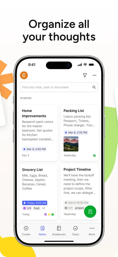
On-frame caption: “Full device frame showing the home dashboard with a 2x2 note grid, search bar, and green FAB.

Bold centered caption 'Organize all your thoughts' in black sans-serif above a centered iPhone. The screen shows a home dashboard: an orange avatar circle with a white 'C', a search bar reading 'Find any note, task or document', and a 2x2 grid of note cards including 'Home Improvements', 'Packing List' with a mountain thumbnail, 'Grocery List', and 'Project Timeline'. A green circular FAB with a white note icon overlaps the bottom-right card. The tab bar reads Create, Notes, Notebooks, Tasks, More, with Notes highlighted by a purple icon. Abstract orange and green shapes bleed in from the left and right edges against an off-white field.

Evernote App Store screenshot 3 — Get things done, all in one app
03

Get things done, all in one app

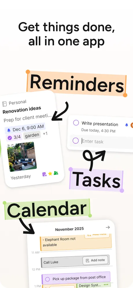
On-frame caption: “Collage frame without a device, using handwritten labels and arrows to link Reminders, Tasks, and Calendar.

The caption 'Get things done, all in one app' tops a device-free collage. Three feature zones are annotated with handwritten-style labels on highlighter blocks: 'Reminders' in black on peach, 'Tasks' on lavender, and 'Calendar' on mint green. Arrows point from each label to a corresponding UI snippet. The Reminders arrow targets a 'Renovation ideas' note card with a date pill. The Tasks arrow targets a checklist showing 'Write presentation' with an 'Enter task' field. The Calendar arrow targets a November 2025 schedule strip with color-coded events at 11 AM, 12 PM, and 1 PM. The background is clean off-white.

Evernote App Store screenshot 4 — Find anything in seconds
04

Find anything in seconds

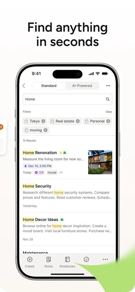
On-frame caption: “Full device frame demonstrating search with active filters and yellow keyword highlighting.

Caption 'Find anything in seconds' sits above a centered iPhone showing a search results screen. A search field contains the term 'Home'. Below, a toggle shows 'Standard' and 'AI-Powered' as options, followed by a filter row of removable pills: 'Tokyo', 'Real estate', 'Personal', 'moving'. The results list counts '15 Results' and shows notes such as 'Home Renovation' and 'Home Security' with the keyword highlighted in pale yellow. Note cards include thumbnails, date pills, and task counters. The tab bar is partially visible at bottom. A green abstract shape enters from the bottom right, overlapping the lower chrome.

Evernote App Store screenshot 5 — Scan and save what matters
05

Scan and save what matters

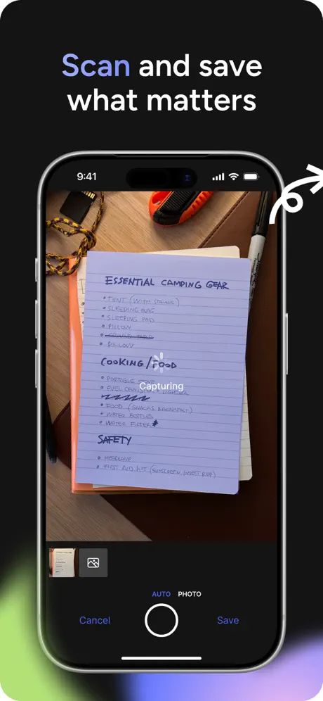
On-frame caption: “Dark-mode frame with full-device camera viewfinder capturing a handwritten camping list.

Dark surrounding field near #0A0A0A sets off the caption 'Scan and save what matters', with the word 'Scan' in a purple-to-lavender gradient. Centered iPhone shows a camera viewfinder aimed at a handwritten page titled 'ESSENTIAL CAMPING GEAR' with categories and blue-ink bullets. The camera chrome includes 'AUTO' and 'PHOTO' toggles, a white shutter ring, and blue 'Cancel' and 'Save' actions. A 'Capturing' label with a loading dot overlays the page. A white decorative arrow swoosh curls at the top right. A soft green-to-purple gradient glow bleeds from the bottom left corner outside the device frame.

Evernote App Store screenshot 6 — Digitize anything with AI transcribe
06

Digitize anything with AI transcribe

On-frame caption: “Split collage showing the scanned notebook above and the OCR'd note below, with sticker tags and a large yellow arrow.

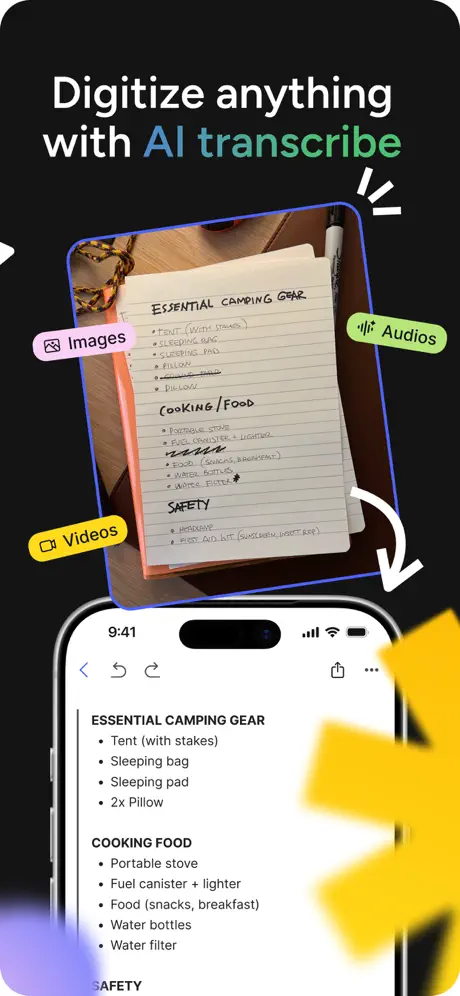
Caption 'Digitize anything with AI transcribe' uses a mint-to-cyan gradient for 'AI transcribe' against a dark background. The upper half displays the scanned camping notebook inside a neon blue border, tagged by floating stickers: 'Images' on pink, 'Videos' on yellow, and 'Audios' on green with a waveform icon. White curved arrows suggest conversion. The lower half shows an iPhone frame with the OCR'd note, listing bullets like 'Tent (with stakes)' and 'Sleeping bag' in clean sans-serif. A large, blurred yellow arrow graphic intrudes from the right edge, partially covering the phone bezel. The phone shows standard editing chrome: back, undo, share, and more icons.

Evernote App Store screenshot 7 — Grab it and go with Web Clipper
07

Grab it and go with Web Clipper

On-frame caption: “Full device frame displaying a saved web article with a gray 'Web Clip' badge.

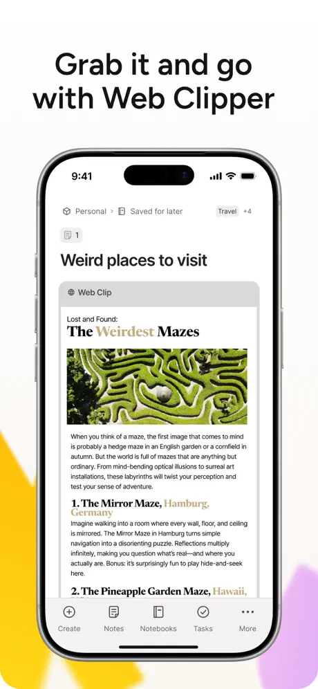
Caption 'Grab it and go with Web Clipper' in bold black above a centered iPhone. The screen shows a saved note titled 'Weird places to visit' with breadcrumb 'Personal > Saved for later' and a 'Travel +4' tag. A gray 'Web Clip' badge introduces a clipped article header, 'Lost and Found: The Weirdest Mazes', followed by a hedge-maze hero image and body copy. Numbered subheadings include '1. The Mirror Maze, Hamburg, Germany' and '2. The Pineapple Garden Maze, Hawaii,'. The bottom tab bar is fully visible. A yellow abstract blob bleeds in from the bottom left against an off-white background.

Evernote App Store screenshot 8 — Your notes, always with you
08

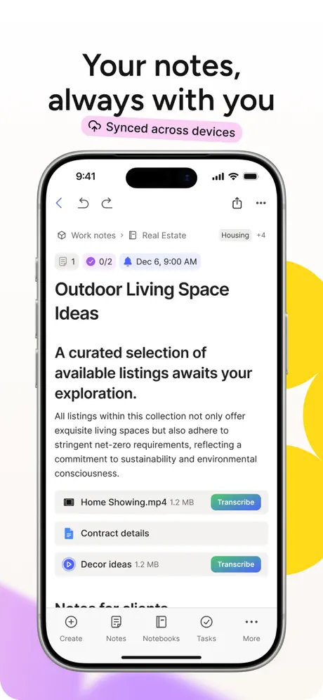
Your notes, always with you

On-frame caption: “Full device frame with note attachments and a pink 'Synced across devices' pill badge under the headline.

Caption 'Your notes, always with you' in bold black above a centered iPhone. Beneath the caption, a pink pill badge reads 'Synced across devices' with a sync icon. The screen displays a note titled 'Outdoor Living Space Ideas' under breadcrumb 'Work notes > Real Estate' with a 'Housing +4' tag. A metadata row shows an attachment count, task completion '0/2', and a reminder 'Dec 6, 9:00 AM'. Body text is followed by file attachments: a video 'Home Showing.mp4' with a teal 'Transcribe' button, a document 'Contract details', and another video 'Decor ideas'. The tab bar is fully visible. Yellow and purple abstract blobs frame the right and bottom left edges.

05The craft

Captions, colour and the mechanics of the sell

Caption pattern

Each device frame uses a two-line bold headline centered above the phone, set in a neutral geometric sans at roughly 40–48 pt. Frame 5 breaks this by applying a purple-to-lavender gradient to the operative verb ('Scan'), while Frame 6 applies a mint-to-cyan gradient to the feature name ('AI transcribe'). Frame 8 adds a secondary pink pill badge ('Synced across devices') directly beneath the main caption, creating a double-headline effect.

Visual system

A repeating set of abstract organic blobs in Evernote green, soft yellow, muted purple, and peach bleed from the corners of nearly every frame. These shapes sit behind the device and act as a signature wallpaper that unifies the sequence. Inside the UI, the app relies on iOS-style cards, rounded 16pt modals, and consistent bottom tab bars. The collage frames abandon the device container entirely, letting note cards and calendar strips float with soft drop shadows to imply a shallow depth field.

The thumbnail test

The strongest thumbnail read belongs to Frame 5, where the near-black background and white shutter ring create maximum contrast in the grid. The weakest belongs to Frame 1, which has no headline and relies on a complex collage that collapses into green-and-white noise at small scale.

Conversion mechanics

Frame 1 performs no conversion work because it lacks a headline; a shopper sees the logo and a travel note but receives no value proposition. Frame 2 fixes this immediately with 'Organize all your thoughts'. Frame 3's collage is high energy but sacrifices the credibility of a real device frame, which may reduce trust for shoppers primed to see actual UI. Frame 5's dark canvas is the highest-contrast stop in the carousel and likely earns the longest look. Frame 8's pink badge adds noise rather than clarity.

06Where it slips

What we would change

Frame 1 is a missed hook

The hero frame contains no caption headline, forcing the Evernote logo to do all communicative work. At thumbnail size, the complex collage of floating cards and partial iPhone reads as visual noise. Specific fix: add a bold two-line value proposition above the logo, e.g., 'Your notes, organized'.

Decorative blobs cannibalize UI chrome

In Frame 4, a green abstract shape overlaps the bottom tab bar, obscuring the Tasks icon. In Frame 6, a blurred yellow arrow covers the note body that is supposed to prove OCR accuracy. Specific fix: nudge all decorative shapes at least 20pt clear of the device frame, and crop the yellow arrow in Frame 6 so its tip does not cross the bezel.

Dark-mode rhythm is jarring

The sequence drops into near-black for Frames 5 and 6, then snaps back to off-white for Frame 7. In a rapid swipe, this feels like a flashing cut rather than a thematic chapter. Specific fix: hold the light canvas through Frame 5 and use dark mode only for Frame 6, or extend dark mode through Frame 7 to create a fully realized capture-and-save arc.

Frame 8's double headline competes for attention

A pink pill badge reading 'Synced across devices' sits directly beneath the main caption, creating two headline-weight elements where one is enough. Specific fix: delete the pill and let the main caption carry the message, or move the sync indicator inside the device screen as a small status chip.

Frame 3's calendar strip is illegible at scale

The 'Calendar' zone in the collage frame is the smallest UI snippet and itsevent text is sub-10pt. Specific fix: magnify the calendar strip to match the width of the 'Reminders' note card, or replace the strip with a single large calendar card showing one bold event.

07The recipe

How to apply this to your own app

  1. Pair every frame with a single headline

    Every frame after Frame 1 leads with a bold headline, while Frame 1 relies solely on the brand mark. Replicating this mistake wastes the first impression.

  2. Use dark mode as a chapter break

    Evernote introduces a near-black canvas for camera and OCR frames. If your app has a distinct modality—scan, record, capture—consider a background swap to signal context change without changing the caption grammar.

  3. Limit decorative elements to the margin

    The abstract blob system works as brand wallpaper, but when it crosses the device frame it obscures UI. Keep organic shapes anchored to corners and at least one margin-width away from the phone bezel.

  4. Collage is best for breadth, device for depth

    Frames 3 and 6 show multiple surfaces at once; the rest show a single screen. Use collage when you need to prove feature breadth in one glance, then immediately return to a full device frame to prove the UI is real.

  5. Match real content between before and after states

    Frame 6 wins because the handwritten camping list and the OCR'd note share identical text ordering. If you show a scan-to-digital transition, keep the source and destination content pixel-for-pixel identical so the shopper instantly grasps the transformation.

08Takeaways

Five things worth stealing

  • Anchor every frame with a descriptive caption above the device so shoppers can grasp the value proposition without parsing UI microcopy.
  • Keep decorative graphic elements like arrows and blobs at least 20pt clear of interactive UI to preserve legibility at thumbnail scale.
  • When switching between light and dark backgrounds, hold the new value for no more than two consecutive frames to avoid a disjointed swipe rhythm.
  • If using floating UI cards outside the device bezel, maintain consistent shadow depth and corner radius so layers read as intentional, not accidentally clipped.
  • Avoid placing secondary headline badges near the primary caption; instead, integrate that messaging into the device screen or let the main headline carry the narrative.
09The verdict

What the set actually achieves

Productivity shoppers see a familiar iOS interface wrapped in friendly, colorful blobs. The collage frames prove feature breadth while the full-device frames prove UI depth. The dark-mode scan frames arrest the swipe rhythm just long enough to signal capture as a distinct modality.

PRODUCT DESIGNERS BUILDING SCREENSHOT SETS FOR UTILITY OR PRODUCTIVITY APPS THAT NEED TO PROVE BOTH BREADTH AND UI CREDIBILITY IN EIGHT FRAMES OR FEWER. ESPECIALLY RELEVANT FOR APPS WITH A SCAN OR CAPTURE FEATURE THAT BENEFITS FROM A DARK-MODE VISUAL PIVOT.

10Questions

Frequently asked

Why does Frame 1 have no headline?

It appears to function as a brand hero or feature graphic rather than a traditional screenshot. The logo and wordmark are intended to stamp the brand before the value proposition begins in Frame 2. However, this is a conversion risk because the first frame gives no reason to swipe.

How does the set handle the scan-to-text narrative?

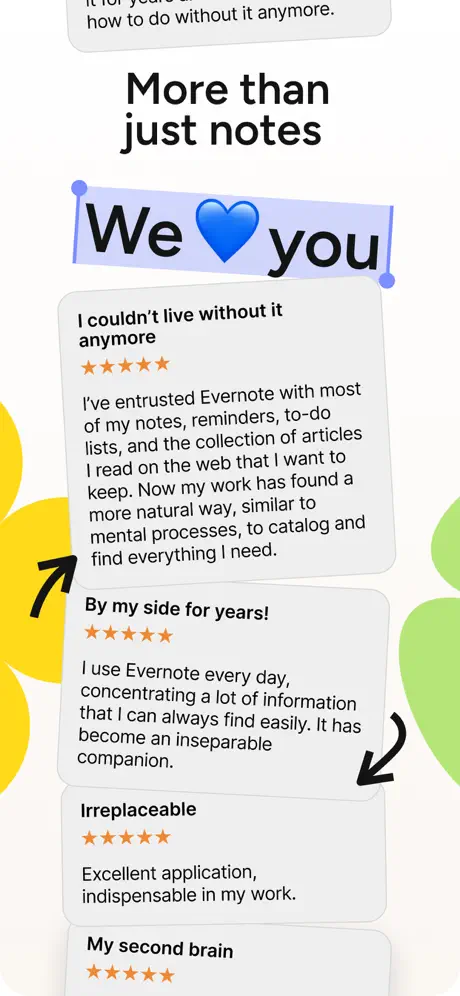
It dedicates two consecutive frames to the story. Frame 5 shows the camera viewfinder pointed at a handwritten list in dark mode. Frame 6 splits the canvas to show the physical notebook above and the digitized note below, completing the before-and-after arc.

What keeps the sequence from feeling like disconnected feature dumps?

A consistent corner-blob system in green, yellow, and purple unifies the backgrounds, and the UI chrome (tab bar, breadcrumbs, tag pills) repeats across frames, creating a familiar visual grammar even when the layout language shifts between device and collage.

Is the handwritten style in Frame 3 part of the app UI or just marketing?

It is marketing chrome only. The arrows and highlighter blocks do not appear inside the device frame; they are overlaid by the marketing team to point at UI snippets.

What should I copy and what should I avoid?

Copy the alternating cadence of device frame versus collage, the verbatim caption above every screen, and the before-after content matching in the scan frames. Avoid letting decorative blobs overlap the tab bar, presenting two headline elements in one frame, and starting the sequence without a value proposition.

11Keep reading

Build your own screenshot set

The full set

9 shots
Evernote App Store screenshot 1Evernote App Store screenshot 2Evernote App Store screenshot 3Evernote App Store screenshot 4Evernote App Store screenshot 5Evernote App Store screenshot 6Evernote App Store screenshot 7Evernote App Store screenshot 8Evernote App Store screenshot 9

About the app

Capture ideas when inspiration strikes. Bring your notes, to-dos, and schedule together to tame life’s distractions and accomplish more—at work, at home, and everywhere in Evernote Corporation, via the App Store listing.

Screenshots and store metadata belong to Evernote Corporation. They are shown here for design commentary and criticism. The analysis on this page is original work by floow.design. View the original listing.

More Productivity teardowns

Browse all →