Fabric app icon
ProductivityScreenshot teardown14 min read

Fabric App Store screenshots

Fabric is a productivity app selling an AI-augmented workspace. Its store listing has to compress a sprawling feature set—search, writing assistance, transcription, collaboration, annotation, and project organization—into eight static frames. That is the central design challenge: not merely showing screens, but teaching a shopper the app’s grammar before they reach the fold.

Set published by Fabric Internet · 10 frames analysed

4.6 · 166 ratingsFreev0.8.11Updated 6mo ago
Fabric App Store screenshot 1
01At a glance

The set in one screen

Framing
Alternating full-device (6 frames) and free-floating UI (2 frames)
Captions
Centered black serif, 4–7 words per headline, identical scale across all 8 frames
Backdrop
Pure white to near-white (#FFFFFF) with atmospheric purple/indigo gradients used inconsistently
Type
Editorial serif for captions; system sans-serif for in-app UI
UI / copy split
High—nearly every frame shows real app chrome rather than illustration
Frame 1 job
Set up the workspace metaphor, establish social proof, and prove this is a real consumer app, not a concept video.

Sampled palette

text#000000
ground#FFFFFF
gradient core#4F46E5
star accent#FACC15
highlight#FEF08A
recording dot#EF4444
02The challenge

What this screenshot set had to solve

The most difficult brief in productivity is breadth. Fabric captures notes, indexes files, transcribes lectures, rewrites prose, and supports live collaboration. A shopper scrolling the App Store has perhaps two seconds per frame to understand which of their jobs this app does. The design team therefore faces a sequencing problem: do they open with density, proving capability, or with clarity, proving focus? They also have to signal ‘AI’ without resorting to the clichéd sparkle iconography that has saturated the category since 2023. The chosen route is a headline-first, thesis-driven carousel: each frame makes a declarative promise in large type, then uses the remaining canvas to provide one piece of evidence.

The headline repetition creates a strong brand voice, yet the oscillation between device-framed and free-floating compositions introduces a structural instability that weakens the narrative flow.
03The approach

How the set argues its case

The strategy is editorial reduction. Every frame follows an identical top-down grid: headline, evidence, atmosphere. The headlines are written as complete sentences or short phrases—‘Your AI workspace,’ ‘AI that lives where your work does,’ ‘Find anything by meaning’—set in what appears to be a transitional serif (closer to Times New Roman than to a geometric sans). This choice distances Fabric from the rounded, friendly sans-serif vocabulary of Notion, Craft, and Apple Notes. It reads as serious, academic, almost newspaper-like. The app UI beneath, however, is rendered in a clean system sans with rounded card corners (roughly 12px radius) and generous whitespace, creating an intentional tension between the ‘editorial’ wrapper and the ‘software’ contents. The purple-to-blue gradient is the only decorative element allowed outside the phone bezel, but its application is improvisational rather than systematic—sometimes it floods the background, sometimes it merely grazes the corners.

By framing the app inside an iPhone 15 Pro titanium chassis in six of eight frames, the team grounds the product in physical reality. When they break the pattern in Frames 2 and 3, the effect is meant to feel conceptual—‘this is not just an app on a phone, this is a layer over your work.’ Whether that break succeeds or confuses is a question the critique will address.

04Frame by frame

Every screenshot, and the job it does

Fabric App Store screenshot 1 — Your AI workspace
01

Your AI workspace

On-frame caption: “Your AI workspace

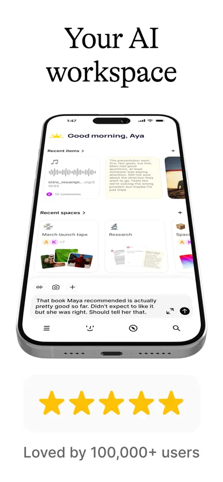
Frame 1 opens with a full-bleed white canvas. The headline ‘Your AI workspace’ sits in the upper safe zone, centered and set in the same large black serif that will dominate every subsequent frame. Below it, a titanium iPhone 15 Pro—complete with Dynamic Island, speaker mesh, and charging port—is centered vertically. The phone displays the app’s dashboard: a greeting reading ‘Good morning, Aya’ with a sun icon; a ‘Recent items >’ section containing an audio card labeled ‘intro_resampl...mp3’ with a gray waveform and a ‘12 comments’ badge; a text card beginning ‘The presentation went fine. Marc had good questions...’; and a ‘Recent spaces >’ section showing cards for ‘March launch tape,’ ‘Research,’ and a third card cropped to ‘Spac...’. At the bottom of the phone screen, an input sheet shows the sentence: ‘That book Maya recommended is actually pretty good so far. Didn't expect to like it but she was right. Should tell her that.’ Below the device, a soft white pill shape contains five yellow stars (#FACC15), and beneath that pill the text reads ‘Loved by 100,000+ users’ in a neutral gray sans-serif (#6B7280). The frame establishes immediate social proof and gives the shopper a complete map of the app’s home-level information architecture. However, the star pill is oversized relative to the caption beneath it, and the vertical gap between the pill and the social-proof text feels accidental rather than measured.
Fabric App Store screenshot 2 — AI that lives where your work does
02

AI that lives where your work does

On-frame caption: “AI that lives where your work does

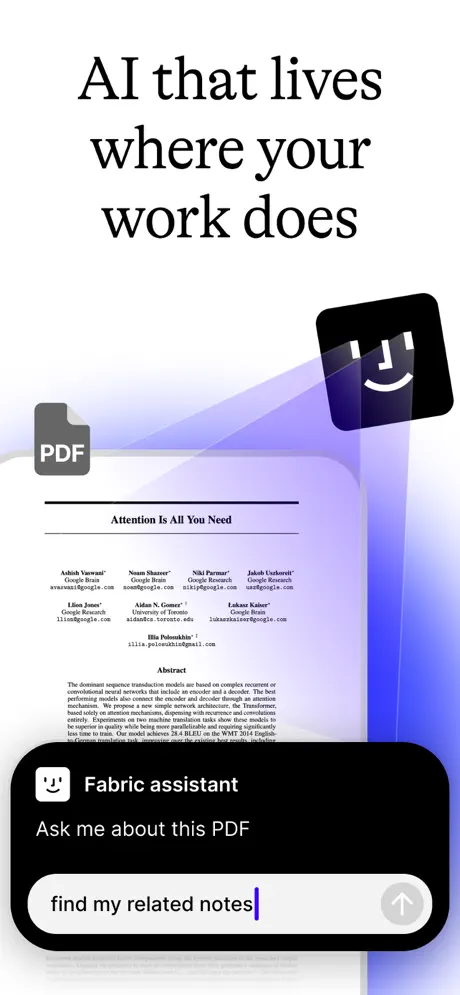
Frame 2 is the first disruption. There is no device frame. Instead, the canvas floats a PDF document—specifically the academic paper ‘Attention Is All You Need’ with author names including Ashish Vaswani, Noam Shazeer, and Niki Parmar visible—beside a gray ‘PDF’ label at upper left. The app’s black rounded-square icon, bearing a white smiley face, hovers at upper right, backlit by a sweeping translucent indigo shape that reads roughly #4F46E5 at its core. Below the document, a black chat sheet interrupts the composition, branded ‘Fabric assistant’ with the same smiley glyph and the prompt ‘Ask me about this PDF.’ An input field reads ‘find my related notes’ with a blue text cursor and a gray circular send button. The gradient here is the most expressive in the entire set, flowing behind the elements like a spotlight. Because this frame abandons the literal device that Frame 1 just established, the shopper’s mental model is forced to shift from ‘app on a phone’ to ‘ambient layer over documents.’ That conceptual leap is risky in the second slot.

Fabric App Store screenshot 3 — Find anything by meaning
03

Find anything by meaning

On-frame caption: “Find anything by meaning

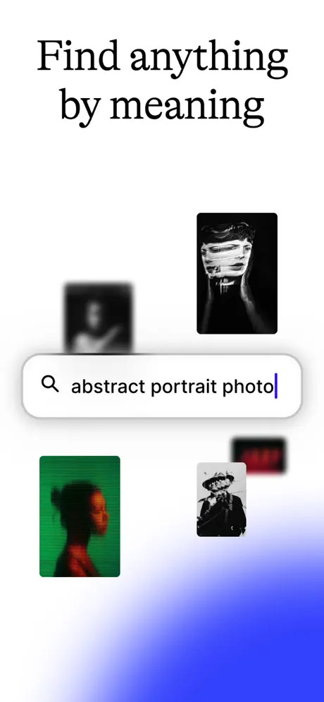
Frame 3 continues the free-floating approach. No iPhone bezel appears. Centered in the frame is a white pill-shaped search bar with a gray magnifying glass and the query ‘abstract portrait photo’ in black sans-serif, terminated by a blue insertion caret. Four image thumbnails orbit the search field: a sharp black-and-white portrait with tape-like distortion at upper right; a blurred dark thumbnail at upper left; a green-tinted silhouette with scan lines at lower left; a black-and-white figure in a hat at lower center; and a blurred red thumbnail at far right. The background transitions from pure white at top to a saturated blue gradient (#4F46E5) at bottom. The composition is sparse and gestural, suggesting semantic search rather than keyword matching. Yet without any device boundary, it is impossible to tell whether this is a mobile interface, a tablet layout, or a desktop modal. The frame sacrifices concrete product evidence for atmosphere.

Fabric App Store screenshot 4 — Write 10x faster
04

Write 10x faster

On-frame caption: “Write 10x faster

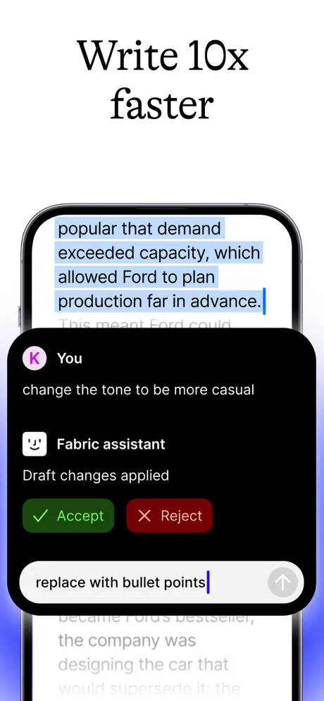
The device frame returns here. An iPhone 15 Pro shows a text editor with a paragraph highlighted in light blue (#93C5FD). The visible text ends with ‘...popular that demand exceeded capacity, which allowed Ford to plan production far in advance.’ Overlapping the lower half of the screen is a black bottom-sheet chat interface. It opens with a purple circle avatar labeled ‘K’ and ‘You,’ followed by the command: ‘change the tone to be more casual.’ The assistant replies beneath its smiley icon: ‘Draft changes applied.’ Two pill buttons sit side by side—a dark green ‘Accept’ (#15803D) and a dark red ‘Reject’ (#7F1D1D). A fresh input field at the bottom reads ‘replace with bullet points.’ Subtle purple gradients bleed into the bottom corners, echoing Frame 2’s palette. The black sheet is so dominant that the actual writing surface is reduced to a narrow strip; the shopper sees the *act* of rewriting more than the *context* of the document. That focus may be intentional, but it undersells the editor itself.

Fabric App Store screenshot 5 — Organize your ideas, thoughts and projects
05

Organize your ideas, thoughts and projects

On-frame caption: “Organize your ideas, thoughts and projects

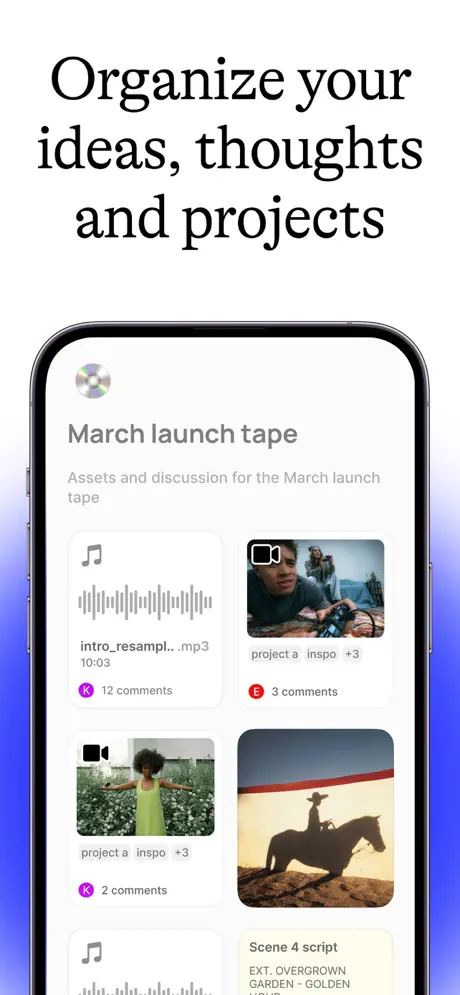
Frame 5 places an iPhone 15 Pro at center, displaying a project space titled ‘March launch tape.’ A CD emoji serves as the space icon. The subtitle reads ‘Assets and discussion for the March launch tape.’ The body is a masonry grid of media cards: an audio card with music-note icon, waveform, filename ‘intro_resampl...mp3,’ duration ‘10:03,’ and a purple ‘K’ badge with ‘12 comments’; a video card with camera icon showing a cinematographer, labeled ‘project a inspo +3’ with a red ‘E’ badge and ‘3 comments’; a second video card showing a figure in a green dress in a field, also tagged ‘project a inspo +3’ with ‘2 comments’; an image card showing a cowboy silhouette on horseback at sunset; and partial glimpses of a second audio card and a text card beginning ‘Scene 4 script / EXT. OVERGROWN GARDEN - GOLDEN.’ Blue gradient vignettes press in from the left and right edges. This is the only frame that exposes the app’s spatial organization model, and it does so with realistic, messy project data rather than sanitized placeholders. The ‘March launch tape’ space, however, repeats the exact dummy title already shown in Frame 1, which makes the carousel feel like it is circling the same example rather than expanding the universe.

Fabric App Store screenshot 6 — Turn conversations into notes, automatically
06

Turn conversations into notes, automatically

On-frame caption: “Turn conversations into notes, automatically

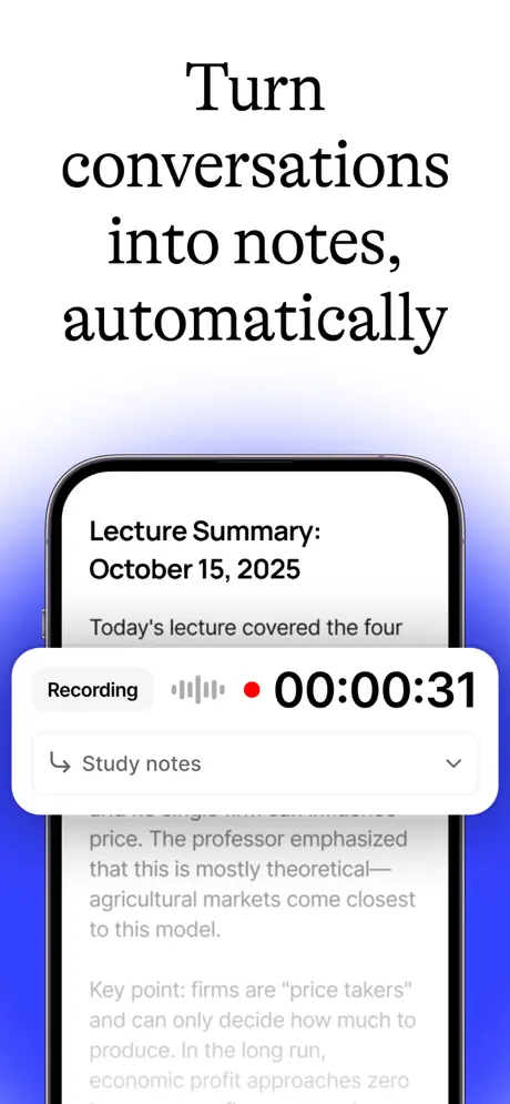
Frame 6 keeps the iPhone frame and shows a document titled ‘Lecture Summary: October 15, 2025.’ The body text, slightly dimmed, discusses economic theory: ‘Today’s lecture covered the four...’ and later, ‘price. The professor emphasized that this is mostly theoretical—agricultural markets come closest to this model.’ Floating above the document is a white rounded recording widget containing the label ‘Recording,’ a gray waveform, a red status dot (#EF4444), and a bold black timer reading ‘00:00:31.’ Beneath the timer, a dropdown reads ‘Study notes’ with a tag icon and downward chevron. The widget casts a soft shadow that separates it cleanly from the document layer beneath. Blue edge gradients return. The frame is successful because it stage-manages depth: the recording UI feels like a tangible object hovering over content, and the timer’s large numerals read instantly at thumbnail scale. The red dot is the only warm accent in an otherwise cool frame, drawing the eye directly to the active state.

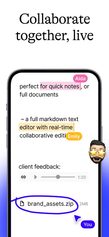
Fabric App Store screenshot 7 — Collaborate together, live
07

Collaborate together, live

On-frame caption: “Collaborate together, live

Frame 7 is the busiest composition in the set. An iPhone 15 Pro displays a live document with two user highlights: ‘quick notes’ in pink (#F9A8D8) tagged with an ‘Aida’ pill in magenta (#EC4899), and ‘editor with real-time’ in orange (#FBBF24) tagged with an ‘Emily’ pill in amber (#F59E0B). Below the text, an audio player shows a waveform, play triangle, gray scrubber, and timestamp ‘1:20.’ A file attachment row reads ‘brand_assets.zip 2MB,’ circled by a hand-drawn blue scribble stroke. At bottom right, a cursor arrow points to a blue ‘You’ pill (#3B82F6). A Memoji avatar—male, bearded, wearing star-shaped glasses—floats off the right edge of the phone. The left and right canvas edges are washed in blue gradient. The density is intentional, meant to communicate simultaneity, but the result is cacophony. Six distinct graphic systems compete: flat highlight colors, flat avatar pills, a skeuomorphic audio player, a hand-drawn circle, a custom cursor, and an illustration-style Memoji. Nothing in the previous frames prepared the shopper for this level of noise.

Fabric App Store screenshot 8 — Annotate any file or note
08

Annotate any file or note

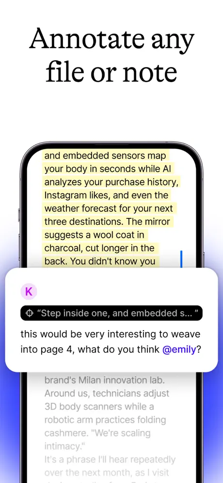
On-frame caption: “Annotate any file or note

Frame 8 closes with an iPhone 15 Pro showing a document paragraph highlighted in pale yellow (#FEF08A). The highlighted text reads: ‘and embedded sensors map your body in seconds while AI analyzes your purchase history, Instagram likes, and even the weather forecast for your next three destinations. The mirror suggests a wool coat in charcoal, cut longer in the back. You didn't know you.’ A comment bubble overlays the lower third: a purple ‘K’ avatar, a black quote pill containing ‘Step inside one, and embedded s...,’ and the comment text ‘this would be very interesting to weave into page 4, what do you think @emily?’ with the mention rendered in blue (#3B82F6). Behind the bubble, the document text continues dimmed: ‘brand's Milan innovation lab. Around us, technicians adjust 3D body scanners while a robotic arm practices folding cashmere...’ Blue gradient vignettes frame the device. The frame effectively demonstrates threaded annotation, but the yellow highlight against the white card background offers poor differentiation, and the headline ‘Annotate any file or note’ is the least differentiated claim in the entire set—every competitor makes the same promise.

05The craft

Captions, colour and the mechanics of the sell

Caption pattern

Each caption is centered, stacked, and set in black (#000000). The line lengths vary—Frame 4’s ‘Write 10x faster’ is short and punchy; Frame 5’s ‘Organize your ideas, thoughts and projects’ fills three full lines—but the point size appears locked. This creates a rigid, almost magazine-like masthead rhythm.

Visual system

The team restricts itself to a near-monochrome foundation. App interfaces sit inside white or light-gray cards. The only saturated accent is the signature gradient, sampled at approximately #8B5CF6 on the violet end and #2563EB on the blue end. Highlights inside the app use pale yellow (#FEF08A), pink (#F9A8D8), and orange (#FBBF24), but these are UI functional colors, not marketing palette extensions. The one outlier is Frame 1’s five-star rating, rendered in a bright, almost traffic-yellow (#FACC15) that sits outside the app’s internal color logic.

The thumbnail test

At small size, only three things survive: the black serif headline, the white ground, and the yellow stars in Frame 1. The in-app details disappear entirely, which means the headlines must carry the full persuasive burden. They are, fortunately, legible and high-contrast.

Conversion mechanics

Social proof is front-loaded in Frame 1 with the five-star pill and user count. No pricing, awards, or publication logos appear elsewhere. The funnel logic assumes that trust, once established, can be spent across the remaining seven frames on pure feature evidence. However, there is no clear call-to-action frame at the end; Frame 8 simply stops annotating. For conversion, the team relies entirely on the app name and icon at the top of the store page rather than repeating the value proposition in the final swipe.

06Where it slips

What we would change

Device framing whiplash

Frames 2 and 3 discard the iPhone chassis that Frame 1 establishes, then Frame 4 suddenly reintroduces it. In a swipeable carousel, this inconsistency is disorienting. A shopper scrolling at speed perceives an oscillation between ‘real app’ and ‘concept art.’ The fix is structural: either float *every* frame as pure UI to sell the ‘layered over your work’ metaphor, or lock every screen inside the same device angle so the hardware becomes a familiar frame. If the team insists on mixing both modes, the abstract frames should at least retain a ghosted device outline to preserve spatial continuity.

Typographic monotony

Every headline uses the same centered black serif at the same scale. While this creates brand recognition, it also flattens the narrative rhythm. The shopper receives eight identical typographic shocks in a row. The fix is to modulate the system: left-align one or two frames, introduce a lighter weight for secondary clauses, or vary line spacing. For example, Frame 3’s ‘Find anything by meaning’ could have been set smaller with a subheadline underneath, creating pause and hierarchy.

Gradient without a system

The purple-to-indigo gradient is the set’s only recurring decorative motif, yet it behaves unpredictably. It floods Frame 2, sits as a bottom-right blob in Frame 3, becomes a corner vignette in Frames 4–8, and disappears entirely in Frame 1. Without a fixed rule—say, a bottom 12% wash on every frame—the gradient reads as an afterthought. The fix is to anchor it to a single zone, such as a full-bleed background behind the device or a consistent bottom-edge shadow, so it functions as a brand signature rather than a texture grab-bag.

Frame 7’s visual noise

The collaboration frame introduces a Memoji and a hand-drawn blue scribble that clash with the app’s flat, precise UI language. The Memoji pulls the tone toward casual iMessage territory, while the scribble circle around ‘brand_assets.zip’ looks like markup rather than interface. The fix is to remove the Memoji and replace the hand-drawn stroke with a native 2px selection border in #3B82F6. This keeps the focus on the actual collaboration features—the highlights, pills, and audio comment—without decorative distractions.

Weak differentiation in later headlines

‘Organize your ideas, thoughts and projects’ and ‘Annotate any file or note’ are category-generic claims that could belong to Apple Notes or Notion. They squander the final frames where a shopper needs a memorable departure. The fix is to swap these for mechanism-driven headlines: instead of ‘Organize your ideas,’ show the outcome, e.g., ‘Assets, scripts, and sound in one grid.’ Specificity converts faster than abstraction.

07The recipe

How to apply this to your own app

  1. Assets, scripts, and sound in one grid.

    A specific feature callout beats a generic promise. Use Frame 5’s dense project view as a template, but write the headline as a concrete user outcome.

  2. Lock your frame grammar early

    Decide in Frame 1 whether you are selling software-on-hardware or software-as-layer. Fabric’s oscillation between the two modes weakens the narrative. Commit to one and repeat it.

  3. Build a gradient rule, not a gradient mood

    If you use a brand color wash, assign it a structural job—bottom edge only, or full background behind every device. Random atmospheric bleeding looks like a rendering bug at thumbnail size.

  4. Corral your accents

    Frame 7’s six competing graphic systems are a warning: every new color, illustration style, or annotation markup in a screenshot costs attention. Audit each element and remove anything that does not appear in the app itself.

08Takeaways

Five things worth stealing

  • Use realistic project data, not lorem ipsum. The ‘March launch tape’ and ‘Attention Is All You Need’ references ground the AI in recognizable work.
  • Reserve one frame for social proof, front-loaded. Once trust is established, the remaining frames can focus purely on capability.
  • A serif headline is a viable differentiator in a category saturated with rounded sans. Just vary the lockup so the rhythm does not flatline.
  • When showing AI interaction, keep the command-and-response geography consistent. Frame 4’s black bottom sheet is a strong pattern; it could have been reused in Frame 8’s annotation reply to create cross-frame familiarity.
  • verdictScorecardDesignOnly:
  • scorecardDesignOnly
  • verdictScorecard
09The verdict

What the set actually achieves

The set leans heavily on literal UI capture. There are no lifestyle photographs, no hand-model mockups, and no 3D mascots beyond a single Memoji cameo. This literalism builds trust, but it also means the frames inherit all the visual complexity of the app itself. The headline repetition creates a strong brand voice, yet the oscillation between device-framed and free-floating compositions introduces a structural instability that weakens the narrative flow.

Productivity junkies, creative teams, and knowledge workers who have bounced between Notion, Obsidian, and Apple Notes and now want a single AI-augmented hub. The academic paper in Frame 2 and the lecture transcription in Frame 6 specifically court students and researchers.

10Questions

Frequently asked

Why does Frame 1 include social proof instead of a feature?

Social proof is a classic first-frame tactic for unknown brands. The five-star pill and ‘100,000+ users’ text answer the shopper’s first question—‘is this legit?’—before they ask anything else.

Why are Frames 2 and 3 missing the iPhone frame?

They appear to be selling an ambient, document-layer concept rather than a boxed app. The risk is that a rapid swiper may perceive them as marketing illustrations rather than actual product screenshots.

Is the serif headline choice effective?

It differentiates Fabric from the rounded sans competition, but the identical treatment across all eight frames creates monotony. A little typographic variation would improve pacing without sacrificing voice.

What is the biggest honest weakness?

The oscillation between device-framed and free-floating compositions breaks spatial continuity, and Frame 7 introduces decorative elements (Memoji, hand-drawn circle) that clash with the app’s flat UI language.

What is the best single thing to copy?

The use of real, messy project data—audio files with truncated names, academic PDFs, lecture notes—instead of sanitized placeholder content. It makes the AI features feel like they are solving actual work, not demo fantasies.

11Keep reading

Build your own screenshot set

The full set

10 shots
Fabric App Store screenshot 1Fabric App Store screenshot 2Fabric App Store screenshot 3Fabric App Store screenshot 4Fabric App Store screenshot 5Fabric App Store screenshot 6Fabric App Store screenshot 7Fabric App Store screenshot 8Fabric App Store screenshot 9Fabric App Store screenshot 10

About the app

Fabric is your all-in-one AI-powered workspace that helps you instantly capture, find, and collaborate. Your scattered digital life becomes a beautifully organized second brain - Fabric Internet, via the App Store listing.

Screenshots and store metadata belong to Fabric Internet. They are shown here for design commentary and criticism. The analysis on this page is original work by floow.design. View the original listing.

More Productivity teardowns

Browse all →