Lex app icon
ProductivityScreenshot teardown15 min read

Lex App Store screenshots

When every dating and social app on the store looks like a grid of headshots inside a glass rectangle, how do you signal that the product underneath is built for a specific culture and not just a filtered version of everything else? Lex’s screenshot set answers by wrapping the phone in a single, saturated visual world—one that leans on personality, flat florals, and an unapologetically loud palette before it ever explains the feature list. The result is a sequence that behaves more like a folded zine than a conventional product tour.

Set published by Lex Social Inc. · 10 frames analysed

4.4 · 5.3K ratingsFreev4.0.1Updated 7mo ago
Lex App Store screenshot 1
01At a glance

The set in one screen

Framing
iOS interface only, no hardware bezel; rounded rectangle with status bar held at 9:41 across all eight frames
Captions
Ultra-bold white sans-serif, centered, set in the canvas negative space above the device
Backdrop
Deep midnight navy (~#161640) unifying every exterior frame; flat organic flowers in lemon, lavender, and cyan bleed in from the margins
Type
Heavy geometric sans, tight tracking, white at roughly 40–48pt equivalent; inside-device text is dark gray (~#111827) at 15–20pt with rounded pill tags
UI / copy split
Headlines occupy the top third; device occupies the bottom two-thirds, leaving almost no dead space
Frame 1 job
Emotional and cultural positioning—no device, no features, only faces and flora

Sampled palette

#161640#161640
#4ADE80#4ADE80
#FDE047#FDE047
#FEF08A#FEF08A
#C084FC#C084FC
#F472B6#F472B6
02The challenge

What this screenshot set had to solve

The challenge is twofold. First, the set must distinguish Lex from every other people-meeting app in a single thumb-scroll. Second, it has to communicate four distinct interaction models—geolocation, feed, groups, and events—without collapsing into a generic grid of identical chrome frames. The designer also has to solve the classic App Store tension: the screenshots must feel cohesive when seen as a set, yet distinct enough that a user swiping at speed can parse each new feature. On top of that, the product itself sits in a space where tone matters as much as utility; the visuals need to say that this is a queer space before the captions do.

The first frame contains no phone, no CTA, and no feature list. It is a brand billboard, and it sets the rules for everything that follows.
03The approach

How the set argues its case

The strategy is canvas-first. Rather than floating a phone on a white void, each screenshot treats the 9:16 canvas as a single composition divided into two horizontal zones: a headline band across the upper third and a device window across the lower two-thirds. The exterior midnight navy (~#161640) never changes, so the frames stitch together visually when viewed as thumbnails. Decorative vector florals—lemon yellow petals, lavender blobs, cyan amoebas—bleed in from the left and right edges to bridge the gap between the physical phone screen and the store canvas, making the device feel inserted into a world rather than placed on top of one. The type system is ruthlessly simple: one weight, one color (white), one alignment (centered). Inside the phone, the app switches its own header color between lime green (~#4ADE80) and off-white (~#F9FAFB) to mark shifts in feature category, while the tab bar and custom icon set repeat frame-to-frame to reinforce navigational continuity.

Positioning is cultural before functional. Frame 1 opens with a human face in an organic blob mask and the line “If it’s queer, it’s here.” By withholding the device entirely, the set sacrifices immediate feature comprehension for identity signaling. Only after that handshake does the sequence introduce the utility layer: map, feed, groups, events, profiles. The ordering is deliberate—community scale moves from macro (map/feed) to micro (profiles)—though the set ends on an individual profile rather than a collective action, which slightly reframes the product’s core promise.

04Frame by frame

Every screenshot, and the job it does

Lex App Store screenshot 1 — “If it’s queer, it’s here”
01

“If it’s queer, it’s here”

On-frame caption: “If it's queer, it’s here

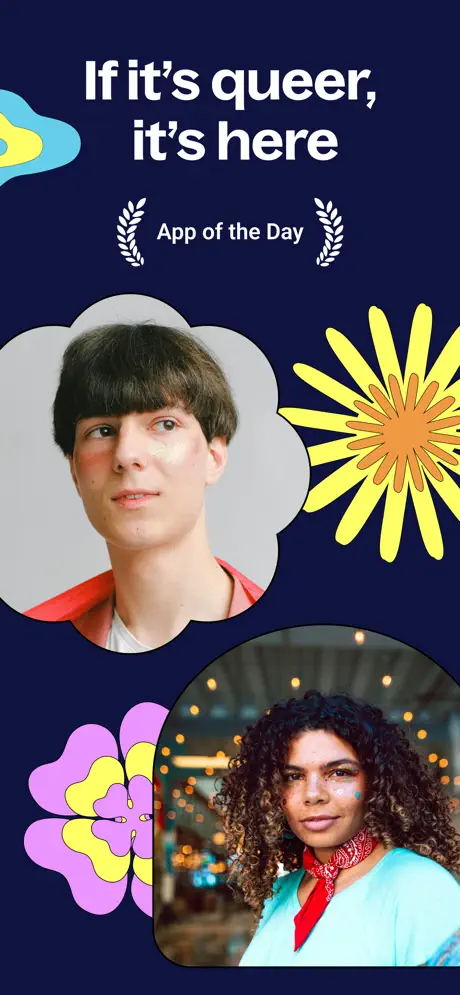
There is no device here. The frame is a full-bleed poster on a deep midnight ground—approximately #161640—with two masked photographic portraits floating in asymmetrical positions. The upper portrait sits inside a scalloped cloud shape with a 3pt white keyline; the lower sits inside a rounded rectangle. Between them, flat vector florals intrude from the margins: a yellow daisy with an orange center (~#FB923C) on the right, a lilac-and-yellow bloom on the lower left, and a cyan-and-yellow blob on the upper left. The headline is set in an ultra-bold sans, centered, at roughly 48pt in pure white. Beneath it, a smaller line reads “App of the Day,” flanked by two white laurel wreaths. The frame offers no feature, no CTA, and no UI chrome. It functions entirely as a trust signal and a cultural flag, using the white stroke around the photo masks to create sticker-like depth against the dark field. For a designer building a set, this is a high-risk move: it burns the first impression on emotion rather than utility, betting that the reader will scroll once more to find the app itself.
Lex App Store screenshot 2 — “Find funsies right next to you”
02

“Find funsies right next to you”

On-frame caption: “Find funsies right next to you

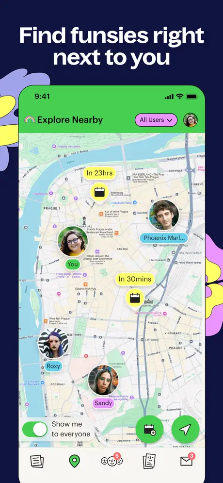
The device appears for the first time, and the headline sits directly above it with minimal clearance—perhaps 32pt—reading “Find funsies right next to you.” The phone UI shows a map view with a lime-green header (~#4ADE80) and a status bar fixed at 9:41. Inside the map, circular avatars roughly 44pt in diameter are pinned to a street grid of Prague; user pills read “You” in green, “Phoenix Marl…” in blue, “Roxy” in blue, and “Sandy” in pink. Two yellow lozenges—“In 23hrs” and “In 30mins”—pair calendar icons with time offsets. The bottom of the screen hosts a toggle labeled “Show me to everyone” and a five-item tab bar with red notification badges. Decorative floral shapes from frame 1 intrude at the left and right edges, bridging the exterior canvas and the screen interior. The choice to show an actual city map with real street names (PRAHA 1, PANSKÁ) gives the UI documentary specificity, though it also risks making the app feel geographically limited. The frame establishes geolocation by showing faces on a map rather than a generic red pin.

Lex App Store screenshot 3 — “Discover local queer community”
03

“Discover local queer community”

On-frame caption: “Discover local queer community

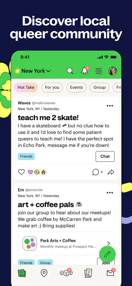
Frame three maintains the device-plus-headline architecture. The caption reads “Discover local queer community,” and the green header returns, now showing a location pill—“New York” with a sun icon and dropdown chevron—beside a search magnifier, a bell with a red “3” badge, a filters icon, and a user avatar. Below a horizontally scrollable filter bar, the active pill “Hot Take” wears a pink-to-lavender gradient while “For you,” “Events,” “Group,” and a truncated “Fri” sit in neutral outline strokes. The feed cards are text-dominant: one post headlined “teach me 2 skate!” in bold ~20pt black type, followed by body copy mentioning Echo Park and a “Friends” tag in a pale blue pill. A second post reads “art + coffee pals ☕” and links to a group card for “Park Arts + Coffee.” A green floating pencil button hovers at the lower right. Reactions appear as native-style heart, fire, and emoji glyphs beside a comment count of “4.” The frame sells the product as a textual, conversational network rather than an image grid.

Lex App Store screenshot 4 — “Create and join queer groups”
04

“Create and join queer groups”

On-frame caption: “Create and join queer groups

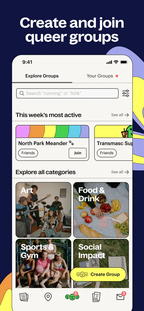
Here the header inside the device breaks from lime green, shifting to off-white (~#F9FAFB) to reduce chromatic fatigue. Two tabs appear at the top: “Explore Groups” underlined, and “Your Groups” with a red dot. A search field holds the placeholder text Search 'running' or 'kink'—quotation marks included—next to a sliders icon. A horizontal row titled “This week’s most active” shows cards with flat graphic headers, including a rainbow gradient strip and a yellow ground. Below, a two-by-two category grid displays “Art,” “Food & Drink,” “Sports & Gym,” and “Social Impact” in white sans-serif text laid directly onto photography, without gradient scrims or dark overlays. A yellow pill-shaped floating button at the bottom right reads “Create Group” preceded by a triple-smiley icon. The tab bar persists at the very bottom, maintaining orientation across the set. For a designer, the most notable choice is the search hint copy: by including the word “kink” inside quotation marks, the screenshot signals an unfiltered community vocabulary that would never appear in a generic social app.

Lex App Store screenshot 5 — “Meet LGBTQ+ people near you”
05

“Meet LGBTQ+ people near you”

On-frame caption: “Meet LGBTQ+ people near you

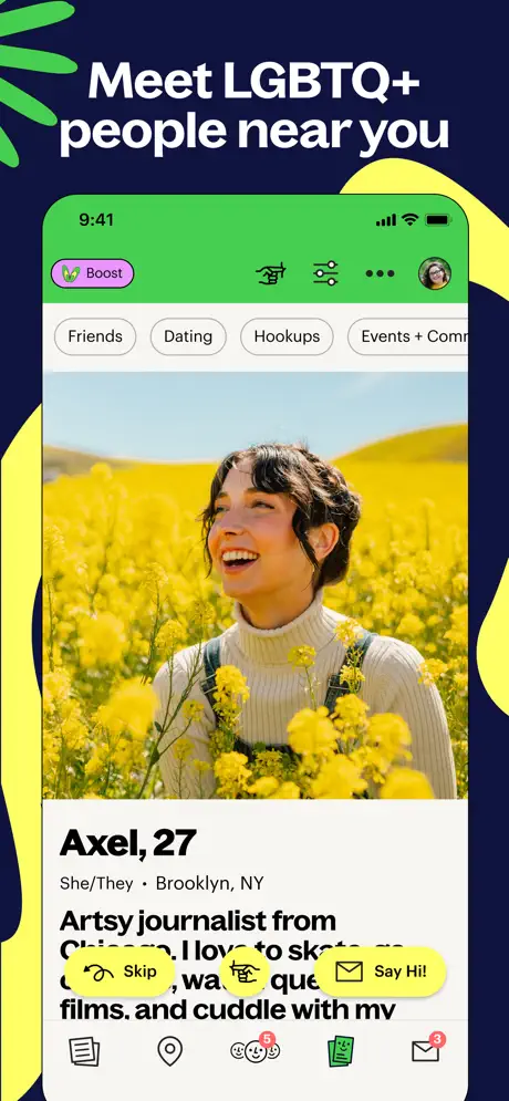
The fifth frame returns to the green header under the headline “Meet LGBTQ+ people near you.” At the top of the device, segmented pills read “Friends,” “Dating,” “Hookups,” and a truncated “Events + Comm…” The profile photo fills the full width of the screen interior—no rounded corners, no padding—showing a figure in a field of yellow flowers. Below, the name “Axel, 27” appears in roughly 28pt bold, followed by the line “She/They • Brooklyn, NY” in a lighter weight. The bio begins, “Artsy journalist from Chicago. I love to skate…” Two yellow action pills hover near the bottom edge of the bio: one reads “Skip” with a curved arrow, the other “Say Hi!” with an envelope glyph. The tab bar is still present, grounding the view in the app’s hierarchy. By avoiding the stacked-card metaphor common to dating apps, the frame reads as open-ended browsing; the presence of the “Skip” pill next to “Say Hi!” makes the interaction model explicit without animation.

Lex App Store screenshot 6 — “Find LGBTQ+ events”
06

“Find LGBTQ+ events”

On-frame caption: “Find LGBTQ+ events

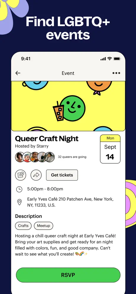
Frame six shifts to an event detail page beneath the caption “Find LGBTQ+ events.” The device header is off-white again. A back arrow and the word “Event” center the top bar, with a three-dot menu on the right. The hero area is illustration, not photography: a yellow ground (~#FEF9C3) hosts a green smiley face holding a boba tea, with blue and orange smileys peeking from the top edge. The title “Queer Craft Night” appears in bold black type, with “Hosted by Starry” directly beneath. A date badge at the right shows “Mon / Sept / 14” inside a rounded square with a yellow top rule. An avatar stack of four overlapping circular thumbnails—each roughly 28pt, with negative margins—sits beside the text “32 queers are going.” Action buttons include an outline “Get tickets” pill and icon-only share and flag options. Detail lines for time and address use thin stroke icons in gray. A large green pill button spanning nearly the full device width reads “RSVP.” The tab bar is hidden, narrowing the focus to a single conversion action. The copy in the description ends with an emoji trio—🎨✨—matching the casual tone set in frame 3.

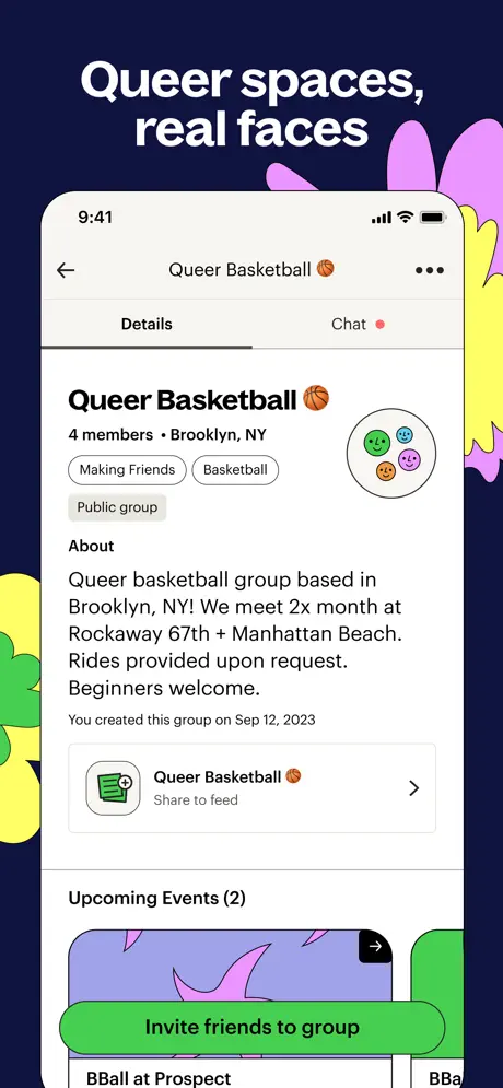
Lex App Store screenshot 7 — “Queer spaces, real faces”
07

“Queer spaces, real faces”

On-frame caption: “Queer spaces, real faces

The seventh frame shows a group detail view under “Queer spaces, real faces.” The off-white header contains a back arrow, the title “Queer Basketball 🏀,” and a three-dot menu. Below, two tabs read “Details” and “Chat,” the latter carrying a red notification dot. The group name repeats beside a custom avatar: four small smiley faces arranged in a circle with a thin black stroke. Metadata reads “4 members • Brooklyn, NY,” followed by three tags in gray outline pills: “Making Friends,” “Basketball,” and “Public group.” The about section is set in 15pt gray with generous line height, stating that the group meets twice monthly at Rockaway 67th and Manhattan Beach. A meta line reads, “You created this group on Sep 12, 2023.” A share row with a green thumbnail and chevron leads into an “Upcoming Events (2)” carousel where only the tops of event cards are visible. A massive green CTA button at the bottom reads “Invite friends to group.” Decorative purple and yellow floral shapes leak in from the right margin, re-anchoring this functional interior to the exterior brand world.

Lex App Store screenshot 8 — “Live your loudest self”
08

“Live your loudest self”

On-frame caption: “Live your loudest self

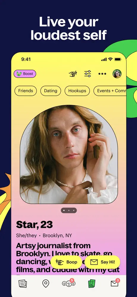
The final frame breaks the established color logic. The device background is no longer off-white or lime-green; instead, the entire screen is flooded with a gradient shifting from lemon yellow (~#FEF08A) at the top to soft pink (~#F9A8D4) at the bottom. The header adopts this gradient. The “Boost” pill remains in lavender on the left, while segmentation pills for “Friends,” “Dating,” “Hookups,” and “Events + Comm…” persist below. The profile photo sits inside a superellipse with an extremely large corner radius—almost a full squircle—occupying the upper half of the viewport. Pagination dots centered beneath the image indicate a carousel. The name “Star, 23” appears in bold dark type, followed by “She/they • Brooklyn, NY.” The bio is partially obscured by two yellow action pills: “Boop” and “Say Hi!” At the bottom, the tab bar shows the documents icon filled in green and a red “5” badge on the central smiley tab. By abandoning the navy exterior and the green header for a warm gradient, the frame acts as an emotional full stop, returning the viewer to face and identity rather than function.

05The craft

Captions, colour and the mechanics of the sell

Caption pattern

Each caption sits above the device in the same ultra-bold sans, centered, with no subtitle or body copy. The cadence is roughly three-to-five words per line, forcing line breaks that create rhythmic blocks: “Find funsies / right next to you.” There is no period at the end of any caption, and the tone shifts from manifesto (“Live your loudest self”) to invitation (“Discover local queer community”) to utility (“Find LGBTQ+ events”).

Visual system

The visual system is held together by three constants: the midnight exterior, the floral vector motifs, and the white headline treatment. Interior the phone, a secondary system takes over: lime green for discovery/map/feed headers, off-white for detail pages (events, groups), and a lemon-to-pink gradient for the final profile frame. Pills and lozenges are the dominant UI shape—yellow for time and action buttons, blue and pink for user tags, gray for group metadata. Photography is candid, not commercial: faces have glitter, outdoor settings are ungraded, and lighting is natural. The custom tab bar icons (a location pin, a stack of papers, a triple-smiley face) repeat in every frame where the tab bar is visible, acting as a compass for the viewer.

The thumbnail test

In thumbnail view, the white headlines against the dark navy read as bold stripes of contrast. The lime-green headers visible inside the device on frames 2, 3, 5, and 8 add bright rectangular anchors that draw the eye. However, because frames 2, 3, and 5 all open with the identical green band, the middle of the set risks collapsing into a single green blur at small scale.

Conversion mechanics

Conversion is handled differently depending on the feature. In the event frame, a full-width green “RSVP” button sits at the bottom with no tab bar to compete; in the profile frames, binary yellow pills (“Skip” / “Say Hi!”, “Boop” / “Say Hi!”) float above the tab bar, implying swipe-or-chat decisions. The group frame uses a green “Invite friends to group” CTA. There is no single repeated CTA color; green is used for yes/RSVP/commit actions, while yellow is used for light social gestures. This two-tier system maps well to low-stakes versus high-stakes intent, though a designer laying out a store set might want to standardize the primary action color to train the shopper’s eye.

06Where it slips

What we would change

Chromatic repetition flattens the middle frames

Frames 2, 3, and 5 all open with the identical lime-green header (~#4ADE80). When a user swipes rapidly, the strong green band dominates the thumbnail, causing the map, the feed, and the profile to read as the same screen. Fix: alternate the header tint or exterior canvas tone per feature—perhaps a cool blue variant for the map, a warm yellow for the feed—so each swipe registers as a distinct mode without leaving the brand family.

Caption-to-device spacing is tight

The white headlines are set very close to the top edge of the device—roughly 24–32pt of clearance. At smaller preview sizes, the text almost collides with the status bar icons inside the screenshot. Fix: increase the margin between the caption baseline and the device top to at least 56–64pt, or reduce the headline point size by 10–15 percent to restore vertical balance.

Geographic specificity in the map frame risks regionalizing the product

Frame 2 displays a live map of Prague with readable street names such as PANSKÁ and PRAHA 1. A global audience may subconsciously file the app as Europe-specific. Fix: replace the live map with a stylized or anonymized city rendering, or use a more universally recognized skyline silhouette, stripping readable street labels.

Notification badges add noise without benefit

Red badges appear on the bell, mail, and community tab icons (counts of 3 and 5). In static screenshots, these registers as unexplained clutter; the viewer cannot tap them, so they function as visual static rather than social proof. Fix: strip the numerical badges from the screenshot build, or reduce them to a single discreet dot if activity needs to be implied.

Direct text-on-photo grids in frame 4 lack contrast insurance

In the category grid, white text is laid over photographic backgrounds with no gradient scrim—most noticeably on Sports & Gym, where the photo background is mid-tone and the text legibility depends entirely on the user’s screen brightness. Fix: add a 20–40 percent black gradient scrim behind each category label, or use a subtle text-shadow to guarantee WCAG compliance.

07The recipe

How to apply this to your own app

  1. Invent a framing device that repeats

    Lex uses the midnight navy canvas and floral vectors as a frame for every phone. If you are building a set, design one exterior motif—color field, pattern, or gradient—that persists across all frames so the thumbnails read as siblings, not strangers.

  2. Write the caption before you crop the UI

    The headline in each frame is oversized and centered, forcing the device to sit lower in the composition. By prioritizing the caption’s hierarchy, you guarantee that the feature is named before the user’s eye parses the chrome. Make sure your canvas reserves the top 25–30 percent for text alone.

  3. Use the first frame to establish culture, not utility

    Frame 1 contains no phone, no feature list, and no CTA. It is a brand billboard, and it sets the rules for everything that follows. If your product serves a specific community or identity, consider burning your opening screenshot on tone and trust before you explain the mechanics.

  4. Vary the interior header color to mark territory

    Lex’s green header is a strong signature, but its overuse in the middle frames homogenizes the set. Assign a distinct header tint to each major feature (map, feed, profile, detail) so that a swiping thumb can map color to function instantly.

08Takeaways

Five things worth stealing

  • Lex’s set proves that App Store screenshots can behave like editorial spreads rather than spec sheets. The consistent midnight canvas and floral border system turn eight separate frames into one continuous environment.
  • The decision to open with a device-less brand frame is high-risk and high-reward: it trades immediate comprehension for cultural specificity, a bet that pays off only if the user scrolls past frame one.
  • Verbatim copy tone—'funsies,' 'teach me 2 skate!,' 'Boop'—is the secret glue between the exterior captions and the interior UI. The screenshots feel honest because the language inside the phone matches the language above it.
  • The strongest technical choice is the refusal to use generic dating-app tropes: no stacked cards, no super-like icons, no glossy portrait filters. The candid photography and flat illustration signal a different category entirely.
  • The weakest technical choice is the uniform lime-green header across discovery screens, which collapses visual differentiation when the frames are viewed as thumbnails. Rotating that header color is the single fastest fix to improve parseability.
  • If you are building your own set, steal the canvas-first approach, but avoid the notification-badge clutter and the tight caption-to-device padding that Lex accepts as part of its maximalist personality.
09The verdict

What the set actually achieves

Lex opts for an art-directed poster system. Every frame shares the same midnight ground and floral border vocabulary, but the content inside the device rotates through map, feed, group grid, event detail, and profile views. The captions are front-loaded with vernacular copy (“funsies,” “teach me 2 skate!,” “Boop”) that matches the lowercase, emoji-heavy text inside the UI. The net effect is a set that reads as one continuous environment rather than eight disconnected feature dumps.

Product designers and teams building community or social products that need to signal identity before utility. The case study is written as a practical teardown for anyone preparing their own App Store screenshot set who wants to balance brand expression with feature clarity.

10Questions

Frequently asked

Why does frame 1 omit the device entirely?

It functions as a brand handshake. By leading with faces, flora, and the line 'If it's queer, it's here,' the frame establishes emotional context before any UI is revealed. The risk is that a shopper might think it is not an app screenshot at all.

How does the set handle the swipe-to-browse profile mechanic without animation?

It uses binary yellow pills—'Skip' and 'Say Hi!'—overlaying the bio text. This implies a decision point without relying on the Tinder-style card stack metaphor.

What is the approximate color palette?

Exterior midnight ~#161640; interior header green ~#4ADE80; action yellow ~#FEF08A; accent lavender ~#C084FC; event hero yellow ~#FEF9C3; gradient pink ~#F472B6.

What makes the typography distinctive?

The exterior captions use a single ultra-bold white sans, tightly tracked and centered, at roughly 40–48pt. Inside the device, the type is a clean geometric sans in dark gray with rounded pill tags, keeping the UI friendly but legible.

Are there accessibility concerns?

Yes. The category grid in frame 4 places white text directly on photographic backgrounds without scrims, which may fail contrast thresholds depending on the photo. Additionally, the green header against the navy canvas is safe, but the yellow-to-pink gradient in frame 8 paired with white headline text could prove problematic if extended elsewhere.

11Keep reading

Build your own screenshot set

The full set

10 shots
Lex App Store screenshot 1Lex App Store screenshot 2Lex App Store screenshot 3Lex App Store screenshot 4Lex App Store screenshot 5Lex App Store screenshot 6Lex App Store screenshot 7Lex App Store screenshot 8Lex App Store screenshot 9Lex App Store screenshot 10

About the app

"The potential of an app like Lex to create a definitively queer social space feels expansive." — The New York Times THE TOP SOCIAL APP FOR LGBTQ+ COMMUNITY Lex is a free Lex Social Inc., via the App Store listing.

Screenshots and store metadata belong to Lex Social Inc.. They are shown here for design commentary and criticism. The analysis on this page is original work by floow.design. View the original listing.

More Productivity teardowns

Browse all →