Jomo app icon
ProductivityScreenshot teardown17 min read

Jomo App Store screenshots

Jomo’s App Store gallery treats the carousel as a single, continuous environment: eight frames pinned to the same saturated azure void, each one anchored by a taxonomic black pill, a centered white headline, and an iPhone 15 Pro frame that never sits flat. For a category as utilitarian as screen-time blocking, the design challenge is not just proving what the app does, but making discipline feel desirable. This set attempts to bridge that gap by locking every layout to a rigid gestural language—deep blues, floating glass cards, and emoji-coated friction screens—while front-loading social proof to earn the click before a shopper ever sees a feature list.

Set published by ORDER LLC · 10 frames analysed

5.0 · 2 ratingsFreev1.0.6Updated 5mo ago
Jomo App Store screenshot 1
01At a glance

The set in one screen

Framing
iPhone 15 Pro in graphite, consistently tilted between 12° and 25°, often cropped by the canvas edge to suggest depth.
Captions
Large white headlines, centered, with occasional scribble underlines for tonal warmth.
Backdrop
Persistent azure gradient, roughly #0F4CFF bleeding into #3B82F6 in clouded frames and flattening to #2B7FFF in solid ones.
Type
A single geometric sans family in heavy weight for headlines, regular for subheads, and no visible serif or monospaced accents anywhere in the set.
UI / copy split
Roughly 60:40 in favor of typography and negative space; the device often occupies the lower half or right third, never the full canvas.
Frame 1 job
Merge an App Store endorsement, a quantified value proposition, and three awards into one vertical poster before the user swipes once.

Sampled palette

(primary headlines)#FFFFFF
(feature pills)#000000
(dominant background)#2B7FFF
(icon accents)#FFD60A
(ratings)#FF9F0A
(CTA buttons inside UI)#007AFF
02The challenge

What this screenshot set had to solve

The fundamental tension in productivity-tool screenshots is credibility versus emotion. A shopper needs to believe the app can actually block Instagram, but they also need to feel what life looks like after two reclaimed hours. Jomo’s set inherits an additional constraint: the real app UI is mostly dark-mode dashboards, modal dialogs, and locking interstitials—interfaces that, when photographed flat, can look punitive rather than helpful. The design team had to soften that severity without abandoning the authority of the tool itself. They also needed to sequence eight distinct mechanics—blocking rules, journaling, limits, actions, breaks—without letting any single feature feel like an afterthought. In a category where every competitor shows the same Apple Screen Time charts, the challenge was to make Jomo’s specific personality recognizable at thumbnail scale inside the search results page.

Consistency becomes its own weakness when the canvas refuses to shift value across eight consecutive frames.
03The approach

How the set argues its case

Jomo’s strategy is anchoring. Rather than treating each screenshot as an independent billboard, the set behaves like a vertical landing page sliced into portrait segments. The black pill acts as a chapter marker—“Smart App Blocking,” “Easy Setup,” “Breaks”—while the headline below translates engineering features into emotional outcomes. The device is never presented straight-on; it is always torqued, partially masked by the canvas edge, or overlapped by floating cards. That motion is meant to imply depth inside a static image. Social proof is placed aggressively early—Frame 1 carries three App Store badges, Frame 2 layers review bubbles above the hardware—because the team clearly assumes trust, not feature density, is the primary funnel constraint in the productivity category.

Positioned between a wellness app and a parental-control utility. The screenshots lean into the wellness side—emoji journals, cartoon mascots, reclaimed hours—while the UI inside the phone proves the utility is technically sound.

04Frame by frame

Every screenshot, and the job it does

Jomo App Store screenshot 1 — The Opening Poster
01

The Opening Poster

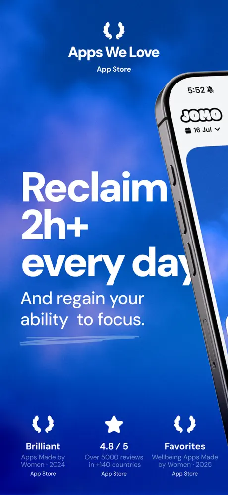
On-frame caption: “Apps We Love / App Store / Reclaim 2h+ every day / And regain your ability to focus. / Brilliant · Apps Made by Women · 2024 / 4.8 / 5 · Over 5000 reviews in +140 countries / Favorites · Wellbeing Apps Made by Women · 2025

The first frame establishes the real estate immediately: a clouded azure gradient, roughly #0F4CFF at the perimeter diffusing into lighter #3B82F6 hotspots, serves as the stage. Centered near the top is the App Store laurel wreath in white, followed by “Apps We Love” in bold and “App Store” in regular weight beneath it. The headline is enormous, likely 80pt or more, set in a tight geometric sans: “Reclaim 2h+ every day.” The word “day” is literally cut by the right edge of the iPhone frame entering from the right—only the descender of the ‘y’ disappears behind the graphite bezel, a layout tolerance that reads as a mistake at zoom. Below the headline, “And regain your ability to focus.” sits in a lighter weight, underlined by a hand-drawn scribble stroke in pale blue-grey that adds tonal warmth without changing the palette. The phone itself is cropped to show only the top status bar (5:52), the JOMO logotype, and a calendar chip reading “16 Jul.” At the bottom, three identical-width columns carry social proof: the left and right columns use laurel wreath icons bracketing the words “Brilliant” and “Favorites,” while the center column swaps the wreath for a solid star. The center badge reads “4.8 / 5” and “Over 5000 reviews in +140 countries.” Because the star is a different visual shape than the surrounding wreaths, the row acquires a subtle wobble; it is symmetrical in text weight but not in icon rhythm. The overall density is high for an opening frame—headline, subhead, device, three awards, and a brand seal—but the hierarchy is clear because everything is centered and nothing competes with the white type against the deep blue.
Jomo App Store screenshot 2 — Reviews Meet Data
02

Reviews Meet Data

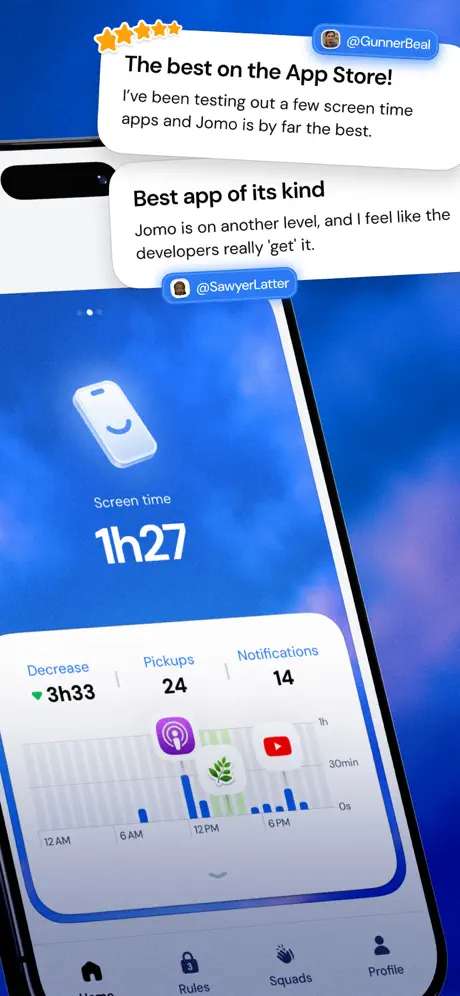
On-frame caption: “@GunnerBeal · The best on the App Store! / I’ve been testing out a few screen time apps and Jomo is by far the best. / @SawyerLatter · Best app of its kind / Jomo is on another level, and I feel like the developers really ‘get’ it. / Screen time · 1h27 · Decrease ▼ 3h33 · Pickups 24 · Notifications 14 / Home · Rules · Squads · Profile

Frame 2 pushes the device deeper into the composition and overlays two floating review bubbles above it. The background remains the same clouded azure, but the focal plane is now split between social proof (top) and product surface (bottom). The upper bubble, attributed to “@GunnerBeal,” carries five orange stars, roughly #FF9F0A, left-aligned above the quote: “The best on the App Store! I’ve been testing out a few screen time apps and Jomo is by far the best.” A second bubble below, attributed to “@SawyerLatter,” omits stars and reads: “Best app of its kind / Jomo is on another level, and I feel like the developers really ‘get’ it.” Both bubbles use white fill, subtle shadow, and rounded corners; they overlap the Dynamic Island area of the phone, creating depth but also occluding the hardware’s top edge. Inside the phone, a light-mode dashboard shows a smiling phone icon, the label “Screen time,” and the figure “1h27” in very large numerals. Beneath that, a three-column data row reads “Decrease ▼ 3h33,” “Pickups 24,” and “Notifications 14.” A bar chart spans the lower half of the screen with app icons—Podcasts, YouTube, and a leaf icon—placed at their usage peaks. The tab bar at the very bottom is partially cropped by the canvas, showing “Home,” “Rules,” “Squads,” and “Profile.” The risk here is competition: the review bubbles want attention first, but the dashboard is so detailed that the eye bounces between layers. At thumbnail scale the bubbles win; at full view the dashboard feels cramped.

Jomo App Store screenshot 3 — The Blocking Interstitial
03

The Blocking Interstitial

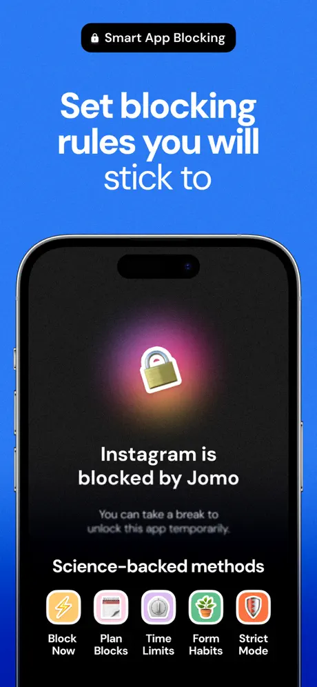
On-frame caption: “Smart App Blocking / Set blocking rules you will stick to / Instagram is blocked by Jomo / You can take a break to unlock this app temporarily. / Science-backed methods · Block Now · Plan Blocks · Time Limits · Form Habits · Strict Mode

The background shifts to a flatter, more saturated cobalt, around #2B7FFF, without the cloud diffusion of the first two frames. A black pill at the top contains a lock icon and the text “Smart App Blocking.” The headline, “Set blocking rules you will stick to,” breaks across three lines; the rag places “stick to” alone on the third line, leaving a small orphan that weakens the vertical momentum. Centered below is the device in portrait, its internal screen deep black (#0B0B0B). A glowing padlock icon—diffusing pink and amber light—floats above the text “Instagram is blocked by Jomo.” Beneath that, smaller grey text states “You can take a break to unlock this app temporarily.” Below the device, the label “Science-backed methods” introduces a horizontal row of five square icons: “Block Now” (yellow lightning), “Plan Blocks” (red calendar), “Time Limits” (grey gauge), “Form Habits” (green plant), and “Strict Mode” (orange shield). The icons use soft pastel fills with heavy black labels beneath them. Structurally, this frame shifts from proof to mechanism: the shopper is now being shown not why to use Jomo, but how it feels when Jomo intervenes. The darkness of the phone screen against the bright blue is the strongest contrast in the set so far.

Jomo App Store screenshot 4 — Emotional Journaling
04

Emotional Journaling

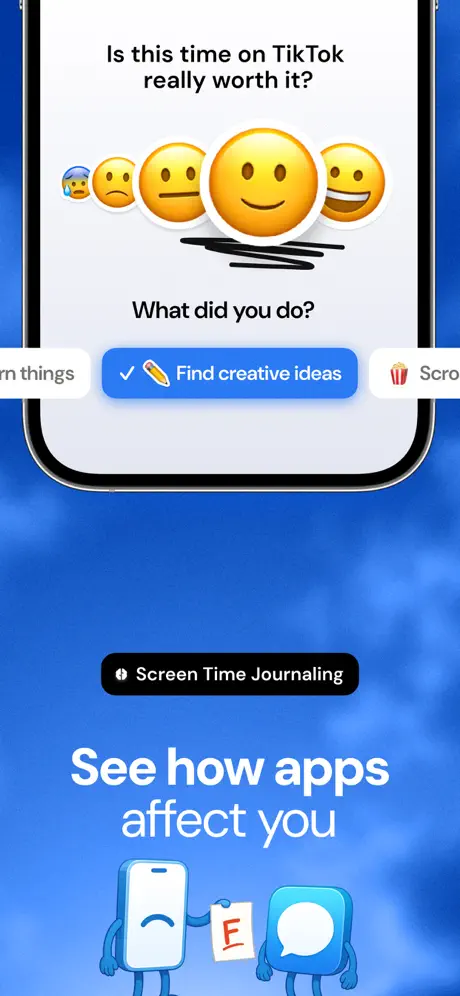
On-frame caption: “Is this time on TikTok really worth it? / What did you do? / ✏️ Find creative ideas / Screen Time Journaling / See how apps affect you

Frame 4 inverts the typical balance by pushing the device into the upper 40 percent of the canvas. Inside the phone, a light-grey journaling modal asks, “Is this time on TikTok really worth it?” followed by a horizontal row of five emoji faces ranging from anxious to grinning, with the neutral-to-smiling range centered and enlarged. Beneath the selected emoji, a black scribble strike anchors the choice, and then “What did you do?” prompts a response. A blue pill button reads “✏️ Find creative ideas,” flanked by partial buttons on either side: “Learn things” on the left and “🍿 Scro…” (presumably “Scroll”) on the right, both cropped by the device bezel. Below the hardware, a black pill reads “Screen Time Journaling,” and the headline “See how apps affect you” sits above two cartoon mascots: a sad phone holding a paper graded “E” and a speech-bubble character beside it. The structural problem is vertical compression. The device is so high that the headline and mascots occupy the lower third with little breathing room; the blue gradient behind them feels empty by comparison. The frame attempts to introduce emotional intelligence and character design into the gallery, but the stylistic jump from sleek glass UI to flat illustration is jarring. The mascots do not share the same material language as the app interface, creating an aesthetic seam between product and metaphor.

Jomo App Store screenshot 5 — Rule Templates
05

Rule Templates

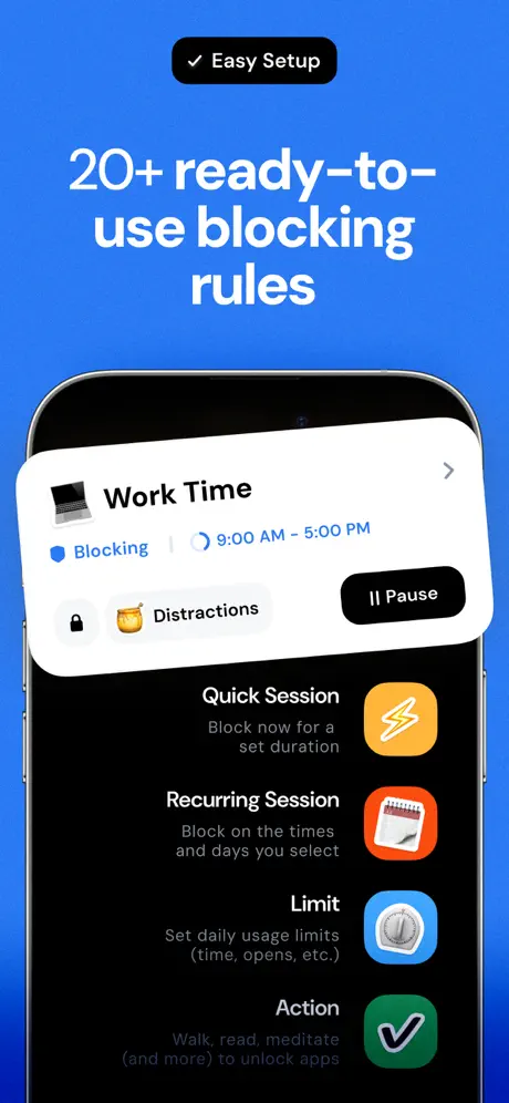
On-frame caption: “Easy Setup / 20+ ready-to-use blocking rules / Work Time · Blocking · 9:00 AM - 5:00 PM · Distractions · Pause / Quick Session · Recurring Session · Limit · Action

The background returns to the solid #2B7FFF cobalt. A black pill labeled “Easy Setup” with a checkmark icon opens the frame. The headline “20+ ready-to-use blocking rules” occupies the upper center in white. The device is centered, showing a dark-mode list. A white card pops forward from the top of the list, reading “Work Time” with a laptop icon, a chevron at the right, and metadata inside: a blue dot with “Blocking,” a clock icon with “9:00 AM - 5:00 PM,” and a tag reading “🔒 🍯 Distractions.” A black “Pause” button lives on the right edge of the card. Below this card, still inside the phone, four list items are stacked: “Quick Session / Block now for a set duration” with a yellow lightning icon; “Recurring Session / Block on the times and days you select” with a red calendar; “Limit / Set daily usage limits (time, opens, etc.)” with a grey gauge; and “Action / Walk, read, meditate (and more) to unlock apps” with a green checkmark. The typography inside the phone is small but crisp, and the pop-out card creates a parallax effect against the flat list beneath it. The frame succeeds at showing depth without animation, though the headline’s line break—splitting “ready-to-use” and “blocking rules” across lines—creates a slightly awkward read because the hyphenated phrase is broken by line rather than by natural clause.

Jomo App Store screenshot 6 — Friction Modals
06

Friction Modals

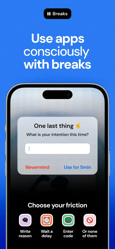
On-frame caption: “Breaks / Use apps consciously with breaks / One last thing ☝️ / What is your intention this time? / Nevermind / Use for 5min / Choose your friction · Write reason · Wait a delay · Enter code · Or none of them

A black pill with a pause-bar icon introduces “Breaks.” The headline “Use apps consciously with breaks” sits below in centered white. The device shows a system-modal aesthetic: a translucent black backdrop with a light-grey card floating dead-center. The card reads “One last thing ☝️” and “What is your intention this time?” followed by a blank text field with a cursor. Two buttons sit side by side at the card’s bottom: “Nevermind” in red/coral (#FF453A) and “Use for 5min” in iOS blue (#007AFF). Below the phone, the label “Choose your friction” introduces another four-icon row: “Write reason” (purple speech bubble), “Wait a delay” (orange clock), “Enter code” (green number pad), and “Or none of them” (pink prohibition sign). The composition is vertically centered and calm, but the phone screen itself is visually small relative to the canvas; the modal card occupies perhaps 30 percent of the total frame area, making the actual interface hard to read at thumbnail scale. The red “Nevermind” is the first warm-red element in the entire set, and it draws disproportionate attention because the eye has been trained on blue, white, and black for five frames.

Jomo App Store screenshot 7 — Stacked Limit Cards
07

Stacked Limit Cards

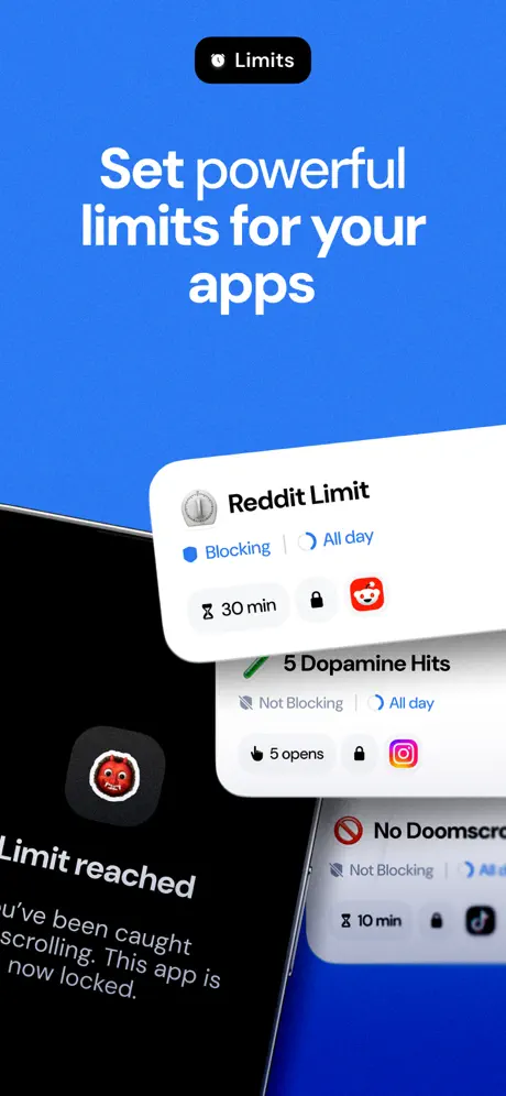
On-frame caption: “Limits / Set powerful limits for your apps / Reddit Limit · Blocking · All day · 30 min / 5 Dopamine Hits · Not Blocking · All day · 5 opens / No Doomscro… · Not Blocking · All… · 10 min / Limit reached · You’ve been caught scrolling. This app is now locked.

The background stays #2B7FFF. A black pill reads “Limits.” The headline “Set powerful limits for your apps” is centered. The device is tilted steeply, entering from the lower left and exiting at the upper right, creating the most aggressive angle in the set. Inside the screen, three white cards are stacked with vertical overlap. The top card shows the Reddit icon and “Reddit Limit,” with a blue “Blocking” badge, a clock icon, “All day,” a timer icon, “30 min,” and a lock. The second card shows “5 Dopamine Hits” with an Instagram icon, a grey “Not Blocking” badge, and “5 opens.” The third card is partially visible: “No Doomscro…” (the truncation is in the original UI), “Not Blocking,” and “10 min” with a TikTok icon. Outside the device, on the lower left, text bleeds into the frame: “Limit reached / You’ve been caught / scrolling. This app is / now locked.” The left edge of this text is cropped by the image boundary, so “You’ve” appears to start with a cropped ascender or is shoved against the bezel. This reads as an accidental export error rather than an intentional bleed; the phrase is incomplete and sits in an ambiguous spatial relationship to the phone. The overall message—multiple limit types for different apps—is conveyed, but the production sloppiness undermines the precision the app claims to offer.

Jomo App Store screenshot 8 — Analytics & Actions
08

Analytics & Actions

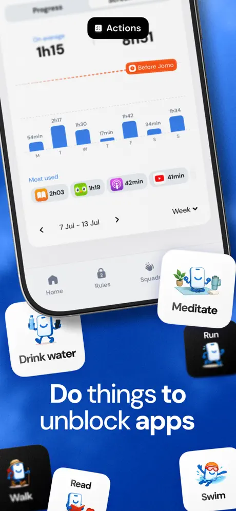
On-frame caption: “Actions / On average 1h15 · Before Jomo / Most used · 2h03 · 1h19 · 42min · 41min / 7 Jul - 13 Jul · Week / Do things to unblock apps / Drink water · Meditate · Run · Walk · Read · Swim

The final frame opens with a black pill reading “Actions.” The device occupies the upper center, tilted moderately, showing an analytics dashboard. At the top, “On average 1h15” is paired with an orange pill, “Before Jomo,” and a dotted baseline projecting backward. A bar chart tracks seven days with varying screen-time loads; the tallest bar hits 2h17. A “Most used” row beneath lists Books (2h03), a green icon (1h19), Podcasts (42min), and YouTube (41min). A week selector reads “7 Jul - 13 Jul” with a chevron and “Week” dropdown. The tab bar shows Home, Rules, and Squads. Around the device, floating square cards with rounded corners carry cartoon phone mascots: “Drink water” (phone lifting weights), “Meditate” (phone with tea and plant), “Run” (dark card, running phone), “Walk” (dark card, hiker phone), “Read” (white card, phone reading), and “Swim” (white card, swimming phone). The headline “Do things to unblock apps” anchors the bottom. This frame is the busiest in the set. The floating cards overlap the device bezel and each other, creating a collage effect, but at the expense of UI legibility. The “Before Jomo” pill inside the analytics screen is tiny and partially cropped by the top edge of the phone frame, making the comparative data point easy to miss. The frame attempts to end on a note of positive action—unblocking through healthy habits—but the visual noise competes with itself.

05The craft

Captions, colour and the mechanics of the sell

Caption pattern

Every frame opens with a black rounded pill, white text, and a left-aligned SF Symbol-style icon. The headline sits below in 48–64pt white. The device occupies the lower 50–60% of the frame. This scaffold never breaks, which makes the set instantly scannable as a Jomo ownable.

Visual system

The color system is stark: blue, white, black. There are no gradient text effects, no neon accents, no backdrop blurs behind the type. Even the app UI shown inside the phone respects this—light screens appear in Frame 2 (dashboard) and Frame 4 (journal), but most blocking surfaces are near-black, letting the blue negative space dominate. The result is a two-tone gallery that feels premium but risks monotony.

The thumbnail test

At thumbnail size, the azure field and white type remain legible, but the tilted device shrinks to illegible fuzz. Only the headline and black pill survive, which is exactly what a search-results impression needs. The screenshots are designed for out-of-context legibility first, feature walkthrough second.

Conversion mechanics

The set converts on trust first, mechanics second. Frame 1 and Frame 2 never show a feature; they show endorsements, awards, and review quotes. Only after social permission is granted does the gallery walk through blocking, journaling, rules, breaks, limits, and actions. This sequencing respects the psychology of the App Store: a shopper scrolling at 11 PM is not looking for a feature comparison; they are looking for a reason to believe. The black pills act as wayfinding, but they rely on the shopper reading them. If the user is swiping quickly, the pills blur into the same shape, and the blue canvas offers no color cue that a new topic has arrived. The conversion funnel here assumes a slower, more deliberate viewer than average.

06Where it slips

What we would change

The Cropped Descender in Frame 1

In the headline “Reclaim 2h+ every day,” the descender of the ‘y’ in “day” is obscured by the iPhone frame entering from the right. At a glance it looks like “da,” which undermines the typographic authority of the largest text on the canvas. The fix is precise: shift the phone 10–14pt right, or narrow the headline text box by 5 percent so the rag breaks before ‘day,’ or simply reduce the headline point size by 4pt to maintain clearance. This is not a subjective preference; it is a collision that should have been caught in QA.

Background Monotony Across Eight Frames

Frames 1 and 2 use a cloud-diffused azure; Frames 3 through 7 flatten to a solid #2B7FFF; Frame 8 returns to a diffused texture. Despite minor shifts, the dominant hue never changes. In a carousel, this amount of chromatic uniformity causes the frames to bleed into one another in memory. The fix is not to abandon blue, but to introduce value shifts: a deep midnight blue (#0A192F) for the blocking frame, a near-black for the limits frame, or a soft white inversion for the journaling frame. Rhythm requires contrast not just in content, but in luminosity.

Frame 7’s Truncated Outside Copy

The phrase “Limit reached / You’ve been caught / scrolling. This app is / now locked.” appears on the left side of Frame 7, partially outside the device. The left boundary of the image crops the text awkwardly; “You’ve” looks like it begins with a fragment. The fix is to either move the entire phrase inside the device bezel as an overlay, or extend the canvas width so the text can breathe with proper margins. Alternatively, delete the outside copy entirely because the stacked cards already communicate the limit state without redundant captions.

Stylistic Collision Between UI and Illustration

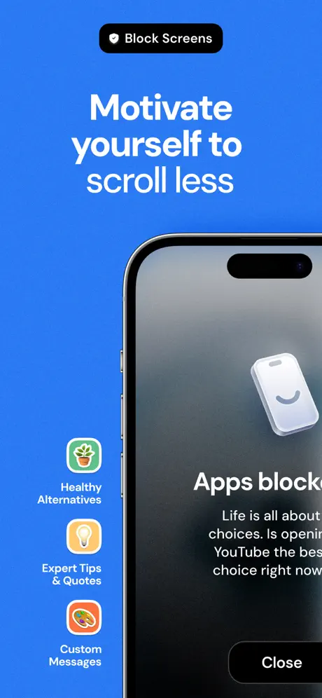
Frame 4 and Frame 8 introduce flat, friendly cartoon mascots that do not share the material language of the app interface. The app itself uses glassmorphism, dark-mode panels, and iOS-native sheets. The mascots look like they belong to a different product or an onboarding pamphlet. The fix is to vector the mascots in the same material style—give them translucent fills, subtle specular highlights, or at least the same rounded-corner radius as the app’s cards—or isolate them to a single frame so the aesthetic shift feels intentional rather than accidental.

Headline Ragging and Orphans

Frame 3 isolates “stick to” on its own line beneath “rules you will.” Frame 5 breaks “20+ ready-to-use / blocking rules” in a way that severs the adjective phrase. In both cases, manual typesetting or a slightly narrower text box would force better breaks: “Set blocking rules / you will stick to” or “20+ ready-to-use / blocking rules” could be improved by sizing down 2–3pt or using a non-breaking space after “ready-to-use.” These micro-errors signal haste in a set that otherwise wants to feel meticulously designed.

07The recipe

How to apply this to your own app

  1. 01. Lock your background logic to one hue, but vary its value by feature.

    Choose a brand color and commit, as Jomo does, but plan at least two value stops (deep and light) so that each screenshot registers as a distinct beat in the scroll. If every frame is the same luminosity, the thumb learns to ignore the color signal.

  2. 02. Treat the first two frames as trust, not teaching.

    Jomo front-loads awards and reviews before showing any UI. For any app in a crowded category, this is the correct hierarchy: social proof earns the pause; feature density earns the install. Put your hardest trust signals in Frame 1 and Frame 2, even if it feels repetitive to your internal team.

  3. 03. Use the phone frame as a cropping device, not just a container.

    Notice how Jomo rarely shows the entire device. The frame is cut by canvas edges, tilted, or overlapped by floating cards. This creates depth in a static image. When building your own set, avoid straight-on, full-device flat lays; instead, let the hardware break the frame edge to suggest motion.

  4. 04. Build a taxonomy pill and repeat it religiously.

    The black pill with icon + category label gives the shopper an instant parsing mechanism. Invent your own: maybe a colored badge, a numbered step, or a keyword chip. Repeat it in the exact same position so the viewer’s eye learns where to land for context before reading the headline.

  5. 05. Never let type collide with hardware.

    Frame 1’s cropped ‘y’ is a reminder that the device layer and the type layer must be spaced with real clearance. As a rule, keep headline text within the left 55 percent of a portrait canvas if a device enters from the right, or accept that the device must retreat until the descenders and ascenders are fully visible.

08Takeaways

Five things worth stealing

  • A single-hued background creates brand recognition but requires value shifts to maintain rhythm across more than four frames.
  • Social proof belongs in the first 1.5 seconds of attention; Jomo places awards and review quotes before any feature explanation.
  • Tilted and cropped hardware generates depth, but the crop must never truncate text—descenders and ascenders need protected margins.
  • Category pills (black chips with icons) act as chapter headings; repeating them in the same position trains the shopper how to scan.
  • Cartoon illustration and glassmorphic UI can coexist only if their material languages are harmonized; otherwise they fracture the product identity.
09The verdict

What the set actually achieves

The gallery achieves a recognizable brand footprint through repetition, yet sacrifices the rhythmic pacing that keeps a thumb swiping. The first three frames establish a pattern—headline, pill, tilted device—that later frames ride perhaps too faithfully. Where it succeeds is in micro-copy authenticity: the review quotes are colloquial, the blocking interstitials show real app names (Instagram, TikTok, Reddit), and the analytics screen uses believable weekly data. Where it stumbles is in production tolerance: a cropped descender in Frame 1, truncated outside-the-device copy in Frame 7, and an unrelenting blue that never gives the eye a place to rest across eight continuous panels.

This set is best suited for designers building productivity, wellness, or utility apps that need to feel emotionally approachable despite technically aggressive features. If your app blocks, limits, or tracks behavior, Jomo’s blueprint shows how to soften authoritarian UI with warm copy, friendly emoji, and consistent blue real estate.

10Questions

Frequently asked

Why does the background stay blue across all eight frames?

It is a deliberate anchoring strategy. The team sacrifices visual variety for instant brand recognition. In the App Store search results grid, a shopper who swipes Jomo’s gallery sees a continuous blue wall that differentiates it from competitors using white or black backgrounds. The risk is swipe fatigue inside the gallery itself.

Why is the iPhone never shown straight on?

Angled hardware creates parallax and depth in a static 9:16 image. It also lets the design team crop aggressively, showing only the UI elements that matter (a modal, a card, a chart) while hiding status bars or tab bars that add noise.

Are the review bubbles in Frame 2 readable at thumbnail scale?

No. At the tiny thumbnail size shown in search results, the review bubbles dissolve into white noise. However, the orange stars and the presence of text shapes still signal ‘social proof’ even if the words are unreadable. The headline and black pill remain the primary legible layer.

What is the specific weakness of Frame 7?

Frame 7 attempts a complex layered stack of limit cards inside a steeply tilted phone, but it also bleeds explanatory text (“Limit reached…”) outside the device on the left edge. That text is cropped by the image boundary, making it look like an export error rather than an intentional design choice. The fix is to move the copy inside the device or extend the canvas margin.

11Keep reading

Build your own screenshot set

The full set

10 shots
Jomo App Store screenshot 1Jomo App Store screenshot 2Jomo App Store screenshot 3Jomo App Store screenshot 4Jomo App Store screenshot 5Jomo App Store screenshot 6Jomo App Store screenshot 7Jomo App Store screenshot 8Jomo App Store screenshot 9Jomo App Store screenshot 10

About the app

هل تبحث عن تجربة فريدة ومميزة تُمكّنك من عيش اللحظة بكل تفاصيلها؟ تطبيق جومو | Jomo هو الحل المثالي لك. مع هذا التطبيق، يمكنك التمتع بكل لحظة من حياتك واكتشاف أشياء جديدة وممتعة. ORDER LLC, via the App Store listing.

Screenshots and store metadata belong to ORDER LLC. They are shown here for design commentary and criticism. The analysis on this page is original work by floow.design. View the original listing.

More Productivity teardowns

Browse all →