ClickUp app icon
ProductivityScreenshot teardown10 min read

ClickUp App Store screenshots

ClickUp’s App Store set attempts the impossible: making an everything-app feel coherent in seven swipes.

ClickUp App Store screenshot 1
01At a glance

The set in one screen

Framing
iPhone 15 Pro with Dynamic Island (Frames 2–7); Frame 1 uses a poster layout with no device.
Captions
Bold, centered sans-serif headlines beneath the device, often paired with icon triads or avatar clusters.
Backdrop
Pure white (#FFFFFF) with a soft magenta-to-cyan gradient bleed across the top edge of every canvas.
Type
Heavy headline weight for captions; mid-weight iOS system text inside devices; secondary metadata in gray (#6B7280).
UI / copy split
The interface is left intentionally dense—real project names, truncated message previews, and live timestamps—to signal authenticity.
Frame 1 job
Feature menu / manifesto on a blank canvas, establishing modularity before showing any hardware.

Sampled palette

#FFFFFF#FFFFFF
#111827#111827
#6B7280#6B7280
#FF5DCD#FF5DCD
#00C2FF#00C2FF
#7C3AED#7C3AED
02The challenge

What this screenshot set had to solve

The central design challenge is cognitive-load management. ClickUp must communicate at least six distinct functional surfaces—Projects, Brain AI, Tasks, Chat, Docs, and Scheduling—while retaining the clarity expected of a mobile-first productivity tool. A shopper swiping through the App Store dwells on each screenshot for roughly two to four seconds; in that window, the set must establish platform legitimacy, signal enterprise-grade depth, and differentiate from single-purpose competitors. An additional structural tension exists in Frame 1, which abandons the device frame entirely for a typographic poster. That choice risks making the app feel like a desktop or web-only service, forcing the remaining six frames to compensate with unmistakable iOS hardware cues. The team also needs to weave social proof into the narrative without letting logo clutter steal focus from the interface itself.

When the app does everything, let each frame do exactly one thing.
03The approach

How the set argues its case

The design team chose to prioritise topic isolation over user-journey continuity. Every frame is an island, with only subtle visual sensibilities tethering one swipe to the next. That route was likely chosen to counteract the cognitive overwhelm inherent to an all-in-one product—Storyboards, mind maps, and nested subtasks don’t belong in the same screenshot, so they’re never forced together.”

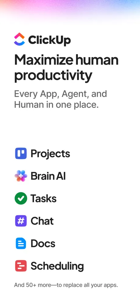
Frame 1 is the only one without device hardware. It functions as a poster. The canvas is pure #FFFFFF, crowned by a diffuse magenta-to-cyan gradient that bleeds across the top fifth. The ClickUp logomark—its chevron motif in pink, orange, and blue—sits above the bold headline “Maximize human productivity” in near-black sans-serif (≈ #111827). Below that, the secondary line “Every App, Agent, and Human in one place.” is rendered in a quieter mid-gray (≈ #6B7280). The body is a vertical ledger of six capabilities: Projects, Brain AI, Tasks, Chat, Docs, and Scheduling. Each row pairs a rounded-rect icon—blue, prismatic gradient, green, purple, blue, and red respectively—with a label in ≈ #111827. The row spacing is generous, roughly 24pt, turning the list into scannable placards. At the bottom, “And 50+ more—to replace all your apps.” acts as a footnote. The absence of a phone is the riskiest move in the set; it trades instantaneous platform recognition for whitespace and declarative clarity.
04Frame by frame

Every screenshot, and the job it does

ClickUp App Store screenshot 1 — The Manifesto
01

The Manifesto

On-frame caption: “No external caption text; headline is its own caption.

This frame is the only one without device hardware. It functions as a poster. The canvas is pure #FFFFFF, crowned by a diffuse magenta-to-cyan gradient that bleeds across the top fifth. The ClickUp logomark—its chevron motif in pink, orange, and blue—sits above the bold headline “Maximize human productivity” in near-black sans-serif (≈ #111827). Below that, the secondary line “Every App, Agent, and Human in one place.” is rendered in a quieter mid-gray (≈ #6B7280). The body is a vertical ledger of six capabilities: Projects, Brain AI, Tasks, Chat, Docs, and Scheduling. Each row pairs a rounded-rect icon—blue, prismatic gradient, green, purple, blue, and red respectively—with a label in ≈ #111827. The row spacing is generous, roughly 24pt, turning the list into scannable placards. At the bottom, “And 50+ more—to replace all your apps.” acts as a footnote. The absence of a phone is the riskiest move in the set; it trades instantaneous platform recognition for whitespace and declarative clarity.
ClickUp App Store screenshot 2 — The Hub + Social Proof
02

The Hub + Social Proof

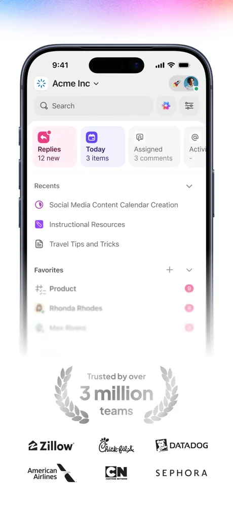
On-frame caption: “Trusted by over 3 million teams

The iPhone 15 Pro enters here—black titanium bezel, Dynamic Island, status bar locked at 9:41. The screen reveals the Home hub under the workspace “Acme Inc”. A search bar sits beneath the header, followed by a horizontally scrolling card row: “Replies 12 new” on a light pink ground (text ≈ #BE185D, background ≈ #FDF2F8), “Today 3 items” on a light purple ground (≈ #F3E8FF), and truncated cards for Assigned and Activity. Under that, a “Recents” list and a “Favorites” list display items like “Social Media Content Calendar Creation” with circular iconography and pink notification badges (≈ #F43F5E). The phone fades to white at its lower edge. Below this fade, trust signals begin: a gray laurel wreath (≈ #9CA3AF) wraps “Trusted by over 3 million teams”, followed by a monochrome logo lockup—Zillow, Chick-fil-A, Datadog, American Airlines, Cartoon Network, and Sephora. The density inside the phone is high, but the crop omits the tab bar, keeping the frame top-heavy and focused on the workspace switcher.

ClickUp App Store screenshot 3 — The Inbox
03

The Inbox

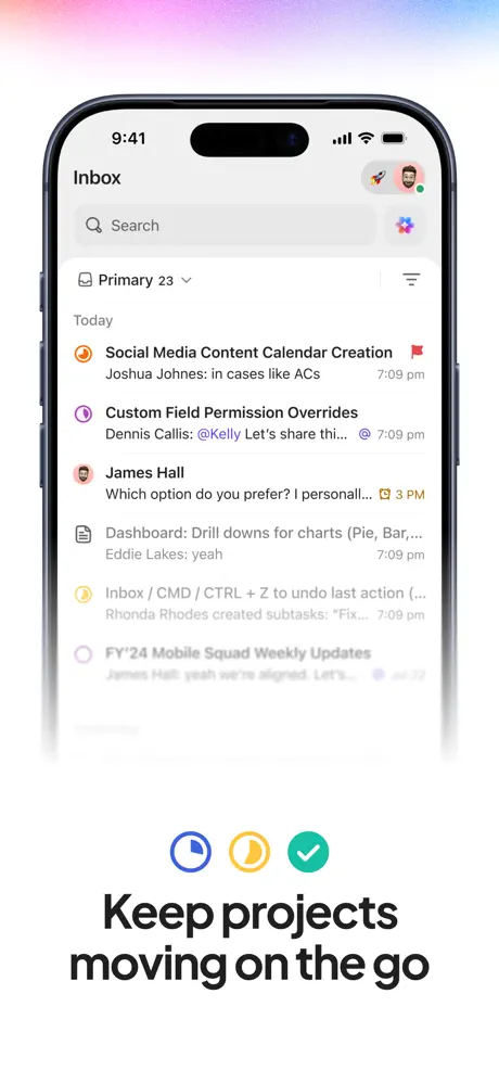
On-frame caption: “Keep projects moving on the go

The caption beneath the device reads “Keep projects moving on the go”, set in a bold ≈ 32pt weight. Above that headline, three circular icons—a blue clock, a yellow crescent, a green checkmark—form a decorative triad. The device displays the Inbox. The list shows threaded, realistic metadata: “Social Media Content Calendar Creation” carries a red flag icon; a message from “Joshua Johnes: in cases like ACs” is timestamped 7:09 pm; Dennis Callis includes an “@Kelly Let's share thi...” mention; James Hall’s message is truncated with a 3 PM stamp. Timestamps are right-aligned in a light gray (≈ #9CA3AF). The bottom rows fade into the canvas to suggest a longer feed. This frame succeeds because it proves immediacy—the preview text is believably messy, signaling that the app handles live workflows. The status bar remains at 9:41, consistent with Frame 2, which preserves temporal continuity across the set.

ClickUp App Store screenshot 4 — Brain AI
04

Brain AI

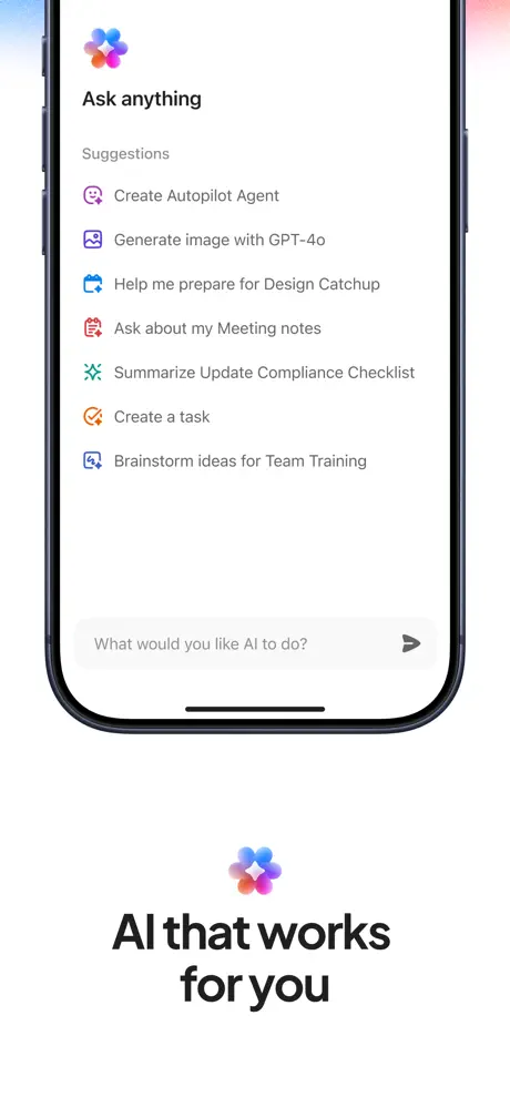
On-frame caption: “AI that works for you

The caption here is “AI that works for you”, anchored by the Brain AI prismatic icon below the phone. Structurally, this frame is the outlier: the iPhone is cropped asymmetrically, with the left bezel clipped more aggressively than the right, breaking the consistent viewport margin established in Frames 2, 3, 5, 6, and 7. Inside, an “Ask anything” sheet is visible. The suggestion list contains verbatim rows: “Create Autopilot Agent”, “Generate image with GPT-4o”, “Help me prepare for Design Catchup”, “Ask about my Meeting notes”, “Summarize Update Compliance Checklist”, “Create a task”, and “Brainstorm ideas for Team Training”. A bottom input field shows the placeholder “What would you like AI to do?” against a light gray ground (≈ #F3F4F6). Naming GPT-4o specifically grounds the AI in a real model rather than vaporous branding. However, the tighter crop sacrifices spatial context; without the full bezel, the sheet UI feels disconnected from the handheld frame, reading more like a floating detail than a phone screen.

ClickUp App Store screenshot 5 — Tasks
05

Tasks

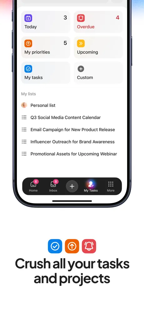
On-frame caption: “Crush all your tasks and projects

The caption reads “Crush all your tasks and projects” beneath another decorative icon triad: a blue checkmark, an orange upward arrow, and a red bell. The device shows a dashboard of filter tiles arranged in a two-column grid—Today (3), Overdue (4), My priorities (5), Upcoming, My tasks, and Custom. Overdue uses red text (≈ #EF4444) and a red bell icon. Below the grid, a “My lists” section enumerates projects like “Q3 Social Media Content Calendar” and “Influencer Outreach for Brand Awareness”. Crucially, the tab bar is visible here: a near-black (≈ #000000) frosted strip housing Home with a red badge (6), Inbox with a red badge (8), a central plus button, My Tasks, and More. That tab bar is valuable architectural evidence; it shows shoppers how the app scales beyond a single screen. The balance between the grid and the list below is tight but readable, and the red badges inject urgency without overwhelming the white space.

ClickUp App Store screenshot 6 — Chat
06

Chat

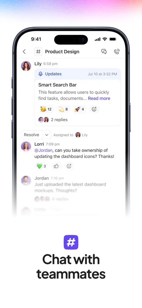
On-frame caption: “Chat with teammates

The caption is “Chat with teammates”, anchored by a single purple hashtag icon (≈ #7C3AED). The device displays the “# Product Design” channel. The conversation thread begins with an “Updates” card from Lily, timestamped “Jul 10 at 3:32 PM”, containing hyperlinked “Read more” text in purple and reaction counts (🥳 12, 🫰 8, 🚀 4). Below that, an assignment pill shows “Assigned to Lily”. Lorri’s message includes a literal mention: “@Jordan, can you take ownership of updating the dashboard icons? Thanks!”, followed by a heart reaction (3). Jordan’s reply at “7:16 pm” begins below but blurs out. The UI interpolates messaging and project management—resolve buttons, assignment avatars, and threaded replies—making the competitive positioning visually explicit. Message bubbles use light fills and native iOS spacing, while the header maintains the back arrow and channel title. This is the most narratively coherent frame because every UI element supports a single mental model: chat that drives action.

ClickUp App Store screenshot 7 — Docs
07

Docs

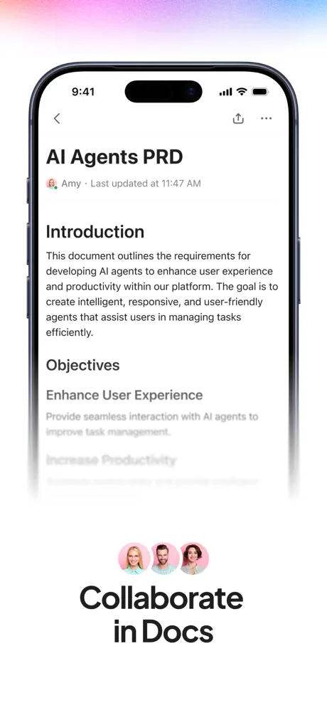
On-frame caption: “Collaborate in Docs

The caption reads “Collaborate in Docs”, accompanied by a stack of three overlapping circular avatars beneath the phone. The device displays a document titled “AI Agents PRD”. Metadata reads “Amy · Last updated at 11:47 AM” in gray (≈ #6B7280). The typography inside the doc is rigorous: “Introduction” as a bold H2, followed by body copy in a dark gray (≈ #374151) that begins “This document outlines the requirements for developing AI agents...”. Then “Objectives” and “Enhance User Experience” continue the hierarchy. The text is real prose, not placeholder, which lends credibility. The lower portion fades aggressively into the white canvas, obscuring the final lines. The avatar stack below the phone telegraphs multiplayer presence, though it mildly conflicts with the single-author “Amy” metadata visible in the document header. Still, the frame effectively positions ClickUp as a serious documentation competitor. The fade at the bottom is consistent with the set’s masking language, though here it clips actual content more than chrome.

05The craft

Captions, colour and the mechanics of the sell

Caption pattern

Each frame after Frame 1 follows a rigid south-anchor formula: hardware fades into white, then a small icon cluster or avatar stack, then a large bold caption. This cadence becomes predictable by Frame 3, which aids skim reading but risks monotony.

Visual system

A shared aurora gradient (≈ #FF5DCD to #00C2FF) bleeds across the top of every canvas, acting as a brand tether. Type is handled in a single weight family: heavy black for headlines (≈ 32–40pt), regular weight for subheads (≈ 18–20pt), and standard iOS system text inside the devices. Pure white (#FFFFFF) is the only background color used, so the set feels airy even when the UI inside the phone is dense.

The thumbnail test

Bright white background with bold headline. Distinguishable by logo and icon list. Feels more like a landing page card than a mobile preview, which may cause a split-second identity crisis for App Store scrollers accustomed to seeing a device in thumbnail one.

Conversion mechanics

Frame 2 is the conversion moment: social proof is introduced before the shopper has seen a single feature in depth. The trust badge (“Trusted by over 3 million teams”) sits in the scan path immediately after the workspace screenshot, acting as a credibility bridge before the user investigates specific surfaces. However, Frame 1 lacks any conversion lever—no rating, no device, no social proof—so shoppers who bounce after the first swipe leave with only a feature list, not a reason to install.

06Where it slips

What we would change

Frame 1 loses the mobile frame too early

The poster strategy is bold, but it severs the immediate “mobile app” context. Adding a faint device silhouette or nesting the composition inside a phone frame would preserve whitespace while signaling iOS.

Frame 4 breaks the bezel rhythm

The left bezel is cropped more aggressively than the right, creating an asymmetry that undermines the consistent viewport established everywhere else. Re-export with identical hardware padding.

Decorative icon triads lack semantic anchors

In Frames 3 and 5, the three-icon clusters above the captions scan as ornament rather than information. Their relationship to the underlying UI is not legible; either tie them to explicit tab-bar segments or remove them to let the device dominate the vertical axis.

Accessibility risk on the 'Replies' card

Frame 2 uses light pink text on a light pink ground that may dip below WCAG AA contrast. Darkening the text by two swatches or increasing ground saturation would fix it.

Top gradient is too diffuse

The persistent aurora is so soft that on certain displays it reads as a color-calibration error rather than intentional branding. Increasing its opacity or anchoring it to a geometric shape would sharpen identity.

07The recipe

How to apply this to your own app

  1. Catalog first, prove second

    Use Frame 1 as a table of contents. If your app has multiple surfaces, enumerate them in the opening screenshot so the shopper knows what to expect in the next five swipes.

  2. Leave the UI messy

    Real timestamps, truncated previews, and actual user names beat placeholder text. Density signals that the tool is already inhabited.

  3. Lock the device crop

    Export every device frame from the same template. Even a two-pixel bezel variance between frames breaks the illusion of a single coherent set.

  4. Anchor the bottom of every canvas

    A recurring caption position creates rhythm. Pair it with a small icon or avatar cluster so the eye always knows where to rest between swipes.

08Takeaways

Five things worth stealing

  • Modular storytelling beats journey storytelling when the product surface area is enormous.
  • Social proof belongs early—Frame 2 interrupts the feature list with trust signals before skepticism can harden.
  • Real UI density is a competitive asset for productivity tools; sanitized mocks hurt credibility.
  • Consistent hardware framing is a hygiene factor—one asymmetrical crop damages the whole set.
  • Decorative iconography above captions should earn its place by mapping to real UI, otherwise it becomes visual noise.
09The verdict

What the set actually achieves

The set lands as a disciplined, modular walkthrough. Each frame isolates one product surface, uses real UI instead of sanitized mocks, and repeats a consistent south-anchor caption pattern that stabilizes the swipe experience.

Teams evaluating Notion, Asana, or Slack replacements who need to see that ClickUp can handle documents, chat, and tasks without switching apps. The density and enterprise logos suggest the target is operations leads at mid-size companies rather than casual individual users.

10Questions

Frequently asked

Why is there no iPhone in Frame 1?

The first frame is treated as a manifesto poster rather than a device preview. It prioritizes whitespace and icon legibility over platform signaling, shifting the mobile proof to Frames 2–7.

What is the decorative gradient at the top of every screenshot?

A soft magenta-to-cyan aurora bleed (≈ #FF5DCD to #00C2FF). It acts as a brand tether that unifies the seven frames without adding a colored border or heavy background.

Which frame shows the tab bar?

Frame 5 (“Crush all your tasks and projects”) is the only frame where the bottom tab bar is fully visible, rendered in near-black with frosted blur.

What AI model is referenced in the set?

Frame 4 explicitly names “GPT-4o” in one of the suggestion rows beneath the “Ask anything” header.

11Keep reading

Build your own screenshot set

The full set

7 shots
ClickUp App Store screenshot 1ClickUp App Store screenshot 2ClickUp App Store screenshot 3ClickUp App Store screenshot 4ClickUp App Store screenshot 5ClickUp App Store screenshot 6ClickUp App Store screenshot 7

About the app

Screenshots and store metadata belong to ClickUp. They are shown here for design commentary and criticism. The analysis on this page is original work by floow.design. View the original listing.

More Productivity teardowns

Browse all →