Cosmos app icon
SocialScreenshot teardown13 min read

Cosmos App Store screenshots

Cosmos is a social curation app whose App Store screenshots treat the storefront like a gallery opening. The set leans on editorial photography, surgical typography, and an almost monastic color palette to sell the idea of taste-as-identity. For a designer building their own screenshot narrative, it is a masterclass in restraint—and a warning about the cost of being too quiet.

Set published by Cosmos Entity · 8 frames analysed

4.7 · 3.1K ratingsFreev2.8.0Updated 4mo ago
Cosmos App Store screenshot 1
01At a glance

The set in one screen

Framing
Mixed. Frames 1, 2, 4, 6, 8 present UI full-bleed without device chrome; frames 3, 5, 7 nest the interface inside a white iPhone shell.
Captions
Large, bold sans-serif headlines in near-black (#111111), centered or flush-left, acting as exhibition labels above the UI.
Backdrop
Consistent warm off-white matting, approximately #F2F0EB, used as the canvas for every frame outside the device.
Type
Geometric sans-serif at a massive scale, tight leading, high contrast against the plaster background.
UI / copy split
Roughly 70% interface / 30% headline and negative space.
Frame 1 job
Frames 1–2 establish discovery; frames 3–5 establish identity and social graph; frames 6–8 establish trust, filtering, and interoperability.

Sampled palette

#F2F0EB#F2F0EB
#111111#111111
#688559#688559
#FFFFFF#FFFFFF
02The challenge

What this screenshot set had to solve

The central design problem is how to market a visual discovery tool whose interface is intentionally understated. Cosmos does not rely on saturated buttons, heavy shadows, or gamified badges; its in-app chrome is thin, light, and nearly invisible. In an App Store environment where shoppers swipe in half-second bursts, restraint is a liability unless it is framed deliberately. The team had to communicate at least three distinct value categories—browsing (search, color filtering), identity (profiles, following), and utility (import, collaboration)—without letting the screenshots feel like a disjointed feature list. They also needed to signal legitimacy immediately: frame 1 carries an 'App of the Day' laurel, which means the visual language had to feel premium enough to justify that endorsement. Perhaps hardest of all, the product’s differentiation lives in subtle interactions (hiding AI content, searching by hex code, sharing to a clustered board) that do not lend themselves to explosive hero imagery. The challenge, then, was to build a scrollable sequence that reads like a single cohesive exhibition wall, where each frame is quiet but never silent, and where the photography does the emotional lifting that the UI refuses to do.

03The approach

How the set argues its case

The team adopted a 'gallery matting' strategy: treat every screenshot as a framed print on a plaster wall. Backgrounds are identical across all eight frames, so the shopper’s eye travels smoothly during the swipe. Headlines are stripped to three words or fewer, functioning like title cards in a silent film. To prevent the minimal UI from flatlining, they introduced a strict alternation between full-bleed interface (frames 1, 2, 4, 6, 8) and device-framed portraits (frames 3, 5, 7). This creates a rhythmic pulse: tool, object, tool, object. Color is used as punctuation rather than decoration; frames 1–3 and 5–8 stay within a warm black-and-ivory range, so when frame 4 floods the screen in #688559 sage green, it acts as a hard reset that forces the viewer to pause. The photography curation is deliberately adult—still lifes, shadowed interiors, grainy textures, no overt lifestyle cheer—which aligns the product with gallery culture rather than viral content culture. Copy is entirely verb-led, focusing on action rather than aspiration.

The set never shouts. It assumes the viewer is already tired of loud, algorithmic feeds and is looking for a quieter, more deliberate space to collect images. By embedding the iOS share sheet and third-party app logos, it also signals that Cosmos is a utility layer inside the existing mobile ecosystem, not a walled garden.

04Frame by frame

Every screenshot, and the job it does

Cosmos App Store screenshot 1 — The Brand Thesis
01

The Brand Thesis

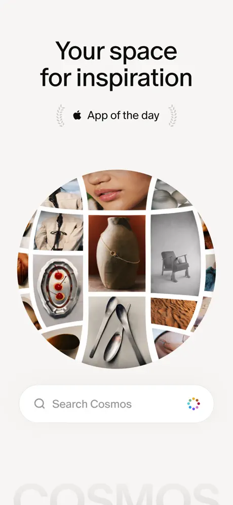
On-frame caption: “Your space for inspiration

The first frame is a marketing composition rather than a literal UI screenshot. A warm off-white background hosts a massive centered headline in dense black, with an 'App of the Day' badge—complete with Apple logomark and symmetrical laurel wreaths—sitting just beneath it to establish immediate social proof. The hero is a large circular image mosaic with thin white gutters, containing fashion still lifes, interior vignettes, and abstract textures that function as a visual manifesto. At the bottom, a rounded search pill contains the placeholder text 'Search Cosmos' and a small circular color-wheel icon on the right. A ghosted wordmark, 'COSMOS', bleeds off the lower edge at roughly 10% opacity. The layout is radial and heavily centered, which risks feeling static, but the variety of photography inside the circle prevents total symmetry. It reads as an invitation rather than a dashboard.
Cosmos App Store screenshot 2 — Discovery Density
02

Discovery Density

On-frame caption: “Search and discover

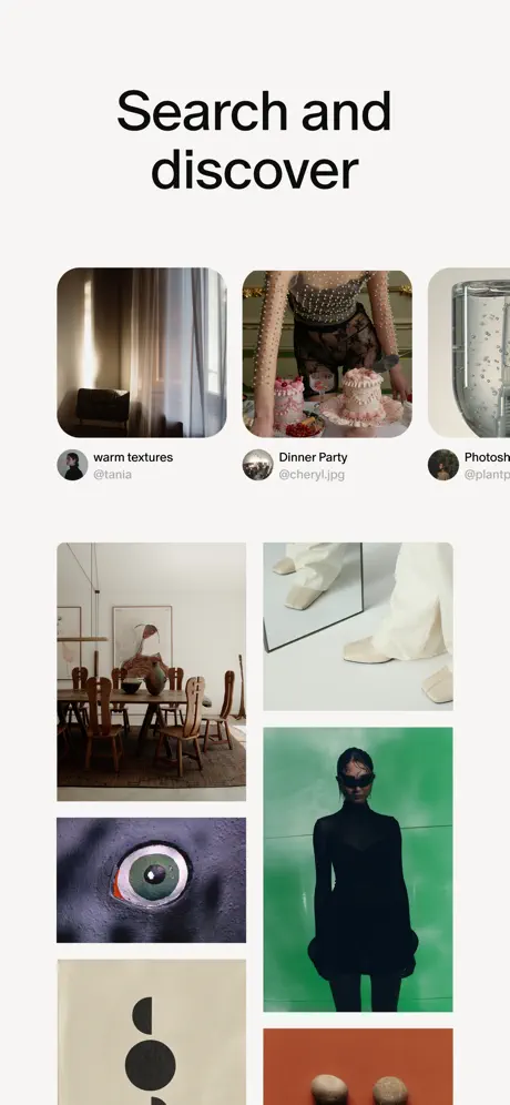
This frame drops the circular motif entirely and presents a full-bleed masonry grid of editorial photography against the same off-white backdrop. The grid uses rounded-corner tiles of varying heights, mimicking a Pinterest or Are.na layout. The top row introduces user attribution: circular avatars paired with collection titles and handles. Visible text includes 'warm textures' @tania, 'Dinner Party' @cheryl.jpg, and a truncated 'Photosho...' @plantp... where the interface crop clips the copy. Below, the masonry continues with interior scenes, fashion details, and abstract objects. There is no visible search bar or navigation chrome; the value proposition is communicated purely through the density and apparent quality of the content. The composition pulls downward via asymmetry, encouraging the viewer to imagine infinite scroll.

Cosmos App Store screenshot 3 — Identity Container
03

Identity Container

On-frame caption: “Save to your profile

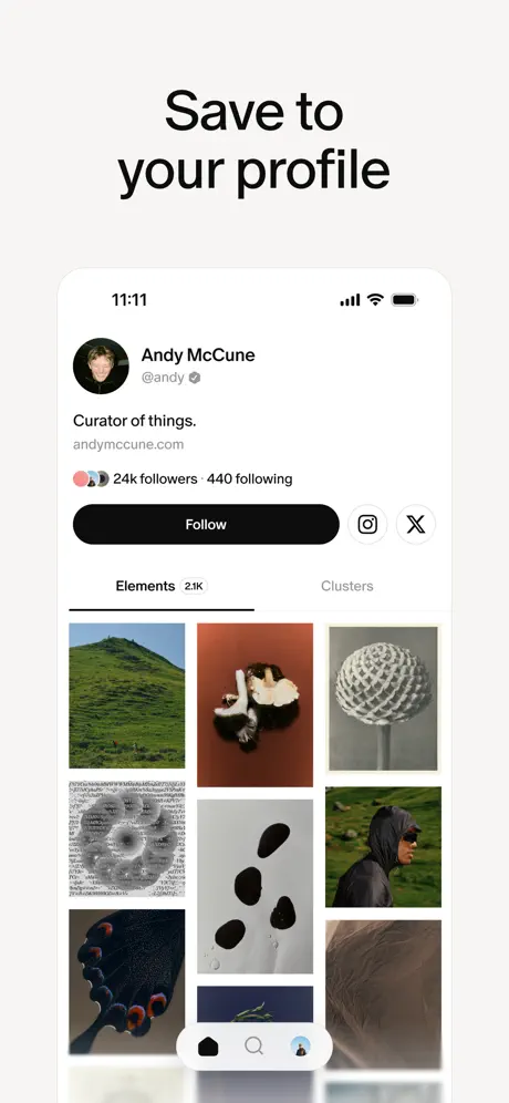
Here the interface is suddenly nested inside a white iPhone frame with rounded corners, breaking the fourth wall and turning the app into a possessed object. The status bar shows 11:11, full signal, wi-fi, and battery. Inside, a profile page for 'Andy McCune' @andy displays a verified checkmark, a short bio reading 'Curator of things.', and a url 'andymccune.com'. A stack of overlapping micro-avatars sits to the left of the follower count ('24k followers · 440 following'). A solid black pill button labeled 'Follow' dominates the width, flanked by outlined-circle secondary actions for Instagram and X. Below, a tab switcher shows 'Elements 2.1K' active with a thin underline, beside 'Clusters'. A masonry grid of saved images fills the lower two-thirds. The iOS tab bar is visible at the bottom. The frame establishes persistence and ownership: this is not ephemeral browsing; it is a library.

Cosmos App Store screenshot 4 — Chromatic Proof
04

Chromatic Proof

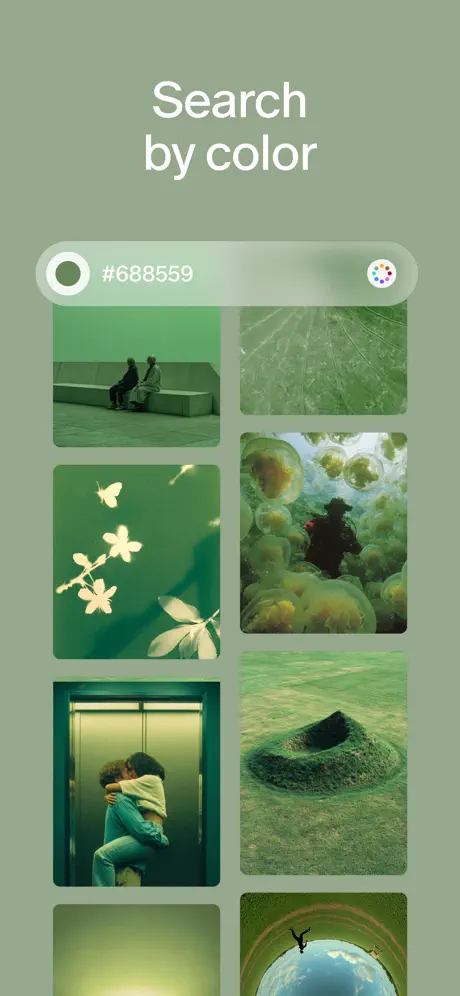
On-frame caption: “Search by color

The most visually arresting frame in the set. The entire background is flooded in a muted sage green that matches the hex code '#688559' displayed in the search bar. White headline text sits at the top, followed by a translucent pill-shaped search input containing a white circle swatch on the left, the hex string in the center, and the familiar color-wheel icon on the right. Below, a two-column masonry grid shows only green-tinted photography: a couple on a bench, backlit leaves, jellyfish, an elevator embrace, a crater in grass. The frame abandons the device shell, letting the color field touch the edges of the screenshot. It functions as both a palette cleanser and a hard proof of a novel search paradigm. The monochrome wash makes every other frame in the set feel like a prelude.

Cosmos App Store screenshot 5 — Social Graph
05

Social Graph

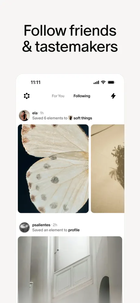
On-frame caption: “Follow friends & tastemakers

Back inside the white iPhone frame. The header shows a dotted logo mark on the left, 'For You' and 'Following' tabs centered, and a lightning bolt icon on the right. The feed below uses activity cards. The first card shows a user named 'ela' from '1h' ago with the text 'Saved 6 elements to 🧺 soft things' above a dual-image preview: a cropped butterfly wing on the left and a beige wall shadow on the right. The second card shows 'psalientes · 2h' with the text 'Saved an element to profile' above a tall architectural image of a white hallway with an arched opening. The typography inside the device is small, utilitarian, and low-contrast, letting the saved imagery dominate each card. It reads as a calm, reverse-chronological stream of taste rather than a notification factory.

Cosmos App Store screenshot 6 — The Filter
06

The Filter

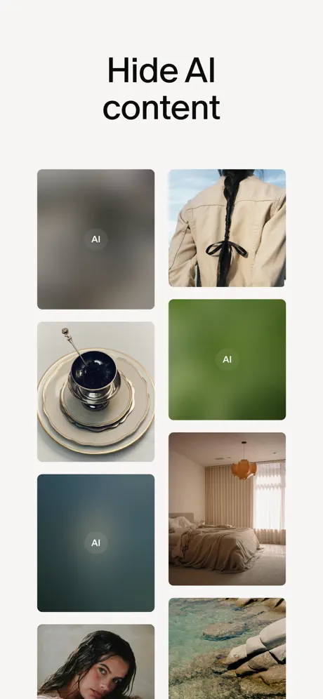
On-frame caption: “Hide AI content

This frame returns to full-bleed masonry on the off-white background, but several tiles are deliberately obliterated. Three cards—one grey, one green, one blue-grey—are rendered as heavy gaussian blurs with a small white 'AI' label centered inside each. The remaining tiles show sharp photography: a braided jacket, stacked serveware with a dark egg, a beige bedroom, a wet-haired portrait, and a rocky coastline. The layout is irregular, two-column masonry with varying heights. The frame demonstrates filtering by subtraction; the blurred tiles read as censored or removed. It is a brave conceptual move for an App Store screenshot, where most apps pretend their content is universally perfect. The visual language of blur is instantly understood, though the small 'AI' typographic treatment risks being misread as a watermark or a loading state.

Cosmos App Store screenshot 7 — Shared Space
07

Shared Space

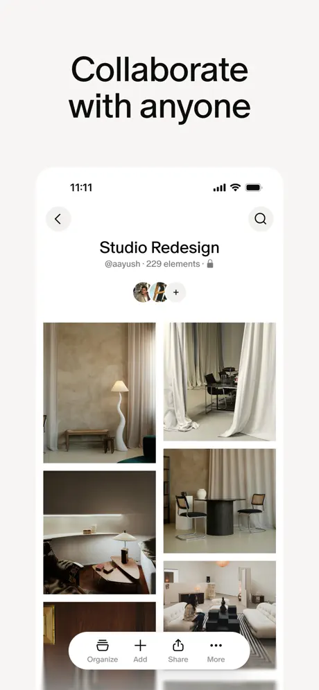
On-frame caption: “Collaborate with anyone

Nested again in the white iPhone shell. The header contains a back chevron, the collection title 'Studio Redesign', and the owner '@aayush · 229 elements ·' followed by a lock icon. Beneath, overlapping circular collaborator avatars sit next to a '+' button, implying multiplayer curation. The body is a restrained masonry grid of interior design photography—limewash walls, heavy drapery, sculptural lamps—unified by a warm, desaturated palette. At the bottom, a floating white action pill contains four grey line icons labeled 'Organize', 'Add', 'Share', and 'More'. The icons are thin and low-contrast, nearly disappearing into the pill. The frame sells the app as a workspace for small teams, positioning it adjacent to tools like Notion or Milanote rather than pure social media.

Cosmos App Store screenshot 8 — The On-Ramp
08

The On-Ramp

On-frame caption: “Import from anywhere

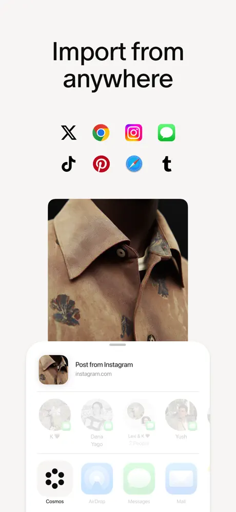
The final frame is a composition of external logos and system UI. At the top, two rows of third-party app icons appear in full color: X, Chrome, Instagram, Messages, TikTok, Pinterest, Safari, and Tumblr. Centered below is a large image of a tan embroidered shirt collar, presumably the content being imported. At the bottom, an iOS share sheet is partially visible, showing 'Post from Instagram' with the url 'instagram.com', a horizontal row of circular contact suggestions (K, Dena Yayo, Lexi & K, Yush), and a bottom row of action icons including a black Cosmos dot-cluster logo, AirDrop, Messages, and Mail. The frame attempts to communicate interoperability by literally showing the iOS system chrome, but the composition is top-heavy: the logo grid floats without anchoring, and the share sheet is cropped so aggressively that the contact names are barely legible.

05The craft

Captions, colour and the mechanics of the sell

Caption pattern

Every frame uses a single centered or left-aligned headline in bold near-black type: 'Your space for inspiration', 'Search and discover', 'Save to your profile', 'Search by color', 'Follow friends & tastemakers', 'Hide AI content', 'Collaborate with anyone', 'Import from anywhere'. There are no subheadlines, no body paragraphs, and no feature callouts inside the UI screenshots themselves. The restraint is absolute.

Visual system

The visual system is built on three constraints: one background color, one type weight, and one corner radius logic. The off-white matting (#F2F0EB approximated) separates the screenshot from the App Store's own white page, creating a subtle inset effect. The typography appears to be the system sans-serif, sized at roughly 56–64pt equivalent, occupying the top 18–22% of the frame. Inside the UI, all images use a uniform rounded rectangle treatment, approximately 12–16pt corner radius, which echoes the pill-shaped search bars and buttons. The only deviations are the circular avatar crops and the circular mosaic in frame 1.

The thumbnail test

The trigger is unclear. Frame 1's circular mosaic is visually heavy, but it is also abstract; there is no clear text label screaming 'moodboard' or 'Pinterest alternative' from the thumbnail view. A shopper browsing the Social category might not parse the circular collage as an app interface at all.

Conversion mechanics

The sequence follows a logical user journey—discovery, identity, search, social, filtering, collaboration, import—but the emotional arc peaks too early. Frame 1 is the only purely aspirational image; by frame 8, the shopper is left looking at a truncated iOS share sheet, which is a utility moment, not a desire moment. The set may convert users who already know they want a Pinterest alternative, but it does little to seduce the browser who has not yet articulated that need.

06Where it slips

What we would change

Device frames dissolve into the matting

In frames 3, 5, and 7, the white iPhone shell sits on an off-white background that is only marginally cooler and darker. Without a visible drop shadow or edge stroke, the phone silhouette dissolves, particularly along the left and right bezels. On an OLED display, the effect is even weaker. Fix: add a diffuse 8% black drop shadow beneath the device, or a 1px stroke in #E0DDD8, to lift the object off the canvas.

Truncated demo copy looks broken

Frame 2 clips the collection title 'Photosho...' and the handle '@plantp...' at the right edge of the masonry. In a live app, truncation is acceptable; in a marketing asset, it reads as a bug or a lazy export. Fix: shorten the demo copy to handles that survive the crop, or widen the gutter so the full words 'Photoshoot' and '@plantport' remain legible.

AI blur is semantically ambiguous

Frame 6 presents blurred tiles with a small white 'AI' label. In the rapid scroll of the App Store, a shopper is more likely to read these as failed image loads or NSFW blurs than as a deliberate user-controlled filter. The screenshot shows no toggle, no settings gear, and no explicit 'Hide' verb inside the interface. Fix: superimpose a visible segmented control or toggle switch at the top of the frame, labeled 'Show AI' / 'Hide AI', so the action is understood as agency rather than censorship.

Trademarked logos create legal and visual noise

Frame 8 uses full-color third-party marks—Instagram, Pinterest, Chrome, Tumblr—without disclaimer styling. This exposes the listing to potential App Store rejection or IP complaints. Visually, the saturated brand colors clash with the app’s otherwise muted monochrome system, making the frame feel like an affiliate ad rather than a product screenshot. Fix: replace the logo grid with generic monochromatic glyphs (a globe for web, a camera for photos, a chat bubble for messages) that suggest breadth without borrowing equity.

The final frame is a weak closer

Ending on an import action sheet is an administrative note, not a crescendo. The share sheet is cropped at the bottom, the contact avatars are unreadable, and the central shirt image feels disconnected from the import narrative. A stronger eighth frame would return to the emotional promise of frame 1—perhaps a fullscreen collaboration board or a dramatically composed saved element—so the shopper closes the carousel with a feeling of aspiration rather than a reminder of setup work.

07The recipe

How to apply this to your own app

  1. Use a single canvas color

    Cosmos binds eight disparate frames by painting every screenshot background the same warm off-white. If your product uses a light UI, export your screenshots onto a colored mat that is 5–10% darker or warmer than pure white so the frame reads as an intentional object, not a default export.

  2. Alternate device and full-bleed rhythmically

    The set uses a heartbeat pattern: interface, object, interface, object. When showing a tool or filter, go full-bleed so the UI feels expansive; when showing a profile or feed, use device chrome so the shopper imagines holding it. Never alternate randomly; let the framing carry meaning.

  3. Use color as a stop sign

    Frame 4 works because it is the only saturated frame in an otherwise monochrome sequence. If you have a killer differentiator—color search, dark mode, a chart—flood that single screenshot in the feature’s native hue so the swipe momentum stalls exactly where you want attention.

  4. Audit every truncated string

    Marketing screenshots are not live data. There is no excuse for ellipses on usernames, titles, or captions. Before exporting, replace all dynamic text with static dummy copy that fits every cropping scenario.

08Takeaways

Five things worth stealing

  • A restrained palette and editorial photography can make a social app feel like a gallery, but only if the typography and framing are disciplined enough to support the quiet.
  • Device frames need edge definition—shadow or stroke—to survive on variable display temperatures.
  • Conceptual features like 'hide AI' require explicit chrome in a screenshot; do not rely on implied behavior.
  • The last frame in a set should reinforce desire, not utility. If your final screenshot is a settings panel or a share sheet, reconsider the emotional payoff.
  • verdictProse
09The verdict

What the set actually achieves

The resulting set is a highly consistent, eight-frame narrative that alternates between raw interface and device-framed social proof, using a warm monochrome gallery wall as its binding agent. It succeeds in looking expensive, but sacrifices some immediacy and legibility along the way.

This set is a textbook study for designers building tools for creative professionals—curators, architects, stylists, or strategists—where taste is the product. It will also resonate with indie apps that lack a marketing budget for 3D illustrations and must let the UI itself seduce.

10Questions

Frequently asked

Should I use device chrome in every App Store screenshot?

Not necessarily. Cosmos proves that mixing full-bleed UI with device-framed UI creates rhythm. Use chrome when you want to emphasize possession or social context; drop it when you want to show the tool at its most expansive.

How many words should a screenshot headline be?

Cosmos stays at three or fewer. In a set this quiet, any more would compete with the imagery. Treat the headline as a gallery placard, not a paragraph.

Is it safe to use third-party app logos in screenshots?

Generally no. App Store guidelines discourage using trademarks without permission, and brands like Instagram or Pinterest may object. Cosmos takes a visible risk in frame 8. Safer to imply connectivity with generic icons or system UI.

What is the background color used in the Cosmos screenshots?

The team uses a consistent warm off-white, approximately #F2F0EB, as the canvas for every frame. It never changes, creating a seamless swipe experience on the store page.

Why does the 'Search by color' frame look so different?

Frame 4 floods the background in the exact sage green being searched (#688559). It is a deliberate punctuation mark in an otherwise monochrome set, designed to stop the thumb and prove the feature.

11Keep reading

Build your own screenshot set

The full set

8 shots
Cosmos App Store screenshot 1Cosmos App Store screenshot 2Cosmos App Store screenshot 3Cosmos App Store screenshot 4Cosmos App Store screenshot 5Cosmos App Store screenshot 6Cosmos App Store screenshot 7Cosmos App Store screenshot 8

About the app

Welcome to Cosmos. Your space for inspiration. Cosmos is where inspiration lives — built for curated discovery, saving ideas, and sharing with collaborators and friends. With Cosmos Entity, via the App Store listing.

Screenshots and store metadata belong to Cosmos Entity. They are shown here for design commentary and criticism. The analysis on this page is original work by floow.design. View the original listing.

More Social teardowns

Browse all →