
CRED app icon
FinanceScreenshot teardown11 min read

CRED App Store screenshots

CRED’s latest App Store screenshot set treats finance like editorial fashion: a white canvas, a sharp serif voice, and credit cards that refuse to stay inside the phone. It is an exercise in restraint that occasionally loosens its tie just enough to let product utility slip through.

Set published by Dreamplug · 7 frames analysed

4.8 · 2.8K ratingsFreev5.7.7Updated 4mo ago
CRED App Store screenshot 1
01At a glance

The set in one screen

Framing
Single iPhone 15 Pro mockup, centered; frames 1 and 4 break the card out beyond the device bezel; frame 7 introduces a cropped triptych.
Captions
Large transitional serif headline in #1A1A1A, paired with a smaller neutral sans subhead in #6E6E6E or #666666; positioned either above or below the device depending on the frame’s internal density.
Backdrop
Pure white (#FFFFFF) across all seven frames, creating a continuous horizontal band when swiped.
Type
Editorial serif dominates the marketing layer; the UI layer relies on clean sans-serif numerals and small-caps metadata. No rounded ‘friendly’ fintech type in sight.
UI / copy split
Roughly 60/40 in favor of UI, but the marketing headlines are sized large enough to own the thumbnail at small scale.
Frame 1 job
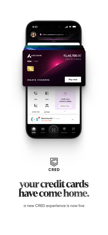
The opening frame must stop the thumb without resorting to neon gradients or human photography. CRED answers by breaking the card out of the device, casting a soft shadow, and pairing it with a declarative headline that frames the entire product as a destination rather than a utility.

Sampled palette

#1E0014#1E0014
#BE0F52#BE0F52
#00D66C#00D66C
#000000#000000
#FFFFFF#FFFFFF
#F5F5F5#F5F5F5
02The challenge

What this screenshot set had to solve

Finance screenshot sets face a paradox: shoppers want proof of utility, but dense dashboards die at thumbnail size. CRED needed to communicate six distinct jobs—card aggregation, credit-score tracking, RuPay UPI enablement, QR payments, merchant checkout, and rewards—without letting the sequence fragment into six different apps. The additional constraint is brand temperament: the interface uses dark, moody, dimensional surfaces that can easily collapse into undifferentiated black blobs when scaled down. The team had to find a way to let each frame telegraph its specific function while maintaining a recognizable signature across the swipe path. That meant solving for both information hierarchy at arm’s length and tactile detail up close.

03The approach

How the set argues its case

The underlying strategy is a refusal to decorate. The designers established a single canvas (#FFFFFF), a single device frame, and a single typographic lockup—serif headline above/below, sans subhead beneath it—then let the UI’s own color and dimensionality do the work. Where most fintech sets use illustration to explain features, CRED lets the product interface speak, occasionally extruding physical cards beyond the screen to bridge the gap between digital and tangible. The rhythm alternates dark UI (frames 1, 4, 5) with light UI (frames 2, 3, 6, 7), preventing visual fatigue without abandoning the white wrapper. Shadow language is consistent across the floating objects: soft, diffuse, realistic, never the harsh drop-shadow defaults of raw mockup templates.

The positioning is unmistakably exclusionary in tone. Headlines like “for those who know their worth” and “master the number that matters” do not explain mechanics; they assign status. The screenshots are built for a shopper who already understands credit and wants to feel seen by a product that looks as obsessive about finish as they are about their own score. This is not onboarding for first-time card holders; it is a membership card presented as an app.

04Frame by frame

Every screenshot, and the job it does

CRED App Store screenshot 1 — The Floating Card as Hero
01

The Floating Card as Hero

On-frame caption: “your credit cards have come home. / a new CRED experience is now live

The Axis Bank card is extruded upward so its top edge breaks the iPhone bezel, casting a soft, multi-layered shadow onto the screen surface. The card face lives in deep plum-black (#1E0014), with a magenta-pink light leak bleeding from the right edge. Inside the UI, the tab bar is fully visible: HOME filled, CARDS, a central scan button with a subtle neon ring, REWARDS, and MORE. The lockup below the device is centered, using a high-contrast transitional serif for “your credit cards have come home.” and a neutral grey sans for the subhead. The composition is intentionally top-heavy; the card’s asymmetry pulls the gaze upward and invites a swipe.
CRED App Store screenshot 2 — The Dashboard at Scale
02

The Dashboard at Scale

On-frame caption: “credit card management / for those who know their worth

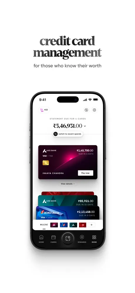
The caption moves above the device. The screen shows an aggregate statement—“STATEMENT DUE FOR 4 CARDS”—followed by a massive “₹5,46,931.00” with a chevron-down and a “switch to recent spends” toggle. Beneath the figure, the card stack returns with the same Axis plum card leading, followed by a teal Axis variant and a blue ICICI Bank card. A bottom filter strip reads “ALL (4)” alongside tiny bank favicons and a plus control. The Dynamic Island and status bar are left fully unobstructed. The spacing around the rupee amount is generous; the figure is centered with roughly twice the margin used between the card thumbnails below, giving the numerical evidence room to breathe.

CRED App Store screenshot 3 — The Score as Trophy
03

The Score as Trophy

On-frame caption: “master the number that matters / decode & improve your credit score.

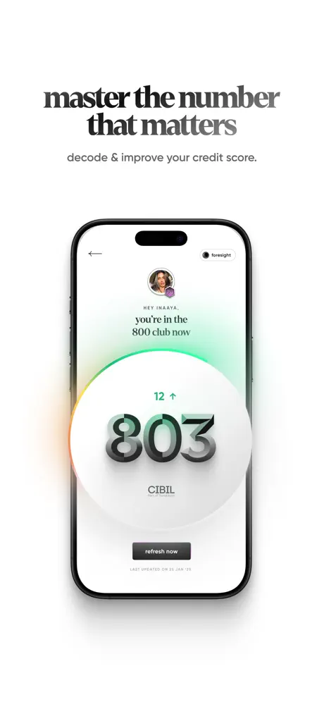
This frame switches to light mode, creating a mid-sequence exhale. A circular glassmorphic ring glows behind the score, shifting from green at the top through yellow to orange at the bottom edge. The numeral “803” is rendered in a thick, layered 3D type that feels almost physical. Above it, a small green “12 ↑” indicates movement. The microcopy “HEY INAAYA,” and “you’re in the 800 club now” is centered in a smaller serif. A dark “refresh now” pill anchors the bottom, with “LAST UPDATED ON 25 JAN ‘25” in tiny all-caps metadata beneath it. The background is near-white (#F5F5F5), and the absence of the tab bar makes the screen feel like a modal moment rather than a navigable page.

CRED App Store screenshot 4 — Physical Metaphor for Activation
04

Physical Metaphor for Activation

On-frame caption: “your card's UPI upgrade / enable UPI on your RuPay credit card.

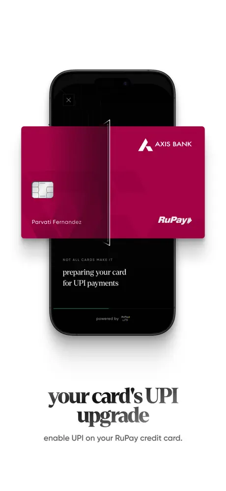
An Axis Bank RuPay card floats in flat, front-facing magenta (#BE0F52) over a darkened phone. A vertical white line with arrowheads bisects the card, evoking a transformation or processing state. On the device itself, small white text reads “NOT ALL CARDS MAKE IT” and “preparing your card for UPI payments,” with “powered by RuPay UPI” at the bottom. The composition is more symmetrical than frame 1, losing some of the dynamic diagonal tension, but the saturated color block is unmistakable at thumbnail size. The card’s left half shows the chip and “Parvati Fernandez,” while the right half carries the Axis and RuPay logotypes.

CRED App Store screenshot 5 — QR Scanning in the Dark
05

QR Scanning in the Dark

On-frame caption: “lightning fast payment settlement / scan any QR code and pay instantly.

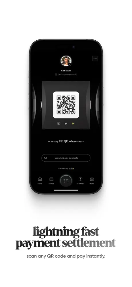
This is the only frame where the headline uses a tonal shift: “lightning fast” is solid black, while “payment settlement” fades into mid-grey. The device displays a pure black (#000000) interface with a centered QR code inside a rounded white square. Above the code, a profile avatar and “PARVATI” with a truncated UPI ID. Below, a search pill reads “search & pay contacts,” and the tab bar repeats the same five-item structure seen in frame 1. The restraint inside the UI is notable—no merchant stickers, no animated flourishes, just the code and a control row—but the headline gradient is an unexplained departure from the solid-fill rule used everywhere else.

CRED App Store screenshot 6 — The Green Confirmation
06

The Green Confirmation

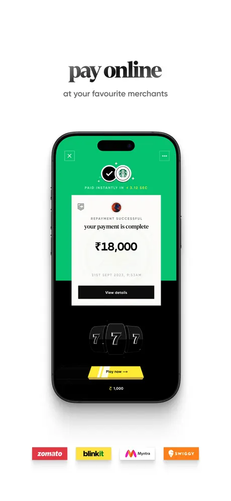
On-frame caption: “pay online / at your favourite merchants

The screen’s top half is flooded with a high-saturation green (#00D66C) that immediately signals success. A white receipt card inside reads “REPAYMENT SUCCESSFUL / your payment is complete / ₹18,000,” with a black “View details” button. A Starbucks co-brand mark and a “PAID INSTANTLY IN +3.12 SEC” badge add specificity. Below the receipt, a slot-machine “777” teaser and a yellow “Play now →” button introduce gamification. Outside the phone, four merchant pills—zomato, blinkit, Myntra, swiggy—sit below the device. They are low-resolution, use inconsistent corner radii, and their saturated brand colors rupture the monochrome discipline of the set. The frame communicates merchant breadth, but the execution undermines the craft established in the previous five screens.

CRED App Store screenshot 7 — Rewards as Editorial Spread
07

Rewards as Editorial Spread

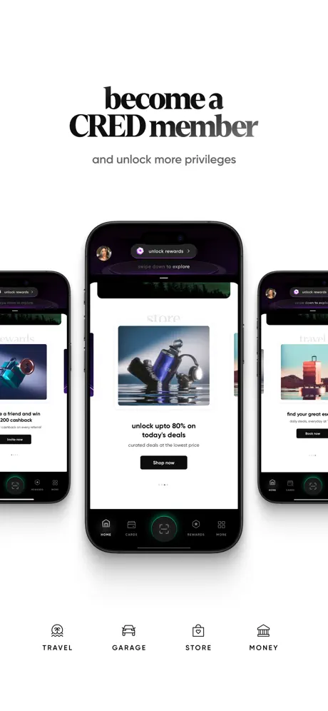
On-frame caption: “become a CRED member / and unlock more privileges

The single-device convention breaks into a triptych: a central iPhone flanked by tightly cropped siblings showing travel and rewards content. The center screen displays the “STORE” category with a lifestyle product image, “unlock upto 80% on today's deals,” and a black “Shop now” button. The side phones are cropped so aggressively that their headlines disappear, rendering them decorative texture. Below the cluster, four category icons—TRAVEL, GARAGE, STORE, MONEY—map the ecosystem in a schematic row. The density here is a sharp contrast to the airy minimalism of frame 1, and the side devices risk becoming visual noise at small scale. The serif lockup remains strong, but the composition feels like a collage rather than a continuation of the strict modular system.

05The craft

Captions, colour and the mechanics of the sell

Caption pattern

Every frame follows a near-rigid pattern: two lines of text, serif then sans, flush center. The only anomaly is frame 5, where “payment settlement” is rendered in a stepped grey gradient rather than solid fill. This is the only frame where the caption itself competes with the UI for attention because the tonal shift reads as an error against the flat system. Frame 6 shortens the headline to two words (“pay online”), letting the UI’s green banner carry the energy—a smart compression tactic that could have been used elsewhere to tighten the read.

Visual system

The visual system is built on contrast, not color. The brand’s iconic plum-black (#1E0014) is allowed to anchor frames 1 and 2, while the success green (#00D66C) in frame 6 is treated as an event color rather than a brand color. Type sizing is absolute: the marketing serif sits at a scale roughly 1.4× the device width, ensuring it survives scaling. Internal UI type is small but crisp—bill amounts, due dates, and metadata all use generous line height so the dashboard frames never feel like spreadsheets. The only structural weakness is the merchant logo strip in frame 6, which abandons the monochrome vector language for raster brand marks with clashing hues.

The thumbnail test

At small scale, the white background creates a glowing strip that separates CRED from adjacent listings. The floating plum card in frame 1, the massive green block in frame 6, and the bold magenta split-card in frame 4 each read as distinct abstract shapes. The serif headlines hold their weight surprisingly well, though frame 5’s grey-fade headline dissolves faster than the solid black used elsewhere. Frame 7’s triptych becomes a dark, unreadable smudge at thumbnail size; the density rewards a tap but fails to compel one.

Conversion mechanics

For a conversion-focused shopper, the sequence does something clever: it front-loads emotional identity (frame 1) before proving administrative utility (frame 2). That ordering means a user who only swipes twice still absorbs the brand promise. Frames 3 and 4 then alternate between emotional reward (score) and practical utility (UPI), keeping motivation balanced. The merchant strip in frame 6 is the most explicit conversion play, but it is also the weakest visual moment. If the team’s goal is to lower acquisition cost, frame 6 would benefit from A/B testing against a version without the raster logos, since the green success state alone is already a powerful signal of trust.

06Where it slips

What we would change

Merchant Logo Strip in Frame 6

The zomato, blinkit, Myntra, and swiggy pills are low-resolution, use inconsistent corner radii, and introduce four new high-chroma colors that clash with the plum-green-black system. They look like partner badges pasted in after the design review. Fix: remove them entirely, or replace them with four monochromatic 1pt-stroke icons that match the tab bar’s drawing language. The success screen is strong enough to stand on its own.

Gradient Headline in Frame 5

“lightning fast” is solid black, but “payment settlement” fades to grey. This is the only gradient text in the entire set, and it reads as a mistake or an unapproved text style. Fix: apply the same solid #1A1A1A fill used in every other frame. If hierarchy is needed, change weight or size, not opacity.

Frame 4 Micro-copy Legibility

“NOT ALL CARDS MAKE IT” is typeset small and low-contrast against pure black, making it nearly invisible at thumbnail size. The phrase is also semantically ambiguous without context. Fix: delete the line entirely; the headline below and the bisected card already communicate the feature. If retention is required, move it above the card fold in #FFFFFF at 14pt equivalent minimum.

Frame 7 Triptych Cropping

The side phones are cropped so tightly that their internal captions and CTAs are lost. At thumbnail size they read as dark, undifferentiated rectangles. Fix: either add at least 16pt of breathing room to each side device so their headlines survive cropping, or abandon the triptych and use a single device with the four category icons below to carry the breadth message.

07The recipe

How to apply this to your own app

  1. Establish one canvas color and never deviate.

    CRED’s #FFFFFF background turns the screenshot strip into a continuous editorial page. Choose one wrapper color and let the UI content provide contrast, not the background.

  2. Let the product break the frame, but use one shadow language.

    Frames 1 and 4 succeed because the extruded objects share the same diffuse shadow system. If you break the device bounds, render the object with realistic lighting so it feels tethered, not pasted.

  3. Ration color to functional events.

    Green only appears for payment success. Magenta only appears for RuPay. Plum only appears for the core card identity. When every feature gets its own gradient, the brand disappears; when color is mapped to meaning, the shopper learns the system in one pass.

  4. Headline outside, proof inside.

    Place your marketing promise in the caption layer and your product evidence in the device. Never make the shopper hunt for the value proposition inside a dense UI.

08Takeaways

Five things worth stealing

  • Restraint is not the absence of detail; it is the discipline to let one element—here, the floating plum card—own the frame.
  • Alternating light and dark UI frames inside a white wrapper creates rhythm without abandoning system consistency.
  • Partner logos and raster assets can undermine months of typographic and color discipline in a single frame.
  • A serif headline in a finance category dominated by geometric sans is a defensible, high-return differentiation tactic.
  • closingThoughts
09The verdict

What the set actually achieves

The sequence lands as a coherent editorial object. Headlines provide the thesis; UI provides the evidence. Light and dark mode alternation creates rhythm. Only two frames (6 and 7) deviate from the strict minimalism, and while those deviations introduce noise, they do not destroy the set’s credibility. A shopper swiping rapidly will remember the plum card, the green confirmation, and the serif voice—exactly the three brand anchors that matter most.

This set is built for experienced credit-card users who measure apps by finish as much as by function. The tone is exclusionary in the best sense: it assumes the shopper already knows what CIBIL is, already carries multiple cards, and already shops at the merchants listed. It will not convert a first-time credit user, but it is not trying to. For designers, the lesson is that a screenshot set can behave like a lookbook: each frame a single outfit, all sharing the same tailoring.

10Questions

Frequently asked

Why does frame 3 abandon the tab bar?

The credit-score screen is presented as a modal achievement rather than a navigable page. Removing the tab bar isolates the emotional moment and prevents the UI from feeling like a spreadsheet buried inside a dashboard.

How does the set handle dark-mode UI without turning into black blobs?

The white canvas provides a constant light border, and the internal dark screens are punctuated by high-contrast elements—the white QR code, the magenta card, the green success banner—that read as distinct shapes even when scaled down.

Why does frame 5’s headline use a grey fade?

It should not. This is the only frame where the headline departs from a solid fill, and it appears to be either a rendering error or an unvetted exploration. The fix is to return to the same #1A1A1A solid weight used everywhere else.

What is the safest element to steal from this set?

The typographic lockup: a large transitional serif headline paired with a smaller, neutral sans subhead, both centered on a white field above or below a single device. It is transferable to almost any category and instantly elevates perceived production value.

What is the weakest element to avoid?

The merchant logo strip in frame 6. Raster partner marks with clashing brand colors break the vector-clean language of the UI and look like late-stage stakeholder additions rather than designed elements.

11Keep reading

Build your own screenshot set

The full set

7 shots
CRED App Store screenshot 1CRED App Store screenshot 2CRED App Store screenshot 3CRED App Store screenshot 4CRED App Store screenshot 5CRED App Store screenshot 6CRED App Store screenshot 7

About the app

CRED is a members-only app for all payment experiences. Trusted by over 1.4 crore+ creditworthy members, CRED rewards you for the payments & good financial decisions you Dreamplug, via the App Store listing.

Screenshots and store metadata belong to Dreamplug. They are shown here for design commentary and criticism. The analysis on this page is original work by floow.design. View the original listing.

More Finance teardowns

Browse all →