Days app icon
ProductivityScreenshot teardown12 min read

Days App Store screenshots

Days is a countdown app competing in a crowded Productivity category where most competitors lead with timers and dense calendar grids. Its App Store screenshot sequence instead bets everything on full-bleed photography, high-contrast typographic overlays, and editorial card layouts. The result is an eight-frame story that reads more like a lifestyle magazine than a utility, forcing the shopper to feel the product before they evaluate it.

Set published by MD Apps LTD · 8 frames analysed

4.8 · 11K ratingsFreev3.35Updated 9mo ago
Days App Store screenshot 1
01At a glance

The set in one screen

Framing
Frames 1–2 use aggressive device angles; Frames 3–8 switch to straight-on frontals.
Captions
Large, dark, sans-serif headlines against #FFFFFF, usually centered or flush left.
Backdrop
Cloudless white; no gradients, no textures, no patterns.
Type
Condensed, bold white italics for event titles; small tracked-out uppercase for countdown metadata.
UI / copy split
Heavy photography, minimal visible interface. Only Frames 5, 6, and 7 show dense UI.
Frame 1 job
Frame 1 must stop a thumb mid-scroll by promising emotional memory rather than calendar management. It does this with a tilted device, overflowing photo cards, and a headline that anchors the app to personal milestones.

Sampled palette

Screen text
UI surface
02The challenge

What this screenshot set had to solve

The central tension in selling a countdown app is that the category defaults to mechanical utility: timers, ticking numbers, and calendar grids. Days is positioning itself around memory and emotion—weddings, road trips, birthdays—yet it still has to prove its iOS citizenship through widgets, native forms, and system integration. The screenshot set must therefore sell two contradictory ideas at once: the subjective warmth of a photo album and the objective reliability of a productivity tool. With only eight frames, the designer also has to surface social sharing, Unsplash integration, recurring events, and a dark mode without collapsing into a disjointed feature dump. Every slide carries the risk of either feeling too sentimental to be useful or too clinical to be loved.

The set argues that the app is both a camera roll and a calendar engine.
03The approach

How the set argues its case

The team solves the emotion-versus-utility problem by delegating each job to a different visual layer. Photography does the emotional lifting: every screen is saturated with human faces, travel imagery, and high-contrast moments. The interface itself stays almost invisible—black and white type, thin dividers, and native iOS toggles—so it reads as a system-friendly utility. Framing creates rhythm: odd frames tilt the device aggressively across the canvas, while even frames plant it straight and centered, giving the sequence a breathing pulse. Caption typography stays deliberately plain—large, dark, sans-serif headlines against #FFFFFF—so the eye rests between photo-dense slides. By alternating lifestyle shots with literal iOS home-screen widgets and standard date pickers, the set argues that the app is both a camera roll and a calendar engine.

Days is positioned as a lifestyle-forward emotional utility. It does not sell speed, automation, or task volume; it sells anticipation. By surrounding native iOS patterns with aspirational photography, the screenshots argue that using the app is closer to flipping through a photo album than checking a calendar.

04Frame by frame

Every screenshot, and the job it does

Days App Store screenshot 1 — Establish the Feed
01

Establish the Feed

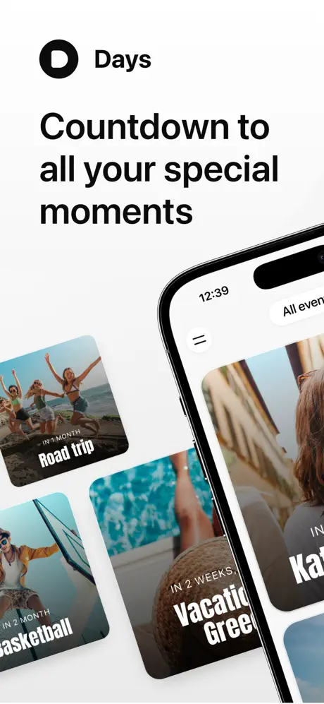
On-frame caption: “Countdown to all your special moments

Frame 1 opens on a stark white ground—roughly #FFFFFF—anchored by a black circular wordmark and the headline “Countdown to all your special moments” set in a heavy sans-serif, likely SF Pro Display at a large optical size, flush left. The iPhone device enters from the lower right at a steep angle, its Dynamic Island and status bar partially visible. On-screen, the interface presents a masonry-style feed of event cards with deep, consistent corner radius—somewhere near 24 pt—and full-bleed photography. Each card carries a bottom gradient where white type sits: a small, tracked-out label such as “IN 1 MONTH” above a large, condensed bold title like “Road trip” or “Basketball.” A truncated card reading “Vacation Gree…” and another beginning with “Kat…” imply a scrollable abundance. The black-on-white header treatment keeps the App Store shopper grounded, while the tilted device injects diagonal energy that prevents the composition from feeling like a static catalog.
Days App Store screenshot 2 — Social Proof and Density
02

Social Proof and Density

On-frame caption: “Featured on the App store

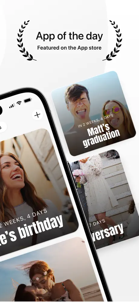
Frame 2 reverses the device angle, now pushing up from the lower left, which creates a back-and-forth rhythm with Frame 1. Above the phone, a pair of black laurel wreaths bracket the text “App of the day” and the smaller line “Featured on the App store,” establishing immediate category credibility. The screen itself shows the same card system but with different emotional hooks: a couple making faces under the headline “Matt’s graduation,” a wedding-dress detail labeled “Anniversary” with “7 DAYS,” and a laughing portrait for a birthday event. The plus (+) icon in the top-left of the interface hints at creation without demanding attention. By keeping the wreath graphics and the device in the same black-and-white register as the typography, the frame avoids the gaudy, colorful badge clutter common in competitor screenshots. Instead, social proof is treated as another typographic element—calm, monochrome, and confident.

Days App Store screenshot 3 — The Widget Argument
03

The Widget Argument

On-frame caption: “View events on your home screen

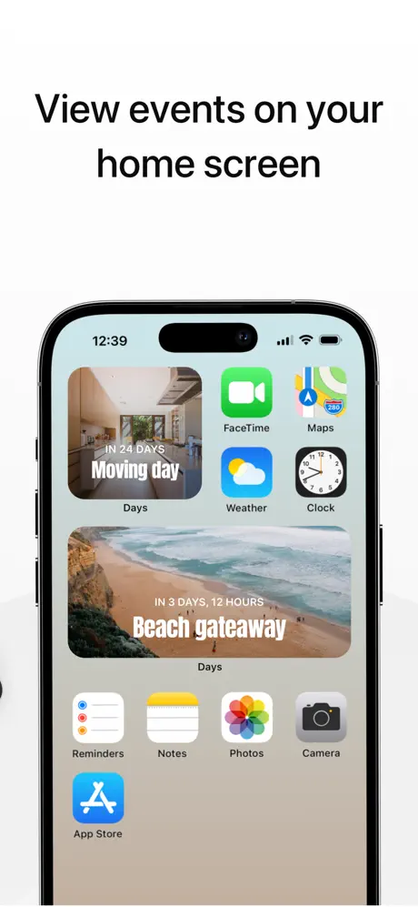
Frame 3 switches to a dead-center, straight-on device—the first frontal view in the sequence—and the caption reads “View events on your home screen.” The iPhone sits against the same white backdrop, but the screen itself shows a literal iOS home screen with a neutral beige wallpaper. Two Days widgets occupy the grid: a smaller square widget showing an interior photo with “IN 24 DAYS” above “Moving day,” and a wider rectangular widget below it displaying a beach scene with “IN 3 DAYS, 12 HOURS” above “Beach getaway.” Both widgets faithfully reproduce the app’s photo-card language—full-bleed imagery, bottom gradient, condensed white type—proving the brand identity scales down to system-level furniture. Surrounding the widgets are first-party Apple icons—FaceTime, Maps, Weather, Clock, Reminders, Notes, Photos, Camera, App Store—so the frame functions as an explicit argument about system credibility. The lack of device tilt here is strategic: it reads as documentation, not advertising.

Days App Store screenshot 4 — Full-Screen Immersion
04

Full-Screen Immersion

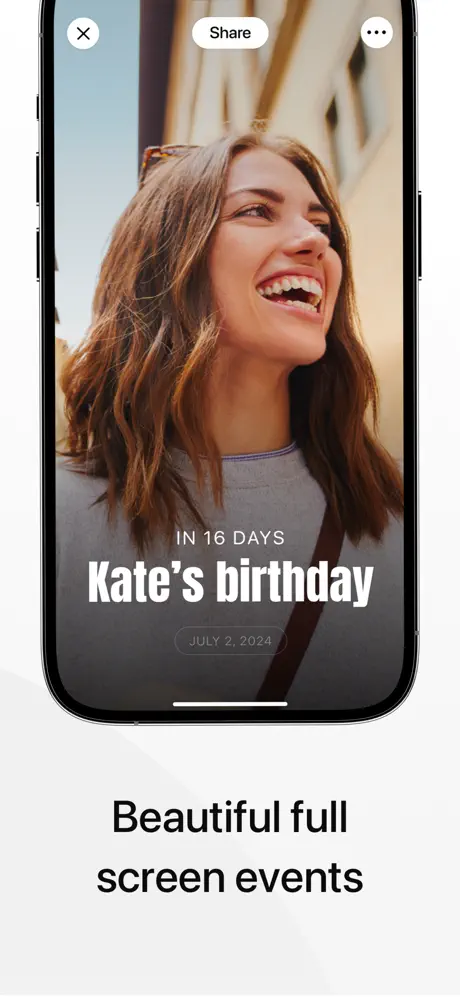
On-frame caption: “Beautiful full screen events

Frame 4 keeps the device frontal and devotes nearly the entire canvas to a single photograph of a woman laughing in warm, golden-hour light. The caption below—“Beautiful full screen events”—is set in the same bold, dark sans-serif, but here the words feel almost unnecessary because the image is doing the selling. Interface chrome is minimized to three elements: a white-circle “X” in the top left, a white “Share” pill in the center, and a three-dot menu in the top right. On the photo itself, typography follows a strict hierarchy: a small, tracked-out “IN 16 DAYS” in white sits above the large condensed headline “Kate’s birthday,” while the target date “JULY 2, 2024” floats inside a translucent dark pill. A subtle bottom-to-top gradient—likely a black-to-transparent fade at roughly 60–80 % opacity—keeps the white type legible without destroying the photo’s warmth. This frame is the emotional climax of the sequence, proving that the app’s “content” is the user’s own life, not the interface.

Days App Store screenshot 5 — Image Sourcing
05

Image Sourcing

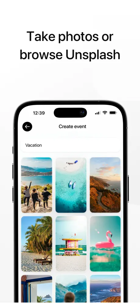
On-frame caption: “Take photos or browse Unsplash

Frame 5 addresses a practical user anxiety—where do the photos come from?—with the headline “Take photos or browse Unsplash.” The screen shows the event-creation flow: a black back-arrow circle, a centered “Create event” navigation title, and a text field containing the word “Vacation.” Below, a three-column grid of royalty-free photography presents options: friends on a sea cliff, underwater flippers, a Pacific Coast highway, palm shadows on sand, a Miami lifeguard stand, and a pink flamingo float. The grid thumbnails use a tighter corner radius than the event cards—perhaps 12 to 16 pt—and sit on a white ground that mirrors the App Store canvas itself, creating visual continuity. This frame is the most conventionally “utility” slide in the set, relying on standard iOS navigation patterns and a clear information hierarchy. It reassures the shopper that even if they have no personal photos ready, the app ships with an endless supply of stock vacation imagery.

Days App Store screenshot 6 — Social Distribution
06

Social Distribution

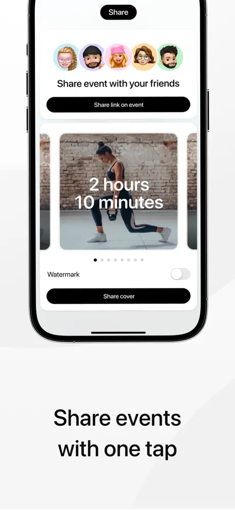
On-frame caption: “Share events with one tap

Frame 6 turns to networked utility with the caption “Share events with one tap.” The phone displays a share sheet centered around a preview card: a woman lunging in athletic wear with a large white countdown reading “2 hours 10 minutes” overlaid directly on the image. Above the preview, a row of five colorful Memoji heads introduces iOS’s social layer, followed by the text “Share event with your friends” and a black pill button labeled “Share link on event.” A “Watermark” toggle and a second black button, “Share cover,” sit beneath the preview, grounded by a row of pagination dots that hints at multiple export formats. The inversion of the Share button—here it is a black pill with white text against a white ground—subtly shifts the UI’s tonal register from airy to affirmative. This frame is the sequence’s most densely populated interface, yet it still reserves the majority of the screen’s real estate for a human photograph, maintaining the app’s photographic priority even while explaining mechanics.

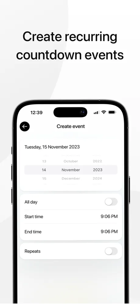
Days App Store screenshot 7 — Recurrence and Precision
07

Recurrence and Precision

On-frame caption: “Create recurring countdown events

Frame 7 answers the productivity-minded shopper with the headline “Create recurring countdown events.” The screen is a bare, iOS-native form: a centered “Create event” title, a back arrow, and a conventional three-column date wheel set to Tuesday, 15 November 2023. Below the picker, four table-view cells—separated by hairline rules in a light cool gray, roughly #F2F2F7—present “All day,” “Start time,” “End time,” and “Repeats,” each with a standard iOS toggle or right-aligned detail label. There is no photography here; the frame’s entire credibility rests on interface familiarity. By adopting Apple’s native toggle shapes, cell padding, and navigation hierarchy, the screenshot argues that Days is not a toy or a novelty widget, but a structurally sound scheduling utility. The emptiness of the white ground is deliberate: it lets the form breathe and signals precision, complementing the emotional excess of the surrounding frames.

Days App Store screenshot 8 — Dark Mode Flex
08

Dark Mode Flex

On-frame caption: “View events in night mode

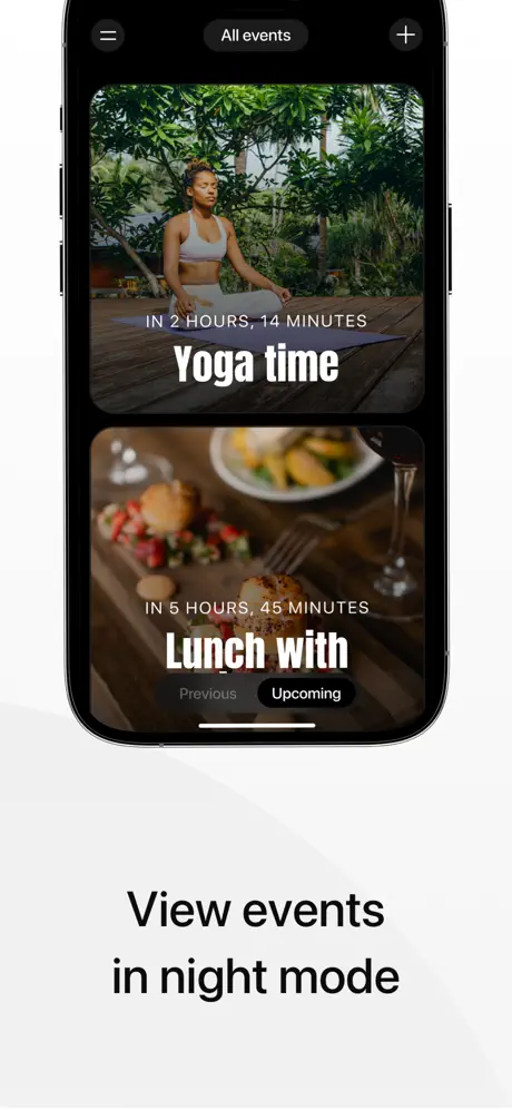
Frame 8 closes the sequence with the caption “View events in night mode,” switching the app’s entire register to a near-black ground—likely #000000 or a very neutral #0A0A0A. The device remains frontal, displaying the same card system now rendered in dark mode: lush photography still bleeds to the edges, but the interface chrome—hamburger menu, “All events” pill, and plus icon—sits against the void instead of white. Two cards are visible: a yoga scene titled “Yoga time” counting down “IN 2 HOURS, 14 MINUTES,” and a food photograph for an event labeled “Lunch with” at “IN 5 HOURS, 45 MINUTES.” At the bottom, a segment control offers “Previous” and “Upcoming,” with the active tab set in a white-bordered pill. The frame demonstrates that the app’s typographic system—white condensed bold over photographic gradients—survives the mode switch without alteration. Ending here is a quiet flex: it proves technical completeness, respects the system setting, and lets the shopper know the app will feel at home on their iPhone regardless of the time of day.

05The craft

Captions, colour and the mechanics of the sell

Caption pattern

Frame 1: Persuasive promise. Frame 2: Social proof. Frames 3–8: Functional benefit. The shift from emotional promise to literal feature is necessary but acoustically monotone: every caption uses the same weight, size, and color, so none get more vocal emphasis than another.

Visual system

The single strongest visual glue is the event card. Every card uses full-bleed photography, a bottom gradient mask, a small uppercase countdown label, and a large condensed bold title in white. This component survives scaling from full-screen (Frame 4) to widget (Frame 3) to share-preview (Frame 6) without breaking, giving the shopper a mnemonic anchor that persists across contexts. The only deviation is Frame 6’s share-preview countdown, which abandons the condensed bold for a lighter, wider sans-serif.

The thumbnail test

Frame 1 wins the thumbnail test because the diagonal phone, partial cards, and bold headline create a gestalt that reads instantly as “photo memories” rather than “productivity tool.” The black wordmark pops against white even at small scale, and the visible card corners suggest depth. Later frames, especially 5 through 7, flatten into static rectangles that lose silhouette distinctiveness.

Conversion mechanics

The set is front-loaded with emotion and leans heavily on straight-on documentation in the back half. For conversion, Frames 1 and 2 do the heavy lifting of stopping scroll and establishing the brand mood. Frames 3 and 4 close the deal by proving system integration and full-screen beauty. Frames 5 through 8 are progressively more niche; a shopper who reaches Frame 8 is already persuadable, but a casual scroller may never see the dark mode proof.

06Where it slips

What we would change

Rhythmic flatline after Frame 2

After the diagonal energy of Frames 1 and 2, the sequence presents five consecutive straight-on, vertically centered devices with the same bold, dark caption treatment. The eye fatigues because the canvas never breaks its own grid again. A single angled device at Frame 5 or 8 would have reintroduced motion and prevented the back half from feeling like a spec sheet.

Frame 6 breaks its own type system

The countdown inside the share preview uses a lighter, wider sans-serif (“2 hours 10 minutes”) that abandons the condensed bold identity established everywhere else. Because this is the only place the typographic voice changes, it reads as an oversight rather than an intentional hierarchy.

Memoji color pollution

Frame 6 introduces a row of five Memoji heads that inject skin tones, neon pink, and pastels into a palette that has been ruthlessly black-white-and-photography. The strip feels visually loud against the monochrome discipline of the surrounding frames.

Frame 7 is brand-anonymous

While functionally necessary, Frame 7 contains no photography, no brand tint, and no custom UI—just a native date picker and toggles. It reads as credible but anonymous, and in a rapid scroll it risks looking like a system settings screen rather than the same lifestyle app.

Stock wreath iconography

The laurel wreaths in Frame 2 feel like generic vector clip art. They lack the typographic refinement of the wordmark and sit awkwardly between the stark header and the dense card photography. A simpler text lockup or editorial badge would have maintained the sophisticated tone.

07The recipe

How to apply this to your own app

  1. Let photography lead

    If your app handles personal milestones, fill the screenshots with human faces and aspirational imagery before you show a single form field. The interface should feel like a frame for the content, not the content itself.

  2. Create a repeatable card component

    Days’s event card is the mnemonic glue that ties widgets, full-screen views, and share previews together. Design one hero component that can scale across contexts so the shopper recognizes your app at every frame.

  3. Alternate framing angles to control pacing

    Use angled devices for emotional, browse-heavy screens and straight-on frontals for documentation-heavy screens. The change in geometry gives the shopper’s eye a rest and signals shifts in information density.

  4. Restrain the palette to let moments breathe

    By limiting UI chrome to black and white, Days ensures that the user’s own photos become the color story. Avoid branded gradients or heavy tints that compete with user-generated content.

  5. Don’t abandon brand in utility frames

    Frame 7’s native form is visually coherent with iOS but visually incoherent with Days. Even creation flows can retain a brand photograph, a tinted header, or a custom graphic cue so the screenshot still feels like your app.

08Takeaways

Five things worth stealing

  • A photo-first approach can differentiate a utility app in a crowded category without hiding core functionality.
  • Consistent card components that scale across widget, feed, full-screen, and share contexts create instant visual literacy.
  • Monochrome App Store canvases and black type maximize the impact of colorful user photography.
  • Alternating device angles creates rhythm, but the rhythm must be maintained; five consecutive straight-on frames stall the sequence.
  • Utility frames—forms, pickers, toggles—still need a brand signature so they do not feel like system stock photography.
09The verdict

What the set actually achieves

Days’s screenshot sequence establishes an immediately recognizable visual system—photo cards with bottom-anchored white type, alternating device angles, and a monochrome App Store canvas—that makes the app feel editorial and native at the same time. The eight frames successfully communicate photo-first event creation, home-screen widgets, full-screen immersion, social sharing, recurrence, and dark mode. However, the kinetic rhythm stalls after Frame 2, and Frame 7’s generic native form drains the brand warmth built by the surrounding lifestyle imagery.

This case study is for mobile product designers and App Store managers building lifestyle utilities—countdown apps, journaling apps, photo calendars, or memory trackers—who need to balance emotional imagery with iOS-native credibility.

10Questions

Frequently asked

Why does Frame 3 show a real iOS home screen instead of the app interface?

It functions as social proof through context. By embedding Days widgets among first-party Apple icons, the frame argues that the app is a system citizen, not a siloed third-party experience.

Why is the caption typography so plain across all eight frames?

The designers treat the captions as neutral ground. By keeping them in the same bold, dark sans-serif against white, they prevent the typography from competing with the event photography, which is the actual color and emotion of the set.

What is the specific weakness of Frame 6’s typography?

The share-preview countdown (“2 hours 10 minutes”) uses a lighter, wider weight than the condensed bold used on every other event card. This breaks the visual system and makes the preview feel like a different app.

How does the dark mode frame serve conversion?

Frame 8 does not need to sell a new feature; it sells technical completeness. For iOS users who live in dark mode, seeing a screenshot that respects their system setting removes a small friction point and signals modern development.

What should be fixed first in this set?

Add a diagonal or broken-grid frame somewhere after Frame 4 to restart the rhythm, and replace Frame 7’s empty native form with a version that includes a small brand photograph or tinted header so the creation flow still feels like Days.

11Keep reading

Build your own screenshot set

The full set

8 shots
Days App Store screenshot 1Days App Store screenshot 2Days App Store screenshot 3Days App Store screenshot 4Days App Store screenshot 5Days App Store screenshot 6Days App Store screenshot 7Days App Store screenshot 8

About the app

Countdown to the special moments that matter to you. It’s the small things in life that matter most. Birthdays, anniversaries, weddings and moments shared with the closest people MD Apps LTD, via the App Store listing.

Screenshots and store metadata belong to MD Apps LTD. They are shown here for design commentary and criticism. The analysis on this page is original work by floow.design. View the original listing.

More Productivity teardowns

Browse all →