Endel app icon
Health & FitnessScreenshot teardown16 min read

Endel App Store screenshots

The App Store page for an audio utility faces a paradox: the product is invisible. You cannot hear a soundscape in a static JPEG. That means every screenshot has to translate frequency, calm, and focus into layout, contrast, and reading order. Endel’s eight-frame set attempts this by treating the carousel as a storyboard—moving from emotional agitation to scientific proof—and wrapping the entire sequence in a near-total monochrome palette. For designers building a screenshot set for any ambient, background-running, or audio-first product, this sequence is a study in tension: how much atmosphere can you layer on before the UI becomes illegible?

Set published by Endel · 8 frames analysed

4.6 · 32K ratingsFreev4.8.0Updated 4mo ago
Endel App Store screenshot 1
01At a glance

The set in one screen

Framing
Mixed—full devices appear straight-on (Frames 3, 4, 5, 7, 8) and angled/cropped (Frame 2). Frame 1 is pure illustration with no device.
Captions
Large bold sans-serif headlines (approx. 36–56 pt equivalent) stacked at the top or top-left, paired with thin 1 px horizontal rules that act as list separators.
Backdrop
Pure #000000 black or radial gray gradients (#1A1A1A to #000000). No photography; all graphics are vector linework, concentric rings, and abstract waveforms.
Type
San Francisco-style system sans. Headlines are heavy, tightly tracked, and white. Subheadlines inside UI cards are smaller (approx. 15–17 pt), often italicized for descriptive blurbs.
UI / copy split
Low in early frames (Frames 1–2), high in middle frames (Frames 3–7), moderate in Frame 8.
Frame 1 job
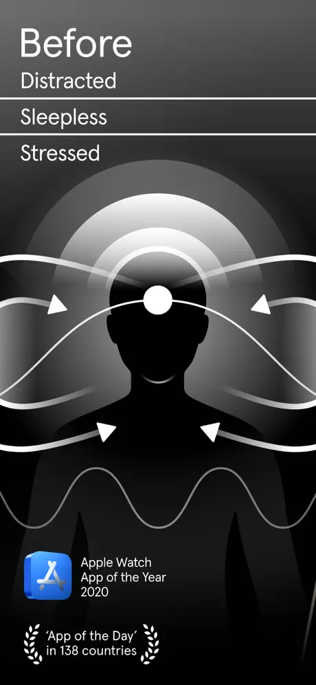
Establish an emotional deficit rather than a product. Frame 1 shows no interface. It opens with the word 'Before' in a large bold sans (approx. 56 pt, #FFFFFF), followed by a list—'Distracted', 'Sleepless', 'Stressed'—each separated by a 1 px white hairline that runs nearly full-width. A head-and-shoulders silhouette anchors the center; concentric white rings emanate from the forehead like interference patterns, and chaotic white vector bands wrap around the figure with arrowheads. The bottom-left corner carries two credibility markers: the Apple Watch App of the Year 2020 badge (system blue icon, #007AFF) and the text 'Apple Watch App of the Year 2020', plus ''App of the Day' in 138 countries' flanked by small laurel icons. The frame asks the browser to identify with a state of being rather than an app feature. That is a high-risk move in search results, where the first frame often needs to signal 'this is software' immediately. Here, the software signal is delayed until Frame 2. For designers, this is a critical decision point: if your category is crowded, deferring the device may cost the swipe; if your brand is distinct enough, it creates curiosity.

Sampled palette

#000000#000000
#0A0A0A#0A0A0A
#3A3A3A#3A3A3A
#B0B0B0#B0B0B0
#FFFFFF#FFFFFF
(Apple badge only)#007AFF
02The challenge

What this screenshot set had to solve

Endel must sell an intangible—algorithmically generated sound—in a format that is entirely visual and silent. The shopper is likely scrolling Health & Fitness at speed, so the set needs to communicate function, credibility, and emotional outcome without audio cues or motion. At the same time, the app’s interface itself is minimal and dark, which means showing raw UI runs the risk of looking like empty black space. The design challenge, then, is to make the screenshots feel like an extension of the app’s aesthetic while still delivering enough information density to answer 'what does it do?' before the viewer bounces.

Endel’s sequence chooses brand atmosphere over immediate interface recognition in Frame 1, then spends the remaining seven frames trying to close the comprehension gap with UI, data, and publication logos.
03The approach

How the set argues its case

The designer mapped the carousel to a classic conversion arc—agitate the problem, present the paradigm shift, list the tools, prove the outcomes, then de-risk with science and press. By locking every frame to a #000000 field and a white-on-black typographic system, the set avoids the spa-blue clichés common in meditation and sleep apps. Instead of competing on warmth, it competes on precision. The recurring profile silhouette acts as a visual protagonist: the mind is the product. The device frames are treated as evidence windows rather than heroes—they float in the lower half or corner, never dominating the illustration. This tells the designer that the screenshots were likely conceived as a horizontal scroll through a single environment rather than eight disconnected product photos.

Endel is positioned not as a playlist app but as a neuro-acoustic utility. The copy choices reinforce this: '852 Hz', '8D Sound', 'Brain Massage', 'Quick Task', 'Circadian Science'. Even the user testimonial in Frame 4 specifies 'unmedicated ADHD', signaling that the app is aiming for a clinical-adjacent, high-functioning user base rather than a casual wellness audience. The framing of the device UI supports this: the graphs, input signals, and waveform comparisons look like dashboard readouts, not album art.

04Frame by frame

Every screenshot, and the job it does

Endel App Store screenshot 1 — The Negative State
01

The Negative State

On-frame caption: “Before / Distracted / Sleepless / Stressed

This frame contains no device. The entire canvas is #000000. A head-and-shoulders silhouette occupies the lower-center, its face blank. Above it, the word 'Before' sits at roughly 56 pt bold (#FFFFFF), left-aligned in the upper safe zone. Beneath it, three negative states—'Distracted', 'Sleepless', 'Stressed'—are stacked as a list, each separated by a 1 px white horizontal rule that spans most of the width. Concentric white rings bloom from the forehead like ripples, and chaotic white vector bands with arrowheads wrap across the figure, visually implying overstimulation. In the bottom-left corner, the Apple Watch App of the Year 2020 badge introduces the only color in the entire eight-frame set: a system-blue square icon (#007AFF range) next to the words 'Apple Watch App of the Year 2020'. Below that, ''App of the Day' in 138 countries' is paired with small laurel icons. By refusing to show software in Frame 1, the designer forces the viewer to identify emotionally before evaluating functionally. The risk is that a browser in search results may not recognize this as an app screenshot at all.
Endel App Store screenshot 2 — The Paradigm Shift
02

The Paradigm Shift

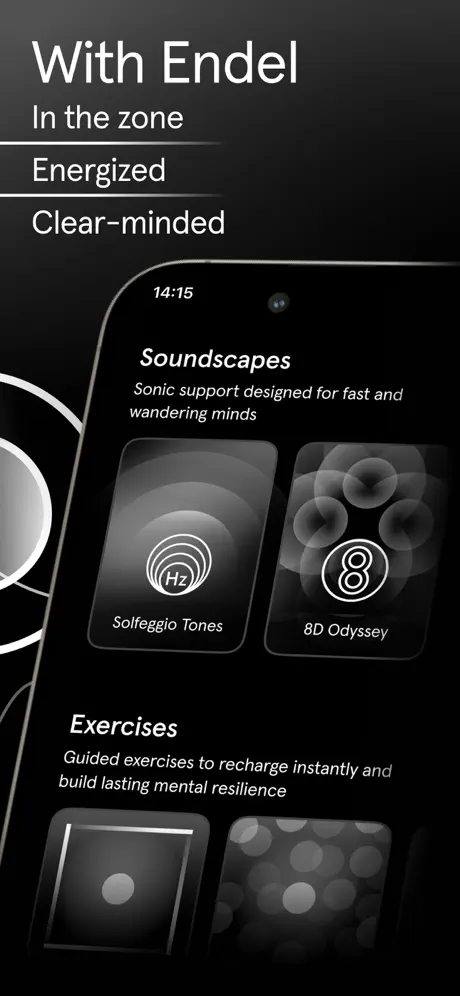
On-frame caption: “With Endel / In the zone / Energized / Clear-minded

The narrative pivot. The headline construction mirrors Frame 1 exactly: 'With Endel' at large scale, followed by three positive states separated by the same hairline rules. The device—an iPhone with a dark bezel—enters from the lower-right at a shallow angle, cropped so that only roughly 70 percent of the screen is visible. The status bar shows 14:15; the dynamic island area is out of frame. Inside the device, the UI reveals two content categories: 'Soundscapes' with the subhead 'Sonic support designed for fast and wandering minds', and 'Exercises' with the subhead 'Guided exercises to recharge instantly and build lasting mental resilience'. Two cards are fully visible—'Solfeggio Tones' (with an 'Hz' concentric icon) and '8D Odyssey' (with a stylized '8')—while additional cards peek below. A white curved line bleeds in from the left edge, visually tethering Frame 2 to Frame 1’s illustration system. The device framing here is softer than a standard product shot; it reinforces that the UI is merely a window into the experience.

Endel App Store screenshot 3 — The Toolbox
03

The Toolbox

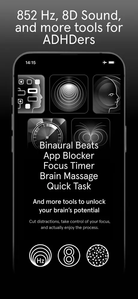
On-frame caption: “852 Hz, 8D Sound, and more tools for ADHDers

The first full-device, straight-on frame. The headline is centered near the top in a bold sans, approximately 36 pt. The phone is centered vertically, status bar visible with a location arrow and battery icon. The screen shows five square tool icons in a grid arrangement (three across the top row, two across the bottom). Overlaid directly on the device in large white type is a feature list: 'Binaural Beats', 'App Blocker', 'Focus Timer', 'Brain Massage', 'Quick Task'. Below the phone, centered text reads 'And more tools to unlock your brain's potential', followed by a smaller subhead: 'Cut distractions, take control of your focus, and actually enjoy the process.' Three circular icons—'Hz', '8', and a dotted sphere—anchor the bottom. The decision to stack white labels over the phone screen creates a legibility problem: the labels compete with the white-line iconography behind them, and at thumbnail scale the words dissolve into the grid. A fix would be to pull the labels outside the bezel or introduce a #0A0A0A scrim behind each line.

Endel App Store screenshot 4 — Focus Proof
04

Focus Proof

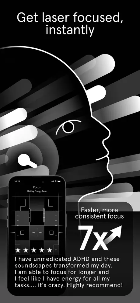
On-frame caption: “Get laser focused, instantly

The layout splits into three zones. Top: the headline in large white sans. Center-right: the recurring profile silhouette, now with an open eye rendered as a simple curved stroke, set against diagonal speed lines that suggest forward motion. Lower-left: a device showing 'Focus / Midday Energy Peak' with an abstract grid of white blocks and dashes. Directly beneath the device, five solid white star glyphs sit above a user quote in approximately 14 pt regular: 'I have unmedicated ADHD and these soundscapes transformed my day. I am able to focus for longer and I feel like I have energy for all my tasks.... it's crazy. Highly recommend!' Lower-right: a dark rounded card contains 'Faster, more consistent focus' above a massive '7x' with an upward arrow. The 7x numeral is the largest type element in the entire set, likely exceeding 120 pt. The quote, however, is too small for comfortable reading at App Store preview size; it blurs into texture. The star rating feels tacked on, adding noise between the device and the testimonial. A stronger treatment would place the quote inside a #1C1C1E card at 17 pt minimum and remove the star row entirely.

Endel App Store screenshot 5 — Sleep Proof
05

Sleep Proof

On-frame caption: “Fall asleep in minutes

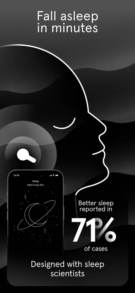
The profile silhouette returns, but the eye is now a closed 2 px curve, signaling rest. The background shifts from sharp diagonal streaks to soft, undulating gray hills (#1A1A1A to #000000 gradients), lowering the visual frequency to match the subject. Lower-left: a device displays 'Sleep / Night Energy Rise' with a Saturn-like ringed planet and starfield. The time reads 22:30. Lower-right: 'Better sleep reported in' sits above a massive '71%' with a slightly raised, oblique percent sign, followed by 'of cases' underneath. At the very bottom, centered text states 'Designed with sleep scientists'. The frame succeeds because it alters only two variables from Frame 4—the eye state and the background geometry—yet completely changes the emotional register. This is modular storytelling: same protagonist, different environment. For designers, it demonstrates that you can create distinct use-case frames without redesigning the entire visual system.

Endel App Store screenshot 6 — Scientific Authority
06

Scientific Authority

On-frame caption: “Scientifically designed and validated

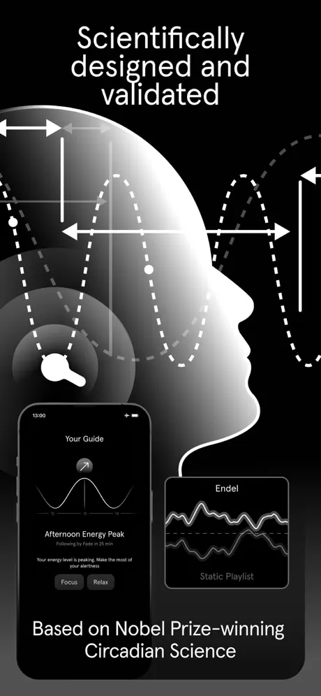
The most information-dense frame. The silhouette is now filled with a white sphere gradient and overlaid with dashed sinusoidal waveforms, measurement brackets, and arrows, implying data and calibration. Two UI elements compete for attention: a full device on the left showing 'Your Guide' with a line graph beneath 'Afternoon Energy Peak' and two pill buttons labeled 'Focus' and 'Relax', and a smaller floating card on the right comparing an 'Endel' waveform against a 'Static Playlist' waveform. The bottom caption reads 'Based on Nobel Prize-winning Circadian Science'. The problem is density compression. Both screens are rendered too small to read comfortably; text like 'Static Playlist' and the graph labels approximate 8 pt in the screenshot, which becomes illegible on an actual phone screen. The frame tries to prove scientific rigor by showing data visualization, but the visualization is too compressed to parse. A better approach would be to show one full-size device and a magnified detail crop at 140 percent scale, rather than two competing screens.

Endel App Store screenshot 7 — Personalization Engine
07

Personalization Engine

On-frame caption: “Personalized, AI-powered

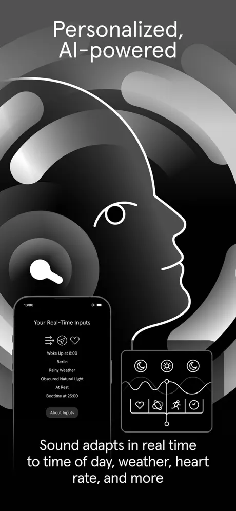
The background returns to abstract curved tubular forms with specular highlights. The profile silhouette is present with an open eye. Lower-left: a device shows 'Your Real-Time Inputs' with a list of contextual variables—'Woke Up at 8:00', 'Berlin', 'Rainy Weather', 'Obscured Natural Light', 'At Rest', 'Bedtime at 23:00'—each preceded by small icons (wind, location pin, heart). A pill button labeled 'About Inputs' sits at the bottom of the screen. To the right, a floating card displays a waveform with a vertical playhead and a row of icons (moon, sun, runner, checkmark). The bottom caption states 'Sound adapts in real time to time of day, weather, heart rate, and more'. This frame answers the 'how' question. It shifts the narrative from states and tools to inputs and automation. The type hierarchy inside the device is clean, but the floating card on the right is slightly ambiguous: it is unclear whether it is an inset of the phone screen or a separate UI element. Clarifying the boundary with a subtle #333333 stroke or 16 pt corner radius would help.

Endel App Store screenshot 8 — Press Validation
08

Press Validation

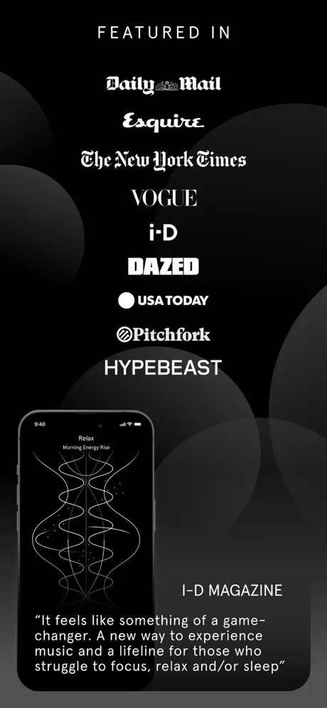
On-frame caption: “Featured in Daily Mail, Esquire, The New York Times, VOGUE, i-D, DAZED, USA TODAY, Pitchfork, HYPEBEAST

The final frame functions as a footer. 'FEATURED IN' sits at the top in wide-tracked all-caps sans. Below, nine publication names are stacked: *Daily Mail* in blackletter, *Esquire* in script, *The New York Times* in roman, *VOGUE* in high-contrast serif, *i-D* in sans, *DAZED* in bold sans, *USA TODAY* with its circular icon, *Pitchfork* with its spiral icon, and *HYPEBEAST* in block sans. All are rendered in white. Lower-left: a device shows 'Relax / Morning Energy Rise' with symmetrical intertwining sine waves against a starfield. Lower-right: the attribution 'I-D MAGAZINE' in all-caps sans sits above a quotation: 'It feels like something of a game-changer. A new way to experience music and a lifeline for those who struggle to focus, relax and/or sleep'. The decision to invert every logo to white damages recognizability; *USA TODAY*'s colored circle becomes an anonymous white dot, and *Pitchfork*'s spiral loses contrast. A stronger execution would retain original logo colors against the black field, or reduce the set to four recognizable marks at larger scale. The device UI here feels tacked on; by Frame 8, the viewer is looking for a CTA or pricing, neither of which is present.

05The craft

Captions, colour and the mechanics of the sell

Caption pattern

Headlines always sit in the upper safe zone, clear of the device and the silhouette. They tend toward second-person implication ('Get laser focused') or before/after states ('Before', 'With Endel'). Subheads are shorter than typical App Store copy and often omit verbs, functioning more like mantras: 'In the zone', 'Energized', 'Clear-minded'. This reduces cognitive load but also demands that the viewer infer mechanism. The captions do not explain how the app works; they label the state the user will enter. That choice keeps word count down and type size up, preserving contrast against the black field.

Visual system

The visual language is built from four primitives: (1) the head silhouette, rendered as a 2–3 px white outline with a featureless face; (2) concentric radial gradients used to imply signal emission or absorption; (3) 1 px hairlines and waveforms that suggest measurement and frequency; and (4) rounded rectangles for UI cards and device screens. There is no drop shadow anywhere—depth is created solely through gradient value shifts (#1A1A1A to #000000). This gives the set a flat, editorial quality. The typography is strictly utilitarian: a system sans in two weights (heavy for headlines, regular for body) with no serif accents outside the inverted publication logos in Frame 8.

The thumbnail test

At small scale, Frames 1, 4, and 5 hold up best because they rely on massive headline type and a single silhouette shape. Frame 3 collapses into a gray smudge: the five feature labels blend into the icon grid, and the device becomes a dark rectangle indistinguishable from the background. Frame 6 suffers similarly because both UI screens shrink to unreadable thumbnails. Frame 8’s press logos lose differentiation when reduced; nine white wordmarks on black read as horizontal noise. If you squint, the set still looks cohesive, but only the first, fourth, and fifth frames actually communicate a distinct message without requiring tap-to-expand legibility.

Conversion mechanics

The set moves the viewer through a clear emotional funnel: identify pain (Frame 1), imagine relief (Frame 2), inventory features (Frame 3), validate with outcomes (Frames 4–5), de-risk with science (Frame 6), explain mechanics (Frame 7), and seal trust with press (Frame 8). What is missing is a closing frame that hard-sells the download—no trial language, no subscription context, no 'Get Started' button. In App Store optimization terms, this sequence assumes the user converts on trust and curiosity alone. That may work for a brand with existing awareness, but for cold traffic, Frame 8 could be replaced or extended with a clear value-exchange summary (e.g., price, free trial, or core modality reminder).

06Where it slips

What we would change

Frame 1 delays interface recognition

Showing zero UI in the first screenshot is a conversion gamble. In the App Store search results grid, Frame 1 is the only image many users ever see. If the illustration does not immediately signal 'app', shoppers may scroll past. The fix is not necessarily to add a device—if the brand is strong enough, the silhouette works—but to ensure the Apple badge and the word 'App' appear above the fold and are large enough to categorize the product instantly.

Frame 3 buries text on top of UI

The labels 'Binaural Beats', 'App Blocker', 'Focus Timer', 'Brain Massage', and 'Quick Task' are set in white directly over a white-on-black icon grid. Without a text shadow or scrim, the contrast between copy and background UI is unpredictable. At small scale, the words vibrate against the line icons behind them. The fix is to move the feature list outside the device bezel, or to place each label inside a #0A0A0A rounded rectangle with 12 px padding, creating separation.

Frame 4 makes the testimonial unreadable

The user quote is set in roughly 14 pt regular weight on a #000000 background. On a 5.5-inch preview, that size is below comfortable reading thresholds. Because the quote is a primary trust signal, rendering it at sub-16 pt undermines its purpose. The fix is to increase the type to at least 17 pt and place it inside a #1C1C1E card with 24 pt padding, improving both contrast isolation and perceived authority. The five-star row above it adds clutter and should be removed or replaced with a verified user handle.

Frames 4–7 suffer from silhouette fatigue

The same right-facing profile outline appears in Frames 4, 5, 6, 7, and 8 with only minor variations (open eye, closed eye, filled head). The repetition is thematically consistent but compositionally static; the carousel begins to feel like a template swap rather than a progressive narrative. The fix is to vary the motif aggressively between frames. For sleep, crop to a macro of the breath waveform and remove the head entirely; for science, zoom into the dashed data lines so the profile becomes a partial edge. Changing scale and crop keeps the thumb scrolling.

Frame 6 compresses two screens below readability thresholds

By showing both 'Your Guide' and the 'Static Playlist' comparison at once, neither screen is large enough to read. Text inside the right card is reduced to texture. The frame is trying to communicate a competitive advantage—Endel’s dynamic waveform versus a static playlist—but the evidence is illegible. The fix is to show one full-size device on the left and an exploded detail card on the right at 1.5x scale, cropping into the waveform difference rather than shrinking the entire UI.

07The recipe

How to apply this to your own app

  1. Write the arc before you design the canvas

    Endel’s strongest structural choice is narrative order: problem, solution, features, proof, science, personalization, press. Before you open Figma, write your eight headlines as a sentence. If they do not build on each other, the carousel will feel like a random feature dump.

  2. Choose one visual protagonist

    The silhouette in Endel gives the viewer an anchor. Your app may not have a literal head, but it should have a recurring primitive—an abstract shape, a specific UI card, or a color field—that repeats with variation across every frame. This creates cohesion without demanding identical layouts.

  3. Separate atmosphere from interface

    Endel risks collision when it overlays marketing copy on top of live UI. Decide early which frames are atmospheric (no device) and which are functional (device only). If you must mix text and UI, insert a scrim or bounding box so the two information layers do not fight.

  4. Test every frame at 20% zoom

    App Store thumbnails are tiny. Open your export and zoom out until the frame is postage-stamp sized. If the headline and one key shape are still legible, the frame passes; if it dissolves into mid-gray mud, rebuild it. Endel passes this test on Frames 1, 4, and 5, but fails on Frames 3 and 6.

  5. Reserve Frame 8 for action or pricing

    Endel uses Frame 8 for press logos, which is a common practice but a weak closer. If your app has a free trial, a subscription price, or a single killer feature, the final frame is your last chance to convert a swiper. Press validation is better placed in Frame 3 or 4 as a small badge, leaving the final slot for a download nudge.

08Takeaways

Five things worth stealing

  • A monochrome palette (#000000, #FFFFFF, gray gradients) can differentiate a wellness app from competitors relying on soft blues and pastels, but it demands exceptional contrast discipline to avoid muddy thumbnails.
  • Recurring visual motifs (the silhouette, concentric rings, hairline rules) turn eight separate images into a single scrolling environment, which increases perceived production value.
  • Legibility must win over atmosphere whenever text overlaps live UI; a #0A0A0A scrim or external label placement is the safer choice.
  • The first frame is a contract with the viewer: Endel promises an emotional transformation before showing a single button, which works for brand-aware audiences but may confuse cold traffic.
  • Scientific credibility in screenshots requires legible evidence; shrinking data visualizations to fit multiple screens simultaneously undermines the claim.
09The verdict

What the set actually achieves

The final set reads as a linear monograph: problem (Frame 1), solution introduction (Frame 2), feature inventory (Frame 3), benefit proof for focus (Frame 4), benefit proof for sleep (Frame 5), scientific authority (Frame 6), personalization logic (Frame 7), and social proof (Frame 8). The consistent use of a single recurring profile silhouette, the strict absence of color outside the Apple badge, and the repeated 1 px hairline separators give the carousel a zine-like continuity. However, the sequence also demonstrates where atmospheric design collides with App Store practicality: text overlaid on UI, duplicate compositions, and press logos robbed of color identity all weaken readability at small scale.

The set is built for a browsing user in the Health & Fitness category who identifies with productivity or sleep friction—particularly someone familiar with focus tools, ADHD workflows, or circadian health. It assumes a level of cultural literacy around terms like 'binaural beats' and '8D audio', which filters the audience toward the tech-savvy wellness segment rather than casual meditation beginners. The explicit mention of ADHD in both the headline (Frame 3) and testimonial (Frame 4) narrows the positioning further, suggesting the screenshots are optimized for search terms tied to focus and neurodivergence rather than general relaxation.

10Questions

Frequently asked

Why is there no device in Frame 1?

Frame 1 is an emotional agitator. It sells the problem ('Distracted, Sleepless, Stressed') before introducing the product. This delays interface recognition but increases narrative tension, betting that curiosity will carry the viewer to Frame 2.

How does the set maintain consistency across eight different messages?

Four primitives recur: the #000000 field, the white profile silhouette, 1 px hairline separators, and a rigid two-weight typographic system. Even when the message shifts from sleep to science, the visual grammar stays identical.

Why are the press logos inverted to white?

Inversion preserves the strict monochrome palette, but it sacrifices brand recognizability. Logos like *USA TODAY* and *Pitchfork* rely on color or high-contrast black marks to read quickly; in white, they become generic shapes.

What is the weakest frame for conversion?

Frame 3 is the weakest at thumbnail scale because it layers five large text labels over a busy icon grid, producing visual vibration. The headline is strong ('852 Hz, 8D Sound, and more tools for ADHDers'), but the composition fights itself.

11Keep reading

Build your own screenshot set

The full set

8 shots
Endel App Store screenshot 1Endel App Store screenshot 2Endel App Store screenshot 3Endel App Store screenshot 4Endel App Store screenshot 5Endel App Store screenshot 6Endel App Store screenshot 7Endel App Store screenshot 8

About the app

Focus, relax, and sleep through the power of sound. Endel creates AI-powered sounds designed to support your everyday life. Backed by science, and enjoyed by millions worldwide. Endel, via the App Store listing.

Screenshots and store metadata belong to Endel. They are shown here for design commentary and criticism. The analysis on this page is original work by floow.design. View the original listing.

More Health & Fitness teardowns

Browse all →