FocusPomo app icon
ProductivityScreenshot teardown11 min read

FocusPomo App Store screenshots

How do you sell a seriousness of a productivity tool when your brand identity is built around smiling cartoon tomatoes?

Set published by FocusPomo Apps · 7 frames analysed

4.8 · 6.9K ratingsFreev5.1.2Updated 5mo ago
FocusPomo App Store screenshot 1
01At a glance

The set in one screen

Framing
The set alternates between iPhone and Apple Watch hardware, using copper-edged iPhones as the primary canvas and a single Ultra watch as an ecosystem argument.
Captions
Heavy geometric sans-serif headlines sit above lighter gray subheads, forming a rigid typographic system beneath every device.
Backdrop
A neutral off-white recurs behind every frame, isolating the hardware and making the internal UI modes—cream light mode and deep navy dark mode—feel like deliberate theater.
Type
A single bold weight anchors headlines below devices, while UI type inside the screens follows a clean, system-adjacent hierarchy.
UI / copy split
Approximately 70 percent of each frame is device and interface; the remaining 30 percent is headline, subhead, and social-proof badge beneath.
Frame 1 job
Establish the mascot as wallpaper, not obstruction, and front-load the largest user-count metric before the first swipe ends.

Sampled palette

#FDF8F3#FDF8F3
#2A1A10#2A1A10
#E87A3A#E87A3A
#1A1A2E#1A1A2E
#E86A3C#E86A3C
#F5A623#F5A623
02The challenge

What this screenshot set had to solve

Designing App Store screenshots for a focus timer means solving the toy-versus-tool problem within the first three seconds of a swipe. The visual identity here is literally built around cartoon tomatoes, which risks signaling casualness to shoppers who are specifically searching for scheduling, reporting, or app-blocking rigor. The designer had to prove functional depth—calendar views, trend analytics, session blocking—without letting the whimsy of smiling fruit undercut the credibility of those features. Simultaneously, the set needed to communicate multi-platform reach across iPhone, Apple Watch, and implied iPad support via iCloud sync. That meant sacrificing one slot to hardware photography while still reserving enough frames for data density. Finally, the interface itself is bifurcated between a soft cream light mode and a saturated, nocturnal dark mode; the screenshots had to make both feel like contiguous surfaces rather than two unrelated apps. In short, the brief demanded personality-first branding that could still survive a skeptic’s feature audit at thumbnail scale.

The set trusts that a single orange thread can bind a watch face, a dark task list, and a bar chart into one coherent product narrative.
03The approach

How the set argues its case

The team chose a rhythm of escalating specificity. Frame one establishes the character and primary action. Frame two immediately pivots to watchOS to claim offline portability and ecosystem breadth. The remaining five frames stay on iPhone, alternating between dark and light canvases to showcase mode flexibility without explicitly labeling it. Typography under the devices never deviates: a single heavy sans-serif for headlines, a lighter gray for explanatory subheads, creating a newspaper-like hierarchy that reads at small sizes. By clustering social proof early—user counts, regional badges, and star ratings in frames one through three—the set clears the deck for feature-dense storytelling afterward. The underlying strategy reads as trust-first, teach-second.

Positioned between playful mascot apps like Forest and austere timers like Toggl, the set argues that productivity software can carry illustrative warmth without abandoning calendar-grade density. It does not compete on minimalism; it competes on recognizable brand volume.

04Frame by frame

Every screenshot, and the job it does

FocusPomo App Store screenshot 1 — Stay Focused
01

Stay Focused

On-frame caption: “Simple, Cute, Motivated

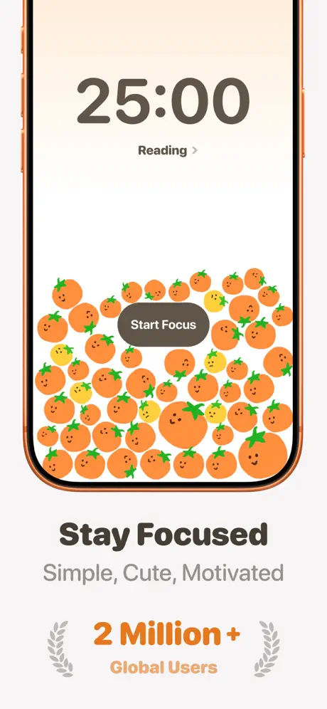
The opening frame centers a copper-edged iPhone against an off-white ground that reads approximately #FDF8F3. Inside the device, the screen is bisected into two distinct registers: a massive ‘25:00’ timer in a dark warm gray sits in the upper third, while the lower two-thirds are saturated with illustrated produce—mostly orange tomatoes with small green stems, punctuated by a few yellow ones. A rounded pill button labeled ‘Start Focus’ in white type is set into a charcoal rectangle layered directly over the tomato field, proving the characters are background texture rather than interactive obstruction. Beneath the phone, the headline ‘Stay Focused’ is set in a heavy geometric weight, followed by the lighter gray subhead ‘Simple, Cute, Motivated.’ The lowest tier anchors the composition with a laurel-flanked badge: ‘2 Million +’ in bright orange, with ‘Global Users’ underneath in a softer peach. The tomatoes bleed behind the button, confirming that charm here is environmental, not structural.
FocusPomo App Store screenshot 2 — Focus on your wrist
02

Focus on your wrist

On-frame caption: “Works offline, syncs with iCloud

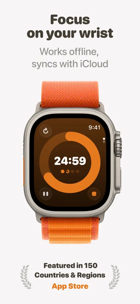
This frame interrupts the iPhone cadence with an Apple Watch Ultra wearing an orange alpine loop, centered against the same neutral backdrop. The watch face itself is a dark brown or near-black circular canvas—roughly #2A1A10—with a thick orange progress ring tracking around a white ‘24:59’ counter. Tiny page-control dots sit beneath the numerals, and a restart icon hovers at the top-left of the watch bezel. Above the hardware, the headline ‘Focus on your wrist’ is rendered in the familiar bold sans, with the lighter subhead ‘Works offline, syncs with iCloud’ beneath it. Below the watch, another laurel-wrapped badge states ‘Featured in 150 Countries & Regions’ in charcoal, while ‘App Store’ is singled out in the same orange that animates the watch ring. By foregrounding physical hardware rather than UI screenshots, the frame argues ecosystem breadth and offline utility before the viewer has fully committed to the swipe.

FocusPomo App Store screenshot 3 — Simple but Deep
03

Simple but Deep

On-frame caption: “Fluid motion, powerful features

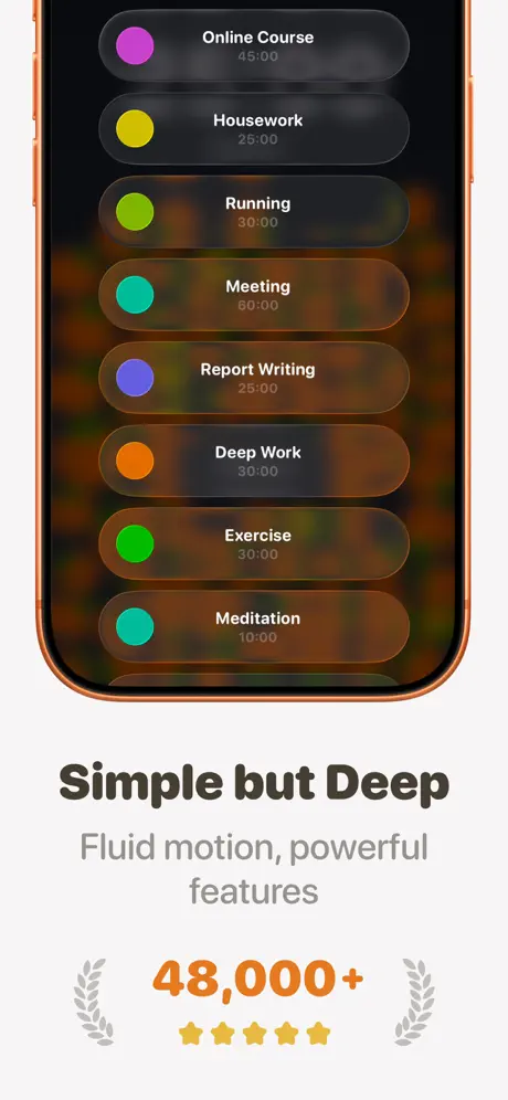
Returning to the copper iPhone, this frame introduces task management in dark mode. Seven rounded rectangular cells are stacked vertically, each hosting a colored circle on the left—purple, yellow, green, teal, violet, orange, and mint—and a task name paired with a duration on the right. The background behind the list dissolves into warm amber and orange bokeh, keeping the tomato brand language alive in abstract form. Below the device, the headline reads ‘Simple but Deep,’ followed by ‘Fluid motion, powerful features.’ The bottom badge offers ‘48,000+’ in orange, flanked by gray laurels and five small yellow stars. The contrast between the bright task-category glyphs and the translucent dark cards shows how the interface handles information density without abandoning its saturated palette. Notably, the copper device bezel harmonizes with the orange bokeh, making the phone itself feel like part of the product chromatics.

FocusPomo App Store screenshot 4 — Calendar View
04

Calendar View

On-frame caption: “View focus stats for 1 day, 2 days, or a week

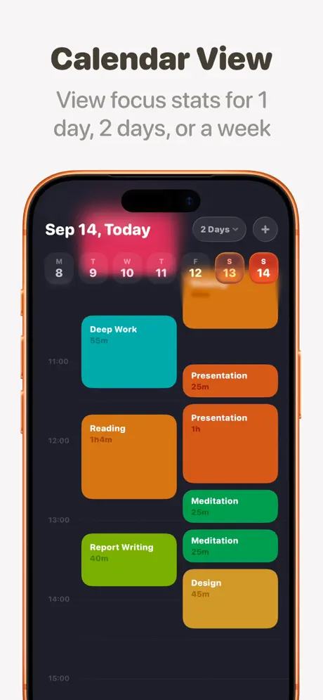
Headlined ‘Calendar View’ above the device, this frame shows a dark-mode iPhone screen running a deep navy or near-black background—approximately #1A1A2E. The top bar reads ‘Sep 14, Today’ in white, while a date strip below displays the week, with Tuesday the 9th radiating a hot pink glow and the weekend days sheathed in orange. The main body is a time-blocked day view: teal, orange, red, green, lime, and gold rectangles represent sessions like ‘Deep Work,’ ‘Reading,’ and ‘Meditation,’ mapped to a vertical timeline from 11:00 to 15:00. The explanatory line beneath the headline promises ‘View focus stats for 1 day, 2 days, or a week,’ although the screenshot itself only demonstrates the single-day layout. This frame shoulders the burden of proving planner-grade seriousness, and it does so through chromatic variety rather than minimalist restraint.

FocusPomo App Store screenshot 5 — Focus Trend
05

Focus Trend

On-frame caption: “View focus stats for 1 day, 2 days, or a week

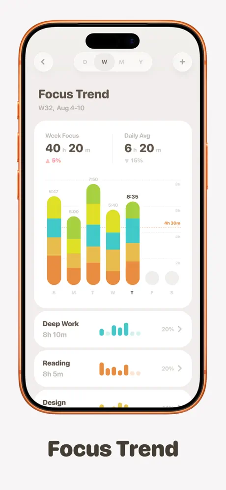
Titled ‘Focus Trend’ below the phone, this frame inhabits a light-mode analytics environment of soft gray and off-white. At the top, a pill-shaped segmented control offers D, W, M, Y, with a plus button at the right margin. The header reads ‘Focus Trend’ with ‘W32, Aug 4-10’ beneath it. Two summary cards display ‘Week Focus 40h 20m’ paired with a red upward triangle and ‘5%,’ and ‘Daily Avg 6h 20m’ paired with a gray downward triangle and ‘15%.’ A stacked vertical bar chart follows, using orange, yellow, teal, and lime segments to map five active weekdays, while Saturday and Sunday appear as empty gray circles. A dotted horizontal baseline marks ‘4h 30m.’ Below, category rows for ‘Deep Work’ and ‘Reading’ combine miniature bar sparklines with percentage labels. The palette recycles the produce-mascot tones into data semantics, keeping the brand recognizable even in statistical abstraction.

FocusPomo App Store screenshot 6 — Pomodoro Insights
06

Pomodoro Insights

On-frame caption: “Blocking distracted apps

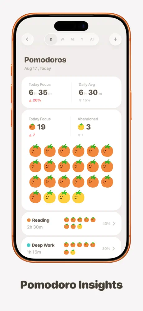
The sixth frame delivers the emotional payoff for the mascot introduced in the opening shot. Titled ‘Pomodoro Insights,’ it presents a light-mode iPhone with a header reading ‘Pomodoros, Aug 17, Today.’ Summary stats occupy the top card: ‘Today Focus 6h 35m’ marked up ‘20%,’ and ‘Daily Avg 6h 30m’ marked down ‘15%.’ Beneath that, a literal grid of nineteen orange tomato icons and three yellow ones acts as a tally—directly translating completed and abandoned sessions into character density. Further down, category rows for ‘Reading’ and ‘Deep Work’ render tracked time as small tomato trains, each ending in a percentage and a chevron. By making the mascot the encoding mechanism itself, the frame replaces abstract line charts with collectible visual volume, turning habit data into a scene the user might want to populate.

FocusPomo App Store screenshot 7 — App Blocker
07

App Blocker

On-frame caption: “Blocking distracted apps

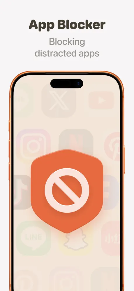
The final frame narrows to a single symbolic gesture. The iPhone screen is washed in a pale cream ground—roughly #F5F0E6—with ghosted app icons, including recognizable silhouettes for X, YouTube, Instagram, Netflix, Spotify, LINE, and Snapchat, faded into near invisibility. Centered on this tableau is a large orange shield—approximately #E86A3C—bearing a white prohibition symbol. The headline above reads ‘App Blocker,’ with ‘Blocking distracted apps’ underneath. No UI chrome, no settings toggles, no notification previews. After six frames of escalating interface density, this minimalist sign-off risks feeling abrupt, yet it functions as a memorable full-stop. The reliance on third-party iconography, however, drifts toward illustration rather than product documentation, which can weaken App Store credibility for shoppers hunting proof of actual enforcement mechanics.

05The craft

Captions, colour and the mechanics of the sell

Caption pattern

Nearly every frame follows an identical two-line cadence beneath the hardware: a bold imperative or noun phrase (‘Stay Focused,’ ‘Calendar View,’ ‘Focus Trend’) followed by a lighter gray explanatory clause. This creates a predictable scanning rhythm for the shopper.

Visual system

The off-white backdrop is treated as a gallery wall: neutral, consistent, and slightly warm. Inside the devices, the UI alternates between cream light mode and deep navy dark mode, yet both are cross-stitched by the same orange family (#E86A3C through #F5A623) so that mode switching never feels like brand switching. Laurel wreaths appear in three frames, always flanking a numerical achievement in orange, turning social proof into a repeatable crest motif.

The thumbnail test

At small scale, the first frame’s massive timer numerals and tomato field read instantly as a Pomodoro timer, while the copper phone bezel catches light differently than standard black-framed competitors. The orange social-proof numerals also punch through the off-white background better than gray body copy, though the headline weight can feel monolithic when compressed.

Conversion mechanics

The progression from character introduction to hardware proof to data density mirrors a standard awareness-to-evaluation funnel. A shopper who needs app blocking may not swipe all the way to frame seven, but the first three frames do enough emotional and social sorting to earn the swipe. The calendar and trend frames likely close the deal for planners, while the pomodoro grid rewards the curious browser with brand charm.

06Where it slips

What we would change

Uneven pacing between hardware and UI narrative

Frame two’s Apple Watch interlude breaks the iPhone momentum before the core task-list or calendar mechanics are established. A shopper might exit the gallery still wondering how the watch timer and phone task list relate. The fix is to either move the hardware frame to position five or six, where ecosystem polish feels like a bonus rather than a prerequisite, or to add a small watch-face preview inside a later iPhone frame to tie the two timelines together.

Social proof badges compete poorly with vibrant UI

The laurel wreaths, user counts, and star ratings are elegantly symmetric, but their gray tone is so muted that they visually sink against the saturated oranges inside the phones. At thumbnail scale, the ‘2 Million +’ and ‘48,000+’ numerals do not pop as aggressively as they should for trust signals. Increasing the badge contrast—either by darkening the gray to a charcoal or by giving the numerals a subtle drop shadow—would preserve hierarchy without redesigning the motif.

Frame seven abandons interface for illustration

The abstract shield and ghosted third-party icons read as marketing illustration rather than actual blocking UI. This not only skirts App Store guidelines that prefer functional depiction, but also denies the shopper visible evidence of enforcement behavior. The fix is straightforward: replace the shield with the app’s real permission gate, showing a blocked notification sheet or a locked home-screen overlay, so the frame proves mechanism rather than merely suggesting intent.

Caption promises exceed the screenshot evidence

Frame four’s subhead promises ‘View focus stats for 1 day, 2 days, or a week,’ yet the screenshot displays only the single-day view with a ‘2 Days’ dropdown closed. That creates a minor credibility gap. The fix is to either open the dropdown to reveal the multi-day options, or to add a small inset or alternate state showing the week view, ensuring the caption is visually supported rather than verbally asserted.

Headline typography is uniformly heavy beneath devices

Every frame uses the same bold weight for its lower headline, which at thumbnail scale can feel like an impenetrable slab. Introducing one lighter weight or shortening the line length for subheads would improve scannability on first impression. For example, ‘Focus on your wrist’ could afford a slightly lighter cut because the watch hardware already commands attention; the text does not need to shout.

07The recipe

How to apply this to your own app

  1. Commit to one mascot or chromatic anchor

    FocusPomo proves that a single orange family can hold together watchOS, dark mode, and bar charts. Pick one color or character and thread it through every frame until it becomes wayfinding.

  2. Cluster social proof early, then get out of its way

    Front-load trust signals in the first two or three frames so the remaining screenshots can focus on feature depth without needing to re-earn credibility.

  3. Match caption promises to screenshot states

    If your text mentions multiple views or settings, ensure the UI inside the phone visibly demonstrates at least two of them; do not make the shopper infer capability from a closed dropdown.

  4. Alternate light and dark mode to imply breadth

    You do not need a dedicated dark-mode frame if every other screenshot toggles the background. The alternation itself signals native support without spending a precious slot.

08Takeaways

Five things worth stealing

  • Color discipline can turn a playful mascot into a serious brand system across light, dark, and wearables.
  • Hardware shots interrupt narrative momentum; place them where they amplify rather than introduce.
  • Social-proof badges need enough contrast to survive against saturated UI screenshots.
  • Final frames should show real enforcement UI, not abstract illustration, to satisfy skeptical shoppers.
  • Caption claims must be visually verifiable inside the screenshot to maintain trust.
09The verdict

What the set actually achieves

The gallery opens with an emotional character moment, pivots to a watch hardware argument, then sprints through task lists, calendar blocks, analytics, and blocking. Color discipline acts as the glue: a near-identical orange-red recurs in the tomatoes, the watch complication ring, the shield icon, and the bar charts, turning a mascot into a brand system. Social proof is clustered in the early frames so that later frames can focus on pure interface storytelling. By alternating light and dark backgrounds across the sequence, the set implies native mode support without wasting a frame on an explicit toggle demonstration.

This set is best suited for designers and product teams building character-driven productivity or wellness apps who need to balance emotional appeal with feature credibility. It offers a clear template for repeating a single visual hook across disparate interface contexts.

10Questions

Frequently asked

Does the set follow Apple’s App Store screenshot guidelines?

Mostly, but frame seven edges toward illustration by using ghosted third-party app icons and an abstract shield rather than documented UI. Apple generally prefers actual interface screenshots for feature claims.

Why does the set switch between light and dark modes?

The alternation implies native support for both appearances without dedicating an entire frame to a mode toggle, effectively doubling the perceived breadth of the UI system within the same seven-slot limit.

How does the first frame balance character and function?

By layering the ‘Start Focus’ button directly over the tomato field, the frame signals that the mascot is decorative wallpaper while the timer and call-to-action remain structurally primary.

What role does the Apple Watch frame play in conversion?

It argues offline portability and ecosystem reach before the shopper has committed to the swipe, though its placement at position two risks disrupting the core iPhone feature narrative.

11Keep reading

Build your own screenshot set

The full set

7 shots
FocusPomo App Store screenshot 1FocusPomo App Store screenshot 2FocusPomo App Store screenshot 3FocusPomo App Store screenshot 4FocusPomo App Store screenshot 5FocusPomo App Store screenshot 6FocusPomo App Store screenshot 7

About the app

FocusPomo is a minimalist, beautiful and professional app based on the "Pomodoro Technique". It helps you to stay focused without being distracted and become more productive when FocusPomo Apps, via the App Store listing.

Screenshots and store metadata belong to FocusPomo Apps. They are shown here for design commentary and criticism. The analysis on this page is original work by floow.design. View the original listing.

More Productivity teardowns

Browse all →