Hers app icon
Health & FitnessScreenshot teardown17 min read

Hers App Store screenshots

Telehealth apps suffer from an identity problem on the App Store: too clinical and they feel alienating; too lifestyle-oriented and they feel untrustworthy. The Hers screenshot set attempts to solve this by compressing an entire patient journey—discovery, intake, diagnosis, treatment, and ongoing support—into eight frames, all staged against an unchanging brand canvas. What follows is a frame-by-frame study of how the team balances pharmaceutical credibility with consumer warmth, and where the seams start to show.

Set published by WhatsGoodApps LLC · 9 frames analysed

5.0 · 1 ratingsFreev1.1Updated 6mo ago
Hers App Store screenshot 1
01At a glance

The set in one screen

Framing
2 lifestyle (angled hands) → 6 flat (front-facing device)
Captions
2-line lockup. Top line bold white; second line at ~60% opacity.
Backdrop
Continuous deep sea-teal gradient (~#134E4A → #1A5A56)
Type
Geometric sans-serif; marketing headlines are large (~40–48pt) white; UI text ranges from 14pt captions to 24pt dashboard numerals.
UI / copy split
Marketing copy occupies ~15% of the frame height; UI occupies ~65%; negative space fills the remainder.
Frame 1 job
Establish category (healthcare), signal trust (4.8 stars, 30k+ ratings), prove physical product (3D vial, pills), and show breadth of service (masonry care categories).

Sampled palette

(teal canvas)#134E4A
(optimal / UI accent)#6ECDCB
(out-of-range / magenta)#E85D8F
(in-range / gold)#F2C166
(light surfaces)#FFFFFF
(dark UI bg)#0F292E
02The challenge

What this screenshot set had to solve

The shopper landing on a telehealth listing is usually in a state of low-grade anxiety. They are trying to distinguish a legitimate medical service from a supplement dropship in about six seconds. For Hers, the problem is compounded by the app’s hybrid nature: it is part diagnostics platform, part pharmacy, part messaging clinic. A new user has to understand not just what the app does, but how the experience feels—clinical yet accessible, serious yet supportive. The screenshot set therefore has to act as a compressed patient journey, moving from emotional promise to functional proof without dropping the viewer into dense, EMR-style interfaces that read as noise at thumbnail size. At the same time, the App Store search results crop hides the bottom fifth of every portrait screenshot, so the top two-thirds of each frame must function as an independent poster. The team also faces a continuity challenge: the app itself contains white intake forms, dark-mode dashboards, magenta lab headers, and light-mode chat screens. Making these disparate interior color temperatures feel like a single, coherent product—rather than a bundle of acquired features—is the central tension the design has to resolve.

The team treats the teal background as a stage curtain that never drops. That discipline is what keeps an intake form, a magenta lab result, and a white chat screen from feeling like three different apps.
03The approach

How the set argues its case

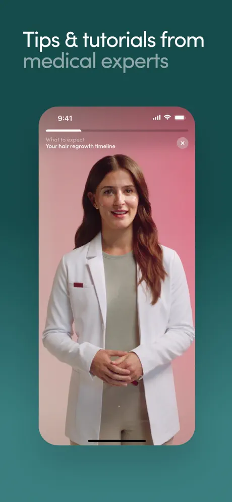
The team anchors the entire sequence to a single, unchanging stage: a deep sea-teal background sampled around #134E4A to #1A5A56. That canvas never shifts, creating continuity even when the UI inside the device jumps from a white onboarding screen to a magenta lab result to a sky-blue progress chart. Against this constant background, typography is locked to a strict two-line cadence: a bold, pure-white lead and a desaturated sub-line at roughly 60% opacity. The effect is cinematic—title and subtitle—without changing font weight or size. Device framing is used as a storytelling device, not merely a container. Frames 1 and 2 introduce photorealistic hands holding the phone at shallow angles, accompanied by floating 3D pharmaceutical objects: an orange capsule, a frosted vial with a green cap, an embossed pill. These objects do the work of category signaling; they tell the viewer that Hers ships physical products, not just digital content. Then, starting at frame 3, the set pivots to straight-on, flat device renders. This shift sacrifices warmth for scanability, letting the UI chrome read clearly. The sequence follows a carefully plotted patient journey: lifestyle promise, discretion, intake, diagnostics, drilling down, action plan, progress tracking, and finally human support. Copy is kept under five words per headline, forcing the interface itself to carry the explanatory weight. Color inside the UI is used semantically—teal for optimal, gold for caution, magenta for risk—so that even non-readers can parse the health states at a glance.

The set positions Hers between a wellness lifestyle brand and a clinical tool. The floating pills and photorealistic hands in frames 1–2 borrow from beauty and supplement marketing, while the dark-mode dashboards, biomarker counts, and NPI numbers in frames 4–8 borrow from patient-portal design. The result is a DTC healthcare aesthetic: friendly enough to feel approachable, but structured enough to imply medical oversight.

04Frame by frame

Every screenshot, and the job it does

Hers App Store screenshot 1 — Healthcare designed for you
01

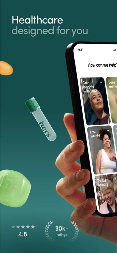
Healthcare designed for you

On-frame caption: “Healthcare designed for you

The first frame is an asymmetrical lifestyle composition. The marketing headline sits in the upper-left safe area: 'Healthcare' in bold white, followed by 'designed for you' in a muted, 60% opacity grey-white. The background is a continuous deep teal gradient, sampled around #134E4A. Entering from the bottom right, a photorealistic hand grips an iPhone 14/15 Pro, angled roughly fifteen degrees counter-clockwise so the device’s right edge bleeds off-canvas. The thumb wraps behind the phone, obscuring a sliver of the screen. Inside the device, the app displays a masonry-style card grid beneath the header 'How can we help?'. Four cards are visible. Top left: 'Gain insights with Labs', paired with a portrait of a woman wearing a headscarf. Top right, partially cropped: 'Ease meno...' (the remainder implied). Middle left: 'Lose weight' over a portrait of a woman in a white tank top. Bottom right: 'Tackle anxiety' over an older woman in a pink blazer. Each card stacks white text in the lower-left corner and a small arrow in the upper-right. Floating in the negative space are three 3D product renders: an orange capsule at the top-left, a translucent 'hers'-branded vial with a forest-green cap at center-left, and a semi-translucent green gummy at bottom-left. Bottom-left, below the props, sits social proof: five small grey stars, '4.8' in white, and a laurel wreath enclosing '30k+' and 'ratings' in a pale sage outline at roughly #7A9E99.
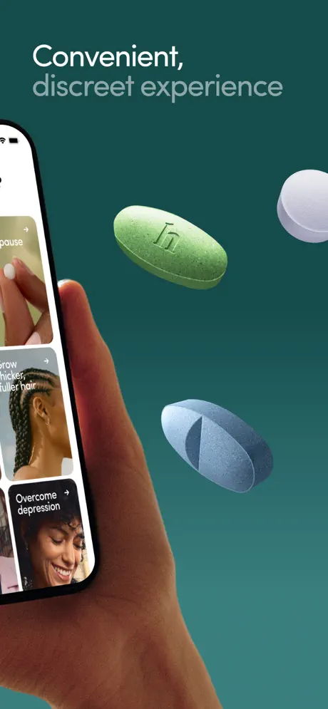
Hers App Store screenshot 2 — Convenient, discreet experience
02

Convenient, discreet experience

On-frame caption: “Convenient, discreet experience

Frame 2 reverses the composition. The headline 'Convenient,' in bold white and 'discreet experience' in muted grey-white occupies the same upper-left anchor. The phone now enters from the left, held in a hand with a noticeably darker skin tone than frame 1, angled roughly ten degrees clockwise. The left edge of the screen is cropped, showing the trailing edge of the card feed. Visible cards continue the masonry: the bottom of a '...ause' card (completing 'menopause' from the previous frame), 'Grow thicker, fuller hair' over a portrait of a woman with braids, and 'Overcome depression' over a portrait of a woman with curly hair smiling. The tab bar is cropped away entirely; the focus is on the content tiles. On the right two-thirds of the canvas, three pharmaceutical pills float in space: a green oval tablet embossed with a lowercase 'h', a matte blue bisected capsule, and a plain white round tablet. They cast soft, diffuse shadows against the teal. This frame doubles down on the tactile product language established in frame 1, but the shift of the hand to the left side rebalances the visual weight so the set does not feel repetitive.

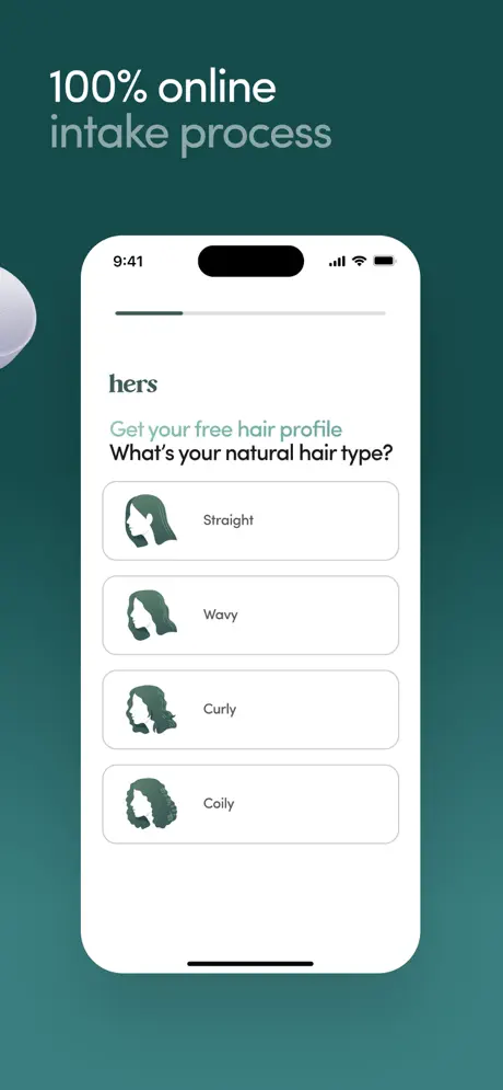
Hers App Store screenshot 3 — 100% online intake process
03

100% online intake process

On-frame caption: “100% online intake process

With frame 3, the set pivots hard to flat UI. The headline reads '100% online' in bold white, 'intake process' in muted grey-white, left-aligned in the upper safe area. The device is now perfectly centered and front-facing, with no hand. A barely visible white pill shape floats at the extreme left edge, a vestigial reminder of the 3D motif. The screen itself is light mode. The status bar shows 9:41, cellular, Wi-Fi, and battery. Below the Dynamic Island, the wordmark 'hers' appears in a dark grey. Underneath, the text 'Get your free hair profile' is rendered in a bright accent teal near #4A9E9A, followed by the bold question 'What's your natural hair type?' in near-black. The interface shows four vertically stacked option cards with rounded corners at roughly twelve-pixel radius. Each card has a light grey border near #E5E5E5 and contains a forest-green silhouette icon—depicting straight, wavy, curly, and coily hair types—and a label in dark grey. The active-state logic is not shown; all four sit in a neutral, unselected state. The frame’s job is to prove that onboarding is low-friction and self-serve.

Hers App Store screenshot 4 — Clear, holistic health snapshot
04

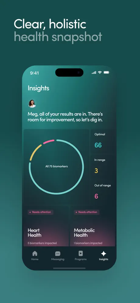
Clear, holistic health snapshot

On-frame caption: “Clear, holistic health snapshot

The fourth screenshot introduces the app’s dark-mode dashboard. The headline 'Clear, holistic' in bold white and 'health snapshot' in muted grey-white anchors the top left. The device is centered, straight-on, displaying a UI with a dark teal gradient background that runs from roughly #0F292E to #1A3C3C. At the top of the screen, the word 'Insights' appears in white. Below it, a circular avatar (~32px) sits next to the greeting: 'Meg, all of your results are in. There's room for improvement, so let's dig in.' Dominating the center-left is a large radial chart labeled 'All 75 biomarkers'. The ring is segmented into three colors: teal near #6ECDCB for optimal, gold near #F2C166 for in-range, and magenta near #E85D8F for out-of-range. To the right, a vertical legend renders numerals at a large point size: '66' in teal under 'Optimal', '3' in gold under 'In range', and '6' in magenta under 'Out of range'. At the bottom, two dark cards feature a subtle magenta glow and a small pill-shaped tag reading 'Needs attention'. They are labeled 'Heart Health / 5 biomarkers impacted' and 'Metabolic Health / 1 biomarkers impacted'. Critically, this is the only frame in the entire set that reveals the tab bar: Home, Messaging, Programs, and Insights (active, rendered with a filled sparkle icon).

Hers App Store screenshot 5 — Insights into 10 vital health areas
05

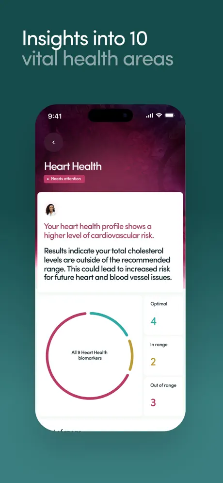
Insights into 10 vital health areas

On-frame caption: “Insights into 10 vital health areas

Frame 5 drills into a specific condition. The headline reads 'Insights into 10' in bold white and 'vital health areas' in muted grey-white. The device remains centered and front-facing, but the internal screen introduces a new color temperature: the top thirty-five percent is a rich magenta-to-purple gradient near #6B1D3D to #9E2B5E, while the bottom sixty-five percent is white at #FFFFFF. The header contains a white back chevron, 'Heart Health' in white, and a translucent magenta pill tag reading 'Needs attention'. Inside the white card, a small avatar precedes two paragraphs. The first, in bold magenta, states: 'Your heart health profile shows a higher level of cardiovascular risk.' The second, in dark grey, reads: 'Results indicate your total cholesterol levels are outside of the recommended range. This could lead to increased risk for future heart and blood vessel issues.' Below the text, a smaller radial chart is labeled 'All 9 Heart Health biomarkers'. It uses the same teal, gold, and magenta segmentation. To the right, the legend reads 'Optimal 4' in teal, 'In range 2' in gold, and 'Out of range 3' in magenta. The gradient bleed from header to card creates a sense of depth, though it slightly softens the boundary between marketing layer and UI layer.

Hers App Store screenshot 6 — Doctor-developed Action Plan
06

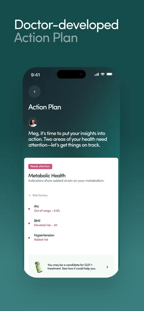
Doctor-developed Action Plan

On-frame caption: “Doctor-developed Action Plan

The sixth frame moves from diagnosis to prescription. The headline 'Doctor-developed' in bold white and 'Action Plan' in muted grey-white sits in the familiar upper-left position. Inside the device, the background returns to a dark teal gradient. A back arrow and the title 'Action Plan' appear at the top, followed by the avatar and the text: 'Meg, it's time to put your insights into action. Two areas of your health need attention—let's get things on track.' A white rounded sheet slides up from the bottom, occupying roughly the lower sixty percent of the screen with a corner radius near sixteen pixels. At its top, a magenta pill tag reads 'Needs attention', followed by 'Metabolic Health' in bold and 'Indicators show added strain on your metabolism.' in grey. Under the subhead 'Risk factors'—prefaced by a small icon—three list items appear with magenta bullet dots: 'A1c Out of range – 5.8%', 'BMI Elevated risk – 30', and 'Hypertension Added risk'. At the very bottom of the white sheet, a horizontal teaser card contains a thumbnail of a green pill bottle and the text: 'You may be a candidate for GLP-1 treatment. See how it could help you.' A chevron indicates drill-in navigation. This frame is doing dual work: it shows clinical authority and subtly introduces commerce.

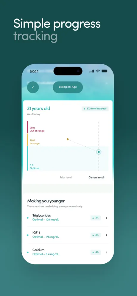
Hers App Store screenshot 7 — Simple progress tracking
07

Simple progress tracking

On-frame caption: “Simple progress tracking

Frame 7 introduces longitudinal tracking. The headline 'Simple progress' in bold white and 'tracking' in muted grey-white continues the cadence. The device shows a light-mode screen with an atmospheric header: a soft sky-and-cloud gradient near #E0F7FA fading into white, a sharp departure from the previous dark canvas. At the top, a back arrow and a pill-shaped segmented control reading 'Biological Age' sit below the status bar. The hero metric, '31 years old', is rendered in a large teal near #3AAFA9, with 'As of today' in smaller grey beneath it. To the right, a tag reads '▼ 3% from last year' in teal. The chart occupies the midsection. A vertical axis is color-coded: '99.0 Out of range' in magenta, '70.0 In range' in gold, and '0.0 Optimal' in teal. A dotted line connects a gold dot labeled 'Prior result' to a teal-ringed dot labeled 'Current result'. Below, a section titled 'Making you younger' lists three rows—Triglycerides, IGF-1, and Calcium—each with a teal status dot, 'Optimal – [value]' in dark grey, and a small teal downward arrow with a percentage. Right-facing chevrons on each row suggest deeper detail. The overall temperature is optimistic and airy.

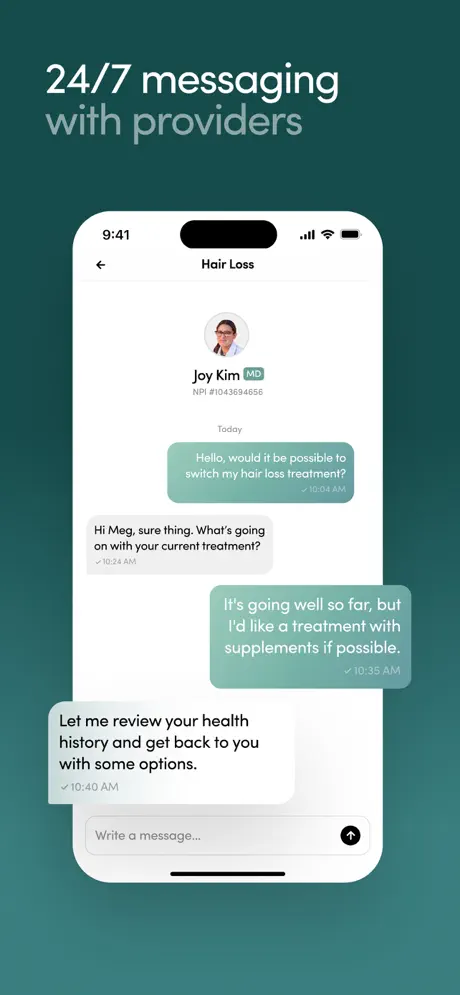
Hers App Store screenshot 8 — 24/7 messaging with providers
08

24/7 messaging with providers

On-frame caption: “24/7 messaging with providers

The final frame closes the loop with human support. The headline '24/7 messaging' in bold white and 'with providers' in muted grey-white sits above a centered, front-facing device showing a white-background chat interface. The header contains a left back arrow and the centered title 'Hair Loss'. A circular provider avatar sits above the name 'Joy Kim MD', the NPI number 'NPI #1043694656' in small grey, and a teal 'MD' badge. Below the 'Today' separator, the conversation unfolds in standard bubble format. User bubbles are right-aligned in solid teal near #5CBDB6 with white text; provider bubbles are left-aligned in light grey near #F2F2F7 with near-black text. The transcript reads verbatim: User: 'Hello, would it be possible to switch my hair loss treatment?' Provider: 'Hi Meg, sure thing. What's going on with your current treatment?' User: 'It's going well so far, but I'd like a treatment with supplements if possible.' Provider: 'Let me review your health history and get back to you with some options.' Timestamps are rendered in small grey with checkmarks: 10:04 AM, 10:24 AM, 10:35 AM, and 10:40 AM. At the bottom, a rounded input field contains the placeholder 'Write a message...' alongside a black send button inside a black circle.

05The craft

Captions, colour and the mechanics of the sell

Caption pattern

Every frame uses an identical two-line caption in the top-left safe area. The first line is bold and pure white; the second line is the same typeface at the same size but rendered at roughly 60% opacity. The only exceptions are frame 3 ('100% online / intake process') and frame 7 ('Simple progress / tracking'), where the second line is a single word. This cadence creates a predictable scan pattern: the eye always knows where to find the value proposition.

Visual system

The visual system is built on three layers: (1) the immutable teal canvas, which acts as a brand frame; (2) the device layer, which alternates between angled lifestyle renders and flat UI renders; and (3) the floating 3D product layer, which appears only in frames 1–2. Inside the device, the UI alternates between light and dark modes. Light mode is reserved for intake, chat, and progress tracking; dark mode is reserved for dashboards and action plans. This creates an informal grammar: dark screens equal 'results', light screens equal 'interaction'. The typography inside the UI is a clean sans-serif with generous spacing, and iconography is minimal—silhouette avatars, simple line chevrons, and pill-shaped tags.

The thumbnail test

At small scale, the first two frames hold up well because the high-contrast white headline against dark teal is immediately scannable, and the 3D objects add texture that distinguishes the listing from flat illustration competitors. Frames 3 and 8 also survive compression because their interiors are high-contrast (white UI, black text). Frames 4 and 5 suffer slightly: the dark-mode dashboard in frame 4 becomes a dark rectangle with a thin colorful ring, and the magenta header in frame 5 bleeds into a pink blur. The shopper swiping quickly may perceive frames 4–6 as a single dark blob unless they pause.

Conversion mechanics

The set is strongest at the top of the funnel. Frames 1 and 2 signal physical product and breadth of service faster than most competitors. The intake frame (3) reassures the user that onboarding is multiple-choice, not essay-writing. However, the conversion arc weakens in the middle. Frame 4 shows a dashboard, but without the tab bar persisting, the shopper does not learn where they are in the hierarchy. Frame 6 introduces GLP-1 treatment in a teaser card, which is a smart monetization signal, but it is visually small. A larger, higher-contrast call-up might improve commercial intent. Frame 8’s chat interface is the strongest trust-closer; it should arguably appear earlier in the sequence (frame 3 or 4) because provider access is a major differentiator in telehealth.

06Where it slips

What we would change

Rhythm whiplash between frames 2 and 3

The first two frames establish a lifestyle language—angled hands, floating pills, shallow depth of field—then frame 3 abandons that entirely for a sterile, flat UI render. There is no transitional frame to bridge the two visual dialects. The fix would be to retain a faint hand shadow or overlap a floating 3D pill against the device bezel in frame 3, so the product photography and UI photography share a single world.

3D motif is abandoned after frame 2

The pharmaceutical objects vanish almost completely after frame 2; only a sliver of a white pill appears at frame 3’s left edge. Because those objects were doing the critical work of signaling physical product and brand texture, their absence makes frames 4 through 8 feel like generic SaaS dashboards. The fix: let translucent capsule shapes bleed softly into the bottom corners of frames 5 and 6, maintaining the tactile brand language throughout the sequence.

Tab bar is visible only once

The tab bar appears exclusively in frame 4. A shopper swiping quickly will not internalize the app’s information architecture, and frame 8’s messaging screen could easily be mistaken for an embedded web view rather than native tab content. The fix: keep the tab bar visible in any frame depicting a top-level destination, particularly Messaging and Insights, so the shopper learns the app’s floor plan.

Clinical copy in frame 5 is illegible at thumbnail scale

The diagnostic paragraph inside the white card—'Results indicate your total cholesterol levels are outside of the recommended range...'—is dense body copy that collapses into grey noise when the image is reduced to search-result size. Because this is a marketing screenshot, not a functional build, the team should have enlarged the card text by roughly 15% or used a zoomed crop to make the risk statement legible at 20% scale.

Frame 7’s atmospheric header fights the marketing headline

The light, busy clouds behind 'Biological Age' reduce edge contrast against the white marketing text above the phone. At thumbnail size, the phone frame and the headline begin to merge. The fix: add a subtle dark vignette or scrim behind the marketing headline, or shift the device twenty points lower to restore clear separation between canvas text and UI content.

07The recipe

How to apply this to your own app

  1. Anchor every frame to a single canvas color

    If your app contains both light and dark interiors, pick one brand background and never change it. The teal stage is what lets Hers show a white intake form and a magenta lab result in adjacent frames without feeling fractured.

  2. Use a strict caption cadence

    The two-line headline pattern (bold claim + muted evidence) trains the eye to scan the same zone every time. Establish a headline grid and stick to it across all eight frames so the shopper can parse the value proposition while swiping at speed.

  3. Show the navigation chrome at least twice

    If your app has a tab bar or primary navigation, let it appear in more than one frame. Screenshots are often the first time a user sees your information architecture; hiding the chrome makes the app feel like a series of modal slides instead of a navigable home.

  4. Separate marketing type from UI type by scale

    When you need to show readable interface copy inside a device frame, boost the UI type by 10–15% specifically for the screenshot build. Body text that looks fine on a phone becomes unreadable at App Store thumbnail size.

  5. Carry a visual motif across the entire arc

    The floating pills in frames 1–2 are a great brand signature, but they disappear. If you introduce a 3D or illustrative motif early, find a way to let it ghost through the remaining frames—even as a faint shadow or edge bleed—so the set feels like one continuous scene.

08Takeaways

Five things worth stealing

  • A constant background color is the cheapest way to unify disparate UI screens.
  • Two-line headlines create a scan rhythm that works at swipe speed.
  • Lifestyle hands are effective hooks, but the transition to flat UI needs a bridge.
  • Persistent navigation chrome (tab bar) is a trust signal; do not hide it after one frame.
  • On-screen UI copy must be oversized for the screenshot medium; standard 16pt body text fails at thumbnail scale.
09The verdict

What the set actually achieves

The final set succeeds as a brand narrative but underperforms on navigational consistency and UI legibility. The first two frames are strong category anchors; the intake and dashboard frames read clearly; and the chat frame closes the loop on human support. However, the abrupt shift from lifestyle photography to flat UI in frame 3 fractures the visual rhythm, the tab bar is shown only once (frame 4), and frames 5 and 6 bury critical diagnostic copy in body-text sizes that are illegible at small scale. The set is a competent execution of a difficult healthcare brief, but it would convert more effectively with tighter framing continuity, persistent social proof, and larger on-screen type built specifically for the thumbnail environment.

Product designers building telehealth, wellness, or any multi-modal service app where the screenshot set must move from emotional promise to functional proof in under eight frames. The lessons on canvas consistency and caption cadence apply to any category with complex interior UI.

10Questions

Frequently asked

Why does the background never change?

The deep teal canvas acts as a stage. By keeping it constant, the team ensures that light screens (intake, chat) and dark screens (dashboards, action plans) still read as the same product. It is a low-effort, high-return continuity device.

Are the hands holding the phone real or rendered?

They appear to be photorealistic 3D renders or high-end photography with shallow depth of field. The skin texture and lighting are consistent across both hands, suggesting a controlled render pipeline rather than stock photography.

Why is the tab bar only in frame 4?

Likely because the other frames depict drill-down or modal flows where the tab bar is hidden in the actual app. For a marketing screenshot set, however, that is a strategic error: the shopper never learns where Messaging or Programs live.

What is the semantic color system inside the UI?

Teal (#6ECDCB) denotes optimal results, gold (#F2C166) denotes in-range, and magenta (#E85D8F) denotes out-of-range or needs attention. This tri-color logic repeats across charts, tags, and axis labels.

11Keep reading

Build your own screenshot set

The full set

9 shots
Hers App Store screenshot 1Hers App Store screenshot 2Hers App Store screenshot 3Hers App Store screenshot 4Hers App Store screenshot 5Hers App Store screenshot 6Hers App Store screenshot 7Hers App Store screenshot 8Hers App Store screenshot 9

About the app

Tired of swiping left on destiny? Meet Hers, the app that’s part daydream, part digital artist, and pure romantic fun. Just answer a few playful questions about your ideal match, WhatsGoodApps LLC, via the App Store listing.

Screenshots and store metadata belong to WhatsGoodApps LLC. They are shown here for design commentary and criticism. The analysis on this page is original work by floow.design. View the original listing.

More Health & Fitness teardowns

Browse all →