How We Feel app icon
Health & FitnessScreenshot teardown15 min read

How We Feel App Store screenshots

How We Feel: A Frame-by-Frame Study in Chromatic Consistency and Nonprofit Store Narratives

Set published by The How We Feel Project, Inc. · 8 frames analysed

4.9 · 28K ratingsFreev1.17.3Updated 4mo ago
How We Feel App Store screenshot 1
01At a glance

The set in one screen

Framing
iPhone with curved bezels and 9:41 status bar in frames 1–5; full-bleed vector illustrations in frames 6–8.
Captions
Centered, sentence-case white serif, occupying the upper 18–22% of each canvas.
Backdrop
Absolute black or near-black (#141414) across all eight frames; no environmental textures or gradients behind the device.
Type
Old-style high-contrast serif for canvas headlines; white italic sans for in-app prompt text; emotion names rendered in the app’s category color.
UI / copy split
UI dominates frames 1–5; frames 6–8 are pure illustration/typography with no device chrome.
Frame 1 job
Establish emotional granularity and the core color system.

Sampled palette

#FF5F4C#FF5F4C
#FFD84D#FFD84D
#50E3C2#50E3C2
#60A5FA#60A5FA
#141414#141414
#FFFFFF#FFFFFF
02The challenge

What this screenshot set had to solve

Screenshots for mental-health and journaling apps usually fall into two traps: they either look like sterile clinical dashboards (blue headers, stock photography of people meditating) or they dissolve into vague lifestyle aspiration (sunsets, handwritten fonts, no actual UI). The challenge visible here is harder than either extreme. The app needs to communicate a granular emotional taxonomy—dozens of distinct feeling states mapped to hues and shapes—without turning the store page into a spreadsheet. At the same time, it must establish nonprofit credibility (Yale Center for Emotional Intelligence), a donations-based business model, a privacy promise, and award legitimacy, all while maintaining a warm, accessible tone. That is a lot of narrative freight for eight frames. The design problem, then, is temporal: how do you sequence trust, feature proof, and institutional authority so that a shopper swiping in two seconds per frame still absorbs the hierarchy of values? The team appears to have solved this by treating color as a cross-frame language: coral means tension, amber means energy, mint means calm. The consistency of that mapping lets the viewer read emotion faster than they can read words, which is essential when the UI itself is visually dense.

The screenshots are at their strongest when the device frame acts as a stage, and at their weakest when the product disappears entirely.
03The approach

How the set argues its case

The team uses three formal constraints to keep the narrative coherent. First, every feature frame (1–5) is locked to the same centered iPhone bezel with visible status-bar chrome, creating a stage effect that isolates the UI from the surrounding void. Second, canvas headlines are set in a large, high-contrast serif—likely a cut in the Tiempos or DM Serif family—always white (#FFFFFF), always centered, and always occupying the upper fifth of the frame. This turns the headline into a ceiling that pushes the eye downward into the device. Third, the interior UI relies on pure black (#000000) backgrounds so the device and the canvas merge into a single dark field; the screenshots never feel like a phone floating on a colored poster. The final three frames abandon the device entirely, shifting to full-bleed vector illustrations. This is a deliberate narrative rupture: frames 1–5 answer “what do I do?” while frames 6–8 answer “why should I trust you?” The color system bridges the gap—yellow blobs in the UI become the yellow blob mascot in the privacy frame, mint shapes become the mint heart in the donations frame—but the shift from photography and UI to line-art poster is abrupt enough that it risks losing shoppers who are scanning for app proof rather than brand philosophy.

The app positions itself as a nonprofit scientific tool rather than a venture-scale wellness startup. That positioning is communicated not through copy alone but through the ascetic restraint of the black canvas, the耶鲁 italic lockup in frame 8, and the plainspoken donation slide in frame 7. There are no aspirational lifestyle models smiling at sunrise; the photography inside the UI is candid and personal (a child with a tennis racket, a foggy skyline, an airplane wing), which keeps the tone grounded. The overall impression is institutional yet intimate: Yale at the bottom, a hand-drawn heart in the middle, and a precise emotion-picker at the top.

04Frame by frame

Every screenshot, and the job it does

How We Feel App Store screenshot 1 — The Emotion Picker
01

The Emotion Picker

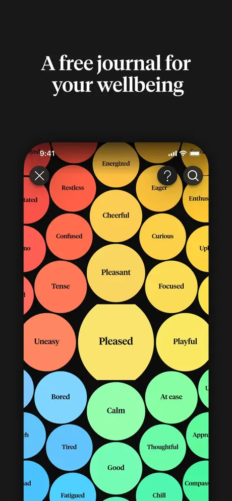
On-frame caption: “A free journal for your wellbeing

The first frame centers an iPhone displaying a full-screen field of overlapping circles against absolute black. Each circle contains a single emotion word in a clean sans-serif. The visible vocabulary spans Restless, Energized, Eager, Enthusiastic (cropped), Cheerful, Pleasant, Curious, Confused, Tense, Focused, Uneasy, Pleased, Playful, Bored, Calm, At ease, Tired, Thoughtful, Good, Fatigued, and Chill. The circles scale by size—Pleasant and Pleased are the largest—and follow a warm-to-cool gradient path: coral-reds at the upper left, oranges and yellows in the center, mints at the lower right, and sky blues at the bottom left. In-app chrome is minimal: a circular close button with an X at upper left, and circular Help and Search buttons at upper right. There is no visible tab bar or navigation rail, so the bubbles appear to float in an infinite canvas. The headline above the device is set in a large white serif with generous line-height, occupying roughly the top fifth of the frame. The overall effect is dense but legible; the shopper immediately grasps that the app offers a wide emotional vocabulary rather than a reductive happy/sad toggle.
How We Feel App Store screenshot 2 — The Journal Feed
02

The Journal Feed

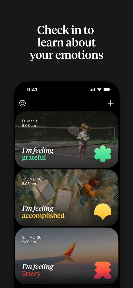
On-frame caption: “Check in to learn about your emotions

Inside the device, three full-width cards stack vertically. Each card is a photograph overlaid with a dark gradient scrim so that white text remains legible. The top card shows a child holding a tennis racket; timestamped “Fri Mar 31 / 8:08 am,” it reads “I’m feeling grateful,” with the word grateful rendered in mint (#50E3C2) and paired with a mint four-leaf-clover blob on the right. The second card shows books and fruit on a checkered cloth; timestamped “Thu Mar 30 / 5:05 pm,” it reads “I’m feeling accomplished,” with accomplished in amber (#F5A623) and a yellow semicircle blob. The third card shows an airplane wing above clouds; timestamped “Sun Mar 26 / 2:20 pm,” it reads “I’m feeling jittery,” with jittery in coral-red (#FF5A5F) and a red abstract X-shape. The typographic hierarchy is tight: italic “I’m feeling” in white, followed by a heavier colored sans for the emotion label. A settings gear icon sits at the top left of the screen, and a plus icon at the top right. This frame proves that the color system from frame 1 is not decorative; it is functional data visualization inside a photojournal.

How We Feel App Store screenshot 3 — The Monthly Calendar
03

The Monthly Calendar

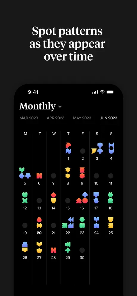
On-frame caption: “Spot patterns as they appear over time

The device displays a calendar view titled “Monthly” with a dropdown chevron. A horizontal month scrubber shows MAR 2023, APR 2023, MAY 2023, and JUN 2023, with JUN 2023 appearing as the rightmost and presumably selected tab. Below, a standard seven-column grid is labeled M T W T F S S. Individual days are represented by small white numerals; many cells contain tiny multicolored glyphs—roughly 12–16 px in screen space—that echo the emotion blobs from frame 1. Day 1 carries a red and blue pair; day 3 carries yellow and blue; day 20 carries red and yellow; day 29 carries mint and green. Empty days are marked by small gray dots. Hairline white vertical rules separate the columns. The frame attempts to prove longitudinal value, but the glyphs are so small that they read as decorative noise rather than readable data. At store thumbnail size, the calendar collapses into a dark grid with indistinct confetti, undermining the “spot patterns” promise.

How We Feel App Store screenshot 4 — The Tools Directory
04

The Tools Directory

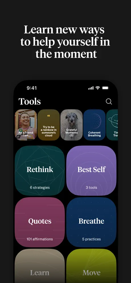
On-frame caption: “Learn new ways to help yourself in the moment

This frame shows a bimodal layout. At the top, a horizontally scrolling rail of rounded chips mixes photography, quotes, and illustration: a portrait labeled “As a Friend I am…”, a yellow card reading “Try to be a rainbow in someone’s cloud,” a dog photo labeled “Grateful Moments (3),” a navy spiral labeled “Coherent Breathing,” and a partial teal planet chip reading “Tin… Tra…” that is cut off by the right bezel. Below the rail, a two-column grid of large rounded rectangles presents categories: “Rethink” on a teal block (#0F4C46) with faint geometric lines and “6 strategies”; “Best Self” on purple (#8B5CF6) with “3 tools”; “Quotes” on magenta (#9D174D) with “101 affirmations”; “Breathe” on navy (#1E3A8A) with “5 practices”; and bottom-row cards “Learn” on taupe (#78716C) and “Move” on olive (#84CC16), both cropped hard at the bottom edge of the screen. The search icon lives at the top right. The cropping is the most obvious flaw here: because “Learn” and “Move” are sliced off mid-card, the screenshot looks like a rendering error rather than an intentional peek at more content. A fade gradient or a fully visible last row would have fixed the composition.

How We Feel App Store screenshot 5 — The Social Feed
05

The Social Feed

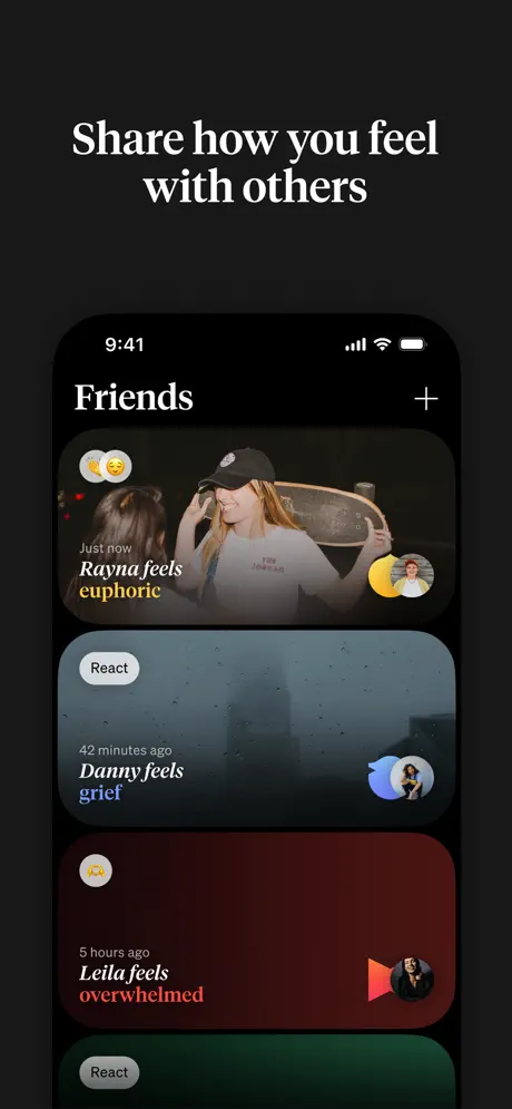
On-frame caption: “Share how you feel with others

The in-app screen mirrors frame 2’s card architecture but adds social metadata. A top card shows a woman holding a skateboard; at upper left, a heart-eyes emoji and a grinning emoji float in small white circles. The text reads “Just now / Rayna feels euphoric,” with euphoric in yellow (#FBBF24); a circular avatar sits on a yellow semicircle at lower right. The second card displays a foggy city skyline: “42 minutes ago / Danny feels grief,” with grief in blue (#60A5FA), a gray pill-shaped “React” button on the left, and a blue abstract shape with an avatar on the right. The third card is a deep red-mahogany gradient: “5 hours ago / Leila feels overwhelmed,” with overwhelmed in red (#EF4444), another “React” pill, and a red shape with avatar. A fourth green card is barely visible at the bottom edge. The frame demonstrates that the color-language system scales to social context without breaking the feed’s readability. However, the Leila card contains large dead space below the text, making the layout feel bottom-heavy and unfinished.

How We Feel App Store screenshot 6 — The Privacy Promise
06

The Privacy Promise

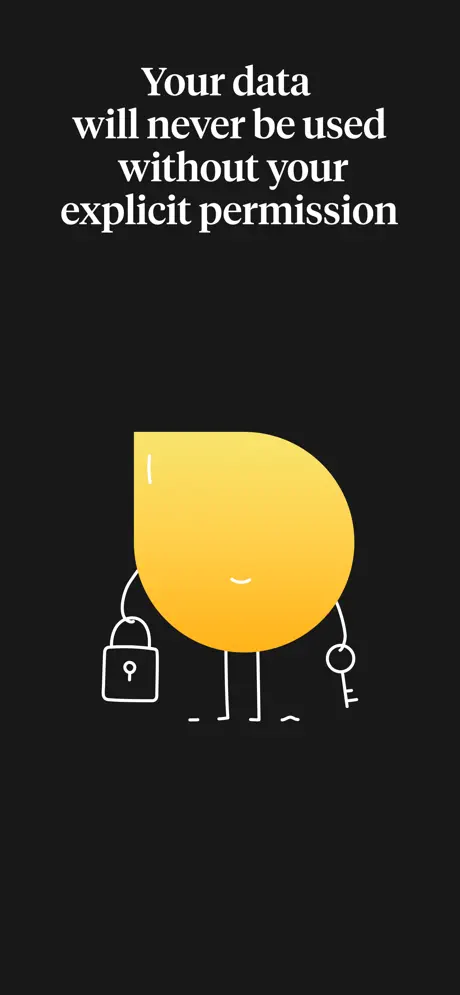
On-frame caption: “Your data will never be used without your explicit permission

For the first time, the device disappears. The canvas is pure #141414 black. Centered is a large yellow gradient blob—roughly #F59E0B fading to #FCD34D—that matches the color and rounded form of the emotion blobs inside the app. The blob has been given white line-art stick limbs; its left hand holds a padlock, its right hand a key, and a simple curved line suggests a smile. There is no UI, no status bar, no photography. The frame is a pure trust signal. While the blob’s shape recalls the in-app glyphs, the shift from device-framed product to standalone illustration is jarring because frames 1–5 established a rigid convention: white headline, black surround, centered iPhone. Breaking that convention for a poster-style slide risks losing shoppers who are auditing features rather than brand ethos.

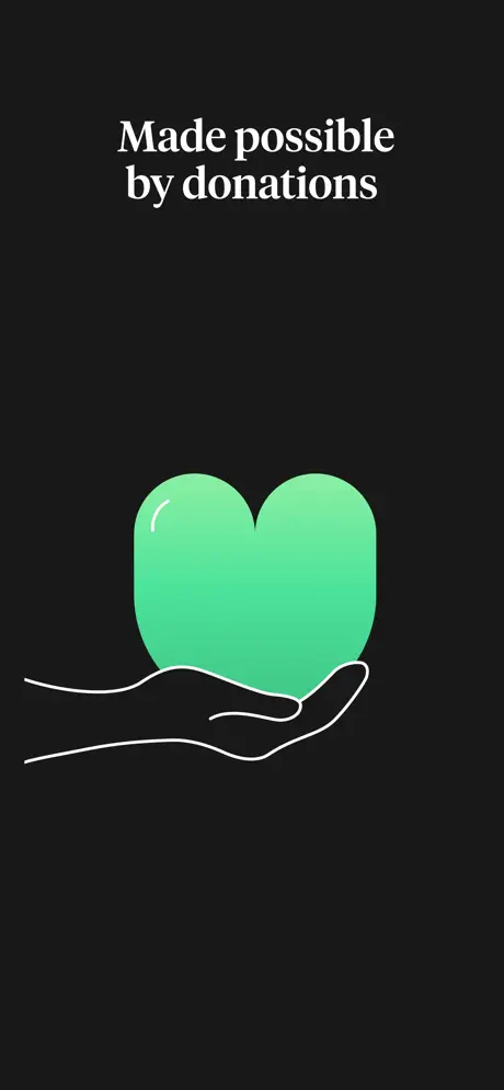
How We Feel App Store screenshot 7 — The Donation Model
07

The Donation Model

On-frame caption: “Made possible by donations

Again, no device. The same black canvas holds a mint-gradient heart—#34D399 to #10B981—cradled by a white line-art open palm extending from the lower left. The heart is glossy, with a single white highlight stroke at upper left. The illustration is minimal and quiet, occupying roughly the vertical center of the frame. After six frames of dense UI and photography, the negative space feels intentional, almost like a breath. Yet the frame offers zero product proof. For a shopper deciding in seconds, a full screenshot dedicated to the business model is a luxury; most competitors bury this in description text. The visual tie to the broader set is strictly chromatic—the mint heart matches the calm-state vocabulary from frame 1—but without UI context, it functions as a nonprofit billboard rather than an app screenshot.

How We Feel App Store screenshot 8 — The Institutional Lockup
08

The Institutional Lockup

On-frame caption: “Celebrated worldwide for cultural impact

The final frame is entirely graphic. Two white award badges float on the black background. The upper badge is a braided circular seal containing the Apple logo, “AppStore,” “Cultural Impact Winner,” and “2022.” The lower badge is a radiating sunburst seal reading “BEST USER EXPERIENCE” and “WEBBY AWARD WINNER” around a center that shows “20” above a spring icon and “23” below. At the bottom, in smaller white serif type, the text reads “Yale Center for Emotional Intelligence,” with “Emotional Intelligence” set in italic. There is no app interface, no device, no color beyond white. The frame is pure credibility. While the badges are sharply rendered, dedicating an entire screenshot to external validation is a missed opportunity to show one more differentiated feature state. At thumbnail scale, the Yale lockup is readable but subordinate, while the badges dominate—leaving the viewer with an impression of prestige but no final reminder of what the app actually does.

05The craft

Captions, colour and the mechanics of the sell

Caption pattern

Headlines are sentence-case, never all-caps. Frame 1: “A free journal for your wellbeing.” Frame 2: “Check in to learn about your emotions.” Frame 3: “Spot patterns as they appear over time.” Frame 4: “Learn new ways to help yourself in the moment.” Frame 5: “Share how you feel with others.” Frame 6: “Your data will never be used without your explicit permission.” Frame 7: “Made possible by donations.” Frame 8: “Celebrated worldwide for cultural impact.” The rhythm is consistent: a verb-led imperative for the first five, then a declarative statement for the final three. That shift mirrors the move from product to philosophy.

Visual system

The in-app color logic is the true protagonist. Emotion states are assigned to specific hues that repeat across every frame: coral-reds cluster around tension (Restless, Confused, Tense, Jittery), yellows cluster around active positivity (Energetic, Eager, Cheerful, Euphoric, Accomplished), mints cluster around calm (Grateful, Calm, Good, Chill), and blues cluster around low-energy states (Bored, Tired, Fatigued, Grief). Those same hues reappear as calendar glyphs, social-card tints, and category-block backgrounds. Even the abstract blob shapes are consistent: a four-leaf clover for gratitude, a semicircle for accomplishment, an X-form for jittery states. That level of systems thinking means a viewer can learn the palette in frame 1 and read the rest of the set chromatically.

The thumbnail test

At small scale, the set reads as a vertical column of white headlines on black. The device silhouettes are distinct, and the colored blobs inside frames 1, 2, and 5 register as bright confetti against the dark field. Frame 3, however, collapses into a gray smudge because the calendar glyphs are too small to resolve. Frame 8 becomes two white circles—legible as badges, but missing any product context. A shopper speed-scrolling will get “emotions,” “photos,” and “awards,” but may miss the pattern-tracking and tools features entirely.

Conversion mechanics

The set is front-loaded with interface proof, which is smart for conversion. Shoppers see the core mechanic (frame 1), the daily habit (frame 2), the long-term payoff (frame 3), the utilities (frame 4), and the network effect (frame 5) before encountering any non-product material. That ordering respects the App Store funnel: hook with the unique UI, then justify with depth, then close with trust. However, frames 3 and 4 are the weakest conversion assets because their density works against them at small sizes. Frame 3’s calendar glyphs need to be legible to prove the “patterns” promise; frame 4’s cropped bottom row needs to feel intentional, not broken.

06Where it slips

What we would change

Pattern-Spotting Failure in Frame 3

The biggest functional misfire is frame 3’s calendar. The emotion glyphs are too small to resolve at store thumbnail size, so the frame fails to prove the value proposition written above it. A shopper cannot ‘spot patterns’ in a grid of 8-pixel confetti. The fix is to zoom into a single week or highlight a visible streak—perhaps three consecutive amber days—to demonstrate the insight without requiring reading glasses.

Abrupt Cropping in Frame 4

The Tools grid crops the bottom row of category cards (“Learn” and “Move”) at roughly mid-height. Because the cards are solid-color rectangles with text, the crop reads as a mistake rather than a glimpse of scrollable content. The fix is either to pull the viewport up so the bottom row is fully visible, or to apply a bottom-edge gradient fade that signals intentional masking.

Discontinuity in Frames 6–8

Frames 1–5 establish a strict compositional contract: white serif headline, centered iPhone, black surround. Frames 6–8 break all three rules simultaneously—no device, illustration instead of UI, and poster-style centered graphics. The result feels like a different app. The fix is to either maintain the device frame through all eight slides (showing the privacy policy or an awards modal inside the app) or to introduce the blob mascot earlier inside the UI so its appearance in frame 6 feels like payoff rather than a non-sequitur.

Wasted Real Estate on Credentials

Frame 8 sacrifices an entire screenshot to two award badges and a Yale lockup. In a store environment where you have at most ten frames, giving one-eighth of your narrative to pure third-party validation is expensive. The fix: overlay the App Store and Webby badges as smaller graphics in the corner of frame 2 or 5, and use frame 8 to show a differentiated feature—such as a widget, a breathing exercise in progress, or an onboarding moment.

Empty Space in Frame 5

The bottom card in the social feed (Leila’s “overwhelmed” state) contains a large expanse of dark red gradient with only a tiny avatar and shape at lower right. The composition feels unbalanced because the upper portion carries all the text and the lower portion carries none. The fix is to either add a background photograph with a red tint—matching the other cards—or to reposition the avatar and shape closer to the text block so the card feels intentionally composed rather than half-loaded.

07The recipe

How to apply this to your own app

  1. Decide if you are selling UI or selling philosophy. If the answer is both, introduce the non-UI visual language early so the transition does not fracture the set.

    How We Feel waits until frame 6 to show its blob mascot. By then, the shopper has grown accustomed to device photography. If your app has a beloved character or illustration system, seed it in frame 1 or 2 as an empty state or guide so frame 6 feels like a reunion.

  2. Build a compositional grid and never break it without amplification.

    The centered iPhone + top headline grid in frames 1–5 is powerful because it is predictable. If you must break it, make the break so visually loud—larger type, more color, more negative space—that it reads as a climax, not an error.

  3. Treat color as a cross-frame language, not just decoration.

    The most transferable lesson here is the emotion-to-hue lockup. If your app categorizes content by state, topic, or priority, assign each category a specific hex value and repeat it in screenshots 1 through 5. Shoppers will learn the system subconsciously and read later frames faster.

  4. Zoom in on data visualization.

    Frame 3 teaches that dense dashboards do not survive the App Store thumbnail test. If a screenshot claims to show ‘patterns,’ make the pattern unavoidable at 300 px wide. Isolate a trend, enlarge a glyph, or add a connecting line.

  5. Audit your crops like a print designer.

    Scrollable UI inside a screenshot is dangerous because the crop edge is unforgiving. If content is cut off, signal the continuation with a fade or shadow. Never let solid shapes end in hard seams.

08Takeaways

Five things worth stealing

  • Absolute black canvases can differentiate a Health & Fitness app from the category’s typical airy pastels, but only if the in-app UI is also dark enough to merge with the surround.
  • A recurring serif headline acts as a ceiling that pushes the eye down into the device; keep the weight and size identical across frames.
  • Color systems scale across screenshots if you treat them as grammar rather than ornament.
  • The blob/shape language is a smart alternative to emoji; it feels bespoke and avoids platform-specific rendering issues.
  • Nonprofit positioning is communicated through restraint—minimal chrome, no price tags, plainspoken donation slides—rather than through persuasion.
09The verdict

What the set actually achieves

The set establishes an immediate visual identity through absolute black surrounds and a recurring serif voice. It prioritizes product proof in the opening five frames, then pivots to values and credibility in the closing three. The result is a sequence that feels more like a curated gallery walk than a conventional feature list, though that same pivot introduces a structural fracture between device-framed UI and non-device illustration.

This case study is for mobile product designers and screenshot strategists building apps in wellness, mental health, education, or any category where emotional tone matters as much as feature velocity. If you are debating whether to show raw UI or lifestyle photography, How We Feel offers a middle path: UI-first proof with a tightly controlled color language that keeps the humanity intact.

10Questions

Frequently asked

Why does the set switch from device frames to illustrations?

The switch appears to be a narrative pivot from feature proof to values and trust. The risk is that it breaks the visual rhythm; the reward is that it signals the app is mission-driven rather than purely commercial.

How does the palette support conversion?

By mapping every emotion to a specific hue that repeats across all eight frames, the set trains the viewer to read the app chromatically. A yellow blob in frame 1 equals a yellow headline in frame 2 equals a yellow badge in frame 5, creating instant pattern recognition.

What is the biggest risk in frame 3?

The calendar glyphs are too small to prove the ‘spot patterns’ promise at thumbnail size. The frame looks decorative rather than informative.

Should I copy the black-canvas approach?

Only if your in-app UI is also dark. How We Feel succeeds because the device screen and the canvas share the same black value, making the phone feel like a window rather than an object.

11Keep reading

Build your own screenshot set

The full set

8 shots
How We Feel App Store screenshot 1How We Feel App Store screenshot 2How We Feel App Store screenshot 3How We Feel App Store screenshot 4How We Feel App Store screenshot 5How We Feel App Store screenshot 6How We Feel App Store screenshot 7How We Feel App Store screenshot 8

About the app

How We Feel is a free app created by scientists, designers, engineers, and therapists to help people better understand their emotions and find strategies to help them navigate The How We Feel Project, Inc., via the App Store listing.

Screenshots and store metadata belong to The How We Feel Project, Inc.. They are shown here for design commentary and criticism. The analysis on this page is original work by floow.design. View the original listing.

More Health & Fitness teardowns

Browse all →