imagi app icon
EducationScreenshot teardown13 min read

imagi App Store screenshots

When an app promises to turn Python into a playground, its App Store screenshots have to perform a precarious balancing act: the visuals must signal ‘beginner-friendly creativity’ while still showing the actual coding surface. The set for imagi attempts this by wrapping a dark, technical UI inside a bright, continuous pixel-art world. The result is a bold, character-driven carousel that alternates device placement, color temperature, and typographic emphasis to keep a shopper swiping—though not without a few missteps that reveal the tension between illustration and interface.

Set published by imagiLabs AB · 10 frames analysed

4.7 · 3.2K ratingsFreev1.20.2Updated 8mo ago
imagi App Store screenshot 1
01At a glance

The set in one screen

Framing
Physical iPhone bezels rotated at steep angles; device alternates left/right to create rhythm.
Captions
Heavy geometric sans-serif with offset underline bars or marker-style highlight blocks.
Backdrop
Flat-to-gradient fills that shift from warm yellows into cool teals across the sequence.
Type
Bold black headlines with highlighter-style rules beneath or behind key phrases; italic lowercase never appears, keeping the tone graphic and assertive.
UI / copy split
Roughly 65% illustration, 35% device chrome. The app UI is always cropped, never shown full-bleed.
Frame 1 job
Establish brand mascot, primary value proposition, and the continuous bottom landscape in one glance.

Sampled palette

(lemon)#F7EA48
(mint underline)#5DE8A0
(orange)#FFA726
(sky underline)#80D8FF
(deep orange)#FF9800
(yellow highlight bar)#FFF176
02The challenge

What this screenshot set had to solve

The central design problem visible in this set is how to introduce a code editor without triggering intimidation. The app’s actual interface, seen in Frames 3 and 4, is a dark-mode grid with numbered axes, color swatches, and syntax prompts—visual language that reads as technical and dense. The screenshots must therefore use the surrounding canvas to neutralize that density before the shopper even reaches those frames. Additionally, the product spans three distinct modes—learning, exploring, and creating—which have to be communicated sequentially without feeling like disconnected feature tabs. The challenge is essentially choreographic: eight frames, three modes, one continuous story, and zero patience from a scrolling App Store browser.

The screenshots treat the App Store carousel not as a spec sheet, but as a side-scrolling level.
03The approach

How the set argues its case

Rather than isolating features, the team adopted a world-building approach. Every frame shares three constants: the bottom hill, the black-outlined pixel aesthetic, and the 1-bit-plus-accent color illustration style. Within that sandbox, variation is achieved through device placement and background hue shifts. Captions are front-loaded; the headline always sits in the upper third, ensuring it is not cropped by the App Store overlay on smaller phones. The UI inside the device is deliberately secondary—often showing only 35–40% of the screen—so the shopper registers ‘coding environment’ without needing to parse every button. The strategy relies on pattern recognition: once the viewer associates the ghost and the hills with the brand, each new frame only needs to introduce one new verb—Learn, Play, Explore, Create.

The screenshots position the app at the intersection of education and creative tool. By showing social feeds, level unlocks, and a free-form editor in the same visual language, the set argues that coding is a craft activity comparable to drawing or community sharing, not an abstract academic task. The Python-specific references—laptop with a snake, the '</>' symbol—are tucked into the pixel scenery as easter eggs rather than foreground claims, letting the aesthetic do the persuading.

04Frame by frame

Every screenshot, and the job it does

imagi App Store screenshot 1 — Frame 1
01

Frame 1

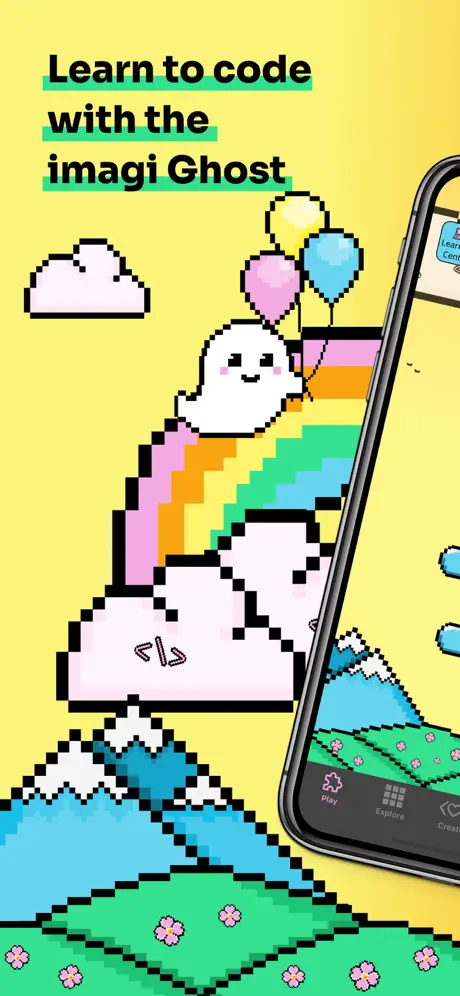
On-frame caption: “Learn to code / with the / imagi Ghost

The sequence opens on a flat lemon-yellow ground (~#F7EA48) that fills roughly the top two-thirds of the canvas. The headline is set in a heavy, tightly-tracked sans-serif in pure black, with each line anchored by a thick mint underline (~#5DE8A0) offset slightly below the baseline. To the left, a white pixel cloud encloses a '</>' symbol. A pixel rainbow arcs from the green hill at the bottom toward the upper right, where the white ghost mascot floats clutching three balloons—yellow, pink, and cyan. The iPhone enters from the bottom-right corner at a steep leftward angle; only the right 40% of the screen is visible, cropping away the left side of the app but revealing the tab-bar icons for Play, Explore, and Create. The black bezel and rounded corners of the device are crisp. The bottom edge is a continuous green hill with repeating pink flower sprites, establishing the persistent ‘ground plane’ that will run through the rest of the set.

imagi App Store screenshot 2 — Frame 2
02

Frame 2

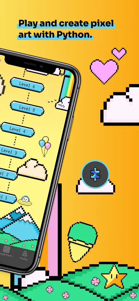
On-frame caption: “Play and create pixel / art with Python.

The background warms to a saturated orange (~#FFA726). The headline occupies the upper left, again in heavy black sans-serif, this time underlined with a light blue rule (~#80D8FF). The iPhone now hangs from the upper left, angled down toward the right, revealing a vertical path of six blue pill-shaped buttons labeled Level 6 through Level 1, connected by dotted black lines on a yellow in-app background. Floating pixel props occupy the negative space: two pink hearts at the upper right, a white cloud fragment, a blue-tinted snow-globe icon containing a four-pointed star, and a green-and-yellow ice cream cone near the lower right. The bottom hill continues, now accented with a yellow star sprite. The phone’s tab bar displays ‘magicharm’ and ‘Profile’ labels in very small type beneath grid icons.

imagi App Store screenshot 3 — Frame 3
03

Frame 3

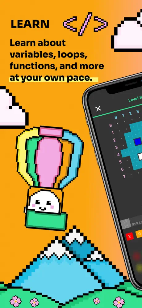
On-frame caption: “LEARN / Learn about / variables, loops, / functions, and more / at your own pace.

The backdrop stays in the orange family but darkens to a tangerine (~#FF9800) before meeting the green hill. A new hierarchy appears: an all-caps ‘LEARN’ kicker, followed by a large pixel-art '</>' rendered in magenta and pink, then the body caption. The phrase ‘at your own pace.’ is distinguished by a yellow highlight bar (~#FFF176) rather than an underline. The iPhone is positioned on the right, nearly vertical, showing a dark-mode coding grid. The app screen displays a black canvas with a numbered x-y axis running 0–7, a cyan pixel shape, and a bottom palette with color swatches including ‘R’ and ‘O’. In-app text shows ‘Level 8’ and an ‘X’ close button at the top. The ghost appears inside a hot-air-balloon basket, the balloon striped in pink, yellow, and blue. White-capped mountains and the standard flower hill ground the bottom third.

imagi App Store screenshot 4 — Frame 4
04

Frame 4

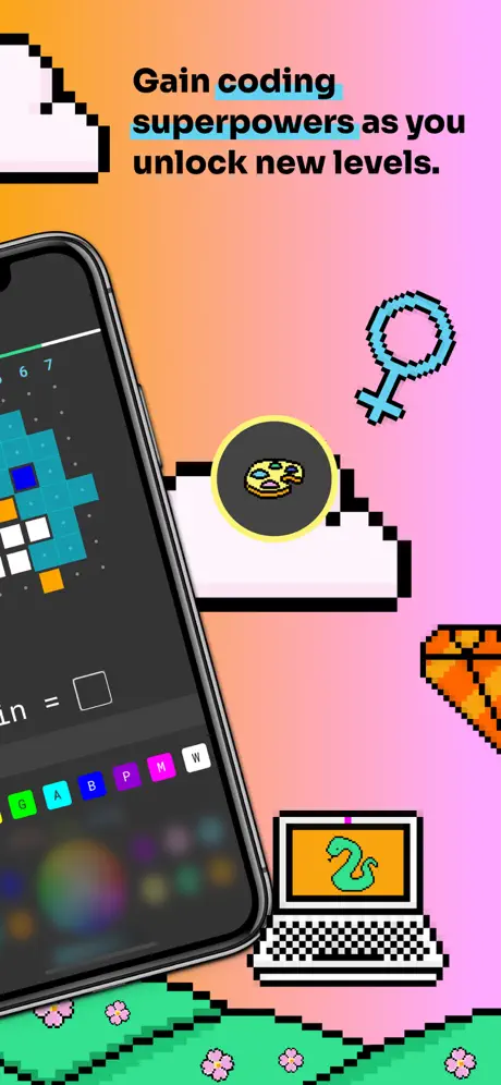
On-frame caption: “Gain coding superpowers / as you unlock new levels.

A smooth gradient transitions from peachy orange (~#FFCC80) at the upper left to soft pink (~#F48FB1) at the lower right. The headline uses a light blue underline beneath ‘coding superpowers’ only. The iPhone sits on the left side, revealing the dark grid editor at closer range. Visible UI includes a bottom row of color swatches labeled G, A, B, P, M, and W in bright green, cyan, blue, purple, magenta, and white. A text field reads ‘in = ’ followed by a white square. The in-app pixel shape now incorporates orange, white, and cyan blocks. Surrounding props include a blue Venus/feminine symbol at upper right, an orange basketball entering at the far right edge, and a laptop at the lower right displaying a green snake on an orange screen—a literal Python nod. A cloud holds a yellow-ringed black circle suggesting a coin or power-up. The bottom hill is reduced to a thin strip.

imagi App Store screenshot 5 — Frame 5
05

Frame 5

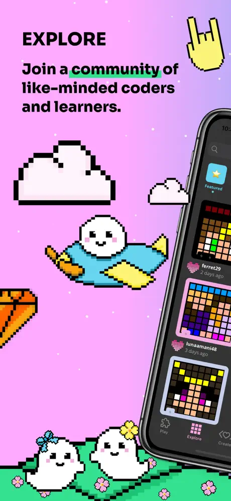
On-frame caption: “EXPLORE / Join a community of / like-minded coders / and learners.

The background shifts to a flat lilac pink (~#EA80FC). The all-caps ‘EXPLORE’ kicker returns, and the word ‘community’ carries a mint underline beneath it. The iPhone occupies the right side, presenting a social feed interface. Visible elements include a search magnifying glass, a ‘Featured’ star badge, and project cards attributed to ‘ferret29’ and ‘lunaaman148,’ each with a heart icon and timestamps reading ‘2 days ago’ and ‘3 days ago.’ The cards show dense pixel portraits on dark backgrounds. At center-left, the ghost wears a blue sweater and holds a paintbrush. Two smaller ghosts—one with a blue bow, one with a yellow flower—sit on the bottom hill. A yellow pixel ‘rock on’ hand gesture floats at the upper right, and cloud motifs continue at left and center-right.

imagi App Store screenshot 6 — Frame 6
06

Frame 6

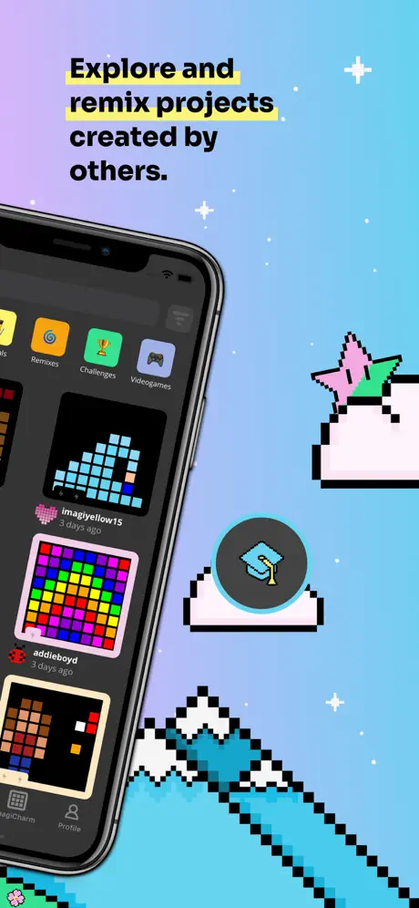
On-frame caption: “Explore and / remix projects / created by others.

The gradient stretches from lavender (~#CE93D8) at the top left to sky blue (~#81D4FA) at the bottom right, dotted with tiny white four-pointed sparkles. Yellow highlight bars sit behind ‘Explore and’ and ‘remix projects.’ The iPhone enters from the left, showing a discovery grid with category pills reading ‘Remixes,’ ‘Challenges,’ and ‘Videogames.’ Below are square thumbnails: a cyan mountain by ‘imagiyellow15,’ a rainbow grid by ‘addieboyd,’ and timestamps. The tab bar shows ‘magicharm’ and ‘Profile.’ Floating props include a pink-and-green star wand and a cloud containing a graduation-cap icon inside a dark circle. Mountains and the green hill continue at the bottom edge, maintaining the world continuity.

imagi App Store screenshot 7 — Frame 7
07

Frame 7

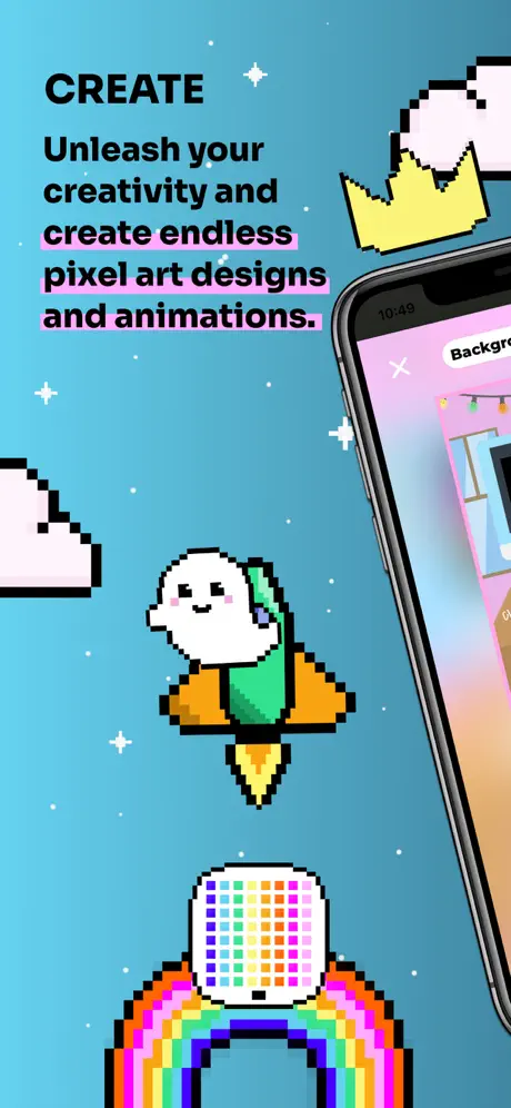
On-frame caption: “CREATE / Unleash your creativity and / create endless / pixel art designs / and animations.

The background is a flat mid cyan or teal (~#4DD0E1). The all-caps ‘CREATE’ kicker sits at upper left. The second sentence of the headline is backed by thick pink highlight bars (~#F48FB1). The iPhone is on the right, showing a creation screen with a close ‘X’ and a ‘Background’ button at top. The ghost now wears a green jetpack with orange wings, centered in the frame. At the very bottom, a full-width rainbow arcs above the hill line. A yellow pixel crown floats near the top right. White sparkles are scattered sparingly across the cyan field. The visible UI suggests an asset-placement mode rather than the code grid seen earlier.

imagi App Store screenshot 8 — Frame 8
08

Frame 8

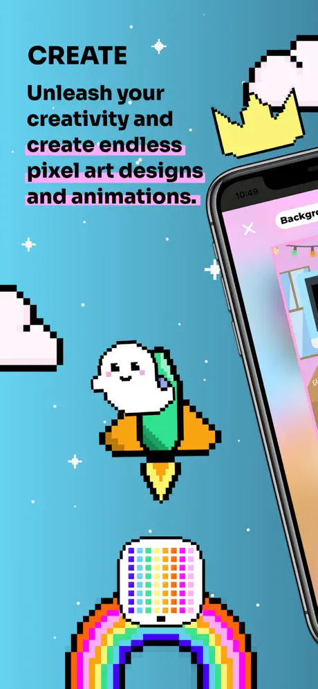
On-frame caption: “CREATE / Unleash your creativity and / create endless / pixel art designs / and animations.

This frame is structurally identical to Frame 7: the same teal background (~#4DD0E1), the same ‘CREATE’ kicker, the same pink-highlighted headline text, the same jetpack ghost in the same position, the same rainbow, crown, and sparkle placement, and the same iPhone crop showing the identical ‘Background’ button and close ‘X’. No new UI surface, prop, color shift, or caption variation is introduced. It occupies the final slot as a pure duplicate.

05The craft

Captions, colour and the mechanics of the sell

Caption pattern

Headlines follow a strict hierarchy: an all-caps kicker (‘LEARN’, ‘EXPLORE’, ‘CREATE’) or an imperative sentence, followed by a benefit-driven promise. The copy avoids jargon until Frame 3, where ‘variables, loops, functions’ finally appears—by which point the viewer has already accepted the visual premise.

Visual system

The color logic is environmental. Frame 1 starts with a flat lemon field (~#F7EA48). Frame 2 shifts to a saturated orange (~#FFA726). Frame 3 keeps the orange family but cools toward the bottom. Frame 4 introduces a peach-to-pink gradient (~#FFCC80 to ~#F48FB1). Frame 5 is full lilac (~#EA80FC). Frame 6 cools further into a lavender-to-sky gradient (~#CE93D8 to ~#81D4FA). Frames 7 and 8 settle on a mid cyan/teal (~#4DD0E1). This thermal arc—from warm invitation to cool creative focus—gives the sequence an almost musical resolution.

The thumbnail test

At small scale, the ghost silhouette, the bright underlines, and the alternating orange/pink/teal backgrounds remain distinct. The dark UI inside the phones, however, tends to collapse into a black rectangle, which means frames 3 and 4 lose detail when viewed as tiny thumbnails in search results. The device bezel helps, but only marginally.

Conversion mechanics

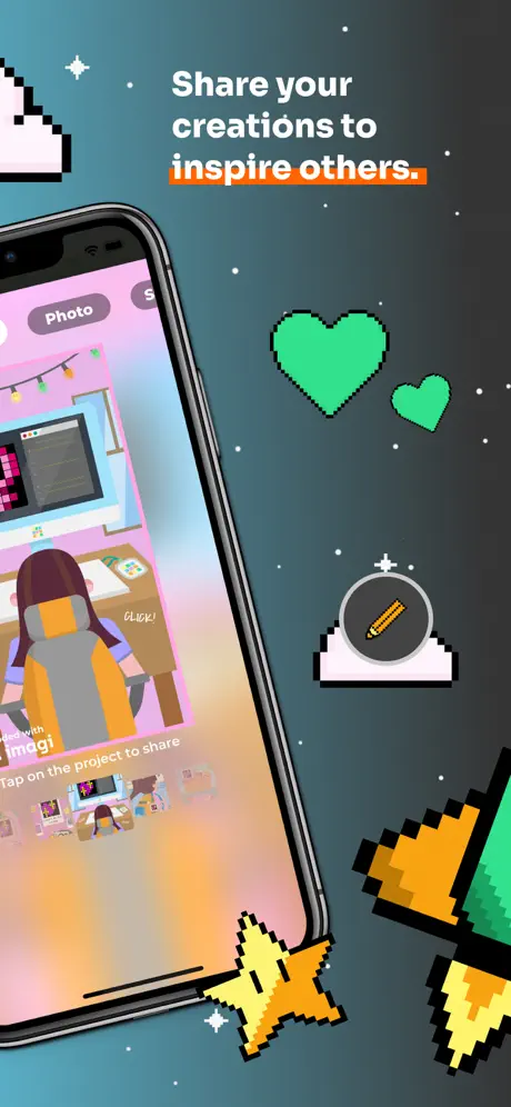
The set makes a strong first impression through continuity. A shopper swiping quickly will register the changing background colors, the rotating ghost, and the shifting phone angle as motion, even though each frame is static. The captions front-load benefit-driven verbs: Learn, Play, Gain, Join, Explore, Create. However, the dark UI in Frames 3 and 4 may convert poorly for absolute beginners because the grid reads as complex before the caption is even processed. The social proof in Frame 5 is smart, but the thumbnails are too small to convey the quality of community output at a glance.

06Where it slips

What we would change

The duplicate final frame burns an entire slot

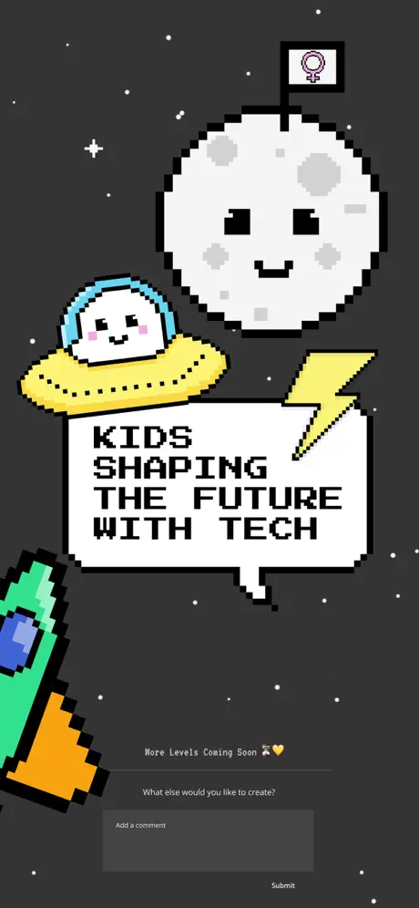
Frame 8 is a pixel-for-pixel repeat of Frame 7. In an eight-frame carousel, every slot is expensive real estate, and ending on a duplicate signals a lack of content depth rather than emphasis. The fix is straightforward: replace it with a distinct closing beat. Options include a profile/achievements screen that shows the user’s gallery, a sharing dialog that demonstrates social export, or even a wider shot of an animation timeline to substantiate the ‘animations’ promise in the headline. If no eighth asset exists, the team should simply remove the duplicate and let the set end on Frame 7 rather than deflate the narrative arc.

The dark coding UI fights the friendly wrapper

Frames 3 and 4 expose the actual code editor: a black canvas, numbered axes, and small color swatches. The abrupt shift from sunny illustrations to a dark, dense grid creates a tonal clash that risks confirming the very fear—‘coding is hard’—that the playful wrapping tries to dispel. The fix is not to hide the editor, but to preview it differently: zoom in on a single, colorful pixel shape against a clean background, crop out the intimidating axis numerals, or show a split-screen where code sits next to its playful output. The current framing shows too much administrative chrome (axes, swatches, close buttons) and not enough creative payoff.

Legibility of in-app text is inconsistent

In Frame 2, the ‘Level 6’ buttons are readable because the blue pills and black text are large relative to the screen crop. In Frame 5, however, usernames like ‘ferret29’ and timestamps like ‘2 days ago’ are rendered at a scale that becomes fuzzy inside the angled phone. The ‘magicharm’ label in the tab bar is particularly illegible, looking like a compression artifact. The fix is to either increase the relative size of the phone mockup when showing text-heavy UI, or to choose preview states that rely on iconography and bold pixel art rather than small social metadata.

Gradients and pixel art share an awkward dimensional mismatch

Frames 4 and 6 use smooth, modern gradients as backgrounds, while the pixel props are strictly flat-colored with 1-bit black outlines and zero dithering. The two systems do not obey the same light logic: the ghost is flat, the background is atmospheric. This creates a visual disconnect that undermines the retro authenticity of the sprites. The fix would be to replace the smooth gradients with flat color blocks, horizontal bands, or even halftone dithering that matches the 8-bit rendering of the characters. Cohesion matters more than trendy gradient fills when the brand promise is explicitly pixel-based.

Color pacing plateaus in the learning beat

The sequence moves from yellow (Frame 1) to orange (Frame 2) and then stays in the orange family for Frame 3. Because Frame 3 is where the actual educational value proposition appears, the emotional temperature stalls right when the narrative should deepen. Shifting Frame 3 to a distinct hue—perhaps a mint green or a soft coral—would maintain forward momentum and give each functional mode its own color signature: yellow for introduction, orange for gamification, a new hue for curriculum, pink for social, and teal for creation.


07The recipe

How to apply this to your own app

  1. Audit duplication ruthlessly

    If two frames show the same headline, device angle, and background, one of them is waste. Build eight distinct beats or cap the set at seven.

  2. Match environment and UI temperature

    When your app contains dense or dark interfaces, preview them through the lens of the surrounding illustration style rather than dropping a raw screenshot into the phone frame.

  3. Use persistent ground planes

    A recurring visual baseline—here, the green hill and flowers—turns separate frames into a continuous panorama. Identify one motif in your brand that can serve this anchoring role.

  4. Alternate device placement

    Left, right, left, right. This simple zig-zag prevents the carousel from feeling like a static slide deck and guides the eye across the entire canvas.

  5. Caption for thumbnail scale

    Assume the first frame will be seen at 30% size. Lead with a short imperative and a thick underline or highlight that survives aggressive downsampling.

08Takeaways

Five things worth stealing

  • The imagi set proves that education apps do not need to lead with chrome-heavy feature lists. By foregrounding a mascot-driven world and treating the device as a prop rather than the hero, the screenshots sell an emotional outcome—creative play—before explaining the mechanical means.
  • The alternating left-right phone angles and the traveling bottom hill are low-cost devices that create rhythm without animation.
  • The weakest moments occur when the set forgets its own premise: the duplicate frame and the unmediated dark grid both break the spell of the pixel-art fantasy. The lesson for other designers is that every frame must either advance the story or confirm a new capability; repetition and raw UI are the enemy of curiosity.
  • conclusion
  • finalVerdict
  • pour se designerReadingThis
  • imagiLabsAB
09The verdict

What the set actually achieves

The design team solved the choreography by building a persistent, gamified landscape. A green hill dotted with pink flowers and a pixel-art mountain range anchors the bottom edge of nearly every frame, turning individual screenshots into contiguous panes of a single world. The ghost mascot reappears in different costumes—balloons, hot-air balloon, jetpack, blue sweater—acting as a surrogate user on a journey. Color temperature is mapped to emotional beats: yellow for introduction, orange for gamified progress, pink for social discovery, and teal for creative output. Typography abandons subtlety; thick black headlines with mint, blue, or pink underline bars (and occasional yellow highlight blocks) are readable at thumbnail scale. The physical iPhone hardware is never flat: it enters from alternating sides at steep angles, so the eye zig-zags naturally across the carousel.

This case study is written for a product designer or growth designer who is about to commission or build an App Store screenshot set for an app that spans multiple modes—education, creation, and social—and who needs to balance a friendly brand world against a technically complex UI.

10Questions

Frequently asked

Why does the set use physical iPhone bezels instead of flat UI?

The bezels add depth and cast subtle shadows that separate the app content from the illustrated background. They also signal ‘real app’ rather than ‘concept art,’ which can lift trust on the App Store.

How does the color temperature arc help conversion?

Warm colors (yellow, orange) feel inviting and energetic, while cool colors (pink, teal) feel creative and focused. The arc maps the emotional journey from ‘start here’ to ‘make something,’ giving the shopper a subconscious sense of progression.

Is the duplicate frame a bug or a deliberate choice?

Based on the visible pixels, it is an exact duplicate. There is no variation in prop placement, caption, or UI state. In a production set, this is best treated as an error to be replaced with new information.

Would flat backgrounds improve the pixel-art cohesion?

Yes. Replacing the smooth gradients in Frames 4 and 6 with flat color blocks or halftone dithering would align the background rendering with the 1-bit sprite aesthetic, tightening the visual system considerably.

11Keep reading

Build your own screenshot set

The full set

10 shots
imagi App Store screenshot 1imagi App Store screenshot 2imagi App Store screenshot 3imagi App Store screenshot 4imagi App Store screenshot 5imagi App Store screenshot 6imagi App Store screenshot 7imagi App Store screenshot 8imagi App Store screenshot 9imagi App Store screenshot 10

About the app

Never tried coding before? Looking to learn with like-minded friends? With imagi, you will learn to code in Python and use this skill to express yourself creatively. Become part imagiLabs AB, via the App Store listing.

Screenshots and store metadata belong to imagiLabs AB. They are shown here for design commentary and criticism. The analysis on this page is original work by floow.design. View the original listing.

More Education teardowns

Browse all →