Moshi Kids app icon
EducationScreenshot teardown13 min read

Moshi Kids App Store screenshots

App Store Screenshot Breakdown: Moshi Kids

Set published by Mind Candy Ltd · 10 frames analysed

4.7 · 69K ratingsFreev10.12.0Updated 5mo ago
Moshi Kids App Store screenshot 1
01At a glance

The set in one screen

Framing
Poster-style illustration in Frame 1; bezel-less iPhone shell in Frames 2–4, 6–8; device-free floating cards in Frame 5.
Captions
Stacked white pills with ~24pt corner radius, black bold sans-serif center text, diffuse drop shadow.
Backdrop
Continuous gradient from deep violet #7C3AED top to pale cyan #A5F3FC bottom across Frames 2–8; Frame 1 uses a radial teal burst #2DD4BF.
Type
Rounded geometric sans-serif; heavy weights for captions; fine print for in-app metadata.
UI / copy split
Illustration-heavy. Exterior characters occupy 15–20% of each canvas; UI is framed but not always dominant.
Frame 1 job
Category + audience + primary value proposition with zero device context.

Sampled palette

#7C3AED#7C3AED
#A5F3FC#A5F3FC
#2DD4BF#2DD4BF
#0F172A#0F172A
#14B8A6#14B8A6
#FF4ECD#FF4ECD
02The challenge

What this screenshot set had to solve

Merchandising an audio-first sleep app for children is fundamentally a trust exercise. The screenshots must speak to a parent who is browsing in a state of mild urgency—often after a poor night’s sleep—while avoiding visual noise that signals yet another overstimulating screen. The core tension is dual-audience: the buyer is an adult, but the user is a child. The set must signal calm, safety, and pediatric credibility without abandoning the candy-colored character equity that keeps a seven-year-old engaged. There is also a structural paradox specific to audio apps. Without gameplay loops or video timelines to screenshot, the team must make static images feel like sound. The challenge compounds when you consider the App Store thumbnail wall: in search results, only Frame 1 is visible. That first image has to carry the full proposition—category, audience, benefit, and mood—before the user ever initiates a swipe. Once inside the gallery, the remaining seven frames need to cover onboarding, content breadth, personalization, playlist curation, proof of efficacy, and library depth without repeating themselves. The Moshi team elected to solve this through brand maximalism: fill every pixel with character art, gradient washes, and UI fidelity, then hope the density reads as abundance rather than clutter.

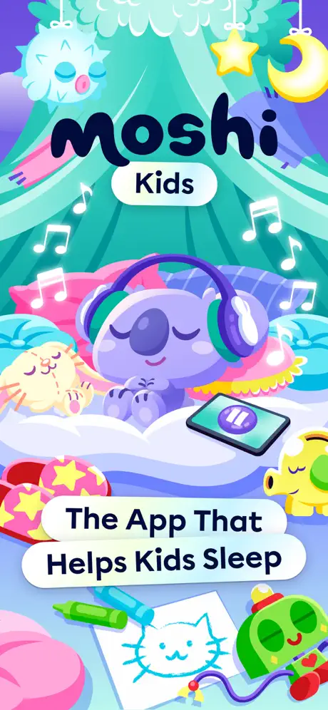
Frame 1 is a theatrical curtain raiser that establishes color temperature and mascot hierarchy before any interface is shown.
03The approach

How the set argues its case

The team committed to a wrapper-and-device system. Frames 2 through 8 suspend a white iPhone shell in the center of a continuous violet-to-cyan gradient that reads approximately #7C3AED at the top edge, cooling to #A5F3FC near the bottom. Rather than isolating each screenshot on a neutral background, the gradient acts as a stage curtain that unifies the swipe experience. Characters puncture this backdrop: a lavender koala, a red-masked monkey, a wide-eyed panda. They sit partially outside the safe zone, creating overlapping depth and implying that the app world spills past the screen bezel. Inside the device, the UI mocks retain the app’s native squircle aesthetic—rounded cards, mint-green active states at roughly #14B8A6, and soft drop shadows on horizontal lists. The external captions are deliberately fragmented. Phrases like “Designed For Babies” and “Toddlers & Kids 0-12” are split across two separate pills rather than combined into a single block. This fragmentation increases hit-area size for each line and prevents the eye from skipping the secondary clause. The captions are positioned in the upper safe zone, clear of Apple’s mandatory notch-trimming margins, with a vertical rhythm of roughly 12pt between the two pills. The overall hierarchy is character first, caption second, device third—a risky inversion of standard utility-app merchandising, but one that aligns with a parent’s desire to see a friendly, non-mechanical interface.

The set positions the product as a character-universe first and a utility second. By leading with plush-like mascots and rainbow-lit illustrations, the screenshots signal that the app is a storybook environment rather than a clinical sleep tool. The repetition of the koala, the unicorn Fluttercup, and the monkey across multiple frames builds mascot equity even before the user understands the full feature set.

04Frame by frame

Every screenshot, and the job it does

Moshi Kids App Store screenshot 1 — The App That Helps Kids Sleep
01

The App That Helps Kids Sleep

On-frame caption: “The App That Helps Kids Sleep

The opening frame is a pure brand poster with no device chrome. A radial burst of teal and turquoise rays—centered near the top third and fanning downward—creates a tent-like canopy in a shade close to #2DD4BF. Against this, the “moshi” wordmark sits in an extremely bold, rounded sans-serif, colored in near-black #0F172A, with the word “Kids” housed in a white pill centered directly beneath it. The lower half of the composition is packed with foreground props: a purple koala wearing green headphones, a sleeping yellow cat to the left, a paused smartphone showing a purple pause glyph, a child’s crayon drawing of a cat, scattered wax crayons in green and blue, and a green robot-like toy wearing a red and yellow cap. Musical notes in white outline float through the negative space. At the bottom, anchored in the safe zone, a large white pill reads “The App That Helps Kids Sleep” in the same bold black weight. The image never breaks the fourth wall to reveal UI; it is entirely narrative illustration, functioning as a theatrical curtain raiser that establishes color temperature and mascot hierarchy before any interface is shown.

Moshi Kids App Store screenshot 2 — Designed For Babies Toddlers & Kids 0-12
02

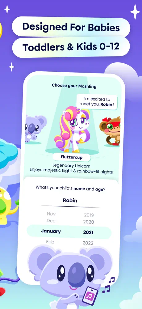
Designed For Babies Toddlers & Kids 0-12

On-frame caption: “Designed For Babies / Toddlers & Kids 0-12

The transition from poster to UX occurs here. Two stacked white caption pills occupy the upper safe zone, reading “Designed For Babies” and “Toddlers & Kids 0-12”. Centered below is a bezel-less white iPhone displaying the onboarding flow. The screen is dominated by a stage metaphor: three Moshlings stand under a spotlight, with the center unicorn—labeled “Fluttercup” and sub-titled “Legendary Unicorn / Enjoys majestic flight & rainbow-lit nights”—selected. A speech bubble floats above her head: “I'm excited to meet you, Robin!”. Below the stage, a form asks “Whats your child's name and age?” with the name “Robin” entered in a single-line field and a scrolling date selector locked on “January 2021” inside a pale mint highlight around #99F6E4. The surrounding wrapper maintains the violet gradient and introduces a large lavender koala at the bottom holding a tiny phone, plus a green snail-like creature creeping in from the left margin. The device crops both status bar and home indicator, framing only the emotional hook of character selection rather than system utility.

Moshi Kids App Store screenshot 3 — With Bedtime Stories White Noise & Music
03

With Bedtime Stories White Noise & Music

On-frame caption: “With Bedtime Stories, / White Noise & Music

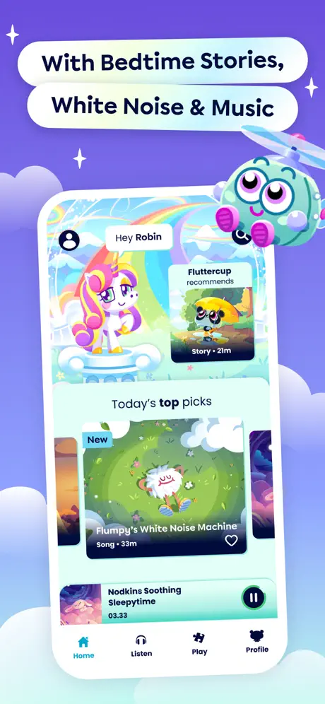
Caption pills read “With Bedtime Stories,” and “White Noise & Music”. The device now shows the main Home tab. At top left, a circular avatar and the greeting “Hey Robin” sit above the selected unicorn character, Fluttercup, posed against an in-app rainbow. To the right, a recommendation card states “Fluttercup recommends” with a bee thumbnail captioned “Story • 2m”. Below, a section header “Today's top picks” introduces a hero card: a “New” badge in sky blue, the title “Flumpy's White Noise Machine”, tag “Song • 33m”, and a heart outline. A persistent mini-player at the very bottom shows “Nodkins Soothing Sleepytime” at timestamp 03.33 beside a pause button, hovering just above a four-item tab bar where “Home” is active in teal #14B8A6 and “Listen”, “Play”, and “Profile” sit inactive in grey. The exterior wrapper adds a teal helicopter creature with pink rotor gloves at the upper right, while translucent cloud shapes drift behind the phone. The interior palette pushes warmer than Frame 2 due to the rainbow artwork, but the exterior gradient remains locked to the same violet-cyan key.

Moshi Kids App Store screenshot 4 — Handpicked Playlists For Your Child
04

Handpicked Playlists For Your Child

On-frame caption: “Handpicked Playlists / For Your Child

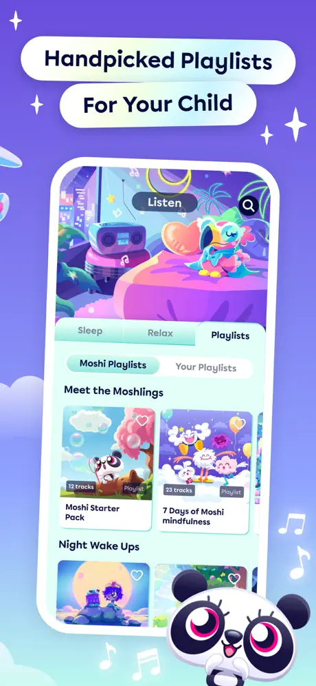
The external caption is split into “Handpicked Playlists” and “For Your Child”. Inside the device, the app is on the Listen tab, with three top segments—Sleep, Relax, Playlists—the latter active. Below, secondary pills toggle between “Moshi Playlists” (active) and “Your Playlists”. The content area is a vertically scrolling grid of square playlist cards. Under “Meet the Moshlings”, the visible items are “Moshi Starter Pack, 12 tracks” and “7 Days of Moshi mindfulness, 23 tracks”. A lower section, “Night Wake Ups”, begins with a partial card showing a moonlit landscape. The in-app header illustration is a dense diorama: a boombox on a stool, a heart-shaped cushion, and a sleeping bird on a bed, all cast in magenta and navy. Outside the phone, a panda with oversized pink-ringed eyes peeks from the bottom-right, flanked by floating musical notes. The device no longer shows a tab bar; the crop comes just below the grid, so the frame focuses entirely on library depth rather than navigation mechanics.

Moshi Kids App Store screenshot 5 — Create Your Own With Their Favourites
05

Create Your Own With Their Favourites

On-frame caption: “Create Your Own / With Their Favourites / Your favourites

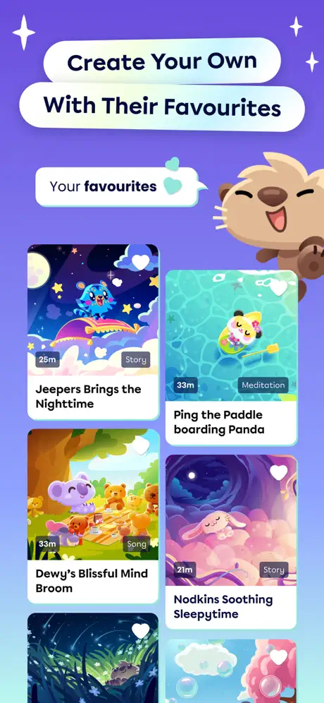
This is the structural outlier. The captions read “Create Your Own”, “With Their Favourites”, and a smaller speech-bubble pill below states “Your favourites” with a teal heart icon. Uniquely, there is no device frame. Instead, a two-column grid of content cards floats directly on the violet wrapper background. The visible cards are “Jeepers Brings the Nighttime” (25m, Story), “Ping the Paddle boarding Panda” (33m, Meditation), “Dewy's Blissful Mind Broom” (33m, Song), and “Nodkins Soothing Sleepytime” (21m, Story), plus a fifth card cropped at the bottom edge. Each tile carries a heart outline in its upper right and a duration pill in its lower left. A brown otter-like character with closed eyes and open mouth peeks from the top-right corner. By abandoning the bezel, the cards scale roughly 40% larger than they appear inside the device mocks, but the viewer loses all sense of screen boundaries, aspect ratio, and touch-target density. The background gradient holds, so the frame still reads as Moshi, yet the visual rhythm is disrupted by the missing rectangle.

Moshi Kids App Store screenshot 6 — Proven To Help Kids Sleep Faster & Reduce Night Wake-Ups
06

Proven To Help Kids Sleep Faster & Reduce Night Wake-Ups

On-frame caption: “Proven To Help Kids / Sleep Faster & Reduce / Night Wake-Ups

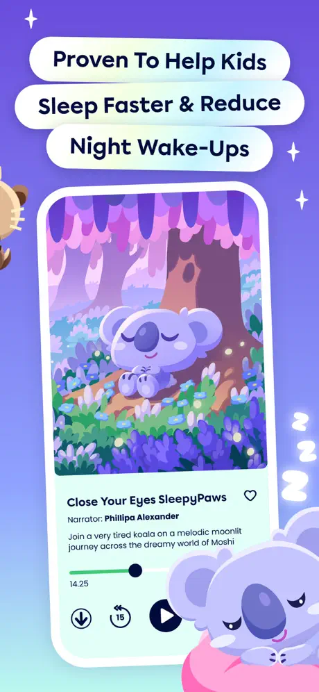
The caption stack is three pills high: “Proven To Help Kids”, “Sleep Faster & Reduce”, and “Night Wake-Ups”. The device displays a full-screen player. The upper two-thirds are filled with a vertical illustration of a lavender koala sleeping in a forest of violet trunks and periwinkle blossoms against a pink mist. Below the artwork, the title “Close Your Eyes SleepyPaws” appears in a heavy weight, followed by “Narrator: Phillipa Alexander” in a smaller size, and a paragraph set in fine print: “Join a very tired koala on a melodic moonlit journey across the dreamy world of Moshi”. A progress bar with a green fill near #4ADE80 and a black circular knob sits at roughly 25% completion, labeled “14.25”. Playback controls—download, 15s rewind, and a large circular play button—anchor the bottom. The exterior canvas crowds the device with a second sleeping koala on a pink donut pillow at bottom-right and white “Z” glyphs floating along the right edge. The three-line caption consumes significantly more vertical space than previous frames, compressing the device downward and shrinking the playable UI relative to the canvas.

Moshi Kids App Store screenshot 7 — With Age-Appropriate Content For Each Child
07

With Age-Appropriate Content For Each Child

On-frame caption: “With Age-Appropriate / Content For Each Child

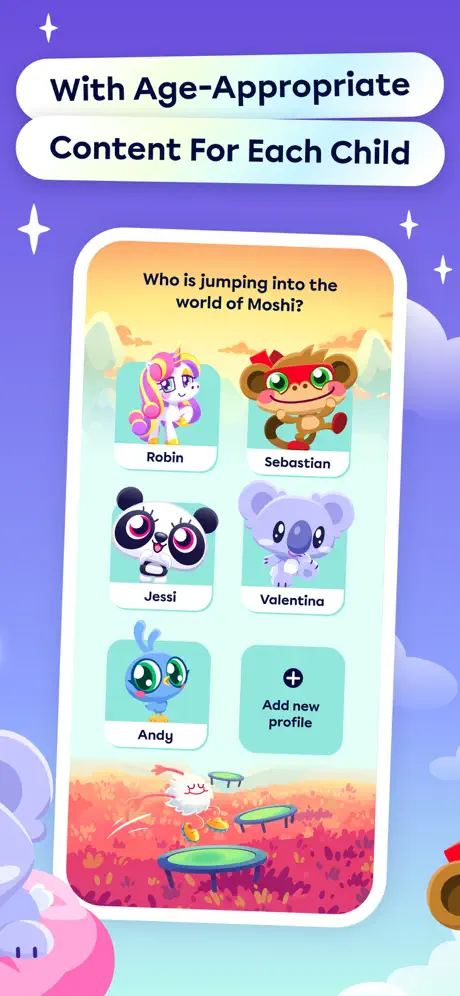
External captions read “With Age-Appropriate” and “Content For Each Child”. The device presents a profile-switching screen titled “Who is jumping into the world of Moshi?”. Five rounded-rectangle profile tiles appear in a 2-by-3 grid (with one slot empty): Robin (unicorn), Sebastian (monkey with red mask), Jessi (panda), Valentina (koala), Andy (blue bird). The sixth tile is a dashed “Add new profile” button with a plus icon. The in-app background is a warm sunset gradient of cantaloupe #FDBA74 deepening to marigold, with a foreground of pink flowers and trampolines where a white ghost-like creature bounces. The exterior wrapper remains cool violet, creating a deliberate temperature clash that makes the screen feel like a portal. The pink-pillow koala returns at bottom-left, and a monkey face intrudes at bottom-right. Because the profiles use large avatars and minimal text, this is the most legible UI in the entire set; even at thumbnail scale, the faces read instantly, which supports the frame’s message of multi-child personalization.

Moshi Kids App Store screenshot 8 — 500+ Stories Sounds & Music To Enjoy
08

500+ Stories Sounds & Music To Enjoy

On-frame caption: “500+ Stories, Sounds / & Music To Enjoy

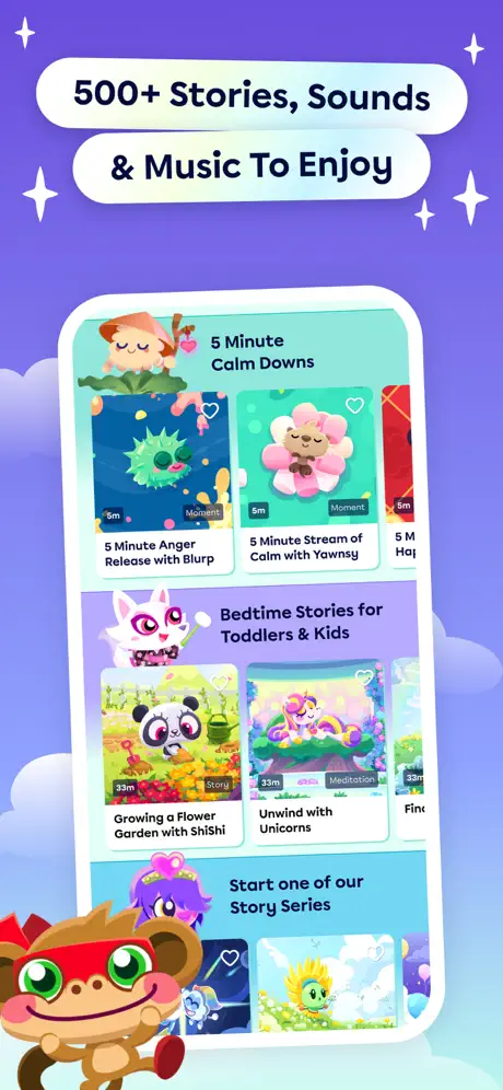
The final frame carries the caption “500+ Stories, Sounds” and “& Music To Enjoy”. Inside the device, a segmented browsing feed stacks three horizontal carousels. At top, “5 Minute Calm Downs” shows compact cards such as “5 Minute Anger Release with Blurp” and “5 Minute Stream of Calm with Yawnsy”, both tagged “Moment” with 5m badges. The middle section, “Bedtime Stories for Toddlers & Kids”, displays larger cards: “Growing a Flower Garden with ShiShi” (33m, Story) and “Unwind with Unicorns” (33m, Meditation). A bottom section, “Start one of our Story Series”, is partially visible. The exterior is the busiest of the set: a white rabbit with magenta eyes floats left of the device, a purple crowned character sits below the rabbit, and a brown monkey with a red mask occupies the bottom-left corner. The density of exterior characters nearly rivals the interior UI, yet the white caption pills maintain hierarchy through high contrast. The frame functions as a catalog-size proof point, ending the sequence on abundance rather than a call-to-action button.

05The craft

Captions, colour and the mechanics of the sell

Caption pattern

All eight frames use white rounded pills with black bold text. Frame 3 is unique in carrying an extra speech-bubble pill; Frame 6 is unique in stacking three full-width caption pills instead of two, consuming significantly more vertical safe-zone real estate.

Visual system

Single gradient wrapper, repeating mascot motifs, squircle interior UI, squircle exterior pills, sparkle glyphs, and soft cloud shapes. The system is highly disciplined in Frames 2–4 and 6–8, then deliberately broken in Frame 5 by the removal of the device shell.

The thumbnail test

At 1242x2208 thumbnail scale, Frame 1 reads as a children’s poster. The dark navy wordmark “moshi” and the white pill reading “The App That Helps Kids Sleep” survive compression, but the absence of a phone frame means the thumbnail fails the instant software-recognition test in the Education category.

Conversion mechanics

No pricing, no rating, no award badge, and no direct CTA button appear anywhere in the eight frames. Value proposition is implied entirely through caption copy and content density. This is a brand-trust play rather than a deal-driven lander.

06Where it slips

What we would change

Frame 1 withholds software context in the thumbnail view.

The set’s primary strength is systemic consistency. By locking Frames 2 through 8 to the same violet-cyan gradient and repeating mascot placements, the team achieves a carousel that feels like a continuous environment rather than a disconnected slide deck. However, Frame 1 is entirely device-free. While it succeeds as a brand poster, it withholds the one piece of context a parent needs in the search-result thumbnail: evidence that this is an application, not a book or toy. Inserting even a sliver of device or a UI card into the lower corner would bridge the gap between storybook and software.

Frame 5 breaks the visual contract by removing the device shell.

After three consecutive framed-device shots, Frame 5 abandons the phone shell entirely. The floating grid reads as an error rather than an intentional magnification. The fix is simple: maintain the bezel and zoom into the favorites grid, or, if the shell must go, replace it with a hand interacting with the cards to preserve scale context.

Frame 6 suffers from caption bloat and illegible metadata.

The three-line caption stack—“Proven To Help Kids / Sleep Faster & Reduce / Night Wake-Ups”—consumes roughly 140pt of vertical safe zone, pushing the device downward. Inside that device, the narrator credit and description paragraph are rendered at a realistic but tiny point size; at screenshot scale, they dissolve into texture. The team should either crop the player artwork tighter to enlarge the metadata, or shorten the external caption to two lines and let the device reclaim the space.

Exterior mascots create visual tangents in Frames 6 and 8.

The exterior characters in Frames 6 and 8 sit so close to the device bezel that they flatten depth into a single plane. Either overlapping the phone more decisively—creating true layered occlusion—or pulling the mascots back by roughly 20pt would restore the illusion of a three-dimensional stage.

07The recipe

How to apply this to your own app

  1. Design a wrapper gradient that survives the swipe test.

    If you produce more than three frames, lock the background to a single continuous gradient. The eye reads the carousel as one surface, which doubles the perceived production value.

  2. Fragment your copy into multi-pill stacks.

    Instead of one long headline, split claims across two rounded pills. Each line gets larger type and more breathing room, which preserves legibility when Apple crops the top 10% on older phones.

  3. Commit to the device frame, or abandon it entirely.

    Mixing framed and unframed UI in the same set fractures the user’s sense of scale. Decide whether you are selling an interface or selling content; if you switch mid-sequence, add a hand, shadow, or bezel cue to re-establish context.

  4. Type-check your smallest UI text at thumbnail size.

    Open your screenshot at 300px wide. If any metadata becomes illegible, exaggerate the point size in the mockup. App Store screenshots are marketing images, not interface simulators.

08Takeaways

Five things worth stealing

  • A continuous violet-to-cyan wrapper unifies the swipe experience across seven frames.
  • White caption pills with heavy corner radius and black type create a scannable, repeatable rhythm.
  • Frame 1’s device-free poster is high-impact but risky for Education category thumbnails.
  • Frame 5’s missing bezel is the weakest structural beat in an otherwise disciplined sequence.
  • The set ends on catalog breadth rather than a pricing or CTA message, implying a brand-trust conversion strategy.
09The verdict

What the set actually achieves

Not provided in the visual set. No conversion metrics visible in the screenshots; not part of this analysis. The evaluation below is strictly formal and narrative-based, drawn from layout, copy, cropping, color, and consistency.

Product designers merchandising subscription content apps for children, particularly in Education, Health & Fitness, or Books categories where emotional reassurance matters more than feature lists. Digital illustrators and brand designers will also find the wrapper-and-mascot system instructive.

10Questions

Frequently asked

Why does Frame 1 omit the device entirely?

The frame functions as a theatrical poster. It establishes the Moshi world, color palette, and mascot hierarchy before introducing UI. The trade-off is that search-result thumbnails lose software context.

How does the caption system work across all eight frames?

Every frame uses white rounded pills with bold black sans-serif text, stacked vertically in the upper safe zone. Frame 6 breaks the pattern by using three pills instead of two, which consumes extra vertical space.

What is the specific legibility issue in Frame 6?

The narrator credit and description paragraph inside the player screen are rendered at a small point size. At App Store screenshot scale, the text becomes texture rather than readable copy.

Which frame breaks the visual rhythm, and how?

Frame 5 removes the iPhone shell that is present in Frames 2–4 and 6–8. The floating cards scale larger but sever the viewer’s sense of screen boundaries and touch-target density.

11Keep reading

Build your own screenshot set

The full set

10 shots
Moshi Kids App Store screenshot 1Moshi Kids App Store screenshot 2Moshi Kids App Store screenshot 3Moshi Kids App Store screenshot 4Moshi Kids App Store screenshot 5Moshi Kids App Store screenshot 6Moshi Kids App Store screenshot 7Moshi Kids App Store screenshot 8Moshi Kids App Store screenshot 9Moshi Kids App Store screenshot 10

About the app

The award-winning app for kids full of 1000s of hours of bedtime stories, sleep sounds, music & white noise. With lovingly crafted original audio content for Kids set in the Mind Candy Ltd, via the App Store listing.

Screenshots and store metadata belong to Mind Candy Ltd. They are shown here for design commentary and criticism. The analysis on this page is original work by floow.design. View the original listing.

More Education teardowns

Browse all →