Speak Languages app icon
EducationScreenshot teardown11 min read

Speak Languages App Store screenshots

This seven-frame set for an Education-category language app bets everything on a single, searing orange background and a collection of illustrated character cards. The designer is trying to explain a complex product loop—gacha draws, situational AI chat, mapped progression, and flashcard review—without ever letting the frames feel like a spreadsheet. It is a case study in using color as a brand leash and character art as a scroll-stopper, but it also carries the kind of production scars that appear when a bold visual strategy runs ahead of its QA.

Speak Languages App Store screenshot 1
01At a glance

The set in one screen

Framing
Alternating 15° off-axis hero shots (Frames 1, 7) and vertical dead-center exhibits (Frames 2–6). All frames use the same iPhone 14/15 Pro graphite chassis with the Dynamic Island visible.
Captions
Bold white geometric sans, centered or flush-left in the top third, 3–4 lines maximum.
Backdrop
Saturated orange gradient, flat or top-to-bottom gradient depending on frame.
Type
Inter or SF-like sans-serif inside the app; large white marketing headlines outside the device.
UI / copy split
Marketing captions are brief (4–7 words per line). In-app UI is text-heavy, especially Frames 4 and 6, where bilingual Chinese/English copy fills the screen.
Frame 1 job
Stop the scroll with novelty: a caricature card stack and a promise of gacha mechanics.

Sampled palette

Approx. (primary marketing orange)#FF5A3C
Approx. (in-app beige chat ground)#F2EFE9
Approx. (map island green)#7CB342
Approx. (map water cyan)#C9E3F6
Neutral grey (UI dial)#8E8E93
02The challenge

What this screenshot set had to solve

The Education storefront is a wallpaper of pastel greens and gradient blues that all whisper the same promise. The designer behind this set had to do two difficult things at once: first, signal that this is not another Duolingo clone, and second, teach a non-obvious product architecture inside seven static images. The app itself mashes up four distinct mental models—a gacha collector, a chat-based conversation trainer, an adventure map, and a spaced-repetition flashcard system—so the screenshot sequence had to function as a comic strip as much as a feature list. On top of that, the in-app UI is bilingual, built for Chinese speakers learning English, which means any honest screenshot is at risk of text overload. The challenge, then, was not simply to decorate the store page, but to compress a multi-layered learning loop into a legible narrative arc without collapsing into clutter.

Commit to a background color that owns the scroll, alternate your camera angles to create cinematic pacing, and let one idea breathe per frame.
03The approach

How the set argues its case

The designer chose a single flood-color strategy: every frame sits on the same hot orange, which turns the seven screenshots into one continuous visual object. To avoid monotony, the set alternates between angled, collage-style hero shots and straight-on product exhibits, creating a rhythmic wide-shot / close-shot cadence. The narrative itself follows a classic loop: Hook the mechanic (gacha), name the premise (daily adventure), expand the world (map), demonstrate the core value (conversation and correction), show retention (flashcards), add depth (contextual dictionary), and close with the payoff (collection). Character art is used as the primary emotional vehicle; the cards depict irreverent caricatures of public figures and professions, trading generic polish for memorability. This approach correctly prioritizes emotion and system clarity over feature-list dryness.

Education apps usually borrow clinical palettes to signal credibility. This set runs the opposite direction, borrowing language from casual mobile games—gacha pulls, map nodes, collectible grids—to reframe language learning as collection and adventure.

04Frame by frame

Every screenshot, and the job it does

Speak Languages App Store screenshot 1 — The Hook
01

The Hook

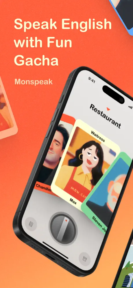
On-frame caption: “Speak English with Fun Gacha

The set opens with an iPhone 14/15 Pro rotated roughly fifteen degrees clockwise, cropped so tightly that the left and right edges of the chassis push beyond the frame. The headline 'Speak English with Fun Gacha' is set in a thick white geometric sans, flush left in the upper third and spanning about sixty percent of the width. Beneath it, the wordmark 'Monspeak' appears in a lighter weight, roughly half the headline size. The orange background shifts from a hotter #FF4D2E at the top to a peachier #FF8C5A at the bottom left. On the device screen, the 'Restaurant' scene shows a stack of illustrated character cards. The topmost card is labeled 'Waitress' with the name 'Max' at the bottom; the character wears a yellow shirt and a red apron reading 'MON CAFE.' A second phone peeks in from the top right corner, and a third card intrudes from the left edge, giving the composition a scrapbook energy. The bottom of the phone screen reveals a large, skeuomorphic grey dial flanked by two small square icon buttons. The tilt sacrifices some legibility—the 'Steven Jobs' card on the right is truncated—but gains a sense of motion that a straight-on shot would not provide.
Speak Languages App Store screenshot 2 — The Stabilizer
02

The Stabilizer

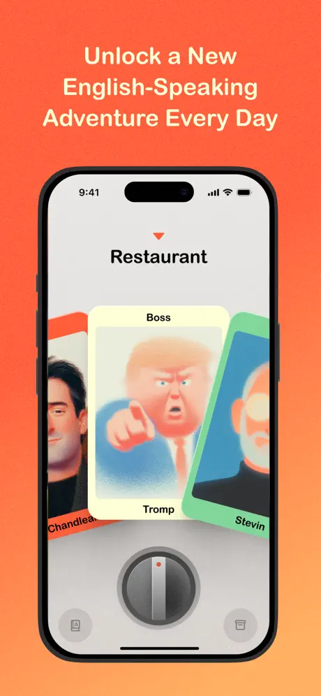
On-frame caption: “Unlock a New English-Speaking Adventure Every Day

Frame 2 snaps back to a perfectly vertical, centered device on the same orange field. The caption, centered in three lines, now occupies the top negative space with generous padding—roughly eighty points between the caption baseline and the phone top. The screen shows the same card-carousel interface, but the center card is 'Boss' / 'Tromp,' a caricature in a blue suit pointing directly at the viewer. Left and right cards ('Chandler' and 'Stevin') are partially visible with orange and green borders, respectively. By holding the phone straight, the designer ensures the grey dial at the bottom and the 9:41 status bar are fully legible. This frame functions as the stabilizing counterweight to Frame 1: it says, 'Here is exactly what the interface looks like.'

Speak Languages App Store screenshot 3 — The World
03

The World

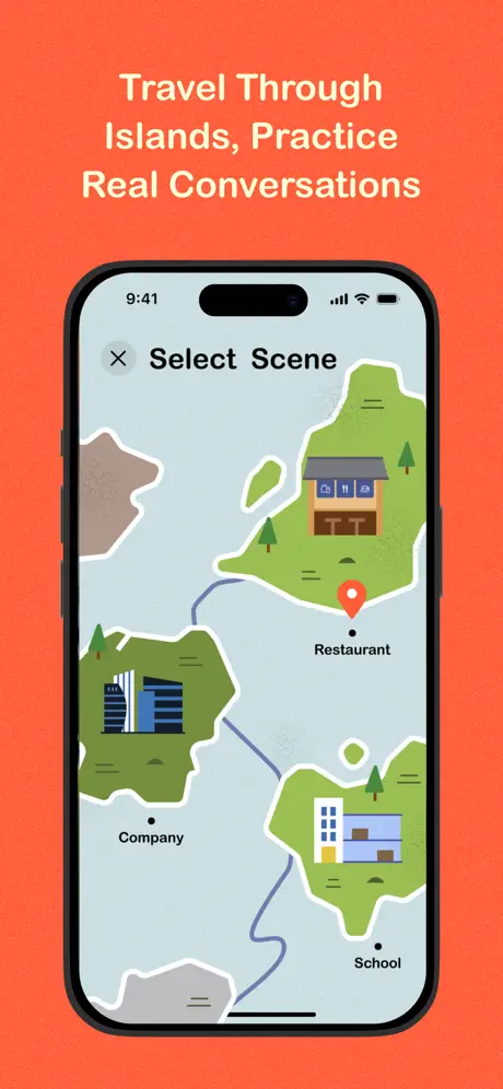
On-frame caption: “Travel Through Islands, Practice Real Conversations

This frame switches from character cards to a map view. The caption remains centered in the same white sans-serif. Inside the phone, a 'Select Scene' screen presents flat vector islands in two shades of green (#7CB342) with white outlines, floating on pale cyan water (#C9E3F6). Three nodes are labeled—'Restaurant,' 'Company,' and 'School'—with a red location pin parked over Restaurant. The illustration style reads casual mobile game rather than ed-tech. Because the in-app palette is cool and muted, it risks blending into the hot orange frame; the black bezel creates most of the separation here. The frame answers the 'where' of the app, expanding the promise from a single card UI to a navigable archipelago.

Speak Languages App Store screenshot 4 — The Loop
04

The Loop

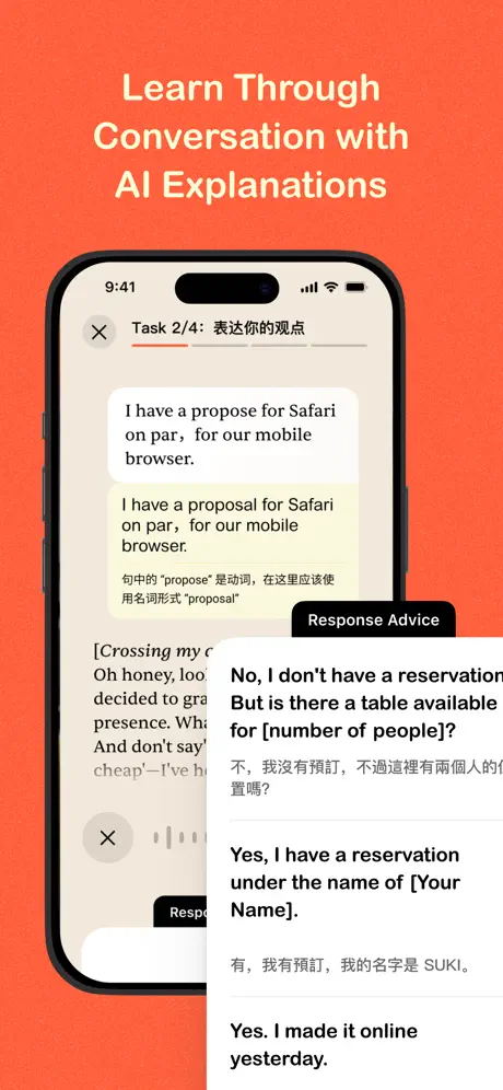
On-frame caption: “Learn Through Conversation with AI Explanations

Frame 4 dives into the learning interface and is the densest shot of the set. The header reads 'Task 2/4: 表达你的观点' with segmented progress underlines. A chat bubble contains the user error: 'I have a propose for Safari on par, for our mobile browser.' Below it, a correction appears in a pale yellow block: 'I have a proposal for Safari on par, for our mobile browser.' A Chinese footnote explains the part-of-spece error. Overlapping the right half is a white 'Response Advice' modal with bilingual suggested replies, including 'No, I don't have a reservation. But is there a table available for [number of people]?' and its Chinese equivalent. The app background is a warm beige (#F2EFE9). Three information layers—chat, correction, and modal—compete for the same viewport, making the frame feel compressed. The orange surround contains the chaos, but at thumbnail size the internal contrast drops and the frame risks reading as a grey smudge.

Speak Languages App Store screenshot 5 — The Reinforcement
05

The Reinforcement

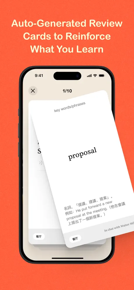
On-frame caption: “Auto-Generated Review Cards to Reinforce What You Learn

This frame pulls back to a cleaner flashcard moment. The app shows '1/10' at top center. A white review card is rotated roughly eight degrees clockwise with a soft shadow. A small label reads 'key words/phrases,' and the hero word 'proposal' is set large in black. Beneath it, Chinese translation and an example sentence—'He put forward a new proposal at the meeting.'—fill the lower third. At the bottom, two small grey pills read '餐厅,' and a context line notes 'In chat with Waiter Mike.' This frame uses physical tilt to imply swipeability. After the density of Frame 4, the white space here is a deliberate exhale, letting the shopper rest on a single, legible word.

Speak Languages App Store screenshot 6 — The Depth
06

The Depth

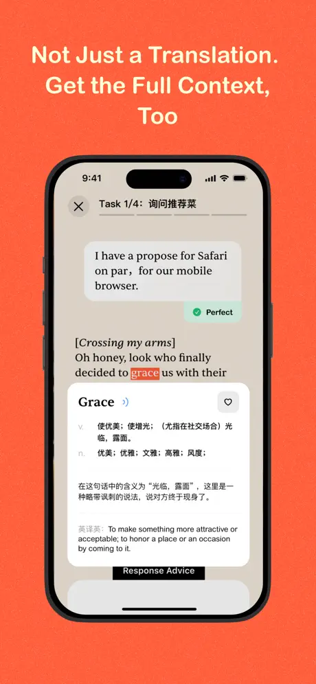
On-frame caption: “Not Just a Translation. Get the Full Context, Too

Frame 6 returns to the chat UI with a different task state. The header reads 'Task 1/4: 询问推荐菜.' A chat bubble contains the exact same erroneous sentence seen in Frame 4—'I have a propose for Safari on par, for our mobile browser'—but annotated with a green 'Perfect' badge. Stage direction in brackets reads '[Crossing my arms],' followed by dialogue where the word 'grace' is highlighted in soft red. A bottom sheet defines 'Grace' with part-of-speech labels, Chinese definitions, and a long contextual explanation of sarcastic usage. The black 'Response Advice' pill sits at bottom center. While the frame successfully demonstrates depth, the reuse of the identical demo text from Frame 4 makes the app feel like it has only one sample conversation. The beige background and dense typography mirror Frame 4, maintaining continuity, but the lack of content variation is a missed opportunity.

Speak Languages App Store screenshot 7 — The Payoff
07

The Payoff

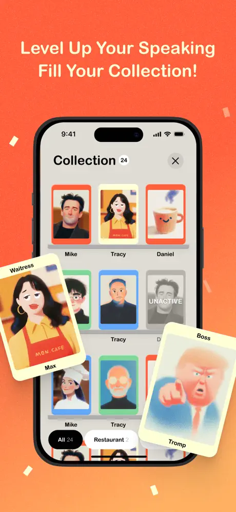
On-frame caption: “Level Up Your Speaking Fill Your Collection!

The set closes with a return to dynamic composition. The phone displays a grid titled 'Collection 24,' with a three-column layout of portrait cards bordered in orange, yellow, red, blue, and green. One card is greyed out and labeled 'UNACTIVE.' Two cards burst out of the device bounds: 'Waitress' / 'Max' from the bottom left and 'Boss' / 'Tromp' from the bottom right, overlapping the orange background. Small white rectangular confetti particles scatter across the frame. Filter pills at the bottom read 'All 24' and 'Restaurant 2.' By breaking the device edge with floating cards, the designer reintroduces the kinetic energy of Frame 1, bookending the sequence with motion and answering the unspoken question: 'What do I keep?'

05The craft

Captions, colour and the mechanics of the sell

Caption pattern

The captions are written as short imperative or declarative sentences: 'Speak English with Fun Gacha,' 'Unlock a New English-Speaking Adventure Every Day.' They avoid feature-bloating adjectives and instead name the mechanic or the outcome. Length is kept to 3–4 lines, stacked and centered (or flush-left in Frame 1), ensuring the text block never covers the device screen.

Visual system

Two visual systems are at war, intentionally or not. The marketing layer is flat, bold, and graphic: pure orange, white type, no texture. The app layer is mixed; the cards and map are flat vector, but the bottom dial in Frames 1 and 2 is skeuomorphic grey plastic with shading and a red indicator dot. That dial feels borrowed from a 2012 music player and sits uneasily against the paper-flat illustration style of the character portraits.

The thumbnail test

At thumbnail scale, the orange field and the beige card stack in Frame 1 read as a single hot shape. The caricature faces remain readable because of their high-contrast skin tones and thick outlines. Frame 3, however, loses some edge definition because the pale cyan map water blends into the bright orange surround; the black phone bezel saves it from disappearing completely.

Conversion mechanics

The set is front-loaded with personality. Frame 1 stops the scroll because the shopper has not seen a language app lead with a gacha caricature of a political figure before. Frame 2 then converts that curiosity into interface comprehension. The transition to Frame 3 expands the mental model from a single toy to a world, which increases perceived value. However, Frames 4 and 6 may stall conversion because the bilingual density demands literacy and attention that store shoppers rarely grant. The flashcard in Frame 5 is the easiest 'aha' moment after the hook. Frame 7 closes with a completionist dopamine hit, which is a strong final CTA for anyone motivated by collection.

06Where it slips

What we would change

Inconsistent Caption Alignment

Frame 1 sets the marketing headline flush left. Frames 2 through 7 snap it to center. Over a seven-frame swipe, that wobble breaks grid discipline and makes the brand feel less intentional. Fix: Lock every marketing caption to center alignment and keep the text block width consistent across the set.

Frame 4 Information Overload

The chat correction, Chinese footnote, and Response Advice modal occupy the same focal plane. At thumbnail scale, the frame reads as a beige smudge. Fix: Stage the screenshot with the modal either fully open and centered, or dismissed entirely. Let the caption carry the 'AI Explanations' promise; the image should show one clear insight.

Visible Spelling Error

Frame 7 displays a greyed-out collection card labeled 'UNACTIVE' instead of 'INACTIVE.' In a language-learning product, orthographic errors in store assets directly undermine trust. Fix: Reshoot or composite with corrected copy.

Skeuomorphic Dial Disconnect

The grey plastic dial in Frames 1 and 2 feels visually disconnected from the flat illustration language used in the cards and map. It reads as a stock UI kit element. Fix: Replace the metallic knob with a flat circle and a simple chevron, or reduce the gradients so the element speaks the same vector language as the rest of the app.

Repeated Demo Content

Frame 6 reuses the exact same erroneous user sentence that appears in Frame 4 ('I have a propose for Safari on par...'). When a shopper swipes between frames and sees identical text, the app appears content-thin. Fix: Vary the demo dialogue per frame to suggest breadth and living content.

07The recipe

How to apply this to your own app

  1. Choose a background color that acts like a neon sign.

    The orange here is not decoration; it is a brand fence. When every frame shares a flood color, the shopper cannot mistake your screenshots for another app's.

  2. Alternate your camera angles to create pacing.

    Straight-on frames prove the UI is real. Angled frames create motion. Use the angles for emotion and the straight shots for evidence.

  3. Let one idea breathe per frame.

    Frame 4 tries to show chat, correction, and advice simultaneously, and it chokes. Frame 5, with a single word on a white card, is the clearest communicator in the set. If a feature is complex, split it across two frames rather than layering it into one.

  4. Audit your screenshots for spelling before export.

    Store assets are final thesis statements. A single typo in Frame 7 costs more than the time it takes to re-render.

08Takeaways

Five things worth stealing

  • Flood-color backgrounds create unmissable brand continuity.
  • Character art and game metaphors (gacha, maps, collection) differentiate ed-tech effectively.
  • Bilingual UI screenshots must be staged with extreme hierarchy; density is the enemy of conversion.
  • Production discipline—alignment, spelling, content variation—matters as much as the big idea.
  • The final frame should answer the 'what do I keep?' question before the shopper swipes away.
09The verdict

What the set actually achieves

The set succeeds at brand recognition and emotional tone. A shopper scrolling past will remember the orange and the caricatures. However, production inconsistencies—typographic alignment shifts between frames, repeated demo text, and a visible spelling error—undercut the professionalism that language learners expect from an educational tool.

Designers preparing screenshot sets for hybrid utility apps—especially those that blend gamification with serious functionality—and product teams debating whether to show dense UI or simplified marketing renders. Also useful for teams localizing store pages for bilingual markets, where the tension between honest UI and legible marketing is acute.

10Questions

Frequently asked

Why alternate between angled and straight framing?

Because seven straight-on frames feel like a catalog, and seven angled frames feel evasive. The alternating rhythm lets you sell emotion first, then prove functionality.

Should I use my real in-app UI if it is text-heavy?

Yes, but stage it. Honest UI builds trust, but honest UI does not mean unedited UI. Crop, simplify, or pause the app in a moment where only one layer is dominant.

Does a single background color really help conversion?

It helps recognition. In a feed of mixed palettes, a single dominant color makes your frames read as one continuous object, increasing the odds the shopper swipes through all seven.

How do I avoid making a feature-heavy app look confusing?

Build a narrative arc, not a feature grid. Each frame should advance a story: hook, context, world, core loop, reinforcement, depth, payoff. If a frame does not advance the story, cut it.

11Keep reading

Build your own screenshot set

The full set

7 shots
Speak Languages App Store screenshot 1Speak Languages App Store screenshot 2Speak Languages App Store screenshot 3Speak Languages App Store screenshot 4Speak Languages App Store screenshot 5Speak Languages App Store screenshot 6Speak Languages App Store screenshot 7

About the app

Screenshots and store metadata belong to Speak Languages. They are shown here for design commentary and criticism. The analysis on this page is original work by floow.design. View the original listing.

More Education teardowns

Browse all →