Jamboree app icon
EducationScreenshot teardown12 min read

Jamboree App Store screenshots

Jamboree’s App Store screenshot set treats the gallery as a vertical comic strip: eight full-bleed panels that attempt to teach a shopper—within four seconds per swipe—how to play, make, tweak, and socially distribute a user-generated game. The app lives in Education, yet the visuals speak the language of UGC content platforms. As a case study, the set is a useful tension study between exuberant creative energy and the disciplined restraint that screenshot galleries usually demand.

Set published by Jamboree Co., Ltd. · 10 frames analysed

5.0 · 3 ratingsFreev26.4.0Updated 4mo ago
Jamboree App Store screenshot 1
01At a glance

The set in one screen

Framing
Single device frame in Frame 1; full-bleed illustration/UI abstraction in Frames 2–8
Captions
Large bold sans-serif headline, lighter sub-line; pattern alternates between big-above-small and small-above-big
Backdrop
Varies per frame: #837AFD lavender, sky blue #6BC5FC, deep royal #1B5FCC, top-down green landscape, cream #FFF6E9, neon green #4ADE80, cyan sky #87CEEB, mint #E6FFFA
Type
Rounded geometric sans, heavy weight for headlines (~64–80pt equivalent), regular weight for sub-headlines (~24–32pt equivalent)
UI / copy split
Approximately 70:30 in favor of environmental art and floating UI over literal app chrome
Frame 1 job
Establish mobile context with a hardware frame, then immediately drop it to sell the fantasy

Sampled palette

#837AFD#837AFD
#6BC5FC#6BC5FC
#1B5FCC#1B5FCC
#3BD16A#3BD16A
#FFF6E9#FFF6E9
#4ADE80#4ADE80
02The challenge

What this screenshot set had to solve

Designing a screenshot set for a no-code game maker presents a classic taxonomy problem: do you show the creation tool first, or the fun output first? Jamboree’s team clearly sided with ‘output first,’ positioning Frame 1 as a gameplay promise (‘Endless Play. No ads. No purchases.’) and only afterward revealing the editing pipeline. The risk is that shoppers may not mentally connect the charming games on display with the editing affordances hidden in later frames. The design challenge, then, was to keep a single coherent brand thread across wildly divergent game genres—pixel-art flappy birds, blocky racing dioramas, clay-filtered platformers—without letting the screenshots feel like eight different apps.

The moment the device frame disappears in Frame 2, the set crosses from app-screenshot territory into marketing-poster territory. That is a deliberate gamble, and it changes the shopper’s reading strategy entirely.
03The approach

How the set argues its case

Jamboree’s core visual strategy is chromatic theming. Each frame adopts the dominant palette of the game genre it is showcasing: lavender and soft white for a cute pixel sky; deep royal blue for a social-reactions beat; warm cream for filter comparisons; neon green for physics tweaking. This makes the set feel like a curated playlist rather than a repetitive product demo. The typography is the only constant: a bold, rounded sans-serif that appears in heavy white against dark or saturated backgrounds, and in heavy black against the single light frame (Frame 5). The team also uses a 3D sticker language—puffy clouds, floating hearts, googly-eyed mushrooms, emoji reactions—that unifies disparate art styles under one tactile, toy-like physicality. By placing UI elements (steppers, prompt cards, chat bubbles) directly onto the artwork without device frames, they signal that the interface is lightweight and embedded in the content rather than buried in chrome.

UGC game creators often default to blue ‘developer tool’ aesthetics. Jamboree avoids this entirely by wrapping creation features inside social and entertainment visuals. Frame 2 (‘Create Games’) does not show a code editor; it shows a casual natural-language prompt card floating over a voxel train track. Frame 6 (‘Tweak Details’) foregrounds a ‘Jump Height’ stepper, but frames it inside a lush platformer level rather than an inspector panel. The positioning is clear: this is not school, this is play that happens to produce games.

04Frame by frame

Every screenshot, and the job it does

Jamboree App Store screenshot 1 — Endless Play
01

Endless Play

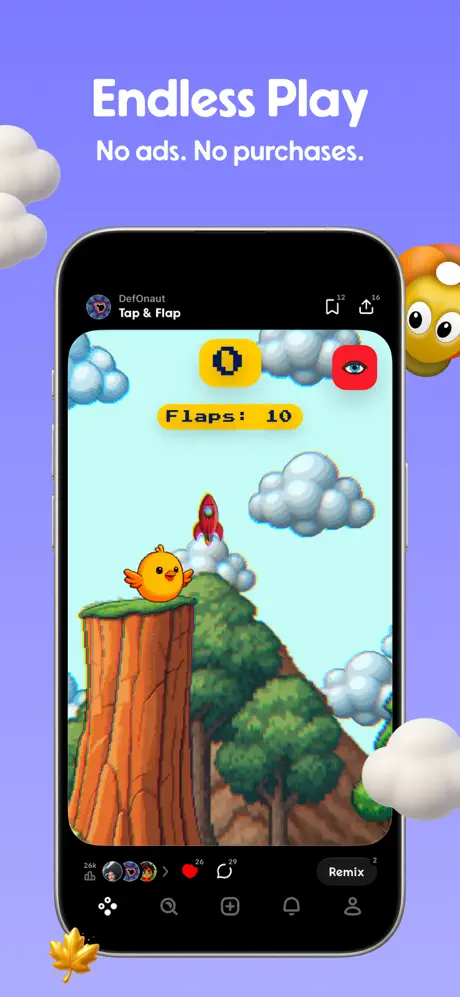
On-frame caption: “Frame 1 opens on a saturated lavender background, roughly #837AFD, which serves as a stage rather than a sky. At the top, the white rounded sans-serif reads ‘Endless Play’ in a very heavy weight, approximately 80pt equivalent, followed by a smaller sub-line: ‘No ads. No purchases.’ The phone itself is a standard black-bezel iPhone, vertically centered, occupying roughly 65% of the frame width. Inside the screen, a pixel-art game shows a yellow bird perched on a tree stump; game UI includes a yellow pill badge with a pixelated ‘0’, a red square button with an eye icon in white (around #FF2D55), and a yellow label reading ‘Flaps: 10’ in an embedded bitmap font. The host-app chrome is visible at the bottom of the phone screen: a dark tab bar with Home, Search, Create, Notifications, and Profile glyphs, plus a ‘Remix’ pill at the bottom right. Outside the device, soft white 3D clouds intrude from the left and right edges, a yellow maple leaf sits at the bottom-left corner, and a googly-eyed orange mushroom peeks in from the right. By framing the phone once—and only once—the designers tell the shopper ‘this is a mobile app,’ then immediately free themselves from hardware constraints for the remaining seven frames.

The spacing between the headline and the device top is generous, roughly 120pt, giving the words room to breathe before the eye drops to the screen content. The red eye icon is the warmest accent inside the phone UI, and it deliberately echoes the red mushroom’s white spots outside the frame, creating a cross-boundary color callout that most viewers will feel before they notice it.
Jamboree App Store screenshot 2 — Create Games
02

Create Games

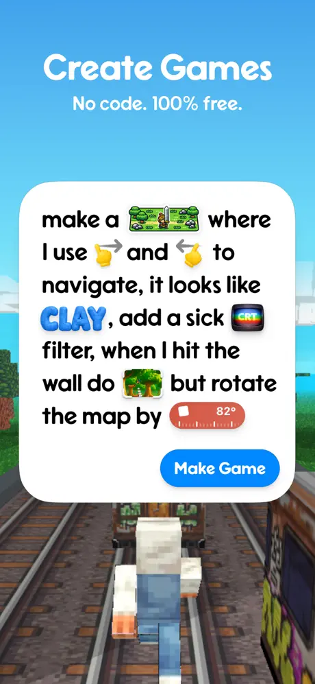
On-frame caption: “Frame 2 abandons the hardware frame entirely. The background is a bright sky-blue gradient, approximately #6BC5FE at the horizon, fading to a lighter #9ADCFF at the top. Headline text is centered in white: ‘Create Games’ in the familiar heavy rounded sans, with ‘No code. 100% free.’ beneath it in a lighter weight. Below the text sits a large white rounded card—corners appear to be around 28–32pt radius—containing a natural-language prompt rendered in black sans-serif with inline emoji and image placeholders. The verbatim text reads: ‘make a [sword landscape icon] where I use 👉 and 👈 to navigate, it looks like CLAY, add a sick [CRT badge] filter, when I hit the wall do [forest icon] but rotate the map by [red dial 82°]’. The word ‘CLAY’ is rendered in blue 3D bubble lettering. At the bottom of the card, a blue pill button reads ‘Make Game’ in white. The background behind the card is a low-angle voxel train-track scene with a blocky character, but it is deliberately out of focus relative to the card. The composition tells the shopper that the input method is conversational, not technical.

The card’s drop shadow is soft and diffuse, roughly 20% black with a 12pt vertical offset. That softness causes the white card to blend slightly into the pale sky, reducing separation. A slightly harder shadow or a 1pt hairline stroke would lock the card forward. The button blue is a standard energetic #007AFF, and it is the only interactive-affordance color in the entire eight-frame set, making it function as an unconscious call-to-action.

Jamboree App Store screenshot 3 — Get Reactions
03

Get Reactions

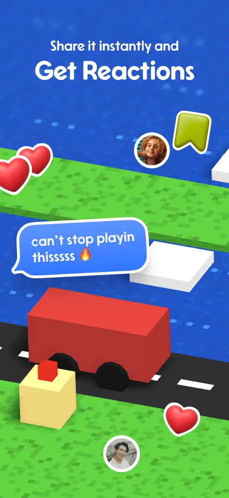
On-frame caption: “Frame 3 shifts to a deep royal blue background, around #1B5FCC, with a subtle pixel-noise texture that reads as digital atmosphere. At the top, the hierarchy is inverted: ‘Share it instantly and’ sits above the much larger ‘Get Reactions’, both in white. The lower two-thirds of the frame is a blocky, isometric game scene with bright green checkerboard grass patches, a navy road with white dashed lane markers, and a red rectangular vehicle with black wheels. Floating above the environment are social proof elements: two red hearts with thick white outlines and drop shadows at the upper left; a circular profile photo of a woman with curly hair near the upper center, approximately 56pt diameter; a green bookmark icon with a white border at the upper right; and a blue speech bubble overlapping the road that reads, verbatim, ‘can't stop playin thisssss 🔥’. A second circular profile photo of a man appears near the bottom center, and a lone red heart sits at the lower right. The scene is busy, but the blue background provides enough negative space at the top to prevent total clutter.

The speech bubble uses a casual rounded sans in white, matching the headline type family but at a much smaller size. The diagonal arrangement of the hearts and avatars creates a Z-pattern that leads the eye from the headline down to the car and across to the comment bubble. However, at thumbnail scale, the two top-left hearts merge into a single red blob, and the profile photos shrink to unreadable skin-tone dots. The social proof layer is relying on recognition of form rather than detail.

Jamboree App Store screenshot 4 — Create items, maps and Characters
04

Create items, maps and Characters

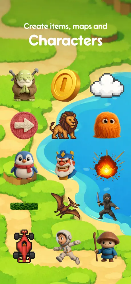
On-frame caption: “Frame 4 is the only true top-down composition. The landscape background is a soft 3D render of green foliage, sand paths, and a turquoise river winding through the center. Text sits in the upper third: ‘Create items, maps and’ in regular-weight white, followed by an oversized ‘Characters’ in bold white that dominates the line. Rather than showing an inventory grid, the designers have scattered twelve distinct game assets across the terrain: a meditating green orc monk at upper left; a gold coin with an engraved line; a pixel-art cloud; a pink yarn-textured circular arrow button; a pixel lion; an orange furry monster; a penguin in a red scarf; a cartoon king’s face; a 2D explosion sprite; a green grass block; a pterodactyl; a black ninja; a red pixel race car; an astronaut; and a small mushroom wizard. There is no bounding box, no panel, no scroll indicator—just assets dropped onto the map as if a child spilled a toy chest.

The lack of focal hierarchy is the critical design choice here. The river creates a natural S-curve, but the text sits dead center above it, fighting the coin and cloud for attention. The assets are roughly equal in visual weight; nothing is scaled to 150% to anchor the composition. The white text ‘Characters’ is legible because the background beneath it is relatively dark green, but at thumbnail size the entire frame reads as ‘green noise.’ A stronger move would have been to place one hero character at double scale in the foreground and let the rest recede.

Jamboree App Store screenshot 5 — Apply Filters
05

Apply Filters

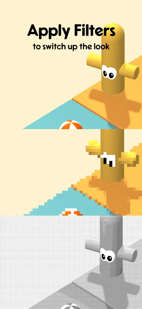
On-frame caption: “Frame 5 breaks the color temperature of the set entirely. The background is a warm cream, approximately #FFF6E9. At the top left, black sans-serif text reads ‘Apply Filters’ in heavy weight, with ‘to switch up the look’ beneath it in regular weight. The frame is divided into three horizontal bands, each showing the same scene—a yellow cactus-like palm tree with googly eyes on a sand wedge, a teal water plane, and a striped beach ball—under three different post-processing treatments. The top band is smooth 3D with antialiased geometry and soft shadows. The middle band is aggressively pixelated: jagged edges, reduced color palette, blocky dithering. The bottom band is a grayscale halftone or newsprint filter, rendering the scene in dots and lines with no color. There are no borders between the bands; they are separated only by the cream background bleeding through the gutters.

This is the only frame in the set that uses black type on a light ground, and the shift is jarring—but useful, because it signals a feature that is technical rather than emotional. The problem is abstraction: without any device frame, editor chrome, or even a ‘before / after’ label, the shopper may not understand that these are real-time filters inside the app. The bands also crop the scene at different heights, so the beach ball floats higher in the middle band than in the top, breaking the comparative alignment. A subtle phone outline or a consistent crop window would make the feature instantly legible.

Jamboree App Store screenshot 6 — Tweak Details
06

Tweak Details

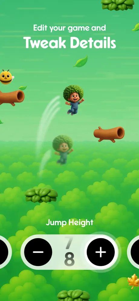
On-frame caption: “Frame 6 returns to a full-bleed game environment, this time in a vivid green gradient that shifts from a light lime at the top to a deeper grass green at the bottom, around #4ADE80 to #3BD16A. The inverted caption returns: ‘Edit your game and’ in small white, then ‘Tweak Details’ in massive bold white. The scene shows a character with broccoli-textured hair and a blue outfit jumping through a field of soft, blobby bushes. White motion-blur arcs suggest jump physics. Brown pipe obstacles flank the scene left and right. A smiling bee and falling leaves decorate the upper area. At the bottom, centered over the action, is a white rounded control panel labeled ‘Jump Height’ in white. Below that label, a white pill-shaped stepper shows a black minus circle on the left, a black plus circle on the right, and the fraction ‘7’ over ‘8’ in black with a gray slash between them. Partial stepper pills are visible hard against the left and right edges of the frame, implying a horizontally scrollable row of controls.

The stepper is the only UI element in the frame, and it is drawn at enormous scale—each circle is roughly the size of the character’s head—so it reads clearly even at small sizes. However, the stepper sits directly on top of the gameplay scene with no scrim or card behind it, which risks losing the white pill against a light-green cloud. The partial steppers at the edges feel like a cropping error rather than an intentional ‘carousel’ hint; they sit flush to the frame boundary with no padding, which tightens the composition uncomfortably. Dropping the entire control row 40pt upward and showing only full pills would clean up the spatial logic.

Jamboree App Store screenshot 7 — Remix Games
07

Remix Games

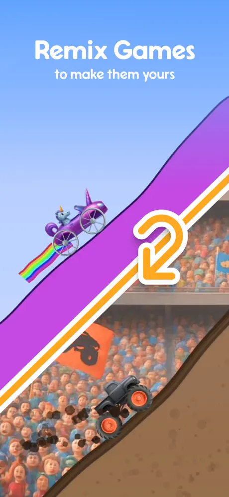
On-frame caption: “Frame 7 is the most graphically aggressive. The background is a clear sky blue, around #87CEEB. The caption pair reads ‘Remix Games’ in heavy white, then ‘to make them yours’ in lighter white, placed unusually high in the frame—roughly in the top fifth. A bold diagonal slash splits the composition from top-left to bottom-right. The upper-left triangle shows a purple speed-ramp track against the sky; a small purple unicorn-driven car with a rainbow contrail races along it. The lower-right triangle shows a brown dirt track inside a stadium filled with a crowd of low-poly spectators in orange and blue. A dark monster truck with red rims kicks up black dirt clods. Separating the two scenes is a thick diagonal band: purple fill, orange stripe, white stripe. Overlaid on the band is a large orange-outlined numeral ‘2’ with a curved arrow, suggesting duplication or iteration. An orange flag with a black skull icon waves in the crowd section.

The diagonal slice creates strong dynamic tension, but the text placement is risky. App Store galleries often crop or overlay the top 10–15% of a screenshot with gallery chrome or signaling UI; placing the primary headline that high pushes it close to the danger zone. The ‘2’ icon is the frame’s true hero, and its scale is appropriately monumental—roughly 140pt tall. The purple ramp and orange flag are complementary opposites on the color wheel, so the frame vibrates with energy. The missing element is any hint of the original game being remixed; without a ‘before’ state, the shopper must infer the remix concept from the number and arrow alone.

Jamboree App Store screenshot 8 — Send to Friends
08

Send to Friends

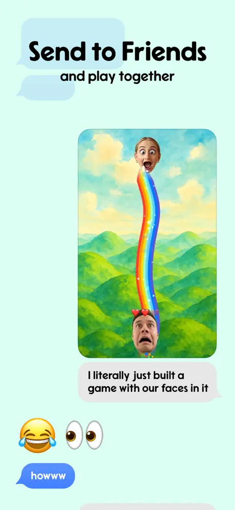
On-frame caption: “Frame 8 closes the sequence on a pale mint background, approximately #E6FFFA. Two faint, empty light-blue chat bubbles float behind the headline for depth. The text at top left reads ‘Send to Friends’ in heavy black, with ‘and play together’ in regular black beneath it. Centered in the frame is a rounded-rectangle game screenshot depicting two disembodied human heads—one blonde woman at the top, one man at the bottom with small red hearts floating above his head—connected by a wavy rainbow path. The game background is a soft watercolor landscape of green hills and yellow-green sky. Below the game image, a gray chat bubble contains the verbatim text: ‘I literally just built a game with our faces in it’. Further down, a laughing-crying emoji and a googly-eyes emoji float at the left. At the very bottom, a blue iMessage-style pill bubble reads ‘howww’ in white. The entire frame mimics a messaging thread, collapsing the distinction between the game and the chat interface that distributes it.

The meta-commentary inside the chat bubbles does more work than the headline: it explains the feature by showing a fake social reaction. The blue ‘howww’ bubble anchors the bottom and provides a tonal punctuation mark. The contrast ratios are generally safe, though the gray bubble text is softer than necessary. The game screenshot-within-a-screenshot is well-bordered by its rounded corners, but the man’s head at the bottom is cropped close to the jawline, making the facial scale feel slightly awkward next to the woman’s fuller crop. Even so, the frame is the set’s strongest narrative closer because it connects creation back to human relationship—the loop the app wants toown.

05The craft

Captions, colour and the mechanics of the sell

Caption pattern

The caption hierarchy alternates unpredictably. Frames 1, 3, 6, and 7 place the smaller clause above the large headline (‘Share it instantly and’ / ‘Get Reactions’), while Frames 2, 4, 5, and 8 place the large headline above the smaller clause (‘Create Games’ / ‘No code. 100% free.’). This inversion creates a stutter in vertical rhythm. A shopper thumbing quickly learns no dependable anchor point for where to plant their eye first. The four frames that use small-above-big also center-align the pair, whereas Frame 8 left-aligns its black text block. The inconsistency is not fatal, but it prevents the set from feeling like a cohesive deck.

Visual system

The only unbroken visual system across all eight frames is the rounded sans-serif wordmark and the 3D-illustration rendering style. Every background element—clouds, vehicles, characters—shares a soft, beveled, physically-based look that keeps the synthetic world grounded. However, there is no persistent logo, no watermarked icon, no recurring button shape, and no consistent safe-area padding for text. The result is eight beautiful posters that happen to sit next to each other, rather than eight chapters of one story. The system is aesthetic, not structural.

The thumbnail test

At iPhone thumbnail scale, the lavender Frame 1 and neon Frame 6 read best because they rely on high-contrast white typography and simple center compositions. Frame 4 (‘Characters’) collapses into a busy green smudge at small scale because its white text sits over a mid-tone foliage path and the scattered assets have no single focal anchor. Frame 5 (‘Apply Filters’) suffers similarly: the black-on-cream text is crisp, but the three horizontal bands compress into indistinguishable beige stripes when shrunk. The set overall is readable, but the middle frames would benefit from stronger silhouette discipline.

Conversion mechanics

From a conversion perspective, the sequence front-loads value props: Frame 1 promises no ads and no purchases, and Frame 2 promises no code and 100% free. That doubles down on risk removal before the shopper has seen any editing complexity. However, Frames 3 through 8 never return to pricing, IAP gates, or social proof metrics. The set seems to assume that creative joy alone will drive the install. For the Education category, where parents and teachers are often the gatekeepers, the absence of any safety, privacy, or age-rating visual cue after Frame 1 is a missed reassurance opportunity.

06Where it slips

What we would change

Typographic rhythm is fractured

Four frames place the small clause above the big headline; four frames do the opposite. The inconsistency forces the eye to recalibrate on every swipe. A disciplined set should lock the hierarchy: either always lead with the emotional headline on top and the feature descriptor beneath, or use a consistent label system. The fix is simple: choose one pattern, baseline-align all captions to the same vertical offset from the top, and let the shopper’s eye fall into a groove.

Device abandonment weakens interface credibility

Frame 1 establishes the iPhone frame beautifully, but Frames 2–8 never return to it. The result is that floating UI elements—like the prompt card in Frame 2, the stepper in Frame 6, and the chat bubbles in Frame 8—read as marketing illustrations rather than screenshots of a working app. The shopper cannot tell whether these are actual interfaces or aspirational fantasies. The fix is not to reintroduce full hardware chrome seven more times, but to add a subtle, recurring screen mask or rounded-corner safe area that ties the floating UI back to a 9:19.5 viewport. This would preserve the full-bleed art while signaling ‘this is real software.’

Frame 5’s abstraction sacrifices comprehension

The filter comparison in Frame 5 is visually clever but structurally opaque. Without a device boundary or a ‘before’ label, the three bands look like a graphic design exercise rather than an in-app feature. At thumbnail scale, they flatten into three beige streaks. The fix is to place the filtered output inside a recognizable phone-shaped window, or to overlay a small toolbar or toggle that hints at the editing context. Give the shopper a door into the scene.

Frame 4 lacks a focal anchor

The scattered asset field in Frame 4 is democratic to a fault. Every character and item competes at the same scale. The river creates a path, but the eye has no destination. The fix is to scale one asset—perhaps the astronaut or the lion—to 120% and place it at the optical center, then arrange the remaining assets as satellites. Additionally, adding a faint circular or linear gradient behind the text would ensure ‘Characters’ does not get lost in the foliage at small sizes.

No persistent brand anchor across frames

Beyond the typeface, there is no repeated logo mark, icon, button shape, or background texture that says ‘this is still Jamboree.’ The color jump from lavender to royal blue to cream to neon green is so extreme that the frames feel like separate brand campaigns. The fix is to introduce a single persistent element: a small wordmark in the bottom corner, a signature 3D sticker that recurs in every frame, or a consistent vignette treatment. One anchor would thread the beads together.

07The recipe

How to apply this to your own app

  1. Lock your caption hierarchy before you color the frames

    Decide whether the big promise sits above or below the small descriptor, then enforce it across every screenshot. Consistent vertical rhythm trains the thumb.

  2. Use one device frame as orientation, then ghost the rest

    If you want the immersive full-bleed look, establish the hardware once, then use subtle corner radii or aspect-ratio crops in subsequent frames so the UI still reads as mobile-native.

  3. Let one hero asset carry the frame

    When showcasing a library or inventory, resist the urge to show breadth by scattering everything at equal scale. Pick a protagonist, scale it up, and let the rest support.

  4. Theme by color, but thread by detail

    Radical palette shifts per frame can work—Jamboree proves that—but only if a secondary constant (type weight, a recurring sticker, a logo) travels with the shopper from panel to panel.

08Takeaways

Five things worth stealing

  • Jamboree’s set proves that a screenshot gallery can behave like a storyboard rather than a spec sheet.
  • Color-as-content is a valid strategy, but it requires structural discipline to avoid brand diffusion.
  • Showing UI inside environmental art (the stepper over the platformer, the prompt card over the voxel track) is powerful when the scale is exaggerated; when it is too subtle, it looks like decoration.
  • The best frame in the set is Frame 8 because it collapses product and distribution into one social image; the worst is Frame 5 because it forgets to explain itself.
  • For creator tools, the loop must end with a human reaction. Jamboree instinctively knows this, even when the execution wobbles.
09The verdict

What the set actually achieves

The set succeeds in establishing a playful, youthful tone and communicates breadth. However, it sacrifices interface legibility in multiple frames and breaks its own typographic rhythm often enough that a quick swiper may lose the narrative thread. The honest verdict: it is a mood-board-strong, system-weak presentation that would benefit from stricter hierarchy rules and a persistent brand anchor across the color-shifting panels. For a designer building a similar creator-platform set, Jamboree is a masterclass in using color as content—and a cautionary tale about what happens when every frame wants to be the hero.

This set is a strong reference for designers working on UGC platforms, social creation tools, or youth-oriented educational apps where mood must precede feature explanation. It is less useful for utility apps, financial tools, or any product where trust depends on interface literalism. Study Jamboree if you are trying to balance ‘what it feels like’ against ‘what it does.’ Avoid its mistakes if your category demands immediate comprehension over emotional persuasion.

10Questions

Frequently asked

Why did the designers use a device frame only once?

It is a deliberate narrative device. Frame 1 establishes the physical platform; the remaining frames sell the fantasy worlds that exist beyond the bezel. The trade-off is that later UI elements lose their context as 'real app chrome.'

Does the alternating caption hierarchy actually hurt conversion?

Not measurably on its own, but it adds cognitive load. In a four-second swipe window, any friction in reading pattern reduces retention. Standardizing the hierarchy is low-hanging fruit for improving scroll cohesion.

What is the specific hex of the lavender background in Frame 1?

Approximately #837AFD. It is a blue-leaning lavender with medium saturation that keeps white text above 4.5:1 contrast while still feeling playful rather than corporate.

How does Frame 8 avoid looking like an iMessage clone?

It does not entirely avoid it—and that is the point. By mimicking the native messaging visual language (blue and gray bubbles, emoji reactions), it signals interoperability with the user’s existing social graph. The risk is Apple HIG disapproval if the resemblance is too literal, but visually it reads as parody rather than counterfeit.

11Keep reading

Build your own screenshot set

The full set

10 shots
Jamboree App Store screenshot 1Jamboree App Store screenshot 2Jamboree App Store screenshot 3Jamboree App Store screenshot 4Jamboree App Store screenshot 5Jamboree App Store screenshot 6Jamboree App Store screenshot 7Jamboree App Store screenshot 8Jamboree App Store screenshot 9Jamboree App Store screenshot 10

About the app

親親寶貝Kissbaby婦嬰用品店,2000年設立於新北市新店區。為提供異位性皮膚炎寶貝更好的護膚品於今2004年創立Jamboree品牌全心投入研製『自然、健康、環保』的寶寶清潔護膚用品,以『創新、領導、更新』的核心價值,不斷激勵研發團隊突破成長。從寶寶清潔護膚品再延伸傻媽媽抗老級保養品、美髮清潔保養品及健康營養食品,皆與國內外大型實驗室合作,並委託GMP Jamboree Co., Ltd., via the App Store listing.

Screenshots and store metadata belong to Jamboree Co., Ltd.. They are shown here for design commentary and criticism. The analysis on this page is original work by floow.design. View the original listing.

More Education teardowns

Browse all →