Nibble app icon
EducationScreenshot teardown15 min read

Nibble App Store screenshots

Nibble’s eight-frame App Store set tries to solve a familiar education-app paradox: how do you look credible enough to teach history and physics, yet playful enough to compete with trivia games? The answer here is a split personality—one poster-like hero frame of pure brand illustration, followed by seven UI walkthroughs that cycle through games, video, audio, chat, and lessons. It is a densely packed deck that squeezes five content modalities into a single swipeable argument. For designers building screenshot sets for multi-functional products, Nibble is a case study in the risks of editorial richness without unifying system rules.

Set published by Kremital Limited · 10 frames analysed

4.3 · 40K ratingsFreev10.5.2Updated 4mo ago
Nibble App Store screenshot 1
01At a glance

The set in one screen

Framing
1 banner-style illustration + 7 device frames; inconsistent device realism between frame 2 and frames 3–8.
Captions
Bold centred sans-serif headline + smaller grey subhead outside the device.
Backdrop
Saturated violet for frames 1–2; off-white (#F5F5F7) for frames 3–8.
Type
Heavy headline weight for claims; UI uses standard iOS-style hierarchy with no decorative display face.
UI / copy split
UI-heavy after frame 1; captions function as feature labels rather than storytelling.
Frame 1 job
Establish brand tone and justify the 'bite-sized learning' value proposition before showing any interface.

Sampled palette

#7B11E6#7B11E6
#F5F5F7#F5F5F7
#B44CF6#B44CF6
#C0392B#C0392B
#10B981#10B981
02The challenge

What this screenshot set had to solve

The core challenge for an all-in-one learning app is modality overload. Nibble does not do one thing; it does at least five distinct things—interactive lessons, video, audio, games, and an AI chat layer—each with its own navigation paradigm and visual language. In the App Store, where a user swipes through screenshots in under six seconds, showcasing five UIs without creating a feature-dump sensation is genuinely difficult. The designer had to: (1) establish the brand’s illustrative voice immediately, (2) communicate breadth without losing density, (3) keep the set readable at thumbnail scale, and (4) prevent the individual modality frames from feeling like five separate apps. To make it harder, education apps must signal trust. That usually means clean layouts, legible copy, and restrained color. Nibble’s brand, however, is loud, purple, and cartoon-driven. The tension between academic credibility and visual playfulness is the real design problem this set is trying to solve.

Even the best character work cannot compensate for placeholder copy in a screenshot.
03The approach

How the set argues its case

The creative strategy leans on editorial illustration to carry personality, while keeping the UI screenshots as neutral and literal as possible. Frame 1 is a manifesto: no phone, no settings, no tab bar—only the wordmark “nibble,” a speech bubble reading “Get your bite of knowledge instead of scrolling,” and a cast of historical and pop-culture characters rendered in orange and purple. From there, the set adopts a formula: headline makes a promise, subhead explains the learning style, device shows the evidence. The decision to shift from a saturated purple surround (frames 1–2) to an off-white surround (frames 3–8) appears intended to separate brand impression from product inspection, but it also splits the set into two visually disconnected halves. The purple device stroke used in frames 3–8 is the only element that carries the brand color forward, and it does so as a thin outline rather than an immersive field.

Nibble positions itself as the anti-scroll app. Frame 1’s caption explicitly contrasts “a bite of knowledge” with infinite scrolling, and the subsequent frames each provide a distinct content format that feels self-contained. The positioning is breadth-first: rather than drilling deep into one killer feature, the set argues that you can learn however you want—by playing, watching, listening, or chatting. This is a defensive strategy against single-purpose competitors, but it risks diluting the value proposition for users who only wanted one of those five things.

04Frame by frame

Every screenshot, and the job it does

Nibble App Store screenshot 1 — The manifesto
01

The manifesto

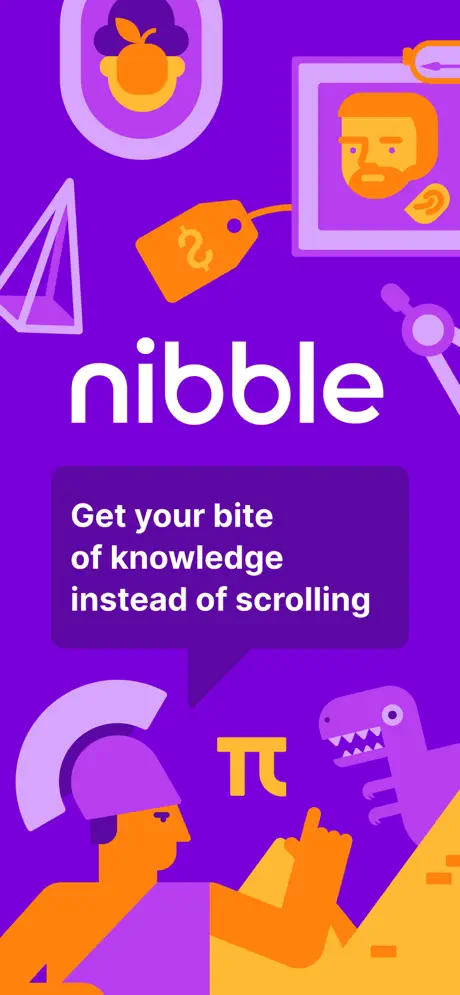
On-frame caption: “Get your bite of knowledge instead of scrolling

Frame 1 is a full-bleed poster with no device frame and no UI chrome. The background is a saturated violet, roughly #7B11E6, soaked edge-to-edge. At the vertical centre sits the wordmark “nibble” in a bold, rounded, white lowercase sans-serif. Directly beneath it, a dark-plum speech bubble—approximately #4A0B99—holds the caption “Get your bite of knowledge instead of scrolling” in white text. The bubble’s tail points downward toward the illustration, tethering text to image. The surrounding canvas is populated by flat graphic characters and symbols: an orange-skinned figure wearing a purple helmet at the bottom left, a graduation-capped character with a magnifying glass at the bottom right, a small T-Rex, a Pi symbol, a geometric crystal, a price tag, and two framed portraits in the upper register. The composition is radially balanced but extremely dense. The bottom third acts as a foundation; the top third acts as ornament. Because the frame contains no interface, it reads entirely as brand promise. The risk is legibility at small scale: the peripheral illustrations compete with the central lockup, and the speech bubble caption is only one size step removed from the wordmark, making the hierarchy between brand name and value proposition slightly muddy.
Nibble App Store screenshot 2 — The home feed and the realistic bezel
02

The home feed and the realistic bezel

On-frame caption: “Learn 6X more effectively

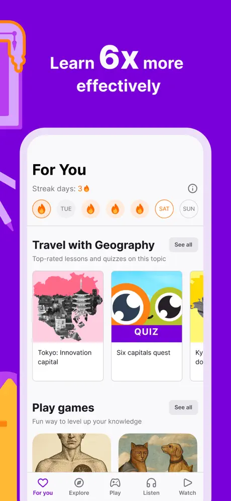
The second frame introduces a realistic white iPhone bezel, complete with side buttons, rounded corners, and a physical shadow, set against the same saturated purple ground used in frame 1—roughly #9013FE. Above the device, the headline reads “Learn 6X more effectively,” with the “6X” enlarged relative to the surrounding words, creating a visual anchor through scale contrast. Inside the phone, the “For You” feed is visible. At the top, a streak counter reads “Streak days: 3” followed by a fire emoji. Below that, a horizontal calendar strip spans TUE through SUN, with small fire icons marking active days. The first content section is titled “Travel with Geography,” paired with a grey “See all” pill. Two cards are fully visible: “Tokyo: Innovation capital,” which uses a pink collage treatment, and “Six capitals quest,” which carries a purple “QUIZ” banner over an orange-and-green owl-eye graphic. Further down, a “Play games” section introduces thumbnail cards showing classical artwork and animal portraits. The bottom tab bar displays five modalities: For you, Explore, Play, Listen, Watch. The realism of this device is notable because it disappears immediately after this frame. The crop is generous: the tab bar is fully intact, and the card peeks on the right edge suggest scrollable breadth without cutting off critical UI.

Nibble App Store screenshot 3 — The game modality and the outline device
03

The game modality and the outline device

On-frame caption: “Play addictive games

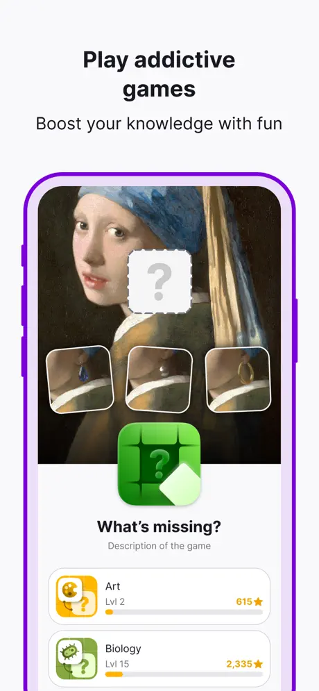
Here the set pivots. The background switches abruptly to off-white, approximately #F5F5F7, and the realistic iPhone is replaced by a stylized flat outline with a thick purple stroke—around #B44CF6. The headline above reads “Play addictive games,” with the subhead “Boost your knowledge with fun.” Inside the outlined device, the screen shows a game detail page titled “What’s missing?” The canvas is Vermeer’s “Girl with a Pearl Earring,” partially obscured by a white tile carrying a grey question mark. Below the painting are three zoomed detail tiles serving as answer choices. Beneath these sits a green rounded-square icon with a white question mark, then the title “What’s missing?” and, critically, the line “Description of the game,” which is placeholder copy left visible in a live store asset. Lower still are category rows for “Art” (Lvl 2, 615★) and “Biology” (Lvl 15, 2,335★). The orange and green category iconography is consistent with the brand palette, but the presence of placeholder text is a concrete oversight that undermines the professionalism of the frame.

Nibble App Store screenshot 4 — Video and the typo
04

Video and the typo

On-frame caption: “Watch short videos

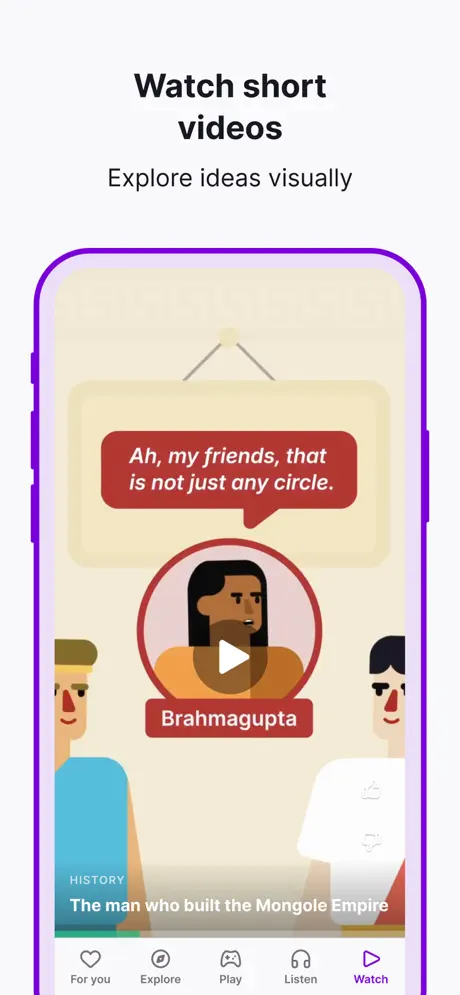
The headline/subhead pairing repeats: “Watch short videos” / “Explore ideas visually.” The same purple-outlined device and off-white surround carry over. Inside, a video player interface shows an animated historical scene rendered in flat editorial illustration. A speech bubble in deep red (#C0392B) contains the text “Ah, my friends, that is not just any circle.” Below the bubble, a circular avatar of a figure labeled “Brahmagupta” sits on a matching red lozenge, with a white play button overlaid at the centre. Underneath the video frame, a category tag reads “HISTORY” in small caps, followed by the title “The man who built the Mongole Empire.” The spelling “Mongole” is visible here—an error in a store screenshot for an education product. The tab bar at the bottom confirms “Watch” as the active tab, highlighted in purple. The frame succeeds at showing motion-ready content through a still image, but the typo and the dense layering of speech bubble, avatar, and play button create a crowded focal point.

Nibble App Store screenshot 5 — Interactive lessons
05

Interactive lessons

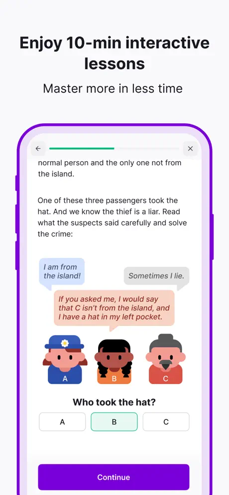
On-frame caption: “Enjoy 10-min interactive lessons

Headline: “Enjoy 10-min interactive lessons.” Subhead: “Master more in less time.” The device displays an interactive logic puzzle. At the very top, a thin green progress bar tracks lesson completion. Below, body text sets up a mystery about a stolen hat and three suspects. Three chat bubbles appear in sequence: a blue bubble on the left reads “I am from the island!”; a grey bubble on the right reads “Sometimes I lie.”; and a salmon-pink bubble on the left reads “If you asked me, I would say that C isn’t from the island, and I have a hat in my left pocket.” Beneath the dialogue, three cartoon avatar heads are labeled A, B, and C. A multiple-choice question—“Who took the hat?”—is followed by three pill buttons; button B is outlined in an emerald green (~#10B981), indicating selection. At the bottom, a full-width “Continue” button in solid dark purple (~#6D28D9) grounds the layout. The density of text in this frame is the highest in the set; at thumbnail scale, the narrative becomes illegible, though the interactive format is still readable from the layout pattern alone.

Nibble App Store screenshot 6 — Audio list
06

Audio list

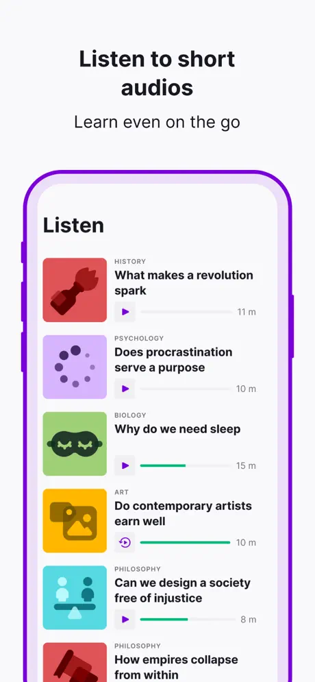
On-frame caption: “Listen to short audios

This frame carries the headline “Listen to short audios” and subhead “Learn even on the go.” Inside the device, a list under the header “Listen” displays audio lessons in a vertical stack. Each row consists of a rounded-square category icon on the left, a bold title, a play button, a horizontal progress indicator, and a duration on the right. The visible rows are: History, “What makes a revolution spark,” 11 m, red icon; Psychology, “Does procrastination serve a purpose,” 10 m, purple icon; Biology, “Why do we need sleep,” 15 m, green sleep-mask icon; Art, “Do contemporary artists earn well,” 10 m, yellow icon (with its progress bar nearly complete); Philosophy, “Can we design a society free of injustice,” 8 m, teal icon; and a partially visible Philosophy entry below. The value of this frame is statefulness: by showing progress bars at different fill levels, the screenshot implies ongoing usage without requiring animation. The color coding by subject is a smart navigational aid, though the text-heavy list format risks being skipped by fast swipers.

Nibble App Store screenshot 7 — AI chat
07

AI chat

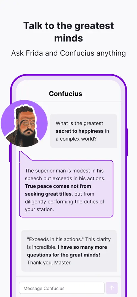
On-frame caption: “Talk to the greatest minds

Headline: “Talk to the greatest minds.” Subhead: “Ask Frida and Confucius anything.” The screen shows a chat interface centred on the name “Confucius.” At the top left, a circular photograph of Confucius is ringed in light purple and bleeds slightly outside the device frame on the left edge—a deliberate overlap not seen elsewhere in the set. The user’s message sits on the right in a light grey bubble: “What is the greatest secret to happiness in a complex world?” The reply occupies a large left-aligned bubble with a light purple tint and dark purple border. It reads: “The superior man is modest in his speech but exceeds in his actions. True peace comes not from seeking great titles, but from diligently performing the duties of your station.” Key phrases are bolded for scanability. A second user message appears below in grey, and at the bottom a text input field reads “Message Confucius,” paired with a light purple send button. This frame demands more reading time than a store browser will realistically give it. The overlap of the avatar outside the device frame is a playful spatial move, but because it is isolated to this frame, it reads as an inconsistency rather than a system.

Nibble App Store screenshot 8 — Topic breadth
08

Topic breadth

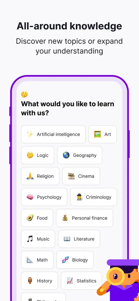
On-frame caption: “All-around knowledge

The final frame uses the headline “All-around knowledge” and subhead “Discover new topics or expand your understanding.” Inside the device, an onboarding topic picker asks, “What would you like to learn with us?” preceded by a winking emoji. The answers are arranged in a two-column bento grid of rounded pill buttons, each combining an emoji and a label: ✨ Artificial intelligence, 🖼️ Art, 🤔 Logic, 🌍 Geography, 🙏 Religion, 🎬 Cinema, 🧠 Psychology, 🕵️ Criminology, 🥑 Food, 💰 Personal finance, 🎵 Music, 📖 Literature, 📐 Math, 🧬 Biology, 🏺 History, 📈 Statistics. At the bottom right corner, a small illustrated character—orange skin, purple graduation cap, magnifying glass—peeks up from below the device edge. The frame communicates breadth effectively through sheer volume of visible pills. However, the character at the bottom is cropped by the screenshot boundary in a way that feels accidental rather than intentional. If the set is viewed on a device with rounded corners, that character may be further obscured.

05The craft

Captions, colour and the mechanics of the sell

Caption pattern

Every frame after the hero uses the same sentence architecture: a bold two-to-four-word headline (“Watch short videos,” “Enjoy 10-min interactive lessons”) followed by a shorter grey subhead (“Explore ideas visually,” “Master more in less time”). This anaphora creates rhythm, but it also flattens the narrative. There is no escalation; each frame makes an equivalent claim, so the shopper’s eye is trained to skim rather than read. The copy inside the devices is where the actual texture lives, and much of it is too small to parse on a small screen.

Visual system

The visual system has three moving parts: the illustrative brand world (frame 1 and the occasional character), the realistic device (frame 2), and the stylized outline device (frames 3–8). The illustration style is flat, geometric, and high-contrast, using orange skin tones against violet environments. The UI inside the devices is standard iOS-style: rounded cards, pill buttons, bottom tab bars, and progress indicators. The set never fully reconciles the cartoon exterior with the utilitarian interior; the two systems sit adjacent to each other rather than integrated. The purple stroke around the outlined device is approximately #B44CF6, which keeps the brand present but feels like a watermark rather than a structural element.

The thumbnail test

At thumbnail scale, frame 1 reads as a bright purple graphic with a white wordmark. It is distinctive. Frame 2 remains purple and keeps the brand visible. Once the user hits frame 3, however, the background turns to near-white, and the frames become small-device previews with black text. The visual punch drops significantly, meaning users scrolling rapidly through search results may lose the brand thread after the second swipe. The consistent headline weight helps, but the color dropout is audible.

Conversion mechanics

The set prioritizes breadth signals over conversion triggers. There are no star ratings, testimonial quotes, or social-proof badges inside the frames. The closest element to trust-building is the streak counter in frame 2 and the level badges in frame 3, which imply retention and replayability. For an education app, this is a defensible choice—users convert on content quality, not urgency—but a single frame showing completion certificates, user stats, or a star rating might have anchored credibility more firmly.

06Where it slips

What we would change

Device realism is fractured

Frame 2 uses a photorealistic white iPhone bezel against a purple field. Frames 3–8 drop that realism entirely in favor of a flat, purple-stroke outline device on an off-white ground. This is not a subtle difference; it is a jarring gear shift that makes the set feel like two separate projects stitched together. The fix is to standardize on one treatment. The stylized outline is preferable because it echoes the brand purple and feels native to the illustration system in frame 1. If the realistic device must stay, it should appear in every frame, and the background should remain purple to maintain continuity.

Placeholder and typo copy made it to production

Frame 3 displays the literal string “Description of the game” under the game title. Frame 4 shows “The man who built the Mongole Empire,” a typo for Mongol. In an education app, visible placeholder text and spelling errors in store assets directly erode trust. The fix is simple: every visible string in a screenshot should be proofed as rigorously as the app store metadata. Replace “Description of the game” with a concrete mechanic summary like “Spot the missing detail,” and correct the empire spelling before export.

The word “addictive” is a liability

Frame 3’s headline reads “Play addictive games.” Platform reviewers and parental audiences treat the word “addictive” as a red flag in wellness and education categories, and some stores actively discourage language that frames engagement as compulsive behavior. Replacing the headline with “Play quick games” or “Play daily games” removes regulatory friction without sacrificing meaning.

The background color dropout kills brand momentum

The first two frames live entirely inside the brand’s violet world. After frame 2, that world disappears and is reduced to a thin device stroke. The result is that frames 3–8 feel like generic UI tours rather than owned brand moments. The fix is to tint the off-white background with a whisper of the brand purple (~#F5F0FF) or to keep a purple surround behind every device, unifying the set into a single chromatic environment.

Frame 7 is too text-dense for a screenshot

The chat frame is visually noisy and asks the shopper to read a multi-line philosophical quote. App Store browsers do not pause to read paragraphs. The fix is to crop the conversation to a single prompt and a single short reply, or to use a blank-state screen showing the input field and a suggested question. That would communicate the chat feature in under a second.

07The recipe

How to apply this to your own app

  1. Adopt a repeating headline cadence, but escalate the promise

    Nibble’s headline/subhead formula is mechanically sound: a large claim followed by a smaller clarification. If you borrow this, vary the energy across the set so the fifth frame does not feel identical to the second. Let the headlines build a mini-narrative rather than a checklist.

  2. Proof every pixel of text

    Placeholder strings and typos are the fastest way to lose credibility in an education or productivity screenshot set. Export your frames, then read every line aloud before upload.

  3. Unify your device treatment from frame one

    Decide early whether you are using a realistic bezel, a flat outline, or no device at all, and commit to that decision across every frame. If you must transition, do it at a logical breakpoint—such as between the hero frame and the product frames—not in the middle of the feature tour.

  4. Use stateful UI to imply motion

    Nibble’s audio frame is a strong example of showing progress bars at different fill levels to imply ongoing activity without animation. If your app has lists, timers, or trackers, capture them in mid-use rather than at zero-state.

08Takeaways

Five things worth stealing

  • A single illustrated hero frame can carry brand personality for an entire set, but only if the subsequent frames echo at least one of its visual properties—whether color, stroke weight, or character motif.
  • The two-line headline/subhead pairing above a device is a repeatable, scannable pattern for multi-modal apps, but it flattens quickly if every frame makes an equivalent claim.
  • Stateful UI elements—partial progress bars, filled streak counters, mid-conversation bubbles—communicate utility more effectively than blank states or placeholders.
  • In education and productivity categories, visible proofing errors and placeholder copy exact a higher trust penalty than in entertainment categories.
  • Dropping the brand background color after the first two frames may improve UI legibility, but it severs the visual thread that connects the product back to the brand promise.
09The verdict

What the set actually achieves

The set lands on a repeating two-layer structure: a large, centered text claim outside the device, and the proof-of-feature inside the device. Frame 1 is pure brand poster; frames 2–8 are pure product demo. The result is a swipeable curriculum: brand, home feed, games, video, lessons, audio, chat, topics. A designer auditing the store page gets a rapid tour of what the app contains, even if the connective tissue between frames is occasionally strained.

Multi-modal productivity, education, or content apps that need to prove breadth without turning the screenshot set into a UI spec sheet. The formula works best when each frame can show a genuinely different screen, rather than minor variations on the same layout. Avoid this approach if your app has a single killer feature; the breadth-first structure will dilute it before the shopper reaches the install button.

10Questions

Frequently asked

Why does the device frame change after frame 2?

The set appears to shift from a realistic iPhone bezel in frame 2 to a stylized purple outline for the remaining frames. This is likely an artifact of different design phases or asset sources being combined without final unification. Structurally, it breaks the visual system.

Does the purple background return after frame 2?

No. Frames 3 through 8 all sit on an off-white surround. The only purple remaining is the stroke around the outlined device and the in-app UI accents.

Is there a social proof or rating frame?

The set does not contain a star rating, user review, or testimonial screenshot. Trust is implied through content volume and UI polish rather than explicit social proof.

What is the strongest frame in the set from a conversion perspective?

Frame 1 is the strongest as a thumb-stopper because it contains no device chrome and reads as a poster at small scale. Frame 5 is the strongest at demonstrating differentiated value, because the interactive lesson layout is visually distinct from standard video or article UIs.

11Keep reading

Build your own screenshot set

The full set

10 shots
Nibble App Store screenshot 1Nibble App Store screenshot 2Nibble App Store screenshot 3Nibble App Store screenshot 4Nibble App Store screenshot 5Nibble App Store screenshot 6Nibble App Store screenshot 7Nibble App Store screenshot 8Nibble App Store screenshot 9Nibble App Store screenshot 10

About the app

Meet Nibble — an all-around knowledge app of interactive 10-min lessons & quizzes. Crush your goals and expand your understanding of topics you want to know more about. Our app Kremital Limited, via the App Store listing.

Screenshots and store metadata belong to Kremital Limited. They are shown here for design commentary and criticism. The analysis on this page is original work by floow.design. View the original listing.

More Education teardowns

Browse all →