Skillsta app icon
EducationScreenshot teardown12 min read

Skillsta App Store screenshots

When an app sells confidence, its screenshots have to look confident. Skillsta’s eight-frame App Store set tries to externalize invisible traits—charisma, eloquence, presence—through a character-driven dark-mode world. The result is a narrative billboard that stubbornly refuses to behave like a standard feature carousel, for better and for worse.

Set published by Ranely Limited · 9 frames analysed

4.4 · 3.1K ratingsFreev3.8.2Updated 4mo ago
Skillsta App Store screenshot 1
01At a glance

The set in one screen

Framing
Mixed. Frame 1 is a full-bleed illustration with no device. Frames 2 and 3 are character scenes with no device. Frames 4–7 center a black iPhone with rounded corners and a 12:52 status bar. Frame 8 returns to a no-device poster layout.
Captions
Large, bold, white sans-serif, upper-left or top-centered, acting as a chapter title for each frame.
Backdrop
Continuous dark gradient, roughly #121212 at the top easing to #2a2a2a at the bottom, unifying the full carousel.
Type
Geometric sans-serif, white, weights ranging from semibold (body) to heavy (headlines). UI text inside devices is smaller, gray (#9ca3af), and functional.
UI / copy split
About 60:40. Characters and captions dominate; actual interface is visible but often partially covered by illustrative intrusions.
Frame 1 job
Brand promise and social proof. No product UI is shown.

Sampled palette

#121212#121212
#2a2a2a#2A2A2A
#ffffff#FFFFFF
#fbbf24#FBBF24
#ea580c#EA580C
#3b82f6#3B82F6
02The challenge

What this screenshot set had to solve

The central design problem is translation: how do you screenshot something as intangible as 'unshakeable presence'? Skillsta’s category—communication skills, charisma training—does not lend itself to tidy dashboard metrics or lifestyle photography. The team had to build a visual grammar that could turn internal emotions into external signals. That meant creating a recognizable 'before' state (anxiety, self-doubt) and an 'after' state (confidence, eloquence) without relying on stock photos or abstract icons. At the same time, Apple's browsing context demands that the first frame function as a billboard at thumbnail size, while later frames must still prove the app is a real piece of software and not just a content booklet. The challenge, then, was to balance mascot-driven storytelling with hard UI evidence across eight sequential panels, all while maintaining a single dark gradient canvas that reads as one continuous environment rather than eight disconnected images.

The orange beanie character is worth more than any feature list. By frame 3, you recognize his silhouette; by frame 6, you expect him. That is theScreenshotSet's real asset.
03The approach

How the set argues its case

The strategy is storyboarding, not spec-sheet marketing. The team withholds the device entirely for the first three frames, forcing the shopper to absorb the emotional premise before encountering interface chrome. Typography is handled with a single family at a single color (#FFFFFF), letting hue shifts in the pills and bubbles carry meaning. Illustrations are deliberately cropped by the canvas edge—hands, heads, and mascots bleed off-screen to simulate motion and depth. When the iPhone finally appears in frame 4, it is never left alone; characters intrude from the left and right margins, ensuring the brand world and the UI layer share the same space. Time is locked to 12:52 across device frames to preserve continuity, and the palette is restricted so that blue-to-green gradients always mean progress while muted purples mean the problem state.

Skillsta positions itself not as a course library but as a pocket coach. The screenshots avoid academic language (no 'curriculum,' 'syllabus,' or 'accreditation') and instead lean on therapy-adjacent vocabulary: 'Overthinking everything,' 'Unshakable presence,' 'Clear, eloquent speech.' The visual tone sits somewhere between Duolingo mascot energy and a dark-mode Headspace, aiming for approachable rather than institutional.

04Frame by frame

Every screenshot, and the job it does

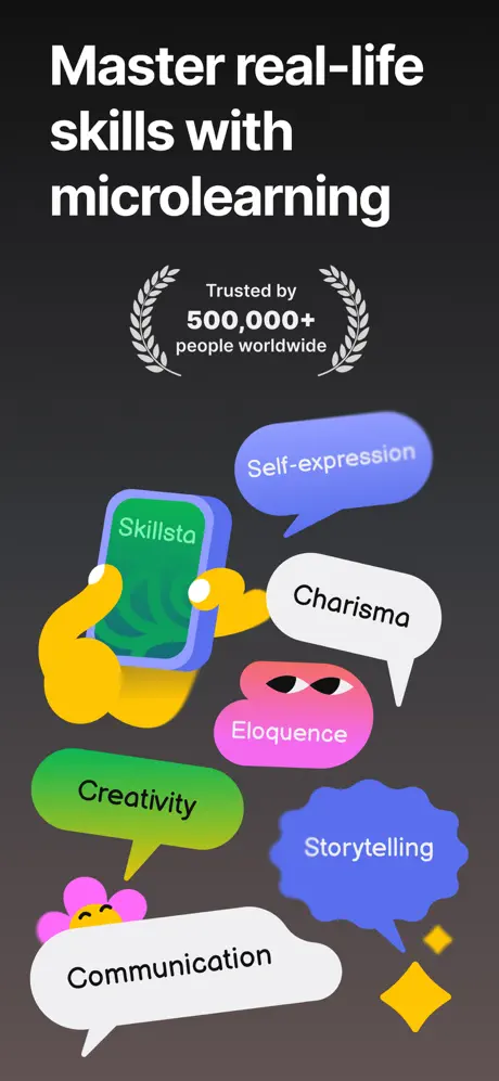
Skillsta App Store screenshot 1 — Master real-life skills with microlearning
01

Master real-life skills with microlearning

On-frame caption: “Master real-life skills with microlearning

This is a pure brand poster: no device, no UI, no login screen. The headline sits in the upper third, set in a heavy white sans-serif with tight line-height. Beneath it, a social-proof lockup reads 'Trusted by 500,000+ people worldwide,' sandwiched by silver laurel wreaths (#a1a1aa) at roughly 18pt. The illustration layer is dense. Two yellow hands (#fbbf24) cradle a smartphone with a green screen (#22c55e) displaying the word 'Skillsta' in white. Six speech bubbles float at various angles: 'Self-expression' in periwinkle (#818cf8), 'Charisma' in white with black type, 'Eloquence' in hot pink (#ec4899) containing a pair of stylized eyes, 'Creativity' in lime (#84cc16), 'Storytelling' in deep blue (#3b82f6), and 'Communication' in white. A small pink flower character (#f472b6) anchors the lower-left corner. The frame establishes the brand vocabulary immediately, though the bubble count is high enough that the eye bounces before settling on the headline.

Skillsta App Store screenshot 2 — Before Skillsta
02

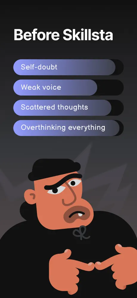
Before Skillsta

On-frame caption: “Before Skillsta

The background remains the same dark gradient. Four rounded pills are stacked vertically with even spacing of roughly 56pt. Each pill carries a left-to-right gradient from muted lavender (#8b5cf6) to slate gray (#475569) and a long black shadow extending approximately 20pt to the right. The text inside is white and reads: 'Self-doubt,' 'Weak voice,' 'Scattered thoughts,' 'Overthinking everything.' Below the pills, the orange-skinned protagonist (#ea580c)—cropped at the shoulders, wearing a black beanie and black hoodie (#0f0f0f)—fills the lower half. His hands meet in an anxious steeple and his expression is downcast. The layout is disciplined: by preserving this exact structure in the next frame, the team makes the transformation readable at a glance.

Skillsta App Store screenshot 3 — After Skillsta
03

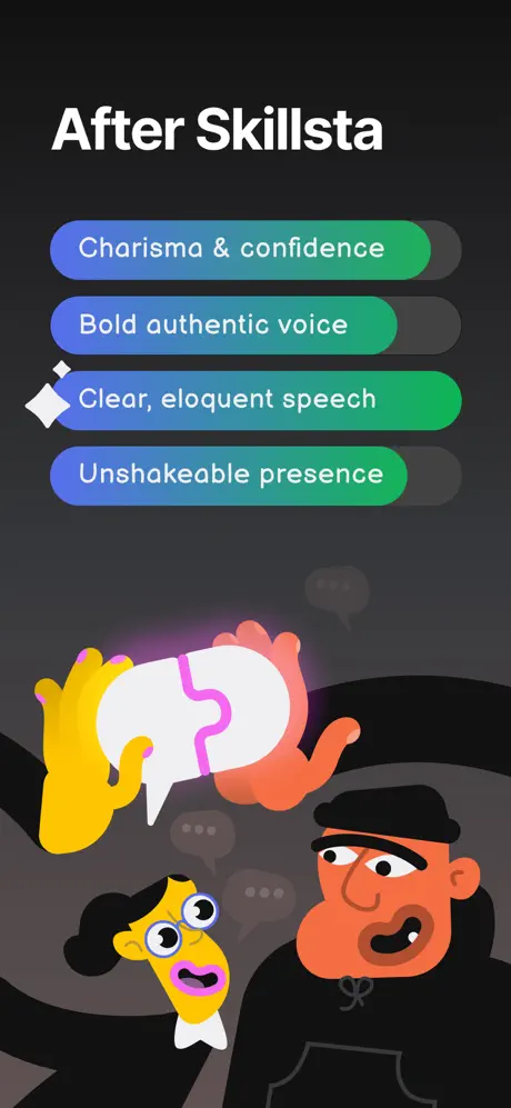
After Skillsta

On-frame caption: “After Skillsta

Identical scaffolding to frame 2, but the emotional polarity is reversed. The four pills now read: 'Charisma & confidence,' 'Bold authentic voice,' 'Clear, eloquent speech,' and 'Unshakable presence.' Their gradients have shifted to blue (#3b82f6) melting into emerald (#10b981). A white diamond sparkle punctuates the left side of the third pill. The same orange character returns, now in three-quarter profile with mouth open as if speaking. A yellow secondary character (#facc15) with oversized round glasses and pink lips enters from the lower-left, holding a white speech bubble containing a pink puzzle piece (#f472b6). Ghosted gray speech bubbles (#374151) drift in the background. The before/after pair works because nothing moves except color and expression; the shopper receives the argument without reading a word.

Skillsta App Store screenshot 4 — Bite-sized interactive lessons
04

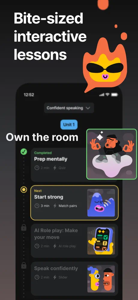
Bite-sized interactive lessons

On-frame caption: “Bite-sized interactive lessons

This is the first appearance of a device frame: a black iPhone with the status bar locked to 12:52. The screen shows a curriculum list titled 'Confident speaking' with a dropdown chevron and a 'Unit 1' blue pill. Four lesson rows are visible: 'Prep mentally' (marked Completed with a green check), 'Start strong' (marked Next with a yellow circle outline), and two locked items below. Each row has a dark card (#1f2937), a thumbnail illustration, a duration, and an activity type label such as 'Quiz' or 'Match pairs.' An orange flame mascot (#f97316) with black sunglasses breaches the top-right bezel. The overlay text 'Own the room' is large (~32pt), white, and positioned at the left margin, partially covering the device screen. The frame succeeds at mixing UI and brand, though the overlap sacrifices legible screen real estate.

Skillsta App Store screenshot 5 — AI-powered speech & voice training
05

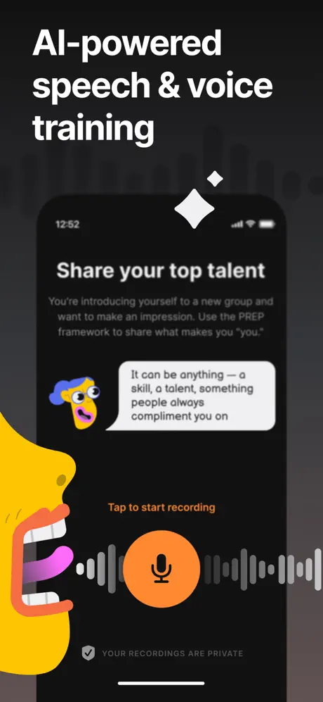
AI-powered speech & voice training

On-frame caption: “AI-powered speech & voice training

The device displays a prompt screen with the headline 'Share your top talent' in white. Below, gray body copy (#9ca3af) explains: 'You're introducing yourself to a new group and want to make an impression. Use the PREP framework to share what makes you 'you.'' An off-white speech bubble (#f3f4f6) contains black instructional text: 'It can be anything — a skill, a talent, something people always compliment you on.' A yellow character profile (#facc15) with an open mouth and pink tongue bleeds in from the left margin, overlapping the device by roughly 15%. Centered beneath the bubble is an orange label (#fb923c) reading 'Tap to start recording,' followed by a large orange microphone button (#fb923c, ~72pt diameter). A gray waveform (#6b7280) stretches horizontally behind the button. The footer states 'YOUR RECORDINGS ARE PRIVATE' in muted gray with a shield icon. The hierarchy funnels attention to the record button effectively.

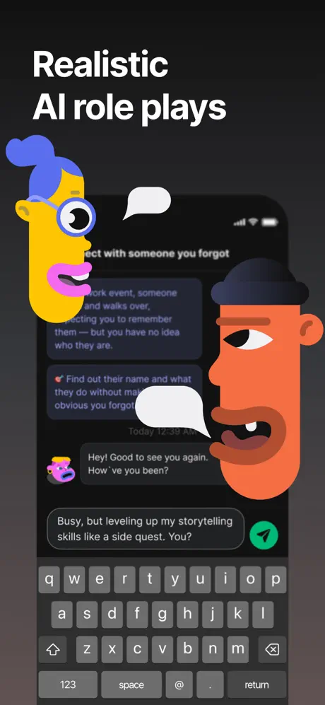
Skillsta App Store screenshot 6 — Realistic AI role plays
06

Realistic AI role plays

On-frame caption: “Realistic AI role plays

The device shows a chat interface. The scenario header is truncated mid-word: '...nect with someone you forgot.' Below, scenario copy in a dark card (#374151) begins, 'At a work event, someone ... and walks over. Expecting you to remember them — but you have no idea who they are.' A purple-gray objective pill (#4b5563) contains white text—'Find out their name and what they do without mak... obvious you forgot'—with a red target icon. The keyboard is fully visible at the bottom, consuming roughly 35% of the device footprint. Chat bubbles include 'Hey! Good to see you again. How 've you been?' and 'Busy, but leveling up my storytelling skills like a side quest. You?' A green send button (#10b981) with a white paper plane sits at the bottom-right. Two oversized character heads—the yellow figure with blue hair on the left, the orange beanie figure on the right—bracket the phone. While the framing is dynamic, the truncated header and keyboard bulk make this the least legible functional demonstration in the set.

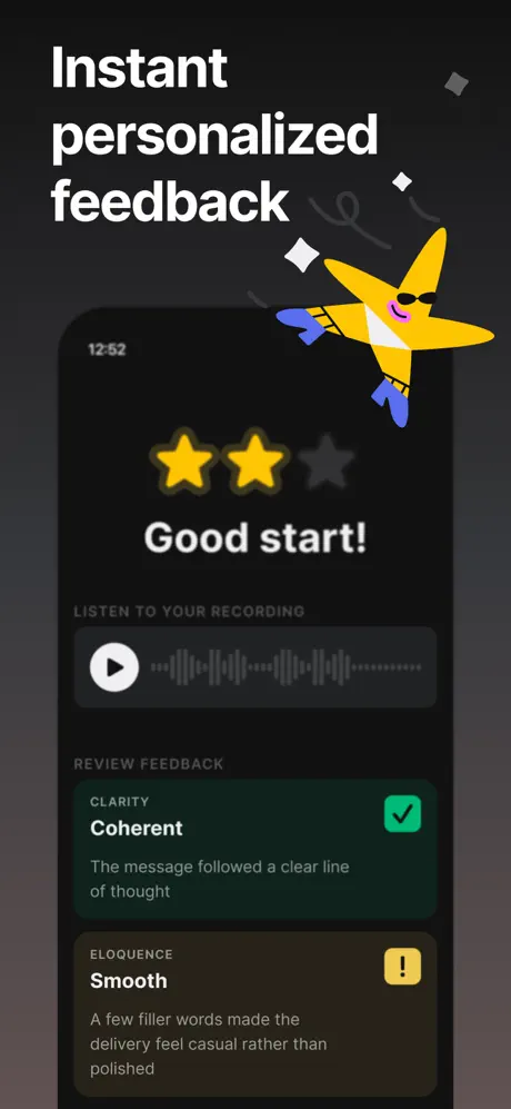
Skillsta App Store screenshot 7 — Instant personalized feedback
07

Instant personalized feedback

On-frame caption: “Instant personalized feedback

At top, two filled yellow stars (#fbbf24) and one empty gray star (#6b7280) sit above the white headline 'Good start!' at roughly 32pt. Below, a player card contains a white play button inside a dark rounded rectangle (#374151) with a dotted waveform. Two feedback cards follow: 'CLARITY / Coherent' in a dark green-tinted card (#064e3b) with a green checkmark (#22c55e), and 'ELOQUENCE / Smooth' in an olive-tinted card (#713f12) with a yellow warning icon (#facc15). The body copy under each criterion is gray (#9ca3af): 'The message followed a clear line of thought' and 'A few filler words made the delivery feel casual rather than polished.' A yellow star-shaped character (#facc15) wearing blue gloves and sunglasses flies across the upper right, breaking past the device edge. The color-coded card system makes the feedback scannable, though the visible two-filled-star motif sits oddly against congratulatory copy.

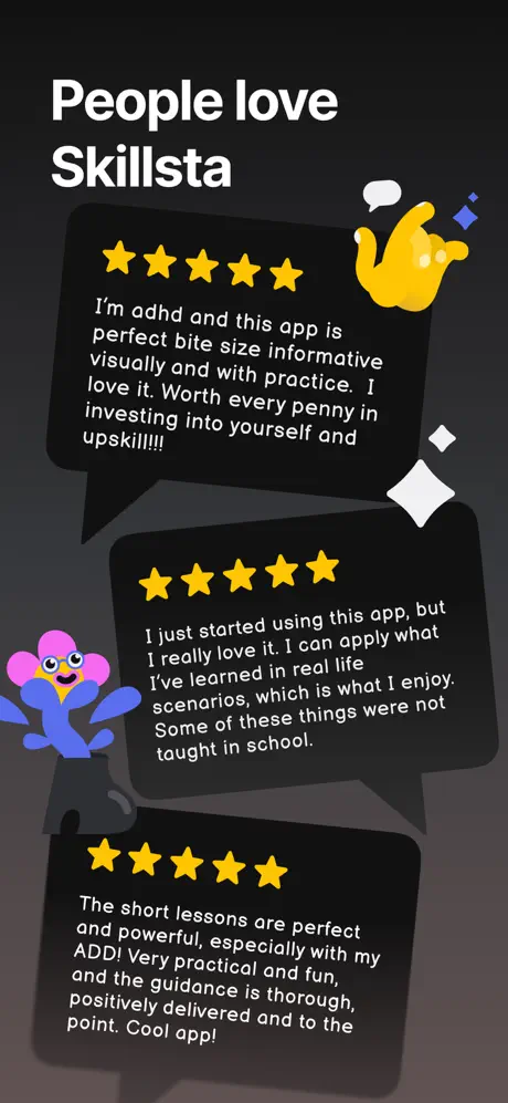
Skillsta App Store screenshot 8 — People love Skillsta
08

People love Skillsta

On-frame caption: “People love Skillsta

No device; the frame returns to the dense poster logic of frame 1. Three dark speech bubbles (#1f2937) with black shadows are stacked vertically, each angled slightly. Every bubble leads with five yellow stars (#fbbf24). The first review reads: 'I'm adhd and this app is perfect bite size informative visually and with practice. I love it. Worth every penny in investing into yourself and upskill!!!!' accompanied by a yellow hand gesture (#fbbf24) and a blue diamond. The second: 'I just started using this app, but I really love it. I can apply what I've learned in real life scenarios, which is what I enjoy. Some of these things were not taught in school.' accompanied by the pink flower character. The third: 'The short lessons are perfect and powerful, especially with my ADD! Very practical and fun, and the guidance is thorough, positively delivered and to the point. Cool app!' The headline 'People love Skillsta' mirrors the scale and position of frame 1's title, creating bookend symmetry.

05The craft

Captions, colour and the mechanics of the sell

Caption pattern

Every frame opens with a short, declarative headline in sentence case: 'Master real-life skills with microlearning,' 'Before Skillsta,' 'Bite-sized interactive lessons,' etc. These captions are positioned in the top safe zone, well above the device bezel, ensuring they survive App Store cropping. Inside the UI, smaller text is left-aligned or centered depending on the screen type, but the store-level caption never moves from the upper-left quadrant after frame 1.

Visual system

The visual system is governed by a dark gradient that never breaks. Against this void, color is applied in three tiers: white for typography and information, saturated accents (periwinkle, hot pink, lime, emerald) for illustrative bubbles and pills, and mid-gray (#6b7280, #9ca3af) for secondary UI text. Shadows are used sparingly and literally: the pills in frame 2 have long, hard drop shadows extending rightward in pure black, but because the background is already near-black, the shadows are nearly invisible. The characters share a flat, vector-chunky style with minimal linework—large rounded noses, dot eyes, and solid color fills—making them readable at any scale.

The thumbnail test

At small scale, frame 1 reads as a bright cluster of colored bubbles against black—recognizable but busy. Frame 2 and 3 pass the thumbnail test best; the orange face is large enough to read as an emotion even at 120pt width, and the pill shapes scan as lists. Frame 6 fails hardest; the keyboard becomes a gray slab and the scenario header text is illegible. The yellow and orange characters remain visible across all frames, which helps brand recognition when swiping quickly.

Conversion mechanics

The strongest conversion mechanic here is the before/after emotional mirror in frames 2 and 3. By keeping layout, character scale, and typographic position identical while swapping gradient direction and facial expression, the set triggers an instant 'I want that transformation' response without requiring the shopper to parse feature bullet points. Frame 1's social proof is conventional but effective—500,000+ is specific enough to feel credible. Frame 8's testimonials are smartly chosen because they mention ADHD and ADD, signaling an audience segment that struggles with traditional long-form learning. However, there is no explicit price, trial, or download incentive anywhere in the sequence; the set relies entirely on desire and trust.


06Where it slips

What we would change

Frame 1 is over-illustrated

Six speech bubbles, two hands, a phone, a flower, a headline, and a social-proof lockup create multiple competing focal points. The shopper's eye has no clear resting place. A specific fix: reduce the bubble count from six to four, increasing the headline size by roughly one weight step to re-establish hierarchy.

Frame 4's overlay text cannibalizes the UI

'Own the room' is large, white, and positioned directly over the left margin of the device screen, obscuring part of the lesson list beneath it. Moving the text entirely above the device bezel—or cropping it to a smaller size aligned with the left edge—would preserve the readability of the actual interface.

Frame 6's keyboard dominates the device

The fully expanded iOS keyboard consumes roughly 35% of the phone frame, and the scenario header is truncated mid-word ('...nect with someone you forgot'). Cropping the keyboard to a single row, or removing it entirely, would free vertical space for legible copy and fix the truncation without losing context—shoppers already know what a keyboard looks like.

Frame 7's star rating contradicts the copy

Two filled yellow stars and one visible empty star sit above the headline 'Good start!' That visual suggests a mediocre score in a context that should feel encouraging. Either filling all visible stars or rewriting the headline to match a 2/3 progression (e.g., 'Nice effort') would resolve the dissonance.

Frame 8 is typographically dense

Three full reviews at small size strain readability on smaller screens. Removing the third bubble to allow a 1–2pt size increase on the remaining two would improve legibility while preserving social proof volume.

07The recipe

How to apply this to your own app

  1. Before/after only works with identical structure

    Skillsta's frames 2 and 3 are effective because the pill count, character position, and background never change. If you use a before/after pair, lock every variable except the one you want to highlight.

  2. Delay the device chrome if your brand world is strong

    By waiting until frame 4 to show a phone, Skillsta forces the shopper to absorb the mascot system first. This is risky if your illustration is weak, but powerful if the characters are memorable.

  3. Use color as a state machine

    Purple-gray equals 'problem'; blue-green equals 'solution.' Assigning specific hues to emotional or functional states makes the carousel scannable even at swipe speed.

  4. Match store captions to in-app vocabulary

    The phrase 'Bite-sized interactive lessons' in frame 4 mirrors the review language in frame 8 ('perfect bite size'). Continuity between marketing copy and user vocabulary builds trust.

08Takeaways

Five things worth stealing

  • Character consistency across all eight frames builds recognition faster than feature lists.
  • The dark gradient background unifies the carousel into a single environmental space.
  • UI legibility suffers when illustrations overlap device frames; reserve bleed-off art for non-UI frames.
  • Before/after pairs are most persuasive when layout is identical and only color or expression changes.
  • Social-proof frames should be readable at small sizes; three dense paragraphs work against thumbnail scanning.
09The verdict

What the set actually achieves

The shipped set commits fully to an illustrated narrative arc. Frame 1 introduces the brand world and social proof. Frames 2 and 3 lock in a before/after comparison using matching pill-shaped taglists and the same orange protagonist. Frames 4 through 7 cycle through curriculum, speech recording, AI roleplay, and feedback. Frame 8 mirrors the opening by returning to floating speech bubbles, this time filled with user reviews rather than skill keywords. The aesthetic is coherent, but the tension between brand exuberance and UI legibility creates measurable friction in several frames.

This case study is written for mobile product designers preparing screenshot sets for coaching, wellness, or soft-skill apps where the value proposition is emotional rather than functional. It demonstrates how to prioritize narrative arc over feature density, and where that strategy risks breaking down.

10Questions

Frequently asked

How does Skillsta handle the first-frame thumbnail test?

Frame 1 relies on a cluster of brightly colored speech bubbles against black. It is recognizable but busy; the headline competes with the illustration layer rather than dominating it.

Are the screenshots dark mode only?

Every visible UI surface inside the device frames is dark, matching the exterior gradient. There is no light-mode demonstration in the set.

What unifies the set across all eight frames?

Three things: the dark gradient backdrop, the recurring orange and yellow characters, and the single white sans-serif headline system. Even when the device appears, the mascots intrude from the margins to maintain continuity.

Why is there no pricing or trial CTA in the sequence?

The set relies entirely on emotional desire and social proof. No frame mentions a free trial, subscription price, or download button beyond the standard App Store chrome.

What is the weakest frame and why?

Frame 6. The fully visible keyboard obscures too much of the chat interface, and the scenario header is truncated, making it the least informative functional demonstration in the carousel.

11Keep reading

Build your own screenshot set

The full set

9 shots
Skillsta App Store screenshot 1Skillsta App Store screenshot 2Skillsta App Store screenshot 3Skillsta App Store screenshot 4Skillsta App Store screenshot 5Skillsta App Store screenshot 6Skillsta App Store screenshot 7Skillsta App Store screenshot 8Skillsta App Store screenshot 9

About the app

Meet Skillsta — your pocket trainer for mastering real-life skills! We've broken down complex concepts into bite-sized practical lessons that fit your busy schedule. Skillsta is Ranely Limited, via the App Store listing.

Screenshots and store metadata belong to Ranely Limited. They are shown here for design commentary and criticism. The analysis on this page is original work by floow.design. View the original listing.

More Education teardowns

Browse all →