
Oscar Stories for Children app icon
EducationScreenshot teardown12 min read

Oscar Stories for Children App Store screenshots

Oscar Stories for Children — Screenshot Audit

Set published by HeyQQ GmbH · 8 frames analysed

4.5 · 52 ratingsFreev1.8.5Updated 4mo ago
Oscar Stories for Children App Store screenshot 1
01At a glance

The set in one screen

Framing
Mixed — full-bleed illustration and centered iPhone bezels
Captions
Soft, rounded geometric sans in #ffffff, centered top-third
Backdrop
Persistent moonlit sky gradient from #1e1b4b indigo through #7c3aed violet to lavender-peach clouds near #e9d5ff
Type
Large, ballon-like rounded sans-serif for headlines; smaller weight for UI labels inside device frames
UI / copy split
35% UI / 65% illustration
Frame 1 job
Establish genre and emotional mood without showing device chrome

Sampled palette

#ffffff#FFFFFF
#0f172a#0F172A
#f97316#F97316
#d1d5db#D1D5DB
#1e1b4b#1E1B4B
02The challenge

What this screenshot set had to solve

The central design problem here is dual-audience signaling. The screenshots must simultaneously assure parents that the app is a structured, safe educational tool—hence the presence of device frames showing grids, selection states, and currency indicators—and convince children (or the child inside the parent) that the experience is imaginative and character-driven. This tension surfaces in the alternation between frames that feature no device at all, relying on full-bleed AI-generated character art, and frames that drop a literal iPhone bezel into the dreamscape to display UI. The designer also faces the legibility ceiling of App Store thumbnails: text rendered inside a device screenshot at 10–12pt will shrink to near-illegibility when the entire frame is viewed as a swipeable card. Balancing lush, highly saturated character illustrations against the functional requirements of mode selection, profession grids, and social-proof credits creates a constant fight for visual hierarchy and negative space. The challenge is not merely to show features, but to make a parent believe the app is both procedurally magical and mechanically trustworthy within six seconds of swiping.

Unity becomes camouflage when the sky never changes.
03The approach

How the set argues its case

world-building-first continuity alternating between atmospheric promise and device-bound utility proof, constrained to a single nocturnal palette and rounded sans typographic system throughout the 9:19.5 portrait canvas.

Family-safe AI story generation marketed to parents through dual-layer frames that mix emotional character art with actual interface density inside iPhone bezels, framed by press logos and user testimony in the trust-building mid-sequence.

04Frame by frame

Every screenshot, and the job it does

Oscar Stories for Children App Store screenshot 1 — Create your own Bedtime Stories
01

Create your own Bedtime Stories

On-frame caption: “Create your own Bedtime Stories

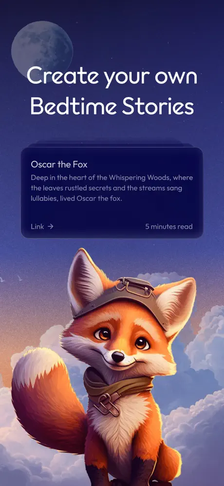
No device frame appears. The top third carries the centered headline “Create your own Bedtime Stories” in the rounded white sans. Beneath it, a dark navy rounded rectangle—corner radius estimated at 24pt—floats as a story preview card. Inside, the title “Oscar the Fox” is set in bold, followed by body copy: “Deep in the heart of the Whispering Woods, where the leaves rustled secrets and the streams sang lullabies, lived Oscar the fox.” A secondary row at the card’s baseline aligns “Link →” flush left and “5 minutes read” flush right, establishing a content metadata pattern. The lower two-thirds are dominated by a fox rendered in warm orange and cream tones, wearing aviator headgear and a scarf, positioned so its upward gaze directs attention back toward the card. The moon sits in the top-left quadrant, balancing the fox’s visual mass at bottom-right. The absence of device chrome makes this frame purely atmospheric, prioritizing narrative mood over functional demonstration.
Oscar Stories for Children App Store screenshot 2 — Let your Kid be the main character
02

Let your Kid be the main character

On-frame caption: “Let your Kid be the main character

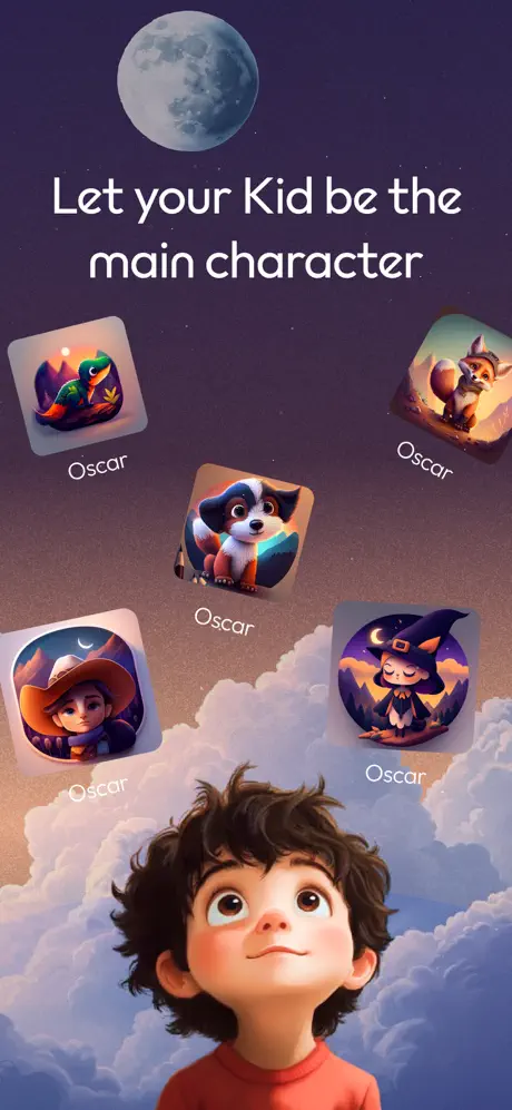
The headline reads “Let your Kid be the main character,” set in the same weight and size as Frame 1. Five rounded-square character thumbnails are scattered across the mid-ground at varied elevations and slight rotations: a dinosaur, the fox, a spaniel-like dog in a beret, a cowboy child, and a witch. Each thumbnail is labeled “Oscar” in the same rounded typeface, a choice that inadvertently flattens the personalization promise by giving every archetype the same name. The lower third introduces a rendered child’s head and shoulders emerging from the cloud bank, looking upward at the thumbnails. The background gradient warms toward a pink-amber horizon compared to Frame 1’s cooler cast, but the sky motif remains identical. There is no device frame or UI chrome; the frame relies entirely on the variety of generated avatars to imply configurability.

Oscar Stories for Children App Store screenshot 3 — Choose a mode
03

Choose a mode

On-frame caption: “Choose a mode

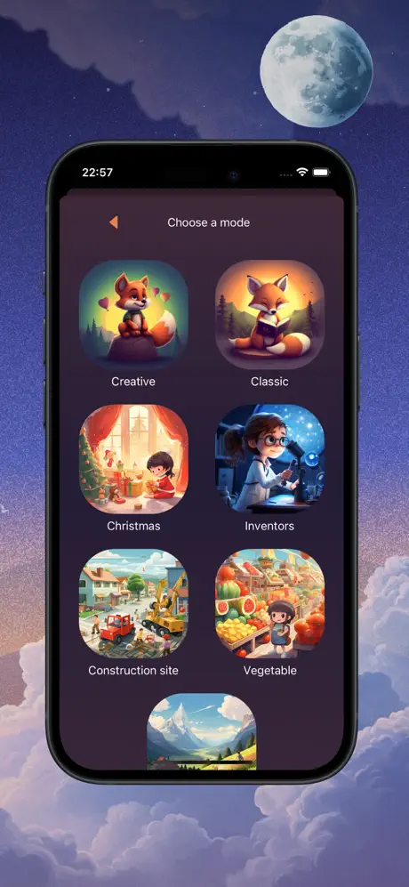
A centered iPhone with Dynamic Island displays a “Choose a mode” screen. A left-pointing back arrow and centered title sit in the app’s header. Below, a vertically scrollable grid of rounded-square tiles presents modes including Creative, Classic, Christmas, Inventors, Construction site, and Vegetable, with a seventh tile—showing a mountain landscape—peeking up from the bottom edge. Each tile contains a distinct AI-generated scene and a white label beneath. The phone is set against the standard sky backdrop, with cloud masses cropped behind the lower bezel. The status bar shows 22:57 and standard iOS connectivity icons. Because the device is rendered at a conservative scale, the labels inside the grid—particularly “Construction site” and “Inventors”—are rendered at a size that approaches the lower limit of App Store legibility. No callouts or enlarged insets guide the eye, so the frame communicates breadth through density alone.

Oscar Stories for Children App Store screenshot 4 — Loved by parents worldwide
04

Loved by parents worldwide

On-frame caption: “Loved by parents worldwide

Social proof and press frame. The headline “Loved by parents worldwide” occupies the top. A five-star glyph sits above a semi-transparent rounded rectangle with a thin border containing the verbatim quote: “It’s so hard to find a good app that works and doesn’t require any money I’m just going to say it ... I love this app 😂😂”. The informal punctuation and emoji register as authentic user voice but dilute the authority expected from a trust-building frame. Below the quote, four publication logos—WIRED, PULS 4, DIE ZEIT, and FOCUS ONLINE—are locked up in two rows. At the bottom, an AUSTRIA EXPO 2025 OSAKA badge and an INNOVATION LAB EXHIBITOR circular seal sit atop the cloud bank. The moon is minimized to a thin crescent in the mid-right. The density of accreditation logos creates a “trust wall,” though the bottom seals are small enough to dissolve into texture at thumbnail scale.

Oscar Stories for Children App Store screenshot 5 — Add family & friends
05

Add family & friends

On-frame caption: “Add family & friends

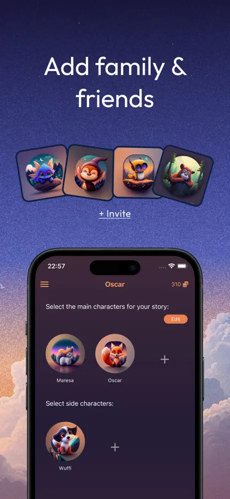
The headline “Add family & friends” introduces a dual-layer composition. Above the device, four rounded-square character avatars fan horizontally, followed by a centered “+ Invite” text link. The lower half presents an iPhone screen titled “Oscar” with a hamburger menu at left and “310 🍯” at right, suggesting an in-app soft-currency wallet. The screen body reads “Select the main characters for your story:” with circular portraits labeled “Maresa” and “Oscar,” plus an add button; below that, “Select side characters:” shows “Wuffi.” An orange-toned “Edit” pill offers the only warm accent inside the dark UI. The frame successfully demonstrates multi-character story assembly, but introduces an unexplained metric—310 honey pots—that offers no context to a browser who has not yet installed the app.

Oscar Stories for Children App Store screenshot 6 — Choose a profession for Oscar
06

Choose a profession for Oscar

On-frame caption: “Choose a profession for Oscar

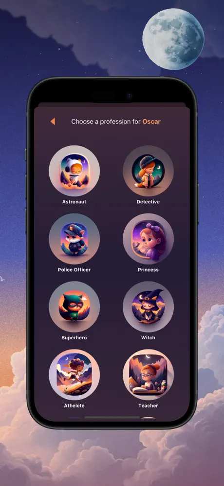
Another device-centric frame. The header reads “Choose a profession for Oscar,” with the name highlighted in orange. Eight circular avatars are arranged in a 2×4 grid: Astronaut, Detective, Police Officer, Princess, Superhero, Witch, Athlete, Teacher. Each sits inside a pale grey-beige ring, roughly #d1d5db, against the app’s near-black background. The surrounding canvas is pure sky illustration, but the black iPhone bezel forms a heavy opaque rectangle that obscures the background. The profession labels are small and uniform; without a selected state, checkmark, or hero enlargement, the frame reads as a static catalog rather than an interactive customization beat. The composition is rigidly symmetrical, lacking the diagonal energy of Frame 2’s floating tiles.

Oscar Stories for Children App Store screenshot 7 — Famous Characters From Classic Tales
07

Famous Characters From Classic Tales

On-frame caption: “Famous Characters From Classic Tales

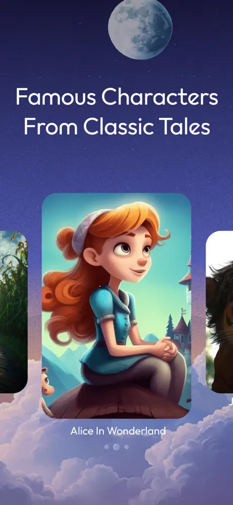
“Famous Characters From Classic Tales” abandons device frames for a horizontal carousel of story cards. The center card displays a red-haired girl in a blue dress, labeled “Alice In Wonderland,” cropped by a rounded rectangle with an estimated 28pt corner radius. Slivered cards peek from the left and right edges, and three pagination dots are centered below the label. The headline is pushed unusually high, leaving the middle and lower portions for the card artwork. Because the cards float without device context, they read as collectible story plaques rather than interface elements. The background darkens toward the top, providing strong contrast for the white type. This frame differentiates the app from purely original-generation offerings by signaling access to familiar public-domain narratives.

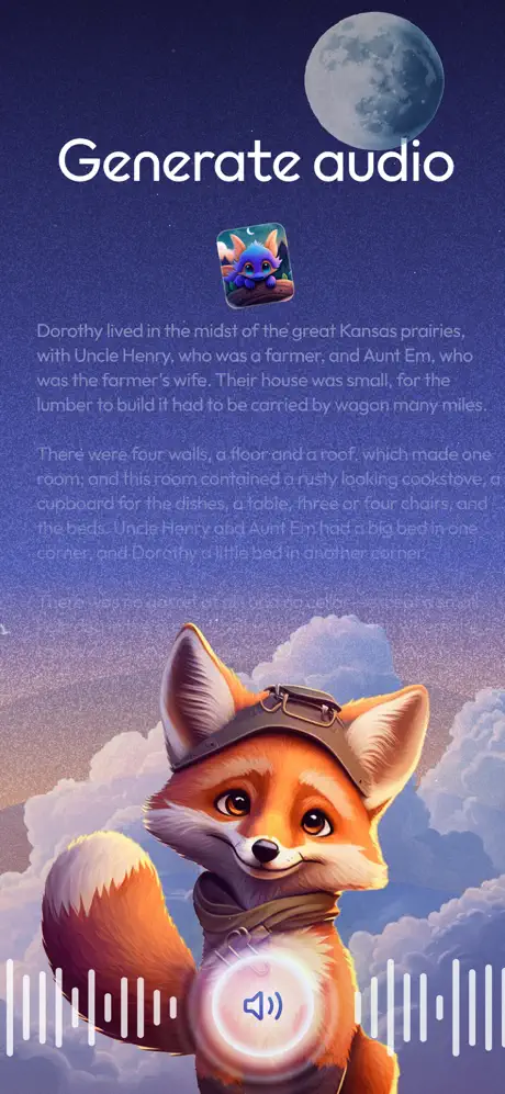
Oscar Stories for Children App Store screenshot 8 — Generate audio
08

Generate audio

On-frame caption: “Generate audio

“Generate audio” brings back the fox from Frame 1, now overlaid with a glowing circular button containing a speaker icon. White waveform bars flank the button at roughly 30% opacity. Above the fox, a small square avatar thumbnail precedes three paragraphs of story text beginning: “Dorothy lived in the midst of the great Kansas prairies, with Uncle Henry, who was a farmer, and Aunt Em, who was the farmer’s wife. Their house was small, for the lumber to build it had to be carried by wagon many miles.” The second paragraph continues: “There were four walls, a floor and a roof, which made one room; and this room contained a rusty looking cookstove, a cupboard for the dishes, a table, three or four chairs, and the beds. Uncle Henry and Aunt Em had a big bed in one corner and Dorothy a little bed in another corner.” A third paragraph begins, “There was no garret at all, and...” but is truncated. At this scale, the text functions as texture rather than readable content. The speaker glyph suggests playback, not generation, leaving the core AI-narration value proposition slightly ambiguous.

05The craft

Captions, colour and the mechanics of the sell

Caption pattern

Centered, friendly, rounded sans-serif; large for headlines, small and functional inside device screens; quotes reproduced verbatim with original grammar and emoji preserved; UI labels left in product-native casing such as 'Construction site' lowercase and 'Choose a profession for Oscar' sentence case.

Visual system

A locked environmental backdrop of a starry, moonlit sky with volumetric clouds is used as stage dressing for every frame. Headlines are always #ffffff, always centered, always in the upper third. Device frames are current-generation iPhones with black bezels and Dynamic Island, cropped to show maximum screen real estate. UI inside the devices relies on near-black backgrounds (#0f172a), circular avatar rings in pale grey (#d1d5db), and a single warm accent (#f97316) for primary actions. No solid color backgrounds or flat studio backdrops are introduced.

The thumbnail test

At thumbnail scale, the white headlines and moon survive, but text inside device frames becomes illegible and the identical background across all eight frames compresses the set into a single visual unit that may not reward continued swiping.

Conversion mechanics

The set opens with mood and closes with a feature, but the shopper’s swipe journey may stall in the middle because frames 3, 5, 6, and 8 all present similarly sized black device rectangles against the same purple sky. For conversion, the most effective frames are likely 1 and 2, which communicate the core promise instantly without requiring the eye to parse UI chrome.

06Where it slips

What we would change

The background illustration is the set’s greatest asset and its biggest liability

Using the same sky gradient and cloud bank across all eight frames creates a visual monotony that undermines swipe-by-swipe discovery; by the fourth frame, the shopper’s brain stops registering new information because the environmental context has not shifted. The fix is to preserve the moon-and-cloud motif but modulate local color temperature: shift utility frames like 3 and 6 toward cooler indigos, and emotional frames like 1 and 8 toward warmer ambers, providing chromatic punctuation without breaking world continuity.

Frame 2’s identical avatar labels contradict the personalization headline

Frame 2’s decision to label every avatar “Oscar” is a concrete flaw that contradicts the headline “Let your Kid be the main character.” If each thumbnail carried a distinct name—Leo, Mia, Sam—the frame would instantly communicate that the app generates unique identities rather than reskinning one template.

Frame 4’s testimonial quote and bottom badges weaken authority

Frame 4’s user quote is transcribed verbatim with missing commas and laughing emoji; while authentic, it sacrifices parental trust for the sake of raw user voice. Replacing it with a cleaner, attributed quote, or moving the raw voice to a smaller caption, would strengthen the “loved by parents” claim. The AUSTRIA EXPO 2025 OSAKA and INNOVATION LAB EXHIBITOR seals at the bottom are illegible below 30% scale and should be removed from this canvas entirely or consolidated into a single “As seen at” lockup.

Dense grids inside device frames in Frames 3 and 6 become illegible at thumbnail size

Frames 3 and 6 place dense selection grids inside device bezels without magnification. At App Store thumbnail size, mode labels like “Construction site” and profession labels like “Police Officer” dissolve into grey smudges. The fix is to crop the device tighter to the screen content—losing the bezel entirely—or to add a 1.5× magnified callout bubble beside the device that isolates one grid item at readable scale.

Frame 8’s body copy is decorative, not readable, and the audio action is ambiguous

Frame 8’s body copy is set at an estimated 8–9pt within the artwork, making it purely decorative. The fix is to reduce the text to a single large sentence at 24pt equivalent, paired with a “Generate narration” label on the button itself rather than a generic speaker icon that implies simple playback.

07The recipe

How to apply this to your own app

  1. Lock one environmental throughline

    If your app serves children or families, consider a single illustrated world that persists across screenshots, but vary the local lighting or color temperature frame by frame so the swipe journey feels progressive rather than repetitive.

  2. Separate proof from polish

    When showing UI inside a device bezel, magnify the single interaction that matters. Do not rely on a dense grid to communicate breadth; the App Store browser will not zoom in for you.

  3. Label for the shopper, not the user

    Unexplained in-app currencies, icon-only buttons, and generic speaker glyphs work for onboarded users but fail for prospects. Add explicit action labels like ‘Generate’ or ‘Add character’ inside your screenshot art, not just inside the app.

  4. Treat every frame as a first impression

    Because shoppers can land on any frame during a swipe, each screenshot must pass the three-foot test independently. If a frame requires squinting to read a 10pt label inside a device screenshot, redesign that frame for billboard legibility.

08Takeaways

Five things worth stealing

  • A single environmental backdrop unifies a set but risks homogenizing it; modulate color temperature per frame to maintain continuity without monotony.
  • Centered, oversized, rounded sans headlines in #ffffff against a dark sky are reliably legible at thumbnail scale and should be treated as non-negotiable anchors.
  • Device frames are useful for trust, but the bezel consumes pixels; consider bezel-less magnification or callout overlays when the UI detail is the selling point.
  • Personalization claims require diverse evidence—repeating the same name across avatars undermines the marketing message.
  • User quotes and press logos earn trust only when they remain crisp and tonally appropriate; raw emoji and sub-30% scale badges hurt more than they help.
09The verdict

What the set actually achieves

The final set reads as a diorama. Every frame floats inside the same nocturnal world, preserving a storybook mood across pure-art renders and dense UI mockups alike. The headline cadence alternates between emotional promise and functional proof, while the color palette—deep violet sky, warm peach cloud band, and silver-blue moon—stays locked across all eight frames. For designers building a similar set, the work demonstrates the power of a single environmental backdrop, but also the exact moment at which that backdrop becomes visual fatigue.

Product designers building AI-generated content apps, children’s educational tools, or family utilities who need to balance emotional storytelling with functional UI proof in a portrait screenshot set constrained to a single illustrated world.

10Questions

Frequently asked

Why does the set use a mix of device and no-device frames?

The alternation attempts a ‘magic, then mechanics’ rhythm: frames 1 and 2 sell imagination, frames 3 and 5 prove there is an actual interface, and frame 8 returns to character art to close on emotion. For designers, this is a valid cadence, but it only works if the transition between art and UI is signaled by a change in scale, cropping, or background color—none of which happen here.

How are the headline and UI typefaces differentiated?

They appear to be the same rounded geometric sans family, differentiated by weight and optical size. Headlines are large and white; UI labels inside the device are smaller, lighter, and rendered in off-whites or pale greys against near-black surfaces. The discipline of using one family keeps the set cohesive.

What is the role of the fox mascot across frames 1 and 8?

The fox acts as a returning character anchor, threading the narrative from story creation in Frame 1 to audio generation in Frame 8. For designers, mascots are valuable memory hooks, but they should not obscure functional UI or headline text; in Frame 8, the fox’s head sits directly behind the audio button, which works compositionally but risks competing with the story text above.

Why is Frame 4’s quote reproduced exactly as shown, including emoji?

The frame presents the review verbatim with original punctuation and emoji preserved. This is a choice toward authenticity, but in the context of a parental trust frame, the sacrifice of grammatical polish and the use of laughing emoji may inadvertently signal informality rather than reliability.

11Keep reading

Build your own screenshot set

The full set

8 shots
Oscar Stories for Children App Store screenshot 1Oscar Stories for Children App Store screenshot 2Oscar Stories for Children App Store screenshot 3Oscar Stories for Children App Store screenshot 4Oscar Stories for Children App Store screenshot 5Oscar Stories for Children App Store screenshot 6Oscar Stories for Children App Store screenshot 7Oscar Stories for Children App Store screenshot 8

About the app

Bedtime Stories Starring Your Child Your child can be the star of their very own personalized story, selecting unique characters and professions that make the adventure uniquely HeyQQ GmbH, via the App Store listing.

Screenshots and store metadata belong to HeyQQ GmbH. They are shown here for design commentary and criticism. The analysis on this page is original work by floow.design. View the original listing.

More Education teardowns

Browse all →