
Introspect app icon
Health & FitnessScreenshot teardown14 min read

Introspect App Store screenshots

How do you sell an app that makes spending harder in a storefront built for instant gratification? The App Store page for Introspect faces exactly that tension. Rather than hiding the friction, the seven-frame screenshot set leans into it, using a sticker-bomb aesthetic, social proof outside the bezel, and a sequential narrative that treats each swipe as a chapter in a behavior-change argument. This case study breaks down the layout, palette, and structural choices frame by frame—and names where the craft slips.

Introspect App Store screenshot 1
01At a glance

The set in one screen

Framing
711x1542
Captions
Sticker-style logotype
Backdrop
3D-rendered objects
Type
Inter
UI / copy split
80/20
Frame 1 job
Establish the expense tracker hook with a giant total

Sampled palette

#F093FB#F093FB
#F5576C#F5576C
02The challenge

What this screenshot set had to solve

The App Store page for Introspect has to solve a category mismatch. It sits in Health & Fitness, a space usually filled with calm gradients, meditation timers, and aspirational photography, yet the app’s core mechanic is cognitive friction: it makes purchasing harder, not easier. The screenshot set must therefore communicate three distinct systems—financial ledger tracking, social accountability via friends, and reflective card-based questioning—without collapsing into a cluttered dashboard. Because shoppers swipe in under three seconds per frame, each image needs to function as a self-contained argument while also advancing a larger narrative. The design also has to resolve a tonal tension visible across the frames: the exterior canvas uses a loud, playful sticker-collage language of handbags and game controllers, while the interior UI relies on minimal white cards, monospaced receipt type, and soft gray statistics. If that handshake fails, the app reads as either too juvenile for its $579 AirPods Max price points or too clinical for the consumer-psychology story it wants to tell. Finally, the team must establish color semantics on sight: green for savings, red for rejection, orange for temptation, blue for actions.

Use the area outside the device bezel to stage context... the phone is the hero, and the external elements are supporting cast.
03The approach

How the set argues its case

tension-and-release rhythm between maxed-out collage frames and airy gradient frames keeps the thumb swiping without visual fatigue. The designers understood that App Store screenshots are sequential pitches, not spec sheets.

second mover in a competitive category using narrative sequencing as differentiation rather than feature density or clinical credibility markers like doctor endorsements or clean sans-serif austerity. It treats financial self-control as a social, almost gamified behavior rather than a spreadsheet discipline.

04Frame by frame

Every screenshot, and the job it does

Introspect App Store screenshot 1 — Stop Impulse Buying
01

Stop Impulse Buying

On-frame caption: “Stop Impulse Buying

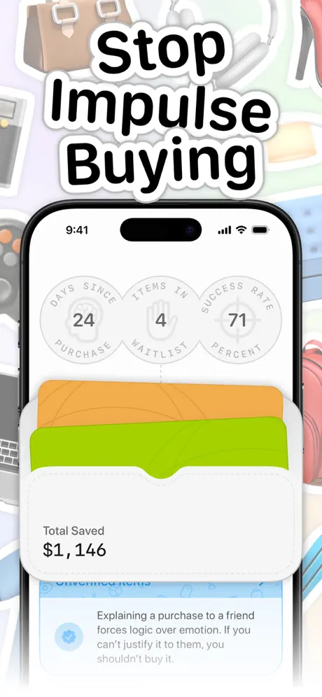
In Frame 1, the headline 'Stop Impulse Buying' is printed in a heavy, rounded sans-serif with a pronounced white outer stroke and diffuse drop shadow, hovering roughly 40pt above the Dynamic Island. The background is a dense collage of aspirational clutter—handbags, headphones, game controllers, keyboards—rendered as soft-edged stickers in pastel tones. Inside the phone, the app screen presents three light gray circular badges (#E5E5EA) arranged horizontally. Each badge uses a circular text path reading 'DAYS SINCE PURCHASE,' 'ITEMS IN WAITLIST,' and 'SUCCESS RATE PERCENT,' with large black numerals centered: 24, 4, and 71. Below the circles, two overlapping cards—one orange (#FFB340) and one green (#C4E538)—cast soft shadows. The lower portion of the screen shows 'Total Saved $1,146' in bold black near-hex #000000, followed by a white tip card containing the verbatim text: 'Explaining a purchase to a friend forces logic over emotion. If you can't justify it to them, you shouldn't buy it.' The crop hides the tab bar entirely, focusing attention on the stats and the savings figure. The headline and device are locked into a single vertical column, with roughly 32pt of clearance between the headline descenders and the status-bar time.
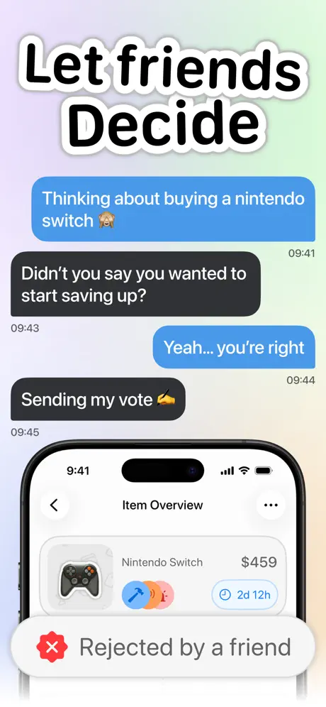
Introspect App Store screenshot 2 — Let friends Decide
02

Let friends Decide

On-frame caption: “Let friends Decide

The headline reads 'Let friends Decide,' maintaining the sticker-logotype treatment. The background shifts to a soft gradient running from lavender (#E6D5F5) at the top to pale mint (#D5F5E3) at the bottom. The canvas is split horizontally: the upper 50% displays a fabricated iMessage transcript outside the phone. Blue bubbles (#007AFF) carry the text 'Thinking about buying a nintendo switch 🙈' and 'Yeah... you're right,' while dark gray bubbles (#1C1C1E) reply with 'Didn't you say you wanted to start saving up?' and 'Sending my vote ✍️.' Timestamps sit at 09:41, 09:43, 09:44, and 09:45, mirroring the phone's status bar for continuity. The lower half shows the device cropped at mid-screen, displaying the 'Item Overview' header with a back chevron and overflow menu. Inside the list, a game-controller icon precedes 'Nintendo Switch' and '$459.' Three overlapping circular avatars—blue with a hammer, orange generic, and pink with a person—signal votes. A timer pill reads '2d 12h' in blue. A white floating banner with a diffuse shadow overlays the bottom edge, carrying a red octagon X (#FF3B30) and the verbatim text 'Rejected by a friend.' By staging the conversation outside the bezel, the frame explains the social mechanic without consuming any in-app pixels.

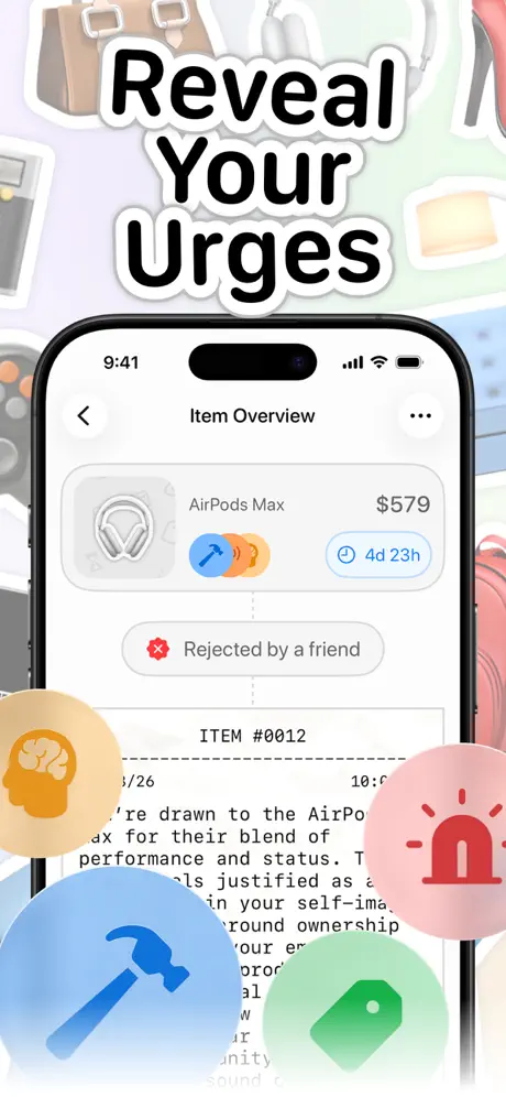
Introspect App Store screenshot 3 — Reveal Your Urges
03

Reveal Your Urges

On-frame caption: “Reveal Your Urges

'Reveal Your Urges' returns to the sticker-collage background. The device displays another 'Item Overview,' this time for 'AirPods Max' at '$579.' The same vote-avatar pattern appears, along with a blue timer reading '4d 23h.' A gray pill below the product row contains a red X and the text 'Rejected by a friend.' Beneath that, the UI shifts to a receipt metaphor: monospaced type reads 'ITEM #0012,' '3/26,' and a time stamp beginning with '10:0.' The body copy, partially visible, starts with 'You're drawn to the AirPods Max for their blend of performance and status.' Four massive translucent circles break out of the phone boundaries: a yellow circle (#FFCC00 at ~80% opacity) with a brain icon, a pink circle (#FF2D55) with a siren, a blue circle (#007AFF) with a hammer, and a green circle (#34C759) with a price tag. These circles range from roughly 100pt to 140pt in diameter and overlap the lower bezel, obscuring the receipt text beneath them. The headline drops lower than in Frame 1, sitting only about 16pt above the Dynamic Island, compressing the top safe zone. The palette remains consistent with the semantic color system introduced earlier, but the overlay density is the highest of the set.

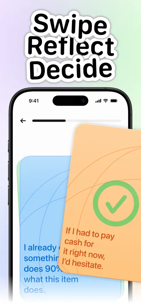
Introspect App Store screenshot 4 — Swipe Reflect Decide
04

Swipe Reflect Decide

On-frame caption: “Swipe Reflect Decide

The headline 'Swipe Reflect Decide' sits above a gradient background nearly identical to Frame 2's lavender-to-mint wash. This is the most restrained composition. The device shows a card-stack interface cropped tightly on the left, hiding most of the bezel and emphasizing motion. At the top, a back arrow and a short black progress bar (~4pt weight, roughly 80pt long) indicate a sequenced flow. The rear card is powder blue (#A2D2FF) with the verbatim text: 'I already own something that does 90% of what this item does.' The front card, offset down and to the right in peach (#FFCC99), reads: 'If I had to pay cash for it right now, I'd hesitate.' That orange card carries a large green ring (#34C759) with a white checkmark, roughly 56pt in diameter. The type on the front card is set in a burnt orange (#C05621) rather than black, keeping the palette warm. By removing all other UI chrome—no tab bar, no headers, no product images—the frame isolates the reflection mechanic. The swipe gesture is implied by the diagonal offset and the soft shadow under the front card. The headline clearance is generous here, about 48pt above the status bar, giving the composition room to breathe.

Introspect App Store screenshot 5 — Own The Outcome
05

Own The Outcome

On-frame caption: “Own The Outcome

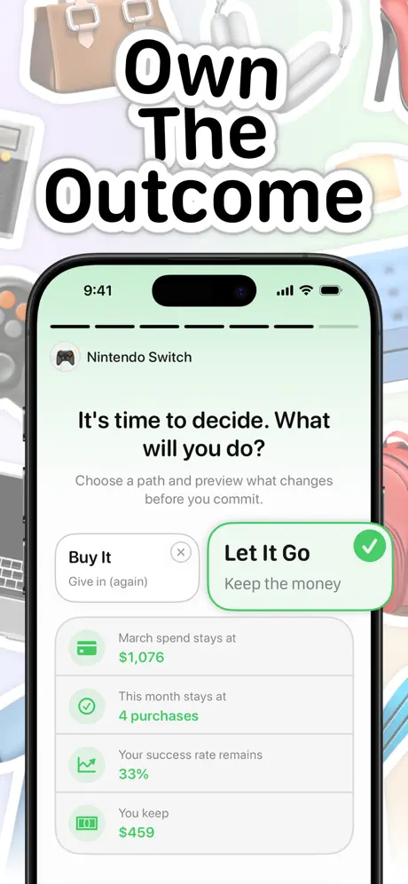
'Own The Outcome' reintroduces the sticker-collage background. Inside the phone, the screen centers on a binary decision. A game-controller icon introduces 'Nintendo Switch,' followed by the prompt 'It's time to decide. What will you do?' and the subtitle 'Choose a path and preview what changes before you commit.' Two large tap targets appear side by side in spirit but stacked vertically: 'Buy It / Give in (again)' is rendered in muted gray with a small gray X circle, while 'Let It Go / Keep the money' is highlighted with a 2pt mint-green border (#34C759) and a green checkmark. Below, four outcome rows use left-aligned icons and green text (#34C759) to list consequences: a credit-card icon with 'March spend stays at $1,076,' a checkmark with 'This month stays at 4 purchases,' a chart icon with 'Your success rate remains 33%,' and a cash icon with 'You keep $459.' The app background is a very pale green wash (#F2FFF5), echoing the savings card from Frame 1. The composition is strictly symmetrical, stabilizing the sequence after the asymmetrical overlays of the previous frame. The status bar remains consistent at 9:41.

Introspect App Store screenshot 6 — Weekly Tips
06

Weekly Tips

On-frame caption: “Weekly Tips

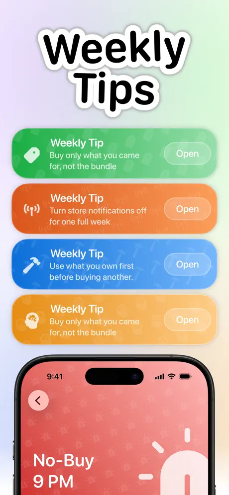
'Weekly Tips' uses the gradient background. The top two-thirds of the canvas are dominated by four full-width rounded rectangles, each roughly 120pt tall with 24pt corner radii. From top to bottom: a green card (#34C759) with a tag icon and the text 'Weekly Tip Buy only what you came for, not the bundle'; an orange card (#FF9500) with a sound-wave icon and 'Weekly Tip Turn store notifications off for one full week'; a blue card (#007AFF) with a hammer icon and 'Weekly Tip Use what you own first before buying another.'; and a yellow card (#FFCC00) with a brain icon that repeats the first tip verbatim: 'Weekly Tip Buy only what you came for, not the bundle.' Each card carries a right-aligned ghost button labeled 'Open.' The bottom third shows the device displaying a full-screen reminder in red-pink (#FF6B6B) with the text 'No-Buy 9 PM' and a minimalist alarm-clock illustration in white. The phone's back chevron sits inside a pink circle. By pushing the actual app into the lower 30% and letting the canvas cards dominate, the frame risks making the UI feel incidental, though it does signal a high volume of content.

Introspect App Store screenshot 7 — Track Your Impulses
07

Track Your Impulses

On-frame caption: “Track Your Impulses

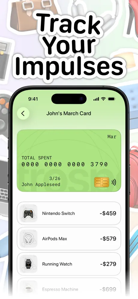
'Track Your Impulses' closes the set with the sticker-collage background, creating bookend symmetry with Frame 1. The device shows 'John's March Card,' a skeuomorphic credit-card view in lime green (#D4F5B8). The card spans nearly the full width of the screen with rounded corners. At top right, 'Mar' is printed in small black type. The label 'TOTAL SPENT' sits above segmented numerals reading '0000 0000 0000 3790' in a digital-display typeface. Below that, '3/26' and 'John Appleseed' flank a gold chip icon and a contactless symbol. Under the card, a transaction list presents four items with gray rounded-square icons: 'Nintendo Switch -$459,' 'AirPods Max -$579,' 'Running Watch -$279,' and 'Espresso Machine -$699.' The negative amounts are set in near-black (#1C1C1E). This frame leverages visual callback—the same game-controller and headphone icons appear in earlier frames—so the shopper recognizes continuity. The header 'John's March Card' uses a centered title with a back chevron in a pale green circle (#D4F5B8). Ending on the cost of failed impulses, rather than on another savings celebration, cleverly exploits loss aversion in the final beat of the swipe journey.

05The craft

Captions, colour and the mechanics of the sell

Caption pattern

Tight three-word imperatives in rounded sans-serif: 'Stop Impulse Buying,' 'Let friends Decide,' 'Reveal Your Urges,' 'Swipe Reflect Decide,' 'Own The Outcome,' 'Weekly Tips,' 'Track Your Impulses.' Each uses a thick white outer stroke with a soft drop shadow to pop against both busy collages and soft gradients.

Visual system

Two alternating background systems: a maximalist 3D sticker collage of physical goods (Frames 1, 3, 5, 7) and a soft lavender-to-mint gradient (Frames 2, 4, 6). Inside the phone, the UI relies on high-shadow cards, segmented seven-segment numerals, circular avatars, and a mint green semantic color for positive outcomes. The iPhone bezel is always a modern black model with the Dynamic Island status bar reading 9:41, full signal, Wi-Fi, and battery.

The thumbnail test

Frame 1's 'Stop Impulse Buying' headline in heavy sticker type over a collage of aspirational goods should arrest the scroll. However, the identical collage reuse by Frame 7 may dull the thumb-stop effect for returning viewers.

Conversion mechanics

The sequence is strongest when it turns app mechanics into emotional beats. 'Rejected by a friend' and 'Give in (again)' are micro-copy choices that carry judgment and humor, which convert better than 'Feature 3: Social Voting.' The decision preview in Frame 5 is a particularly strong conversion asset because it shows consequence before action.

06Where it slips

What we would change

Background fatigue undermines the hook

The sticker collage is effectively identical on Frames 1, 3, 5, and 7. By the seventh frame, the same brown handbag and white headphones lose all visual currency and read as lazy asset reuse. The fix is modular variation: maintain the sticker language but rotate the objects, densities, and drop-shadow angles so the background evolves with the story.

Headline stroke reads juvenile against high-ticket prices

The thick white outer stroke, while legible, creates a scrapbook aesthetic that might collide with the app's pricing context. Mock transactions of $459 and $579 suggest an audience with discretionary income that may find the treatment too young. Reducing the stroke width from roughly 8pt to 4pt, or replacing it with a soft 60% black drop shadow, would preserve legibility while adding tonal maturity.

Decorative overlays obscure functional text

Frame 3 breaks a fundamental App Store rule: the four floating circles—the blue hammer and pink siren in particular—sit directly on top of the receipt copy, hiding the psychoanalytic explanation. If the text is unreadable, the frame fails its communication goal. The circles should be scaled down to 60% of their current size and repositioned into the gutters beside the phone, not over it.

Duplicate copy weakens content promise

Frame 6 contains an unforced error: the first and fourth tip cards repeat the exact text 'Buy only what you came for, not the bundle.' In a seven-frame set, duplication reads as carelessness. Swapping the fourth tip for distinct content would immediately repair the credibility of the 'Weekly Tips' promise.

Green family lacks a single anchor hex

Frame 1 uses a yellow-lime (#C4E538), Frame 5 uses mint (#34C759), and Frame 7 uses pale spring (#D4F5B8). Without a single anchor hex, the brand color dissolves. The team should lock one primary green and derive tints for secondary surfaces.

07The recipe

How to apply this to your own app

  1. Sequence them.

    For designers preparing their own screenshot set, Introspect demonstrates that narrative sequence matters more than individual beauty. Do not treat frames as isolated billboards. Map them to an emotional journey: Frame 1 establishes the promise, Frame 2 introduces the mechanism, Frame 3 explains the psychology, Frame 4 shows the interaction, Frame 5 delivers the payoff, Frame 6 promises longevity, and Frame 7 proves consequence. When your frames chain together this way, the shopper swipes through a story, not a catalog.

  2. Use the margins.

    Use the canvas outside the device bezel to stage context. By placing iMessage bubbles, floating tip cards, and oversized icon orbs outside the phone, Introspect expands its storytelling real estate without crowding the UI. If you adopt this tactic, maintain strict hierarchy: the phone is the hero, and the external elements are supporting cast. Never let a decorative orb sit on top of readable text.

  3. Lock your semantic palette.

    Color discipline is non-negotiable. Even with loud sticker-collage backgrounds, Introspect keeps its functional semantics tight: green for positive outcomes, red for rejection, blue for time-bound actions. If your background is maximalist, your semantic palette must be locked to single hex values. Do not let marketing gradients drift into your functional greens.

  4. Vary your modular backdrops.

    A repeating pattern saves production time, but the shopper experiences it as visual stutter. Build three to four modular background states and alternate them meaningfully so the swipe journey feels progressive rather than loopy.

  5. Write copy as confessional dialogue.

    Write your mock data as if it were dialogue. 'Rejected by a friend,' 'John Appleseed,' '$1,146 saved'—these specifics let viewers project themselves into the app faster than any feature bullet. Write copy that sounds like a confessional, not a press release. If you can make a shopper feel the sting of a denied Nintendo Switch in under three seconds, you have already done the hardest part of App Store design.

08Takeaways

Five things worth stealing

  • Emotional storytelling converts better across this set than dense feature labels would
  • Staging content outside the hard phone boundaries adds narrative room without UI clutter
  • The team correctly leads with a savings figure ($1,146) as a concrete payoff before explaining mechanics
  • Loss aversion is deployed effectively in the final frame by showing sunk costs rather than another celebration of restraint
  • Apparent product/eventual text occlusion under floating decorative elements wastes potential proof
09The verdict

What the set actually achieves

The final set treats the carousel as a comic strip. It alternates between busy collage backgrounds on odd frames and soft gradients on even frames, creating a rhythm that keeps the thumb engaged. By staging contextual content—iMessage transcripts, floating tip cards, psychological icon orbs—outside the device bezel, the team expands storytelling real estate without crowding the UI. The headline copy favors terse imperatives that read like chapter titles, and the device itself is always a modern iPhone with a visible Dynamic Island, cropped tightly enough that the hardware acts as a frame but never so tight that the side buttons disappear. The result is a narrative arc that moves from savings, to social rejection, to urge analysis, to reflection, to decision preview, to ongoing tips, and finally to loss tracking. Where the strategy is cohesive, the craft occasionally wobbles: repeating background assets, inconsistent greens, overlays that obscure text, and duplicate copy weaken what is otherwise a sophisticated pitch.

Designers launching behavioral-finance or habit-tracking apps in crowded wellness categories who need to differentiate through narrative sequencing rather than clinical minimalism. Teams debating whether to prioritize feature density or emotional arc in their first three screenshots will find the most relevant lessons in Frames 1–3. Solo developers seeking a high-production-value App Store aesthetic on a limited asset budget can study the alternating background systems and reusable sticker logic, though they should avoid the duplicate-copy and color-drift mistakes documented here.

10Questions

Frequently asked

Aren't the sticker-style headlines too playful for a finance app?

They narrow the audience to a younger demographic, which may be intentional, but the thick white stroke reduces perceived seriousness. The critique section above suggests a thinner stroke or soft shadow to maintain personality without undermining credibility.

Why place iMessage bubbles outside the phone rather than inside?

It expands storytelling real estate. If the bubbles were inside, the Item Overview detail would be cropped to an unreadable scale. By staging them on the canvas, the frame explains the social mechanic and still shows the UI verdict clearly.

Does the identical collage background actually hurt conversion?

It causes visual fatigue by Frame 7. The set would feel more premium if the collage evolved—swapping in winter coats for summer bags, for example—suggesting the app works year-round.

Why end on a 'loss' frame instead of another savings celebration?

Loss aversion is a stronger motivator than aspiration for this specific behavior-change app. Showing what you failed to resist primes the download better than repeating the 'Total Saved' card from Frame 1.

11Keep reading

Build your own screenshot set

Guides

The full set

7 shots
Introspect App Store screenshot 1Introspect App Store screenshot 2Introspect App Store screenshot 3Introspect App Store screenshot 4Introspect App Store screenshot 5Introspect App Store screenshot 6Introspect App Store screenshot 7

About the app

Screenshots and store metadata belong to Introspect. They are shown here for design commentary and criticism. The analysis on this page is original work by floow.design. View the original listing.

More Health & Fitness teardowns

Browse all →





