Lightpage app icon
ProductivityScreenshot teardown16 min read

Lightpage App Store screenshots

The App Store productivity category is a graveyard of cobalt-blue chat bubbles, neon checkmarks, and promises of ten-fold speed. Into that noise, Lightpage enters with screenshots that feel like the opposite of hustle culture: Impressionist gardens, serif headlines, and journal entries about fading butterflies. The set is an argument that an AI notebook should be sold like a literary quarterly, not a developer tool. Yet the ambition exposes fault lines — a duplicated frame, legibility gambles, and a color palette that wanders across the emotional spectrum without a tether. Below is a full audit of what works, what wastes space, and what a design team should steal (and fix) before shipping their own sequence.

Lightpage App Store screenshot 1
01At a glance

The set in one screen

Framing
Mixed — angled hardware (frames 1-2), front-facing hardware (frames 4, 6-7), no hardware (frames 3, 5, 8)
Captions
Large high-contrast serif headlines (editorial, warm white ~#F2F0EB); UI copy in neutral sans-serif (system/utility)
Backdrop
Full-bleed impressionist and pointillist paintings, heavily blurred or graded; no solid brand color
Type
The headline face appears to be a sharp, high-contrast transitional serif — likely Freight Display, Tiempos Headline, or a similar editorial cut — set in a warm white that avoids the sterility of pure #FFFFFF. Italics are used surgically ('writes back', 'resonate') to add spoken emphasis. UI copy inside the devices stays in a neutral sans, likely San Francisco or Inter, keeping the product readable against the decorative backgrounds. The size delta between headline and UI is aggressive: captions sit at roughly 36-48pt equivalent, while in-app body copy hovers around 15-17pt, creating a clear hierarchy of 'mood' vs. 'function'. Quote bubbles in frame 3 break from the serif system entirely, which is a smart move — testimonials need to feel like speech, not marketing.
UI / copy split
approximately 55:45. The screenshots dedicate generous real estate to headline copy, background art, and negative space. The UI is present but often small (frames 5, 6) or partially blurred by depth-of-field (frame 1), meaning the set prioritizes atmospheric persuasion over feature documentation. This is a deliberate editorial gamble: the product is trusting that a shopper will slow down to read the narrative, rather than scanning for a checklist of AI features.
Frame 1 job
Establish the category contradiction: a notebook that is also a conversation partner. Frame 1 must signal 'journal' (privacy, reflection, chronology) and 'intelligence' (cards, updates, synthesis) in a single glance.

Sampled palette

(deep sea-teal)#3A5F5F
(mossy garden green)#4A6741
(espresso/plum dark)#1F1A1E
(lavender mauve)#7B5E8C
(cornflower meadow blue)#5B7EB8
(sage UI accent)#8A9B80
02The challenge

What this screenshot set had to solve

The central design problem for Lightpage is categorical dissonance. App Store shoppers looking for journals expect calm, privacy, and familiarity — think Day One or Apple Notes. Shoppers encountering AI tools expect chat interfaces, prompt engineering, and functional cobalt accents. Lightpage sits at the awkward intersection: it is an AI product that asks users to be emotionally vulnerable. A screenshot set must therefore overcome immediate skepticism. It cannot look like ChatGPT in a diary skin, nor can it look like a pretty notebook with a hidden robot underneath. The team has only eight frames to prove three things: that the app remembers (continuity), that it listens (input modality), and that it responds with relevance (intelligence). Worse, the productivity category trains users to swipe fast, hunting for checklists and rating badges. The challenge is to slow the swipe without losing the shopper — to make reflection feel like a feature, not a bug.

The team is trying to sell memory and warmth inside a storefront built for speed. Their solution — a serialized story told through dummy data and museum-grade backgrounds — is brave, but the execution needed a stricter editor.
03The approach

How the set argues its case

The team adopts an editorial-curation strategy rather than a feature-list strategy. Instead of announcing 'Voice Input,' 'Weekly Reports,' and 'Smart Notifications' as isolated bullets, each frame is given a literary chapter heading ('Brain dump by speaking,' 'A weekly letter, just for you'). The backgrounds are not decorative gradients but blurred fine-art paintings, signaling that the app belongs in the same mental space as a Sunday afternoon gallery visit. A narrative thread — Emily joining the team, Saoirse and the anniversary dinner, the fading butterflies, the new manager role — runs through the dummy copy so that by frame 6, the 'weekly letter' feels earned because the shopper has already seen the raw entries. Hardware framing is treated dynamically: angled devices add physical premiumness (frames 1-2), straight-on devices maximize UI legibility (frames 4, 6-7), and abstracted UI elements (frames 3, 5, 8) break the rhythm to prevent monotony. The palette is intentionally environmental, shifting with the emotional tenor of each feature: deep teal for the hook, dark plum for intimate voice input, lavender for the synthesizing letter, sunlit fields for gentle reminders.

Lightpage positions itself not as a faster way to take notes, but as a more perceptive companion. The screenshots avoid task-management tropes (no checkboxes, no kanban boards, no timer badges). Instead, they lean into relationship language: 'writes back,' 'good company,' 'just for you.' This is a play for the emotional productivity niche — users who want insight, not optimization.

04Frame by frame

Every screenshot, and the job it does

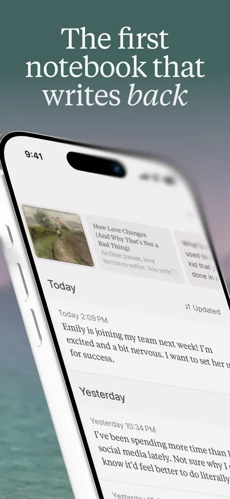
Lightpage App Store screenshot 1 — The first notebook that writes back
01

The first notebook that writes back

On-frame caption: “The first notebook that writes back

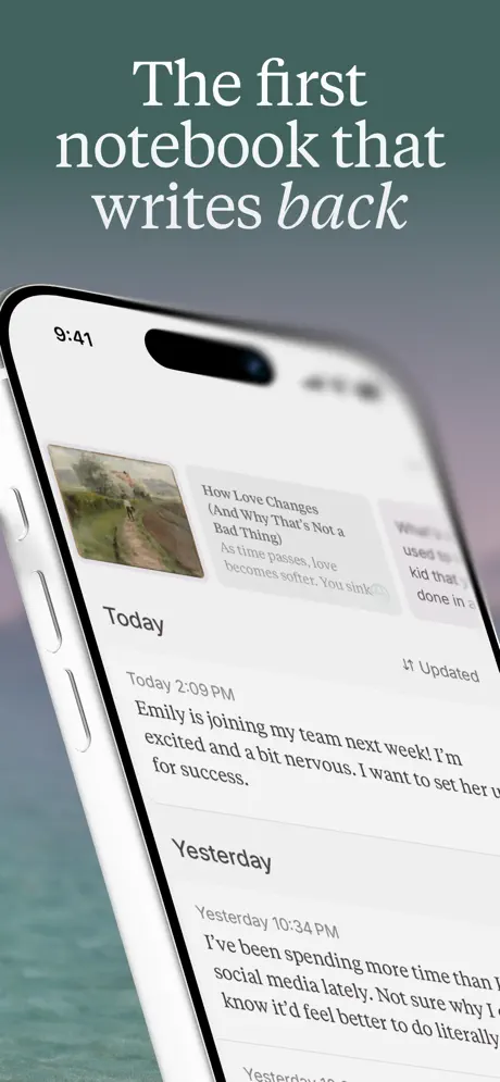
Frame 1 opens with an iPhone 15 Pro angled steeply in a three-quarter counter-clockwise rotation, the Dynamic Island and left-edge antenna bands clearly modeled. The background drifts from a desaturated deep sea-teal (~#3A5F5F) at the top into a hazy cerulean at the bottom, suggesting coastal fog. The headline sits in the upper third, set in a warm white serif (~#F2F0EB) at a generous display size, with “writes back” italicized to emphasize dialogic motion. On the device screen, the app presents a chronological journal feed under a “Today” header, anchored by a 2:09 PM entry: “Emily is joining my team next week! I'm excited and a bit nervous. I want to set her up for success.” Above the feed, a horizontal card carousel shows a pastoral painting of a dirt path paired with the title “How Love Changes (And Why That's Not a Bad Thing).” An “Updated” chip with an upward arrow appears to the right of the carousel, but its function is unexplained. The perspective angle and shallow depth-of-field soften the left and right edges of the screen, making the UI atmospheric but slightly illegible. The physical hardware lends premium weight, yet the frame’s real gambit is tonal: it is selling a notebook that talks, not an AI that stores.
Lightpage App Store screenshot 2 — Duplicate of Frame 1
02

Duplicate of Frame 1

On-frame caption: “The first notebook that writes back

Frame 2 is structurally identical to Frame 1. The same angled iPhone, the same 9:41 status bar, the same headline lockup, the same background gradient, the same “Emily” journal entry, the same pastoral path card, and the same “Updated” chip appear in the same positions with the same crops. No element has been shifted, enlarged, or re-composited. In an eight-frame App Store sequence, the second slot is a precious piece of narrative real estate — usually reserved for a secondary hook, a social-proof bleed, or a feature crescendo. By repeating the opener exactly, the set squanders its first follow-up impression. The shopper swiping from frame 1 to frame 2 receives no new information, no expanded context, and no deeper look at the product’s mechanics. It reads as either a staging error or a fundamental lack of a second argument. The fix is not to tweak the crop but to replace the frame entirely: a straight-on view of the same journal entry receiving an AI response, or a detail crop of the insight card expanding into a full reflection, would maintain continuity while proving the “writes back” promise rather than merely stating it again.

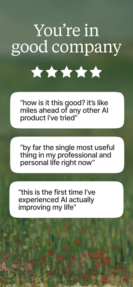
Lightpage App Store screenshot 3 — You're in good company
03

You're in good company

On-frame caption: “You're in good company

Frame 3 drops the device entirely, opting for a pure social-proof card against a heavily blurred impressionist garden in mossy greens and poppy reds. Centered at the top, the serif headline anchors the composition, followed by five white vector stars. Below, three stacked testimonial bubbles occupy the vertical center. Each bubble is a white rounded rectangle with generous internal padding (~20-24pt) and soft ambient shadow. The first quote reads: “how is it this good? it's like miles ahead of any other AI product i've tried.” The second: “by far the single most useful thing in my professional and personal life right now.” The third: “this is the first time I've experienced AI actually improving my life.” The quotes use a neutral sans-serif in sentence case, ranging from casual lowercase to measured title case, which humanizes the testimonials. By removing the phone, the frame sacrifices immediate product context for emotional credibility. The risk is that the shopper, having just seen hardware, now swipes into an abstract poster; the reward is that five stars and italicized praise slow the scroll. The background blur is aggressive enough to render the painting into pure color-field abstraction, ensuring the white bubbles remain legible.

Lightpage App Store screenshot 4 — Brain dump by speaking
04

Brain dump by speaking

On-frame caption: “Brain dump by speaking

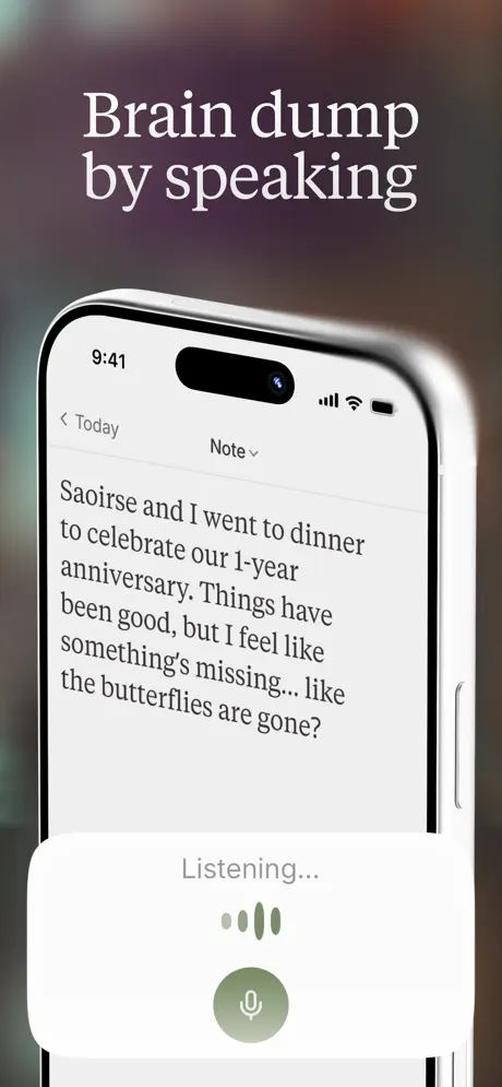
The fourth frame returns to hardware, but the iPhone is now front-facing and vertically centered, occupying roughly the lower two-thirds of the canvas. The background is the darkest in the set — a moody gradient plunging from espresso brown (~#1F1A1E) into deep plum — creating a sense of intimacy and interiority appropriate for voice input. The headline sits above in the same warm white serif. On the device screen, the app shows a note-taking state under a “Note” dropdown, with a back chevron labeled “Today.” The body text is a raw, vulnerable journal entry: “Saoirse and I went to dinner to celebrate our 1-year anniversary. Things have been good, but I feel like something's missing... like the butterflies are gone?” At the bottom, a modal sheet rises containing the word “Listening...” in muted gray, four vertical waveform bars in desaturated sage (~#8A9B80), and a large circular microphone button filled with the same sage tone. The straight-on framing makes the UI text crisp, correcting the legibility issues of the angled opener. This frame is the strongest functional proof in the set: it shows input modality, emotional tone, and UI clarity simultaneously.

Lightpage App Store screenshot 5 — Perspectives that resonate
05

Perspectives that resonate

On-frame caption: “Perspectives that resonate

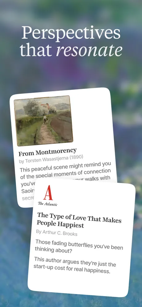
Frame 5 abandons hardware again in favor of two overlapping white cards floating against a heavily blurred background of cobalt and emerald that suggests water-lilies or riverside foliage. The headline “Perspectives that resonate” uses the now-familiar serif formula, with “resonate” italicized. The rear card, tilted approximately eight degrees clockwise, displays a landscape painting titled “From Montmorency by Torsten Wasastjerna (1890)” and a truncated body line beginning “This peaceful scene might remind you of the special moments of connection...” with visible mentions of “Saoir” and “secre” cut off by the frame edge. The front card overlaps from the lower right, carrying The Atlantic’s red “A” logotype and an article teaser: “The Type of Love That Makes People Happiest” by Arthur C. Brooks. The teaser text explicitly references the previous frame’s journal entry: “Those fading butterflies you've been thinking about? This author argues they're just the start-up cost for real happiness.” Both cards employ a 12–16pt corner radius and rely on negative space rather than borders or strokes. While elegant, this frame pushes thumbnail legibility to its limit; the card text is the smallest in the sequence and risks becoming a gray smudge at store-scale. The narrative callback is sophisticated, but the design trade-off is real.

Lightpage App Store screenshot 6 — A weekly letter, just for you
06

A weekly letter, just for you

On-frame caption: “A weekly letter, just for you

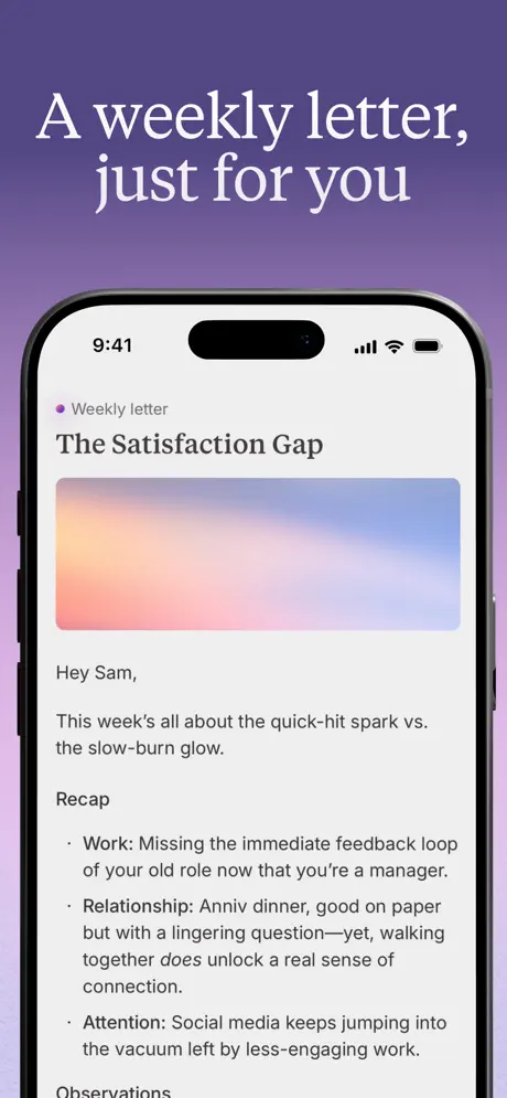
Frame 6 presents a front-facing iPhone against a solid-to-gradient background of muted plum and soft lavender (~#7B5E8C at the top, bleeding toward ~#C4B5D4 at the bottom). The headline “A weekly letter, just for you” maintains the two-line serif cadence. On screen, a “Weekly letter” header with a small purple dot indicator precedes the title “The Satisfaction Gap.” A wide, rounded-corner hero gradient spans the screen in peach and periwinkle, acting as a calming visual separator. The salutation “Hey Sam,” grounds the feature in personalization. Below, a “Recap” section presents three dense bullets: “Work: Missing the immediate feedback loop of your old role now that you're a manager.” “Relationship: Anniv dinner, good on paper but with a lingering question—yet, walking together does unlock a real sense of connection.” “Attention: Social media keeps jumping into the vacuum left by less-engaging work.” An “Observations” header peeks at the bottom edge, suggesting scroll depth. This frame shifts the set from emotional atmosphere to functional proof, demonstrating synthesis. The trade-off is information density: at thumbnail scale, the bullets blur into a single gray block, and the shopper must already be invested to read this closely. A better treatment might have bolded the category tags (Work, Relationship, Attention) so the scan-line carried meaning even unread.

Lightpage App Store screenshot 7 — Here to talk, when you want
07

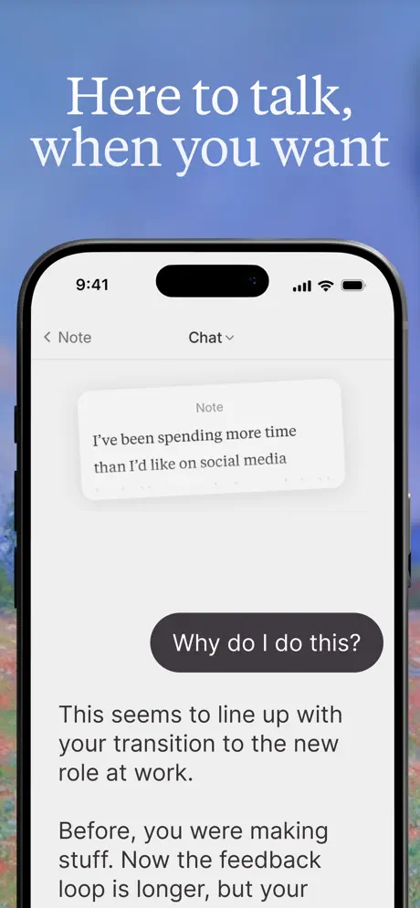
Here to talk, when you want

On-frame caption: “Here to talk, when you want

Frame 7 shows another front-facing iPhone, this time against a background of blurred blue sky above a wildflower meadow in cornflower and poppy tones. The headline breaks across two lines, with a comma hanging after “talk.” The screen displays a chat interface toggled via a “Chat” dropdown beside a back chevron labeled “Note.” A light gray bubble labeled “Note” contains the text: “I've been spending more time than I'd like on social media.” Below it, a dark charcoal bubble (~#3A3A3C) with white text asks: “Why do I do this?” — modeling the user’s own self-inquiry rather than an external AI prompt. The app’s response appears as left-aligned body text beneath the bubbles: “This seems to line up with your transition to the new role at work. Before, you were making stuff. Now the feedback loop is longer, but your...” The truncation is purposeful, inviting the shopper to imagine the continuation. The visual hierarchy is excellent: the dark inquiry bubble reads as a user utterance because of its pill shape, while the light text below reads as the app’s reflective analysis. This frame manages to explain the conversational AI layer without showing a typing indicator or robot avatar, preserving the human tone.

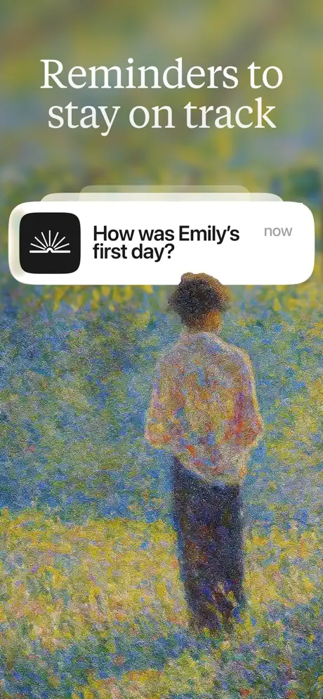
Lightpage App Store screenshot 8 — Reminders to stay on track
08

Reminders to stay on track

On-frame caption: “Reminders to stay on track

The final frame removes the device once more. A single iOS-style push notification banner hovers in the upper third against a full-bleed pointillist painting of a solitary figure standing in a field of violet, gold, and emerald — strongly reminiscent of Seurat. The headline “Reminders to stay on track” sits above in the established serif. The notification itself is a white rounded rectangle with the app’s black square icon on the left: a white radial sunburst or open book glyph. The copy reads “How was Emily's first day?” with a gray “now” timestamp aligned flush right. The figure in the painting stands with hands behind their back, facing away, providing a contemplative negative space that the notification gently invades. Without a lock screen or device silhouette, however, the notification hangs in ambiguous space. The shopper cannot immediately tell whether this is a push alert, an in-app banner, or a widget; the “now” timestamp suggests iOS system UI, but the lack of a status bar or wallpaper removes the context that would make the mechanic legible. The narrative callback to Emily (introduced in Frame 1) is a smart bookend, but the execution would be stronger if the banner sat on a darkened lock screen with a standard wallpaper, providing scale without killing the artistic mood.

05The craft

Captions, colour and the mechanics of the sell

Caption pattern

The captions follow a consistent two-line (sometimes three-line) stack: a declarative clause in roman, followed by an emotional qualifier or feature promise, often italicized. They read like chapter titles or gallery wall text rather than marketing slogans.

Visual system

The system is built on tension: organic vs. digital, historical vs. technological. Fine-art backgrounds (Monet-style gardens, Seurat pointillist fields, anonymous pastoral oils) are blurred into soft environmental color. Against these, iPhone hardware is rendered with clinical precision — chamfered edges, accurate button placement, Dynamic Island. The UI inside the phones is deliberately plain: white cards, gray chat bubbles, black text, system glyphs. This three-layer cake (painting → hardware → UI) ensures that the app itself feels like a clean window into a busier, more emotional world.

The thumbnail test

At small scale, the set reads as a series of gentle color fields with white text. The serif headlines maintain legibility better than sans would, thanks to their stroke contrast. However, frame 6 collapses into a gray-text block because the bullet points are too dense. Frame 5’s overlapping cards become illegible smudges. The angled phone in frame 1 looks like a sleek device shot, but the screen content is lost entirely in thumbnail view.

Conversion mechanics

The set makes a strong emotional case, but conversion-heavy elements are sparse. There is no mention of price, trial, App Store Editor mention, or award badge. Frame 3 provides social proof via testimonials, but there is no numerical rating (4.9, 5.0) or download count. For a subscription app in productivity, this is either a confident premium play or a missed opportunity to reduce purchase anxiety.

06Where it slips

What we would change

Burning Frame 2 on an exact duplicate

The second screenshot is pixel-for-pixel identical to the first. In an App Store context, this is not redundancy; it is waste. The shopper who swipes once receives zero new data. The fix is decisive: replace Frame 2 with a complementary angle or state change. A straight-on crop of the journal feed showing an AI response appearing beneath the Emily entry would prove the headline’s promise while keeping the narrative thread intact. At minimum, the frame should show a different time of day, a different card in the carousel, or a zoomed detail of the insight UI. As it stands, the duplication suggests a team that ran out of arguments after the hook.

Atmospheric blur erasing product proof

Frame 1 uses a steep perspective angle and shallow depth-of-field that softens the edges of the phone screen. Because this is the first impression, the shopper cannot actually read the journal entries that establish the narrative continuity. The product’s core value — intelligent, memory-driven text — is literally out of focus. The fix is to flatten the perspective slightly and deepen the focal plane so the UI remains tack-sharp while keeping the premium hardware angle. If the screen content is illegible, the frame becomes a generic phone mockup, and the ‘notebook’ differentiation is lost.

Background palette whiplash

The set swings from oceanic teal (frame 1) to mossy garden green (frame 3) to espresso plum (frame 4) to lavender (frame 6) to cornflower meadow (frame 7) to sunlit pointillist field (frame 8). Each frame is beautiful in isolation, but at swipe-speed they read as disconnected scenes. The shopper may not perceive these as chapters of one app. The fix is a unified color grade — perhaps lifting shadows toward a consistent mauve or desaturating all backgrounds by 10% — so the frames feel like movements in a single suite rather than entries in a gallery auction. Brand recognition on the App Store depends on chromatic consistency; this set sacrifices that for mood.

Abstract notification lacking system context

Frame 8 presents a push notification floating in space without a lock screen, status bar, or phone bezel. Because the notification uses native iOS styling (white rounded rectangle, app icon left, timestamp right), its lack of a container creates an uncanny effect: the shopper cannot verify where or how this reminder arrives. The fix is to composite the banner onto a darkened iOS lock screen with a standard clock and wallpaper, or to keep the full pointillist painting but add a faint phone silhouette behind the banner. Providing system context turns a conceptual promise into a believable mechanic.

07The recipe

How to apply this to your own app

  1. Use narrative dummy data, not lorem ipsum

    Lightpage’s greatest strength is the serialized story running through its screenshots. Emily, Saoirse, the butterflies, and the new manager role reappear across frames, proving that the app remembers. When building your own set, write a micro-fiction script before designing the screens. A shopper who recognizes a name from frame 1 in frame 6 feels the product’s memory function before reading a single feature bullet.

  2. Split your typographic personality

    The set uses a high-contrast serif for headlines and a neutral sans for UI. This split allows the frame to feel editorial and human on the outside while remaining functional and readable on the inside. Match your headline face to the emotional register of your category: fitness apps might use a compressed grotesque, wellness apps a soft serif, finance apps a sharp neo-grotesque. Never let your marketing type and your UI type compete for the same job.

  3. Vary your hardware treatment to control pacing

    Lightpage alternates between angled hardware (physical, premium), straight-on hardware (legible, factual), and no hardware (abstract, emotional). This rhythm prevents the visual monotony that kills swipe-through rates. Plan your sequence like an edit: open with an angle to establish objectness, cut to straight-on for features, and drop the device entirely for testimonials or conceptual promises.

  4. Grade your environments to one master LUT

    If you use photographic or painted backgrounds, run every frame through a single color-grading LUT before export. Lightpage’s backgrounds clash because each painting carries its own native palette. A unifying grade — cooling shadows, lifting blacks toward a shared tint — would have made the sequence feel expensive and cohesive rather than a collage of stock art.

  5. Never duplicate a frame

    The most fixable error here — Frame 2 repeating Frame 1 — is also the most damaging. In an eight-frame sequence, every slot is rent. Before shipping, audit your sequence as a rapid swipe animation. If any two adjacent frames feel like the same beat, delete one and design a bridge frame that advances the argument. Repetition is not emphasis; it is entropy.

08Takeaways

Five things worth stealing

  • Editorial visuals can differentiate an AI product from chatbot competitors, but only if every frame advances the narrative.
  • Narrative continuity in dummy data is a high-leverage trick that proves product memory without explaining algorithms.
  • Angled hardware adds premiumness at the cost of legibility; reserve straight-on framing for dense or explanatory UI.
  • A unified background grading system is essential when using varied photographic or painted environments.
  • Social proof and testimonials work best when the device disappears, letting the words breathe.
  • Never waste the second frame on a duplicate — it trains the shopper that swiping yields no new information.
09The verdict

What the set actually achieves

A visually distinctive, narrative-driven sequence that successfully differentiates Lightpage from utilitarian competitors, but one that is undermined by a duplicated frame, inconsistent environmental color grading, and moments where atmosphere overrides legibility.

Designers building screenshot sets for emotionally positioned productivity, wellness, or journaling apps — especially those integrating AI — who need to communicate trust and continuity rather than feature velocity. Also useful for teams debating whether to lead with hardware shots or abstract UI in narrative-driven sequences.

10Questions

Frequently asked

What typeface does Lightpage appear to use for headlines?

A high-contrast transitional serif, likely in the vein of Tiempos Headline, Freight Display, or a similar editorial cut with sharp thins and a warm tone. The italic is used surgically for emphasis within the headline.

Why is Frame 2 such a significant error?

In App Store optimization, the first two frames are the most viewed. Frame 2 being identical to Frame 1 means 12.5% of the sequence conveys zero new information. It breaks narrative momentum and suggests a lack of secondary selling points.

How does the set handle the 'AI' aspect without looking like a chatbot?

By avoiding robot iconography, neon accents, and typing indicators. AI is communicated through narrative callbacks (the weekly letter referencing earlier journal entries) and conversational UI that uses muted colors, serif editorial framing, and relationship-oriented language.

What is the specific color of the microphone button in Frame 4?

Approximately a desaturated sage green, sampled around ~#8A9B80, used consistently for the waveform bars and the circular mic button.

11Keep reading

Build your own screenshot set

The full set

8 shots
Lightpage App Store screenshot 1Lightpage App Store screenshot 2Lightpage App Store screenshot 3Lightpage App Store screenshot 4Lightpage App Store screenshot 5Lightpage App Store screenshot 6Lightpage App Store screenshot 7Lightpage App Store screenshot 8

About the app

Screenshots and store metadata belong to Lightpage. They are shown here for design commentary and criticism. The analysis on this page is original work by floow.design. View the original listing.

More Productivity teardowns

Browse all →