Loominote app icon
ProductivityScreenshot teardown12 min read

Loominote App Store screenshots

Loominote

Set published by BinaryVlue · 7 frames analysed

5.0 · 4 ratingsFreev6.4.1Updated 4mo ago
Loominote App Store screenshot 1
01At a glance

The set in one screen

Framing
Hardware-dominant for the first half, then shifting to abstract feature cards and social proof.
Captions
Bold, imperative headlines with gradient text accents and heavy use of pill-shaped tags.
Backdrop
Predominantly warm off-white and pale gray, except for a single disruptive sky-blue frame.
Type
Geometric sans-serif, likely SF Pro Display, with oversized bold headlines for glanceability.
UI / copy split
60:40
Frame 1 job
Establish input modalities and brand name recognition.

Sampled palette

#F8F9FB#F8F9FB
#FF5F2E#FF5F2E
#E040FB#E040FB
#2979FF#2979FF
#1D1D1F#1D1D1F
#9CA3AF#9CA3AF
02The challenge

What this screenshot set had to solve

The Productivity category on the App Store is saturated to the point of semantic dilution: every second app promises to turn voice or text into structured tasks. For Loominote, the design problem is not explaining the hook but proving depth across multiple input types, platforms, and use cases inside a rigid seven-frame swipe limit. The set must communicate voice capture, file upload, transcription, task extraction, calendar integration, and multi-device sync without collapsing into feature-itis. That challenge is complicated by a persona gap visible in the tags: the same interface must feel credible to a surgical resident reviewing tasks like 'Morning Surgery - Cardiac Bypass' and accessible to students seeking 'Quizzes' or 'ADHD-friendly structure.' Too clinical and the app feels cold; too playful and it loses professional trust. There is also the thumbnail paradox: at search-result scale, only color blocks and headlines register, yet at full bleed shoppers expect plausible UI density. Loominote attempts to thread this needle by front-loading hardware realism in the opening frames and retreating toward abstract promise and social proof at the end, effectively treating the sequence as a funnel from evidence to argument.

The set knows what it wants to prove, yet occasionally sacrifices visual cohesion to list features.
03The approach

How the set argues its case

The art direction anchors itself in a near-white neutral ground—roughly #F8F9FB to #FFFFFF—reserving chromatic energy for two controlled outlets: a warm-to-cool gradient text treatment ranging from #FF5F2E through #E040FB to #2979FF, and a tight family of pill-shaped feature tags with categorical icon colors. By keeping backgrounds clinical, the design ensures that a shopper scrolling at speed registers the headlines before anything else. Typography relies on a heavy geometric sans, likely SF Pro Display, with massive imperative statements like 'Speak. Scan. Upload. Record.' occupying the upper half of frames to survive aggressive App Store compression. Device framing is treated as theatrical stage dressing rather than catalog photography: iPhones are aggressively cropped along diagonals, with only the bottom chin and screen edge visible, creating dynamic asymmetry against rows of centered text. The sequence follows a deliberate narrative arc: frame one states the input thesis with floating modality pills; frame two delivers transformation proof via a literal before-and-after split; frame three humanizes the output for specific personas behind a frosted card; frame four widens the hardware ecosystem to iPad and Apple Watch; frame five pivots to scheduling utility; frame six detours into abstract feature breadth; and frame seven closes on mascot and social proof.

Positioned as a universal capture-and-organize utility for professionals, students, and neurodivergent productivity seekers, avoiding the narrow niche of pure meeting transcription by showing medical, academic, and business contexts.

04Frame by frame

Every screenshot, and the job it does

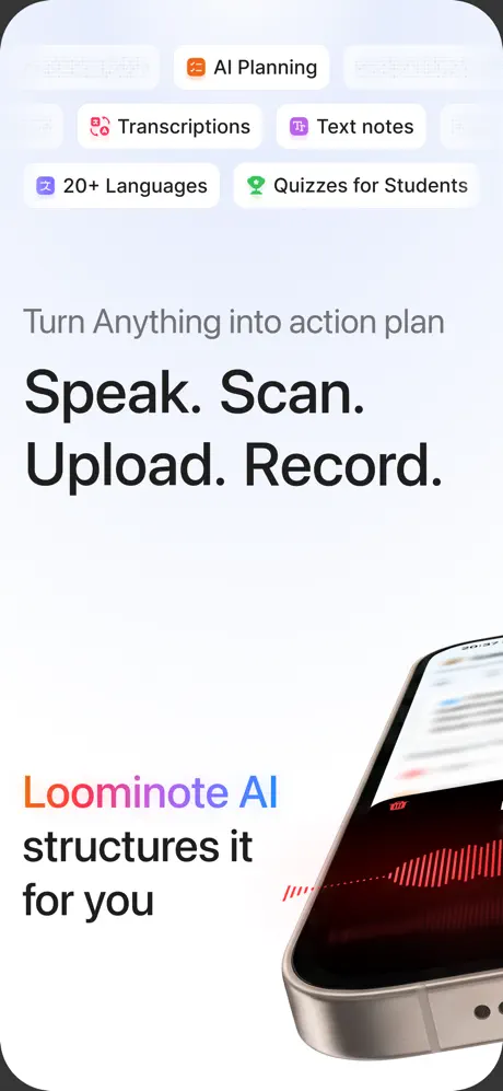
Loominote App Store screenshot 1 — Speak. Scan. Upload. Record.
01

Speak. Scan. Upload. Record.

On-frame caption: “Turn Anything into action plan / Speak. Scan. Upload. Record. / Loominote AI structures it for you

The opening shot is a study in asymmetrical balance. The upper third is occupied by floating pill-shaped tags—'AI Planning,' 'Transcriptions,' 'Text notes,' '20+ Languages,' and 'Quizzes for Students'—each paired with a small icon and rendered with faint gray strokes against a pale #F0F4F8 ground. These pills stagger horizontally in two rows, creating gentle rhythm without demanding fixation. Beneath them, the typography cascades in three weights: a muted gray subhead reading 'Turn Anything into action plan' in roughly #6B7280, a massive bold black imperative 'Speak. Scan. Upload. Record.' in #1D1D1F, and finally the product lockup 'Loominote AI' set in the warm-to-cool brand gradient, followed by the plain black 'structures it for you.' The lower right corner is invaded by the oblique edge of a physical iPhone render, its screen showing a red audio waveform against pure black. By cropping the device below the midpoint, the designer forces the eye to travel from the abstract promise at top left to the tangible hardware at bottom right, implying the microphone is already listening.
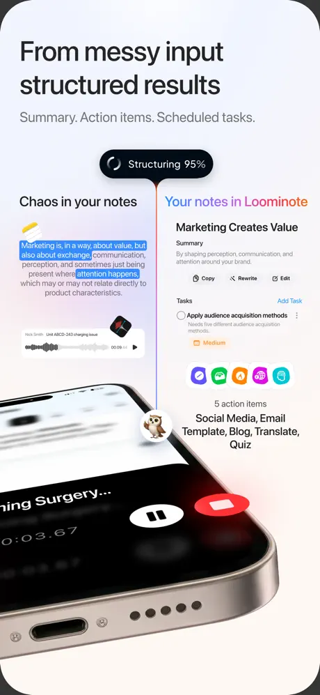
Loominote App Store screenshot 2 — From messy input structured results
02

From messy input structured results

On-frame caption: “From messy input structured results / Summary. Action items. Scheduled tasks.

This frame is the narrative fulcrum of the entire set. A vertical divider splits the canvas into 'Chaos in your notes' on the left and 'Your notes in Loominote' on the right, with a black lozenge at the top center announcing 'Structuring 95%' to literalize the AI processing metaphor. The left side shows messy highlighted text fragments in blue and an audio player labeled 'Nick Smith Unit ABCD-243 charging issue' at 00:09, while the right side presents a sanitized output card titled 'Marketing Creates Value' with a summary paragraph, tasks section, and five circular action icons in purple, green, orange, pink, and teal. The clever structural move is the oversized iPhone hardware at the bottom, its recording interface visible with a white pause glyph and a red stop circle; the owl mascot perches on the top bezel, bridging the two worlds. The color temperature stays cool and neutral, letting the blue highlight on the chaotic text and the orange gradient on 'Loominote' do the semantic heavy lifting. It is the most information-dense frame, yet the split layout prevents claustrophobia.

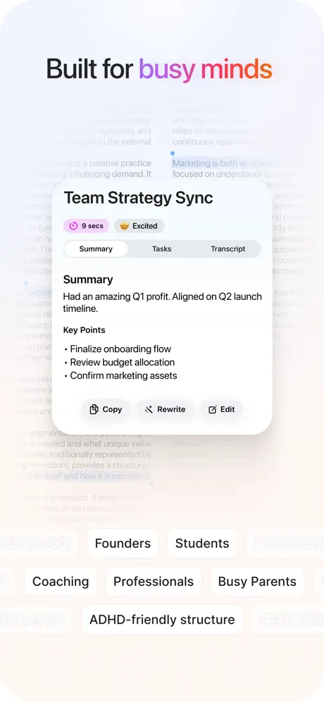
Loominote App Store screenshot 3 — Built for busy minds
03

Built for busy minds

On-frame caption: “Built for busy minds / Team Strategy Sync / Summary / Tasks / Transcript / Copy / Rewrite / Edit / Founders / Students / Coaching / Professionals / Busy Parents / ADHD-friendly structure

Depth is the operative word here. Instead of hardware, the frame foregrounds a single frosted card titled 'Team Strategy Sync,' set against a blurred substrate of body text that suggests pages of notes receding into space. The card itself carries two small pills at top—'9 secs' with a pink timer icon and 'Excited' with a yellow emoji-face—immediately signaling metadata extraction. Below, a three-segment switch reads 'Summary / Tasks / Transcript,' with the Summary tab active and body copy reading 'Had an amazing Q1 profit. Aligned on Q2 launch timeline,' followed by bulleted key points. A row of tertiary actions—Copy, Rewrite, Edit—sits at the card's base in low-contrast gray. Above the card, the headline 'Built for busy minds' uses the brand gradient only on the words 'busy minds,' a disciplined restraint. The lower third scatters audience pills—'Founders,' 'Students,' 'Coaching,' 'Professionals,' 'Busy Parents,' and 'ADHD-friendly structure'—establishing persona targets without cluttering the central demonstration. The overall effect is gallery-like: one pristine artifact floating in a museum of context.

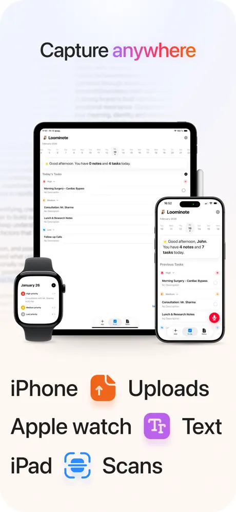
Loominote App Store screenshot 4 — Capture anywhere
04

Capture anywhere

On-frame caption: “Capture anywhere / iPhone Uploads / Apple watch Text / iPad Scans

After three frames of tight iPhone crops, the canvas opens into a multi-device chorus. An iPad Pro stands rear-center, an iPhone fronts it to the right, and an Apple Watch wedges in from the lower left, all displaying the same app context: a dated task list with items like 'Morning Surgery - Cardiac Bypass' and 'Consultation: Mr. Sharma.' The background continues the blurred-document motif, ensuring continuity with frame three. What distinguishes this shot is the bottom typography: three lines pair hardware names with input methods via bold icons—an orange upload arrow for 'iPhone Uploads,' a purple text glyph for 'Apple watch Text,' and a blue scanner for 'iPad Scans.' The iPhone and iPad screens are rendered at high fidelity, but the Watch face is tellingly simplified, showing only priority dots and truncated labels. The headline 'Capture anywhere' gradients the word 'anywhere,' maintaining the textual branding system. This frame sacrifices UI detail for ecosystem breadth, betting that the sight of three synchronized devices is a stronger conversion signal than another transcription close-up.

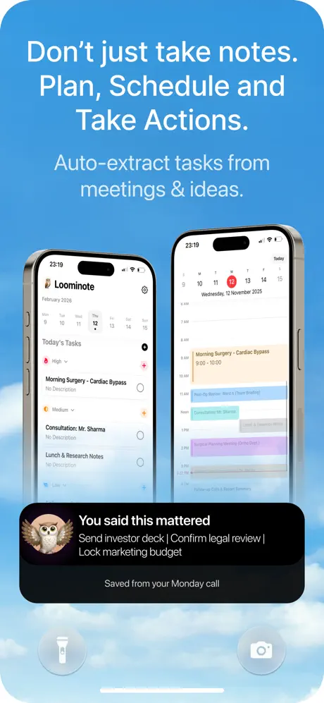
Loominote App Store screenshot 5 — Don't just take notes.
05

Don't just take notes.

On-frame caption: “Don't just take notes. Plan, Schedule and Take Actions. / Auto-extract tasks from meetings & ideas. / You said this mattered / Send investor deck | Confirm legal review | Lock marketing budget / Saved from your Monday call

Here the set breaks its own rules. The background shifts from warm neutrals to a photographic sky gradient—cobalt #2D8CFF bleeding into soft cloud whites—creating immediate tonal whiplash. White headlines read 'Don't just take notes. Plan, Schedule and Take Actions.' and 'Auto-extract tasks from meetings & ideas.' Below, two vertically oriented iPhone renders float side by side: the left displays a task-list view dated February 2026 with checkable items, the right a calendar agenda for Wednesday, 12 November 2025, with color-coded blocks for surgery, consultations, and planning meetings. At the bottom, a black dock-style card hosts the owl mascot and a quote: 'You said this mattered / Send investor deck | Confirm legal review | Lock marketing budget / Saved from your Monday call.' The hierarchy is sound—large white text, then devices, then the social-proof quote—but the frame introduces two unexplained translucent glyphs at the very bottom that resemble a flashlight and camera icon, seemingly floating in the sky. Whether these are navigational affordances or export artifacts, they pollute an otherwise clear composition.

Loominote App Store screenshot 6 — More than notes
06

More than notes

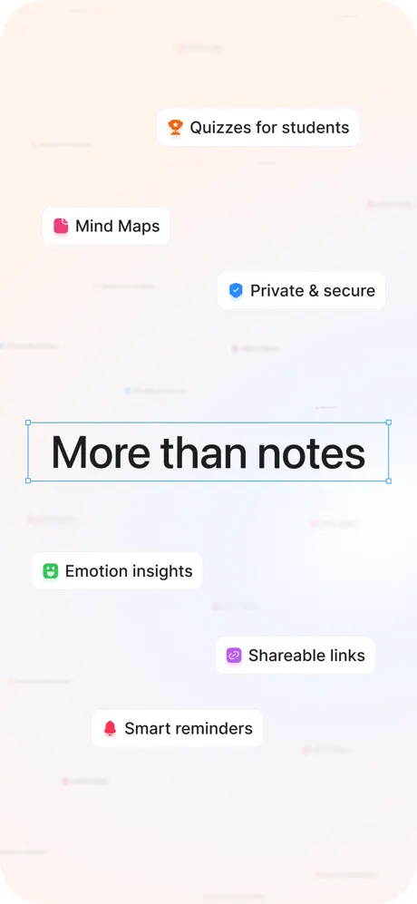
On-frame caption: “More than notes / Quizzes for students / Mind Maps / Private & secure / Emotion insights / Shareable links / Smart reminders

Abstraction takes over. There are no devices, no hands, no recognizably real UI—only a shifted-perspective field of blurred cards in warm cream and a central selectable text box reading 'More than notes' in bold black, complete with blue corner anchors as if the phrase is still being edited in a design tool. Around this focal point, six feature pills drift at irregular angles: 'Quizzes for students' in orange with a trophy icon, 'Mind Maps' in pink with a folder icon, 'Private & secure' in blue with a shield, 'Emotion insights' in green with a face grid, 'Shareable links' in purple with a chain, and 'Smart reminders' in red with a bell. The background is the lightest warm tint in the set, roughly #FDF8F5. By adopting a scattered, almost collaged layout, the frame attempts to communicate breadth and playfulness. However, removing all hardware context means the viewer has nothing to scale the features against; they become floating promises rather than demonstrated capabilities. The selection-box gag is conceptually clever—suggesting the app itself is the canvas—but at thumbnail size it risks scanning as a rendering error rather than an intentional graphic motif.

Loominote App Store screenshot 7 — Think clearly. Act ahead.
07

Think clearly. Act ahead.

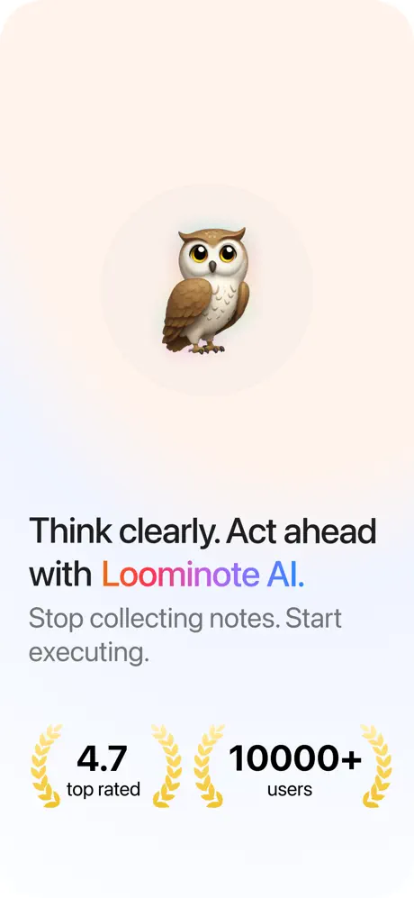
On-frame caption: “Think clearly. Act ahead with Loominote AI. / Stop collecting notes. Start executing. / 4.7 top rated / 10000+ users

The closing frame is a deliberate exhale. A soft radial gradient moves from warm peach at top to pale ice blue at bottom, centering the 3D owl mascot at roughly 30 percent of the frame's height. Below it, the text stack reads 'Think clearly. Act ahead with Loominote AI.' using the full gradient treatment on 'Loominote AI,' followed by the gray subhead 'Stop collecting notes. Start executing.' The bottom third is occupied by two trust badges: a '4.7 top rated' stat and a '10000+ users' stat, each flanked by golden laurel wreaths. There is no interface, no device, no feature tag—only brand, mascot, and social proof. The minimalism works because the preceding six frames have already done the explanatory labor. Yet the reliance on the owl feels slightly unearned; it appears in frame two and frame five as a cute accessory, but never with enough narrative weight to justify center-stage here. Still, as a terminal punctuation mark, the frame's generous negative space and centered axis provide a calm terminus to an otherwise visually busy sequence.

05The craft

Captions, colour and the mechanics of the sell

Caption pattern

Headlines follow a loose verb-forward formula: 'Turn Anything into action plan,' 'From messy input structured results,' 'Built for busy minds.' Subheads clarify the mechanism: 'Summary. Action items. Scheduled tasks.' This creates a scannable rhythm of promise, then proof.

Visual system

The set uses a restrained neutral chassis with high-contrast black typography. Accent color is applied sparingly to icons and gradient headline words, creating a system where purple, orange, pink, and blue serve as semantic tags rather than decorative noise. Shadows are soft and diffuse, suggesting elevation without harsh Material-style drops.

The thumbnail test

At small scale, the boldest elements are the black headlines and the sky-blue frame five, while UI details and mascot nuances disappear entirely. The gradient text is readable but not dominant. The before-and-after split of frame two is the most distinctive silhouette.

Conversion mechanics

The set leads with capability, proves transformation, then expands ecosystem and trust. The weakest conversion moment is frame six, which abstracts too far from demonstrated utility. The strongest is frame two, where the before-and-after split answers the shopper's primary question instantly.

06Where it slips

What we would change

Background temperature fracture

Frame five's aggressive sky-blue gradient shatters the neutral warm-white system established in frames one through four and six through seven. A shopper swiping rapidly will feel the bump. The fix is to commit to one temperature family throughout—either recolor the sky frame to a pale neutral with blue accent elements, or introduce the blue motif earlier so the shift feels intentional.

Gradient fatigue

The gradient text treatment appears in headlines on frames one, three, four, six, and seven. By the final frame it is no longer a highlight but a default, diminishing its power. The fix is to ration the effect to one or two hero moments—ideally the app name in frame one and the closing statement in frame seven only.

Orphaned mascot

The owl pops up in frame two, again in frame five's quote card, and dominates frame seven, yet its functional or brand role is never explained. It reads as decorative novelty. The fix is either to give the mascot a consistent presence across all seven frames as a progress indicator or avatar, or to remove it entirely from the intermediate frames so its closing appearance feels like a reveal.

Abstract detachment in frame six

By abandoning device mockups entirely for floating feature pills, frame six breaks the concrete-first promise of the opening sequence. 'Quizzes for students' and 'Mind Maps' are untethered from any interface context. The fix is to anchor at least one partial device bezel behind the pills, or overlay them onto a blurred app screenshot so the features remain spatially plausible.

Unexplained UI artifacts

Frame five contains two translucent circular icons at the bottom that resemble a flashlight and camera glyph floating over the clouds. They carry no caption and look like export artifacts or template residue. The fix is simple: remove them, or if they are intended as platform affordances, bind them to a clearly readable control bar.

07The recipe

How to apply this to your own app

  1. Maintain background consistency.

    Treat your canvas color temperature as a strict system variable, not a per-frame mood board. If you need a disruptive color for emphasis, introduce it as an accent shape or card, not as a full-background swap.

  2. Ration your chromatic accents.

    If you have one signature effect—gradient text, neon shadow, or glassmorphism—use it sparingly. App Store shoppers scroll fast; repetition dilutes visual hierarchy rather than reinforcing brand.

  3. Anchor abstract features to hardware.

    When you need to show breadth beyond interface screens, keep at least a sliver of a real device in frame. It provides scale and reminds the viewer that these features exist inside an app they can download, not in a concept video.

  4. Earn your mascot.

    If you introduce a brand character, give it a job across the sequence—progress indicator, guide, or avatar—so that its closing appearance feels like narrative payoff rather than sticker decoration.

08Takeaways

Five things worth stealing

  • The before-and-after split in frame two is the strongest storytelling device in the set, proving transformation faster than any headline can.
  • Multi-device framing in frame four is a high-leverage conversion tool for ecosystem-heavy categories.
  • Overusing a single visual effect—here, gradient text—across five of seven frames flattens hierarchy and weakens brand impact.
  • A mascot needs narrative consistency; otherwise it becomes visual noise.
  • Abstract feature callouts without hardware context risk feeling like marketing vapor rather than demonstrated capability.
09The verdict

What the set actually achieves

A seven-frame set that successfully demonstrates input-to-output transformation and ecosystem breadth, but suffers from tonal whiplash due to inconsistent background temperature and an over-reliance on gradient text accents.

Designers building utility apps that span professional and consumer use cases, particularly those needing to prove AI output quality while maintaining multi-platform credibility. Also instructive for teams tempted to over-use gradient accents.

10Questions

Frequently asked

Why does frame five use a sky background when the rest are neutral?

The designer likely wanted to signal 'freedom' or 'openness' to match the scheduling theme, but the execution is too literal and breaks the gallery's cohesion.

What makes frame two effective at thumbnail size?

The stark contrast between the messy blue-highlighted 'before' text and the clean structured 'after' card creates a readable silhouette even when compressed. The black 'Structuring 95%' pill acts as an anchor.

Should frame six have included a device?

Yes. Even a partially cropped iPhone behind the floating pills would have grounded the features in reality and preserved the visual system established in the first four frames.

Is the owl mascot necessary?

Not strictly, but if retained it needs a consistent role—perhaps as a progress spinner, a note avatar, or a summary icon—rather than appearing randomly as decoration.

11Keep reading

Build your own screenshot set

The full set

7 shots
Loominote App Store screenshot 1Loominote App Store screenshot 2Loominote App Store screenshot 3Loominote App Store screenshot 4Loominote App Store screenshot 5Loominote App Store screenshot 6Loominote App Store screenshot 7

About the app

Loominote helps you make sense of everything. Capture voice notes, meetings, random thoughts, scanned documents, PDFs, and text dumps, and turn them into clear summaries, action BinaryVlue, via the App Store listing.

Screenshots and store metadata belong to BinaryVlue. They are shown here for design commentary and criticism. The analysis on this page is original work by floow.design. View the original listing.

More Productivity teardowns

Browse all →