

Social proof, globe, and an orphaned script
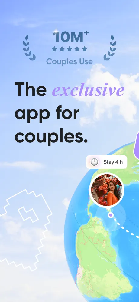
On-frame caption: “The exclusive app for couples.”
The opening frame establishes the visual vocabulary immediately, for better and worse. At top center, the text '10M+' is flanked by symmetrical laurel wreaths and five filled stars, with 'Couples Use' beneath in a lighter weight. This social-proof lockup is rendered in a muted blue-gray that sits only slightly darker than the cloudy #A8C8EC sky behind it, forcing the eye to work for credibility. Below, the headline 'The exclusive app for couples.' sets the word 'exclusive' in a violet italic script—#B57EDC—that never reappears in the remaining seven frames, making it feel like a borrowed asset rather than a systemic type choice. The lower half is dominated by a 3D globe showing the South American continent in saturated greens and blues, with a dotted orbit path terminating at a circular avatar photo of a woman in orange and a white pill badge reading 'Stay 4 h' with a clock icon. A pixelated white heart outline drifts on the lower left, forecasting the widget aesthetic in frame 6 but serving no immediate communicative purpose here. The absence of any device frame means the shopper cannot yet tell whether they are looking at rendered marketing art or captured interface, establishing an ambiguity that haunts the rest of the set.