Lovi app icon
SocialScreenshot teardown14 min read

Lovi App Store screenshots

Designing for the face is uniquely personal. When an app asks users to photograph their skin, analyze blemishes, and follow product recommendations, the App Store screenshots must resolve an immediate tension: they need to feel clinically credible enough to earn a camera-roll invitation, yet warm enough that a user isn’t afraid to see their own pores blown up on a phone screen. The Lóvi set tackles this by splitting the difference between a medical dashboard and a beauty editorial, using a strict six-frame device motif before abandoning hardware entirely for a human close-up.

Set published by Digital Skincare Inc · 7 frames analysed

4.6 · 3.1K ratingsFreev2.9.8Updated 4mo ago
Lovi App Store screenshot 1
01At a glance

The set in one screen

Framing
Rounded-rectangle device shell, ultra-thin white border, used in frames 1–6; frame 7 is full-bleed photography with no chrome.
Captions
Bold, centered sans-serif, ~36–40 pt, dark charcoal (#111827); secondary UI text sits at ~15 pt in #374151.
Backdrop
Gradients shift between pure white, cool neutral gray, and faint lavender-pink; no single ambient tint unifies the sequence.
Type
Maximum contrast headlines against light backgrounds; product metadata uses 2-column modular grids; chat bubbles employ heavy rounded corners (24 px) and gradient fills.
UI / copy split
Roughly 70 % product interface and 30 % large-format copy or photography.
Frame 1 job
Establish both the computer-vision premise and the tonal promise: this is an AI that looks at your face without making the experience feel like a diagnostic report.

Sampled palette

#FFFFFF#FFFFFF
#F3F4F6#F3F4F6
#10B981#10B981
#4F46E5#4F46E5
#A855F7#A855F7
#EC4899#EC4899
02The challenge

What this screenshot set had to solve

The central design problem is trust calibration. Skincare shoppers are trained to be suspicious: of sponsored recommendations, of filter-heavy before-and-afters, and of apps that harvest biometric data. The screenshots must therefore signal three things in under three seconds—medical credibility, unbiased personalization, and emotional safety—without looking like a hospital portal or an Instagram filter pack. Because the app lives in the Social category rather than Health & Fitness, the set also has to imply community or guidance without showing explicit social feeds, which are absent from the visible UI. The designer is forced to build persuasion entirely from interface surfaces, annotation languages, and the micro-copy inside product cards.

The set is strongest when it treats the phone as a transparent lens and weakest when decorative elements physically block the very interface they are meant to advertise.
03The approach

How the set argues its case

The team made three disciplined bets. First, they anchored every frame with a giant, declarative headline that states the benefit, not the feature—'Build a routine that matches your skin' rather than 'AI Routine Builder.' Second, they wrapped the UI in a uniform rounded-rectangle device frame with a near-invisible border, creating a 'magic mirror' effect that keeps the eye inside the screen while letting photography bleed out. Third, they color-coded trust: mint green for quantitative fit scores, indigo for MD verification, and purple for AI-generated chat, so that by frame 4 the shopper can read the interface without reading the words. The decision to place diverse skin tones across frames 1, 3, and 4 is structural, not decorative; it suggests the computer vision has been trained on a range of melanin levels and aging patterns, which is a trust signal in beauty tech.

Rather than competing on price or product inventory, the screenshots position the app as an autonomous skincare consultant. The 'Lóvi MD Verified' badge, the point-cloud scan overlay in frame 3, and the 'Based on your current routine' context tag in frame 4 all frame the phone as a practitioner, not a marketplace. Even the product cards lead with a percentage fit rather than a star rating, emphasizing algorithmic matching over social proof.

04Frame by frame

Every screenshot, and the job it does

Lovi App Store screenshot 1 — Science-backed AI Cosmetologist you can trust
01

Science-backed AI Cosmetologist you can trust

On-frame caption: “Science-backed / AI Cosmetologist / you can trust

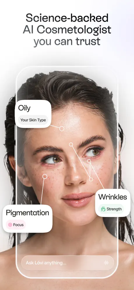
The opening shot establishes the visual grammar for the entire set. The headline sits in the top third, rendered in a bold, tight-leaded sans-serif at roughly 40 pt in #111827. Below it, the device frame encloses a full-bleed facial photograph that continues seamlessly behind the phone, so the hardware feels like a transparent pane of glass rather than a black rectangle. Three white annotation pills float over the face, each connected to a skin feature by a thin 1.5 px line terminating in an open circle. The copy inside the pills is categorical: 'Oily / Your Skin Type,' 'Pigmentation / Focus,' and 'Wrinkles / Strength.' The 'Focus' badge carries a faint pink tint (#FDF2F8) and a rosette icon, while 'Strength' uses a mint fill (#ECFDF5) with a shield icon. At the bottom of the screen, a frosted-glass input bar reads 'Ask Lóvi anything...' with a microphone glyph on the right, anchoring the conversational AI premise. The spacing between the headline and the device top is generous—roughly 48 pt—so the frame never feels crowded against the status-bar-free phone chrome.
Lovi App Store screenshot 2 — Build a routine that matches your skin
02

Build a routine that matches your skin

On-frame caption: “Build a routine / that matches / your skin

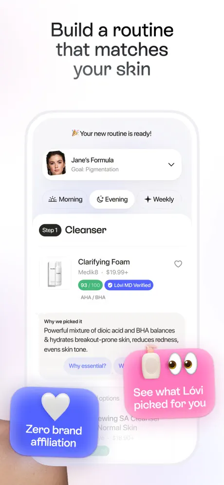
Frame 2 pivots from diagnosis to prescription. The device now displays a routine builder with a segmented control for 'Morning,' 'Evening,' and 'Weekly.' The selected 'Evening' state uses a dark charcoal fill (#1F2937) with a white crescent-moon icon, while inactive segments sit as outline pills. A product card sits below, headlined by 'Clarifying Foam' from 'Medik8' at '$19.99+.' Two badges sit beneath the title: a quantitative emerald lozenge reading '93 / 100' on a #10B981 fill, and a qualitative indigo pill reading 'Lóvi MD Verified' on #4F46E5. The explanatory paragraph—'Powerful mixture of dioic acid and BHA balances & hydrates breakout-prone skin, reduces redness, evens skin tone.'—is set at roughly 15 pt in #374151 with a 1.5 em line height. The most structurally notable choice here is the pair of 3D rendered stickers that rupture the bottom edge of the phone frame: a pink blob on the right bearing a tiny anthropomorphic lotion bottle and the words 'See what Lóvi picked for you,' and a blue lozenge on the left with a puffy heart and the words 'Zero brand affiliation.' These elements introduce physical depth but physically occlude the lower portion of the product card, including the 'Why essential?' link. The background behind the device shifts to a very faint lavender-pink wash, the warmest ambient tint in the set.

Lovi App Store screenshot 3 — Scan your face to see it in its full glory
03

Scan your face to see it in its full glory

On-frame caption: “Scan your face / to see it in its / full glory

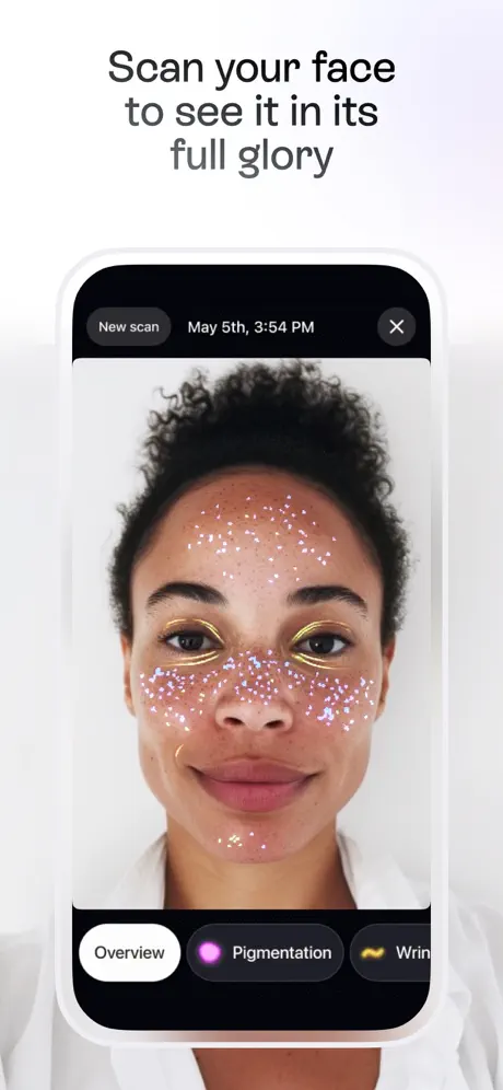
The third frame switches to a dark-interface scan viewer, creating a jolt of contrast against the preceding white UIs. Inside the device, the top 12 % is occupied by a pure-black (#000000) header bar containing a 'New scan' outline pill, the timestamp 'May 5th, 3:54 PM,' and an 'X' close button. The portrait beneath shows a subject with curly hair; overlaid on the face is a point-cloud visualization—magenta and cyan speckles clustered across the forehead, cheeks, and jaw—plus a golden vector graphic resembling eyeliner along the brow and lid. At the bottom, three tab pills float above the black chrome: 'Overview' in white, 'Pigmentation' in an active purple (#A855F7) with a sparkle glyph, and a truncated third tab reading 'Wrin...' with a yellow wave icon. The truncation is a real flaw: in a static marketing asset, the ellipsis reads as a responsive-layout bug rather than an intentional teaser. The subject’s shoulders and white collar continue outside the device frame, maintaining the 'lens-like' continuity seen in frame 1, but the overall mood is colder and more technical.

Lovi App Store screenshot 4 — Get answers from AI Cosmetologist
04

Get answers from AI Cosmetologist

On-frame caption: “Get answers from / AI Cosmetologist

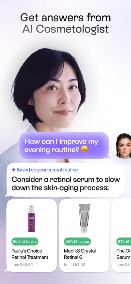
This frame breaks the established formula. Instead of a centered device floating on a neutral field, the composition is split: the left half is filled with a background photograph of a woman in a white coat, while the right half hosts a conversational UI. A large purple gradient bubble (#C084FC to #A855F7) contains the user query: 'How can I improve my evening routine? 😩'. Below it, the AI response begins with a blue diamond bullet and the phrase 'Based on your current routine,' followed by the recommendation 'Consider a retinol serum to slow down the skin-aging process:'. The product shelf beneath is a horizontally scrolling carousel of white cards with 16 px corner radii. Visible cards include 'Paula’s Choice Retinol Treatment' at '90% fit to you' and 'from $68.50,' and 'Medik8 Crystal Retinal 6' at '95% fit to you' and 'from $53.90.' A third card is clipped at the right edge. A small circular avatar of the user from frame 1 peeks in at the far right of the chat header area. The structural tension here is that the background portrait and the chat UI compete for hierarchy; the woman’s face is cropped directly behind the bottom edge of the purple bubble, making the spatial relationship feel unresolved.

Lovi App Store screenshot 5 — Discover the most effective skincare
05

Discover the most effective skincare

On-frame caption: “Discover the most / effective skincare

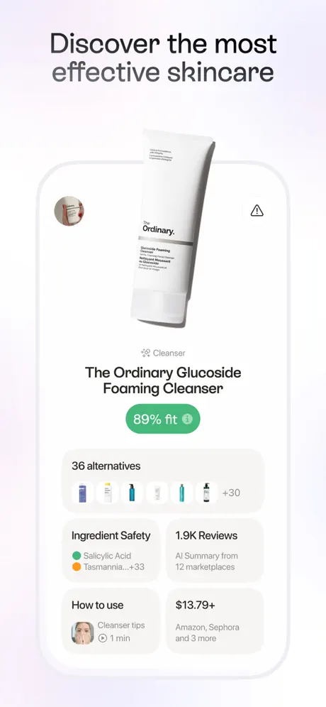
Frame 5 zooms into a single product detail page. A large 3D rendered tube of 'The Ordinary Glucoside Foaming Cleanser' floats in the upper third, casting a soft shadow against a very pale lavender-pink background (#F5F3FF). Below the product hero, a green pill reads '89% fit' alongside an info glyph. The interface is organized into a strict 2-column masonry grid: 'Ingredient Safety' pairs green and amber dots with ingredient names ('Salicylic Acid' and 'Tasmania...+33'), while '1.9K Reviews' notes an 'AI Summary from 12 marketplaces.' A horizontal strip labeled '36 alternatives' shows micro-thumbnails at roughly 36 px width, terminating in a '+30' overflow chip. At the bottom, a 'How to use' row features a circular video thumbnail with a play button and '1 min' duration, opposed by a '$13.79+' price block listing 'Amazon, Sephora and 3 more.' The layout is the most information-dense in the set, relying on generous internal padding (~16 px) and light gray section dividers to prevent collapse.

Lovi App Store screenshot 6 — Follow a tailored plan to get visible results
06

Follow a tailored plan to get visible results

On-frame caption: “Follow a tailored / plan to get visible / results

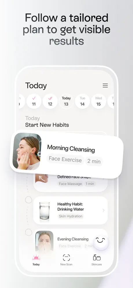
The sixth frame presents a habit tracker. The top of the screen shows a weekly calendar strip with circular day pills of roughly 32 pt diameter; days 11 and 12 carry pink checkmarks, while 'Today' (the 13th) sits inside a selected ring. The header is simply 'Today' beside a hamburger menu icon. The task list mixes skincare actions—'Morning Cleansing,' 'Evening Cleansing'—with lifestyle nudges like 'Healthy Habit: Drinking Water.' Each row pairs a square thumbnail with a title and a subtitle indicating category and duration ('Face Exercise 2 min'). A floating overlay card abruptly obscures the upper list, reading 'Morning Cleansing / Face Exercise 2 min' alongside a profile thumbnail of the user performing the action. The bottom tab bar uses three items: 'Today' (active, rendered in pink #EC4899 with a sunrise glyph), 'New Scan,' and 'Skincare.' The off-device background here is a cool neutral gray, a departure from the warmer lavender of frame 5 and the pure white of frame 1.

Lovi App Store screenshot 7 — Lóvi is a skincare that feels like self care
07

Lóvi is a skincare that feels like self care

On-frame caption: “Lóvi is / a skincare / that feels / like self care

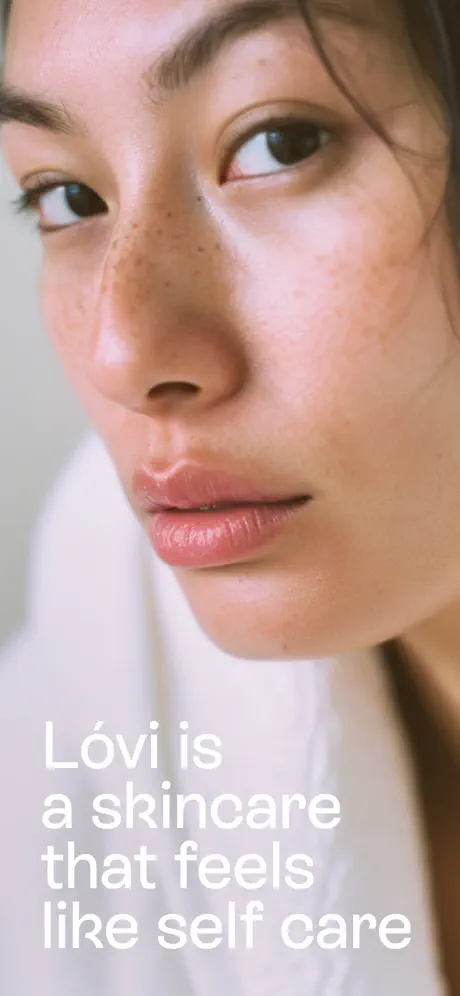
The final frame abandons the device shell entirely. It is a full-bleed editorial photograph cropped tightly on a woman’s face and upper chest; she is wrapped in a white robe and looks off-frame left. The text 'Lóvi is a skincare that feels like self care' is set in large white sans-serif type, roughly 48–56 pt, anchored to the lower-left quadrant. There are no badges, no buttons, no percentages, and no UI chrome. The composition functions as a palate cleanser after six consecutive interface frames, translating the app from a diagnostic tool into an emotional ritual. Because the subject’s skin is naturally freckled and unretouched, it echoes the visual honesty promised in frame 1’s annotation overlays, closing the narrative loop.

05The craft

Captions, colour and the mechanics of the sell

Caption pattern

Top third, centered, two-line maximum. The pattern is rigid: imperative verb phrase on line one, clarifying clause on line two. 'Science-backed / AI Cosmetologist / you can trust' breaks the rule with a third line, but only on the opening frame where the app name still needs contextualization.

Visual system

The off-device backgrounds are clean and minimal, acting almost like a lightbox. There are no confetti gradients, no star-burst stickers, no drop-shadowed App Store badges. The only departure from flatness is in frame 2, where two 3D-rendered promotional stickers (a pink blob with eyes and a blue heart lozenge) explode out from the bottom of the phone. Inside the UI, depth is achieved through subtle shadows on white cards and frosted-glass input bars rather than heavy chrome.

The thumbnail test

At thumbnail scale, the heavy headlines and high-contrast device frames remain legible, but frame 4 risks turning into a purple blur because the chat bubble dominates the composition while the background portrait collapses into undifferentiated mid-tones. Frame 7, despite having no device, actually performs well as a final swipe because the white text on the pale robe creates a high-frequency shape that catches peripheral vision.

Conversion mechanics

The set is engineered for comprehension speed. Every headline is a complete sentence that explains the adjacent UI, so a shopper swiping at thumbnail size still receives a narrative. The repetition of the green 'fit' percentage pill across frames 2, 4, and 5 trains the eye to recognize the app’s core value proposition—personalized matching—without requiring the user to read body copy. However, the sequence misses an opportunity to show the input mechanism for the chat shown in frame 4; the 'Ask Lóvi anything...' bar from frame 1 is never linked to the conversation view, leaving a small interaction gap.

06Where it slips

What we would change

Frame 2 sacrifices UI legibility for decoration

The 3D 'Zero brand affiliation' and 'See what Lóvi picked for you' stickers physically occlude the bottom of the product card and the 'Why essential?' link. This forces the shopper to decode the interface through overlapping layers. Fix: move the stickers outside the device frame, or apply a 40 % dim to the phone screen beneath them so the foreground stickers read as unambiguous overlays rather than collisions.

Frame 3 displays truncated text in a static asset

The bottom tab truncates 'Wrinkles' to 'Wrin...' with an ellipsis. Because this is a screenshot, not a live responsive layout, the truncation signals poor typesetting rather than a teaser. Fix: reduce tab-pill padding by ~4 px, shorten the copy to 'Lines,' or replace the label with a tooltip-friendly icon so the tab never clips.

Frame 4 creates spatial competition between portrait and UI

The background photograph of the woman in the white coat and the chat interface occupy the same z-plane without a scrim or shadow to separate them. The purple bubble’s tail nearly intersects the subject’s hair, creating visual noise. Fix: reduce the chat container width to 85 % of the device and shift it toward the lower-right corner, allowing the background portrait to function as negative space rather than competition.

Ambient background color is inconsistent across the sequence

Frames 1–2 sit on pure white, frame 5 introduces a warm lavender-pink, and frame 6 cools to neutral gray. The shift breaks environmental continuity and makes the set feel like separate apps rather than one continuous space. Fix: settle on a single 5–10 % tint wash—likely the lavender-pink from frame 5—and apply it uniformly behind all framed devices.

Frame 7 risks failing contrast on dim displays

White text on a white robe lacks a safety scrim. While the current crop places most of the type over the slightly darker fabric fold, a low-brightness screen will wash it out. Fix: add a bottom-up gradient from rgba(0,0,0,0.25) to transparent across the lower third. It preserves the editorial mood while locking in WCAG-compliant contrast.

07The recipe

How to apply this to your own app

  1. If your app handles sensitive biometric data, lead with the annotation language, not the button.

    Lóvi’s first frame does not show a 'Start Scan' CTA; it shows results ('Oily,' 'Pigmentation') already mapped to a face. This reverses the risk equation: the user sees what the app sees before committing to the camera.

  2. Color-code trust before shoppers read a word.

    By frame 5, the shopper already associates green with personal fit, blue with medical verification, and purple with AI response. If your app has multiple data sources (algorithmic, expert, community), assign each a locked hex value and repeat it in every frame where that source appears.

  3. End the sequence on emotion, not interface.

    Frame 7 proves that the final swipe is a branding slot, not a feature slot. If your preceding frames are dense with UI, release the tension with a full-bleed image and a single sentence that restates your emotional promise.

  4. Beware the truncation trap in marketing screenshots.

    Never let a static screenshot show an ellipsis. If the UI element is too narrow for the copy, abbreviate intentionally or widen the element. An ellipsis in a store image reads as a bug, not a feature.

08Takeaways

Five things worth stealing

  • A device frame can act as a 'magic mirror' when the photography inside and outside the bezel shares continuous lighting and color temperature.
  • Foreground 3D stickers or badges must respect the readability of the interface they advertise; occluding UI text reduces shopper confidence.
  • Truncated labels in static marketing assets undermine the perception of polish—always deliver fully readable text inside screenshot crops.
  • Shifting ambient background colors between frames disorients the swipe experience; lock a single environmental tint for all device shots.
  • Closing with a device-free editorial frame resets emotional expectations and moves the app from utility to lifestyle category in the shopper’s mind.
09The verdict

What the set actually achieves

The resulting sequence is a linear narrative that mimics the user journey: diagnosis (frame 1), prescription (frame 2), biometric capture (frame 3), conversational support (frame 4), product verification (frame 5), and adherence tracking (frame 6). Frame 7 breaks the pattern entirely to deliver a brand promise. The set reads left-to-right as a storyboard, which helps shoppers who are swiping quickly understand that Lóvi is not a static reference app but a loop of scan-advise-routine-repeat.

This set is a strong reference for designers building AI-assisted health, beauty, or wellness apps who need to telegraph both algorithmic intelligence and emotional safety. It is especially useful if your app lacks obvious social proof or user-generated content and must instead sell trust through UI badges, verification language, and clean annotation design. Teams struggling to balance clinical credibility with approachable femininity will find the color system—charcoal headlines, mint-scored metrics, and lavender conversational accents—a workable middle path. Avoid copying frame 2’s occlusion problem or frame 3’s truncation if your app targets an audience that equates visual polish with product reliability.

10Questions

Frequently asked

Why does frame 3 use a black header when every other frame is light?

The black chrome inside the device creates a theatrical dark-room effect for the face scan. It isolates the point-cloud visualization and makes the magenta speckles pop against the subject’s skin. However, it also breaks the bright, airy continuity established in frames 1 and 2, so the trade-off is visual attention at the cost of environmental cohesion.

How does the set handle diversity without feeling tokenistic?

The set shows three visibly different skin tones across frames 1, 3, and 4, and the computer-vision overlays are mapped to each face with the same annotation language. Because the UI treats each face as a clinical surface to be analyzed—rather than a stylistic backdrop—the diversity reads as functional evidence of algorithmic range rather than decorative inclusion.

What is the weakest frame in the sequence, and why?

Frame 4 is structurally the weakest. By abandoning the centered device-on-background formula without replacing it with a clear spatial logic, the chat UI and the background portrait fight for dominance. The purple bubble overlaps the subject’s hair, the product carousel is cramped at the bottom edge, and the eye does not know whether to read the photograph or the conversation first.

Is the 'Social' category choice reflected in the screenshots?

No visible social features—feeds, sharing icons, community counts, or friend avatars—appear in the interface. The set positions the app as a one-to-one AI consultation tool. If the Social categorization is driven by a community layer not shown here, the screenshots miss an opportunity to differentiate from standalone Health apps.

11Keep reading

Build your own screenshot set

The full set

7 shots
Lovi App Store screenshot 1Lovi App Store screenshot 2Lovi App Store screenshot 3Lovi App Store screenshot 4Lovi App Store screenshot 5Lovi App Store screenshot 6Lovi App Store screenshot 7

About the app

New! Discover our newly added series of Face Yoga videos, meticulously crafted to naturally enhance your skin's tone and firmness. WHY CHOOSE LÓVI? - Lovi™ is your Skin Care Digital Skincare Inc, via the App Store listing.

Screenshots and store metadata belong to Digital Skincare Inc. They are shown here for design commentary and criticism. The analysis on this page is original work by floow.design. View the original listing.

More Social teardowns

Browse all →