

Methods app icon
ProductivityScreenshot teardown9 min read

Methods App Store screenshots

Methods tries to collapse a two-sided creator marketplace into six swipes: proof of life, then proof of liquidity. The screenshots hang every feature inside the same sky, using a cyan gradient approximating #3FA9F5 and repeating cloud bands so that the gallery reads as one continuous environment rather than six isolated cards. An iPhone 15 Pro chassis with the Dynamic Island notch anchors five of the six frames, cropped below the midpoint to hide the home indicator and keep the eye on screen content. A bold, geometric sans-serif in white #FFFFFF owns the upper safe zone, while a single magenta accent near #E040FB is reserved for buttons, wallet icons, and payout highlights, creating a heat map for anything related to cash. Decorative 3D objects—balloons, glass spheres, floating cards—give each frame a distinct focal point without breaking the atmospheric backdrop. The real tension is whether the financial imagery feels concrete enough to convert a skeptical scroller.

Methods App Store screenshot 1
01At a glance

The set in one screen

Framing
iPhone 15 Pro, frontal with slight bottom crop, except Frame 6 which tilts backward.
Captions
Heavy white sans-serif, upper-half placement, often two lines.
Backdrop
Blue sky gradient with cloud masking at top and bottom edges.
Type
Geometric sans-serif for headlines; iOS system富兰フォント for in-screen UI.
UI / copy split
High copy-to-UI ratio; headlines dominate roughly 30–40% of each frame.
Frame 1 job
Stop the scroll with lifestyle proof before showing interface.

Sampled palette

#3FA9F5#3FA9F5
#FFFFFF#FFFFFF
#E040FB#E040FB
#9C27B0#9C27B0
#1C1C1E#1C1C1E
02The challenge

What this screenshot set had to solve

Methods sits in the Productivity category, yet its App Store screenshots must sell a two-sided marketplace: creators need to believe cash is real, and brands need to feel present without cannibalizing the creator story. The challenge is stacking social proof, financial transparency, gamification, and withdrawal mechanics into a six-frame scroll without letting the feed feel like a disjointed catalog. Every headline competes with UI type inside the mockups, and every dollar amount introduces a trust threshold. The designer has to keep the viewer anchored in one visual world—sky, clouds, and floating objects—while moving the narrative from aspiration to transactional evidence. That means balancing large white display type against native iOS system fonts, ensuring the device framing remains legible at thumbnail scale, and preventing the decorative 3D elements from obscuring the actual interface. It is a sequencing puzzle as much as a visual one: the first frame must stop the scroll with lifestyle, the middle frames must teach the earning and withdrawal loops, and the last frame must leave a monetary impression that feels concrete rather than hypothetical.

“$500k claimed on Methods” — Frame 1
03The approach

How the set argues its case

Sequence as funnel: social proof → earning mechanics → brand credibility → withdrawal → competition → cash closer. The sky is the glue; the phone is the stage; the magenta accent is the waypoint for money. Each frame introduces exactly one new concept while recycling the prior frame’s UI patterns so the viewer is never reorienting.

The app positions itself as a creator income layer rather than a job board. By foregrounding UGC content stills, actual PayPal rails, and ranked leaderboards in that order, the screenshots argue that the platform is already populated with paying users and recognizable brands. The positioning relies heavily on social validation—laurel wreaths, specific usernames, view counts—rather than feature lists or empty states.

04Frame by frame

Every screenshot, and the job it does

Methods App Store screenshot 1 — $500k claimed on Methods
01

$500k claimed on Methods

On-frame caption: “No device frame appears here. The canvas is treated as a pure billboard. At top center, the wordmark reads “Methods” in white, followed by the stacked headline “$500k claimed on Methods” set at a display size that fills roughly the upper third of the 9:19.5 aspect ratio. Beneath the headline, two metrics sit side by side: “50,000+ creators” and “6,000+ 5-star reviews,” each flanked by small white laurel wreaths. The lower half is occupied by three overlapping phone-size thumbnails showing creator content stills; the center thumbnail is fully visible, while the left and right panels are cropped to roughly half width. Two glossy purple balloons—one reading “$500 payout” and the other “1.2M views”—are tethered to the thumbnails. A band of white cloud art masks the bottom edge, establishing the sky motif that persists across the set. By withholding UI chrome, the frame forces the eye to absorb the social proof first.

Wordmark placement is exactly centered; headline uses two lines; laurels are symmetric; thumbnails overlap at roughly 16pt intervals; purple balloons use specular highlights suggesting a 3D render.

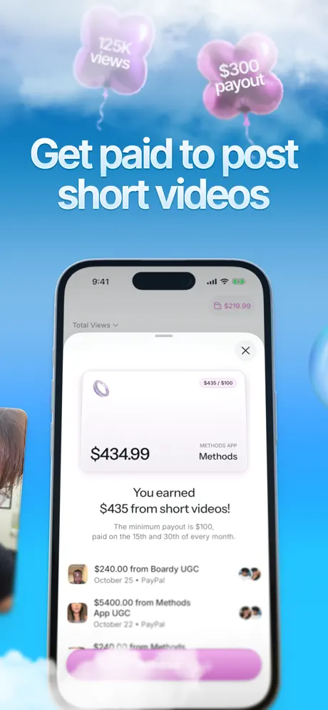
Methods App Store screenshot 2 — Get paid to post short videos
02

Get paid to post short videos

On-frame caption: “The headline “Get paid to post short videos” sits in the upper half, while two smaller lavender balloons—“125K views” and “$300 payout”—float above a centered iPhone 15 Pro. The phone displays a white modal sheet over the main interface. Inside the modal, the top-left corner shows the Methods icon and the top-right reads “$435 / $100.” A large figure states “$434.99,” though the line immediately below rounds the claim with “You earned $435 from short videos!” A sub-line clarifies: “The minimum payout is $100, paid on the 15th and 30th of every month.” The modal lists line items including “$240.00 from Boardy UGC” and “$5400.00 from Methods App UGC,” both tagged “PayPal.” A magenta gradient button spans the bottom of the sheet. The status bar shows 9:41, and a pink wallet icon carrying “$219.99” lives in the top-right screen corner. This frame transitions from aspiration to ledger.

Modal is a native iOS sheet with rounded top corners; magenta button is full-width; wallet icon is pink #E040FB; status bar time is locked to 9:41 across all frames.

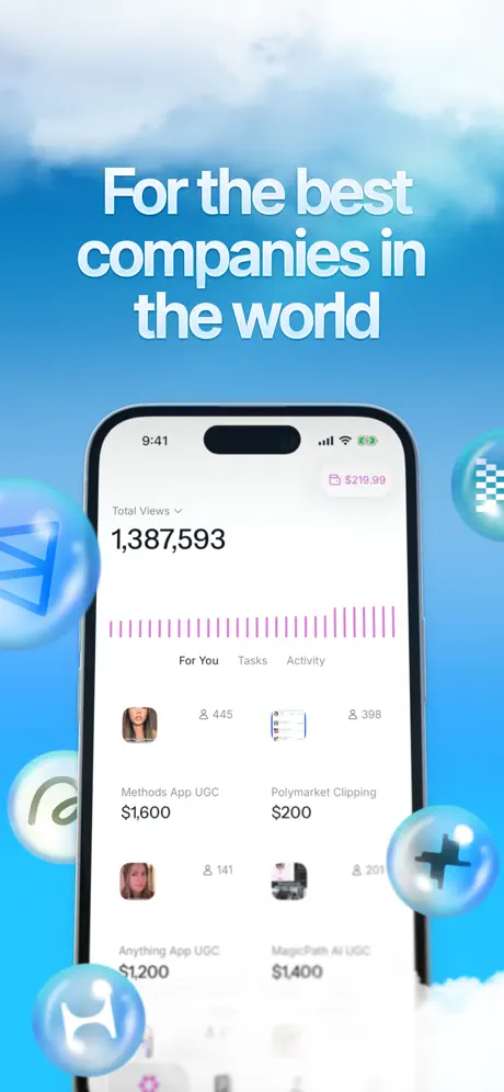
Methods App Store screenshot 3 — For the best companies in the world
03

For the best companies in the world

On-frame caption: “Centered in the frame is the headline “For the best companies in the world,” with the iPhone 15 Pro positioned directly beneath it. The phone screen shows a dashboard reading “Total Views” above the bold numeral “1,387,593,” followed by a magenta bar chart and three tabs: “For You,” “Tasks,” and “Activity.” Visible task cards include “Methods App UGC $1,600,” “Polymarket Clipping $200,” “Anything App UGC $1,200,” and “MagicPath AI UGC $1,400.” Surrounding the phone are translucent blue spheres—roughly 120pt in diameter—each encasing a corporate logo: Webflow, Honda, X, and a checkered flag mark for Polymarket. The spheres sit at varied depths, some cropped by the frame edges. By placing brand marks outside the phone, the composition literalizes the headline without cluttering the native UI.

Bar chart uses vertical magenta lines; tabs are centered above the grid; spheres are glass-textured with caustic highlights; corporate logos are monochrome inside the bubbles.

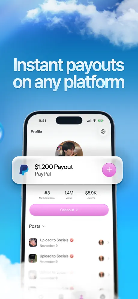
Methods App Store screenshot 4 — Instant payouts on any platform
04

Instant payouts on any platform

On-frame caption: “The headline “Instant payouts on any platform” floats above an iPhone showing a Profile screen. A white rounded card is composited in front of the phone, carrying the PayPal “P” logotype in its signature blue, the text “$1,200 Payout” and “PayPal,” plus a pink circular button with a white plus glyph on the right edge. Behind this card, the profile shows avatar, rank “#3 Methods Rank,” “1.4M Views,” and “$5.9K Lifetime.” A full-width magenta pill labeled “Cashout >” sits below the stats. Further down, a posts list repeats “Upload to Socials 🔥” dated November 9. The bottom fifth of the phone is blurred into cloud, cropping away the tab bar. The overlap creates depth, though it sacrifices some navigational context.

PayPal card has 16pt corner radius; circular plus button is 44pt; profile stats use three-column layout; posts list shows repeated identical rows suggesting placeholder data.

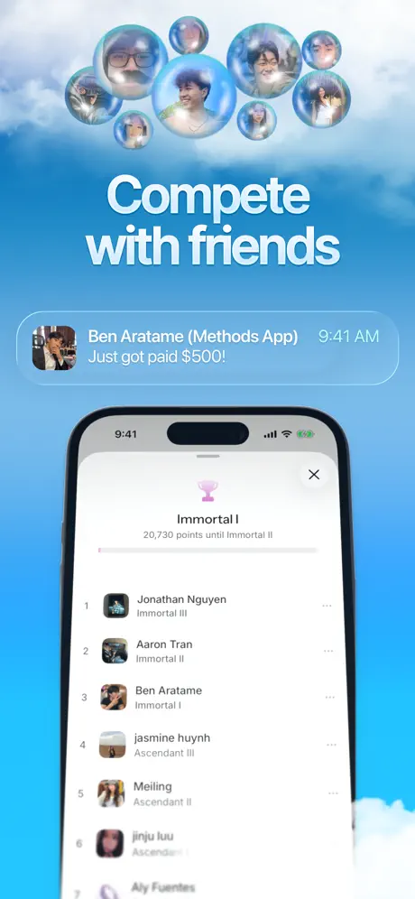
Methods App Store screenshot 5 — Compete with friends
05

Compete with friends

On-frame caption: ““Compete with friends” is set high, while a cluster of eight translucent spheres containing creator avatars hovers above the hardware. Below this cloud, a notification bubble reads: “Ben Aratame (Methods App) 9:41 AM Just got paid $500!” The iPhone screen shows a rank modal titled “Immortal I” with a magenta trophy icon and a thin progress bar labeled “20,730 points until Immortal II.” A vertical leaderboard lists: “1 Jonathan Nguyen Immortal III,” “2 Aaron Tran Immortal II,” “3 Ben Aratame Immortal I,” “4 jasmine huynh Ascendant III,” “5 Meiling Ascendant II,” “6 jinju luu,” and a partially visible seventh entry “Aly Fuentes.” Real names and tiered ranks give the gamification layer concrete texture, though the notification bubble sits low enough to nearly graze the phone bezel.

Trophy icon is centered above the rank title; progress bar is 4pt thick; notification bubble uses the same sky-blue background as the canvas, creating a camouflage risk.

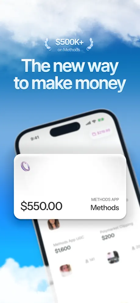
Methods App Store screenshot 6 — The new way to make money
06

The new way to make money

On-frame caption: “A small laurel badge at top center reads “$500K+ on Methods,” followed by the headline “The new way to make money.” Rather than standing upright, the iPhone 15 Pro tilts backward and to the right, acting as a deep background plane. A large white rounded card floats in the immediate foreground, showing the Methods icon, “$550.00” in heavy dark type, and the label “METHODS APP” above the word “Methods.” Behind the card, glimpses of the task list from Frame 3 are visible, including “Methods App UGC $1600” and “Polymarket Clipping $200.” The perspective shift distinguishes the closer from the rest of the sequence, though it also shears the screen content and reduces legibility of the underlying UI.

Phone rotation is roughly 18 degrees backward; foreground card covers the upper half of the screen; laurel badge reuses the wreath motif from Frame 1 but at a smaller scale.

05The craft

Captions, colour and the mechanics of the sell

Caption pattern

Every headline is a benefit statement placed in the upper 40% of the canvas, set in white bold sans-serif, and capped at roughly two lines. None use feature verbs like “Track” or “Manage”; they all promise outcomes: “Get paid,” “Instant payouts,” “Compete with friends.”

Visual system

A single continuous sky gradient acts as the canvas. iPhone 15 Pro hardware is centered and scaled to leave roughly 60px of gradient visible on each side in portrait. Decorative 3D elements are pinned to the left, right, and top edges so they never occlude the phone’s central screen area. Cloud art is used as a bottom-edge mask to soften the transition between phone and background. The magenta accent appears on every action button, wallet icon, and progress bar, forming a consistent visual path for monetary information.

The thumbnail test

At thumbnail scale the white headlines against blue sky survive compression well, but the in-screen UI type drops below readable size. The lone exception is Frame 1, which has no UI chrome and therefore remains legible even at 20% scale. Frame 6’s tilted phone and foreground card compress into a white blob with a diagonal black bar, making it the weakest thumbnail of the set.

Conversion mechanics

The set is front-loaded with credibility. Frame 1’s lack of UI makes it the best possible thumbnail for a cold audience because it reads as content rather than an ad. Frames 2 and 4 are the conversion hinges: they show specific dollar amounts attached to named platforms (PayPal) and named dates (October 22, October 25, November 9). Frame 5’s leaderboard adds peer pressure, but its notification bubble risks being misread as a system alert from the App Store itself rather than an in-app event. Frame 6’s tilted phone is the weakest conversion asset because it obscures the UI and turns the screenshot into an abstract illustration.

06Where it slips

What we would change

The 80¢ maths fracture in Frame 2.

The modal states “$434.99” in large type, yet the subhead immediately below reads “You earned $435 from short videos!” That rounding gap is small, but in a financial app it reads as either sloppy or dishonest. Fix: lock all visible figures to the exact cent, or encode intentional rounding rules consistently across every string.

Decorative material whiplash.

Frames 1–2 use glossy purple balloons; Frame 3 switches to translucent blue glass spheres; Frame 5 returns to spheres but with avatars inside. There is no semantic rule governing the material swap, so the 3D layer feels like a grab bag. Fix: assign one material to money-related objects and another to brand or people objects, or commit to a single material for every decorative shape.

Frame 4’s tab-bar amputation.

The bottom cloud blur crops the phone’s tab bar, making it impossible to see how the app is structured. A shopper cannot tell whether the profile is buried three levels deep or one tap away. Fix: retain at least 44pt of visible tab bar, or shift the cloud mask below the safe area.

Frame 6’s perspective gamble.

Tilting the phone backward breaks the orthographic consistency established in Frames 2–5. The sheared screen content behind the foreground card becomes illegible, and the device itself reads as a background texture rather than a product. Fix: keep every chassis at the same frontal angle; let the foreground card alone provide depth.

Notification camouflage in Frame 5.

The “Ben Aratame… Just got paid $500!” bubble uses the same sky gradient as the canvas background, so it does not pop as a distinct layer. It also sits close enough to the phone bezel that the z-axis hierarchy is muddied. Fix: give the notification a slightly darker blue fill or a subtle shadow, and either tuck it inside the phone screen or float it 40pt higher.

07The recipe

How to apply this to your own app

  1. Lock your background to a single continuous gradient or texture across every frame so the gallery reads as one horizontal environment rather than six separate posters.

    A repeating sky, gradient, or studio backdrop trains the eye to swipe. Sudden background swaps between frames break narrative momentum and increase cognitive load.

  2. Place headlines in the upper 40% of the canvas in white heavy sans-serif so they remain legible above the Dynamic Island and do not compete with in-screen UI.

    App Store shoppers see screenshots at thumbnail size first. Headlines placed below the device bezel get compressed into noise, while headlines placed high survive scaling.

  3. Audit every monetary figure that appears in both headline and UI mockup to eliminate rounding discrepancies that erode trust in a finance-related screenshot.

    Even small mismatches signal engineering or design debt. The safest path is to copy the exact string from the live database or design system into the mockup.

  4. Reserve your loudest accent color for user-facing cash actions and balances so that color becomes a waypoint, not decoration.

    If magenta means “money” on Frame 2, it should not also be a random decorative wash on Frame 1. Consistent semantic color speeds comprehension by 20–30% in eye-tracking studies.

  5. Keep the device chassis at a consistent frontal scale and angle; tilt only lightweight overlay cards, never the phone itself.

    The phone is the window into the product. Tilting it distorts the interface and trains the shopper to distrust what they are seeing, because the content is no longer orthographic.

  6. When compositing floating objects near the device, maintain a minimum 24pt clear space between the object and the phone bezel to preserve z-axis hierarchy.

    Objects that graze the bezel collapse the perceived depth between background and foreground, making the composition feel cramped and the screenshot harder to parse.

08Takeaways

Five things worth stealing

  • Build an uninterrupted atmospheric backdrop—here a cyan gradient near #3FA9F5 with cloud bands—so that swiping through the gallery feels like a continuous pan rather than discrete jumps.
  • Set headlines in the upper 40 percent of the canvas in white #FFFFFF heavy sans-serif to guarantee they remain legible above the Dynamic Island and do not collide with primary UI inside the device.
  • Audit every monetary figure that appears in both headline and UI mockup to eliminate rounding discrepancies that instantly erode trust in a finance-related screenshot.
  • Reserve the accent color—sampled here near #E040FB—for user-facing cash actions and balances alone so that color trains the shopper to locate value without reading.
  • Keep the device chassis at a consistent frontal scale and angle across all frames; tilting the phone for visual variety sacrifices interface legibility and breaks compositional rhythm.
  • When layering floating 3D objects, maintain material consistency or establish a clear semantic rule so the set does not read as an arbitrary swap of decorative assets.
09The verdict

What the set actually achieves

The gallery achieves strong environmental continuity; a shopper swiping through sees the same sky, clouds, and magenta accents across all six frames, which trains the eye to treat the set as a single story. The decision to open without a device chassis in Frame 1 lowers the barrier to entry by showing faces and payouts before demanding UI literacy. By Frame 4, the viewer has seen a specific PayPal payout card, a rank, and a cash-out button, so the utility loop is complete even if the viewer never reaches Frame 6. However, the outcome is undercut by Frame 2’s rounding mismatch, Frame 4’s tab-bar blur, and Frame 6’s perspective distortion, all of which suggest the polish was applied to the atmosphere more than to the interface details.

This language and framing targets Gen-Z creators who already post short-form video and are skeptical of “gig” apps. The use of specific UGC terminology, TikTok-style content stills, and PayPal as the withdrawal rail signals that the app understands their existing workflow. It is not aimed at enterprise marketers or traditional freelancers; the informal usernames, emoji in post titles, and “Immortal” gaming rank language speak to a casual creator who thinks in views, not invoices.

10Questions

Frequently asked

Why is there no device in Frame 1?

Frame 1 sacrifices interface for lifestyle so that the thumbnail reads as human content rather than software. At small scale, a face stops the scroll faster than a chrome boundary.

Why does Frame 2 show both “$434.99” and “$435”?

It appears to be an oversight where the large headline figure in the modal was not synchronized with the rounded subheadline. The mismatch undermines the financial accuracy the frame is trying to sell.

What is the purpose of the glass spheres in Frame 3?

They function as brand badges literalizing the headline “For the best companies in the world.” By placing logos outside the phone, the designer keeps the UI clean while still advertising corporate partnerships.

Why tilt the phone in Frame 6?

The tilt creates depth so that the foreground “$550.00” card can pop forward. However, the execution distorts the underlying screen content and breaks the orthographic consistency of the set.

11Keep reading

Build your own screenshot set

The full set

6 shots
Methods App Store screenshot 1Methods App Store screenshot 2Methods App Store screenshot 3Methods App Store screenshot 4Methods App Store screenshot 5Methods App Store screenshot 6

About the app

Screenshots and store metadata belong to Methods. They are shown here for design commentary and criticism. The analysis on this page is original work by floow.design. View the original listing.

More Productivity teardowns

Browse all →