Minimalist Launcher app icon
UtilitiesScreenshot teardown12 min read

Minimalist Launcher App Store screenshots

Designing a screenshot set for a minimalist launcher is an exercise in advertising absence. The product’s entire value proposition is reduction: fewer icons, fewer colors, fewer dopamine triggers. But the App Store is a context of excess—bright thumbnails, motion graphics, and feature-crowded canvases all screaming for a thumb-stop. The designer behind Minimalist Launcher faces the paradox of making emptiness look intentional rather than unfinished. The set must communicate not just what the app is, but what it removes. That requires a visual language that feels disciplined enough to earn trust. A shopper scrolling past has to believe, in under two seconds, that this home screen replacement will actually lower screen time rather than simply hide it behind another layer of chrome. The screenshots must therefore function as a kind of anti-marketing: calm instead of hype, monochrome instead of gradient, negative space instead of UI density. The challenge is not to explain the feature list, but to make restraint feel like a feature in its own right.

Set published by Ankit Kumar · 8 frames analysed

4.7 · 3.2K ratingsFreev27.2Updated 5mo ago
Minimalist Launcher App Store screenshot 1
01At a glance

The set in one screen

Framing
Notched iPhone, tight crop, often hand-held or angled
Captions
Bold grotesque sans for headlines; italic serif for emotional subheads
Backdrop
Warm off-white ~#F2F1EC with near-black ~#1A1A1A accents
Type
High contrast, large point size, centered alignment dominant
UI / copy split
Approximately 60% device/chrome, 40% caption/ornament
Frame 1 job
Establish authority via social proof before showing product

Sampled palette

#F2F1EC#F2F1EC
#1A1A1A#1A1A1A
#D9D9D9#D9D9D9
#262626#262626
#FFFFFF#FFFFFF
02The challenge

What this screenshot set had to solve

The product is absence. The store is saturation. How do you make less feel like more without adding decorative noise that contradicts the minimalism you are selling? The designer also had to overcome the trust problem of launcher apps: users fear that replacing the home screen will break notifications, hide settings, or simply add friction. The screenshot set needed to signal safety, intentionality, and a clearly defined aesthetic world.

Restraint is architecture, not decoration.
03The approach

How the set argues its case

The set uses a classic persuasion stack: social proof (Frame 1), value proposition (Frame 2), quantified outcome (Frame 3), variety/reassurance (Frame 4), testimony (Frame 5), feature highlight (Frame 6), philosophy restatement (Frame 7), and before/after comparison (Frame 8). By never breaking the two-color system, the designer ensured that even at thumbnail size the sequence feels like one branded environment. Typography alternates between a heavy geometric sans for factual headlines and an italic serif for emotional payoff lines, creating a rhythm of claim and feeling that mimics editorial advertising.

Against other launcher-companion apps that show cluttered dashboards or neon gradients, Minimalist Launcher positions itself as the quiet option. The screenshots do not compete on feature count; they compete on visual silence.

04Frame by frame

Every screenshot, and the job it does

Minimalist Launcher App Store screenshot 1 — Social Proof as First Impression
01

Social Proof as First Impression

On-frame caption: “Frame 1: Social Proof as First Impression

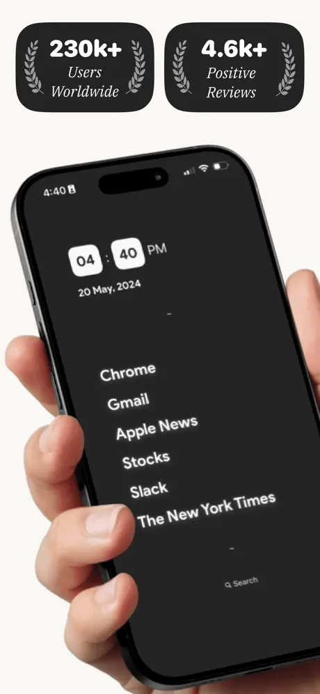
The first frame leads with authority, not product. Two dark, heavily rounded rectangles float above a hand-held iPhone. The left pill reads “230k+” in bold white condensed type, with “Users” and “Worldwide” stacked below in smaller italic serif, all flanked by light-gray laurel wreaths. The right pill mirrors the structure: “4.6k+” over “Positive” and “Reviews.” Beneath them, a palm grips a black iPhone from the lower-left, thumb resting on the bezel. The device screen shows the launcher’s default dark mode: the time is split into two white rectangles reading “04” and “40,” capped by “PM.” The date “20 May, 2024” sits below in subdued gray. A vertical list—Chrome, Gmail, Apple News, Stocks, Slack, The New York Times—occupies the mid-section in a clean, medium-weight sans at approximately 17pt, with a “Q Search” glyph at the bottom. The crop is intimate; the hand bleeds off the left and bottom edges, removing the home indicator from view and suggesting full immersion. The spacing between the social pills and the status bar is generous—roughly 55pt—letting the dark UI breathe against the cream surround.
Minimalist Launcher App Store screenshot 2 — The Promise Without the Product
02

The Promise Without the Product

On-frame caption: “Frame 2: The Promise Without the Product

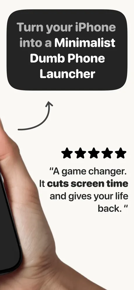
This frame abandons the full device in favor of typographic persuasion. At the top, a large, rounded dark container holds a four-line caption: “Turn your iPhone” and “into a” appear in muted gray, while “Minimalist Dumb Phone Launcher” flips to white bold, creating a clear tonal hierarchy. A hand-drawn curved arrow—dark gray, perhaps 2.5pt stroke—arcs upward from the lower-left, guiding the eye from the text toward the phone edge that just enters the frame. Below the arrow, five solid black star icons anchor a testimonial in dark sans-serif: “A game changer. It cuts screen time and gives your life back.” A hand is visible only as a sliver of palm and thumb on the far left, holding an unseen device. The composition is intentionally unbalanced: the left third is flesh and hardware edge, the right two-thirds are pure caption. This asymmetry creates visual motion, but it also risks losing impatient scrollers who need to see the UI to understand the offering. The frame behaves more like a billboard than a product screenshot.

Minimalist Launcher App Store screenshot 3 — Data as Decoration
03

Data as Decoration

On-frame caption: “Frame 3: Data as Decoration

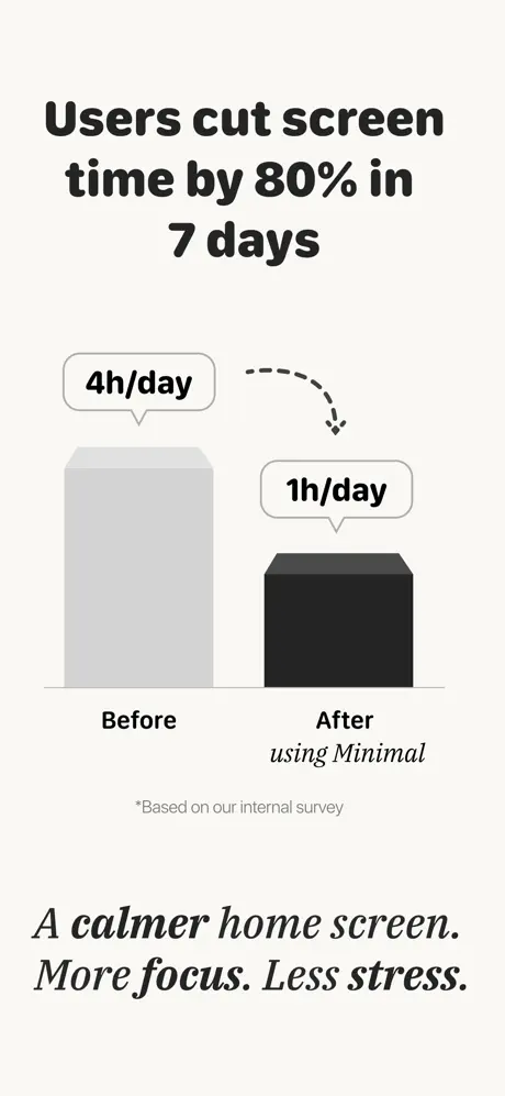
Headline: “Users cut screen time by 80% in 7 days,” set in the same bold sans, centered in the upper safe zone. The middle of the frame is occupied by a lo-fi bar chart. A tall, light-gray 3D extruded block labeled “Before” carries a speech-bubble callout reading “4h/day.” A dashed curved arrow drops to a shorter, near-black block labeled “After” with a “1h/day” callout; beneath it, the label “using Minimal” appears in italic. A disclaimer in small, muted type reads “*Based on our internal survey.” The lower third closes with the italic sentiment: “A calmer home screen. More focus. Less stress.” The chart avoids axes and gridlines, keeping cognitive load low, but the 3D extrusion on the bars introduces a slight skeuomorphic nostalgia that sits oddly against the flat UI shown elsewhere. The “Before” bar reads at approximately #D9D9D9, while the “After” bar sits near #262626. The contrast between the light bar and the cream background (#F2F1EC) is softer than ideal; at thumbnail size, the “Before” state nearly vanishes.

Minimalist Launcher App Store screenshot 4 — Theme Variety in the Abstract
04

Theme Variety in the Abstract

On-frame caption: “Frame 4: Theme Variety in the Abstract

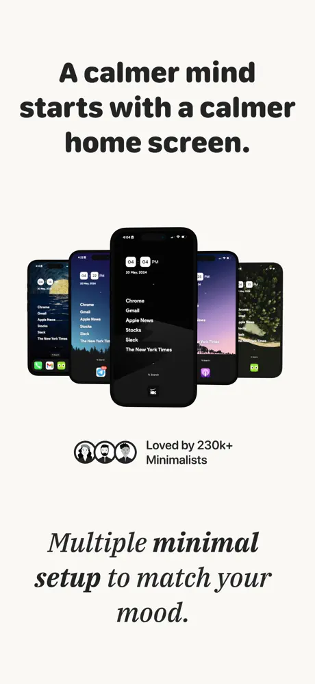
The headline, “A calmer mind starts with a calmer home screen,” introduces a fanned stack of five iPhones in central perspective. The front device displays the familiar dark launcher with time and app list intact; the rear devices show alternative skins—a forest silhouette at dusk, a purple sunset, a green boulder texture—each preserving the same typographic structure. Below the stack, three monochrome avatar icons precede the caption “Loved by 230k+ Minimalists.” The bottom tagline, in italic serif, reads: “Multiple minimal setup to match your mood.” Soft, diffuse drop shadows—roughly 20% opacity black—push the center phone forward. The frame answers the fear of monotony by proving variety exists within the system. However, the rear phones are too small and too obscured to evaluate; their screens register only as colored rectangles, making them decorative rather than persuasive. The vertical rhythm is measured: roughly 45pt from headline to devices, and another 45pt from devices to the avatar row.

Minimalist Launcher App Store screenshot 5 — Testimonials That Overshadow
05

Testimonials That Overshadow

On-frame caption: “Frame 5: Testimonials That Overshadow

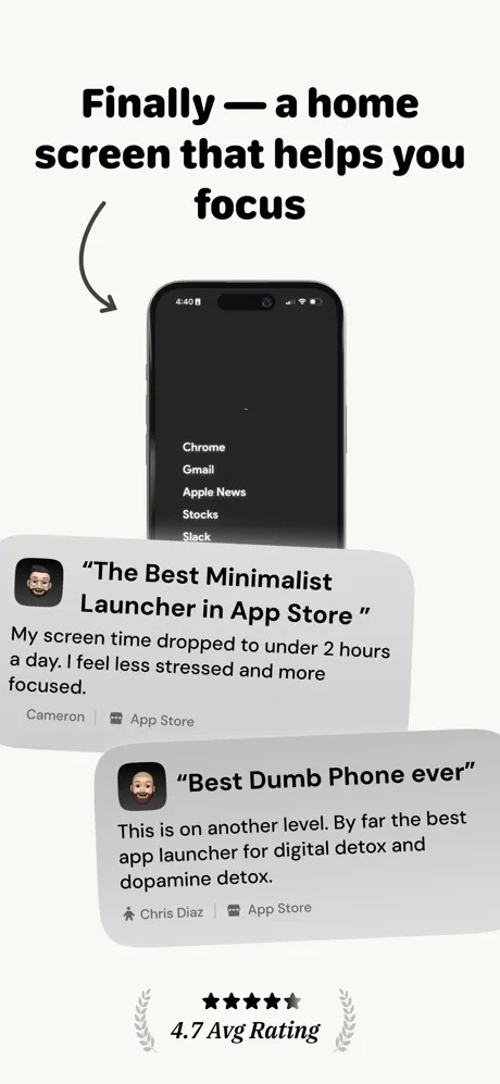
Here, the headline “Finally — a home screen that helps you focus” hovers above a centered iPhone, with a curved arrow swooping in from the upper-left to point at the device. Two review cards overlap the lower half. The top card, with a Memoji avatar, carries the quote “The Best Minimalist Launcher in App Store” and the body: “My screen time dropped to under 2 hours a day. I feel less stressed and more focused.” It is attributed to “Cameron | App Store.” The second card, offset lower and to the right, features another Memoji under the headline “Best Dumb Phone ever,” followed by: “This is on another level. By far the best app launcher for digital detox and dopamine detox.” Attribution: “Chris Diaz | App Store.” A five-star lockup at the bottom reads “4.7 Avg Rating,” flanked by laurel wreaths. The diagonal layering creates depth, but the cards obscure the launcher screen almost entirely. Worse, the card backgrounds—approximately #E8E8E5—are barely distinguishable from the page background, causing the edges to dissolve on bright displays. A thin 1pt stroke or deeper shadow would restore separation.

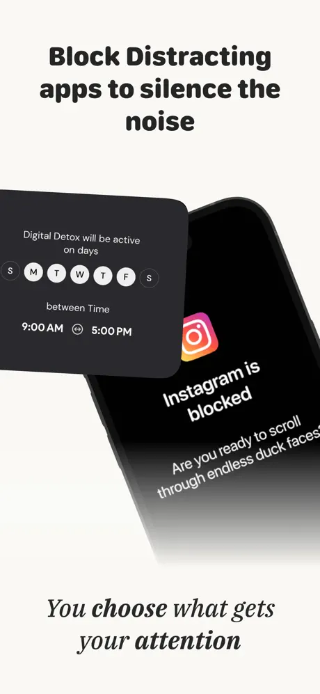
Minimalist Launcher App Store screenshot 6 — Feature Demonstration at an Angle
06

Feature Demonstration at an Angle

On-frame caption: “Frame 6: Feature Demonstration at an Angle

This frame introduces the app-blocking feature. The headline “Block Distracting apps to silence the noise” sits above an iPhone angled at roughly 25 degrees. A dark modal sheet floats above the screen, reading “Digital Detox will be active on days” with a row of circular day selectors: S M T W T F S. Monday through Friday are filled white on dark; the weekend circles remain dark gray. Below, “between Time” introduces “9:00 AM” and “5:00 PM” separated by a small circular icon. Behind the modal, the phone screen shows the Instagram gradient icon and bold text: “Instagram is blocked,” with smaller copy beneath: “Are you ready to scroll through endless duck faces?” The bottom serif caption states, “You choose what gets your attention.” The angled composition breaks the vertical monotony, and the modal introduces a satisfying second layer. The Instagram icon supplies the only full-color element in the entire set, functioning as a deliberate focal point. Yet the day-picker labels are set too small; at thumbnail scale, the circles blur into indecipherable dots. A head-on crop with larger type would serve the feature better.

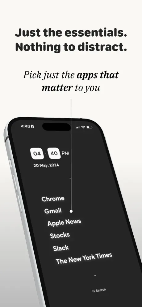
Minimalist Launcher App Store screenshot 7 — The Silver Outlier
07

The Silver Outlier

On-frame caption: “Frame 7: The Silver Outlier

Returning to the core UI, this frame pairs the headline “Just the essentials. Nothing to distract.” with the italic subhead “Pick just the apps that matter to you.” The iPhone is angled slightly, but unlike previous frames, this chassis is silver rather than black. The screen shows the same dark launcher: date, time in white pills, and the identical app list. A thin vertical white line bisects the screen, anchored by a small white circle at its midpoint, suggesting a divider or selection toggle. The crop is aggressive, slicing through the top-left and bottom-right bezels. The silver hardware is the first material break in the set’s device grammar; every other frame uses the black iPhone. That inconsistency is jarring when swiping sequentially. The vertical line motif is also under-explained—without a label or second state, its meaning is ambiguous, and it risks reading as a rendering artifact rather than an interface element.

Minimalist Launcher App Store screenshot 8 — Before-and-After Climax
08

Before-and-After Climax

On-frame caption: “Frame 8: Before-and-After Climax

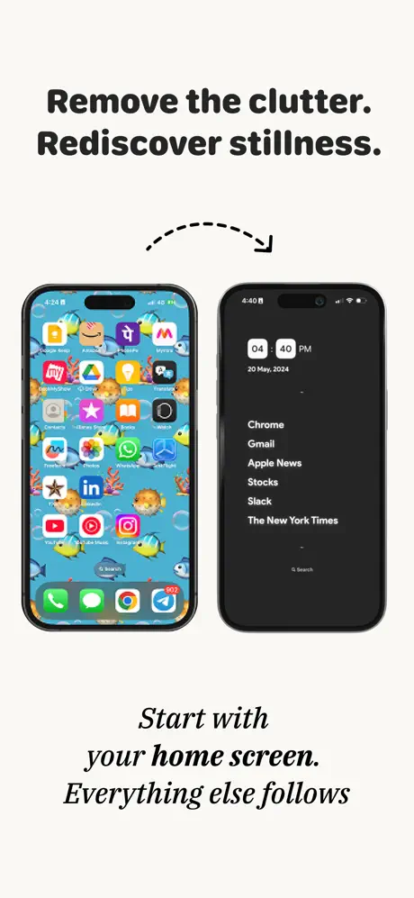
The closing frame presents a direct side-by-side comparison. The headline “Remove the clutter. Rediscover stillness.” is linked by a dashed curved arrow sweeping left to right. On the left, an iPhone displays a standard iOS home screen dense with chromatic app icons—Amazon, Lyft, Watch, Instagram, WhatsApp, and others—layered over a busy blue aquarium wallpaper. The status bar shows 4:24 and a green battery at 84%. On the right, the minimalist launcher appears again in its dark, list-based form at 4:40 PM. Below, the italic caption reads: “Start with your home screen. Everything else follows.” This is the strongest rhetorical frame in the set. The chromatic chaos of the left device makes the right device feel like visual relief. The spacing between the two phones is tight—roughly 18pt—forcing immediate comparison. However, the mismatch in status bar times (4:24 versus 4:40) and battery color (green versus white) introduces micro-friction. For a product selling intentional living, these production slips contradict the message.

05The craft

Captions, colour and the mechanics of the sell

Caption pattern

Headlines are always centered, bold, sentence-case or title-case, stacked in 2–4 lines. Subheads are always italic serif, centered, and placed in the lower third. This predictable cadence lets the reader scroll quickly while still catching the tonal shift between fact (sans) and feeling (serif).

Visual system

The background never changes. The device framing stays within a narrow range of angles. The only color permit is the Instagram gradient in Frame 6, which is deployed precisely because it is the villain of the narrative. Every other element is black, white, or warm gray.

The thumbnail test

At 40% scale, the set holds up because the black headlines remain readable against the cream ground and the device silhouette is always centered. However, the smaller text in Frame 5 testimonial cards and Frame 6 day-picker circles dissolve into gray blurs, losing their informational value.

Conversion mechanics

The set is engineered for emotional resonance rather than feature enumeration. Frame 3 supplies the quantified hook for rational buyers, while Frames 2, 5, and 8 handle the emotional conversion. The before/after in Frame 8 is the true closer; everything before it is preamble. One usability concern: none of the frames explicitly show the onboarding or the permission flow, which means users must take a leap of faith that the launcher is safe to install.

06Where it slips

What we would change

Redundant social proof dilutes the minimalism

Frame 1 opens with “230k+ Users Worldwide” and “4.6k+ Positive Reviews.” Frame 4 repeats “Loved by 230k+ Minimalists.” Frame 5 returns with “4.7 Avg Rating.” For a product built on subtraction, the marketing layer is additive. Fix: Consolidate proof into Frame 1 and Frame 5 only. Use Frame 2 or Frame 4 to show a functional benefit or theme detail instead of another user count.

Micro-production inconsistencies break trust

Frame 8 shows two iPhones with mismatched status bar times (4:24 versus 4:40) and different battery treatments (green icon versus white). Frame 7 introduces a silver iPhone chassis where every other frame uses black. These are small errors, but for a utility that promises control and calm, they read as carelessness. Fix: Align all status bar details to a single timestamp and battery state, and lock the device color to one finish across the entire set.

Low-contrast elements disappear at thumbnail scale

The testimonial cards in Frame 5 use a background of approximately #E8E8E5 against a #F2F1EC page, creating a 4% luminance difference. The day-picker circles in Frame 6 and the disclaimer text in Frame 3 shrink past legibility when the gallery is viewed as a small composite. Fix: Darken the card fill to at least #D9D9D9, increase the day-picker type by 2–3pt, and remove or enlarge the internal survey disclaimer.

Abstract motifs lack functional context

The vertical white line in Frame 7 has no label, no second state, and no caption explaining its purpose. Likewise, the 3D chart bars in Frame 3 feel stylistically orphaned. Fix: Either annotate the line as a ‘before/after slider’ or remove it. Replace the 3D bars with flat rectangles that match the launcher’s own visual language.

Frame 2 withholds the product for too long

The second screenshot in the sequence shows no launcher UI at all—only a cropped hand, a caption block, and a quote. Scrollers who swipe quickly may still not know what the app looks like by the second frame. Fix: Reintroduce the device screen, even as a small inset, so the shopper sees the list-based UI before reaching Frame 3.

07The recipe

How to apply this to your own app

  1. Lock your palette to three values

    Minimalist Launcher proves that a strict background/paper/text system can unify eight disparate messages. Choose your values before designing Frame 2, and never introduce a fourth color unless it is the ‘villain’ you are solving.

  2. Use type pairing to signal tone shifts

    Reserve a bold sans for factual claims and an italic serif for emotional payoff. The alternation creates a rhythm that carries the reader through dense information without fatigue.

  3. Front-load social proof, but do not repeat it

    One high-authority proof point in Frame 1 is enough. Use subsequent frames to show depth, not reinforce the same metric. Repetition burns scroll velocity.

  4. Treat the before/after as the closer

    If your app fixes a visual problem, save the direct comparison for the final frame. Everything before it should build the psychological conditions that make the comparison feel satisfying rather than gratuitous.

  5. Audit every frame at 50% scale

    App Store shoppers see your screenshots as thumbnails first. Any text smaller than 24pt effective, or any contrast ratio below 3:1, will vanish. Review your set on an actual phone screen before shipping.

08Takeaways

Five things worth stealing

  • A locked palette creates brand equity faster than a crowded one.
  • Before/after comparisons should be pixel-perfect; mismatched details destroy credibility.
  • Social proof is seasoning, not the main course—do not repeat it frame after frame.
  • Italic serif subheads are an effective way to soften bold sans claims without adding color.
  • Every device frame must share the same hardware finish and status-bar state to sustain the illusion of a single, controlled environment.
09The verdict

What the set actually achieves

A visually coherent eight-frame sequence that reads like a single editorial layout. The set converts best for users already experiencing notification fatigue, because the calm palette and generous whitespace visually demonstrate the relief the app promises before a single word is read.

Indie utility developers and digital-wellbeing apps that need to sell an aesthetic and emotional transformation rather than a feature matrix. If your app removes complexity instead of adding it, this set demonstrates how to merchandise absence.

10Questions

Frequently asked

Why does Frame 2 show almost no UI?

It prioritizes the value proposition over the interface, betting that the testimonial and headline will stop the scroll. However, this is risky for shoppers who need immediate visual confirmation of the product.

Is the warm cream background necessary?

It is the glue of the set. The off-white (#F2F1EC) separates the screenshots from default iOS whites and gives the page a tactile, paper-like quality that reinforces the ‘calm’ positioning.

What is the weakest frame?

Frame 7, because it introduces a silver iPhone without justification and an unexplained vertical line that confuses rather than clarifies.

What is the strongest frame?

Frame 8. The direct before/after comparison is immediately legible, emotionally satisfying, and vertically compact. It closes the narrative with evidence rather than apology.

11Keep reading

Build your own screenshot set

The full set

8 shots
Minimalist Launcher App Store screenshot 1Minimalist Launcher App Store screenshot 2Minimalist Launcher App Store screenshot 3Minimalist Launcher App Store screenshot 4Minimalist Launcher App Store screenshot 5Minimalist Launcher App Store screenshot 6Minimalist Launcher App Store screenshot 7Minimalist Launcher App Store screenshot 8

About the app

Minimalist Launcher is a Minimal Home Launcher to simplify your iOS home screen. The current home screen with lots of apps creates a cognitive load and distraction which Ankit Kumar, via the App Store listing.

Screenshots and store metadata belong to Ankit Kumar. They are shown here for design commentary and criticism. The analysis on this page is original work by floow.design. View the original listing.

More Utilities teardowns

Browse all →