Onemor app icon
Health & FitnessScreenshot teardown14 min read

Onemor App Store screenshots

Open the Onemor gallery and you are met with a near-black void punctuated by exactly one attention vector: an acid-lime starburst that seems to sit at the intersection of gym culture and cyberpunk. The palette is aggressively narrow. The canvas across all eight frames rarely lifts above #0B0B10, and the typography is locked to a single condensed grotesque in all-caps, white at #FFFFFF, with select words rendered in a venomous yellow-green somewhere near #D0FF14. Every frame after the opener places the same iPhone 15 Pro device mockup dead-center, bezel-perfect, with the Dynamic Island snapping to the same y-coordinate. That rigor gives the set a gallery-like consistency, as if each screenshot is a track on an album rather than a loose collection of features. There is no subtler trick here than absolute restraint: dark mode UI, blown-out headlines, and photography that favors low-key lighting and muscle definition. It is a mood board posing as a product walkthrough, and that is a deliberate choice in the saturated Health and Fitness category.

Set published by Onemor · 8 frames analysed

5.0 · 14 ratingsFreev1.4.1Updated 4mo ago
Onemor App Store screenshot 1
01At a glance

The set in one screen

Framing
iPhone 15 Pro with Dynamic Island, fixed center alignment from Frame 2 onward; Frame 1 is full-bleed poster with no device.
Captions
Ultra-condensed grotesque, all-caps, white versus acid-lime (#D0FF14); italic toggled on scattered words per frame.
Backdrop
Pure #0A0A0A outside the device; inside the app, deep #121212 fills with #1C1C1E card surfaces.
Type
Massive poster headlines outside the device; clean SF-style UI typography inside with 16–22pt card titles and 12pt secondary labels.
UI / copy split
A UI dominant screenshot set. UI covers 80% of each screenshot while only 20% is non-UI elements.
Frame 1 job
The opener withholds every pixel of UI and functions as a brand billboard, relying on social proof and lifestyle photography to earn the swipe.

Sampled palette

#0A0A0A#0A0A0A
#FFFFFF#FFFFFF
#D0FF14#D0FF14
#1C1C1E#1C1C1E
#2C2C2E#2C2C2E
#FF453A#FF453A
02The challenge

What this screenshot set had to solve

The implied design problem is not aesthetic—it is archival. In the App Store, a shopper swiping through a fitness app’s screenshots is doing triage: does this look like a generic workout generator, or does it look like a culture? Onemor chooses the latter, which means the screenshot set must sell belonging, not utility. The challenge, then, is to make plan browsing, rep counting, leaderboards, and tribal chat feel like one continuous atmosphere. That requires holding a single tonal line across eight dissimilar interfaces: a home feed, an active timer, a messaging layer, a coach profile, a tribe picker, a celebratory state, and a dense logging sheet. Any fracture in color, type weight, or device angle breaks the illusion that these screens belong to the same organism. The designer also has to solve the first-frame paradox: if frame one shows no UI at all, frame two has to land hard enough to prove the product is real.

The acid lime is rationed precisely—never used for primary buttons inside the app, reserved almost exclusively for the screenshot captions and small accent badges—so it behaves like a brand tracer across the whole set.
03The approach

How the set argues its case

The team solves the atmospheric problem with three non-negotiable rules. First, the canvas outside the device is always #0A0A0A—never a gradient, never a lifestyle texture—so the phone itself becomes the stage. Second, every headline uses the same ultra-condensed sans-serif, treated as graphic architecture rather than readable copy; words are broken across lines for ragged impact, and emphasis is handled by toggling between white and #D0FF14, occasionally flicking into italic for one or two words per frame. Third, photography and UI are given equal weight: workout imagery bleeds to the edges of the device screen, while interface chrome recedes into frosted #1C1C1E cards and hairline dividers. The acid lime is rationed precisely—never used for primary buttons inside the app, reserved almost exclusively for the screenshot captions and small accent badges—so it behaves like a brand tracer across the whole set.

Onemor positions itself as a fitness culture rather than a utility, and the screenshots mirror that by foregrounding tribe names, coach personalities, and community leaderboards alongside workout content. The product thesis appears to be that social accountability and coaching brands are as important as the exercises themselves.

04Frame by frame

Every screenshot, and the job it does

Onemor App Store screenshot 1 — The Billboard
01

The Billboard

On-frame caption: “STAY LOCKED IN ON YOUR FITNESS JOURNEY

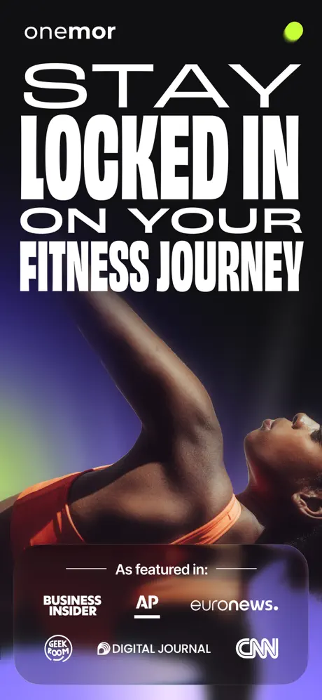
There is no device. The entire canvas is a poster: the word “onemor” sits in lowercase geometric sans at the top-left, measured at roughly 20–24 pt, while a single #D0FF14 dot anchors the top-right. Below, the headline is stacked in four lines of ultra-condensed all-caps: “STAY / LOCKED IN / ON YOUR / FITNESS JOURNEY”. The type is white, tightly leaded, and pushes almost to the safe edges. Behind it, a low-angle photograph of a woman in a coral sports bra stretches upward against a void lit by violet and lime rim light. At the bottom, a glassmorphism panel—roughly 140 pt tall with a subtle blur and a near-transparent fill—houses social proof. The text “As featured in:” is centered between two hairline rules, above two rows of press logos: BUSINESS INSIDER, AP (with its red underline), euronews., GEEK ROOM in a circular badge, DIGITAL JOURNAL with a globe mark, and CNN in its outline wordmark. By withholding every pixel of UI, the frame makes a brand promise before it makes a product demonstration.
Onemor App Store screenshot 2 — Daily Plan
02

Daily Plan

On-frame caption: “A DAILY PLAN FOR EVERY GOAL

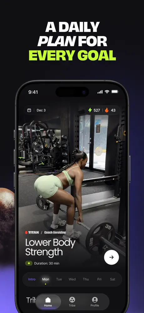
The device appears, framed by the headline “A DAILY PLAN FOR” in white and “EVERY GOAL” in #D0FF14 italic. Inside the phone, the status bar reads 9:41. The app header shows a calendar icon, “Dec 3”, a lightning bolt icon with “527”, and a flame with “43”. The main media is a full-bleed video still of a woman in mint shorts setting up a deadlift in a gym with MATRIX-branded equipment. Overlaid at lower-left is a content card: a red dot, “TITAN / Coach Geraldine”, then “Lower Body Strength” in large UI type, and a star icon with “Duration: 30 min”. A white circular arrow button sits at the bottom-right of the card. Beneath this, a weekly tab bar reads “Intro Mon Tue Wed Thu Fri Sat”, with “Mon” accented by the lime dot/underline. The bottom tab bar shows Home (filled), Tribe, and Profile on a frosted dark ground. The canvas background remains #0A0A0A with a faint indigo wash at the lower-left corner.

Onemor App Store screenshot 3 — Active Guidance
03

Active Guidance

On-frame caption: “GET STEP-BY-STEP GUIDANCE

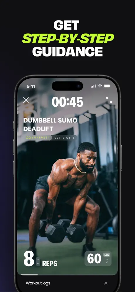
The caption now reads “GET” in white, “STEP-BY-STEP” in #D0FF14 italic, and “GUIDANCE” in white. The screen shows an active workout. Top-left has an “X”, center shows a large “00:45” timer, top-right has a fullscreen expand icon. Below the timer, “DUMBBELL SUMO DEADLIFT” is set in bold all-caps. Under that, a lime chain-link icon precedes “SUPERSET”, beside a dark pill reading “SET 2 OF 3”. The background image is a muscular man holding dumbbells in sumo stance, looking directly out. At the bottom, a translucent dark sheet holds two massive numerals: “8” with up/down arrows and the label “REPS”, and “60” with “LBS” micro-typography and its own arrows. A thin line divides this from the lower edge, where “Workout logs” appears at the left and a chevron at the right. The hierarchy is unapologetically tactile: the rep and weight counters are larger than the exercise name, prioritizing action over information.

Onemor App Store screenshot 4 — Social Layer
04

Social Layer

On-frame caption: “CHAT & COMPETE WITH FRIENDS

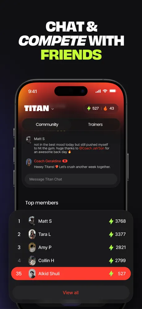
“CHAT &” in white, “COMPETE WITH” in white italic, “FRIENDS” in #D0FF14. The UI shows the “TITAN” tribe view. The header carries the tribe name in bold white with a chevron, plus the same lightning “527” and flame “43” energy metrics. A segmented control sits below: “Community” selected versus “Trainers”. The chat area shows two messages: “Matt S” with a gray avatar and body text, then “Coach Geraldine” with a red verified check, saying “Heeey Titans! ❤️ Let's crush another week together.” A dark input pill reads “Message Titan Chat”. Below, “Top members” introduces a leaderboard: rows numbered 1–4 show names (Matt S, Tara L, Amy P, Collin H) with lightning-scored counts (3768, 3377, 2821, 2799). The fifth row highlights the current user, “Alkid Shuli”, inside a solid red-orange pill (#FF453A), rank 35, score 527. A “View all” link in coral sits beneath. The contrast between the dark rows and the user-highlight pill is the only warm color inside the phone, and it reads as an emergency flare.

Onemor App Store screenshot 5 — Coach Profile
05

Coach Profile

On-frame caption: “FOLLOW PLANS FROM TOP COACHES

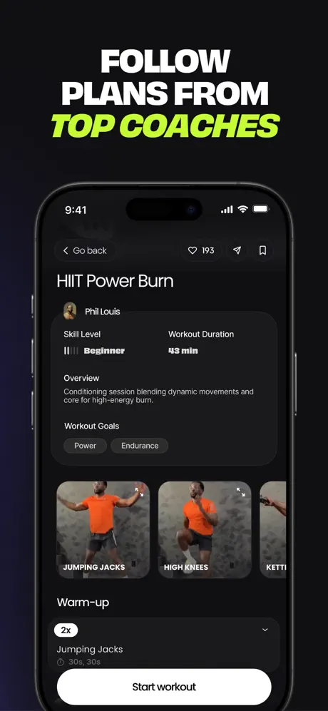
“FOLLOW PLANS FROM” in white, “TOP COACHES” in #D0FF14. This is a program detail page. The top-left shows a chevron with “Go back”; top-right shows a heart icon with “193”, a share arrow, and a bookmark. The title is “HIIT Power Burn”. Below, a coach avatar and “Phil Louis” sit above a metadata grid: “Skill Level” displays five segmented bars with “Beginner” label, and “Workout Duration” reads “43 min”. An “Overview” paragraph follows in dimmed white. “Workout Goals” introduces two pills—“Power” and “Endurance”—on a #2C2C2E fill. A horizontal row of exercise thumbnails follows, each roughly 140 pt wide with rounded corners and white text labels: “JUMPING JACKS”, “HIGH KNEES”, and a truncated “KETTLE...” at the right edge. Further down, an accordion row marked “2x” describes “Jumping Jacks” at “30s, 30s”. A full-width white pill at the bottom reads “Start workout”, creating the strongest call-to-action in the entire set because it is the only true white button shown inside the device.

Onemor App Store screenshot 6 — Tribe Selector
06

Tribe Selector

On-frame caption: “FIND YOUR COMMUNITY

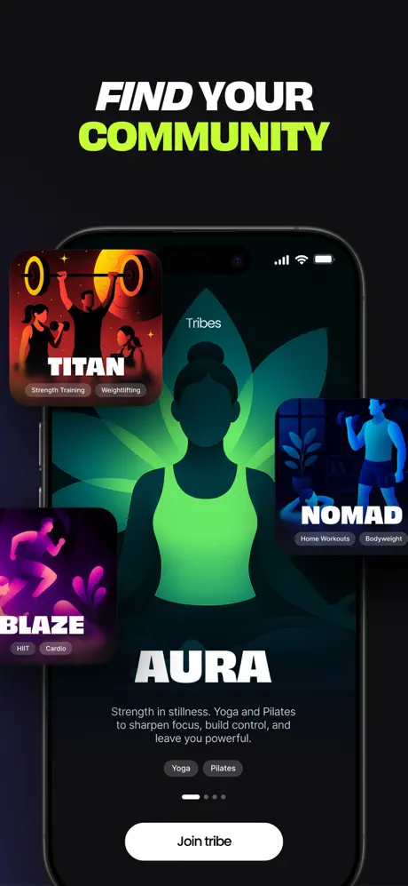
“FIND YOUR” in white italic, “COMMUNITY” in #D0FF14. The phone displays the “Tribes” hub. Dominating the center is the “AURA” tribe card: a neon-green monoline silhouette of a woman against a dark botanical motif. Below, white UI text reads “Strength in stillness. Yoga and Pilates to sharpen focus, build control, and leave you powerful.” Two dark pills read “Yoga” and “Pilates”. Pagination shows five dots, the first white, the rest #48484A. A “Join tribe” white pill sits at the bottom. Extruding from the device edges at three corners are floating tribe cards: top-left is “TITAN” in red-orange with weightlifting illustration and tags “Strength Training” and “Weightlifting”; bottom-left is “BLAZE” in magenta with a runner and tags “HIIT” and “Cardio”; right edge is “NOMAD” in cyan with a home-workout figure and tags “Home Workouts” and “Bodyweight”. The cards cast soft diffuse shadows and sit at slight rotations, breaking the rectangular rigidity of the phone without breaking the frame.

Onemor App Store screenshot 7 — Reward State
07

Reward State

On-frame caption: “TURN CONSISTENCY INTO REWARDS

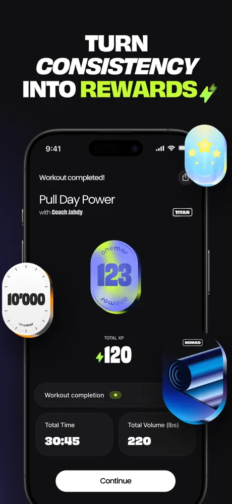
“TURN CONSISTENCY INTO” in white, “REWARDS” in #D0FF14 followed by a lightning bolt icon. This is the completion screen. At top: “Workout completed!”, then “Pull Day Power” with “Coach Jahdy” in bold, and a “TITAN” pill top-right. The center is occupied by a holographic lozenge—a mesh gradient ranging from periwinkle through lime to cyan—with “123” in bold dark type and a repeating “onemor” watermark. Extruding from the left is a white stopwatch dial reading “10'000” with orange accent ticks; from the right, a blue foam roller with a “NOMAD” pill; from top-right, a star badge in matching holo style. Inside the phone, “TOTAL XP” with a lime lightning bolt shows “+120”. A row reads “Workout completion” with a gold star icon. Two metric cards sit side-by-side: “Total Time” at “30:45” and “Total Volume (lbs)” at “220”, both on #1C1C1E fill. A “Continue” white pill anchors the bottom. The composition is maximalist compared to the rest of the set, leaning on 3D chrome to sell the dopamine hit.

Onemor App Store screenshot 8 — Workout Logs
08

Workout Logs

On-frame caption: “TRACK PROGRESS & BUILD HABITS

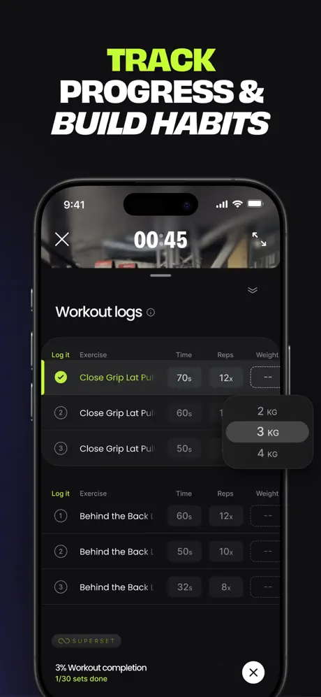
“TRACK” in #D0FF14, “PROGRESS &” in white italic, “BUILD HABITS” in white italic. The UI is a dense workout-logs sheet. A timer “00:45” and an “X” close mark the top. The sheet title is “Workout logs” with an info icon. Column headers read “Log it”, “Exercise”, “Time”, “Reps”, “Weight”. The first block shows “Close Grip Lat Pul...” with row 1 marked by a lime-green check in a circle, “70s”, “12x”. Row 2 has a circle “2”, “60s”, and an open weight cell triggering a popup picker that displays “2 KG”, “3 KG” (selected on #2C2C2E), and “4 KG”. Row 3 circles “3” at “50s”. A second block labeled “Log it” in lime shows “Behind the Back L...” across three rows with descending times and reps. A “SUPERSET” tag appears in a dark pill. The footer states “3% Workout completion” and “1/30 sets done” in lime, with an “X” close in a dark circle at bottom-right. The density is high enough that the weight picker partially obscures the column alignment, collapsing the spatial grid.

05The craft

Captions, colour and the mechanics of the sell

Caption pattern

Each caption is a 2–4 line stack of ultra-condensed all-caps, often breaking after a short verb. The pattern is: generic verb in white, benefit word in #D0FF14 (sometimes italic), and a final white noun line. This creates a ragged vertical rhythm that demands attention but is not consistently applied.

Visual system

A contained dark-mode system. Inside the phone, the app uses nearly-black backgrounds (#121212), elevated cards at #1C1C1E, and occasional frosted glass. Outside the phone, the canvas is absolute black with no texture. The only warm color inside the UI appears in Frame 4’s red-orange leaderboard pill (#FF453A) and the occasional coach verification checkmark.

The thumbnail test

At thumbnail size, the set is instantly legible because the white headlines and acid-lime accents punch hard against the black canvas. However, because Frame 1 contains no device and no recognizable UI pattern, it relies entirely on the shopper caring about the brand promise enough to tap through.

Conversion mechanics

The set assumes the shopper cares about brand mood on first impression. That works for organic discovery from social or influencer channels, but it may underperform in paid search where the user is comparing multiple fitness apps side-by-side and wants to see scheduling or logging immediately. The social proof bar in Frame 1 is smart for trust, yet it cannot compensate for the missing product shot.

06Where it slips

What we would change

Frame 1 shows zero product

Burning the hero slot on a pure lifestyle poster with no device chrome is a gamble. The social-proof glassmorphism bar is handsome, but it does not prove the app exists. Fix: introduce a device mockup even as a ghosted outline, or shift the headline to share space with a UI preview so the shopper knows this is software, not a supplement brand.

The headline system lacks grammatical logic

Frame 2 sets “EVERY GOAL” in lime italic; Frame 3 sets “STEP-BY-STEP” in lime italic; Frame 4 splits the styling so “FRIENDS” alone gets lime while “COMPETE WITH” is white italic; Frame 8 puts lime on “TRACK” but italicizes two separate lines in white. The inconsistency makes the headlines feel reactive rather than systematic. Fix: lock one rule—perhaps always color the outcome and italicize the verb—then audit every frame against that rule.

Frame 7 introduces a skeuomorphic clash

The extruding stopwatch in Frame 7 uses dial textures and orange tick marks that belong to a hyper-realistic 3D language, while every screen inside the phone is flat, dark, and UI-native. The rolled mat and star badge follow a softer illustrative language, but the stopwatch is jarringly literal. Fix: rebuild the extruding objects as vector-lozenge shapes that match the holographic badge in the center, preserving the dark-mode flatness.

Frame 8 conflates two modes

A timer reading “00:45” sits at the top of a logging sheet, merging an active workout session with a retrospective log in a single crop. The weight picker popup also floats over the table header and breaks the grid. Fix: crop the sheet to the bottom half of the phone, removing the timer chrome, or isolate the logging interaction in a cleaner, non-overlapping composition.

The sequence is non-linear

After active workout (Frame 3), the narrative jumps to chat (4), then plan detail (5), then tribes (6), then completion (7), then logs (8). A shopper cannot follow a single session arc. Fix: reorder into a linear user journey—browse, select plan, workout, log, complete, community—so each swipe feels like the next beat in a story rather than a shuffled feature deck.

07The recipe

How to apply this to your own app

  1. Lock the canvas

    If you use a device frame, keep the area outside it ruthlessly consistent. Onemor’s absolute black turns the phone into a stage; any gradient or lifestyle texture outside the bezel would cheapen the UI inside.

  2. Ration your accent

    Onemor uses its acid lime almost exclusively for screenshot captions and tiny UI badges. That restraint makes the color feel branded rather than decorative. Pick one tracer color and forbid it from primary buttons so it stays special.

  3. Headlines are architecture, not sentences

    The ultra-condensed face allows stacking and aggressive cropping. Treat screenshot text as poster design: break lines for shape, not grammar, and let the type extend close to the margins so it reads from the thumbnail.

  4. Follow one arc

    If your app has social, logging, and content features, resist the urge to show them as disconnected vignettes. Arrange screenshots so that screen 2 leads to screen 3 the same way a user would actually tap through.

08Takeaways

Five things worth stealing

  • A single acid-lime accent on a black canvas can separate a fitness app from the category’s typical orange-and-red noise.
  • Full-bleed photography inside the device frame makes the UI feel cinematic, but only if the interface chrome recedes into dark, frosted cards.
  • First-frame lifestyle posters increase brand heat at the cost of immediate product comprehension; use them only when downstream frames recover the clarity fast.
  • Extruding 3D elements outside the device frame add depth, but they must share the same material language as the in-app UI or they feel like clip art.
  • atAGlanceBitsOfUiSeenInThisSetLabel
09The verdict

What the set actually achieves

A polarizing set. Designers will admire the discipline of the black canvas and the headline architecture; conversion-focused product managers will worry that the first frame shows no interface and that the frame sequence follows a scattered feature list rather than a single user session. The set wins on brand coherence but sacrifices narrative linearity.

Onemor’s screenshot set is built for a shopper who values tribe identity and coaching personalities as much as workout mechanics. The heavy emphasis on “TITAN,” “AURA,” and “NOMAD” tribes, plus coach verification badges and social leaderboards, signals that the ideal user wants community accountability, not just a solo exercise library. The dark, club-like aesthetic suggests the target skews young, likely 18–34, and already immersed in gym culture rather than a casual beginner looking for a gentle onboarding promise.

10Questions

Frequently asked

One major architecture difference between mobile apps and desktop apps is the limited screen real estate.

Onemor’s screenshot set shows how to solve that by using full-bleed imagery, receding chrome, and aggressive typography that prioritizes one action per screen. The active workout frame, for example, makes the rep counter larger than the exercise name, which is a direct response to thumb-distance readability and glanceability.

Another key difference is the input method—touchscreens favor gestures and swipes over precise cursor clicks.

The set reflects this by featuring large pill buttons like “Start workout” and “Join tribe,” plus oversized arrow CTAs that sit in the thumb zone. Even the weight picker in the logging sheet is shown as a full-touch popup rather than a cramped desktop dropdown.

Because mobile devices are used on the go, mobile UIs must be designed for shorter attention spans.

Onemor handles this through cinematic poster frames and high-contrast color blocking. The bright lime on black ensures that even in a distracted scroll, the shopper gets one strong takeaway per screenshot: daily plans, step-by-step guidance, or community competition.

Mobile apps often compete for visibility in crowded app stores.

The set leans into distinct tribal branding—TITAN, AURA, BLAZE—rather than generic fitness imagery. That differentiation helps the app stand out in a grid of identical orange dumbbell icons and smiling trainers.

The form factor of mobile devices also means that designers must consider how users physically hold and interact with their devices.

Onemor’s in-app UI places primary actions like the arrow CTA and tab bar within thumb reach. The screenshots also crop the interface to the center of the screen, avoiding the top corners where reach is hardest, which signals awareness of one-handed gym use.

11Keep reading

Build your own screenshot set

The full set

8 shots
Onemor App Store screenshot 1Onemor App Store screenshot 2Onemor App Store screenshot 3Onemor App Store screenshot 4Onemor App Store screenshot 5Onemor App Store screenshot 6Onemor App Store screenshot 7Onemor App Store screenshot 8

About the app

Enjoy 7 days of Onemor Pro FOR FREE. NO credit card info required. Just fyi: onemor isn’t your normal fitness app. It’s where training, workouts, and wellness meet your vibe — Onemor, via the App Store listing.

Screenshots and store metadata belong to Onemor. They are shown here for design commentary and criticism. The analysis on this page is original work by floow.design. View the original listing.

More Health & Fitness teardowns

Browse all →