one year app icon
LifestyleScreenshot teardown10 min read

one year App Store screenshots

A brutal color restriction and a hand-drawn asset library can carry an entire App Store presence—but only if every frame earns its place by revealing information the previous frame could not.

Set published by Wind Down Studio, LLC · 6 frames analysed

4.7 · 351 ratingsFreev2.4Updated 5mo ago
one year App Store screenshot 1
01At a glance

The set in one screen

Framing
Five centered iPhone renders on a solid #2400E6 field; one full-bleed native screenshot (Frame 1).
Captions
Thin white script for headers; white monospace for subheads.
Backdrop
Deep electric blue on marketing frames; system light gray (#F2F2F7) inside the app.
Type
Script display face for marketing; monospace for all in-app text and timestamps.
UI / copy split
App UI occupies roughly 60% of the framed frames; marketing copy occupies the upper 25%.
Frame 1 job
Immediate emotional payoff: a fully bloomed garden of doodles with no explanatory text overlay.

Sampled palette

#2400E6#2400E6
#FFFFFF#FFFFFF
#F2F2F7#F2F2F7
#000000#000000
02The challenge

What this screenshot set had to solve

A daily journaling app must overcome two shopper objections in under three seconds per frame. First, it must prove that the input mechanism is not intimidating—blank-page syndrome kills retention before the download even completes. Second, it must demonstrate that the payoff visualization is rich enough to sustain interest across a 365-day cycle without becoming visually repetitive. The screenshot set faces the added constraint of explaining widgets, privacy architecture, and the depth of the doodle library without breaking the spatial garden metaphor. Because the app’s core reward is an slowly accumulating grid of hand-drawn icons, the designer must show both the destination (a dense, fully populated garden) and the journey (sparse early days) without consuming redundant carousel slots. There is also the technical challenge of legibility: the in-app typography is blue monospace on light gray, while the marketing layer uses a thin white script on deep blue—two very different readability profiles that must survive App Store compression, darkening, and thumbnails at non-Retina sizes.

The set turns color into navigational signage.
03The approach

How the set argues its case

The approach is front-loaded emotional payoff. Frame 1 gives the shopper the reward immediately: a screen nearly covered in electric-blue doodles, with no device bezel to dilute the impact. Only after the hook is set do the subsequent frames explain utility. Frames 2–6 enforce a strict editorial grid: a typographic pairing of thin script and neutral monospace against #2400E6. The device frames are consistently light-gray, softly shadowed, and centered, turning the iPhone itself into a reusable stage. Inside those frames, the app UI maintains its own rigid rules: blue line art at a single stroke weight, pill-shaped buttons with #2400E6 fills, and monospace timestamps. The contrast between the loose, organic doodles and the strict rectangular UI containers—year pills, rounded device edges, widget boxes—is treated as the central tension rather than resolved. Every frame is held together by that one hex value, so the color becomes signage as much as skin.

Lifestyle journaling apps usually sell calm, reflection, or mindfulness. “one year” sells accumulation and pattern: the idea that consistency creates a tapestry. By leading with the densest possible garden in Frame 1, the listing implies the app is already proven, already populated, already worth the habit.

04Frame by frame

Every screenshot, and the job it does

one year App Store screenshot 1 — What a full year looks like
01

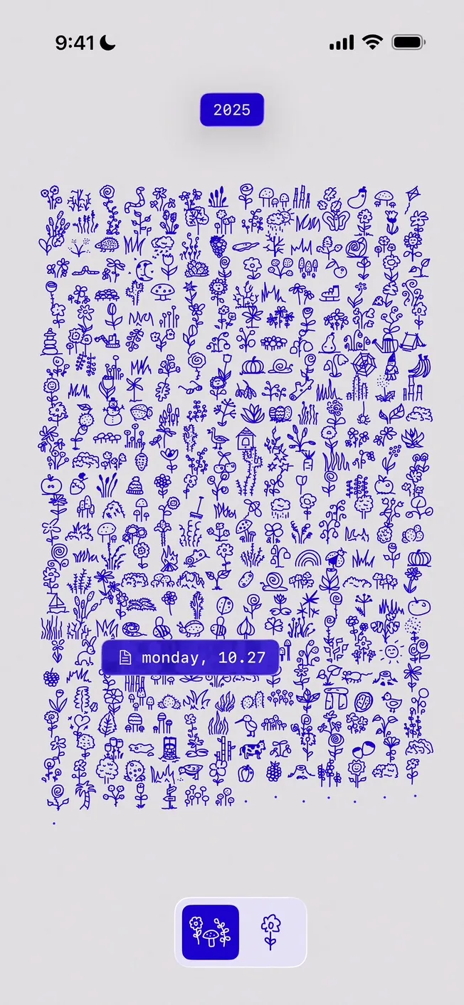
What a full year looks like

On-frame caption: “2025, monday, 10.27

Frame 1 is a native screenshot, not a render. The status bar reads 9:41 with standard cellular and battery glyphs. The background is iOS system gray near #F2F2F7. Centered near the top sits a rounded rectangle pill in #2400E6 containing the white monospace year label “2025”. The majority of the frame is occupied by a dense, seemingly random scatter of blue line-art icons—flowers, mushrooms, birds, rabbits, pears, insects—rendered in a uniform stroke weight with no fill. These illustrations pack into an irregular grid that reads as a textile pattern. A second pill floats over the lower third: #2400E6 background, calendar icon left, white text reading “monday, 10.27”. At the bottom edge, a segmented control shows two buttons: a filled #2400E6 square with white doodles, and an inactive light-gray square with a single blue flower. The crop is tight, slicing through the bottom row of doodles, which reinforces the impression that the pattern continues indefinitely off-screen.

one year App Store screenshot 2 — How memories are planted
02

How memories are planted

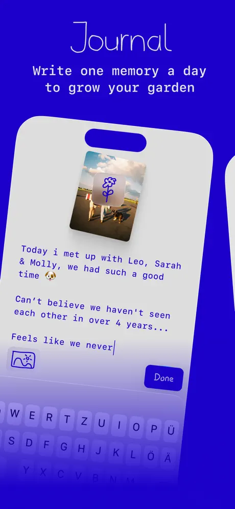
On-frame caption: “Journal / Write one memory a day to grow your garden

Frame 2 drops the raw screenshot into a marketing container. The canvas is solid #2400E6. The white script headline reads “Journal” with a stroke weight so thin it approaches a hairline. Below, in white monospace: “Write one memory a day to grow your garden”. The device frame is a light-gray rounded rectangle with a Dynamic Island slot. Inside, the screen shows a journal entry with a square photograph of two people and a dog on a beach, overlaid by a rounded square containing a blue flower doodle. Beneath the photo, blue monospace body copy reads exactly: “Today i met up with Leo, Sarah & Molly, we had such a good time 🐶” followed by “Can’t believe we haven’t seen each other in over 4 years...” and an active cursor line “Feels like we never|”. A landscape icon sits bottom left; a #2400E6 pill button labeled “Done” sits bottom right. The visible keyboard reveals a QWERTZ layout with Ü, Ö, and Ä keys.

one year App Store screenshot 3 — The garden escapes the app
03

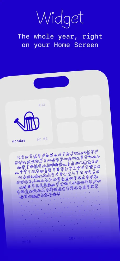
The garden escapes the app

On-frame caption: “Widget / The whole year, right on your Home Screen

The template holds: #2400E6 canvas, white script “Widget”, white monospace “The whole year, right on your Home Screen”. The device frame displays an iOS Home Screen with two widgets. The upper widget is a square: light-gray background, large blue watering-can doodle, “#33” in blue at upper right, and “monday” / “02.02” at lower left and right. The lower widget is a horizontal rectangle containing a miniature, densely packed field of blue doodles—effectively the garden view at scale. Along its bottom edge sit the figures “2025”, “187”, and “256”, suggesting a days-counted meter. Four empty white app icon placeholders occupy the background grid. This frame shifts focus from in-app UI to system-level utility, proving the garden escapes the app boundary while maintaining the same #2400E6 doodle vocabulary.

one year App Store screenshot 4 — Privacy as a system dialog
04

Privacy as a system dialog

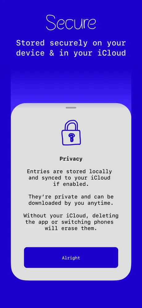
On-frame caption: “Secure / Stored securely on your device & in your iCloud

Frame 4 uses identical envelope dimensions but lands flat. The headline reads “Secure” in script; the subhead reads “Stored securely on your device & in your iCloud” in monospace. The device screen is a centered privacy modal on #E5E5EA. At top: a blue outline padlock icon. The heading “Privacy” appears in centered dark text. The body is three centered paragraphs: “Entries are stored locally and synced to your iCloud if enabled.” “They’re private and can be downloaded by you anytime.” “Without your iCloud, deleting the app or switching phones will erase them.” A full-width #2400E6 button at the bottom reads “Alright”. There are no doodles here except the lock glyph. The frame communicates trust, but visually it is an abrupt departure from the living garden shown elsewhere—a modal interrupt rather than a continuation of the botanical system.

one year App Store screenshot 5 — The empty lattice
05

The empty lattice

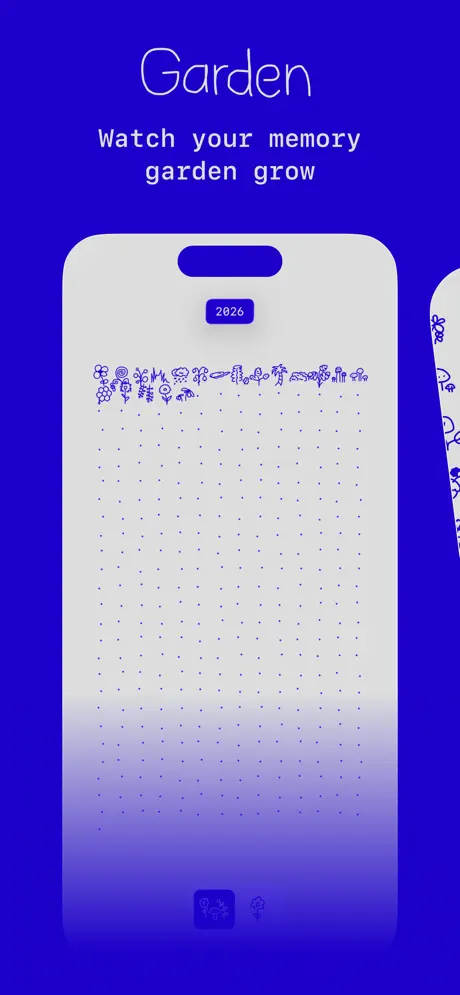
On-frame caption: “Garden / Watch your memory garden grow

“Garden” heads the frame, followed by “Watch your memory garden grow”. The device screen repeats the structure of Frame 1 but in an early-stage state. The year pill now reads “2026”. The top of the grid holds a single sparse row of perhaps ten small blue doodles. Every remaining cell is not an illustration but a tiny blue dot, fading in opacity toward the bottom of the screen until the final rows are barely visible against the #F2F2F7 background. The bottom nav mirrors Frame 1 exactly: the filled-blue and inactive-gray duo. By showing the dot-grid empty state, the frame clarifies the temporal mechanic—each dot is a day waiting to be filled. However, because it rhymes so closely with Frame 1, it risks teaching the shopper nothing new except that the garden starts small.

one year App Store screenshot 6 — Proof of craft
06

Proof of craft

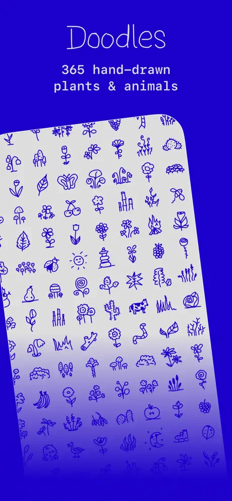
On-frame caption: “Doodles / 365 hand-drawn plants & animals

The final frame tilts the device roughly 15 degrees counter-clockwise, breaking the frontal grid for the first time. The headline reads “Doodles”; the subhead reads “365 hand-drawn plants & animals”. The screen within the device is a pure asset showcase: an unbroken mosaic of blue line illustrations on light gray. Visible motifs include a ladybug, sun, pear, cactus, snail, goat or cow, bananas, leaves, butterflies, mushrooms, and stacked stones. Every icon shares the same stroke weight and #2400E6 color value, proving the set is stylistically locked. There is no UI chrome beyond the status bar. This frame functions as the gallery wall, answering the shopper’s unstated question about repetition—yes, there really are hundreds of unique marks. The tilt introduces faux-physicality, as if the phone were laid on a table covered in stickers.

05The craft

Captions, colour and the mechanics of the sell

Caption pattern

Each framed screenshot uses the same top-locked stack: 1 word in script, followed by 1 sentence in monospace. Only Frame 1 breaks this by containing zero caption copy on the image itself, forcing the App Store metadata to carry the full explanatory load.

Visual system

The app builds a world from one line weight and one color. The doodles share a uniform ~2pt stroke with no fill, creating a visual flatness that keeps them from competing with photos or text when overlaid. The blue is always #2400E6 whether it is a background, a button fill, or an illustration stroke, so the eye never re-calibrates.

The thumbnail test

At small scale, the #2400E6 and off-white pairing reads as a single indigo tile in the search results. The doodle density of Frame 1 becomes a textured blue mass that stands out against competitors who usually show blank pages or serif writing surfaces. However, the thin script headlines risk disappearing into hairlines when downscaled.

Conversion mechanics

The set prioritizes aesthetic coherence over immediate comprehension. Frame 1 shows no input UI, no CTA, and no device frame, so a casual scroller might mistake the app for a wallpaper or sticker pack until Frame 2 arrives. The widgets in Frame 3 do heavy lifting for daily-retention messaging, while Frame 4 handles the data-privacy objection that Lifestyle shoppers often scan for. Frame 6 closes the loop by justifying the price of admission: quantity of art.

06Where it slips

What we would change

Structural redundancy between Frame 1 and Frame 5

Frames 1 and 5 both display the garden grid; Frame 1 shows the climactic dense state, while Frame 5 shows the sparse dot-grid origin. Burning two of six frames on the same screen state—merely inverted in population—is a tax the listing cannot afford. The fix is to delete Frame 5 and let Frame 1 carry the garden narrative alone, freeing a slot for the archive/day-detail view or the onboarding flow that is currently invisible.

German keyboard localization in an English-language frame

Frame 2’s inclusion of a QWERTZ keyboard, visible through the Ü, Ö, and Ä keys, introduces a localization artifact that fractures the universal promise of the English caption text. A shopper in an English-speaking territory sees a UI that subconsciously reads as geographically misaligned. The fix is either to switch the simulator locale to U.S. English before capture, or to crop the frame above the keyboard line entirely.

Privacy screen is visually orphaned

Frame 4’s modal is starved of the app’s illustration language. A generic padlock icon and centered legal text on flat gray does not belong to the same world as the watering cans and snails. The absence of any botanical motif—perhaps a root system or a seed vault metaphor—makes the frame feel like a system alert rather than a branded trust signal. The fix is to introduce a doodle border or replace the lock glyph with a plant-based security icon.

Template rigidity kills lateral momentum

Five frames share the exact same top-heavy text stacking and centered device orientation. Only Frame 6 introduces rotation. At thumbnail scale, the carousel can read as one long blue strip. The fix is to alternate the headline placement or device scale between frames—left-align the script on Frame 3, dramatically enlarge the device on Frame 4—so the eye detects motion as the user swipes.

07The recipe

How to apply this to your own app

  1. Restrict your palette earlier than feels safe.

    Committing to a single dominant hex (#2400E6 here) and one accent neutral turns every frame into a brand impression before the user processes a single word.

  2. Lead with the finished artifact, not the blank tool.

    Frame 1 shows a year already filled. If your app produces a visual result over time, show the most complete version first, then reveal the input mechanism.

  3. Treat the device frame as stage direction.

    The consistent light-gray iPhone shell in Frames 2–6 acts like a proscenium arch. Decide whether your set benefits from that stability, or whether your content is better served by the raw full-bleed honesty of Frame 1.

  4. Verify system artifacts before export.

    Keyboard locales, notification badges, and low-battery icons leak real-world context that can override the story you are trying to tell. Scrub the simulator or crop aggressively.

08Takeaways

Five things worth stealing

  • A single color at maximum saturation can carry six frames if the internal UI respects the same value.
  • Showing the payoff before the UI reduces blank-page anxiety, but it risks ambiguity for shoppers who need immediate category recognition.
  • Hand-drawn assets scale down well because irregular lines remain legible at small sizes where geometric icons become noise.
  • If every frame uses the same device angle and headline stack, the carousel loses visual velocity.
  • In a set this short, redundancy is the only unforgivable sin.
09The verdict

What the set actually achieves

By enforcing a single color and a strict device-frame template across five of six frames, the designer turns a simple two-color palette into instant brand recognition. The payoff-first sequencing proves the emotional destination before explaining the mechanics, and the hand-drawn doodle library answers the fear of visual monotony by sheer variety of line-art marks.

Designers building habit-forming lifestyle apps where the long-term output is more photogenic than the input screen. Anyone relying on a hand-drawn or organic illustration library that needs to prove variety quickly. Teams debating whether to burn a screenshot slot on privacy or widgets when the core loop is visually simple.

10Questions

Frequently asked

Why is Frame 1 presented without a device bezel?

It reads as an immersive payoff shot. By removing the phone frame, the designer collapses the distance between the shopper and the garden, letting the doodle pattern fill the viewport edge-to-edge.

Is the blue consistent across in-app UI and marketing frames?

Yes. The marketing canvas, the in-app buttons, the doodle strokes, and the widget accents all read as the same #2400E6. That consistency is the set’s primary structural adhesive.

Why does Frame 6 tilt the phone?

After five frontal compositions, the slight rotation introduces depth and signals ‘gallery’ rather than ‘interface.’ It breaks the fourth wall of the template without abandoning the blue field.

Does the set explain how to actually write an entry?

Only partially. Frame 2 shows the journal screen, but the marketing layer never labels the text field or the photo attachment. The shopper must infer input from the context of the keyboard and the cursor line.

11Keep reading

Build your own screenshot set

The full set

6 shots
one year App Store screenshot 1one year App Store screenshot 2one year App Store screenshot 3one year App Store screenshot 4one year App Store screenshot 5one year App Store screenshot 6

About the app

Write one short (or long) memory + add an image each day. Every entry becomes a hand-drawn plant, slowly forming a garden over the year. Journaling that feels light, visual, and Wind Down Studio, LLC, via the App Store listing.

Screenshots and store metadata belong to Wind Down Studio, LLC. They are shown here for design commentary and criticism. The analysis on this page is original work by floow.design. View the original listing.

More Lifestyle teardowns

Browse all →