Peaks app icon
FinanceScreenshot teardown9 min read

Peaks App Store screenshots

App Store browsing is an act of peripheral vision. A user scrolls a feed of icons and captions, and a screenshot set has perhaps two seconds to graduate from background noise to intentional tap. For apps in the health and quantified-self category, that window is even narrower because the value proposition is abstract. You cannot photograph sleep debt. You cannot render a circadian rhythm as a hero image. The burden falls entirely on interface design to make invisible biological processes feel tangible, measurable, and—crucially—actionable. The shopper is not just asking, “What does this app do?” They are asking, “Can this app read my body better than I can?” That means the screenshots must simultaneously establish scientific credibility and emotional warmth. Too clinical, and the app feels like a hospital chart; too friendly, and it feels like a toy. The set must also navigate platform conventions: device bezels signal authenticity, widgets signal ecosystem integration, and gradients signal brand mood. Altogether, the challenge is to compress a multi-faceted health tool into a coherent seven-frame story that reads instantly at thumbnail scale and rewards closer inspection.

Set published by Jens Hassler · 7 frames analysed

4.3 · 34 ratingsFreev1.5.5Updated 4mo ago
Peaks App Store screenshot 1
01At a glance

The set in one screen

Framing
Mix of 3D device models and abstract UI compositions
Captions
Heavy sans-serif for feature claims, editorial serif for brand frames, casual script for annotations
Backdrop
Signature indigo-to-coral gradient alternating with white grid fields
Type
Sharp high-contrast serif for headline emotion, bold geometric sans for functional statements
UI / copy split
Roughly 70% interface, 30% typography, with the interface increasing in density toward the end of the set
Frame 1 job
Establish the circadian graph and the color-node logic before explaining any feature

Sampled palette

#4A4F9F#4A4F9F
#9B9ECA#9B9ECA
#F07A56#F07A56
#FFFFFF#FFFFFF
#0A84FF#0A84FF
#5AC8FA#5AC8FA
02The challenge

What this screenshot set had to solve

The app measures intangible biological rhythms—energy peaks, sleep debt, recovery windows—and must communicate that mechanism to a shopper who has never opened it. The designers had to make a spline graph feel as intuitive as a clock face, prove cross-platform utility across iPhone and Apple Watch, surface calendar integration without showing private user data, and close with a privacy argument, all within seven static images that may be viewed at fewer than 400 pixels wide.

At thumbnail scale, typographic diversity does not read as range; it reads as incoherence.
03The approach

How the set argues its case

The sequence moves from concept to validation to integration to depth to ubiquity to trust. Frame 1 anchors the entire set with the circadian spline graph and a four-color node system. Frame 2 extends that graph to the Apple Watch. Frame 3 abstracts the value into calendar blocks. Frames 4 and 5 prove the app can analyze sleep over time. Frame 6 argues the data is always visible via widgets. Frame 7 closes by removing friction—no account, local data, HealthKit sync. The strategy is to answer objections in reverse order of skepticism: first prove the science, then prove the convenience, then prove the safety.

The set refuses to pick a single lane between lifestyle brand and clinical tool. The opening serif headline (“See your inner clock”) positions the product as a reflective, almost poetic utility, while Frame 3’s engineering grid and calendar blocks recast it as a productivity optimizer. Frame 4’s “Insights” dashboard leans back into quantified-self territory. The result is positioning that oscillates between meditation-app warmth and Fitbit-style analytics, which may broaden appeal at the cost of immediate comprehension.

04Frame by frame

Every screenshot, and the job it does

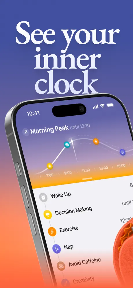
Peaks App Store screenshot 1 — See your inner clock
01

See your inner clock

On-frame caption: “The opening frame commits fully to atmosphere. A vertical gradient fills the entire canvas, transitioning from roughly #4A4F9F at the top through a muted violet mid-tone to a warm coral #F07A56 at the base. Against this, the headline “See your inner clock” is rendered in a sharp white serif (approximate #FFFFFF) with pronounced stroke contrast and ball terminals, stacked across three lines with tight leading that forces the eye downward toward the device. The phone itself is an iPhone 15 Pro, identifiable by the Dynamic Island notch, the titanium side rails, and the repositioned volume buttons visible on the left edge; it is tilted roughly twelve degrees clockwise, catching a specular highlight on the top bezel. The screen inside establishes every subsequent frame’s visual grammar. At the top, a header reads “Morning Peak until 13:10” beside a diagonal trend-arrow icon in white. Below that, the hero spline curve begins at a 7:00 yellow node, passes a 9:00 teal node, crests near an 11:00 white sparkle, then descends through a 13:00 orange node and a 15:00 purple node. Time markers anchor the X-axis at two-hour intervals. Beneath the graph, a vertical list pairs circular glyphs with activities: a grey clock for “Wake Up,” a yellow speech bubble for “Decision Making,” an orange running figure for “Exercise,” a purple sleep icon for “Nap,” a brown coffee cup for “Avoid Caffeine,” and a truncated sixth row suggesting “Creativity.” The color-to-activity mapping is immediate and systematic.

Frame 1 is the strongest card in the set. The gradient is ownable, the circadian graph is legible, and the tilted device creates depth without obscuring the UI.
Peaks App Store screenshot 2 — Trusted by 100k people
02

Trusted by 100k people

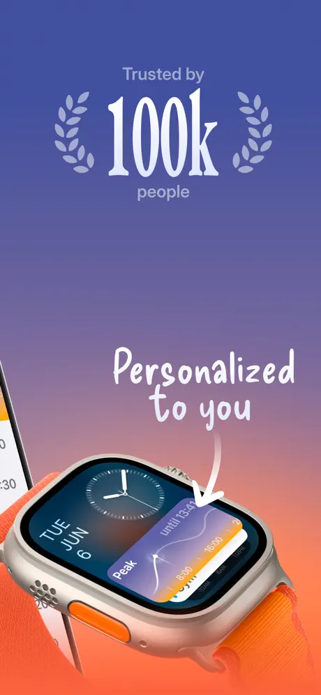
On-frame caption: “Frame 2 continues the gradient bed, creating chromatic continuity that helps the set feel like a unified brand rather than a slide deck. The upper half is devoted to a centered social-proof lockup. The words “Trusted by” and “people” are set in a modest, lightweight sans-serif, while the figure “100k” is rendered in the same high-contrast serif used in Frame 1, flanked by symmetrical lavender laurel wreaths that read as desaturated #9B9ECA vector shapes. The lower half introduces the Apple Watch Ultra as a secondary hardware platform. Its titanium case and orange Alpine Loop strap are shown in three-quarter view, the band curling out of frame toward the bottom right. On the watch face, an analog clock module shares space with a card complication that reads “Peak until 13:41” and replays the circadian spline graph at a wrist-appropriate scale, proving the data visualization system is responsive across device sizes. Overlaid above the watch is the phrase “Personalized to you” in a casual handwritten script, accompanied by a thick white arrow that points directly at the complication card. The left edge of the frame allows a sliver of an iPhone screen to intrude, implying the watch is tethered to the phone ecosystem. The color collision between the orange strap and the coral gradient background is notable; the two orange families are close enough in hue to flatten the watch’s lower edge.

Frame 2 squanders the second-most valuable slot on social proof rather than feature depth. The watch also bleeds into the background, losing its edge definition.

Peaks App Store screenshot 3 — Plan around your energy
03

Plan around your energy

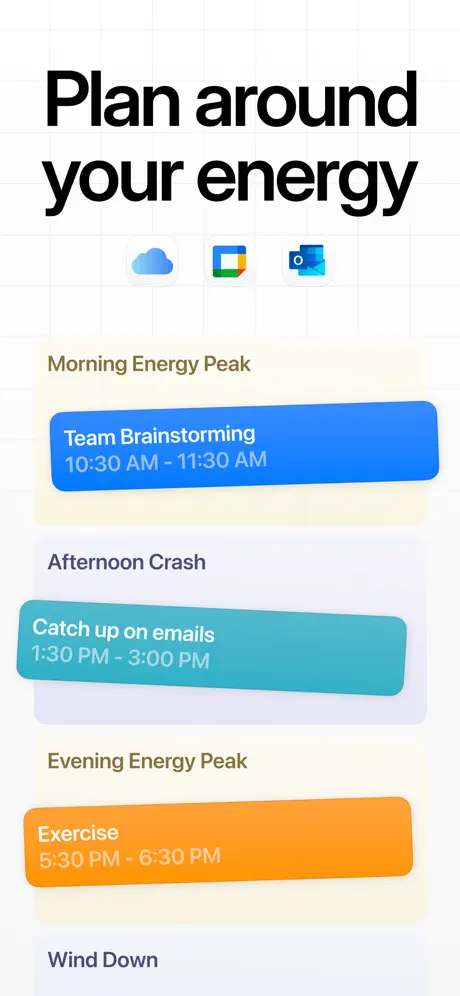
On-frame caption: “This frame marks the most dramatic break in the set. The background abandons the brand gradient entirely for a neutral white field—approximately #FEFEFE—overlaid with a faint grey engineering grid that evokes productivity software and planning tools. The headline “Plan around your energy” is set in the heavy geometric sans, black and bold, with letterforms tight enough to feel almost engineered. Beneath the headline, three small third-party app icons sit in a horizontal row: Apple Weather (cloud), Google Calendar (four-color flag), and Microsoft Outlook (blue envelope with an “O”), suggesting deep calendar integration. The meat of the frame is three stacked rounded rectangles that abstract the user’s calendar into biological phases. The first, under the olive-brown label “Morning Energy Peak,” is a saturated blue card (#0A84FF) containing “Team Brainstorming 10:30 AM - 11:30 AM.” The second, labeled “Afternoon Crash,” is a teal card (#5AC8FA) holding “Catch up on emails 1:30 PM - 3:00 PM.” The third, under “Evening Energy Peak,” is an orange card (#FF9F0A) with “Exercise 5:30 PM - 6:30 PM.” A truncated fourth label, “Wind Down,” appears at the bottom. Crucially, this frame omits any device bezel, which risks making the integration look conceptual rather than shipped.

Frame 3 is the weakest conversion frame because it shows no device context. Calendar integration is a high-value feature, but without a phone bezel the cards look like unshipped concepts.

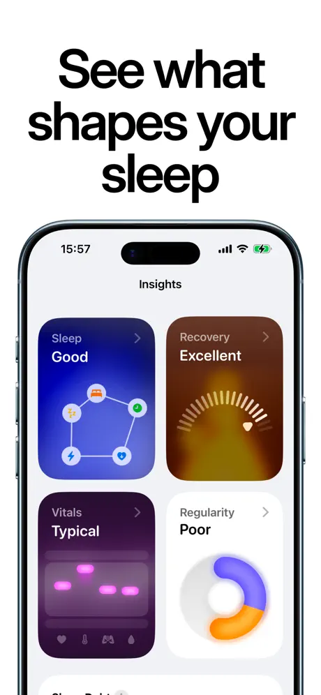
Peaks App Store screenshot 4 — See what shapes your sleep
04

See what shapes your sleep

On-frame caption: “The fourth frame returns to a flat white background and a straight-on iPhone 15 Pro bezel. The time on the phone reads 15:57; the battery icon is green and charging. The headline above the device, “See what shapes your sleep,” reprises the heavy black sans from Frame 3, establishing a sleep-focused subsection of the sequence. Inside the screen, an “Insights” header sits above a 2x2 masonry grid of rounded cards, each behaving as an independent data module. Top-left: a deep sapphire gradient card labeled “Sleep” and “Good,” containing a pentagonal diagram of five icons—bed, sun, lightning bolt, heart, and person—connected by white lines. Top-right: a burnt-sienna-to-amber gradient card labeled “Recovery” and “Excellent,” showing a radial gauge with a heart-shaped indicator. Bottom-left: a dark aubergine card (#2D1B4E) labeled “Vitals” and “Typical,” displaying pink segmented bars and tiny footer icons for heart rate, temperature, respiratory rate, and blood oxygen. Bottom-right: a plain white card labeled “Regularity” and “Poor,” containing an abstract blue-and-orange crescent shape that reads as a broken ring or irregular arc. The diversity of gradients inside the cards creates a heat-map effect, turning the dashboard into a spatialized health report where color alone conveys status before the user reads a word.

Frame 4 is information-dense without feeling cramped. The four-card grid proves the app delivers post-hoc analysis, not just real-time tracking, which answers a key skepticism.

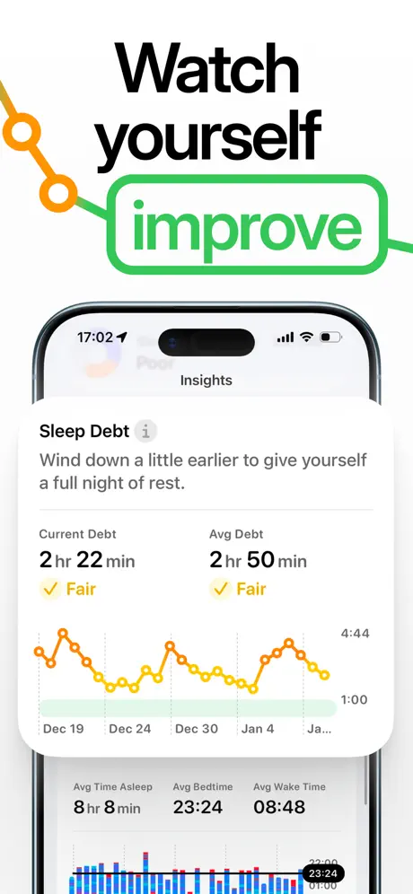
Peaks App Store screenshot 5 — Watch yourself improve
05

Watch yourself improve

On-frame caption: “Frame 5 is the most graphically ornate of the set. Above the device, the headline “Watch yourself improve” is split into two registers: “Watch yourself” in black sans, and the word “improve” replaced by a green rounded-rectangle outline (approximate #34C759) containing the same word in green. An orange dotted trend line enters from the left edge, bounces through two nodes, and threads directly into the green badge, literalizing the concept of tracked progress. The iPhone below, locked at 17:02, shows another “Insights” screen devoted to longitudinal sleep data. The section header is “Sleep Debt” with a small grey circled-info icon. Directly beneath, an advisory sentence reads: “Wind down a little earlier to give yourself a full night of rest.” Two columns follow: “Current Debt 2 hr 22 min” with a yellow checkmark and the qualifier “Fair,” and “Avg Debt 2 hr 50 min” with an identical checkmark and “Fair.” An orange sparkline graphs daily debt across a three-week window from Dec 19 to Jan 4, with Y-axis delimiters at 1:00 and 4:44. Below the fold, three summary statistics are visible: “Avg Time Asleep 8 hr 8 min,” “Avg Bedtime 23:24,” and “Avg Wake Time 08:48,” followed by the top edge of a histogram with a tooltip reading “23:24.” The data density here is high, which rewards curious scrollers but may intimidate skim readers.

The decorative “improve” badge and looping arrow feel like clip-art compared to the clean UI inside the phone. The internal trend data is persuasive enough without the external illustration.

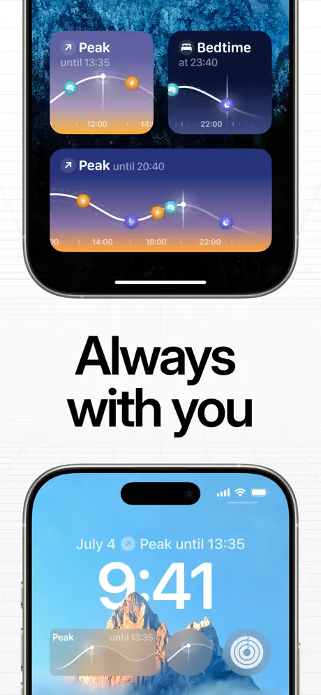
Peaks App Store screenshot 6 — Always with you
06

Always with you

On-frame caption: “This frame adopts the same faint white grid as Frame 3, creating a bookend effect, and sandwiches the words “Always with you” in the heavy black sans between two devices. The top device is an iPhone shown from the front, displaying a stack of widgets against a dark, high-frequency blue wallpaper that resembles aerial ocean photography. Two small widgets sit side by side at the top: one reads “Peak until 13:35” and the other “Bedtime at 23:40.” Below them, a medium widget repeats “Peak until 20:40” and shows the full circadian spline across a 10:00 to 22:00 axis. The bottom device is an iPhone Lock Screen: the date reads “July 4,” the large typographic clock reads “9:41,” and a Live Activity or widget banner at the bottom reads “Peak until 13:35” beside a circular target icon. The Lock Screen wallpaper shows a sunlit rocky mountain against a pale sky. By showing both Home Screen widgets and Lock Screen presence, the frame argues for ambient utility—the app is meant to be a layer on top of the operating system rather than a destination. However, the two wallpapers fight for attention; the top image’s texture is so busy that the orange and teal graph nodes lose definition at thumbnail scale.

Frame 6 makes the case for ecosystem presence, but the top wallpaper’s high-frequency noise competes with the widget text. The bottom Lock Screen is clearer because the mountain wallpaper is low-contrast and calm.

Peaks App Store screenshot 7 — Find your rhythm. Keep your data.
07

Find your rhythm. Keep your data.

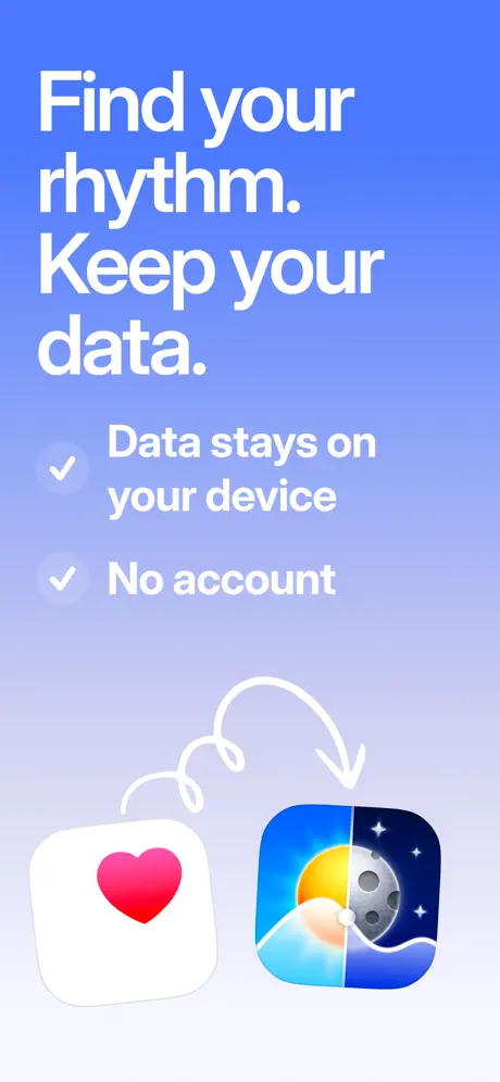
On-frame caption: “The final frame closes the argument with a privacy-first message. The background is a fresh gradient, distinct from Frame 1’s coral scheme: it moves from a bright royal blue (#4B7BF5) at the top to a pale ice blue (#E8ECFC) at the bottom, signaling clarity and openness rather than biological warmth. The headline is white, bold, and direct: “Find your rhythm. Keep your data.” Two proof points follow, each prefixed by a translucent circular checkmark: “Data stays on your device” and “No account.” The lower half of the frame visualizes integration through iconography. On the left is the Apple Health app icon—a rounded white square with a saturated red heart. On the right is the Peaks app icon itself, a split-field illustration showing a yellow sun, blue sky, and teal wave on the left half, and a grey moon with stars over a dark blue wave on the right half. A white scribbled arrow loops from the Health icon toward Peaks, making the data-flow relationship explicit. This frame shifts the value proposition from “what the app measures” to “how the app respects you,” a common closing tactic for health apps seeking to differentiate from ad-supported competitors.

Frame 7 is a disciplined closer. The gradient shift to cool blue signals a tonal change from body to privacy, and the two bullet points are scannable even at thumbnail size.

05The craft

Captions, colour and the mechanics of the sell

Caption pattern

The captions alternate between imperative brand statements (“See your inner clock,” “Plan around your energy,” “Find your rhythm”) and functional benefit statements (“Data stays on your device,” “No account”). The imperative headlines dominate Frames 1, 3, 4, 5, 6, and 7, while Frame 2 relies on social proof (“Trusted by 100k people”) and annotation (“Personalized to you”). The result is a rhythmic cadence of verb-first commands that train the shopper to view the app as an action-oriented tool.

Visual system

The core visual anchors are the circadian spline graph and the four-node color system. The graph appears in Frame 1 inside the phone, in Frame 2 on the watch complication, in Frame 3 implicitly via the calendar card colors, in Frame 6 inside the widgets, and nowhere else. The indigo-to-coral gradient appears in Frames 1 and 2, then disappears for the rest of the set, replaced by white and blue gradients. This means the brand’s most distinctive color asset is front-loaded and abandoned, leaving the later frames to feel visually orphaned.

The thumbnail test

Frame 1 survives the thumbnail test because the white serif headline and the orange-purple gradient hold contrast even when compressed. Frame 4 also survives because the 2x2 card grid creates four distinct color blocks. Frame 3 fails: without a device bezel, the calendar cards look like generic marketing illustrations, and the three tiny app icons are illegible. Frame 6 fails because the top phone’s textured blue wallpaper turns into visual noise at small scale, swallowing the widgets.

Conversion mechanics

The set front-loads its most distinctive visual asset—the indigo-to-coral gradient—then abandons it for the remaining five frames. This is a risky trade-off: Frames 1 and 2 will stop the scroll, but Frames 3 through 7 must rely on typography and UI density alone to maintain interest. The lack of a consistent background color means the set does not read as a recognizable strip when the user scrolls the gallery; each frame looks like a separate ad. For conversion, the strongest signal is Frame 4, because the 2x2 card grid proves the app has depth. The weakest is Frame 3, because calendar integration shown without a device frame lacks credibility.

06Where it slips

What we would change

Typographic Fracture

The set oscillates between an editorial serif (Frames 1–2), a heavy geometric sans (Frames 3–6), a casual handwritten script (Frame 2), and a scribbled line (Frame 7). At thumbnail scale, this diversity does not read as range; it reads as incoherence. A shopper swiping rapidly is likely to perceive Frames 1–2, 3–6, and 7 as belonging to different apps. Fix: Commit to a single display typeface. If the serif is the intended differentiator, extend it to all headlines, or confine it to Frame 1 and shift everything else to the sans.

Frame 2 Compositing

The Apple Watch Ultra’s orange Alpine Loop is almost exactly the same hue as the coral terminus of the background gradient. The result is a loss of edge definition along the strap and the lower titanium case, making the watch look pasted rather than placed. Fix: Isolate the watch on a contrasting cool background or introduce a subtle shadow seam to separate hardware from gradient.

Premature Social Proof

The second frame is the most valuable real estate after the first, yet it spends that space on “Trusted by 100k people” before the user has seen what the app actually does. Social proof works better as a rebuttal than an opener. Fix: Swap Frame 2 and Frame 6. Show ecosystem ubiquity early, and let trust signals close the sale near Frame 7.

Frame 3 Lacks a Bezel

Calendar integration is a high-value conversion feature, but presenting it as free-floating cards strips away the platform context. The shopper cannot tell whether these are native iOS calendar events, in-app notifications, or marketing illustrations. The tiny third-party app icons are also illegible at store resolution. Fix: Place the same three cards inside an iPhone frame, ideally within an actual Calendar app chrome or at least under a realistic status bar.

Frame 6 Wallpaper Noise

The top phone in Frame 6 uses a dark blue high-frequency texture that competes directly with the thin white lines of the widget graphs. At small scale, the orange and teal nodes drown in the background. Fix: Replace the wallpaper with a solid color—pure black or the app’s own indigo—and let the widgets function as high-contrast foreground objects.

07The recipe

How to apply this to your own app

  1. Audit all seven frames as a contact sheet at 300 px wide before shipping. If a decorative element—whether a script font, a stock arrow, or a busy wallpaper—does not survive the zoom-out, remove it.

    The shopper does not see your design intent; they see only what survives at thumbnail scale. In this set, the decorative “improve” badge and the handwritten arrow in Frame 2 are the first casualties of compression.

  2. Never put social proof in Frame 2.

    The second frame should extend the product story, not reassure the user. Trust signals work best after the user understands the value proposition, ideally in Frame 5 or 6.

  3. If you introduce a brand gradient in Frame 1, find a way to echo it in Frames 3–7.

    Otherwise the set visually fragments. A subtle gradient bar, a tinted card, or a repeated background wash is enough to maintain continuity.

  4. When showing widgets, use a solid black or solid white wallpaper in your device mockup.

    Photographic wallpapers have unpredictable contrast that can swallow the very UI you are trying to sell.

08Takeaways

Five things worth stealing

  • The circadian spline graph introduced in Frame 1 is the set’s single strongest visual anchor; every frame that repeats it (watch, widget, lock screen) reinforces comprehension.
  • Frame 4’s four-card grid proves that the app can deliver post-hoc analysis, which is a higher-urgency signal for health apps than real-time tracking alone.
  • The typography system needs consolidation. Four voices in seven frames fractures brand recognition at thumbnail scale.
  • Device bezels are not decorative; they signal platform legitimacy. Frame 3’s decision to omit the bezel undermines the credibility of its calendar-integration claim.
  • The purple-to-coral gradient is ownable, but it disappears after Frame 2, leaving the second half of the sequence visually unmoored.
09The verdict

What the set actually achieves

The set relies on a split personality: gradient-brand frames for emotion, white-grid frames for functionality. It succeeds when it trusts the density of its own UI, and it stumbles when decorative type and illustration compete with the interface.

This set will resonate with designers building health, quantified-self, or bio-tracking apps who need to balance dense data visualization with emotional appeal. It is also instructive for teams struggling to unify multiple feature modules—sleep, energy, calendar, privacy—into a single screenshot narrative.

10Questions

Frequently asked

Why does Frame 1 use a serif when the rest of the set uses sans-serif?

The serif is deployed as a mood-shifter for brand frames. However, the set fails to commit to that voice, making Frame 1 feel isolated rather than authoritative.

Does the Apple Watch in Frame 2 help conversion?

It proves cross-platform utility, which is valuable for wearable buyers, but the social-proof text above it distracts from the hardware story. The watch would work harder if it were the sole focus of the frame.

How could Frame 3 be fixed without reshooting?

Drop the same calendar cards onto an iPhone 15 Pro bezel with a visible status bar. Even a static bezel instantly signals that the integration is native iOS, not a marketing concept.

What is the most critical fix for the set?

Unify the background system. Either extend the indigo-to-coral gradient into every frame as a tint or bar, or abandon it entirely and commit to the white-grid system. The current split makes the app feel like two different products.

11Keep reading

Build your own screenshot set

The full set

7 shots
Peaks App Store screenshot 1Peaks App Store screenshot 2Peaks App Store screenshot 3Peaks App Store screenshot 4Peaks App Store screenshot 5Peaks App Store screenshot 6Peaks App Store screenshot 7

About the app

Peaks! is a token of love for the mountains of this world. Experience over 300'000 peaks of this world in 3D. Get inspired by randomly selected peaks, find mountains by country or Jens Hassler, via the App Store listing.

Screenshots and store metadata belong to Jens Hassler. They are shown here for design commentary and criticism. The analysis on this page is original work by floow.design. View the original listing.

More Finance teardowns

Browse all →