Pool app icon
SocialScreenshot teardown13 min read

Pool App Store screenshots

App Store Screenshot Case Study: Pool by Vintolo Ltd

Set published by Vintolo Ltd · 7 frames analysed

4.6 · 71K ratingsFreev5.6Updated 3y ago
Pool App Store screenshot 1
01At a glance

The set in one screen

Framing
Mix of lifestyle grip (Frames 1–2) and straight-on device (Frames 3–7).
Captions
Large royal-blue serif (or high-contrast italic) set flush-left against a grit-textured off-white.
Backdrop
Near-white field (#F8F8F8) overlaid with uniform speckle noise; internal app chrome is predominantly white.
Type
Headlines are set in a dramatic, slightly slanted deep-blue display face; in-app text is a neutral geometric sans.
UI / copy split
Roughly 70% of the pixels in Frames 3–7 are live UI, while Frames 1–2 are closer to 40% lifestyle photography.
Frame 1 job
Functional context + emotional metaphor.

Sampled palette

(headlines and brand blue)#003CFF
(notification badges / alert red)#FF453A
(UI surfaces, widget borders)#FFFFFF
to #5BB5FF (caustic water texture)#2E8FFF
02The challenge

What this screenshot set had to solve

The App Store shopper scrolling the Social category makes a decision in roughly 1.8 seconds. Pool’s job is to communicate that it is neither a chat app nor another 8-ball game, but a save-later utility built around screenshots. That means the set has to teach a five-step behaviour—capture, file, parse, retrieve, share—across seven frames without ever feeling like a tutorial. The risk with any utility app is falling into sterile grid-of-folders territory; the opportunity is to make organisation feel tactile and expressive. Vintolo’s team therefore had to solve for narrative clarity (what does the app do first?), brand texture (why does it feel different from Apple Notes or Pinterest?), and legibility at thumbnail scale, where every headline competes against saturated game icons and dating-app photography.

"The water metaphor is not just a background; it is the connective tissue between screenshots, widgets and the app icon itself."
03The approach

How the set argues its case

The set anchors itself on a single visual metaphor—water—and stretches it across every surface. Frame 2 shows the high-fidelity caustic water texture inside the app; Frame 6 maps that exact texture onto the iOS home screen as a wallpaper, so the widget containers feel like floating trays on a pool surface. Around the devices, rendered 3D clay icons (a clapperboard, garments, furniture, hardware) act as category synecdoches: they tell the viewer what kinds of content get saved without listing categories in text. The typographic strategy is deliberately split. Headlines use a high-contrast, almost editorial serif italic in #003CFF, sized large enough to be readable in the 3.6-inch App Store thumbnail crop. Inside the phone, everything switches to a neutral, medium-weight sans, keeping the UI scannable. That contrast between ‘poster’ and ‘product’ gives the set a magazine-spread energy. The framing strategy is equally deliberate. Frames 1 and 2 use a real hand holding an iPhone at a steep angle; the wrist enters from the bottom right and the thumb grips the right bezel. This introduces human scale, but it also sacrifices some screen real-estate. Frames 3 through 7 pivot to symmetrical, straight-on device shots with identical top-padding above the Dynamic Island, creating a stable rhythm once the shopper is invested enough to pause.

Pool is positioning itself as a premium, design-forward alternative to the default camera-roll-dump. The 3D props and paper-texture background signal craft, while the bright red badges and chat-bubble search queries signal speed and intelligence.

04Frame by frame

Every screenshot, and the job it does

Pool App Store screenshot 1 — The Capture Contract
01

The Capture Contract

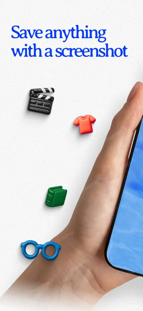
On-frame caption: “Save anything with a screenshot

The canvas is split into two zones. The upper half carries the headline in #003CFF, set in the large italic display face with generous ascenders; the lower two-thirds is occupied by a forearm entering from the bottom right, gripping a black iPhone that is cropped so aggressively only the left edge of the screen and the bottom bezel remain visible. The phone displays the signature caustic water texture, confirming we are inside Pool, but no chrome is legible. Floating in the negative space are four rendered 3D objects: a black-and-white clapperboard in the upper left, a red crew-neck shirt at centre, a green hardcover book below it, and a blue pair of spectacles near the wrist. These objects are lit with soft plastic shaders and cast faint ambient shadows onto the speckled off-white ground. The composition is deliberately asymmetric; the arm creates a strong diagonal that pulls the eye from headline to device. Because the phone is mostly off-canvas, the frame reads as a lifestyle shot rather than a UI screenshot, which is risky in Frame 1 but mitigated by the four icons that telegraph categories instantly. The speckle noise is uniform across the entire background, giving the frame a papery, printed quality that separates it from the sterile white voids common in the category.
Pool App Store screenshot 2 — Brand Imprint
02

Brand Imprint

On-frame caption: “None

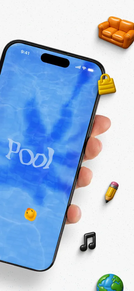
There is no headline text in this frame; the entire communication job is left to the device and the surrounding objects. A hand grips the phone at roughly a 35-degree clockwise rotation. The full status bar is visible: time reads 9:41, signal and Wi-Fi indicators sit to the right of the Dynamic Island, and the battery icon is full. The screen shows the Pool home surface—a photographic blue water caustic texture—over which the word ‘Pool’ is set in a white, stylised serif logotype with a slight wobble that mimics liquid surface tension. A small yellow rubber duck bobs near the lower-left quadrant of the screen. Outside the device, five 3D props orbit the bezel: an orange two-seater sofa in the upper right, a yellow padlock clipped to the right bezel, a yellow pencil with pink eraser below the hand, a black eighth-note glyph beneath that, and a globe at the extreme bottom right. The water texture inside the screen and the 3D props outside it establish Pool’s world: everything floats. Because this frame lacks a caption, it relies entirely on brand recognition; for a first-time viewer it is atmospheric, but for a returning viewer it reinforces the tactile universe. The reflection of the hand on the phone’s black bezel is photographically real, which contrasts with the obviously rendered props—a tension that keeps the image from feeling either too sterile or too cartoonish.

Pool App Store screenshot 3 — From Chaos to Structure
03

From Chaos to Structure

On-frame caption: “Organize what matters

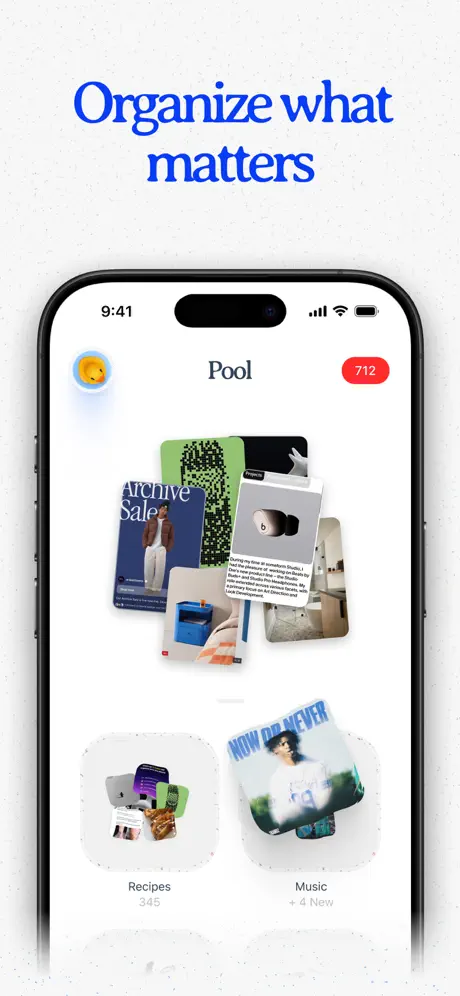
The device snaps to a perfect front-facing view, centred with equal left and right margins. The app chrome is now fully legible. At top, a yellow duck avatar floats inside a soft white circle on the left; the word ‘Pool’ is centred in a medium-weight sans; and a scarlet red badge reading ‘712’ sits on the right, its corners fully rounded and its type white. The main viewport shows a messy, overlapping pile of saved cards—a green QR-style card, an ‘Archive Sale’ fashion card with a male model in tan tailoring, a grey card with a black hardware object, and others—signifying the unsorted stream. Below this pile, the grid begins: two rounded-rectangle folders appear in the lower half. ‘Recipes’ holds 345 items and shows a collage of food screenshots; ‘Music’ shows ‘+ 4 New’ and a collage with a green-tinted album cover. The folder containers use a continuous-corner mask (roughly 28pt radius) and a faint shadow that separates them from the white background. The headline sits high, leaving the middle of the canvas open so the pile of cards feels breathable. The transition from Frame 2’s angled view to Frame 3’s flat orthographic view is a sudden stabilisation; it tells the shopper that the playful world outside the phone resolves into usable software inside it.

Pool App Store screenshot 4 — Link Intelligence
04

Link Intelligence

On-frame caption: “Magically find links & categorise

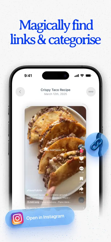
This frame demonstrates parsing depth. The device shows a detail view for a saved item titled ‘Crispy Taco Recipe’, dated March 12th, 2025. A left-facing chevron and an overflow menu (‘ooo’) flank the title. The card itself is a captured social video: beef tacos on a white plate, with the origin platform’s engagement metrics still visible—9.2M likes, 23.5K comments, 3.1M saves, 2.1M shares, and the handle @flavorfulbite · 10-25. A caption beneath reads ‘Crispy beef tacos 🌮✨ – cheesy ground beef tacos with a crispy tortilla s… more’. A 3D blue paperclip icon is superimposed on the right edge of the device, bridging the boundary between screen and background as if physically clipped to the content. At the bottom left, a rounded pill in the same water-blue carries the Instagram glyph and the text ‘Open in Instagram’. The pill’s left edge sits dangerously close to the frame boundary, but its colour harmonises with the headline blue above. By showing origin metadata and a deep-link button, the frame answers the shopper’s unspoken question: ‘If I save from Instagram, do I lose the source?’ The answer is rendered literally.

Pool App Store screenshot 5 — Natural Language Retrieval
05

Natural Language Retrieval

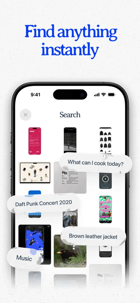
On-frame caption: “Find anything instantly

The UI switches to a search surface. The header contains a close ‘×’ icon and the word ‘Search’. Below it, a masonry grid of saved screenshots fills the screen: a hot-pink phone mock-up, a dark street-photo, a grid of black caps, a flat-lay of garments, a grey ‘RR’ document, a dark music-player interface, and a neon-pink text screenshot. Overlaid on this grid are four white speech bubbles with grey text, each pointing to a different thumbnail as if the user is speaking to the app. The queries read: ‘What can I cook today?’, ‘Daft Punk Concert 2020’, ‘Brown leather jacket’, and ‘Music’. The bubbles use a standard iOS-message shape with a tail, but they are scaled to roughly 110% of the surrounding UI, making them pop. A small blue search-pill is visible at the very bottom centre, partially cut off by the frame edge. The composition is the busiest in the set, which is appropriate for search, but the visual hierarchy is carefully managed: the bubbles sit above the thumbnails, yet their shadows are soft enough that the underlying grid is not fully obscured. One weakness here is that the bubble tails do not always clearly touch their intended targets; ‘Brown leather jacket’ appears to hover between two thumbnails, which could be tightened.

Pool App Store screenshot 6 — Widget as Tray
06

Widget as Tray

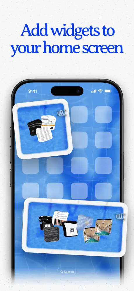
On-frame caption: “Add widgets to your home screen

The frame breaks out of the app and into the iOS home screen. The wallpaper is the same blue caustic water texture seen in Frame 2, creating immediate visual continuity. The home-screen app icons are desaturated and pushed back, establishing depth. Two Pool widgets float in the foreground. The upper widget is a small square with a thick white bezel (roughly 12pt stroke) and rounded corners; inside, two saved cards float on the water background. The lower widget is a medium horizontal rectangle with an identical white frame; it holds five saved cards, including what appears to be a building façade and a text snippet. Both widgets cast soft shadows onto the home screen, lifted about 8pt off the surface. A dim ‘Search’ pill sits at the bottom of the screen. By placing the widgets on the actual home screen rather than inside a mock app container, the frame answers the utility question: ‘Is this accessible without opening the app?’ The white borders around the widgets are much thicker than standard iOS widget padding, which makes them feel like physical lipped trays rather than native system objects—a distinctive design choice, though it risks deviating from platform expectations.

Pool App Store screenshot 7 — Social Pools
07

Social Pools

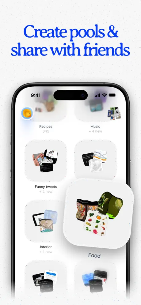
On-frame caption: “Create pools & share with friends

The final frame returns to the app’s grid view but reveals more collections. The duck avatar remains top left. Below it, a 2×3 grid of rounded folder cells is visible: ‘Recipes 345’, ‘Music + 4 new’, ‘Funny tweets + 2 new’, ‘Interior + 4 new’, and a partially visible sixth cell. The bottom-right cell, labelled ‘Food’, is scaled up to roughly 140% and offset forward so it overlaps the ‘Interior’ cell beneath it and the right edge of the canvas. Inside, it shows a collage of fresh produce and recipe screenshots. This broken-grid gesture suggests drag-and-share or a stack being handed off. Each cell uses the same continuous-corner mask and subtle drop shadow seen in Frame 3. The counts are set in a muted grey (#8E8E93), while the ‘+ new’ strings use the same scarlet red as the earlier badge, unifying countable activity across the set. The headline ‘Create pools & share with friends’ is the longest in the set, and the type is slightly narrower here to fit the width without hyphenation. By ending on collaboration, the sequence shifts from individual utility (save, search, widget) to network value, which is a classic bottom-of-funnel move for social-category listings.

05The craft

Captions, colour and the mechanics of the sell

Caption pattern

Every caption except Frame 2 sits in the top 20% of the canvas, left-aligned, in the same #003CFF hue. This creates a consistent eye-line for the shopper who is swiping quickly; the brain learns that the promise is always at the top and the proof is always inside the phone.

Visual system

The set is governed by a 2.5-colour rule: deep blue for promise, pure white for structure, and red only for countable states (badges, ‘new’ labels). The off-white speckle background acts as a neutral ‘fourth colour’ that adds grain without introducing a new hue.

The thumbnail test

In the search-results grid, Frames 1 and 3 read best. Frame 1’s blue headline is the brightest value on the page; Frame 3’s scattered content cards create a high-density thumbnail that invites a tap. Frame 5 suffers slightly because the white speech bubbles merge with the white background at 60% thumbnail scale.

Conversion mechanics

The frame order follows a classic AIDA funnel: Frame 1 (Attention) states the single most universal trigger action; Frame 2 (Interest) establishes brand atmosphere; Frame 3 (Desire) shows the before-and-after of organisation; Frames 4–5 (Conviction) prove intelligence; Frame 6 extends stickiness; Frame 7 lands on community.

06Where it slips

What we would change

Frame 1’s device is cropped too aggressively

Only the left edge and a sliver of bezel are visible. In the 3.6-inch search-result thumbnail, a casual scroller may misread this as a lifestyle poster rather than an app screenshot. Fix: shift the hand upward by roughly 15% so the bottom bezel and home-indicator area are visible, confirming the smartphone container without losing the diagonal energy of the arm.

Frame 2’s lack of headline wastes an education slot

After Frame 1’s promise, Frame 2 offers no new textual information. The stylised ‘Pool’ logotype is elegant but, at thumbnail scale, reads as an abstract white shape on a busy blue field. Fix: add a small sub-caption—perhaps the brand promise line—or increase the logotype’s local contrast with a subtle dark glow (#000000 at 15% blur) so the wordmark survives downscaling.

The headline typeface clogs at small sizes

The blue italic display face used for captions has tight apertures; the counter of the ‘a’ in ‘Magically’ and the bowl of the ‘g’ in ‘Organize’ begin to fill in when the set is viewed on an iPhone SE listing page. Fix: increase tracking by 2–3% and switch to the semi-bold cut of the same family for any word under 32pt.

Frame 4’s Instagram pill occludes content

The ‘Open in Instagram’ lozenge at bottom left sits directly over the saved video’s caption area, hiding the username and source text that the frame is trying to prove it preserves. Fix: move the pill to the bottom centre or replace it with a minimal Instagram glyph in the top-right metadata row, freeing the content to speak for itself.

Frame 5 search bubbles lack optical grounding

The speech bubbles float with soft drop shadows, but their shadow angle (roughly 90° vertical) does not match the device shadow from Frame 3 (roughly 120°), so the bubbles feel pasted on. Fix: unify shadow direction across the entire set to a single 120° source with a y-offset of 12pt and 24pt blur, and add a 1pt #FFFFFF stroke to each bubble so they separate cleanly from dark thumbnails beneath.

07The recipe

How to apply this to your own app

  1. Invent one macro metaphor and repeat it on every surface

    Pool chooses water. It appears in the app background, the home-screen wallpaper, and the widget chrome. If your app has a core spatial idea, carry it into the frame background, not just the UI.

  2. Split your type personality

    Use an expressive, high-contrast face for captions that live outside the phone, and a neutral UI face inside it. That contrast lets you own the brand without sacrificing readability.

  3. Make frame one a verb

    Frame 1 does not say ‘Welcome to Pool’; it says ‘Save anything with a screenshot’. Lead with the action the user is trying to complete, not the app name they have never heard.

  4. Use countable colour sparingly

    Pool reserves red almost exclusively for numbers and badges (712, + 4 new). That restraint means the eye automatically reads red as ‘quantified activity’. Pick one accent hue for your countable states and protect it.

08Takeaways

Five things worth stealing

  • The set succeeds because it treats the App Store canvas as a physical tabletop. The 3D props, paper noise and water texture give the screenshots gravity.
  • The narrative arc—from capture to widget to shared pool—is unmistakable. A shopper can read the story without pausing.
  • The biggest risk is thumbnail legibility. The stylised headlines and extreme croppings in Frames 1 and 2 are expressive at full size but may soften the tap-through rate at search-result scale.
  • For teams building their own sets, Pool proves that consistency of metaphor matters more than consistency of layout. The frames alternate between angled and flat, between lifestyle and UI, yet they never break the blue-water-and-white-tray world.
  • The set could strengthen its conversion by adding one frame that shows onboarding or permission context, as the leap from screenshot-save to social-share in Frame 7 assumes a level of trust that new users may not yet have.
09The verdict

What the set actually achieves

The submissions form a clear narrative arc: Frame 1 proposes the capture mechanic, Frame 2 imprints the brand world, Frames 3–5 demonstrate core loop and magic moments, Frame 6 extends value into iOS widgets, and Frame 7 lands on social proof through shared collections.

Designers building visual-archive, read-later, or social-curation apps who need to communicate magic (search, widgets, shared spaces) without losing the tactile joy of saving random internet ephemera. If your app lives in the Social category but behaves like a utility, Pool’s strategy of leading with lifestyle and fading into UI is a direct template.

10Questions

Frequently asked

Why does Frame 2 have no headline?

It functions as a brand impression rather than a feature call-out. The team is betting that the shopper will pause on Frame 1, then use Frame 2 to absorb atmosphere before Frame 3 resumes the sell.

What is the significance of the 3D icons?

They act as category shorthand. Instead of listing ‘movies, clothes, books, eyewear’ in text, the clapperboard, shirt, book and glasses say it visually across language barriers.

How does the water texture help conversion?

It gives Pool a proprietary colour field. In a category dominated by pink, purple and black, a bright cyan-blue pool is instantly distinctive in the search-results grid.

Is the heavy white widget border in Frame 6 compliant with iOS design?

It deviates from Apple’s standard widget padding, but that deviation is intentional. It makes the widgets feel like physical objects rather than system chrome, reinforcing the app’s tactile brand world.

11Keep reading

Build your own screenshot set

The full set

7 shots
Pool App Store screenshot 1Pool App Store screenshot 2Pool App Store screenshot 3Pool App Store screenshot 4Pool App Store screenshot 5Pool App Store screenshot 6Pool App Store screenshot 7

About the app

Play 8-ball pool on your mobile device against your friend. The object of the game is to pocket your set of assigned balls (solid or striped) and finally pocket black ball to Vintolo Ltd, via the App Store listing.

Screenshots and store metadata belong to Vintolo Ltd. They are shown here for design commentary and criticism. The analysis on this page is original work by floow.design. View the original listing.

More Social teardowns

Browse all →