ReminderOS app icon
ProductivityScreenshot teardown11 min read

ReminderOS App Store screenshots

The Productivity category on the App Store is a visual monoculture of checkmark icons, muted grays, and list views that blur together after three swipes. ReminderOS, developed by Paul Waweru, refuses that template. Its screenshot set stages a deliberate collision between nostalgic 2D pixel-art landscapes and glossy, contemporary 3D props—chrome arrows, golden bells, Memoji heads, and oversized map pins—wrapped around a fairly conventional reminder-app interface. The result is a seven-frame sequence that alternates between a bright, game-like blue sky and stark black canvases, using a single bold, rounded typeface to shout headlines at maximum volume. This case study dissects the layout, color logic, typography, and compositional bets of each frame to understand how the set tries to convert a casual scroll into a download—while naming the exact points where the visual noise overwhelms the message.

Set published by Paul Waweru · 7 frames analysed

0.0Freev1.6.4Updated 4mo ago
ReminderOS App Store screenshot 1
01At a glance

The set in one screen

Framing
iPhone with Dynamic Island appears in frames 1, 5, and 7; omitted in frames 2, 3, 4, and 6.
Captions
All-caps or sentence-case bold rounded sans-serif in white (#FFFFFF), set at display scale.
Backdrop
Alternating custom pixel-art sky (~#2B8DFF) and solid black (#000000).
Type
Display rounded sans-serif, bold weight, with tight line-height, cropped to the emerald safe area of editorial bleeding, filling the top or bottom third of each stun canvas.
UI / copy split
Roughly 50/50. Frames 2, 3, 4, 6, and 7 rely on floating UI elements or pure campaign illustration, while frames 1, 5, and 7 utilize real device 3D framing with status-bar pixels visible.
Frame 1 job
Establish category and core action immediately: a scheduled list view inside hardware with a promise headline.

Sampled palette

~#2B8DFF#2B8DFF
#000000#000000
#FFFFFF#FFFFFF
#8E8E93#8E8E93
~#E1F0FE#E1F0FE
~#FFEB3B#FFEB3B
02The challenge

What this screenshot set had to solve

The core design challenge for any reminder or to-do app is escaping gravity. Apple's native Reminders app ships free on every iPhone, occupies valuable first-screen real estate, and sets the interaction baseline that users already understand: lists, circles, times, and repeat toggles. A third-party alternative must therefore signal differentiation in the first 1.2 seconds of a swipe. For ReminderOS, the challenge is twofold. First, the screenshots must communicate functional breadth—flexible recurrence, early notifications, email-to-task ingestion, and calendar integration—without collapsing into the cluttered feature dump common to indie productivity apps. Second, the visual system must feel coherent across seven frames that switch backgrounds, props, and levels of UI abstraction. The shopper cannot be expected to parse fine print; the hierarchy must work at thumbnail scale, where only color blocks, headline shapes, and central objects remain legible.

The set proves that personality and contrast can stop a scroll, but when props obscure text and settings screens replace outcomes, the shopper remembers the bell and forgets the benefit.
03The approach

How the set argues its case

The set addresses the coherence problem through rigid alternation and asset repetition. Odd-numbered frames (1, 3, 4, 6) sink into a custom pixel-art blue sky—gradients hovering around ~#2B8DFF—with blocky clouds and green foliage that evoke 16-bit console landscapes. Even-numbered frames (2, 5, 7) drop onto solid #000000 black, letting white typography and reflective 3D objects carry the contrast. A single display typeface, bold and heavily rounded, handles every headline in pure white (#FFFFFF), sized large enough that descenders and ascenders dominate the safe margins. The iPhone device frame appears selectively: fully in frames 1, 5, and 7; omitted in frames 2, 3, 4, and 6. This creates a rhythm of showing the app versus showing the idea. A family of 3D props—a chrome-plated hook arrow, a gold bell, a red calendar icon, a checkmark map pin—travels through the sequence, acting as compositional anchors. The pixel art and 3D renders never intersect logically, but they establish a brand tone that reads playful rather than corporate.

An indie productivity tool that breaks category minimalism by borrowing from mobile-game aesthetics—pixel backgrounds and glossy collectible-style props—to signal flexibility and personality rather than enterprise rigor.

04Frame by frame

Every screenshot, and the job it does

ReminderOS App Store screenshot 1 — Never forget anything!
01

Never forget anything!

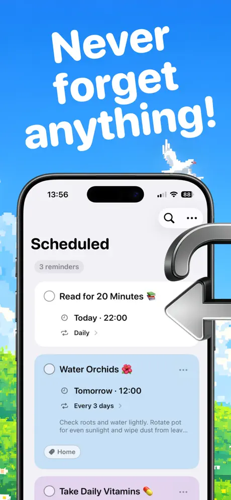
On-frame caption: “Never forget anything!

Frame one opens with the headline 'Never forget anything!' set in massive white rounded type against the pixel-art sky. The sky gradient shifts from deep ~#2B8DFF at the top to lighter blues near the horizon, where blocky green trees and white pixel clouds sit. Centered below the text is a current-generation iPhone frame—Dynamic Island and status bar visible at 13:56 with Wi-Fi and an 88% battery reading—displaying the app's 'Scheduled' list view. The interface uses a clean white-and-gray palette: the title 'Scheduled' in bold black, a subdued '3 reminders' subhead in #8E8E93, and card-based items. The first task, 'Read for 20 Minutes 📚,' shows a circular checkbox, the time 'Today · 22:00,' and a 'Daily' recurrence chevron. The second, 'Water Orchids 🌺,' sits on a powder-blue card (~#E1F0FE) with the note 'Check roots and water lightly. Rotate pot for even sunlight and wipe dust from leav...' truncated, and a 'Home' tag. A third item, 'Take Daily Vitamins 💊,' bleeds off the bottom. A large chrome 3D arrow enters from the right, its hook curling over the phone's bezel and casting a soft shadow. The cropping is severe: the bottom navigation and tab bar are entirely absent, forcing all attention onto the list cells and the headline promise.
ReminderOS App Store screenshot 2 — Your schedule, your way!
02

Your schedule, your way!

On-frame caption: “Your schedule, your way!

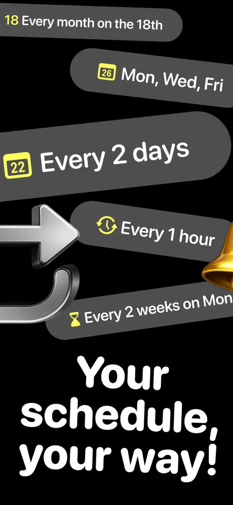
Frame two abandons the device entirely. Against a pitch-black (#000000) ground, five gray lozenges float in a descending diagonal from upper left to lower right. The pills vary in length and carry recurrence logic: '18 Every month on the 18th,' '26 Mon, Wed, Fri,' '22 Every 2 days,' 'Every 1 hour,' and 'Every 2 weeks on Mon.' Icons—a yellow calendar glyph (~#FFEB3B), a refresh clock, an hourglass—sit to the left of each label. The typography inside the pills is white and sans-serif, slightly smaller than the headline but still bold. The chrome arrow from frame one reappears on the left, pointing right, while a gold bell edges in from the right margin, partially cropped. At the bottom, 'Your schedule, your way!' locks into the lower third in the same rounded white face. By extracting scheduling rules from buried settings screens and surfacing them as autonomous chips, the frame foregrounds flexibility. The diagonal stagger prevents the layout from feeling like a static list, though the absence of any phone hardware means the viewer must trust these are in-app options rather than abstract marketing claims.

ReminderOS App Store screenshot 3 — Early reminders
03

Early reminders

On-frame caption: “Early reminders

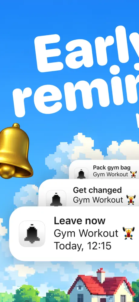
The third frame returns to the pixel sky, with the headline 'Early reminders' cropped tightly at the top edge so that only the central glyphs are fully visible. No phone chassis is present; instead, three stacked notification banners hover in Z-depth above a pastoral scene of blocky clouds, red-roofed cottages, and rolling green hills. Each banner mimics an iOS push notification: rounded white rectangles with a left-side pixelated bell icon, task text, and emoji. From top to bottom, they read 'Pack gym bag / Gym Workout 🏋️,' 'Get changed / Gym Workout 🏋️,' and 'Leave now / Gym Workout / Today, 12:15 🏋️.' The lowest card is the largest, creating forced perspective. A gold 3D bell occupies the left margin, its handle and clapper catching light. The banners are visually informative but structurally ambiguous: the pixel bell icon inside the banners conflicts with the photoreal bell beside them, and without a device bezel, the shopper must mentally map these back to lock-screen behavior. Still, the stacking order effectively communicates a sequence of pre-event alerts.

ReminderOS App Store screenshot 4 — Reminders — No more panic!
04

Reminders — No more panic!

On-frame caption: “...nders No more panic!

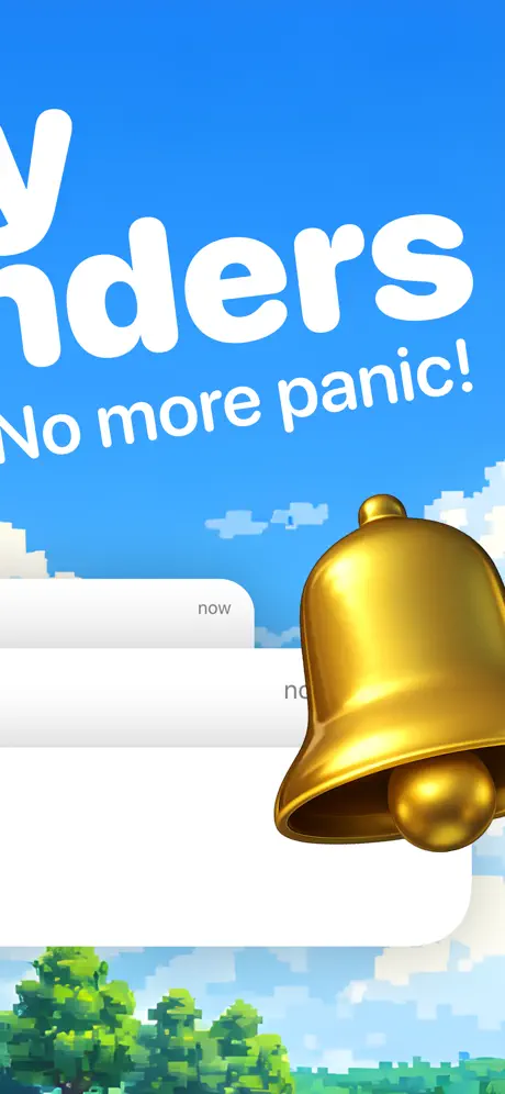
Frame four is the most abstract entry. The headline is severely cropped; only the lower half remains legible as '...nders' and beneath it 'No more panic!' in the same white rounded sans. The pixel sky and treeline return as bookends at top and bottom. Dominating the right two-thirds of the canvas is the gold bell, scaled to roughly twice its size in frame three, overlapping a stack of white rounded cards. The cards reveal almost no readable content—only the fragments 'now' and 'no' peek out from behind the bell's curve. The bell's metallic surface reflects warm highlights, and its base obscures the vertical center of the composition. Structurally, the frame functions as a brand poster rather than a feature explanation: it sacrifices information density for emotional tone. The text 'No more panic!' attempts to name a user feeling, but because the preceding word is truncated and the UI cards are hidden, the frame communicates largely through color and object recognition. For a shopper swiping quickly, this may scan as decorative filler between denser frames.

ReminderOS App Store screenshot 5 — Turn emails into to-do lists!
05

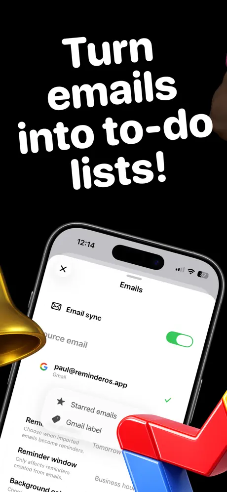
Turn emails into to-do lists!

On-frame caption: “Turn emails into to-do lists!

Frame five flips back to solid black (#000000). The headline 'Turn emails into to-do lists!' occupies the upper third in white. Below it, an iPhone frame shows the 'Emails' settings modal, status bar reading 12:14 and 62% battery. The screen hierarchy is recognizable: a close 'X' top left, the title 'Emails' centered, and an 'Email sync' row with a #34C759 green toggle switched on. Beneath, a 'Source email' field lists 'paul@reminderos.app' beside a Gmail badge. Further down, 'Starred emails' carries a checkmark, and 'Gmail label' is tagged 'Tomorrow.' Microcopy explains 'Choose when imported emails become reminders' and 'Reminder window—Only affects reminders created from emails.' A red-and-blue 3D map pin with a checkmark top sits in the bottom right, overlapping the phone bezel, while the gold bell intrudes from the far left edge. The frame's narrative is integration, yet the visual evidence is configuration: the shopper sees toggles and account fields, not an email transformed into a task. The device framing and shadowing are consistent with frame one, maintaining hardware continuity across the black-background shots.

ReminderOS App Store screenshot 6 — Made for busy minds!
06

Made for busy minds!

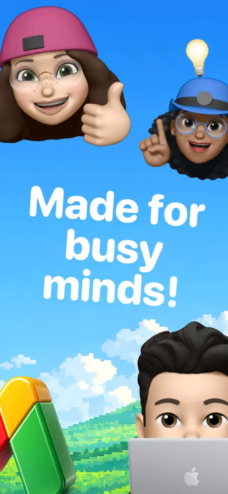
On-frame caption: “Made for busy minds!

Frame six contains no app interface whatsoever. Against the familiar pixel sky, three Memoji heads and a large 3D map pin occupy the vertical space. Top left: a female-presenting Memoji wearing a magenta beanie, glasses, and braces, delivering a thumbs-up. Top right: a female-presenting Memoji in a blue hard hat with a lightbulb hovering above her raised index finger. Bottom right: a male-presenting Memoji with dark hair, visible only from the eyes up, peering over a silver MacBook with a clear Apple logo. Bottom left: a colorful map pin—green base, yellow and orange accents—tilts into the frame. Centered between the figures, 'Made for busy minds!' is set in the house white rounded type. The frame is pure personality play, attempting to humanize the app through Apple's own avatar ecosystem and hinting at cross-device usage via the laptop. Because there is no UI, no feature callout, and no device, the frame depends entirely on the goodwill generated by its characters. The composition is balanced in a triangular lock, but the headline could apply to any productivity tool in the store.

ReminderOS App Store screenshot 7 — All in one place!
07

All in one place!

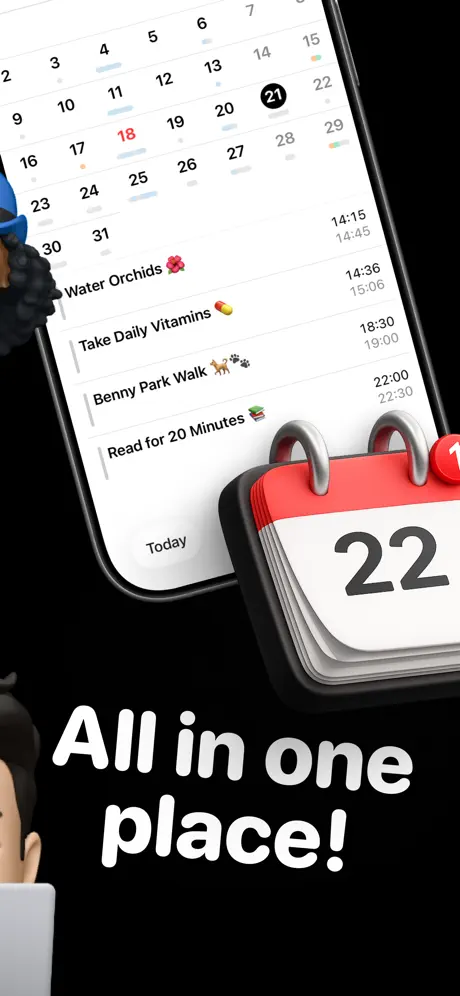
On-frame caption: “All in one place!

The final frame returns to black and closes with the headline 'All in one place!' at the bottom. An iPhone is tilted roughly 15 degrees clockwise, showing a month-view calendar above a scrolling list. In the calendar grid, the 21st is circled in black, and several dates carry colored status dots—reds, blues, and oranges—beneath their numerals. The list below mirrors earlier frames: 'Water Orchids 🌺' with paired timestamps reading 14:15 and 14:45, 'Take Daily Vitamins 💊' with 14:36 and 15:06, 'Benny Park Walk 🐕🐾' with 18:30 and 19:00, and 'Read for 20 Minutes 📚' with 22:00 and 22:30. A 3D calendar icon—red binding, silver rings, white face displaying '22'—sits in the bottom right, overlapping the device. The male Memoji from frame six reappears at the bottom left, cropped at the eyes, behind the same silver MacBook. The rotational tilt breaks the orthogonal grid that dominated frames one and five, adding visual motion to the finale. The frame successfully communicates calendar-plus-list unification, though the Memoji and laptop repetition from frame six feels like an attempt to force a mascot dynamic that the earlier frames never established.

05The craft

Captions, colour and the mechanics of the sell

Caption pattern

Each caption is a colloquial imperative or promise: 'Never forget anything!', 'Your schedule, your way!', 'Turn emails into to-do lists!', etc., set in the same rounded sans at roughly 70–90 pt equivalent, always knocked out in white.

Visual system

Two backdrops, one typeface, and a recurring cast of 3D objects. The blue pixel sky provides nostalgia and warmth; the black frames provide theatrical contrast for features that need to feel technical or integrated. Yellow (~#FFEB3B) appears only on recurrence glyphs, green (#34C759) only on active toggles, and red only on the calendar prop, creating a subliminal coding system that survives a quick swipe.

The thumbnail test

At thumbnail scale the blue and black alternation reads as a flicker, but the gold bell, large white type, and blue sky are visible enough to drag attention away from gray corporate competitors on surrounding listings, though the cropped headline in frame 4 risks muddying the message.

Conversion mechanics

Frame 5 was the easiest conversion trigger. While not the strongest composition, it explicitly names an integration workflow ('Turn emails into to-do lists!') paired with a Gmail address screenshot, making the app feel like it has more plumbing than a default reminder tool.

06Where it slips

What we would change

Gimmick vs. clarity

Frame four is the most damaged: cropping the headline to '...nders' destroys readability, and scaling the gold bell to consume roughly 40 percent of the canvas obliterates the white cards beneath it. The fix is to pull back the camera, reveal the full word 'Reminders,' and reduce the bell so the cards deliver actual evidence.

Settings do not prove payoff

Frame five's email-integration promise is undermined by showing a settings screen rather than a transformed email in a list. The shopper sees toggles and account fields, not a Gmail message rendered as a task. The stronger execution would show an imported email sitting in the reminder list, with the settings screen as secondary evidence.

Orphaned iconography

The chrome arrow in frames one and two is stylistically isolated—it is the only cool-toned metallic prop in a warm-accent family—and its narrative role disappears after frame two. Replacing it with a warmer object or removing it entirely would unify the object palette.

Generic character frame

Frame six is so generic that it could headline a meditation app or a calendar app interchangeably. If the goal is ecosystem storytelling, showing the MacBook screen with the actual app mirrored would tie the character moment to product reality.

Untethered mascot callback

The Memoji reappearance in frame seven feels untethered from the app's actual functionality. The laptop-gaze framing adds compositional balance but contributes nothing to the 'All in one place' claim; cropping the character out and letting the calendar icon own the foreground would sharpen the message.

07The recipe

How to apply this to your own app

08Takeaways

Five things worth stealing

  • Strict background alternation (blue / black) creates a strobe effect that interrupts the App Store scroll.
  • Extracting UI logic into floating pills or banners (frames 2 and 3) lets features read at thumbnail scale without forcing the shopper to decode a full-screen layout.
  • Limiting accent colors to functional roles—yellow for recurrence, green for toggles, red for calendar—builds a subliminal navigation system.
  • Every 3D prop must earn its keep across multiple frames; one-off objects (the chrome arrow) become visual debt.
  • When a headline is cropped or an object obscures the interface, the frame defaults to brand decoration and loses its conversion argument.
09The verdict

What the set actually achieves

The set lands on a bold, toy-like personality through strict alternating cadences and a kitsch 3D asset library, but sacrifices legibility in frames 4 and 5 and leaves some props narratively orphaned across the sequence.

Solo developers and indie makers who want to signal personality over enterprise polish, and who are willing to trade some functional legibility for category differentiation in a crowded Productivity store page. A design team looking to recreate the toyetic, game-adjacent aesthetic will find a useful template here, provided they guard against the legibility traps frames 4 and 6 fall into.

10Questions

Frequently asked

11Keep reading

Build your own screenshot set

The full set

7 shots
ReminderOS App Store screenshot 1ReminderOS App Store screenshot 2ReminderOS App Store screenshot 3ReminderOS App Store screenshot 4ReminderOS App Store screenshot 5ReminderOS App Store screenshot 6ReminderOS App Store screenshot 7

About the app

ReminderOS - Reminders that keep up with you. Create simple reminders or ultra-specific repeat schedules with ReminderOS. Sync seamlessly across your devices, snooze or Paul Waweru, via the App Store listing.

Screenshots and store metadata belong to Paul Waweru. They are shown here for design commentary and criticism. The analysis on this page is original work by floow.design. View the original listing.

More Productivity teardowns

Browse all →