Rumbo Fitness app icon
Health & FitnessScreenshot teardown11 min read

Rumbo Fitness App Store screenshots

This is a short hook.

Set published by WEI JEN CHEN · 9 frames analysed

4.8 · 42 ratingsFreev1.5.0Updated 7mo ago
Rumbo Fitness App Store screenshot 1
01At a glance

The set in one screen

Framing
Split between full-bleed illustration and thick-bordered device frames, with two illustration-only bookends and one partial bezel tease.
Captions
Bold rounded sans-serif, center- or left-aligned, large point size, white on emerald or dark teal on yellow.
Backdrop
Deep emerald (#0B8A5B) dominates; bright yellow (#FFC72C) appears on frame 5 and as accent shapes; interior screens use warm cream (#FFFBE6).
Type
Single heavy geometric rounded family for all copy; no serifs, no mixed weights beyond size contrast.
UI / copy split
Roughly 50/50: frames 1, 3, 8 are pure illustration; frames 2, 4, 5, 6, 7 contain device chrome or UI cards.
Frame 1 job
Introduce the Rumbo IP (dog mascot + mouse sidekick) and establish the playful, non-gym tone before showing any interface.

Sampled palette

#0B8A5B#0B8A5B
#FFC72C#FFC72C
#FFFBE6#FFFBE6
#FF6B00#FF6B00
#A8D5BA#A8D5BA
02The challenge

What this screenshot set had to solve

The team had to sell a personality-heavy fitness brand without letting mascot illustration drown out product proof. App Store shoppers swipe fast; if the first two frames fail to confirm that this is a real workout tool with timers, planners, and stats, the scroll continues. The secondary challenge was visual cohesion across eight frames that alternate between full-bleed cartoons, floating UI cards, tilted phones, and flat device screens, all while mixing English headline copy with CJK duration labels for a global audience.

Mascots can carry your hook, but a device frame carrying real pixels should appear no later than the second swipe.
03The approach

How the set argues its case

The designers locked a two-color package—deep emerald and warm yellow—and repeated the same thick black outlining on both characters and device bezels so that UI elements feel like stickers rather than pasted screencaps. The sequence follows an illustration-feature-illustration-feature rhythm: frame 1 sets the brand world; frame 2 introduces AI-generated workout cards; frame 3 returns to character energy; frame 4 shows an active timer; frame 5 delivers a flat builder UI; frames 6 and 7 handle sharing and stats; frame 8 closes on music integration. This zig-zag pacing is meant to feel energetic, but it also means the first un-cropped, readable screen does not appear until halfway through the carousel.

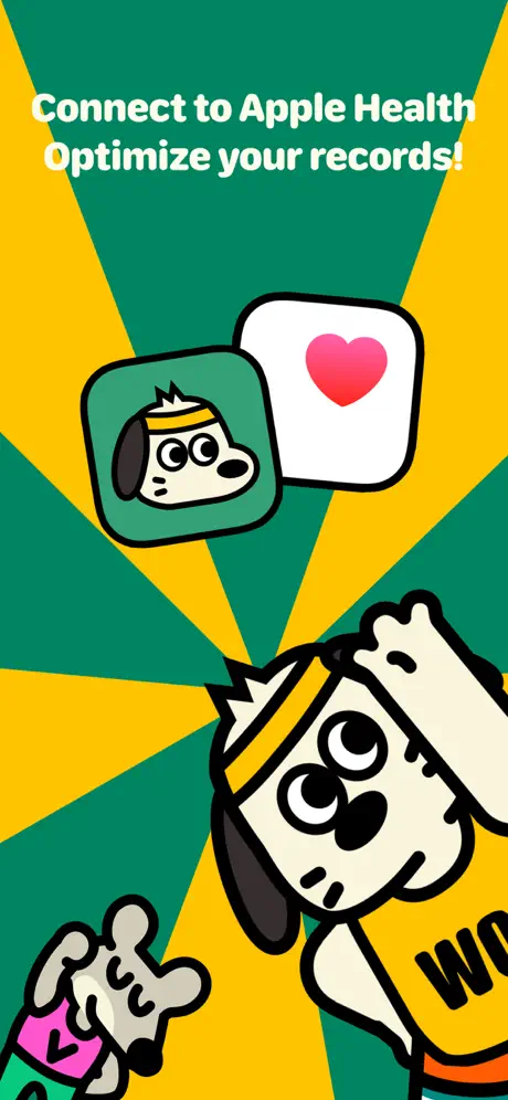
Rumbo positions itself as the antidote to intimidating HIIT apps. Instead of sweat-drenched athletes, it offers a cartoon dog in a “WOOF” tank top and a tiny mouse drinking tea while the dog lifts dumbbells. The captions avoid hardcore terminology; we see “Family warm-up,” “Slow Run,” and “Light workout” rather than “ shred” or “ burn.” The typography is soft, rounded, and oversized, reinforcing that the app targets casual home exercisers and families rather than gym rats.

04Frame by frame

Every screenshot, and the job it does

Rumbo Fitness App Store screenshot 1 — Brand Frame Without Device Chrome Positions Rumbo as a Lifestyle Character, Not Just an App
01

Brand Frame Without Device Chrome Positions Rumbo as a Lifestyle Character, Not Just an App

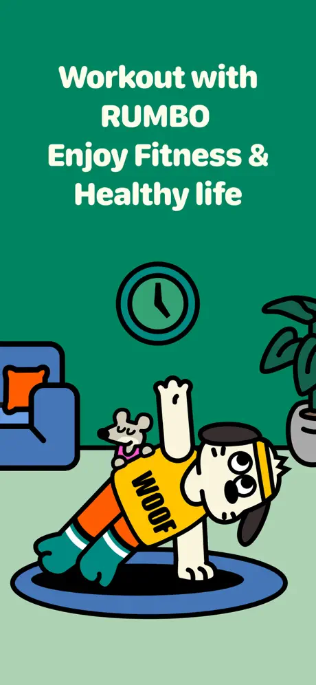
On-frame caption: “Workout with RUMBO Enjoy Fitness & Healthy life

This opening frame is a pure illustration set on a split background of deep emerald (~#0B8A5B) above and a muted mint floor (~#A8D5BA) below. The caption is set in a heavy rounded sans, white, centered across four lines with “RUMBO” in all caps. The visual weight sits low: Rumbo, a spotted dog in a yellow tank top, performs a one-arm plank on a blue mat while a small grey mouse rides his back. A blue armchair with an orange cushion, a wall clock, and a potted plant frame the scene. There is no phone, no UI, and no button. The intention is to establish IP and tone before showing software, but it delays functional proof entirely.
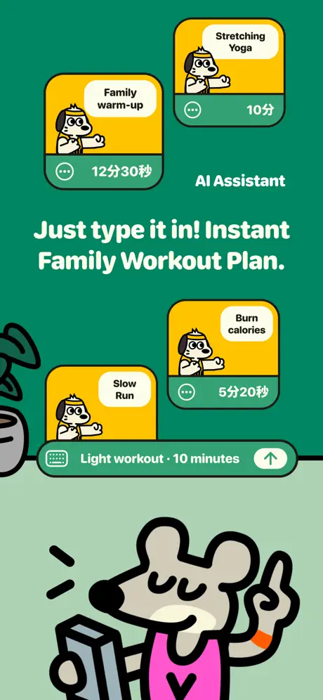
Rumbo Fitness App Store screenshot 2 — Staggered Workout Cards and a Chat Input Bar Sell an AI Planning Feature
02

Staggered Workout Cards and a Chat Input Bar Sell an AI Planning Feature

On-frame caption: “Just type it in! Instant Family Workout Plan.

The background repeats the emerald-to-mint split. Four yellow rounded cards float in an intentionally staggered grid. Each card shows the dog mascot in a miniature pose, a white pill-shaped label (“Family warm-up”, “Stretching Yoga”, “Slow Run”, “Burn calories”), and a duration (“12分30秒”, “10分”, “5分20秒”). Below the cards, a mint-colored chat input bar reads “Light workout · 10 minutes” with a send arrow. The large headline sits just below center in white, with “AI Assistant” as a small subhead above it. At the bottom, the grey mouse occupies nearly 25% of the frame height, holding a phone and pointing upward. This frame tries to communicate generative workout creation through a messaging metaphor, though the density of four cards plus input plus headline plus character creates multiple competing focal points.

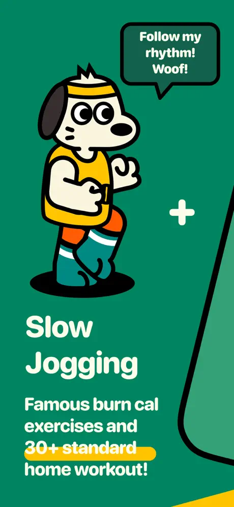
Rumbo Fitness App Store screenshot 3 — A Jogging Mascot and Fragmented Device Edge Introduce the Exercise Library
03

A Jogging Mascot and Fragmented Device Edge Introduce the Exercise Library

On-frame caption: “Follow my rhythm! Woof!

Solid emerald background. Rumbo appears mid-stride, facing right, with a speech bubble containing the verbatim text “Follow my rhythm! Woof!”. To the right, a sliver of a black device bezel intrudes with an unexplained white plus icon floating nearby. The lower-left carries the frame’s main typographic block: “Slow Jogging” in large white sans, followed by “Famous burn cal exercises and 30+ standard home workout!” The phrase “30+ standard” is highlighted with a yellow underline bar behind the text. The composition is roughly two-thirds illustration, one-third negative space, with the device edge acting as a graphic flourish rather than a clear window into the UI.

Rumbo Fitness App Store screenshot 4 — A Tilted Phone Shows an Active Jump-Rope Timer With a Coaching Callout
04

A Tilted Phone Shows an Active Jump-Rope Timer With a Coaching Callout

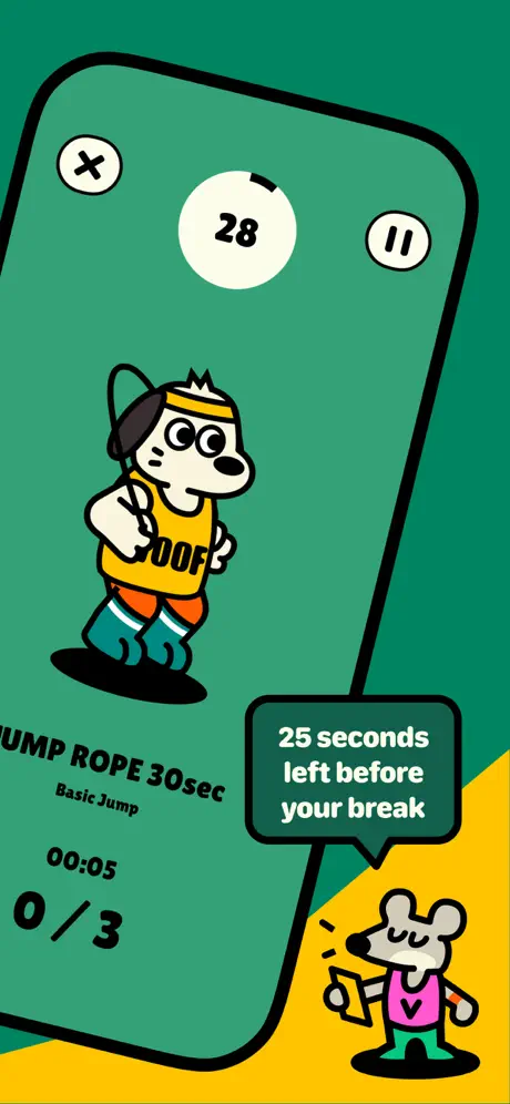
On-frame caption: “25 seconds left before your break

This frame tilts an iPhone-style device about 15 degrees counter-clockwise against an emerald-and-yellow split background. On the device screen, the top row has three white circles: an X on the left, a “28” countdown timer in the center with a partial black ring progress indicator, and a pause button on the right. Below, Rumbo appears with a jump rope, and bold black text reads “JUMP ROPE 30sec” with “Basic Jump” underneath, followed by “00:05” and “0/3”. Outside the device, at the lower right, the grey mouse stands on the yellow ground holding a phone, with a speech bubble stating “25 seconds left before your break”. The tilt adds dynamism but compresses the legibility of the numeric counters.

Rumbo Fitness App Store screenshot 5 — A Flat, Front-Facing Device Finally Exposes the Workout Builder UI in Full
05

A Flat, Front-Facing Device Finally Exposes the Workout Builder UI in Full

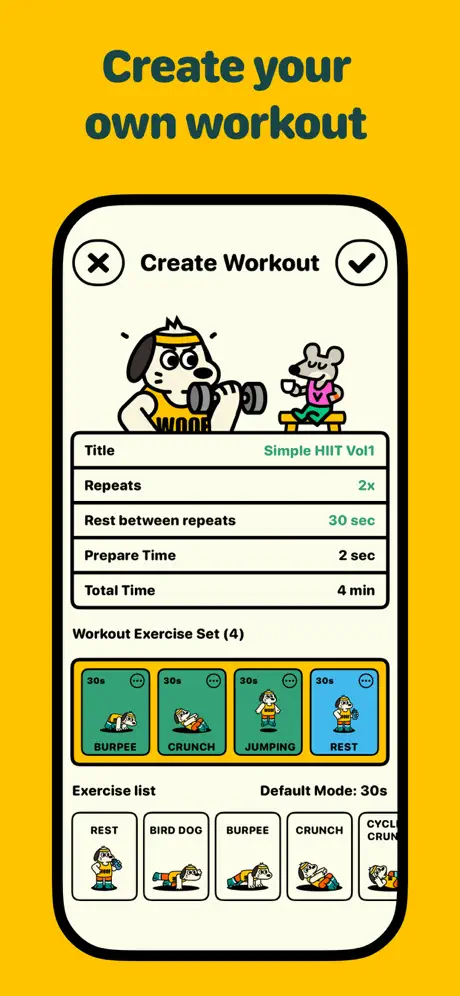
On-frame caption: “Create your own workout

The background switches to bright yellow (~#FFC72C). Centered is a device with a cream screen (~#FFFBE6) showing the “Create Workout” modal. The header has an X, title, and checkmark. Below, an illustration shows Rumbo curling a dumbbell while the mouse sits on a bench with a mug. Form fields stack vertically: Title, Repeats, Rest between repeats, Prepare Time, and Total Time; user-provided values (“Simple HIIT Vol1”, “2x”, “30 sec”, “2 sec”, “4 min”) are right-aligned in green. Under “Workout Exercise Set (4)”, four teal-bordered cards (BURPEE, CRUNCH, JUMPING, REST) display 30-second intervals. A second row labeled “Exercise list” shows additional moves. This is the most information-dense frame and the first time the shopper sees a complete, un-cropped interface.

Rumbo Fitness App Store screenshot 6 — QR-Code Sharing Framed by a Bold Green Card Demonstrates Social Distribution
06

QR-Code Sharing Framed by a Bold Green Card Demonstrates Social Distribution

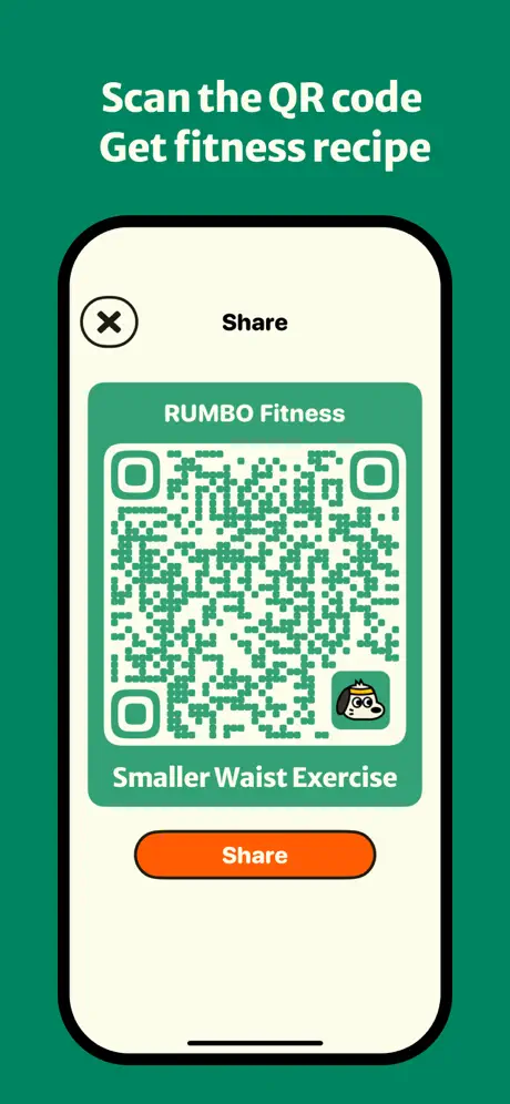
On-frame caption: “Scan the QR code Get fitness recipe

Against the solid emerald background, the caption reads “Scan the QR code Get fitness recipe” in white. The centered device displays a “Share” sheet. A large green rounded-rectangle card dominates the screen, containing “RUMBO Fitness” above a green-on-white QR code, a small Rumbo icon in the lower-right corner of the code, and the label “Smaller Waist Exercise”. An orange pill button (~#FF6B00) at the bottom reads “Share”. The contrast between the orange button and the green card is strong, but the green QR modules on a white ground may reduce scannability compared to a traditional black code. The use of the word “recipe” in the caption feels semantically disconnected from the workout content shown.

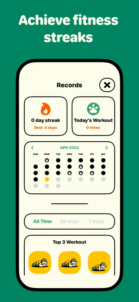
Rumbo Fitness App Store screenshot 7 — A Records Screen With Calendar Heatmap and Identical Top Workouts Closes the Utility Loop
07

A Records Screen With Calendar Heatmap and Identical Top Workouts Closes the Utility Loop

On-frame caption: “Achieve fitness streaks

Top text: “Achieve fitness streaks”. The device screen shows a “Records” modal with two stat cards at top: “0 day streak / Best: 5 days” with an orange flame, and “Today’s Workout / 0 times” with a teal paw print. Below, a calendar for “APR 2024” uses black dots and paw-print icons to encode activity; a single yellow dot highlights one day, while greys indicate the future or empty days. Segmented controls read “All Time / 30 days / 7 days”. The bottom section, “Top 3 Workout”, displays three identical yellow cards showing Rumbo in a plank or burpee position. The reliance on dots rather than numerals on the calendar prioritizes aesthetics over date legibility, and showing the same thumbnail three times weakens the claim of workout variety.

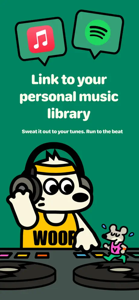
Rumbo Fitness App Store screenshot 8 — Final Illustration-Only Frame Pairs Apple Music and Spotify Logos With a DJ Theme
08

Final Illustration-Only Frame Pairs Apple Music and Spotify Logos With a DJ Theme

On-frame caption: “Link to your personal music library

The closing frame returns to full illustration against emerald green. Two speech bubbles at top contain the Apple Music (pink/red note on white) and Spotify (green circle with black wave lines) icons. Centered text reads “Link to your personal music library” with a smaller subline: “Sweat it out to your tunes. Run to the beat”. Below, Rumbo wears oversized black headphones and stands behind DJ turntables; the mouse jogs in place to the right with sweat beads. No device is shown, so the integration remains an implied promise rather than demonstrated functionality. The turntable platter line art uses a dark grey (#3A3A3A) with neon-colored cue point buttons.

05The craft

Captions, colour and the mechanics of the sell

Caption pattern

Headlines are short, imperative, and conversational: “Just type it in! Instant Family Workout Plan,” “Create your own workout,” “Scan the QR code Get fitness recipe.” They mix title case and sentence case inconsistently—“Workout with RUMBO Enjoy Fitness & Healthy life” runs four lines with uneven line breaks, while later frames favor tighter two-line stacks. There is no period on frame 6, and frame 7 drops punctuation entirely.

Visual system

Every visual object is wrapped in a heavy black stroke—characters, furniture, device bezels, and even speech bubbles share the same weight, creating a graphic-novel flatness. Shadows are limited to simple drop ovals under feet or devices. The palette is strictly partitioned: green means brand space, yellow means feature space, and cream means UI chrome. The mascot never changes outfits, which turns Rumbo into a spatial anchor no matter how the layout shifts.

The thumbnail test

At thumbnail scale, the set reads as alternating green and yellow vertical stripes with a recurring dog face. The high-saturation emerald is strong enough to interrupt a grid of pale-blue competitor screenshots, and the yellow frame (frame 5) acts as a visual speed bump that pulls the eye. That said, the lack of visible UI in frame 1 means the thumbnail-sized first impression communicates “game” or “comic” more than “workout tracker,” which could misdirect or attract the wrong intent.

Conversion mechanics

The first and last frames are pure brand posters; they neither show UI nor carry a CTA button, so they rely entirely on emotional pull. Frame 5, the first fully flat screen, is where a pragmatic shopper finally gets to read real interface density. The sequence would likely convert better if the first device-forward frame arrived in position 2 instead of 5. Frame 7’s zero-state streak data (“0 day streak”, “0 times”) is a conversion killer—store screenshots should always show aspirational populated states. Frame 6’s QR code is a real feature hook for social sharing, but its value is undercut by the odd “fitness recipe” caption.

06Where it slips

What we would change

Inconsistent Device Presence

The set never commits to a framing rule. Frames 1, 3, and 8 show no functional UI; frame 3 even teases a device edge that never resolves into a screen. For shoppers swiping quickly, this delays proof of utility. The fix is simple: every frame should either contain a full device or a clear UI chrome that proves this is software, not a comic strip. If a brand-only splash is mandatory, keep it to the first frame and make frame 2 a clean device shot.

Atypical QR Colors and Weak Data Visualization

The QR code in frame 6 uses green modules, which may scan poorly under low light or low contrast. Switching the modules to near-black (#0B1A14) would improve reliability without breaking the palette. Frame 7’s calendar relies on abstract dots and paw prints instead of numerals, making it impossible to map activity to real dates at a glance. Replace the dot system with small numerals or at least add a legend. Additionally, showing three identical thumbnails under “Top 3 Workout” makes the content library look shallow; swapping in distinct exercise art would better support the “30+ standard” claim made earlier.

Passive Dummy Data Undercuts the Story

Frame 7 displays “0 day streak” and “0 times” for today’s workout. Store screenshots should use aspirational, mid-tier populated data so the shopper imagines success. Zero states belong inside onboarding flows, not in the sales carousel. Populate the streak card with “14 day streak” and the calendar with varied activity patterns. Similarly, frame 4’s rep counter reads “0/3” at a glance that suggests stasis; advancing it to “2/3” would imply active momentum.

07The recipe

How to apply this to your own app

  1. Lock your palette to two parent colors and one cream/off-white for screens.

    Rumbo’s emerald/yellow system works because it never drifts into secondary accents. If you adopt this, assign one color to brand/illustration space and the other to feature-callout space, then reserve cream strictly for UI chrome so the shopper learns to read beige as interactive.

  2. Put a readable device frame in position 2, not position 5.

    You have roughly two swipes to prove your app is real. If frame 1 is a brand poster, frame 2 must contain a flat, front-facing device with legible type. Save tilted or partial devices for later in the sequence once intent is already locked.

  3. Use mascots as navigational anchors, not as replacements for interface.

    The dog and mouse give Rumbo personality, but they should inhabit the UI (as in frame 5’s header illustration) rather than float in illustration-only voids. Put your character inside the phone screen whenever possible so product and brand share the same plane.

  4. Populate stats with aspirational, not null, data.

    Never show “0” in a store screenshot unless your entire value proposition is starting from scratch. Fill streak counters, calendar dots, and completion rings with numbers that suggest a user who is already winning.

08Takeaways

Five things worth stealing

  • Heavy black outlining on both characters and device bezels unifies illustration and UI into a single graphic plane.
  • Alternating green and yellow backgrounds creates visual rhythm, but delaying a flat device screen until frame 5 risks losing pragmatic shoppers.
  • Recurring mascots in identical outfits act as spatial anchors that keep the carousel readable even when layout density changes.
  • Zero-state data in a stats frame undermines the app’s promise; always populate with mid-tier aspirational numbers.
  • A two-color palette with one cream interior is enough to differentiate a fitness app from competitors who default to navy, black, or clinical white.
09The verdict

What the set actually achieves

Rumbo Fitness built a bold, instantly recognizable set that leans on character IP rather than photography to stand out in Health & Fitness. The emerald-and-yellow system holds together across every frame, and the recurring dog-and-mouse pairing creates emotional continuity. However, the sequence delays clean product UI until the fifth swipe, burns two frames on zero-product illustration, and shows passive dummy data in the stats screen—choices that risk losing pragmatic shoppers before they ever see the app’s full interface.

Designers of character-driven utility apps—especially in Health & Fitness, habit tracking, or family/kids categories—who want to see how mascots can carry brand tone without abandoning product proof altogether. Also useful for solo developers who need a low-photography, illustration-heavy store strategy.

10Questions

Frequently asked

Why does frame 3 include a random phone bezel?

It appears to be a compositional flourish intended to bridge illustration and UI, but because it never resolves into a full screen it reads as accidental. The frame would be stronger if it either committed to a full device or removed the bezel entirely.

Does the green QR code actually work?

Modern scanners can read colored QR codes, but green modules on white offer lower contrast than black on white. In low-light screenshot viewing, it may fail. Best practice is to keep QR modules near-black and let the surrounding brand card carry the color.

Why is the dog wearing a yellow tank top in every frame?

The locked outfit turns Rumbo into a brand constant. Like Mickey Mouse’s gloves, the uniform makes the mascot recognizable even at thumbnail scale. It also ensures color continuity between frames.

What would improve conversion the fastest?

Three changes: move a clean device shot to frame 2, replace all zero-state data with aspirational numbers, and give frame 6 a caption that matches the screen’s actual content (sharing a workout) rather than an unrelated “fitness recipe” promise.

11Keep reading

Build your own screenshot set

The full set

9 shots
Rumbo Fitness App Store screenshot 1Rumbo Fitness App Store screenshot 2Rumbo Fitness App Store screenshot 3Rumbo Fitness App Store screenshot 4Rumbo Fitness App Store screenshot 5Rumbo Fitness App Store screenshot 6Rumbo Fitness App Store screenshot 7Rumbo Fitness App Store screenshot 8Rumbo Fitness App Store screenshot 9

About the app

HIIT! SLOW JOGGING! JUMP ROPE! Rumbo, your fluffy fitness friend here to bark some fun into your workout routine! Get those paws moving towards a healthier, happier you? Let's WEI JEN CHEN, via the App Store listing.

Screenshots and store metadata belong to WEI JEN CHEN. They are shown here for design commentary and criticism. The analysis on this page is original work by floow.design. View the original listing.

More Health & Fitness teardowns

Browse all →