SAVO app icon
FinanceScreenshot teardown12 min read

SAVO App Store screenshots

A wallet app entering the App Store finance category faces an immediate paradox: shoppers want evidence of institutional depth, yet they scan at the speed of a social feed. SAVO’s screenshot set must solve for breadth—its interface touches fiat, crypto, cross-border accounts, swaps, card issuance, and equities—without collapsing into an indistinguishable feature grid. The challenge is architectural. How do you telegraph trust and range inside a two-inch thumbnail? The designers appear to have rejected the neo-bank cliché of navy cards on gray concrete. Instead, they committed to a high-saturation color script, 3D mascots, and UI cutaways that float rather than sit. The risk is infantilization: purple dragons and candy backgrounds can read as toy-like in a category ruled by sobriety. The target user is likely a retail crossover—someone who holds both dollars and Ethereum, who remits through Asian payment rails, and who wants a unified ledger. The screenshots must prove functional depth for that profile while remaining visually loud enough to stop a thumb.

Set published by SAVO, Inc. · 7 frames analysed

4.7 · 163 ratingsFreev1.4.18Updated 4mo ago
SAVO App Store screenshot 1
01At a glance

The set in one screen

Framing
Tilted purple iPhone; heavy left-edge crops; no framing devices at all in Frame 6.
Captions
Bold white sans-serif, stacked two-line headlines with body underneath.
Backdrop
Per-frame color assignment ranging from #5B14BA violet to #1F2937 charcoal.
Type
Geometric sans, white, varying weight but consistent alignment.
UI / copy split
UI occupies 40-60% of frames 1, 4, 7; drops to under 20% in frames 2, 3, 5; disappears entirely in frame 6.
Frame 1 job
Establish that the product is a multi-asset wallet, not a single-currency bank app.

Sampled palette

#5B14BA#5B14BA
#D61C4E#D61C4E
#FF6B35#FF6B35
#0A8F6B#0A8F6B
#2563EB#2563EB
#7C3AED#7C3AED
02The challenge

What this screenshot set had to solve

A wallet app entering the App Store finance category faces an immediate paradox: shoppers want evidence of institutional depth, yet they scan at the speed of a social feed. SAVO’s screenshot set must solve for breadth—its interface touches fiat, crypto, cross-border accounts, swaps, card issuance, and equities—without collapsing into an indistinguishable feature grid. The challenge is architectural. How do you telegraph trust and range inside a two-inch thumbnail? The designers appear to have rejected the neo-bank cliché of navy cards on gray concrete. Instead, they committed to a high-saturation color script, 3D mascots, and UI cutaways that float rather than sit. The risk is infantilization: purple dragons and candy backgrounds can read as toy-like in a category ruled by sobriety. The target user is likely a retail crossover—someone who holds both dollars and Ethereum, who remits through Asian payment rails, and who wants a unified ledger. The screenshots must prove functional depth for that profile while remaining visually loud enough to stop a thumb.

Personality will earn the swipe, but only coherence and polish will earn the download.
03The approach

How the set argues its case

Chromatic storytelling with a strict lower-left typographic anchor and alternating 3D mascots to create emotional register shifts across the feature set. Real UI data is surfaced to argue product maturity against a loud, saturated backdrop.

Retail crossover finance: a single ledger for fiat remittance, crypto custody, and brokerage positions. The set avoids both stodgy banking minimalism and anonymous DeFi utilitarianism by leaning into mascot-driven character and vivid per-feature color coding.

04Frame by frame

Every screenshot, and the job it does

SAVO App Store screenshot 1 — Frame 1
01

Frame 1

On-frame caption: “Establishing the Multi-Asset Thesis

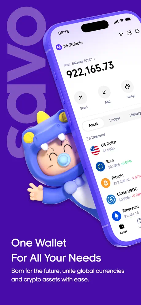
The viewport opens on a saturated violet field approximating #5B14BA. A rotated, low-opacity “SAVO” watermark occupies the upper left, functioning as texture rather than legible type. Entering from the right at roughly fifteen degrees is a purple-cast iPhone with the Dynamic Island visible. Its screen displays the wallet dashboard: user “Mr.Bubble,” an available balance of “$922,165.73,” and a tabbed asset list mixing fiat (US Dollar at $1.0000, Euro at $0.9965) with crypto (Bitcoin, Circle USDC, Ethereum). Below the device, the headline “One Wallet / For All Your Needs” is set in a bold, large white sans, followed by the body line “Born for the future, unite global currencies and crypto assets with ease.” A blue dragon mascot with yellow horns and a pacifier breaches the phone’s lower bezel, its hands overlapping the hardware edge to create literal depth. The composition establishes the thesis in one glance: high balances, multi-currency, approachable character design.

SAVO App Store screenshot 2 — Frame 2
02

Frame 2

On-frame caption: “Invest and Stash

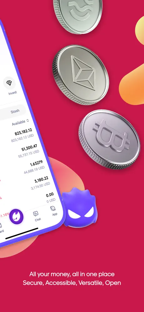
The palette switches abruptly to a crimson ground near #D61C4E. Here the iPhone is shoved to the extreme left edge and cropped so aggressively that only the left third of the screen remains visible, showing an “Invest” tab, a “Stash” header, and holdings such as 823,182.12 and 51,300.47. The app’s bottom navigation peeks out with a purple flame icon, Chat, and App labels. Dominating the right two-thirds are three metallic coins—a generic token, an Ethereum medallion, and a Bitcoin-style stamp—floating above a small purple spiked mascot. The caption reads “All your money, all in one place / Secure, Accessible, Versatile, Open.” The asymmetry is extreme: the UI is reduced to a vertical ribbon while the coins claim the visual mass. At thumbnail size, the screen numbers risk reading as white noise rather than proof.

SAVO App Store screenshot 3 — Frame 3
03

Frame 3

On-frame caption: “Swaps and Speed Claims

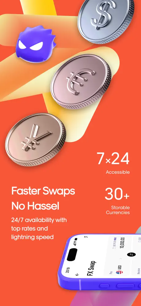
The background shifts to an aggressive orange near #FF6B35, sliced by a diagonal yellow-to-peach ribbon that drives the eye from upper left to center. Three metallic currency coins—USD ($), Euro (€), and Yen (¥)—ride the ribbon’s slope. The purple spiked mascot perches small in the top left corner. The typographic system splits: left-aligned, the headline “Faster Swaps / No Hassel” sits above the body copy “24/7 availability with top rates and lightning speed.” On the right, two stats read “7×24 / Accessible” and “30+ / Storable Currencies.” A bottom-right crop of a phone shows an “FX Swap” screen with USD/EUR selectors and a 10,000.00 input field. The misspelling “Hassel” is visible and damaging. The opposing alignments create kinetic tension, but the phone corner is so small that the interface reads as an afterthought.

SAVO App Store screenshot 4 — Frame 4
04

Frame 4

On-frame caption: “Borderless Accounts

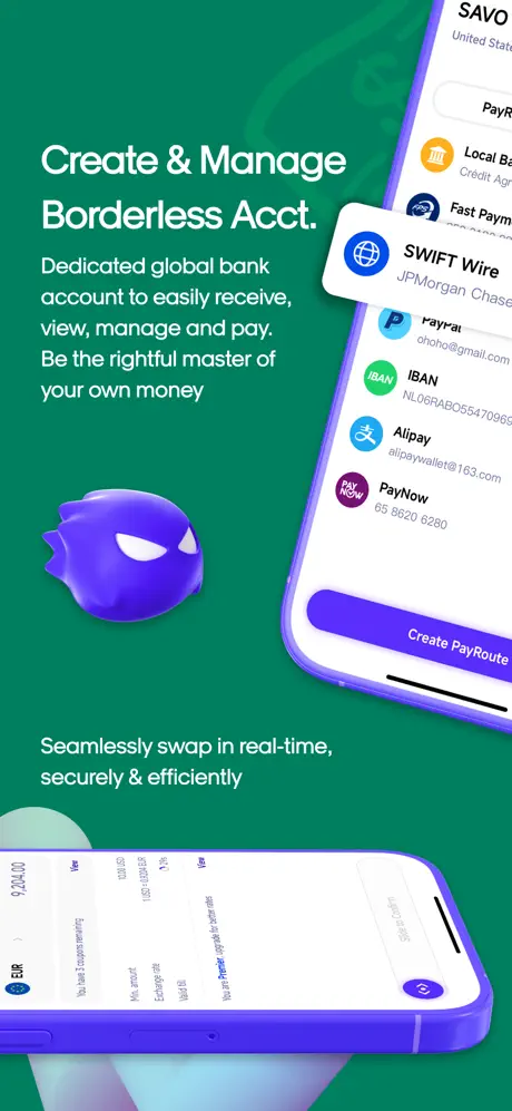
The scene changes to deep emerald near #0A8F6B. Two devices create a diptych. The upper-right phone presents payment rails: SWIFT Wire via JPMorgan Chase, PayPal, IBAN (NL06RABO…), Alipay, and PayNow, each with institutional icons and partially masked credentials. A purple “Create PayRoute” button caps the list. The lower-left device shows a sliding confirmation for EUR 10,024.00, detailing coupon savings, minimums, and exchange rates. The blue dragon mascot returns, centered left at medium scale. The copy stack reads “Create & Manage / Borderless Acct.” followed by “Dedicated global bank account to easily receive, view, manage and pay. Be the rightful master of your own money.” A secondary line, “Seamlessly swap in real-time, securely & efficiently,” floats near the bottom. The density of localized logos provides strong social proof, though the green pushes white text toward the edge of comfortable contrast.

SAVO App Store screenshot 5 — Frame 5
05

Frame 5

On-frame caption: “Payments and Trust

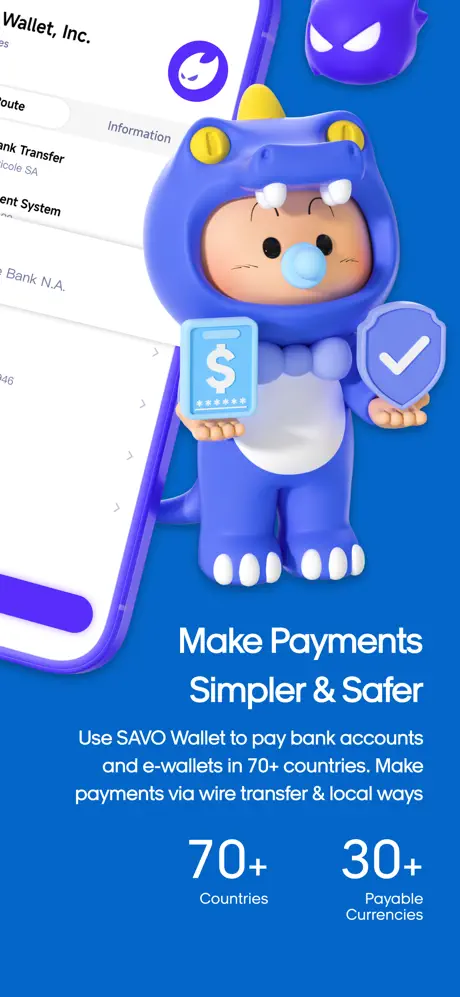
A bright cobalt near #2563EB floods the canvas. The blue dragon mascot is now the central figure, holding a phone with a dollar icon in one hand and a shield with a checkmark in the other. An iPhone is cropped hard to the left edge, displaying a payee list that includes “Wallet, Inc.” and “Bank Transfer.” The purple spiked mascot reappears small in the top right. The headline “Make Payments / Simpler & Safer” anchors the lower half, above the body “Use SAVO Wallet to pay bank accounts and e-wallets in 70+ countries. Make payments via wire transfer & local ways.” Two large stats sit at the bottom: “70+ / Countries” and “30+ / Payable Currencies.” By placing trust iconography literally in the mascot’s hands, the frame turns abstract security claims into a visual metaphor, though the left-edge crop again sacrifices UI legibility.

SAVO App Store screenshot 6 — Frame 6
06

Frame 6

On-frame caption: “Card Lifestyle Aspiration

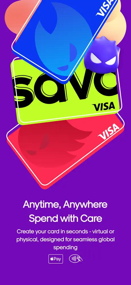
The background returns to electric violet near #7C3AED, but this time no phone appears. Three VISA cards float in a stacked cascade: a blue card with the SAVO flame, a lime card with “SAVO” in heavy black sans-serif, and a red card with the same flame mark. The purple spiked mascot nests between them. Soft peach and melon gradient blobs drift behind the cards, adding atmospheric depth. The caption reads “Anytime, Anywhere / Spend with Care,” with the subcopy “Create your card in seconds - virtual or physical, designed for seamless global spending.” Payment marks for Apple Pay and contactless sit centered below. Without any UI chrome, the frame pivots from proof to pure lifestyle aspiration, relying on the tangible card artifacts to signal spending capability. It is the most conventional frame in the set, and the only one that fails to show the app itself.

SAVO App Store screenshot 7 — Frame 7
07

Frame 7

On-frame caption: “Premium Assets

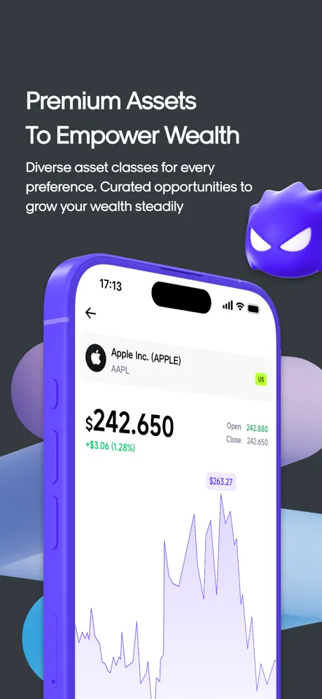
The final frame drops to a charcoal ground near #1F2937. A single centered iPhone, fully visible and untilted, displays Apple Inc. (AAPL) at $242.650, with a purple line chart tracing price action and an Open/Close pair at 242.880 / 242.650. The system status bar reads 17:13. The purple spiked mascot floats in the upper right, smaller than in previous frames. Behind the device, muted lavender and sky-blue ellipses provide subtle depth without competing for attention. The headline “Premium Assets / To Empower Wealth” is paired with “Diverse asset classes for every preference. Curated opportunities to grow your wealth steadily.” By selecting a mainstream equities view rather than a crypto token, the frame deliberately widens the app’s positioning from a niche wallet to a brokerage layer. The dark backdrop acts as a palette cleanser after six saturated screens.

05The craft

Captions, colour and the mechanics of the sell

Caption pattern

Two-line bold headline set in a large geometric sans, followed by a lighter body paragraph. Stats are occasionally pulled out into oversized numerals with micro-labels beneath (e.g., “70+ / Countries”). Copy is always white, always lower-half, creating a reliable anchor zone across the swipe.

Visual system

One device frame in purple resin; two 3D mascots (blue dragon infant, purple spiked orb); seven discrete background colors; white typographic stack; floating 3D coins and cards as environmental props. No two frames share the same background hue, enforcing a chapter-like rhythm.

The thumbnail test

At thumbnail scale, the set reads as a rainbow stripe—violet, red, orange, green, blue, purple, black—which successfully interrupts a scroll. However, white interface elements in frames 2 and 5 compress into unreadable vertical ribbons, and frame 3’s typo becomes a trust fracture. The dragon mascot is visually distinctive even at 120px wide, but the spiked orb risks appearing as a smudge.

Conversion mechanics

Frame 1 does the heaviest lifting: the $922,165.73 balance is intentionally aspirational, suggesting whale-tier usage. Frame 4 is the trust anchor, surfacing logos for Chase, PayPal, and PayNow to answer the unspoken question “Can I actually get money in and out?” Frame 7’s AAPL chart quietly signals stock trading, a feature that crypto-pure competitors often lack. The weakest conversion aid is Frame 6, which shows cards but no interface for ordering them.

06Where it slips

What we would change

Typo in Frame 3

The headline “No Hassel” is a misspelling. In a finance context, this immediately undermines the “Secure, Accessible” claim made two frames earlier. Fix: change to “No Hassle” and regenerate the image.

Extreme Left-Edge Cropping

Frames 2 and 5 push the iPhone so far left that the screen contents collapse into a narrow white stripe at thumbnail scale. Fix: shift the device inward so at least 40% of the screen is readable, or increase the crop margin to 60pt from the left edge.

No UI in Frame 6

After establishing a rhythm of interface proof, Frame 6 breaks the contract by showing only 3D rendered cards. Fix: layer a phone behind the cards displaying the virtual-card creation flow, or a card-management screen.

Accessibility Contrast in Frame 4

The emerald background (#0A8F6B) against thin white sans-serif body copy likely fails WCAG AA for small text. Fix: darken the green to approximately #065F46, or increase the body weight from regular to medium and enlarge by 2pt.

Unresolved Mascot Logic

The dragon and spiked orb alternate without a discernible system. A user cannot tell if they represent different products, moods, or user types. Fix: assign each mascot a vertical—e.g., dragon for custody/savings, orb for trading/swaps—and encode this through props, color temperature, or placement.

07The recipe

How to apply this to your own app

  1. Use high-visibility character design

    SAVO proves that a saturated palette and 3D mascots can survive in the finance category if they are consistent. If your app serves a regulated market, consider giving your characters functional props—cards, shields, charts—so they feel like guides rather than toys.

  2. Surface real account states

    Showing actual balances, real bank logos, and live ticker symbols converts better than gray placeholder boxes. Don’t sanitize your UI for the store; expose the most visually credible detail you can.

  3. Run a thumbnail legibility pass

    Export every frame at 120px wide and see what survives. If your headline disappears or your device screen becomes a blur, the composition needs to be rebalanced for density, not just beauty.

  4. Lock your typographic zone

    SAVO keeps headlines in a persistent lower-left-to-center band across all seven frames. This creates a swipe rhythm. Define a safe zone for captions and stick to it; wandering text feels like narrative chaos.

  5. Spell-check before render

    A single typo in a headline can undo millions in ad spend. Treat screenshot copy with the same editorial rigor as your onboarding flow, because for many users, this is the only copy they will ever read.

08Takeaways

Five things worth stealing

  • Color-coded chapters turn a feature list into a visual rhythm, but only if the palette is different enough frame-to-frame to register in a two-second swipe.
  • Mascots can differentiate fintech brands from sterile incumbents, yet they need a behavioral logic—otherwise they decoration without wayfinding.
  • Real data and institutional logos (Chase, PayPal, Visa) build trust faster than abstract claims of security.
  • Every frame in a screenshot set is an argument; dropping the phone entirely for a pure lifestyle render breaks the evidentiary contract established in earlier frames.
  • Contrast and crop discipline matter more in the carousel than in a Dribbble shot. If the UI is illegible at thumbnail scale, the frame is filler.
09The verdict

What the set actually achieves

The set’s greatest asset is chromatic confidence. By treating each screenshot as a color chapter, the team turns a feature list into a visual rhythm that is hard to ignore in a scroll. The two-mascot system is a high-wire act that mostly succeeds; it gives SAVO a personality taxon distinct from both stodgy banking incumbents and anonymous DeFi tooling. Surface-level credibility is reinforced by real numbers, real payment rails, and real ticker data. Yet the execution is uneven in ways that matter. Frame 3 contains the typo “No Hassel.” In financial services, textual errors erode trust faster than color choices can rebuild it. The fix is simple: correct to “Hassle” and re-render. Frame 2 and Frame 5 both crop the iPhone so severely against the left margin that, at carousel thumbnail scale, the interface becomes illegible. The fix is to preserve at least forty percent of the screen width or to shift the device inward so that type remains readable on a small display. Frame 6’s absence of any UI is a structural breach; after establishing a pattern of “show the product,” the pure card render feels like an empty promise. A phone frame showing virtual card issuance behind the plastic would restore credibility. Accessibility is another concern. The emerald ground in Frame 4 (#0A8F6B) paired with thin white body copy likely fails WCAG AA contrast for small text. Darkening that green toward #065F46 or increasing the font weight by one increment would solve it without breaking the palette. The mascot logic also remains unresolved: the dragon and the spiked orb alternate without a discernible system. If one signals saving and the other trading, the set should encode that visually through props or positioning so that users learn a wayfinding rule rather than registering random decoration. Finally, the sequence itself feels taxonomically scrambled. The flow jumps from wallet to invest to swaps to accounts to payments to cards to stocks, a path that mirrors internal feature silos rather than user intent. A reordered funnel—store, move, pay, spend, grow—would lower cognitive load. SAVO’s screenshots win on stopping power and lose on narrative architecture. The lesson for teams building their own sets is unambiguous: personality will earn the swipe, but only coherence and polish will earn the download.

Crossover retail users who hold both fiat and crypto, remit internationally, and want a unified ledger rather than a pure neobank or a pure DeFi wallet. The set speaks to users who value personality and range over minimalism.


10Questions

Frequently asked

Does the set rely on one mascot or two?

Two. A blue dragon-suited infant appears in frames 1, 4, and 5. A purple spiked orb appears in frames 2, 3, 5, 6, and 7. They never share the frame at equal scale, and their roles are architecturally unresolved.

Why does Frame 6 not show a phone?

It breaks the established pattern. Frame 6 is a pure lifestyle shot showing three rendered VISA cards. For conversion, this is the weakest frame because it offers no interface proof after six screens of device-centric evidence.

Is the copy typo really in the App Store image?

Yes. Frame 3 displays the headline “Faster Swaps / No Hassel,” a misspelling of “Hassle.”

What is the dominant background color strategy?

Each frame receives a unique highly saturated hue—violet, crimson, orange, emerald, cobalt, electric purple, and charcoal—to create a chapter-like rhythm as the user swipes.

Which frame does the heaviest trust work?

Frame 4, by displaying recognizable payment rails including SWIFT Wire (JPMorgan Chase), PayPal, Alipay, and PayNow with real iconography and masked credentials.

11Keep reading

Build your own screenshot set

The full set

7 shots
SAVO App Store screenshot 1SAVO App Store screenshot 2SAVO App Store screenshot 3SAVO App Store screenshot 4SAVO App Store screenshot 5SAVO App Store screenshot 6SAVO App Store screenshot 7

About the app

Welcome to the SAVO Wallet, where managing your wealth becomes a breeze! Say goodbye to complicated processes and hello to effortless control over your assets. With unbeatable SAVO, Inc., via the App Store listing.

Screenshots and store metadata belong to SAVO, Inc.. They are shown here for design commentary and criticism. The analysis on this page is original work by floow.design. View the original listing.

More Finance teardowns

Browse all →