

Senses app icon
Health & FitnessScreenshot teardown13 min read

Senses App Store screenshots

A study in chromatic discipline and fractured framing: how the Senses screenshot set uses a single dark teal wall to unite pelvic-health utility with couples’ intimacy, and where that rigidity begins to erode the message.

Set published by Senses Media LTD · 6 frames analysed

4.6 · 3.6K ratingsFreev5.1.0Updated 5mo ago
Senses App Store screenshot 1
01At a glance

The set in one screen

Framing
Four frames use a fully rendered iPhone chassis (Frames 1, 2, 4, 5); two frames abandon it for floating UI cards (Frames 3, 6).
Captions
Tall condensed serif in aged ivory, center-top placement, consistent across all six frames.
Backdrop
Unbroken dark teal ground, roughly in the vicinity of #235C4E, used as a wallpaper behind every composition.
Type
Marketing serif strictly outside the device; system sans strictly inside the device. No crossover.
UI / copy split
Roughly 70% device/chrome in framed frames; 0% device in abstract frames.
Frame 1 job
Establish the category (kegels), prove real software exists, and promise curated content.

Sampled palette

#235C4E#235C4E
#F0EBD8#F0EBD8
#7B5CFF#7B5CFF
#C4E040#C4E040
#FF5E3A#FF5E3A
02The challenge

What this screenshot set had to solve

The App Store shopper for this niche is likely hesitant. They are not necessarily looking for a game, yet they may be wary of clinical medical apps. The screenshots must overcome the embarrassment factor of the category by looking like a mainstream fitness product while still signaling adult intimacy content. The challenge is communicating medical-adjacent value (kegels, physical therapy) without feeling sterile, and lifestyle value (courses, games) without feeling frivolous.

The set’s strongest asset is its chromatic stubbornness. By locking every frame to the same dark teal, the designers created an instant brand corridor. That virtue, however, becomes exhaustion by the fourth swipe.
03The approach

How the set argues its case

The sequence follows a rough usage funnel: catalog discovery, active exercise, curriculum depth, video library, coaching authority, and playful social features. It attempts to prove utility before personality, then end on human connection rather than another feature list.

Positioned between clinical pelvic-floor apps and glossy lifestyle brands. The serif headline gives magazine authority; the teal ground gives medical calm; the floating cards give lifestyle spontaneity. It targets adults seeking both solo physical improvement and partnered intimacy practices.

04Frame by frame

Every screenshot, and the job it does

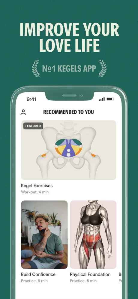
Senses App Store screenshot 1 — The Catalog Promise
01

The Catalog Promise

On-frame caption: “IMPROVE YOUR LOVE LIFE / №1 KEGELS APP

The opener leads with the headline “IMPROVE YOUR LOVE LIFE” in heavy ivory serif, immediately above a laurel-wreathed lockup reading “№1 KEGELS APP”. The typography is center-aligned and occupies roughly the upper third of the canvas. Below it, an iPhone X-style device sits centered, its notch and symmetric bezel clearly visible, the status bar locked to 9:41. Inside the app, the screen reads “RECOMMENDED TO YOU” beneath a profile icon. A dominant “FEATURED” card presents an anatomical pelvis illustration—the sacrum and obturator internus rendered in bone white, with the pelvic floor highlighted in sherbet orange and deep violet against a warm gray ground. Underneath, two smaller horizontal cards protrude; the left shows a seated man under the title “Build Confidence” with the subtitle “Practice, 8 min”, while the right displays a chrome muscle-map labeled “Physical Foundation” with “Practice, 5 min”. A third card is intentionally cropped at the right edge, suggesting a scrollable catalog. The internal padding is tight, especially between the device notch and the app header, but the information architecture is readable.


Senses App Store screenshot 2 — The Active Workout
02

The Active Workout

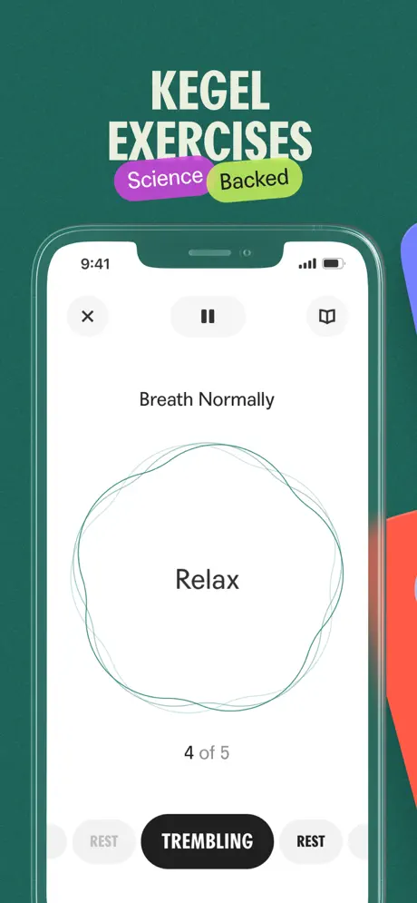
On-frame caption: “KEGEL EXERCISES / Science + Backed pills

Frame two shifts from catalog to workout. The canvas headline now reads “KEGEL EXERCISES”, with the words “Science” and “Backed” tucked into overlapping purple and lime pills beneath. Inside the device, the app UI turns stark white, creating the highest contrast against the teal surround seen in the entire set. The top bar presents a circular “X” close button, a pill-shaped pause control, and a bookmark icon. Centered instructions read “Breath Normally” above a spirograph-style green line animation that encloses the state word “Relax”. A progress counter sits below: “4 of 5”. The bottom of the screen exposes a horizontally scrolling rhythm navigator—flanking gray “REST” pills bracket a central active state, “TREMBLING”, rendered as a filled black lozenge with reversed-out white text. A sliver of saturated red bleeds in from the far right edge, presumably the lip of Frame 3’s coral card, though it reads as a compositional accident rather than an intentional hand-off.

Senses App Store screenshot 3 — Curriculum Spread
03

Curriculum Spread

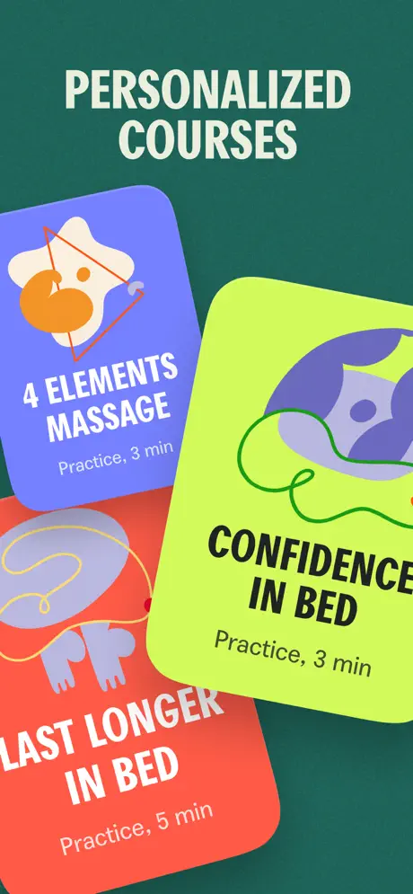
On-frame caption: “PERSONALIZED COURSES

The phone chassis disappears entirely here, replaced by a floating-card composition under the headline “PERSONALIZED COURSES”. Three rounded rectangles overlap in shallow z-space against the unchanged dark teal ground. The top-left card is violet, labeled “4 ELEMENTS MASSAGE” with “Practice, 3 min” and an abstract cream-and-orange illustration. The bottom-left card is coral, reading “LAST LONGER IN BED” with “Practice, 5 min” and a line-art graphic of two figures connected by a thread. The right card is acid lime, titled “CONFIDENCE IN BED” with “Practice, 3 min” and a curvilinear purple form. Each card uses a bold, tight sans-serif for titles and soft drop shadows for depth. By abandoning the device, the frame trades interface proof for emotional abstraction; the shopper sees curriculum variety but gets no sense of how these courses are browsed, purchased, or tracked.

Senses App Store screenshot 4 — Video Library Proof
04

Video Library Proof

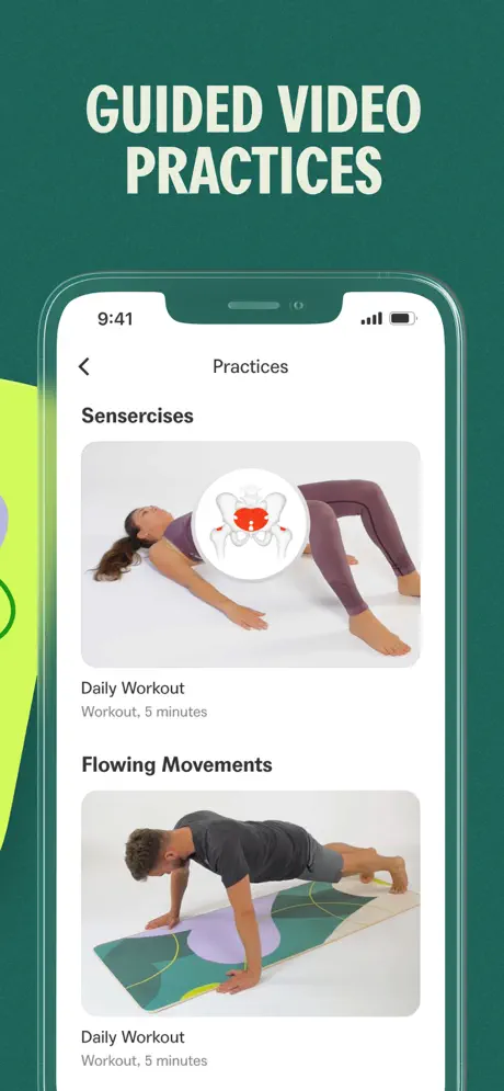
On-frame caption: “GUIDED VIDEO PRACTICES

The device returns for “GUIDED VIDEO PRACTICES”. The app screen shows a back chevron and the header “Practices”. Two stacked thumbnails sit beneath section titles. The first, under “Sensercises”, displays a woman in a pelvic bridge wearing mauve leggings on a white floor; a small circular badge overlays her midsection with a stylized pelvis in red and white. Its metadata reads “Daily Workout” and “Workout, 5 minutes”—an awkward repetition of the word “Workout”. The second thumbnail, under “Flowing Movements”, shows a man in a gray t-shirt holding a plank over a geometric yoga mat, with identical metadata duplicated below. The corners of the thumbnails are heavily rounded to match the platform’s card language. A vertical strip of acid lime bleeds in from the left, visually linking back to Frame 3’s palette, though the overlap cuts into the device bezel without compositional purpose.

Senses App Store screenshot 5 — Coaching Authority
05

Coaching Authority

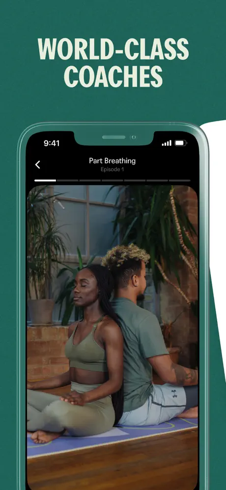
On-frame caption: “WORLD-CLASS COACHES / Part Breathing Episode 1

Trust-building is the goal of the fifth frame, captioned “WORLD-CLASS COACHES”. The device now shows a dark-mode video player for “Part Breathing Episode 1”, complete with a segmented progress scrubber and a thin white playhead. The video itself is full-bleed within the screen, displaying a man and woman seated back-to-back in meditation: the woman wears an olive sports bra and leggings, her hair in long braids, while the man wears a sage tee and light sweatpants with visible tattoo work on his forearm. They are positioned on a purple mat in a plant-filled studio against exposed brick. This frame is the first to leave behind the app’s white chrome for cinematic photography, signaling a shift from software tool to human guidance. A white panel intrudes from the right edge, cropped abruptly, which fractures the full-bleed cinematic intent.

Senses App Store screenshot 6 — Social Play
06

Social Play

On-frame caption: “SPICY CARD GAMES / IT'S DATE NIGHT

The sequence concludes with “SPICY CARD GAMES”, again omitting the device frame. A white card floats in the foreground, tilted slightly counter-clockwise, bearing the small caps header “IT'S DATE NIGHT” and the prompt “Tell me something about me that you find really hot” in a clean, medium-weight sans. Behind it, a dark navy card peeks out, branded with the same “IT'S DATE NIGHT” logotype in cream and decorated with abstract peach and lavender shapes. The typographic voice softens here; the prompt reads as conversational rather than instructional. However, without any navigation bar, deck count, or menu context, the frame feels more like a print advertisement for a card game than a screenshot of a mobile feature. It leaves the funnel on a tone shift—playful and social—but surrenders critical interface context.

05The craft

Captions, colour and the mechanics of the sell

Caption pattern

Every frame uses two-line, all-caps condensed serif headlines set in aged ivory near #F0EBD8, centered in the upper quadrant. Frame 2 adds decorative purple and lime pill badges beneath the headline. Frames 3 and 6 use no device, letting headline and card exist in negative space.

Visual system

Chromatic discipline is the governing rule. All six frames share the same dark teal ground, immediately separating Senses from both sterile white medical apps and black-and-neon lifestyle brands. Accent colors—violet, acid lime, coral—are introduced sparingly at first, then deployed at full saturation across floating cards in Frame 3. Inside the device, the app defaults to a neutral system sans with generous white space, creating a visible gap between the “marketing” voice and the “product” voice.

The thumbnail test

From a distance, the ivory serif headlines are readable, but the dark teal ground blends into the Health & Fitness sea of greens and blues. The floating cards in Frame 3 provide the strongest shape break. The thumbnail icon would likely be the pelvis illustration or the laurel wreath, neither of which is represented in the app icon slot shown here.

Conversion mechanics

Frame 1 handles the ‘what’ and ‘why’. Frame 2 proves there is an actual interactive workout, not just content. Frame 3 expands perceived value through curriculum breadth. Frame 4 introduces video, which raises production-value signals. Frame 5 introduces human coaches, lowering perceived risk. Frame 6 acts as a feature-finish to show the app is not purely clinical. The drop-off risk happens at Frame 3, where the absence of a device may cause shoppers to question whether courses are native app content or external links.

06Where it slips

What we would change

Background Monotony

The set’s strongest asset is its chromatic stubbornness. By locking every frame to the same dark teal—roughly in the #235C4E range—the designers created an instant brand corridor that scans as premium and distinct from Health & Fitness clichés. That virtue, however, becomes exhaustion by the fourth swipe. When the content shifts from pelvic exercise to couples’ meditation to card-game intimacy, the background refuses to modulate, flattening emotional nuance into a single monotone wall. Fix: vary the ground color value by feature family—perhaps a deeper forest for the clinical kegel frame, a warmer charcoal for the coach video—keeping the hue consistent but allowing brightness to breathe.

Device Framing Inconsistency

Frames 1, 2, 4, and 5 faithfully present an iPhone chassis, proving the software exists. Frames 3 and 6 abandon it entirely for floating cards, which breaks the App Store shopper’s implicit trust. A browser cannot tell whether those cards are native UI components, web views, or physical merchandise. Fix: maintain at least a partial device shadow or status bar behind floating elements so the interface contract remains intact.

Badge Typography Clash

Frame 2’s “Science Backed” pills use colors not seen elsewhere in the interface, and their sticker-like placement over the headline cheapens the authoritative voice established in Frame 1. Fix: integrate a single trust badge into the app screen itself, near the exercise title, rather than decorating the canvas space.

Copy Errors and Redundancy

“Breath Normally” should read “Breathe Normally”. Frame 4’s redundant “Daily Workout Workout” labels suggest content was ported without editorial review—errors that erode trust in a health-adjacent product. Fix: run all visible strings through a product-copy editor before export.

Bleed Artifacts

Stray color bleeds from adjacent frames—red at Frame 2’s right edge, lime at Frame 4’s left, white at Frame 5’s right—read as export artifacts, not intentional sequential storytelling. Fix: crop each frame in complete isolation, or commit fully to a panoramic scroll illusion with intentional inter-frame overlaps.

07The recipe

How to apply this to your own app

  1. sequence

    The opener leads with the headline “IMPROVE YOUR LOVE LIFE” in heavy ivory serif, immediately above a laurel-wreathed lockup reading “№1 KEGELS APP”. The typography is center-aligned and occupies roughly the upper third of the canvas. Below it, an iPhone X-style device sits centered, its notch and symmetric bezel clearly visible, the status bar locked to 9:41. Inside the app, the screen reads “RECOMMENDED TO YOU” beneath a profile icon. A dominant “FEATURED” card presents an anatomical pelvis illustration—the sacrum and obturator internus rendered in bone white, with the pelvic floor highlighted in sherbet orange and deep violet against a warm gray ground. Underneath, two smaller horizontal cards protrude; the left shows a seated man under the title “Build Confidence” with the subtitle “Practice, 8 min”, while the right displays a chrome muscle-map labeled “Physical Foundation” with “Practice, 5 min”. A third card is intentionally cropped at the right edge, suggesting a scrollable catalog. The internal padding is tight, especially between the device notch and the app header, but the information architecture is readable.

  2. Frame 2

    Frame two shifts from catalog to workout. The canvas headline now reads “KEGEL EXERCISES”, with the words “Science” and “Backed” tucked into overlapping purple and lime pills beneath. Inside the device, the app UI turns stark white, creating the highest contrast against the teal surround seen in the entire set. The top bar presents a circular “X” close button, a pill-shaped pause control, and a bookmark icon. Centered instructions read “Breath Normally” above a spirograph-style green line animation that encloses the state word “Relax”. A progress counter sits below: “4 of 5”. The bottom of the screen exposes a horizontally scrolling rhythm navigator—flanking gray “REST” pills bracket a central active state, “TREMBLING”, rendered as a filled black lozenge with reversed-out white text. A sliver of saturated red bleeds in from the far right edge, presumably the lip of Frame 3’s coral card, though it reads as a compositional accident rather than an intentional hand-off.

  3. Frame 3

    The phone chassis disappears entirely here, replaced by a floating-card composition under the headline “PERSONALIZED COURSES”. Three rounded rectangles overlap in shallow z-space against the unchanged dark teal ground. The top-left card is violet, labeled “4 ELEMENTS MASSAGE” with “Practice, 3 min” and an abstract cream-and-orange illustration. The bottom-left card is coral, reading “LAST LONGER IN BED” with “Practice, 5 min” and a line-art graphic of two figures connected by a thread. The right card is acid lime, titled “CONFIDENCE IN BED” with “Practice, 3 min” and a curvilinear purple form. Each card uses a bold, tight sans-serif for titles and soft drop shadows for depth. By abandoning the device, the frame trades interface proof for emotional abstraction; the shopper sees curriculum variety but gets no sense of how these courses are browsed, purchased, or tracked.

  4. Frame 4

    The device returns for “GUIDED VIDEO PRACTICES”. The app screen shows a back chevron and the header “Practices”. Two stacked thumbnails sit beneath section titles. The first, under “Sensercises”, displays a woman in a pelvic bridge wearing mauve leggings on a white floor; a small circular badge overlays her midsection with a stylized pelvis in red and white. Its metadata reads “Daily Workout” and “Workout, 5 minutes”—an awkward repetition of the word “Workout”. The second thumbnail, under “Flowing Movements”, shows a man in a gray t-shirt holding a plank over a geometric yoga mat, with identical metadata duplicated below. The corners of the thumbnails are heavily rounded to match the platform’s card language. A vertical strip of acid lime bleeds in from the left, visually linking back to Frame 3’s palette, though the overlap cuts into the device bezel without compositional purpose.

  5. Frame 5

    Trust-building is the goal of the fifth frame, captioned “WORLD-CLASS COACHES”. The device now shows a dark-mode video player for “Part Breathing Episode 1”, complete with a segmented progress scrubber and a thin white playhead. The video itself is full-bleed within the screen, displaying a man and woman seated back-to-back in meditation: the woman wears an olive sports bra and leggings, her hair in long braids, while the man wears a sage tee and light sweatpants with visible tattoo work on his forearm. They are positioned on a purple mat in a plant-filled studio against exposed brick. This frame is the first to leave behind the app’s white chrome for cinematic photography, signaling a shift from software tool to human guidance. A white panel intrudes from the right edge, cropped abruptly, which fractures the full-bleed cinematic intent.

  6. Frame 6

    The sequence concludes with “SPICY CARD GAMES”, again omitting the device frame. A white card floats in the foreground, tilted slightly counter-clockwise, bearing the small caps header “IT'S DATE NIGHT” and the prompt “Tell me something about me that you find really hot” in a clean, medium-weight sans. Behind it, a dark navy card peeks out, branded with the same “IT'S DATE NIGHT” logotype in cream and decorated with abstract peach and lavender shapes. The typographic voice softens here; the prompt reads as conversational rather than instructional. However, without any navigation bar, deck count, or menu context, the frame feels more like a print advertisement for a card game than a screenshot of a mobile feature. It leaves the funnel on a tone shift—playful and social—but surrenders critical interface context.

08Takeaways

Five things worth stealing

  • A single background color creates instant brand recognition in the carousel, but six identical frames risk visual fatigue; consider value shifts while keeping hue consistent.
  • If you use device frames to prove software existence, dropping them for ‘lifestyle’ frames breaks shopper trust. Use a phantom device or consistent shadow to anchor floating cards.
  • Marketing typography (the exterior serif) should have at least a token presence inside the app screenshots, or the product will feel disconnected from its own packaging.
  • Small copy errors (‘Breath Normally’, redundant labels) disproportionately damage credibility in health-adjacent categories.
  • Cross-frame bleeds that read as export artifacts suggest a lack of polish; isolate each frame unless you are deliberately building a panoramic scroll narrative.
09The verdict

What the set actually achieves

A six-frame funnel that successfully establishes feature breadth and brand color ownership, but sacrifices interface honesty for graphic punch in its later stages, and fatigues the eye through chromatic monotony. The set communicates variety but leaves critical navigational and functional questions unanswered.

Designers building screenshot sets for apps in sensitive or dual-tone categories—particularly wellness, therapy, intimacy, or coaching products that must balance authority with accessibility. The Senses set demonstrates how chromatic discipline can unify disparate features, but also shows the interface-trust cost of abandoning device framing mid-sequence.

10Questions

Frequently asked

Why does the set abandon the iPhone frame in screenshots 3 and 6?

Likely to maximize graphic impact and show content variety without interface chrome cluttering the composition. However, the trade-off is that shoppers lose proof that these features exist as native app experiences.

Does the dark teal background help or hurt conversion?

It helps distinctness but hurts energy. In a category dominated by white and light gray, the teal is memorable. By the fifth and sixth frames, though, the unbroken darkness flattens the emotional arc and makes the later, more playful features feel surprisingly heavy.

What is the hierarchy inside the first screenshot?

Marketing message first (headline + laurels), app interface second (device), content metadata third (cards). The eye is pulled top-down from promise to proof to catalog depth.

Is the ‘Science Backed’ badge placement effective?

It is visible but graphically disconnected. The purple and lime pills sit on the canvas rather than inside the app, making them feel like marketing stickers rather than earned trust signals integrated into the workout UI.

11Keep reading

Build your own screenshot set

The full set

6 shots
Senses App Store screenshot 1Senses App Store screenshot 2Senses App Store screenshot 3Senses App Store screenshot 4Senses App Store screenshot 5Senses App Store screenshot 6

About the app

Senses gives you a safe and mindful space to explore yourself and your partner. Senses offers daily kegel exercises, physical practices, meditations and workshops from Senses Media LTD, via the App Store listing.

Screenshots and store metadata belong to Senses Media LTD. They are shown here for design commentary and criticism. The analysis on this page is original work by floow.design. View the original listing.

More Health & Fitness teardowns

Browse all →



