Sona Insight app icon
Health & FitnessScreenshot teardown12 min read

Sona Insight App Store screenshots

When an app promises to record, transcribe, summarize, and chat, its App Store screenshots face a classical product-design dilemma: proving depth without drowning the viewer in feature lists. The Sona Insight set attempts to solve this through a rigidly austere palette, a narrative progression from capture to collaboration, and a deliberate alternation between human hands and flat device crops. Across eight frames, the listing walks shoppers through a specific story—raw conversation becomes structured notes, becomes chat answers, becomes shared insights—while quietly anchoring itself to Apple’s hardware ecosystem. The result is a case study in restraint, though not without moments where that restraint costs clarity.

Set published by Florian Kiem · 8 frames analysed

3.5 · 24 ratingsFreev1.3.0Updated 11mo ago
Sona Insight App Store screenshot 1
01At a glance

The set in one screen

Framing
Human hands plus flat devices on white
Captions
Bold top-left headers with lighter grey subheads
Backdrop
#FFFFFF with near-black typography and SaaS-red accents
Type
Large grotesk sans-serif, likely SF Pro, two-weight stark hierarchy
UI / copy split
UI takes 45-55% of each frame; captions dominate the upper third
Frame 1 job
Establish the core recording + transcription loop through a handheld, real-world crop

Sampled palette

#FFFFFF#FFFFFF
#0A0A0A#0A0A0A
#BDBDBD#BDBDBD
#FF3B30#FF3B30
#34C759#34C759
02The challenge

What this screenshot set had to solve

For a utility that spans audio capture, natural-language processing, cross-device sync, and social distribution, the primary risk in the App Store is fragmentation. A shopper swiping in under three seconds needs to understand not just what the app does, but in what order it does it. The designer is fighting two battles at once: conveying feature breadth—recording, transcription in 99 languages, templated summarization, chat, watch sync, Live Activities, and sharing—without turning the carousel into a PowerPoint checklist. At the same time, the visual language has to signal trust and precision, because transcription apps are judged first on credibility and second on interface polish. The chosen canvas is relentlessly white, almost clinical, which means every typographic decision and every device crop has to carry the narrative weight that colored illustration or lifestyle photography would otherwise provide. There is nowhere to hide; drop shadows, gradients, and decorative blurs are absent. This puts enormous pressure on the actual UI content to look convincing, and on the captions to sequence the story without sounding like a feature dump.

Restraint works only if every frame justifies its real estate with either legible UI or irreplaceable context.
03The approach

How the set argues its case

The set solves the breadth problem through a strict narrative sequence: capture, structure, interrogate, scale, distribute, systemize, extend hardware, and recap. That progression turns eight potentially disconnected features into a single user journey. Visually, the designer alternates between three registers: human hands holding the device to imply real-world use; flat, cropped device fronts that maximize UI legibility; and conceptual layouts that break the phone frame entirely. Color is disciplined to near-monochrome. The palette is essentially white (#FFFFFF), near-black headlines (#0A0A0A), secondary grey captions around #BDBDBD, and functional accents—the red record button in Frame 1 and Frame 5, the green checkmarks in Frame 8, and pastel avatar rings in Frame 5. Typography is loud and straightforward: large, bold sans-serif headlines anchored top-left, with lighter subheads directly beneath them. There are no gradients, no neon AI purples, no glassmorphism. The intent is to let the transcription content itself provide texture, while the containers stay invisible.

Sona Insight’s screenshots compete in a crowded productivity niche by looking more like Apple system apps than like bloated enterprise software. By wearing the iOS visual language—SF Pro-style weights, standard navigation glyphs, Dynamic Island and Live Activity integration—the set signals that the app is a native citizen rather than a cross-platform port. The strategy is trust-through-familiarity.

04Frame by frame

Every screenshot, and the job it does

Sona Insight App Store screenshot 1 — The Promise in Context
01

The Promise in Context

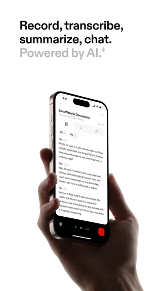
On-frame caption: “Record, transcribe, summarize, chat. Powered by AI.

The opener places an iPhone 15 Pro in a right hand, shot from a three-quarter angle against pure white. The caption sits top-left in two weights: 'Record, transcribe, summarize, chat.' in solid black, followed by 'Powered by AI.' in a muted grey, with a superscript sparkle glyph. On the device screen we see the transcription view for a conversation titled 'Sona Website Discussions,' dated October 21, 2024, Berlin, with a duration of 24:42. Speaker labels 'Flo' and 'Nils' alternate down the transcript, and the bottom toolbar shows a waveform scrubber, a timestamp reading 01:12, and a prominent red square stop button. The hand slightly obscures the left bezel, which is a trade-off: it adds human scale, but costs a few characters of legibility. The framing establishes the core loop immediately—this is a live capture tool—while the AI qualifier is visually deprioritized, as if the designer wants the raw transcript to feel like the hero, not the model powering it.
Sona Insight App Store screenshot 2 — From Noise to Structure
02

From Noise to Structure

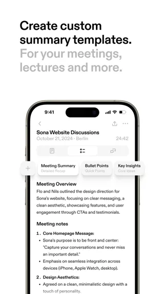
On-frame caption: “Create custom summary templates. For your meetings, lectures and more.

Frame two drops the hand and crops tightly to the top half of the phone, centering the summary interface. The headline reads 'Create custom summary templates. For your meetings, lectures and more.' in the same black-over-grey two-register system. Inside the UI, a horizontally arranged trio of template chips—'Meeting Summary' (Organized Notes), 'Bullet Points' (Quick Format), and 'Key Insights' (Condensed)—sits above a rendered output. The content is convincingly specific: a 'Meeting Overview' paragraph followed by numbered 'Meeting notes' with sub-bullets on homepage messaging and design aesthetics. The tab bar and status icons are cropped away, which focuses attention on the generated text quality but removes navigational context. This frame answers the 'so what?' that Frame 1 raises: the app doesn't just dump text, it categorizes it.

Sona Insight App Store screenshot 3 — Conversational Interface
03

Conversational Interface

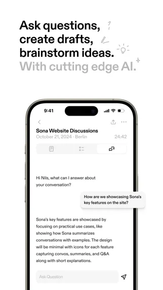
On-frame caption: “Ask questions, create drafts, brainstorm ideas. With cutting edge AI.

Here the caption gains three hand-drawn doodles—a question mark, a pencil, and a lightbulb—to soften the technical premise. The text reads 'Ask questions, create drafts, brainstorm ideas. With cutting edge AI.' The phone shows a chat modal within the same transcript session. A left-aligned bot bubble opens with 'Hi Nils, what can I answer about your conversation?' A right-aligned user bubble asks, 'How are we showcasing Sona's key features on the site?' and the reply begins below. At the bottom, an input field with the placeholder 'Ask Question' and a paper-plane send button mirrors standard messaging patterns. By keeping the same conversation title visible, the frame reinforces continuity: this is not a separate feature, but a layer on top of the existing transcript.

Sona Insight App Store screenshot 4 — The Ubiquity Claim
04

The Ubiquity Claim

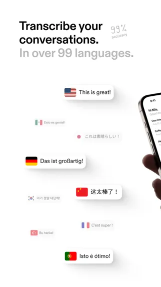
On-frame caption: “Transcribe your conversations. In over 99 languages.

This frame breaks the device-dominant pattern. The headline 'Transcribe your conversations. In over 99 languages.' is accompanied by a vertical '99% accuracy' callout in pale grey near the top right. The composition scatters speech bubbles carrying flags and phrases—USA ('This is great!'), Mexico ('Esto es genial!'), Japan ('これは素晴らしい!'), Germany ('Das ist großartig!'), China ('这太棒了!'), South Korea ('이거 정말 대단해!'), France ('C'est super!'), Turkey ('Bu harika!'), and Portugal ('Isto é ótimo!'). A phone peeks in from the far right edge, barely showing a chat interface. The bubbles float with soft drop shadows against white space. It is the most abstract shot in the set, trading software specificity for scale perception. The risk is obvious: the viewer sees no actual translation UI, only a conceptual promise rendered through iMessage-style bubbles that may not exist in the product.

Sona Insight App Store screenshot 5 — Distribution
05

Distribution

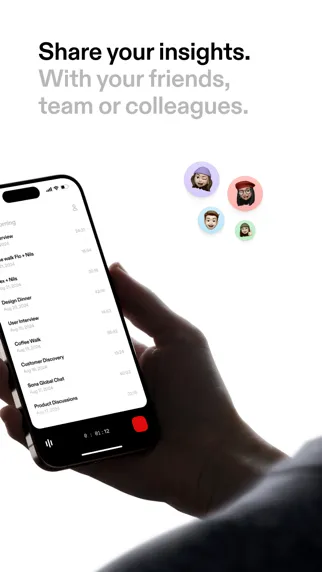
On-frame caption: “Share your insights. With your friends, team or colleagues.

The fifth frame returns to a hand-held device, this time entering from the right, displaying a conversation list. Entries include 'Sona Website Discussions,' 'Flo + Nils,' 'Design Dinner,' 'User Interview,' and others, each with a date and duration. Above the phone, four Memoji-style avatars sit inside pastel-colored circles (lavender, coral, sky blue, mint), implying collaboration. The caption reads 'Share your insights. With your friends, team or colleagues.' The red record button reappears at the bottom right of the screen, providing a color anchor that links back to Frame 1. What is absent, however, is any share sheet, export format, or invitation flow; the sharing is entirely implied by the avatars, which hover in blank space rather than inside the UI.

Sona Insight App Store screenshot 6 — System Integration
06

System Integration

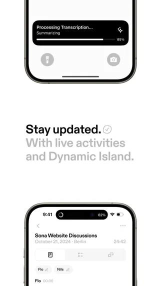
On-frame caption: “Stay updated. With live activities and Dynamic Island.

Frame six stacks two phones vertically around a central headline: 'Stay updated. With live activities and Dynamic Island.' A small checkmark icon punctuates the first line. The top device shows a lock-screen Live Activity titled 'Processing Transcription... Summarizing' with a progress bar pinned at 85%. The bottom device shows the active app beneath the Dynamic Island, which displays a recording waveform and a status readout. The double-crop is efficient but visually dense; at thumbnail scale, the Dynamic Island detail is nearly illegible. The frame is positioned sixth, wisely after the core value props have been established, because shoppers need to already care about the app before an OS-level integration will impress them.

Sona Insight App Store screenshot 7 — Wearable Extension
07

Wearable Extension

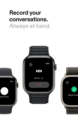
On-frame caption: “Record your conversations. Always at hand.

Three Apple Watches appear in a horizontal line against white space, caption top-left: 'Record your conversations. Always at hand.' The left watch shows a 'Hold to start' state with a white touch target on black. The center watch displays an active recording: three pulsing dots, a timer at 00:01:12, and a grey 'Stop' button. The right watch signals completion with a green checkmark and truncated text 'Upload Comp...' The black watch faces create the darkest visual mass in the entire set, making this frame arresting by contrast alone. By placing watches rather than more phones, the designer signals that capture is ambient and glanceable, not desk-bound.

Sona Insight App Store screenshot 8 — The Checklist
08

The Checklist

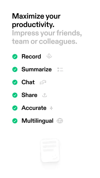
On-frame caption: “Maximize your productivity. Impress your friends, team or colleagues.

The final frame abandons devices entirely for a pure typographic feature list. 'Maximize your productivity. Impress your friends, team or colleagues.' repeats the social language of Frame 5. Below, six items—Record, Summarize, Chat, Share, Accurate, Multilingual—are prefixed with green check circles around #34C759 and paired with thin-line icons (microphone, text block, speech bubble, upload arrow, sparkle, globe). A faint, ghosted document icon sits at bottom center. Functionally, this acts as a recap for skimmers who swiped straight to the end, but it also breaks the show-don't-tell rule that the previous seven frames mostly obeyed.

05The craft

Captions, colour and the mechanics of the sell

Caption pattern

Every frame follows an identical caption architecture: a bold black imperative headline ('Record, transcribe, summarize, chat.'), then a lighter grey explanatory line ('Powered by AI.') sized roughly 60-70% of the headline weight. This pattern becomes rhythmic to the point of predictability by Frame 6. The only variation is Frame 3, where hand-drawn doodles—a question mark, a pencil, a lightbulb—are appended to the headline area, softening the otherwise corporate tone.

Visual system

Spacing is generous and consistent. Captions sit in the upper ~20% of the canvas, leaving the lower two-thirds for the device or conceptual artwork. No frame crowds the top safe zones. Shadows are subtle, diffuse, and cool-grey, never black. The device bezels are rendered with high fidelity, suggesting the source files are official Apple mockups rather than generic templates. This keeps the hardware feeling aspirational and current.

The thumbnail test

At iPhone thumbnail scale, the frames that survive best are Frame 1 (red button contrast against the hand), Frame 7 (the black watch faces creating a dark void), and Frame 8 (the green checkmarks). The middle frames risk bleeding together because their grey-on-white captions and similar device crops lack browse-time distinction. A shopper flicking quickly might register 'white app with black text' three times in a row without parsing the differences.

Conversion mechanics

The set assumes a linear read, but App Store shoppers often swipe non-sequentially or jump to the end. The red record button in Frames 1 and 5 acts as a breadcrumb, helping orient a discontinuous viewer. However, there is no pricing frame, no social-proof quote, and no privacy lockup—omissions that may hurt conversion for a tool that listens to personal conversations. The designer seems to have prioritized pure functionality over risk reversal.

06Where it slips

What we would change

Frame 4 is conceptually disconnected

Instead of showing an actual transcript language selector or a real-time translation interface, it presents iMessage-style bubbles that do not appear to exist in the product. The viewer has no idea whether translation happens inline, in a sidebar, or post-export. A specific fix: replace the floating bubbles with a split-screen transcript showing two detected languages and the app’s language-switcher toolbar, tethering the 99% accuracy claim to real UI.

Frame 8 surrenders to PowerPoint logic

After seven frames of progressive disclosure, ending on a static checklist feels like a retreat. The green checks and iconography read as generic, and the headline nearly duplicates Frame 5’s social promise. The fix is to cut this frame entirely and replace it with a benefits-close frame—perhaps a privacy lockup or an export preview—or convert it into a testimonial card with a quote overlaid on the actual transcript UI.

Frame 6 compresses too much detail

The Live Activity and Dynamic Island are both small, detailed elements; stacking them into a single vertical frame means neither gets the breathing room to register on a small phone screen. A better treatment would isolate one system feature per frame, or use a zoom crop on the Dynamic Island to fill the upper third.

Color differentiation is too timid

Outside of the red record button and the Frame 8 green checks, the entire carousel reads as black, white, and grey. In the App Store grid, where competitors lean on purple AI branding or high-contrast dark modes, this set risks invisibility. A single accent color woven consistently through the UI highlights—perhaps tinting the summary tabs in Frame 2 or the chat bubbles in Frame 3—would improve browse-time distinction without violating the minimal ethos.

Frame 5 under-demonstrates sharing

Floating Memoji heads do not demonstrate sharing; they decorate it. The frame would be stronger with the iOS share sheet pulled up, or a link preview showing an exported conversation, turning decoration into documentation.

07The recipe

How to apply this to your own app

  1. Alternate crops, not just colors

    Sona Insight mixes hand-held shots, flat top-down crops, and hardware-free conceptual frames. If your screenshots all use the same device angle, the carousel becomes wallpaper. Break the rhythm every two or three frames.

  2. Make abstract claims concrete

    If you claim 99 languages, show the language toggle inside your UI, not floating bubbles. App Store shoppers are cynical; interface proof beats conceptual illustration every time.

  3. Reserve the final frame for trust or action

    The last screenshot is your closing argument. Do not waste it on a feature checklist the shopper already scrolled past. Use it for a privacy badge, a rating, a price, or an export example—something that answers 'Why now?'

  4. Build caption rhythm, then break it

    Sona’s rigid two-line caption pattern is readable but predictable. Consider reserving a longer, punchier headline for your hero frame, or adding a third line of micro-copy on the closing frame to disrupt the cadence and reward the swipers who make it to the end.

08Takeaways

Five things worth stealing

  • Narrative sequencing beats feature listing six of the eight frames follow a logical capture-to-share story that respects the shopper’s time.
  • Human hands add conversion context but cost screen real estate; Frame 1’s thumb obscures the left bezel and a few transcript characters.
  • Hardware ecosystem frames (Watch, Dynamic Island) work best after value is established; Frame 7’s dark watch faces provide welcome visual contrast late in the sequence.
  • Consistency is a double-edged sword—the identical caption structure helps readability but makes individual frames harder to distinguish at swipe speed.
  • Show-don't-tell is a rule worth enforcing: the weakest frames are the ones that describe capabilities instead of showing the UI that enables them.
09The verdict

What the set actually achieves

Before any critique, the set must be recognized as a disciplined piece of narrative choreography. It dares to keep the background empty, lets the interface skin breathe, and refuses to abuse the AI-product cliché of neon purple gradients. For designers preparing their own App Store assets, it offers a clear template: lead with the human hand, move to legible UI detail, break the frame for a conceptual claim, then close with hardware ecosystem proof points. Yet the same restraint that makes the first five frames feel premium also makes the last three feel undercooked or visually repetitive. The final verdict is that six of the eight frames earn their real estate, while two surrender to abstract marketing shorthand.

Founders and product designers building AI utility apps who need to communicate multi-step workflows without resorting to cluttered annotation or generic marketing illustration. The case study is especially relevant if your app has a native iOS component and you are debating how much hardware chrome to include.

10Questions

Frequently asked

Why does Frame 1 use a hand when the others are mostly flat?

The hand establishes real-world context and scale immediately. It tells the shopper this is a mobile, on-the-go tool rather than a desktop port. The trade-off is a slight occlusion of the left screen edge.

Is the checklist in Frame 8 necessary?

From a conversion standpoint, probably not. Skimmers who jump to the end still need to see value, but a static checklist is the lowest-density way to deliver it. A testimonial, privacy badge, or export preview would likely outperform it.

How does the color palette affect browse behavior?

The near-monochrome scheme signals professionalism and Apple-native polish, but it sacrifices distinctiveness. In a grid of competing apps, the eye is drawn to contrast first; Sona’s frames rely on the red record button and black watch faces to provide that contrast.

What is the most honest design lesson from this set?

That restraint must be paired with relentless specificity. The frames that work best are the ones showing actual transcript content, real names, and real timestamps. The frames that falter are the ones that retreat to abstract icons and floating bubbles.

11Keep reading

Build your own screenshot set

The full set

8 shots
Sona Insight App Store screenshot 1Sona Insight App Store screenshot 2Sona Insight App Store screenshot 3Sona Insight App Store screenshot 4Sona Insight App Store screenshot 5Sona Insight App Store screenshot 6Sona Insight App Store screenshot 7Sona Insight App Store screenshot 8

About the app

Conversations In. Insights Out. Turn your conversations into valuable insights with Sona Insight. Powered by cutting-edge AI, Sona Insight captures, transcribes, and summarizes Florian Kiem, via the App Store listing.

Screenshots and store metadata belong to Florian Kiem. They are shown here for design commentary and criticism. The analysis on this page is original work by floow.design. View the original listing.

More Health & Fitness teardowns

Browse all →