TextNow app icon
SocialScreenshot teardown13 min read

TextNow App Store screenshots

TextNow ships an eight-frame App Store set that splits its narrative into two distinct modes: lifestyle billboard followed by purple-walled product demo. The thesis is trust-then-proof—frames 1 and 2 establish scale and editorial credibility without showing a single pixel of UI, while frames 3 through 8 place a black-notched iPhone on a saturated violet stage and walk through number provisioning, messaging, account management, coverage, international dialing, and active calling. It is a long set, and the density swings wildly between sparse manifesto and information-rich account screens. For a designer building a telecom or utility screenshot kit, the set is a useful lesson in how color rhythm, asymmetrical photography, and typographic weight can carry a shopper through eight swipes without relying on feature lists.

Set published by TextNow, Inc. · 8 frames analysed

4.8 · 896K ratingsFreev26.16.1Updated 4mo ago
TextNow App Store screenshot 1
01At a glance

The set in one screen

Framing
Frames 1–2 are device-free collage. Frames 3–8 center a black iPhone with visible notch and 9:41 status bar.
Captions
Heavy geometric sans, centered or flush-left. White on purple grounds; black on white grounds.
Backdrop
Alternating solid white and solid purple (#8B5CF6).
Type
Tight-tracking, bold-weight sans. Headlines often occupy 30–40% of frame height.
UI / copy split
Frames 3–8 are 100% UI; frames 1–2 are 0% UI.
Frame 1 job
Establish scale (100M+ users) and the core value bundle (calling, texting, data) before showing product.

Sampled palette

#8B5CF6#8B5CF6
#3B1B85#3B1B85
#75A3D8#75A3D8
#34D399#34D399
#22C55E#22C55E
#EF4444#EF4444
02The challenge

What this screenshot set had to solve

Telecom and VoIP apps face a unique conversion problem on the App Store: the product is invisible infrastructure. A shopper cannot see the network, so the screenshots must visualize trust, cost savings, and ease of activation in equal measure. TextNow’s set takes on the additional risk of running to eight frames—well past the five-frame shorthand most shoppers consume before fatigue sets in. That length creates a structural challenge: how do you sequence eight swipes so that frame 1 does not cannibalize frame 5? The team’s response is to front-load persuasion. Frames 1 and 2 act as a two-slide landing page, using lifestyle photography, a user-count badge, and press logos to answer “Why download?” before a single screen of the app is revealed. Only after that trust contract is signed does the set pivot to device-based proof. The challenge, then, is maintaining visual continuity across two radically different visual systems—white collage versus purple studio—and keeping the shopper oriented as the background color, caption placement, and information density all oscillate.

03The approach

How the set argues its case

The set is built around a two-act rhythm. Act One (frames 1–2) is pure persuasion: white void, massive black type, and organic photo masks that suggest human conversations rather than software. Act Two (frames 3–8) is pure demonstration: a black iPhone on a flat purple field, each frame isolating one job-to-be-done. The purple acts as a branded studio cyclorama, separating the black bezel from the store’s own white background and signaling to the thumb that “a new section has begun.” Typography is handled by a single heavy geometric sans family, tightly tracked, with size used as the primary hierarchical tool rather than weight variation. The decision to alternate background colors—white, white, purple, purple, white, purple, purple, white—creates a strobe effect in the carousel that breaks monotony but also risks feeling disjointed. The team also makes a deliberate choice to mix caption placement: some captions sit above the device, some below, and some are integrated into the collage itself. This variety is meant to feel editorial, though in practice it fights the constrained reading patterns of the App Store gallery.

Positioned as a low-cost, contract-free alternative to traditional carriers. The set never leads with price; it leads with elimination of friction (“No fixed contracts. No bills. Ever.”) and scales up to infrastructure proof (coverage maps, account wallet, per-minute rates).

04Frame by frame

Every screenshot, and the job it does

TextNow App Store screenshot 1 — The Billboard Promise
01

The Billboard Promise

On-frame caption: “Unlimited Calling

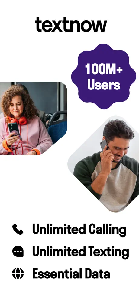
Frame 1 is a collage-style billboard with no device chrome. The “textnow” logotype sits top-center in a bold, rounded lowercase sans. To the right, a deep violet badge with scalloped edges reads “100M+ Users” in white; the violet is roughly #3B1B85, significantly darker than the purple used later in the set. Two lifestyle photos are offset and asymmetrical: on the left, a woman with curly hair and red headphones sits on a bus looking at her phone; on the right, a man smiles while holding a phone to his ear, his image rotated roughly twelve degrees inside a diamond-shaped mask with a soft drop shadow. At the bottom, three black icons—a phone handset, a speech bubble, and a globe—anchor a stacked list in heavy sans: “Unlimited Calling,” “Unlimited Texting,” and “Essential Data.” The spacing between icon and text is tight, roughly one icon-width, and the lines sit in a loose vertical stack that grounds the otherwise floating collage above.
TextNow App Store screenshot 2 — The Manifesto and the Press Bar
02

The Manifesto and the Press Bar

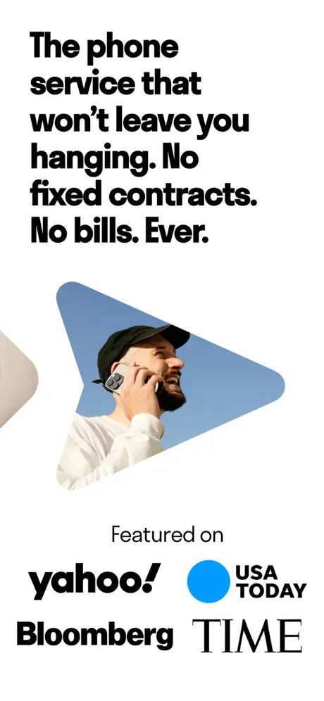
On-frame caption: “The phone service that won't leave you hanging. No fixed contracts. No bills. Ever.

Frame 2 stays on a white ground and remains device-free. The headline is set flush-left in the heaviest weight in the set: “The phone service that won't leave you hanging. No fixed contracts. No bills. Ever.” The type occupies the upper ~40% of the frame and is ragged on the right, creating a stark black shape against the white field. Below the headline, a lifestyle photo of a man with a beard and black cap is masked inside an irregular sky-blue shape (#75A3D8) that resembles a stretched guitar pick. A sliver of another photo bleeds in from the left edge, implying a sequence of candid moments. At the bottom, the words “Featured on” in a smaller, lighter weight introduce a lockup of four press marks: “yahoo!” in its custom black lowercase logotype; “USA TODAY” with a bright cyan dot (#009DFF); “Bloomberg” in a bold sans-serif; and “TIME” in its traditional serif wordmark. The lockup is roughly centered and acts as a trust bridge before the shopper sees any actual software.

TextNow App Store screenshot 3 — Number Provisioning
03

Number Provisioning

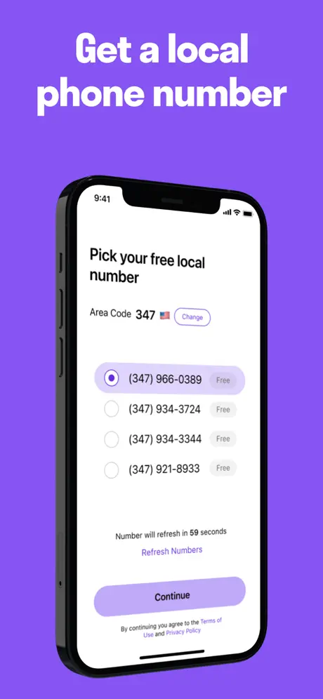
On-frame caption: “Get a local phone number

The set pivots here to device-first demonstration. The background switches to an electric violet (#8B5CF6) that will dominate the remaining frames. White type at the top reads “Get a local phone number.” Centered below is a black iPhone with a visible notch; the status bar reads 9:41. On the screen, the “Pick your free local number” view shows area code 347 alongside a US flag emoji and a “Change” pill. Four number options are listed with radio buttons; the first, “(347) 966-0389,” is selected and tagged “Free.” A line of micro-copy states “Number will refresh in 59 seconds,” with a purple “Refresh Numbers” link beneath. The primary action is a lavender-filled rounded rectangle reading “Continue,” and the bottom of the screen carries terms micro-copy. The contrast between the purple studio wall, the black bezel, and the light UI is severe and effective.

TextNow App Store screenshot 4 — Messaging Proof
04

Messaging Proof

On-frame caption: “Unlimited talk & text

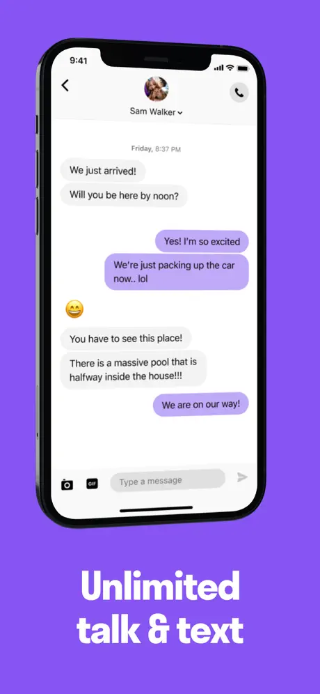
Background remains #8B5CF6, but the caption placement shifts to the bottom: “Unlimited talk & text” in bold white. The device shows a messaging thread with “Sam Walker” and a profile thumbnail at top center. Gray inbound bubbles (#F3F4F6) carry messages like “We just arrived!” and “Will you be here by noon?”; outbound bubbles are colored in a light lilac (#C4B5FD) and include “Yes! I'm so excited” and “We're just packing up the car now.. lol.” An inline emoji (😀) appears between the bubbles. The bottom of the screen shows a camera icon, a GIF indicator, and a “Type a message” input field. By mimicking the native iMessage pattern, the frame lowers cognitive load, but the decision to place the caption below the device breaks the top-caption pattern established in frame 3 and reused in frames 6 and 7.

TextNow App Store screenshot 5 — Account and Day Pass
05

Account and Day Pass

On-frame caption: “Unlimited data on demand

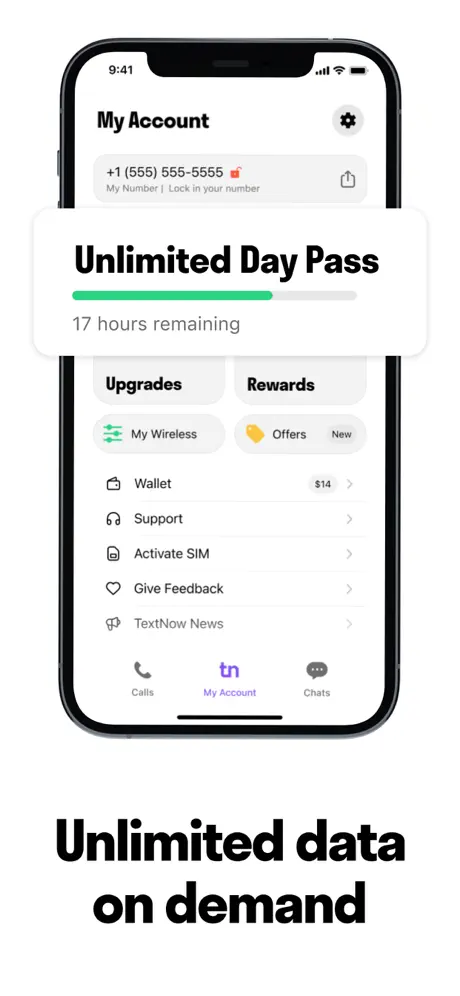
The background returns to white. The device displays the “My Account” screen, with a settings gear at upper right and a number card reading “+1 (555) 555-5555” beneath. A floating white card overlays the top third of the screen, reading “Unlimited Day Pass” in bold black, followed by a mint-green progress bar (#34D399) and the line “17 hours remaining.” Below the card, two tabs read “Upgrades” and “Rewards,” followed by rows for “My Wireless,” “Offers” with a yellow tag and red “New” badge, “Wallet” showing “$14,” “Support,” “Activate SIM,” “Give Feedback,” and “TextNow News.” The bottom tab bar is fully visible, showing “Calls,” a purple “tn” glyph on “My Account,” and “Chats.” The caption below the device reads “Unlimited data on demand.” This is the densest frame in the set; it sacrifices white space to prove that the app has a wallet, SIM activation, and account management layer.

TextNow App Store screenshot 6 — Coverage Map
06

Coverage Map

On-frame caption: “Strong 5G/ LTE coverage

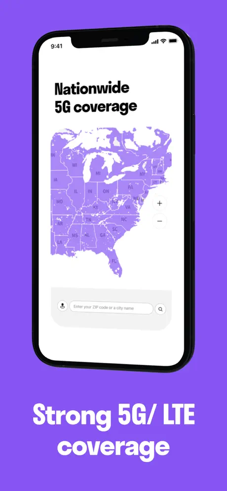
Back on the #8B5CF6 purple ground. The caption at the bottom reads “Strong 5G/ LTE coverage,” notable for an unusual space preceding the slash. The device shows a full-bleed map of the continental United States rendered in the same brand purple, with state boundaries cut in a lighter tint. The on-screen headline inside the app reads “Nationwide 5G coverage.” At the bottom of the screen, a search bar invites the user to “Enter your ZIP code or a city name.” Zoom in/out controls sit on the right edge. The map is decorative rather than data-dense; it communicates breadth without the visual noise of standard map tiles. The purple-on-purple treatment is legible because the state borders provide enough luminance separation.

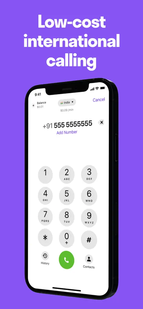
TextNow App Store screenshot 7 — International Dialer
07

International Dialer

On-frame caption: “Low-cost international calling

The purple studio persists. The caption at the top reads “Low-cost international calling.” The device displays a dialer UI. In the header, a balance of “$0.01” sits at left, a country selector for “India” with a flag dropdown sits center, and “Cancel” in purple sits at right. A per-minute rate reads “$0.09 / min.” The number field shows “+91 555 5555555” with a clear “x” and a purple “Add Number” link below. The keypad uses circular gray buttons (#F3F4F6) with black numerals and small sans-serif letters (ABC, DEF, etc.). A green call button (#22C55E) anchors the bottom center, flanked by “History” and “Contacts.” This frame is effective because it shows concrete pricing inside the UI rather than burying it in body copy.

TextNow App Store screenshot 8 — Active Call with Lifestyle Overlay
08

Active Call with Lifestyle Overlay

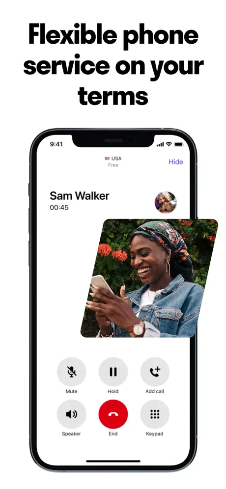
On-frame caption: “Flexible phone service on your terms

The final frame returns to a white ground. The caption at top reads “Flexible phone service on your terms.” The device shows an active call to “Sam Walker” at “00:45,” with a “USA” flag, “Free,” and a purple “Hide” link at the top. Overlaid at a roughly fifteen-degree angle across the center of the screen is a candid photo of a woman outdoors, breaking the rectangular grid. Beneath the overlay, the call controls are visible: gray circles for “Mute,” “Hold,” “Add call,” “Speaker,” and “Keypad,” with a saturated red “End” button (#EF4444) at center bottom. The overlay attempts to merge human warmth with functional proof, but it physically covers the Speaker and Keypad targets, undermining the legibility of the very interface the set is trying to sell.

05The craft

Captions, colour and the mechanics of the sell

Caption pattern

Captions are large, often two-line, and set in the same bold geometric sans throughout. However, their spatial relationship to the device changes by frame: Frame 3 places “Get a local phone number” above the phone; Frame 4 places “Unlimited talk & text” below it; Frame 5 places “Unlimited data on demand” below; Frame 6 places “Strong 5G/ LTE coverage” below; Frame 7 places “Low-cost international calling” above; Frame 8 places “Flexible phone service on your terms” above. That inconsistency means a shopper swiping quickly has to re-anchor their eyes on every screen.

Visual system

A dual-mode system. Billboard frames use white grounds, organic blob and triangle photo masks, and a palette expanded to include a muted sky blue (#75A3D8) and deep violet (#3B1B85). Demo frames collapse the palette to black, white, and a single electric violet (#8B5CF6). The only accent colors appear inside the UI itself: a mint progress bar (#34D399), a green dialer button (#22C55E), and a red end-call button (#EF4444).

The thumbnail test

Frame 1 is the thumbnail frame. It is device-free, which is a gamble. It relies on the “textnow” wordmark, the deep violet “100M+ Users” seal, and three black icon-bullet pairs to earn the tap. Because there is no UI chrome, the thumbnail competes on brand and promise rather than on feature recognition. In a crowded telecom category where rivals splash device frames on every thumbnail, this isolation strategy can read as either confident or evasive, depending on the shopper.

Conversion mechanics

The set front-loads trust before utility. That sequencing is psychologically sound for a category where users fear hidden fees. However, the lack of a device in frame 1 means the thumbnail cannot rely on UI pattern-matching; it must win on brand recognition and headline alone. Inside the set, frames 3 and 7 are the strongest conversion assets because they display real data—specific area codes, specific per-minute rates, a visible countdown timer—which reduces perceived risk.

06Where it slips

What we would change

Caption placement is inconsistent across Act Two

Frames 3, 6, 7 place captions above the device. Frames 4 and 5 place them below. Frame 8 places the caption above. In a swipeable carousel, the human thumb naturally obscures the lower third of the screen, so bottom captions risk being hidden. More importantly, the shifting anchor point forces the eye to re-orient on every swipe, increasing cognitive load. Fix: lock every caption to the top safe zone, maintaining a consistent 48–64pt margin from the top edge so the reading rhythm stays predictable across all eight frames.

Frame 8's angled lifestyle overlay occludes functional UI

A rotated photo of a woman is draped across the middle of the call screen, covering portions of the Speaker and Keypad icons. The overlay adds visual interest, but in a product demo frame it directly contradicts the purpose of the screenshot, which is to prove how the call UI looks and behaves. If the shopper cannot see the controls, the frame fails as proof. Fix: remove the overlay entirely from the device screen and place the lifestyle image beside the phone in a split-screen layout, or confine it to the top-right corner outside the touch-target zone.

Typographic error in Frame 6 undermines precision

The caption reads “Strong 5G/ LTE coverage” with an aberrant space before the slash. For a utility app that sells metered infrastructure, typographic sloppiness in the store page can telegraph sloppiness in billing. Fix: correct the string to “Strong 5G/LTE coverage” and audit all captions for spacing consistency.

The Deep Violet and Sky Blue from Act One disappear in Act Two

Frame 1 introduces a dark violet badge (#3B1B85) and frame 2 introduces a sky-blue photo mask (#75A3D8). Neither color appears in frames 3–8, where the palette collapses to black, white, and the electric violet ground. The result feels like two different design systems stitched together. Fix: thread the deep violet into a UI element—perhaps as the active toggle color or as a selected-state fill inside the app mockups—to keep the palette unified across the billboard and demo modes.

Frame 5's floating card lacks separation

The “Unlimited Day Pass” card is white-on-white, and its drop shadow is too subtle to read against both the phone’s white screen and the screenshot’s white background. The card edges bleed into the surrounding UI rows. Fix: add a one-point stroke in #E5E7EB around the card, or tint the account-screen background behind the card to a cool gray so the white card lifts cleanly.

07The recipe

How to apply this to your own app

  1. 01

    If your app category suffers from trust deficits (finance, telecom, health), front-load credibility before UI. Use your first two frames for stats, press, and manifesto copy, even if that means delaying the device chrome.

  2. 02

    Pick one brand color to act as a studio backdrop for all device frames. TextNow’s electric purple (#8B5CF6) separates the black iPhone bezel from the store background and unifies five otherwise disparate UI screens.

  3. 03

    Anchor captions consistently. Decide whether text lives above or below the device and enforce that rule across the set so the shopper’s eye knows where to land on every swipe.

  4. 04

    Populate mockups with real-looking data—specific phone numbers, balances, countdown timers, and per-minute rates. Specificity reduces perceived risk more than generic placeholder content.

  5. 05

    Audit every frame for typographic errors and spacing inconsistencies. In utility categories, a single spacing bug (“5G/ LTE”) can erode the precision your brand is trying to sell.

08Takeaways

Five things worth stealing

  • A two-act structure—billboard first, demo second—can work in high-friction categories, but only if the visual bridge between acts is strong.
  • Real data inside UI mockups (balances, rates, timers) outperforms lorem ipsum for trust-building.
  • Lifestyle photography should never cover the interactive elements you are trying to demonstrate.
  • A single studio color behind device frames creates instant continuity across disparate screens.
  • Caption placement is not an aesthetic variable; it is a usability constant in a thumb-driven carousel.
09The verdict

What the set actually achieves

The set delivers a clear product narrative: free number, free talk and text, add data when you need it, and call abroad cheaply. The press bar in frame 2 and the 100M+ badge in frame 1 do heavy lifting for credibility. However, the set suffers from inconsistent caption anchoring, a typographic error in frame 6, and an unnecessary lifestyle overlay in frame 8 that occludes the UI it is meant to sell.

Teams building telecom, fintech, or utility apps where trust must precede feature proof. Also useful for designers debating whether to show a device in the thumbnail frame—the set provides a clear case study in leading with brand promise instead of UI chrome.

10Questions

Frequently asked

Why are there no device frames in the first two screenshots?

Frames 1 and 2 function as a landing page. By removing the device, the team forces the shopper to absorb scale (“100M+ Users”), value props, and press credibility before evaluating software. It is a trust-first strategy.

What is the significance of the 9:41 time shown on every device?

The 9:41 status bar is Apple’s standard presentation time, signaling that these are iOS screenshots. It is a subtle visual cue that the set was composed with Apple’s Human Interface Guidelines in mind.

Why does the purple background change shade between frames?

The deep violet badge in frame 1 (#3B1B85) is darker than the electric purple studio in frames 3–8 (#8B5CF6). The set uses the darker shade for marketing collage and the brighter shade for UI demonstration, but the shift is large enough that it risks feeling like two different brands.

How does the set handle international-calling proof?

Frame 7 shows the dialer prepopulated with an India flag, a balance of $0.01, and a per-minute rate of $0.09. By showing actual numbers rather than a generic dial pad, the frame answers the shopper’s cost question before they reach the app.

11Keep reading

Build your own screenshot set

The full set

8 shots
TextNow App Store screenshot 1TextNow App Store screenshot 2TextNow App Store screenshot 3TextNow App Store screenshot 4TextNow App Store screenshot 5TextNow App Store screenshot 6TextNow App Store screenshot 7TextNow App Store screenshot 8

About the app

Call and text for free with TextNow, the free phone service with over 100 million users. Get nationwide coverage with unlimited talk and text, plus 5G data—starting at $0/month. TextNow, Inc., via the App Store listing.

Screenshots and store metadata belong to TextNow, Inc.. They are shown here for design commentary and criticism. The analysis on this page is original work by floow.design. View the original listing.

More Social teardowns

Browse all →