Clarity
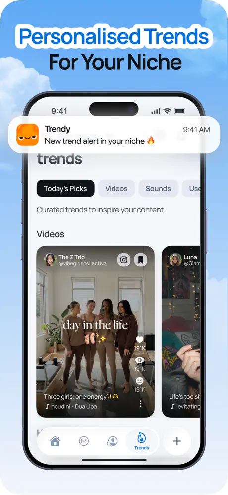
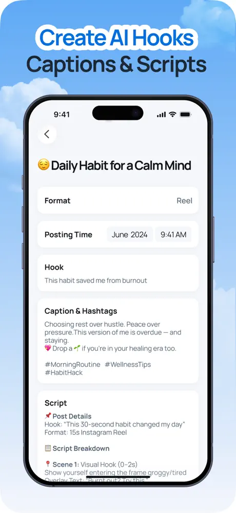
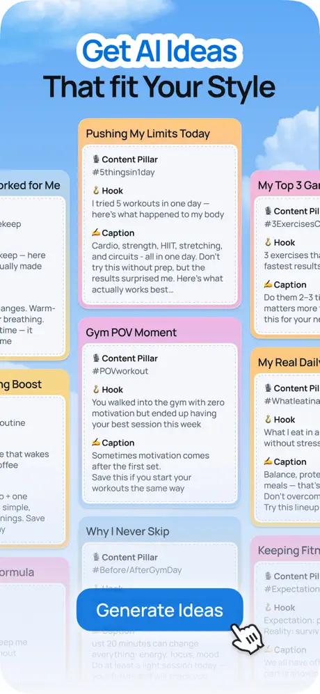
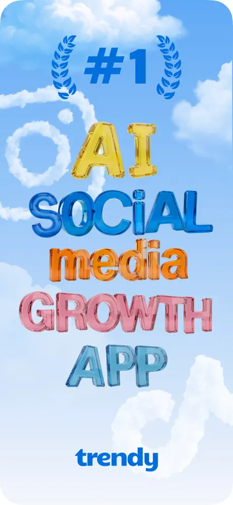
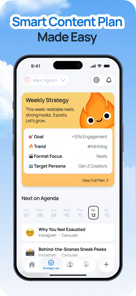
The set attempts a linear narrative—discover trends, write hooks, generate ideas, review analytics, define DNA, and plan content—but structural inconsistencies interrupt comprehension. Frame one shows no product, forcing the shopper to guess the platform for a full swipe. Frame four removes the device entirely, breaking the mental model established in frames two, three, five, six, and seven. Meanwhile, the bottom tab bar changes labels between 'Trends,' 'Performance,' and 'Strategy Lab,' implying at least five top-level destinations that are never fully mapped. A user cannot tell whether these are tabs, modes, or separate apps. The outlined blue headlines unify the frames aesthetically, yet the internal UI density swings so wildly from sparse text forms to overcrowded dashboards that the eye never settles into a predictable scanning pattern.
Credibility
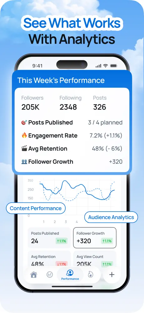
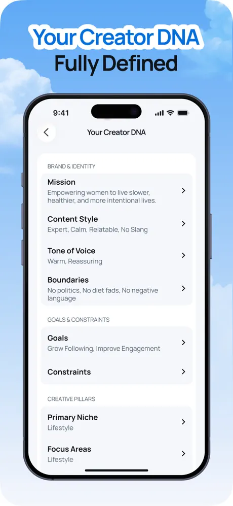
Trust signals in this set are inconsistent. Frame one pairs a bold '#1' claim with generic laurel vectors and no attribution, which reads as self-appointed rather than earned. Frame six promises a 'Fully Defined' creator profile yet leaves the 'Constraints' field empty, contradicting the caption. Frame seven misspells 'Exausted,' a fatal error for an AI writing assistant. On the positive side, the analytics numbers are specific—205K followers, 7.2% engagement, +320 growth—and formatted with realistic decimal precision. However, presenting aspirational metrics inside an unpaid app screenshot can backfire: it suggests the numbers are simulated rather than user-generated. Credibility would be strengthened by replacing the laurels with a verifiable chart badge, filling every blank table row, and proofreading every caption string.
Desire
Desire is built through functional completeness rather than emotional aspiration. The 'Creator DNA' frame is the strongest because it speaks to identity—something creators guard fiercely—and the Boundaries line ('No politics, No diet fads') signals respect for that autonomy. Conversely, the set never shows the payoff: there is no human face, no viral hit notification, no 'before and after' follower count. The aesthetic is relentlessly utilitarian, dominated by system fonts, default table views, and gray backgrounds. In a category where competitors often sell the lifestyle of a successful creator, Trendy sells the dashboard. That appeals to process-oriented users but may fail to spark the emotional urgency that drives impulsive downloads. A single frame showing a real-world result would do more for desire than another analytics metric.
Overall Summary
As a whole, the Trendy screenshot set is a thorough feature checklist wrapped in a visually cohesive sky motif. The headline system—blue outline over dark gray—is disciplined and instantly recognizable. The narrative arc from trend discovery to content calendar is logically sound and covers the full creator workflow. Yet the set also demonstrates the classic pitfall of seven-frame lists: comprehensiveness crowding out persuasion. Two frames compete to show text generation, analytics is crushed into unreadable density, and the absence of the device shell in frames one and four fractures spatial context. For designers, it is a valuable lesson in how background unity cannot fully compensate for inconsistent foreground framing or unfinished dummy content.